GPT-4 Vision 系列:
- 翻译: GPT-4 with Vision 升级 Streamlit 应用程序的 7 种方式一
- 翻译: GPT-4 with Vision 升级 Streamlit 应用程序的 7 种方式二
- 翻译: GPT-4 Vision静态图表转换为动态数据可视化 升级Streamlit 三
- 翻译: GPT-4 Vision从图像转换为完全可编辑的表格 升级Streamlit四
1. 通过量身定制的推荐来增强应用的用户体验
GPT-4 Vision 还可以帮助您改善应用程序的用户体验并简化多页面应用程序的设计过程。
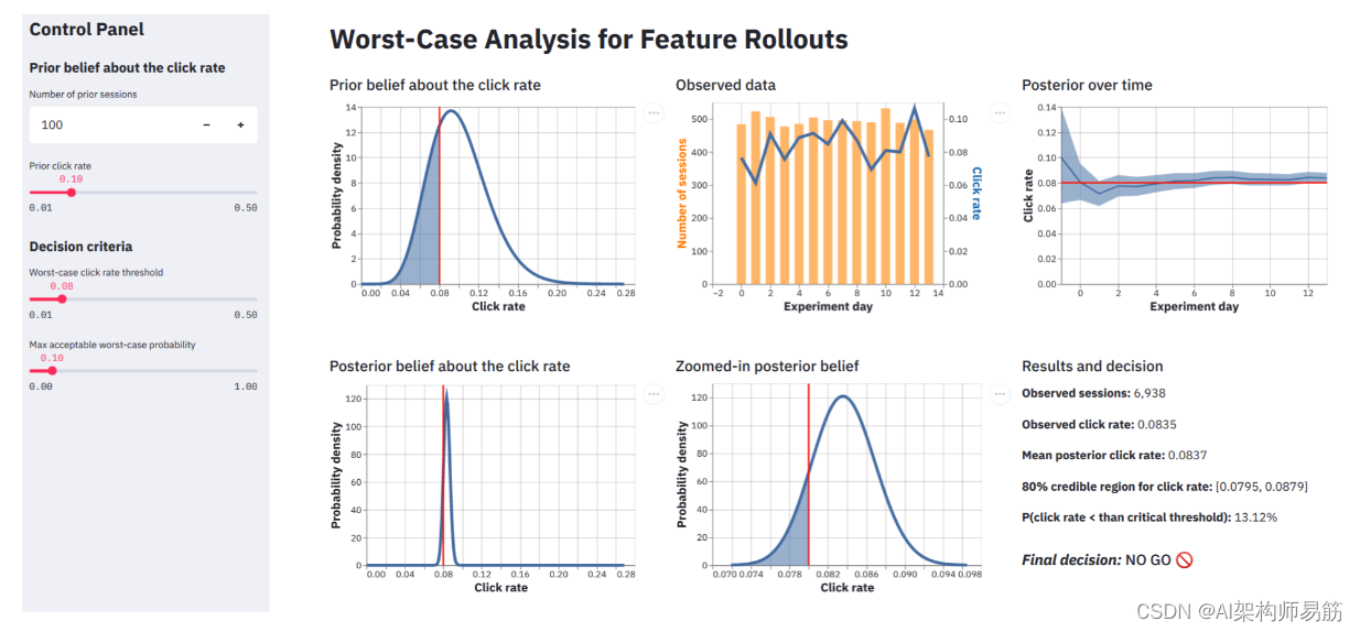
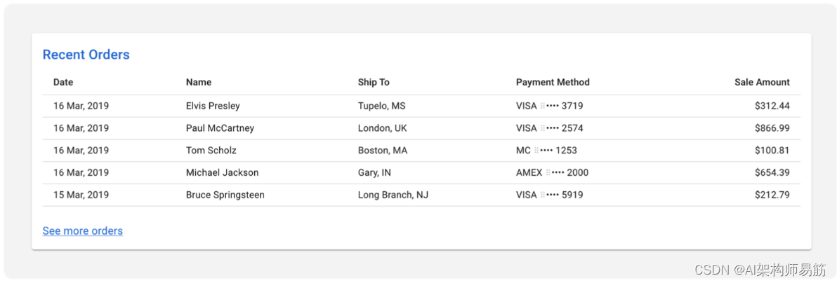
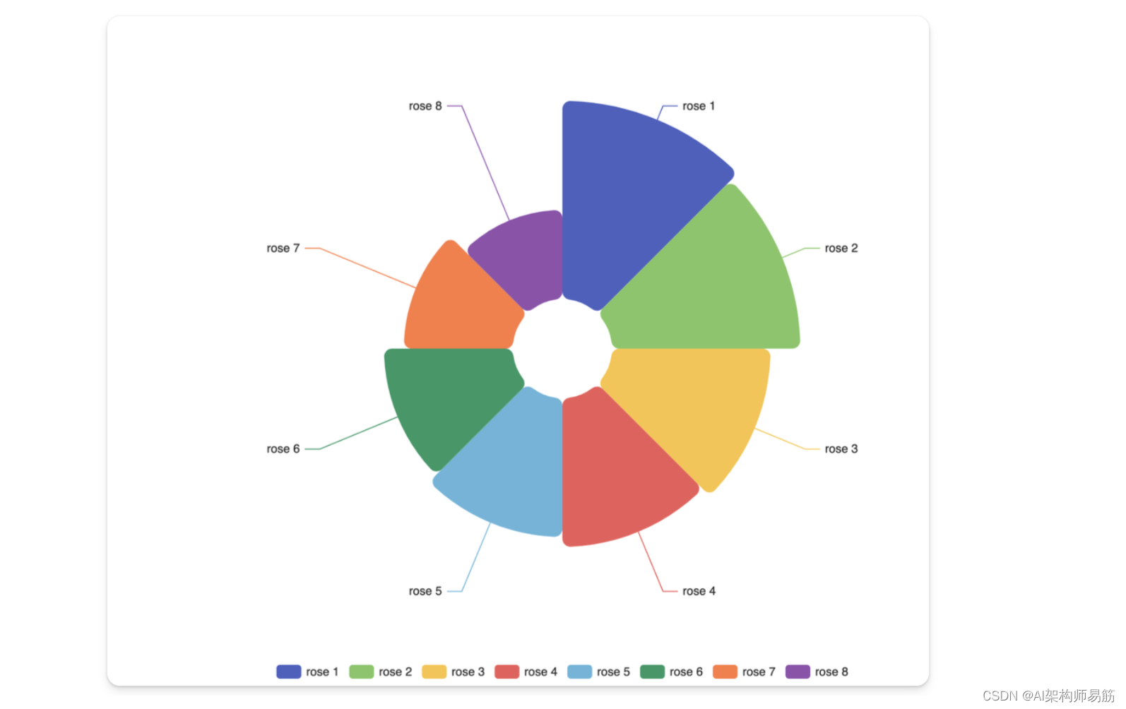
将复杂complex dashboard app 的屏幕截图粘贴 到 ChatGPT 中。
包括以下提示prompt:
Provide 8 suggestions to enhance the usability of this Streamlit app. Then provide the solution code with streamlit.
2. GPT-4 实现
为了增强上传图片中展示的Streamlit应用的可用性,考虑以下建议:
图表的动态更新:实现回调函数,当控制面板输入发生变化时,动态更新图表,无需手动刷新页面。
输入验证:包括输入验证,以防止用户输入无效数据,可能导致计算或可视化出现错误。
清晰的可视化标题:确保所有图表都有清晰的标题,描述它们代表的内容,使用户更容易理解所呈现的数据。
帮助文本/工具提示:添加帮助文本或工具提示,解释每个控制面板输入和图表代表的内容。这可以指导用户如何有效地与应用程序进行交互。
响应式布局:使用响应式布局,确保应用在不同的屏幕尺寸和设备上显示良好。
进度指示器:在进行需要时间的计算时,显示进度指示器,告知用户应用正在处理他们的请求。
可下载报告:提供下载结果的选项,例如“结果和决策”部分,作为PDF或CSV文件,以进行进一步分析或报告。
可访问性功能:考虑可访问性功能,如键盘导航和高对比度显示选项,以使残障人士能够使用该应用。
以下是一个示例,演示了如何将这些建议应用到使用Streamlit编写的代码中。这是一个概念性示例,需要根据应用程序中的具体功能和数据处理进行调整。
import streamlit as st
import numpy as np
import pandas as pd
import matplotlib.pyplot as plt

from scipy.stats import beta

def calculate_prior_belief(num_prior_sessions, prior_click_rate):
    # Generate a Beta distribution for the prior belief
    a = num_prior_sessions * prior_click_rate
    b = num_prior_sessions * (1 - prior_click_rate)
    x = np.linspace(0, 1, 100)
    y = beta.pdf(x, a, b)

    # Plot the prior belief distribution
    fig, ax = plt.subplots()
    ax.plot(x, y)
    ax.fill_between(x, 0, y, alpha=0.2)
    ax.axvline(prior_click_rate, color='red', linestyle='--')
    ax.set_title("Prior belief about the click rate")
    ax.set_xlabel("Click rate")
    ax.set_ylabel("Probability density")

    return fig

def observed_data_plot():
    # Placeholder for generating an observed data plot
    fig, ax = plt.subplots()
    # Example data
    data = np.random.randint(100, 500, size=15)
    ax.bar(range(len(data)), data, color='orange')
    ax.set_title("Observed data")
    ax.set_xlabel("Experiment day")
    ax.set_ylabel("Number of sessions")

    return fig

def posterior_over_time_plot():
    # Placeholder for generating a posterior over time plot
    fig, ax = plt.subplots()
    # Example data
    x = np.arange(15)
    y = np.random.random(15) * 0.1
    ax.plot(x, y, color='blue')
    ax.fill_between(x, y - 0.01, y + 0.01, alpha=0.2)
    ax.set_title("Posterior over time")
    ax.set_xlabel("Experiment day")
    ax.set_ylabel("Click rate")

    return fig

def calculate_posterior_belief():
    # Placeholder for generating a posterior belief plot
    fig, ax = plt.subplots()
    # Example data
    x = np.linspace(0, 1, 100)
    y = beta.pdf(x, 20, 180)
    ax.plot(x, y)
    ax.fill_between(x, 0, y, alpha=0.2)
    ax.axvline(0.08, color='red', linestyle='--')
    ax.set_title("Posterior belief about the click rate")
    ax.set_xlabel("Click rate")
    ax.set_ylabel("Probability density")

    return fig

def zoomed_in_posterior_belief_plot():
    # Placeholder for generating a zoomed-in posterior belief plot
    fig, ax = plt.subplots()
    # Example data
    x = np.linspace(0.07, 0.09, 100)
    y = beta.pdf(x, 20, 180)
    ax.plot(x, y)
    ax.fill_between(x, 0, y, alpha=0.2)
    ax.axvline(0.083, color='red', linestyle='--')
    ax.set_title("Zoomed-in posterior belief")
    ax.set_xlabel("Click rate")
    ax.set_ylabel("Probability density")

    return fig


# Assuming you have a function to calculate and return the plot objects
# These would need to be defined based on your data processing and analysis
# from your_analysis_module import (
#     calculate_prior_belief,
#     observed_data_plot,
#     posterior_over_time_plot,
#     calculate_posterior_belief,
#     zoomed_in_posterior_belief_plot
# )

# 1. Dynamic Update of Charts using Streamlit session state or callback functions
# 2. Input Validation with min, max, step for sliders
# 3. Clear Visualization Titles with st.header or st.subheader

st.sidebar.header('Control Panel')

# Prior belief about the click rate
num_prior_sessions = st.sidebar.number_input('Number of prior sessions', min_value=1, max_value=10000, value=100, step=1)
prior_click_rate = st.sidebar.slider('Prior click rate', min_value=0.01, max_value=0.50, value=0.10, step=0.01)

# Decision criteria
worst_case_click_rate_threshold = st.sidebar.slider('Worst-case click rate threshold', min_value=0.01, max_value=0.50, value=0.08, step=0.01)
max_acceptable_worst_case_probability = st.sidebar.slider('Max acceptable worst-case probability', min_value=0.00, max_value=1.00, value=0.10, step=0.01)

# Assuming we have defined calculation functions that return plots based on the inputs
prior_belief_plot = calculate_prior_belief(num_prior_sessions, prior_click_rate)
observed_plot = observed_data_plot()
posterior_time_plot = posterior_over_time_plot()
posterior_belief_plot = calculate_posterior_belief()
zoomed_posterior_plot = zoomed_in_posterior_belief_plot()

# Layout for charts
col1, col2, col3 = st.columns(3)

with col1:
    st.header("Prior belief about the click rate")
    st.pyplot(prior_belief_plot)

with col2:
    st.header("Observed data")
    st.pyplot(observed_plot)

with col3:
    st.header("Posterior over time")
    st.pyplot(posterior_time_plot)

with col1:
    st.header("Posterior belief about the click rate")
    st.pyplot(posterior_belief_plot)

with col2:
    # Empty for layout balance
    st.header("Empty for layout balance")

with col3:
    st.header("Zoomed-in posterior belief")
    st.pyplot(zoomed_posterior_plot)

# 7. Downloadable Reports
if st.button('Download Results'):
    results_to_download = {

        "Observed sessions": 6938,
        "Observed click rate": 0.0835,
        # ... other results ...
    }
    st.download_button(
        label="Download results as CSV",
        data=pd.DataFrame([results_to_download]).to_csv(index=False),
        file_name='results.csv',
        mime='text/csv',
    )

# 8. Accessibility Features
# Implement features such as keyboard shortcuts and high-contrast mode if necessary

# Additional details such as progress indicators and help text can be added where appropriate.
请用实际代码替换占位符和函数名(your_analysis_module、calculate_prior_belief 等),以反映您的应用程序功能。
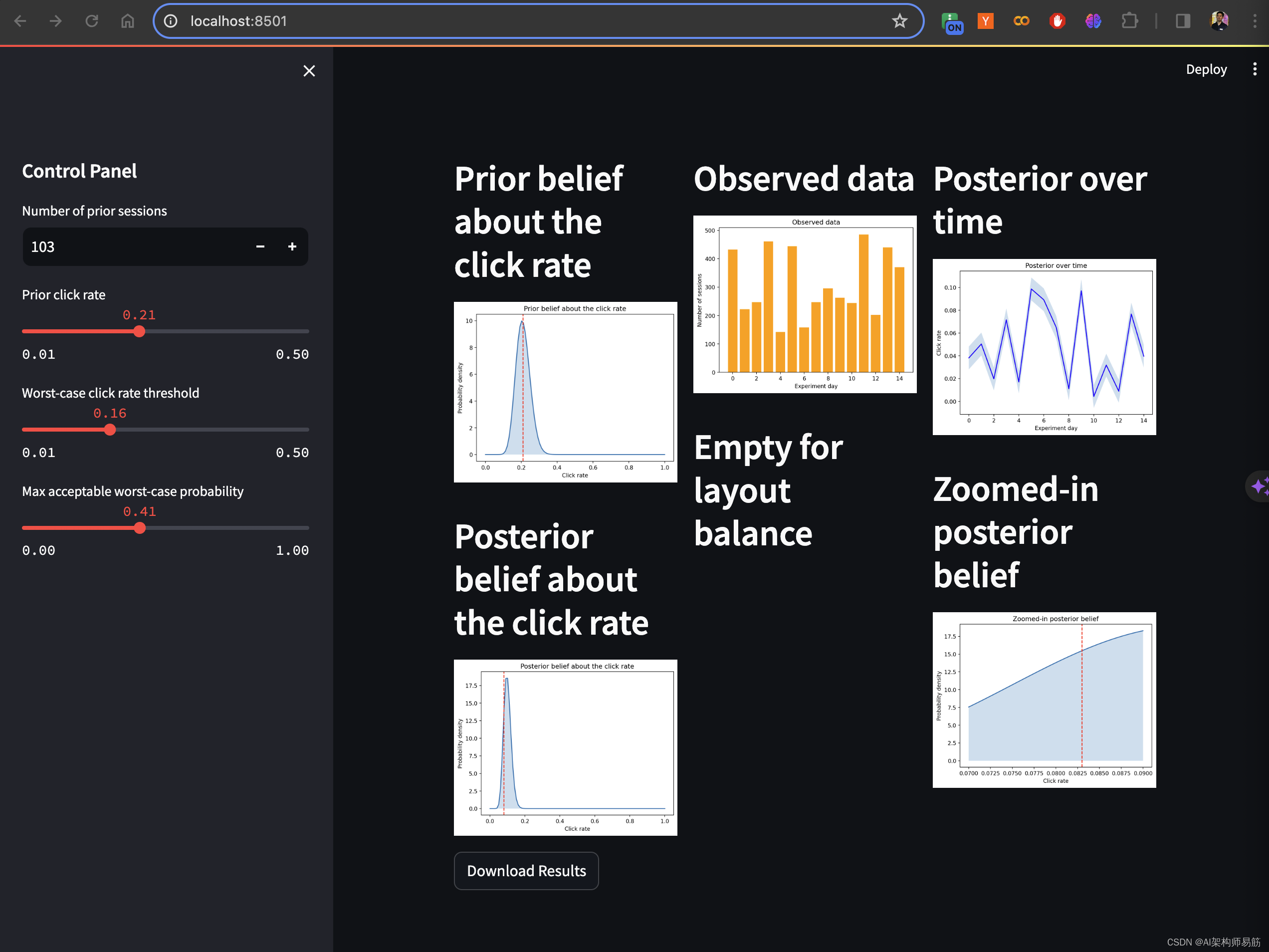
运行结果
3. 请提供实现your_analysis_module的代码
prompt:
请提供实现your_analysis_module的代码
要创建在假设的Streamlit代码中引用的your_analysis_module,我们需要实现执行统计分析并根据输入参数生成图表的函数。例如,这些函数可能使用贝叶斯分析来更新有关点击率的信念。
以下是一个示例,说明您可能如何使用占位符函数来构建此模块,用于生成图表,因为实际的统计分析将取决于您的用例和数据的具体细节:
import numpy as np
import matplotlib.pyplot as plt
from scipy.stats import beta

def calculate_prior_belief(num_prior_sessions, prior_click_rate):
    # Generate a Beta distribution for the prior belief
    a = num_prior_sessions * prior_click_rate
    b = num_prior_sessions * (1 - prior_click_rate)
    x = np.linspace(0, 1, 100)
    y = beta.pdf(x, a, b)

    # Plot the prior belief distribution
    fig, ax = plt.subplots()
    ax.plot(x, y)
    ax.fill_between(x, 0, y, alpha=0.2)
    ax.axvline(prior_click_rate, color='red', linestyle='--')
    ax.set_title("Prior belief about the click rate")
    ax.set_xlabel("Click rate")
    ax.set_ylabel("Probability density")

    return fig

def observed_data_plot():
    # Placeholder for generating an observed data plot
    fig, ax = plt.subplots()
    # Example data
    data = np.random.randint(100, 500, size=15)
    ax.bar(range(len(data)), data, color='orange')
    ax.set_title("Observed data")
    ax.set_xlabel("Experiment day")
    ax.set_ylabel("Number of sessions")

    return fig

def posterior_over_time_plot():
    # Placeholder for generating a posterior over time plot
    fig, ax = plt.subplots()
    # Example data
    x = np.arange(15)
    y = np.random.random(15) * 0.1
    ax.plot(x, y, color='blue')
    ax.fill_between(x, y - 0.01, y + 0.01, alpha=0.2)
    ax.set_title("Posterior over time")
    ax.set_xlabel("Experiment day")
    ax.set_ylabel("Click rate")

    return fig

def calculate_posterior_belief():
    # Placeholder for generating a posterior belief plot
    fig, ax = plt.subplots()
    # Example data
    x = np.linspace(0, 1, 100)
    y = beta.pdf(x, 20, 180)
    ax.plot(x, y)
    ax.fill_between(x, 0, y, alpha=0.2)
    ax.axvline(0.08, color='red', linestyle='--')
    ax.set_title("Posterior belief about the click rate")
    ax.set_xlabel("Click rate")
    ax.set_ylabel("Probability density")

    return fig

def zoomed_in_posterior_belief_plot():
    # Placeholder for generating a zoomed-in posterior belief plot
    fig, ax = plt.subplots()
    # Example data
    x = np.linspace(0.07, 0.09, 100)
    y = beta.pdf(x, 20, 180)
    ax.plot(x, y)
    ax.fill_between(x, 0, y, alpha=0.2)
    ax.axvline(0.083, color='red', linestyle='--')
    ax.set_title("Zoomed-in posterior belief")
    ax.set_xlabel("Click rate")
    ax.set_ylabel("Probability density")

    return fig
这个模块使用scipy.stats中的beta分布来表示对点击率的先验和后验信念。matplotlib库用于生成图表。每个函数都会生成一个图表,并返回一个matplotlib图形对象,可以在Streamlit应用程序中呈现出来。
您需要将此模块与您的主要Streamlit应用程序代码集成,并用实际数据和分析逻辑替换占位符。本示例假定采用贝叶斯方法根据观察到的数据更新信念;如果您的分析不同,您需要相应调整代码。
代码
https://github.com/zgpeace/pets-name-langchain/tree/develop
参考
https://blog.streamlit.io/7-ways-gpt-4-vision-can-uplevel-your-streamlit-apps/


![[TCP协议]基于TCP协议的字典服务器](https://img-blog.csdnimg.cn/direct/9c998e9bb1df47158b3a621817dda29c.png)