前言:
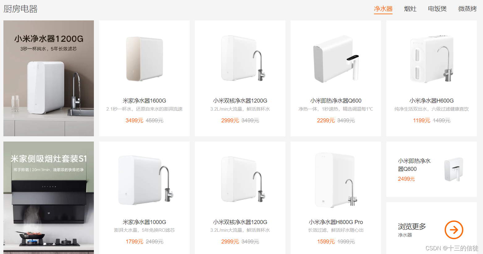
我们可以看到京东的官网上的一些例子(如下图),在同一排中能够存在多个div,这是通过布局方式(例如浮动)来实现的。

CSS传统的布局模式:
<1>普通流(又称之为标准流)
解释:
普通流布局又被称之为标准流布局,顾名思义,按照标准的布局规则进行布局
标准布局规则:
<1> 块元素,独占一行,按照自上而下的顺序
<2> 行内元素,先按照自左向右的顺序排列,如果碰到父级元素的边缘则自动换行
举例:
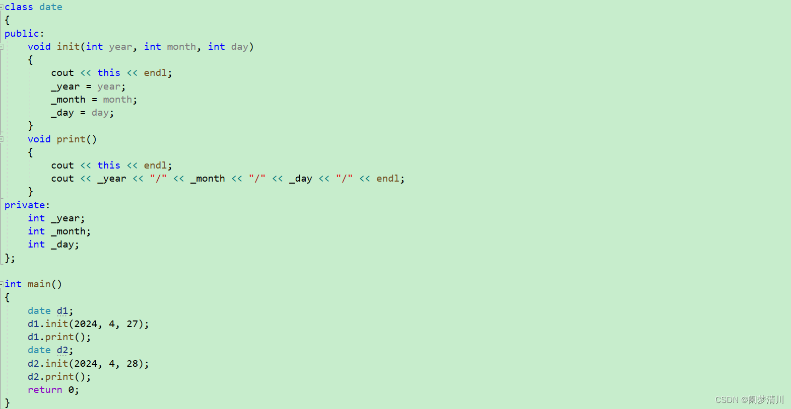
<!DOCTYPE html>
<html lang="en">
<head>
   <meta charset="UTF-8">
   <meta name="viewport" content="width=device-width, initial-scale=1.0">
   <title>Document</title>
   <style>
      .div1{
         height: 200px;
         width: 200px;
         background-color: aqua;
      }
      .div2{
         height: 200px;
         width: 200px;
         background-color: brown;
      }
      .div3{
         height: 200px;
         width: 200px;
         background-color: chartreuse;
      }
   </style>
</head>
<body>
   <div class="div1">div1</div>
   <div class="div2">div2</div>
   <div class="div3">div3</div>
</body>
</html>
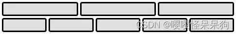
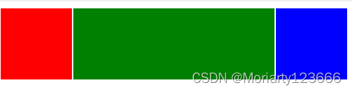
普通流实现一行多个div:
举例:
<!DOCTYPE html>
<html lang="en">
<head>
   <meta charset="UTF-8">
   <meta name="viewport" content="width=device-width, initial-scale=1.0">
   <title>Document</title>
   <style>
      .div1{
         height: 200px;
         width: 200px;
         background-color: aqua;
         display: inline-block;
      }
      .div2{
         height: 200px;
         width: 200px;
         background-color: brown;
         display: inline-block;
      }
      .div3{
         height: 200px;
         width: 200px;
         background-color: chartreuse;
         display: inline-block;
      }
   </style>
</head>
<body>
   <div class="div1">div1</div>
   <div class="div2">div2</div>
   <div class="div3">div3</div>
</body>
</html>
总结:
虽然我们可以通过普通流来实现一行多个div,但是过于麻烦而且行块内存在缝隙,并且有很多的布局无法通过标准流来实现。


<2>浮动 float
基础:
解释:
float属性用于创建浮动框,将其移动到一边,直至 左/右边缘 触及包含块或者另一个浮动框的边缘。
浮动特性:
所有使用floa属性的元素的display属性都会改变,不论它是一个什么样的元素,都会变成一个块级框,而不论它本生是何种元素
用法:
选择器{float:属性值;}
属性值:
举例:
属性值 说明 none 默认值,不进行浮动 left 向左移动
right 向右移动 inline-end
在最右侧 inline-start
在最左侧 <!DOCTYPE html> <html lang="en"> <head> <meta charset="UTF-8"> <meta name="viewport" content="width=device-width, initial-scale=1.0"> <title>Document</title> <style> .div1{ float: left; height: 200px; width: 200px; background-color: aqua; } .div2{ float: right; height: 200px; width: 200px; background-color: brown; } </style> </head> <body> <div class="div1">div1</div> <div class="div2">div2</div> </body> </html>
浮动的脱标:
文字解释:
设置了浮动是元素会漂浮在标准流之上,不占用位置,浮动在上面,也称之为脱标。
图解:
举例:
<!DOCTYPE html>
<html lang="en">
<head>
   <meta charset="UTF-8">
   <meta name="viewport" content="width=device-width, initial-scale=1.0">
   <title>Document</title>
   <style>
      .div1{
         float: left;
         height: 200px;
         width: 200px;
         background-color: aqua;
      }
      .div2{
         height: 800px;
         width: 800px;
         background-color: brown;
      }
   </style>
</head>
<body>
       <div class="div1">div1</div>
       <div class="div2">div2</div>

</body>
</html>


浮动的清除:
原因:
父级盒子在很多时候的高度不方便给出,则有可能造成 浮动的盒子影响到下方的标准流盒子。
清除的方法:
<1>隔墙法(额外标签)
方法:
在浮动标签后添加 空标签()或者其他标签(如br)
总结:
优点:书写简单
缺点:无意义标签较多导致结构化较差
举例:
<!DOCTYPE html>
<html lang="en">
<head>
   <meta charset="UTF-8">
   <meta name="viewport" content="width=device-width, initial-scale=1.0">
   <title>Document</title>
   <style>
      .div1{
         float: left;
         height: 200px;
         width: 200px;
         background-color: aqua;
      }
   </style>
</head>
<body>
   <div style="background-color: brown;">
      <div class="div1">
         div1
      </div>
      <div style="clear: both"></div>
      <br>
   </div>
</body>
</html>
<2>父级添加overflow属性
方法:
在父级的style内添加overflow,来解决
属性值:
属性值 解释 visible 不裁剪溢出的内容。浏览器把溢出来的内容呈现在其内容元素的显示区域以外的地方,全部内容在浏览器的窗口是可见的。 hidden 裁剪溢出的内容。内容只显示在其容器元素区域里面,这意味着只有一部分内容在浏览器窗口里面是可见的。 scroll 类似于hidden,浏览器将对溢出的内容进行裁切,但会显示滚动条以便让用户能够看到内容部分。 auto 类似于scroll,但是浏览器只在真的发生内容溢出的时候才会显示滚动条,如果内容没有溢出则不显示滚动条 总结:
优点:简洁,方便
缺点:溢出的内容无法显示出来
举例:
<!DOCTYPE html>
<html lang="en">
<head>
   <meta charset="UTF-8">
   <meta name="viewport" content="width=device-width, initial-scale=1.0">
   <title>Document</title>
   <style>
      .div1{
         float: left;
         height: 200px;
         width: 200px;
         background-color: aqua;
      }
   </style>
</head>
<body>
   <div style="background-color: brown; overflow: scroll;">
      <div class="div1">
         div1
      </div>
   </div>
</body>
</html>
<3>使用after伪类:
方法:
使用after来代替<1>
总结:
优点:结构语义化
缺点:IE6-7不支持,需要使用zoom:1
举例:
<!DOCTYPE html>
<html lang="en">
<head>
   <meta charset="UTF-8">
   <meta name="viewport" content="width=device-width, initial-scale=1.0">
   <title>Document</title>
   <style>
      .div1{
         float: left;
         height: 200px;
         width: 200px;
         background-color: aqua;
      }
      .div2:after{
         content: "";
         display: block;
         height: 0;
         clear: both;
         visibility: hidden;
      }
   </style>
</head>
<body>
   <div class="div2" style="background-color: brown;">
      <div class="div1">
         div1
      </div>
   </div>
</body>
</html>
<4>使用双伪类
方法:
使用before和after
总结:
优点:结构语义化
缺点:IE6-7不支持,需要使用zoom:1
举例:
<!DOCTYPE html>
<html lang="en">
<head>
   <meta charset="UTF-8">
   <meta name="viewport" content="width=device-width, initial-scale=1.0">
   <title>Document</title>
   <style>
      .div1{
         float: left;
         height: 200px;
         width: 200px;
         background-color: aqua;
      }
      .div2:before,
      .div2:after{
         content: "";
         display: table;
      }
      .div2:after{
         clear: both;
      }
   </style>
</head>
<body>
   <div class="div2" style="background-color: brown;">
      <div class="div1">
         div1
      </div>
   </div>
</body>
</html>


补充:
clear的解释:
clear属性指定一个元素是否必须移动(清除浮动后)到在它之前的浮动元素下面。clear 属性适用于浮动和非浮动元素。
属性值:
after和before伪类的补充:
属性值 说明 none
元素不会向下移动清除之前的浮动。
left
元素被向下移动用于清除之前的左浮动。
right
元素被向下移动用于清除之前的右浮动。
both
元素被向下移动用于清除之前的左右浮动。
inline-start
表示该元素向下移动以清除其包含块的起始侧上的浮动。即在某个区域的左侧浮动或右侧浮动。
inline-end
表示该元素向下移动以清除其包含块的末端的浮点,即在某个区域的右侧浮动或左侧浮动。
见此文章:点击查看
<3>定位 position
属性值略解:
| 属性值 | 解释 |
| static | 正常定位 |
| relative | 相对定位 |
| absolute | 绝对定位 |
| fixed | 固定定位 |
| sticky | 粘性定位 |
属性值详解:
static(正常定位):
解释:
static其意思是正常定位,是position的默认值,包含此属性值的元素遵循常规流,此时的top,right,bottom,left,z-index属性都会失效。
举例:
<!DOCTYPE html>
<html lang="en">
<head>
   <meta charset="UTF-8">
   <meta name="viewport" content="width=device-width, initial-scale=1.0">
   <title>Document</title>
   <style>
      .c{
         position: static;
         background-color: pink;
      }
   </style>
</head>
<body>
   <div class="c">div1</div>
   <br>
   <div class="c">div2</div>
   <br>
   <span class="c">span1</span> <span class="c">span2</span>
</body>
</html>
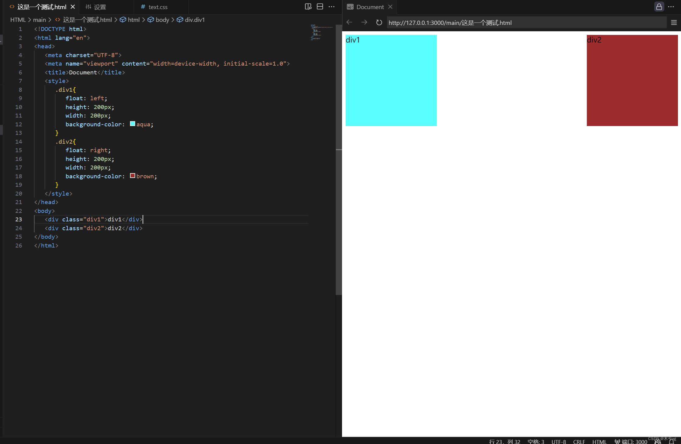
relative(相对定位):
解释:
relative意为相对定位,在不设置top,left,right,bottom等元素时与static并无区别,但设置后,会根据相对于自身再常规流中的位置进行定位。
【意思是说虽然是移动了,但其原有的位置任然存在、占有,只是移动了】
图解:
例如下图,我们利用relative将黑框向下移动到绿色部分处,那么移动后其所占据的空间任然是黑框的部分,但显示时显示的是绿色部分。

举例:
<!DOCTYPE html>
<html lang="en">
<head>
   <meta charset="UTF-8">
   <meta name="viewport" content="width=device-width, initial-scale=1.0">
   <title>Document</title>
   <style>
      .c{
         position: relative;
         top: 100px;
         background-color: pink;
      }
   </style>
</head>
<body>
   <div class="c">div1</div>
   <br>
   <br>
   <br>
   <div style="background-color: aqua;">div2</div>
</body>
</html>
absolute(绝对定位):
解释:
(1)absolute与relate之间的区别在于是否脱离了标准流,relate在移动时并没有脱离,而absolute却脱离了。【absolute不占据原有位置,而是转移后的位置】
(2)absolute与relate之间的区别在于脱离对向是谁,,relative的脱离对象是自身在标准流的位置,而absolute的脱离对象是其最近的定位祖先元素
图解:
例如下图,我们利用absolve将黑框向下移动到绿色部分处,那么移动后其所占据的空间、显示时显示的是绿色部分。
举例:
fixed(固定定位):
解释:
fixed和absolute十分类似,,两者的不同点在于偏移对象和定位对象。
(1)偏移对象:fixed相对于窗口,而absolute是心昂对于定位祖先元素
(2)定位对象:fixed的定位祖先只能是窗口,而absolute可以是相对定位的元素
举例:
<!DOCTYPE html>
<html lang="en">
<head>
   <meta charset="UTF-8">
   <meta name="viewport" content="width=device-width, initial-scale=1.0">
   <title>Document</title>
   <style>
body {
                border: 1px solid black;
                padding: 12px;
                height: 1000px;
            }

            .c {
                position: fixed;
                width: 100px;
                height: 100px;
                background-color: #f00;
                top: 50%;
                left: 50%;
                transform: translate(-50%, -50%);
            }
   </style>
</head>
<body>
   <div class="c">div1</div>
   <div style="background-color: aqua;">div2</div>
</body>
</html>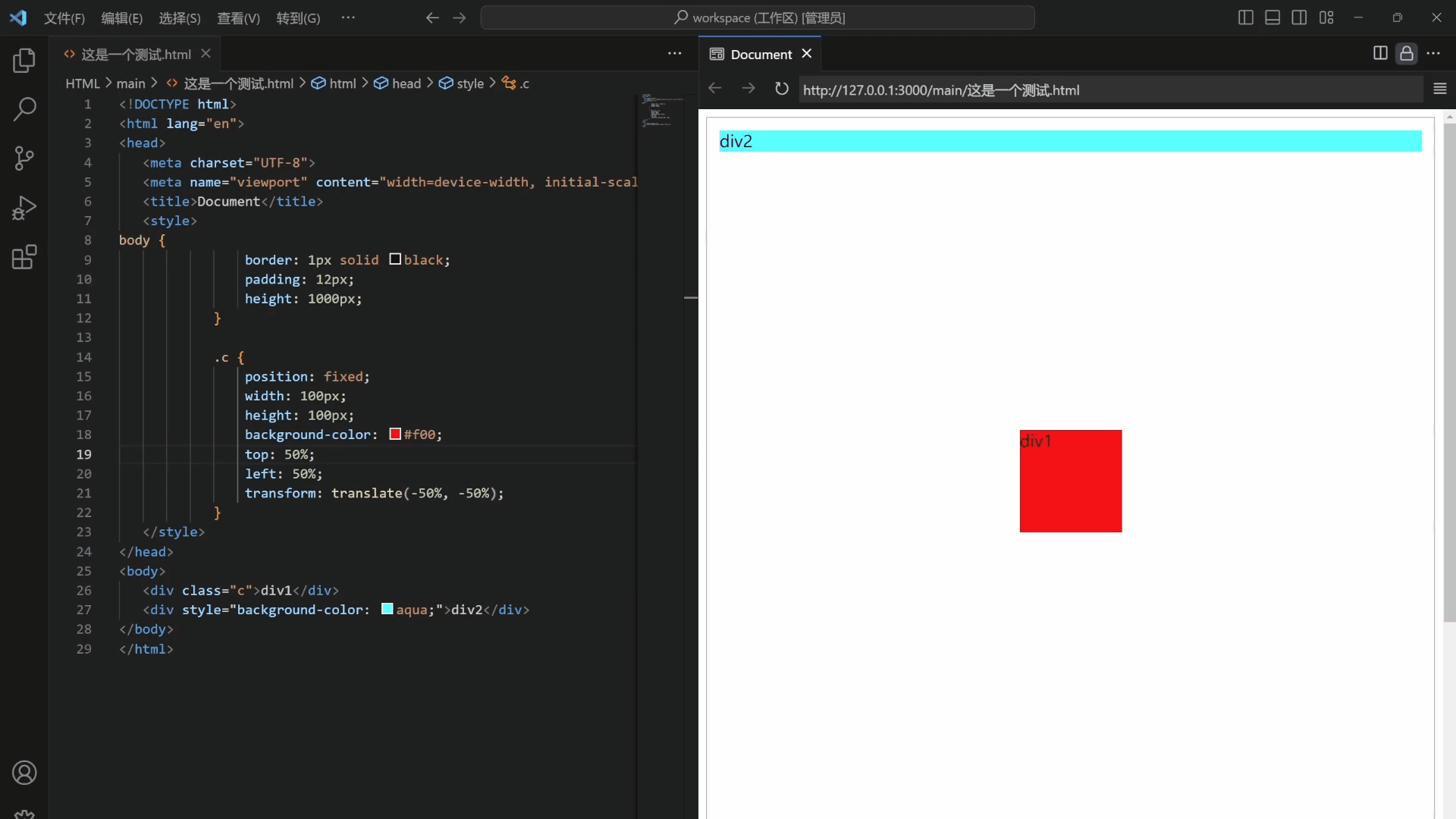
sticky(粘性定位):
解释:
sticky像是fixed和relative的结合体,如果不给其设置top,left,right,bottom具体值,则效果与static一致。当在top、right、bottom、left四个属性中至少设置一个具体值时,元素具备两种状态 【类似relative(相对定位状态)和类似fixed(固定定位状态)】
举例:
以top:10px为例 :当元素相对于窗口顶部的距离大于10px时,元素处于类似relative,一旦元素相对于窗口顶部的距离小于或等于10px时,元素立马切换到fixed。
<!DOCTYPE html>
<html lang="en">

<head>
   <meta charset="UTF-8">
   <meta name="viewport" content="width=device-width, initial-scale=1.0">
   <title>Document</title>
   <style>
      body {
         border: 1px solid black;
         padding: 32px;
         margin: 32px;
         height: 1000px;
      }

      div {
         width: 100px;
         height: 100px;
         position: relative;
      }

      #div1 {
         background-color: red;
      }

      #div2 {
         background-color: black;
         position: sticky;
         top: 100px;
         left: 100px;
         padding: 0;
         margin: 0;
      }

      #div3 {
         background-color: gray;
      }
   </style>
</head>

<body>
   <div id="div1"></div>
   <div id="div2"></div>
   <div id="div3"></div>
</body>

</html>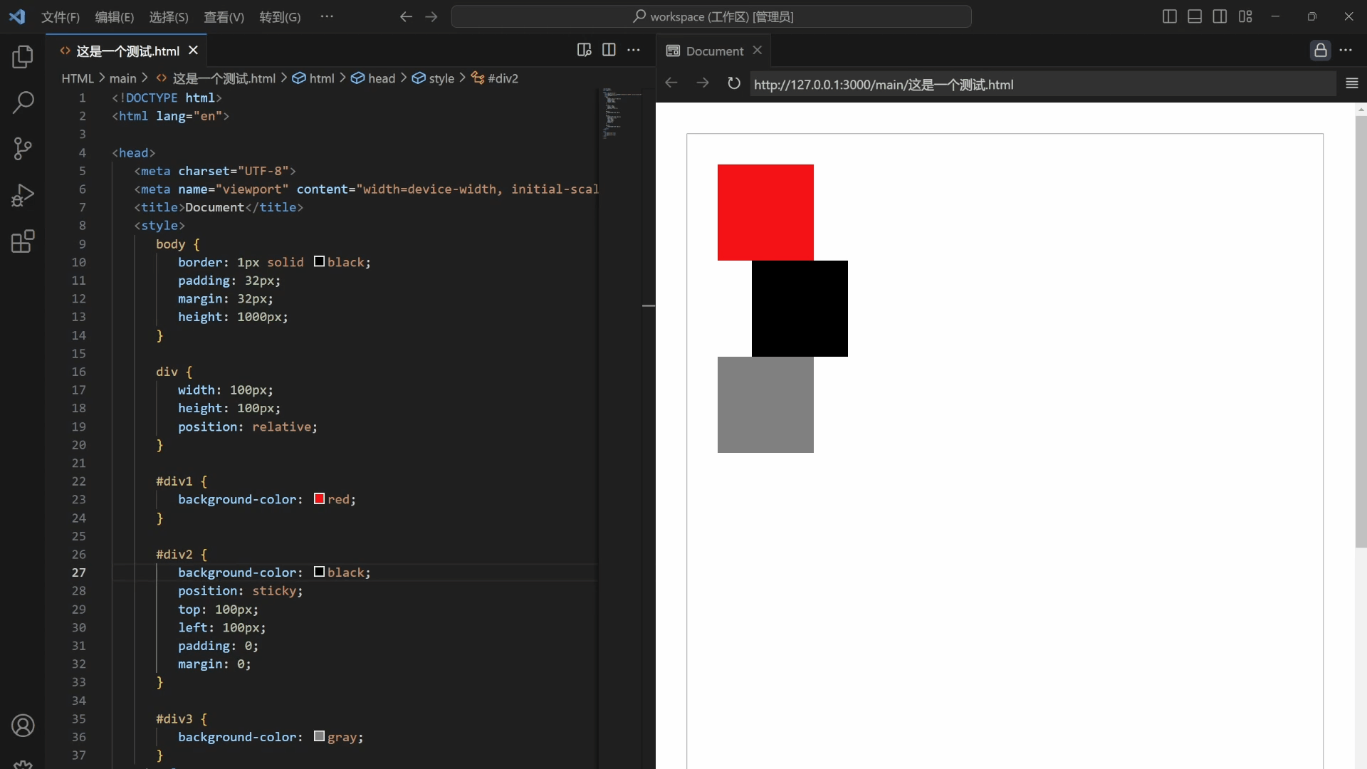


