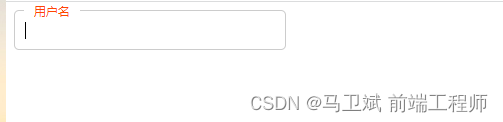
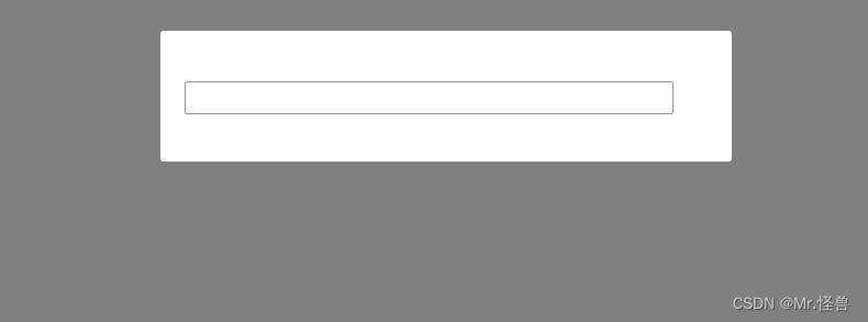
页面效果

此效果主要使用 css 伪选择器配合 html5
required属性来实现一个简单的输入框的交互效果。
此效果可适用于登录页入口、小表单提交等页面,增强用户实时交互体验。
核心代码部分,简要说明了写法思路;完整代码在最后,可直接复制到本地运行。
核心代码
html代码
<label>
  <input type="text" required>
  <span>用户名</span>
</label>
页面主要使用
label与input标签,注意input中使用required属性,来判断input是否为空。
css代码
label{

  width: 240px;
  position: relative;
  display: flex;
  align-items: center;
}
input{

  width: 240px;
  height: 32px;
  line-height: 32px;
  padding: 0 10px;
  border: 2px solid transparent;
  border-bottom-color: #333;
  background-color: transparent;
  box-sizing: border-box;
  transition: all 0.3s;
  font-size: 14px;
  color: #333;
}
span{

  position: absolute;
  font-size: 14px;
  color: #999;
  left: 10px;
  cursor: text;
  z-index: 1;
  transition: all 0.3s;
}
label:hover input,input:focus{

  border-color: blue;
  border-radius: 8px;
}
input:focus+span,input:valid+span{

  transform: translateY(-32px);
}
使用选择器
:hover、:foucus来获取鼠标状态,根据不同鼠标的不同状态来设置样式以及过渡效果,使用:valid来验证input值。
完整代码
html页面
<!DOCTYPE html>
<html lang="zh">
  <head>
    <meta charset="utf-8">
    <link rel="stylesheet" href="style.css">
    <title>输入框选中交互动效</title>
  </head>
  <body>
    <div class="app">
      <label>
        <input type="text" required>
        <span>用户名</span>
      </label>
    </div>
  </body>
</html>
css样式
.app{

  width: 100%;
  height: 100vh;
  position: relative;
  display: flex;
  justify-content: center;
  align-items: center;
}
input{

  list-style: none;
  outline-style: none;
}
label{

  width: 240px;
  position: relative;
  display: flex;
  align-items: center;
}
input{

  width: 240px;
  height: 32px;
  line-height: 32px;
  padding: 0 10px;
  border: 2px solid transparent;
  border-bottom-color: #333;
  background-color: transparent;
  box-sizing: border-box;
  transition: all 0.3s;
  font-size: 14px;
  color: #333;
}
span{

  position: absolute;
  font-size: 14px;
  color: #999;
  left: 10px;
  cursor: text;
  z-index: 1;
  transition: all 0.3s;
}
label:hover input,input:focus{

  border-color: blue;
  border-radius: 8px;
}
input:focus+span,input:valid+span{

  transform: translateY(-32px);
}
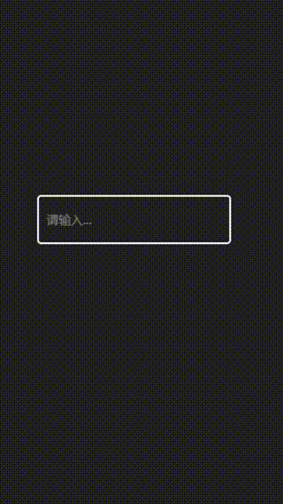
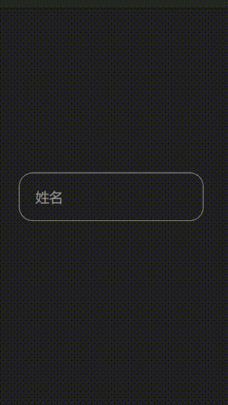
页面效果
以上就是全部代码以及简单的写法思路,希望你喜欢这个交互输入框。
[1] 原文阅读
我是 Just,这里是「设计师工作日常」,求点赞求关注!!!