还在用Flex布局?OUT了 快来看看grid布局吧!
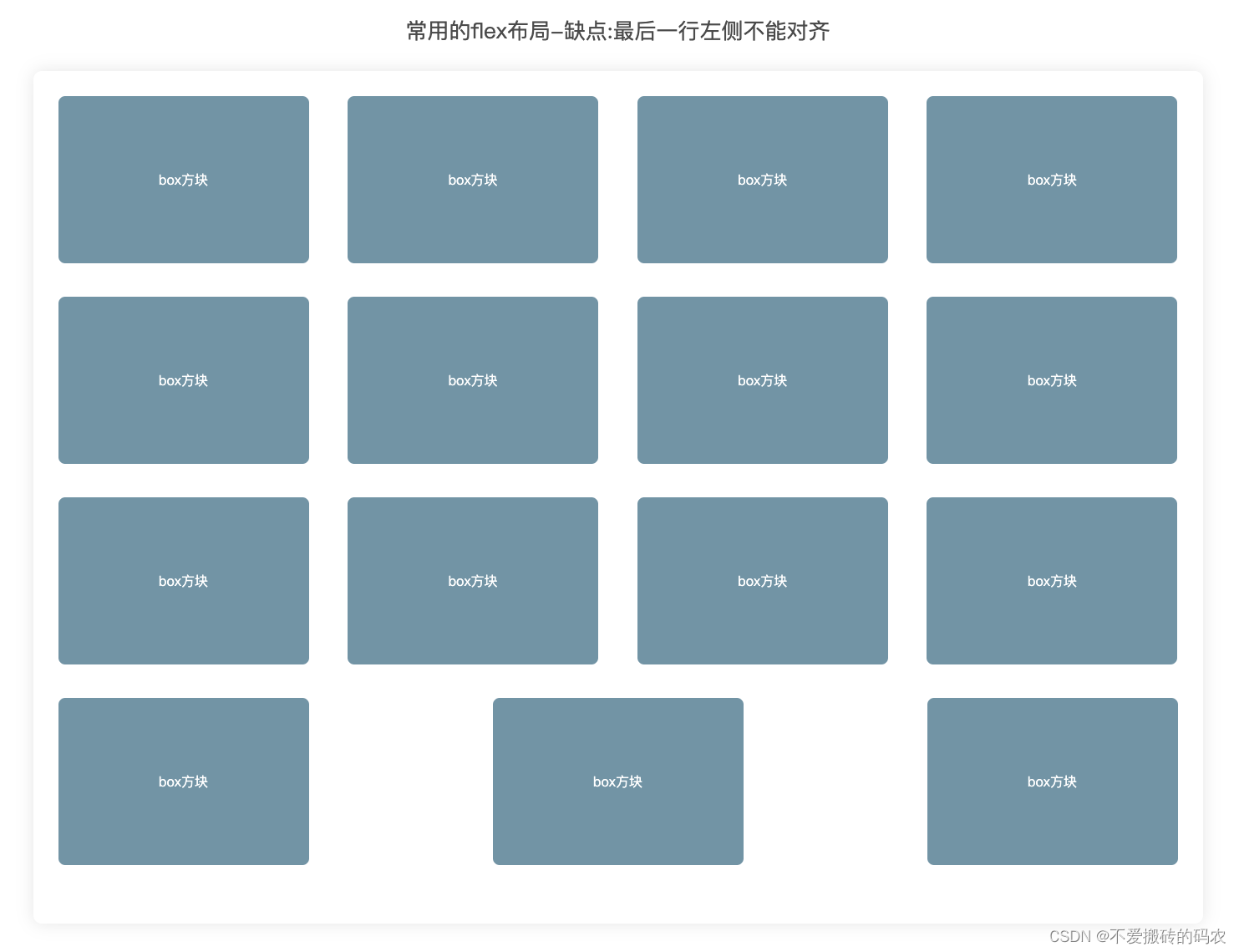
之前我在写布局的时候就喜欢用flex,有一次我需要实现四个方块占一行的需求 ,But 一共有七个方块到了第二行很Egg疼 ,第二行它直接三个方块居中排布, 这三兄弟直接在第二行玩了居中排布,最后 我还是用flex布局解决这个问题 只不过我需要计算宽度以及边距 目的为了让他们一行四个 然后取消 justify-content: space-between;
最终解决了这个问题
现在我们有了Grid布局就很Great!!!
来看代码
<html lang="en">
<head>
<meta charset="UTF-8" />
<meta name="viewport" content="width=device-width, initial-scale=1.0" />
<title>Document</title>
<style>
* {
margin: 0;
padding: 0;
box-sizing: border-box;
}
body {
width: 100%;
height: 100%;
padding: 30px;
box-sizing: border-box;
display: grid;
place-items: center;
/*
CSS 中的 place-items
是一个简写属性 ,
它允许你在相关的布局(如 Grid 或 Flexbox)
中可以同时沿着块级和内联方向对齐元素 (例如:align-items 和 justify-items 属性) 。
如果未提供第二个值,则第一个值作为第二个值的默认值。
*/
}
.Wrapper {
width: 1440px;
height: 100%;
border-radius: 12px;
padding: 30px;
box-sizing: border-box;
box-shadow: 0px 0px 10px rgba(0, 0, 0, 0.1);
border: 1px solid black;
display: grid;
grid-template-columns: repeat(4, 1fr);
grid-template-columns: repeat(4, 1fr);
gap: 20px;
}
.box {
border-radius: 10px;
background-color: #f2f2f2;
text-align: center;
line-height: 200px;
font-weight: 600;
}
.box1 {
grid-row: 1/3;
grid-column: 1/3;
border-radius: 10px;
background-color: #f2f2f2;
text-align: center;
line-height: 200px;
font-weight: 600;
display: flex;
font-size: 40px;
justify-content: center;
align-items: center;
animation: TransitionKeyColors 3s linear infinite;
}
@keyframes TransitionKeyColors {
0% {
color: #000000;
}
25% {
color: #000000;
}
50% {
color: #ffd700;
}
100% {
color: #ffd700;
}
}
</style>
</head>
<body>
<div class="Wrapper">
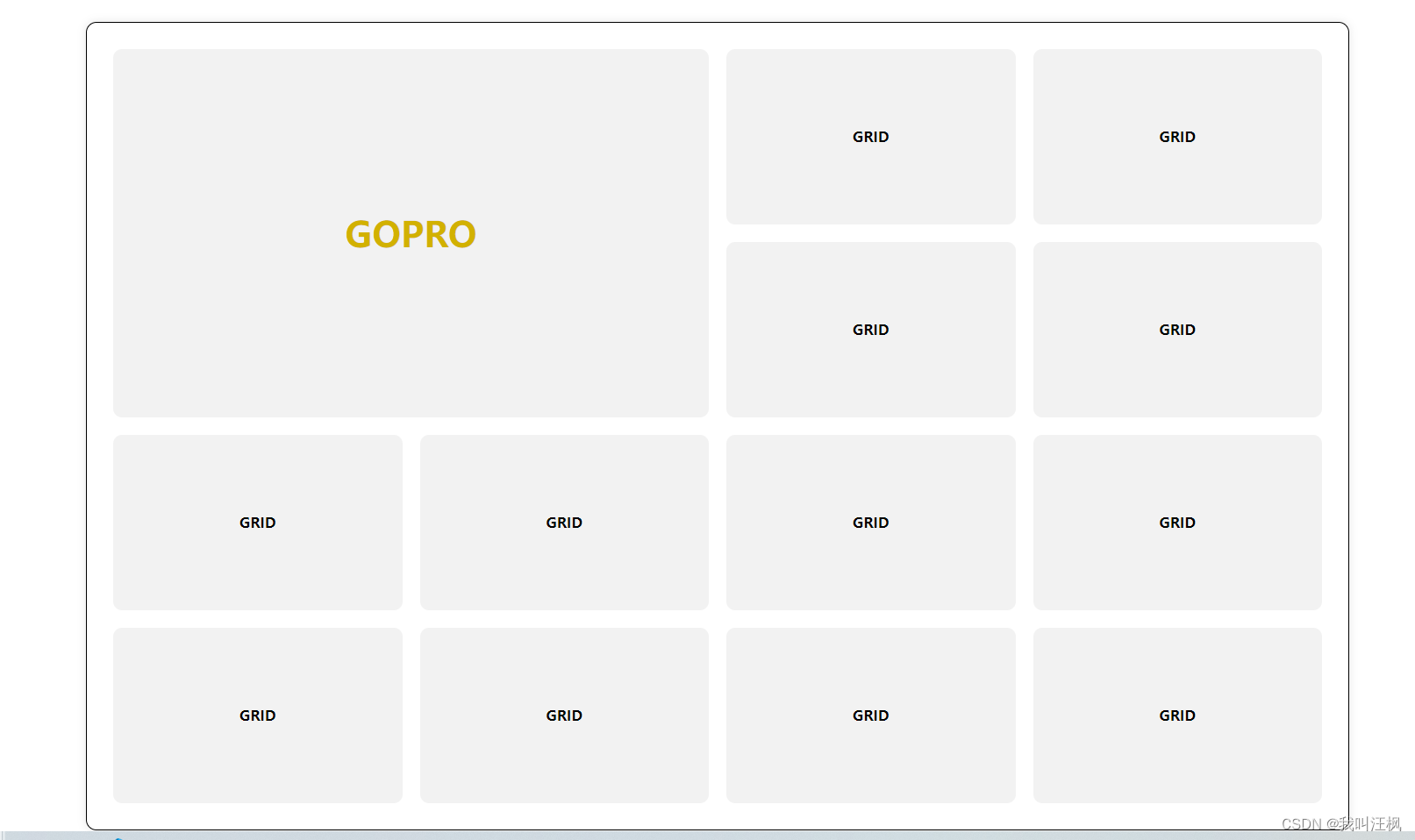
<div class="box1">GOPRO</div>
<div class="box">GRID</div>
<div class="box">GRID</div>
<div class="box">GRID</div>
<div class="box">GRID</div>
<div class="box">GRID</div>
<div class="box">GRID</div>
<div class="box">GRID</div>
<div class="box">GRID</div>
<div class="box">GRID</div>
<div class="box">GRID</div>
<div class="box">GRID</div>
<div class="box">GRID</div>
</div>
</body>
</html>
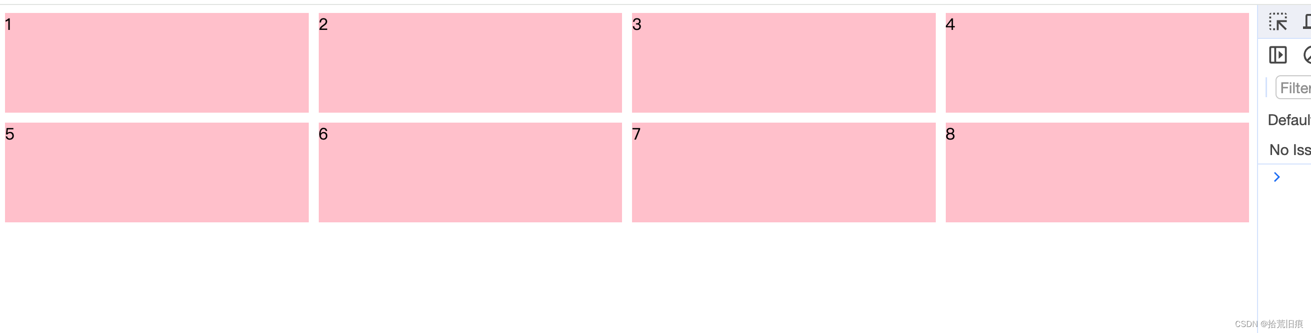
效果图