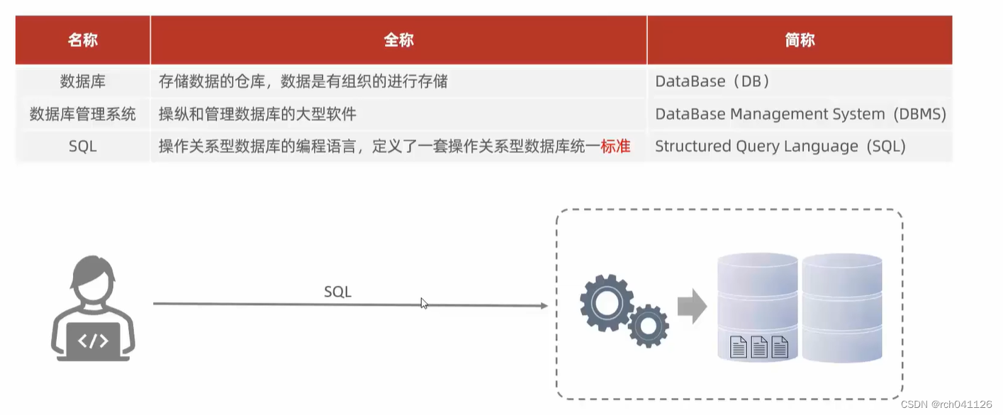
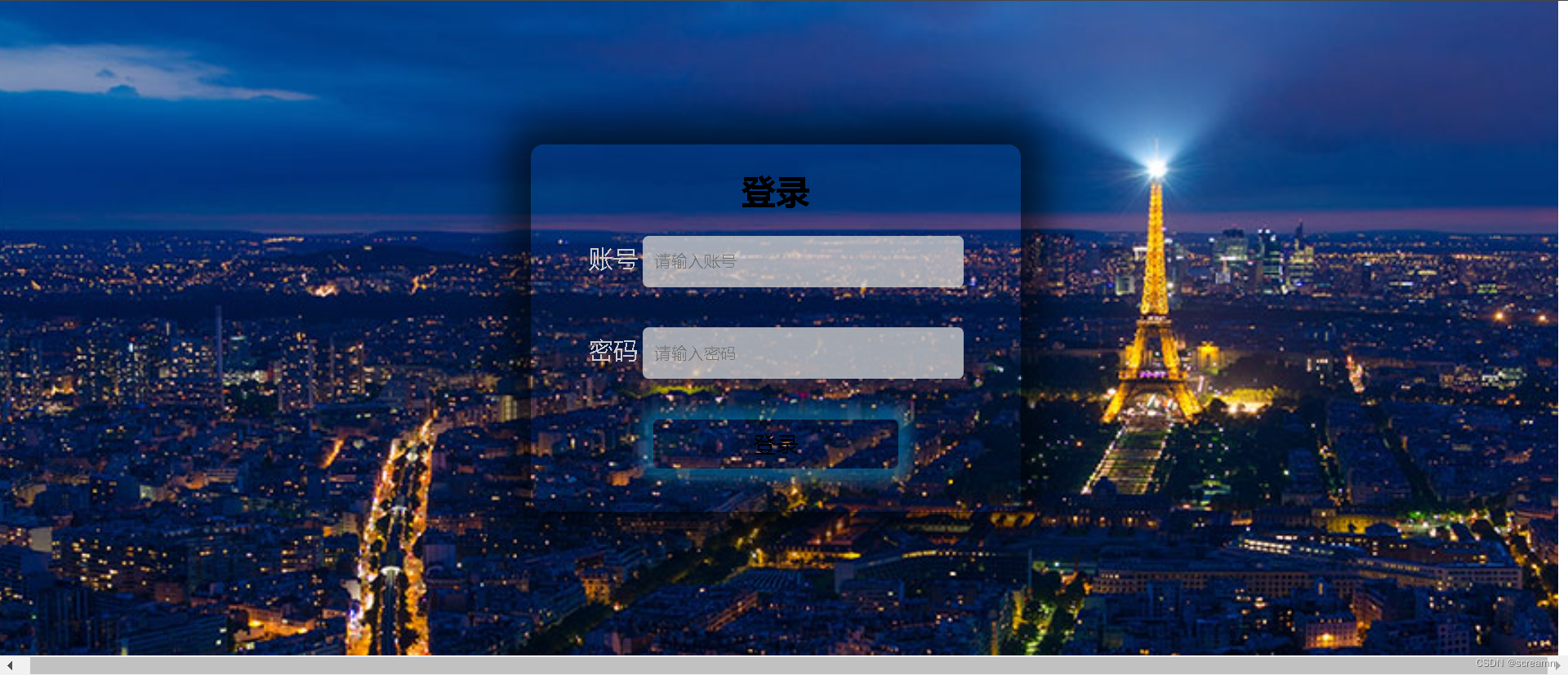
使用 Flex 布局设计登录页是一种简单而灵活的方式,让页面在不同屏幕大小下都能有良好的布局。以下是一个简单的例子,演示如何使用 Flex 布局设计登录页:
HTML 结构:
<!DOCTYPE html>
<html lang="en">
<head>
  <meta charset="UTF-8">
  <meta name="viewport" content="width=device-width, initial-scale=1.0">
  <link rel="stylesheet" href="styles.css">
  <title>Login Page</title>
</head>
<body>
  <div class="login-container">
    <div class="login-box">
      <h2>Login</h2>
      <form action="#">
        <label for="username">Username:</label>
        <input type="text" id="username" name="username" required>

        <label for="password">Password:</label>
        <input type="password" id="password" name="password" required>

        <button type="submit">Login</button>
      </form>
    </div>
  </div>
</body>
</html>
CSS 样式(styles.css):
body {

  margin: 0;
  display: flex;
  justify-content: center;
  align-items: center;
  height: 100vh;
  background-color: #f0f0f0;
}

.login-container {

  width: 100%;
  max-width: 400px;
}

.login-box {

  background-color: #fff;
  padding: 20px;
  border-radius: 8px;
  box-shadow: 0 0 10px rgba(0, 0, 0, 0.1);
}

h2 {

  text-align: center;
  color: #333;
}

form {

  display: flex;
  flex-direction: column;
}

label {

  margin-bottom: 8px;
  color: #555;
}

input {

  padding: 10px;
  margin-bottom: 16px;
  border: 1px solid #ccc;
  border-radius: 4px;
}

button {

  padding: 12px;
  background-color: #007bff;
  color: #fff;
  border: none;
  border-radius: 4px;
  cursor: pointer;
}
在这个例子中:
1、使用 display: flex 将 body 设置为弹性容器,通过 justify-content 和 align-items 居中页面内容。
2、.login-container 作为登录容器,使用 max-width 限制其最大宽度,并使其在小屏幕上保持 100% 宽度。
3、.login-box 是登录框,具有一些基本的样式,如背景颜色、内边距、圆角和阴影。
4、表单内的元素使用 Flex 布局来垂直排列,flex-direction: column。
5、表单元素(label、input、button)都有一些基本的样式,如间距、边框、边框半径等。
这只是一个简单的例子,你可以根据具体需求进行修改和扩展。Flex 布局的优势在于它提供了一种简便的方式来创建响应式和灵活的布局。