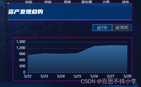
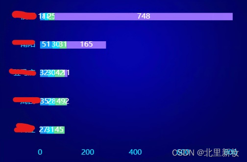
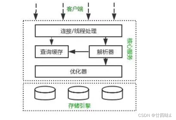
最近遇到一个大屏项目需求,需要给echarts做的折线堆叠面积图做适配,最终效果如下,我的边框线是辅助线,效果达成后去掉即可:
这里我们折线堆叠面积图充满撑满整个div用到的是echarts配置项里的grid,需注意的是grid与series是平级的:
  grid: {
          // 让图表占满容器
          top: "15px",
          left: "50px",
          right: "15px",
          bottom: "30px",
        },
完整的配置项option代码如下:
  const option = {
        xAxis: {
          type: "category",
          boundaryGap: false,
          data: ["5/22", "5/23", "5/24", "5/25", "5/26", "5/27", "5/28"],
          axisLabel: {
            color: "#D8E2FF",
          },
          axisLine: {
            lineStyle: {
              color: "white",
              type: "dashed",
              width: 1,
              opacity: 0.5,
            },
          },
          axisTick: {
            show: false,
          },
          // splitLine: {
          //   lineStyle: {
          //     // 设置网格线为虚线
          //     type: "dashed",
          //     opacity: 0.5,
          //   },
          // },
        },
        yAxis: {
          type: "value",
          axisLabel: {
            color: "#D8E2FF",
          },
          axisLine: {
            lineStyle: {
              show: false,
              // color: "white",
              // type: "dashed",
              // width: 1,
            },
          },
          axisTick: {
            show: false,
          },
          splitLine: {
            lineStyle: {
              // 设置网格线为虚线
              type: "dashed",
              opacity: 0.5,
            },
          },
        },
        series: [
          {
            data: [820, 932, 901, 934, 1290, 1330, 1320],
            type: "line",
            lineStyle: {
              color: "#3169a1",
            },
            showSymbol: false,

            areaStyle: {
              opacity: 1,
              color: new this.$echart.graphic.LinearGradient(0, 0, 0, 1, [
                {
                  offset: 0,

                  color: "#3169a1",
                },
                {
                  offset: 1,
                  color: "#152c49",
                },
              ]),
            },
          },
        ],
        grid: {
          // 让图表占满容器
          top: "15px",
          left: "50px",
          right: "15px",
          bottom: "30px",
        },
        tooltip: {
          trigger: "axis",
          axisPointer: {
            type: "cross",
            label: {
              backgroundColor: "#FB1855",
            },
          },
          formatter: function (format) {
            console.log("format", format);
            let template = "";

            template =
              "<span style='margin-right:10px' >资产总数</span>" +
              `<span style='color:#0d73d6;font-weight:bolder'>${format[0].value}</span>` +
              "<span style='margin-right:10px'></span>" +
              format[0].axisValue;
            // "<br>" +
            // format[0].marker +
            // format[0].seriesName +
            // ":" +
            // "<span style='margin-right:10px' ></span>" +
            // format[0].data.unit +
            // "<br>" +
            // format[1].marker +
            // format[1].seriesName +
            // ":" +
            // "<span style='margin-right:10px' ></span>" +
            // format[1].data.unit;

            return template;
          },
        },
      };
然后,我们需要给echarts图表做适配,注意不能用rem,vm,vh这些单位。我们需要用到百分比,我们在mounted里监听视口变化,然后调用echartThrough方法刷新重新渲染echarts:
  mounted() {
    this.echartThrough();

    var that = this;
    window.addEventListener("resize", function () {
      that.resizeF();
    });
  },
完整代码如下:
<template>
  <div class="BigBox">
    <div class="leftTopShape"></div>
    <div class="commonTitleRight trendBg">
      <p class="titleRight">资产发现趋势</p>
      <div class="bottomLine"></div>
      <div class="rightBgColor"></div>
    </div>


    <div class="trandLineBox">
      <div class="timeBox">
        <div
          class="item"
          @click="selectTime(7)"
          :class="time == 7 ? 'selectTime' : ''"
        >
          近7天
        </div>
        <div
          class="item"
          @click="selectTime(30)"
          :class="time == 30 ? 'selectTime' : ''"
        >
          近30天
        </div>
      </div>

      <div class="echartBox">
        <div class="ThroughputCharts" id="ThroughputCharts" />
      </div>
    </div>
  </div>
</template>
<script>
import echarts from "echarts";
import imgBg from "./../../../assets/images/bounced-small.png";
import rightLine from "@/assets/img/commonImg/headline-line.png";
import rankimg from "@/assets/img/zcts/rankimg.png";
import tjBar1 from "./tjBar1.vue";

const ENUMS_KEYS = {};
export default {
  components: {
    tjBar1: tjBar1,
  },
  props: {
    rankList: {
      type: Array,
      default: () => [],
    },
    zctsDtqjZcpmtop5: {
      type: Array,
      default: () => [],
    },
    selectRankLabel: {
      type: String,
      default: "全部",
    },
  },
  watch: {
    zctsDtqjZcpmtop5(val) {
      // this.resizeF();
    },
  },
  data() {
    return {
      rightLine: rightLine,
      rankimg: rankimg,
      time: 7,
      myChart: null,
    };
  },
  mounted() {
    this.echartThrough();

    var that = this;
    window.addEventListener("resize", function () {
      that.resizeF();
    });
  },
  methods: {
    changeRank(data, flag) {
      this.$emit("changeRank", { data: data, flag: flag });
    },
    selectTime(time) {
      this.time = time;

      this.echartThrough();
    },
    echartThrough() {
      const chartDom = document.getElementById("ThroughputCharts");
      const chart = this.$echart.init(chartDom);
      this.myChart = chart;

      const option = {
        xAxis: {
          type: "category",
          boundaryGap: false,
          data: ["5/22", "5/23", "5/24", "5/25", "5/26", "5/27", "5/28"],
          axisLabel: {
            color: "#D8E2FF",
          },
          axisLine: {
            lineStyle: {
              color: "white",
              type: "dashed",
              width: 1,
              opacity: 0.5,
            },
          },
          axisTick: {
            show: false,
          },
          // splitLine: {
          //   lineStyle: {
          //     // 设置网格线为虚线
          //     type: "dashed",
          //     opacity: 0.5,
          //   },
          // },
        },
        yAxis: {
          type: "value",
          axisLabel: {
            color: "#D8E2FF",
          },
          axisLine: {
            lineStyle: {
              show: false,
              // color: "white",
              // type: "dashed",
              // width: 1,
            },
          },
          axisTick: {
            show: false,
          },
          splitLine: {
            lineStyle: {
              // 设置网格线为虚线
              type: "dashed",
              opacity: 0.5,
            },
          },
        },
        series: [
          {
            data: [820, 932, 901, 934, 1290, 1330, 1320],
            type: "line",
            lineStyle: {
              color: "#3169a1",
            },
            showSymbol: false,

            areaStyle: {
              opacity: 1,
              color: new this.$echart.graphic.LinearGradient(0, 0, 0, 1, [
                {
                  offset: 0,

                  color: "#3169a1",
                },
                {
                  offset: 1,
                  color: "#152c49",
                },
              ]),
            },
          },
        ],
        grid: {
          // 让图表占满容器
          top: "15px",
          left: "50px",
          right: "15px",
          bottom: "30px",
        },
        tooltip: {
          trigger: "axis",
          axisPointer: {
            type: "cross",
            label: {
              backgroundColor: "#FB1855",
            },
          },
          formatter: function (format) {
            console.log("format", format);
            let template = "";

            template =
              "<span style='margin-right:10px' >资产总数</span>" +
              `<span style='color:#0d73d6;font-weight:bolder'>${format[0].value}</span>` +
              "<span style='margin-right:10px'></span>" +
              format[0].axisValue;
            // "<br>" +
            // format[0].marker +
            // format[0].seriesName +
            // ":" +
            // "<span style='margin-right:10px' ></span>" +
            // format[0].data.unit +
            // "<br>" +
            // format[1].marker +
            // format[1].seriesName +
            // ":" +
            // "<span style='margin-right:10px' ></span>" +
            // format[1].data.unit;

            return template;
          },
        },
      };

      var container = document.getElementsByClassName("echartBox")[0];
      const width = container.offsetWidth;
      const height = container.offsetHeight;

      // console.log("container", width, height);

      chartDom.style.width = width - 2 + "px";
      chartDom.style.height = height + "px";
      let myChart = this.$echart.init(
        document.getElementById("ThroughputCharts")
      );
      // console.log(this.option)
      myChart.setOption(option);
      myChart.resize();
    },

    resizeF() {
      this.echartThrough();
    },
  },
};
</script>
<style lang="less" scoped>
.BigBox {
  width: 93%;
  height: 70%;
  position: relative;

  .leftTopShape {
    clip-path: polygon(0 0, 100% 0, 0 100%, 0 0);
    position: absolute;
    left: 0;
    top: 0;
    width: 6px;
    height: 6px;
    background: #facd89;
  }

  .trendBg {
    /* height: 36px; */
    background: linear-gradient(90deg, rgba(0, 68, 145, 0.6) 0%);
    border: 1px solid red;
    clip-path: polygon(2% 0%, 100% 0%, 100% 100%, 0% 100%, 0% 16%);

    position: relative;

    .titleRight {
      text-shadow: none !important;
    }
    .bottomLine {
      position: absolute;
      left: 0;
      bottom: 0;
      width: 100%;
      height: 1px;
      background: linear-gradient(90deg, #62bbff 0%);
    }
    .rightBgColor {
      position: absolute;
      right: 0;
      top: 0;
      width: 171px;
      height: 12px;
      background: linear-gradient(90deg, rgba(0, 68, 145, 0.6) 0%);
      clip-path: polygon(0% 0%, 100% 0%, 100% 100%, 30% 100%);
    }
  }

  .trandLineBox {
    border: 1px solid blue;
    margin-left: 17px;

    position: relative;
    height: 98%;

    .timeBox {
      position: absolute;
      top: 12px;
      right: 0;
      display: flex;

      .item {
        width: 68px;
        text-align: center;
        height: 24px;
        background: rgba(89, 114, 128, 0.24);
        border-radius: 1px;
        border: 1px solid #4d6b84;

        font-family: Alibaba PuHuiTi;
        font-weight: 400;
        font-size: 14px;
        color: #bdc5c9;
        cursor: pointer;
      }

      .selectTime {
        background: rgba(22, 83, 126, 0.4);
        border-radius: 1px;
        border: 2px solid #007ffc;
      }
    }

    .echartBox {
      position: absolute;
      top: 58px;
      left: 0;

      height: calc(100% - 58px);
      border: 1px solid red;
      width: 100%;
      #ThroughputCharts {
        width: 100%;

        height: 100%;
      }
    }
  }
}
</style>
这里,由于我们在main.js里vue原型上挂载了echarts,所以可以直接this.$echart来获取echart对象。main.js里echarts挂载代码如下:
// main.js
import echarts from 'echarts'
Vue.prototype.$echart = echarts


![[大模型]LLaMA3-8B-Instruct Lora 微调](https://img-blog.csdnimg.cn/direct/1620bcdf480942acb22a90f9350e16fb.png#pic_center)