apexcharts数据可视化之圆环柱状图
有完整配套的Python后端代码。
本教程主要会介绍如下图形绘制方式:
- 基础圆环柱状图
- 多组数据圆环柱状图
- 图片背景
- 自定义角度
- 渐变
- 半个圆环图
- 虚线圆环图
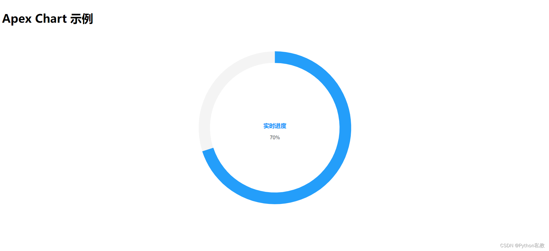
基础圆环图
import ApexChart from 'react-apexcharts';

export function CircleChart() {
    // 数据序列
    const series = [70]
    // 图表选项
    const options = {
        chart: {
            height: 350,
            type: 'radialBar',
        },
        plotOptions: {
            radialBar: {
                hollow: {
                    size: '70%',
                }
            },
        },
        labels: ['实时进度'],
    }
    return (
        <div id="chart">
            <ApexChart options={options} series={series} type="radialBar" height={550}/>
        </div>
    )
}
多值圆环图
import ApexChart from 'react-apexcharts';

export function MultiCircleChart() {
    // 数据序列
    const series = [44, 55, 67, 83]
    // 图表选项
    const options = {
        chart: {
            height: 350,
            type: 'radialBar',
        },
        plotOptions: {
            radialBar: {
                dataLabels: {
                    name: {
                        fontSize: '22px',
                    },
                    value: {
                        fontSize: '16px',
                    },
                    total: {
                        show: true,
                        label: '合计',
                        formatter: function (w) {
                            // 默认情况下,此函数返回所有序列的平均值。
                            // 下面只是展示自定义格式化器函数使用的一个示例
                            return 249
                        }
                    }
                }
            }
        },
        labels: ['苹果', '橘子', '香蕉', '葡萄'],
    }
    return (
        <div id="chart">
            <ApexChart options={options} series={series} type="radialBar" height={550}/>
        </div>
    )
}

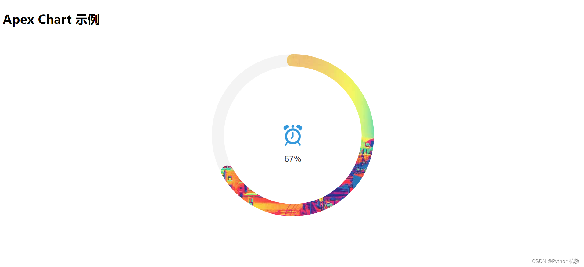
图片背景
import ApexChart from 'react-apexcharts';

export function ImageCircleChart() {
    // 数据序列
    const series = [67]
    // 图表选项
    const options = {
        chart: {
            height: 350, type: 'radialBar',
        },
        plotOptions: {
            radialBar: {
                // 雷达图图标
                hollow: {
                    margin: 15,
                    size: '70%',
                    image: '/clock.png',
                    imageWidth: 64,
                    imageHeight: 64,
                    imageClipped: false
                },
                dataLabels: {
                    name: {
                        show: false, color: '#fff'
                    }, value: {
                        show: true, color: '#333', offsetY: 70, fontSize: '22px'
                    }
                }
            }
        },
        // 使用图片填充
        fill: {
            type: 'image', image: {
                src: ['/4274635880_809a4b9d0d_z.jpg'],
            }
        },
        stroke: {
            lineCap: 'round'
        },
        labels: ['波动率'],
    }
    return (<div id="chart">
        <ApexChart options={options} series={series} type="radialBar" height={550}/>
    </div>)
}
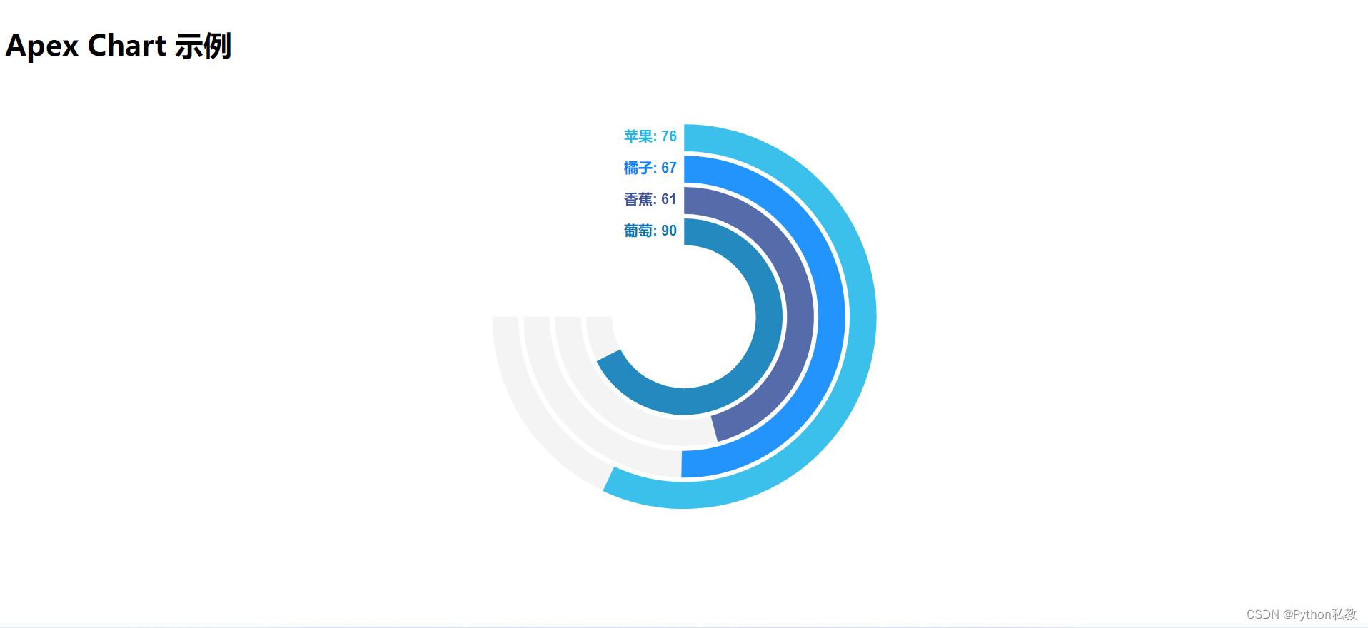
自定义角度
import ApexChart from 'react-apexcharts';

export function CustomAngleCircleChart() {
    // 数据序列
    const series = [76, 67, 61, 90]
    // 图表选项
    const options = {
        chart: {
            height: 390,
            type: 'radialBar',
        },
        plotOptions: {
            radialBar: {
                offsetY: 0,
                startAngle: 0, // 开始角度
                endAngle: 270, // 结束角度
                hollow: { // 中间图标
                    margin: 5,
                    size: '30%',
                    background: 'transparent',
                    image: undefined,
                },
                dataLabels: {
                    name: {
                        show: false,
                    },
                    value: {
                        show: false,
                    }
                },
                barLabels: {
                    enabled: true,
                    useSeriesColors: true, // 使用和对应图表相同颜色
                    margin: 8,
                    fontSize: '16px',
                    formatter: function (seriesName, opts) {
                        return seriesName + ":  " + opts.w.globals.series[opts.seriesIndex]
                    },
                },
            }
        },
        colors: ['#1ab7ea', '#0084ff', '#39539E', '#0077B5'],
        labels: ['苹果', '橘子', '香蕉', '葡萄'],
        responsive: [{
            breakpoint: 480,
            options: {
                legend: {
                    show: false
                }
            }
        }]
    }
    return (
        <div id="chart">
            <ApexChart options={options} series={series} type="radialBar" height={550}/>
        </div>
    )
}
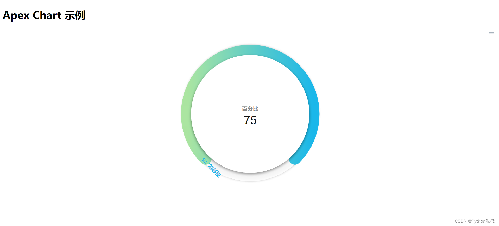
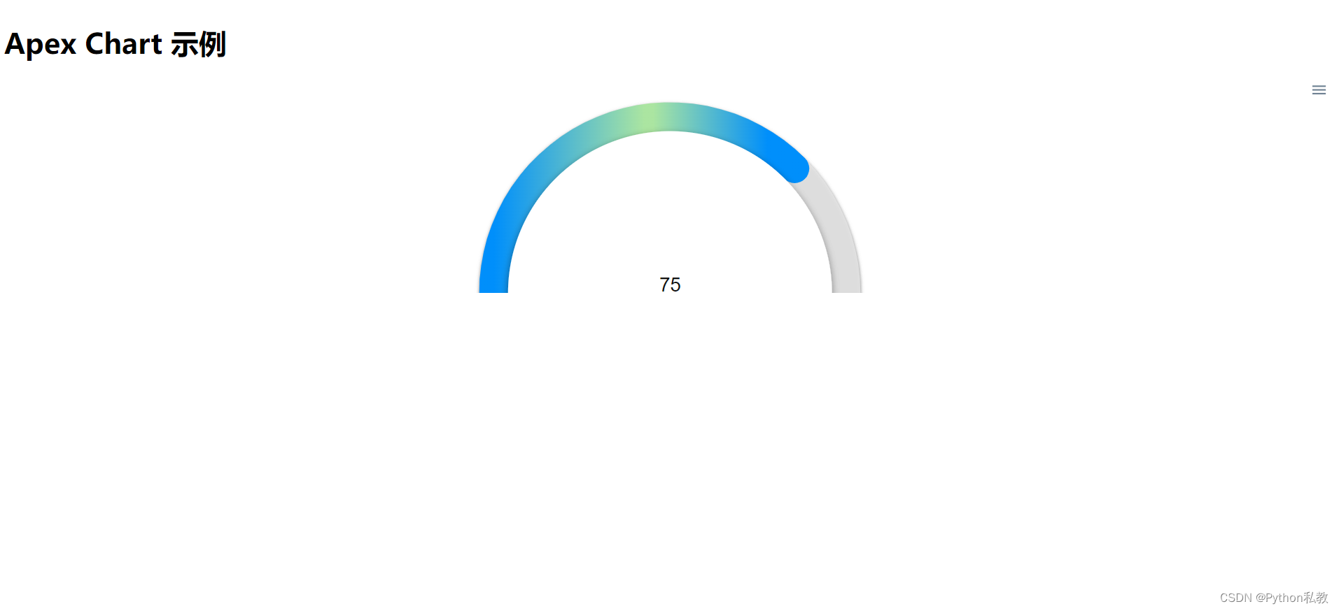
渐变
import ApexChart from 'react-apexcharts';

export function GradientCircleChart() {
    // 数据序列
    const series = [75]
    // 图表选项
    const options = {
        chart: {
            height: 350,
            type: 'radialBar',
            toolbar: {
                show: true
            }
        },
        plotOptions: {
            radialBar: {
                startAngle: -135,
                endAngle: 225,
                hollow: {
                    margin: 0,
                    size: '70%',
                    background: '#fff',
                    image: undefined,
                    imageOffsetX: 0,
                    imageOffsetY: 0,
                    position: 'front',
                    dropShadow: {
                        enabled: true,
                        top: 3,
                        left: 0,
                        blur: 4,
                        opacity: 0.24
                    }
                },
                track: {
                    background: '#fff',
                    strokeWidth: '67%',
                    margin: 0, // margin is in pixels
                    dropShadow: {
                        enabled: true,
                        top: -3,
                        left: 0,
                        blur: 4,
                        opacity: 0.35
                    }
                },
                // 数据标签
                dataLabels: {
                    show: true,
                    name: {
                        offsetY: -10,
                        show: true,
                        color: '#888',
                        fontSize: '17px'
                    },
                    value: {
                        formatter: function (val) {
                            return parseInt(val);
                        },
                        color: '#111',
                        fontSize: '36px',
                        show: true,
                    }
                }
            }
        },
        // 渐变色填充
        fill: {
            type: 'gradient',
            gradient: {
                shade: 'dark',
                type: 'horizontal',
                shadeIntensity: 0.5,
                gradientToColors: ['#ABE5A1'],
                inverseColors: true,
                opacityFrom: 1,
                opacityTo: 1,
                stops: [0, 100]
            }
        },
        stroke: {
            lineCap: 'round'
        },
        labels: ['百分比'],
    }
    return (
        <div id="chart">
            <ApexChart options={options} series={series} type="radialBar" height={550}/>
        </div>
    )
}
半个圆环图
import ApexChart from 'react-apexcharts';

export function SemiCircleChart() {
    // 数据序列
    const series = [75]
    // 图表选项
    const options = {
        chart: {
            type: 'radialBar',
            offsetY: -20,
            sparkline: {
                enabled: true
            }
        },
        plotOptions: {
            radialBar: {
                // 通过角度控制只有一半
                startAngle: -90,
                endAngle: 90,
                track: {
                    background: "#e7e7e7",
                    strokeWidth: '97%',
                    margin: 5, // margin is in pixels
                    dropShadow: {
                        enabled: true,
                        top: 2,
                        left: 0,
                        color: '#999',
                        opacity: 1,
                        blur: 2
                    }
                },
                dataLabels: {
                    name: {
                        show: false
                    },
                    value: {
                        offsetY: -2,
                        fontSize: '22px'
                    }
                }
            }
        },
        grid: {
            padding: {
                top: -10
            }
        },
        fill: {
            type: 'gradient',
            gradient: {
                shade: 'light',
                shadeIntensity: 0.4,
                inverseColors: false,
                opacityFrom: 1,
                opacityTo: 1,
                stops: [0, 50, 53, 91]
            },
        },
        labels: ['平均结果'],
    }
    return (
        <div id="chart">
            <ApexChart options={options} series={series} type="radialBar" height={550}/>
        </div>
    )
}
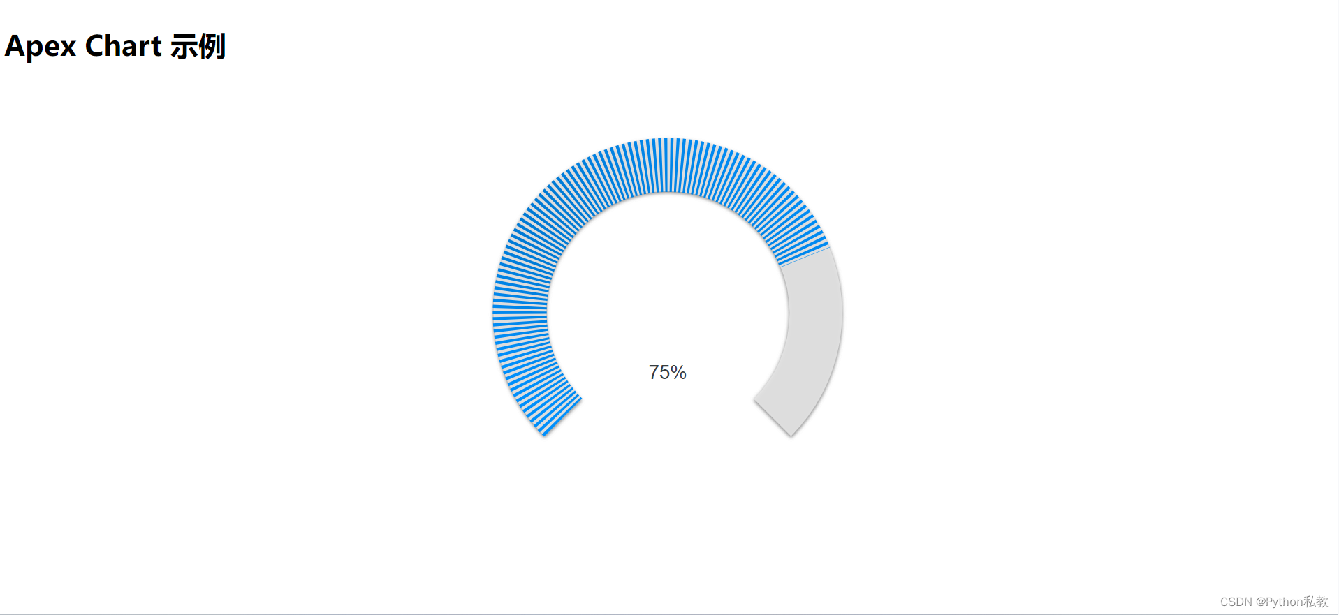
虚线圆环图
import ApexChart from 'react-apexcharts';

export function StrokedGaugeCircleChart() {
    // 数据序列
    const series = [75]
    // 图表选项
    const options = {
        chart: {
            height: 350,
            type: 'radialBar',
            offsetY: -10
        },
        plotOptions: {
            radialBar: {
                startAngle: -135,
                endAngle: 135,
                dataLabels: {
                    name: {
                        fontSize: '16px',
                        color: undefined,
                        offsetY: 120
                    },
                    value: {
                        offsetY: 76,
                        fontSize: '22px',
                        color: undefined,
                        formatter: function (val) {
                            return val + "%";
                        }
                    }
                }
            }
        },
        fill: {
            type: 'gradient',
            gradient: {
                shade: 'dark',
                shadeIntensity: 0.15,
                inverseColors: false,
                opacityFrom: 1,
                opacityTo: 1,
                stops: [0, 50, 65, 91]
            },
        },
        // 线条
        stroke: {
            // 点的数量
            // 数字越小,越密集
            dashArray: 3
        },
        labels: ['中位数比'],
    }
    return (
        <div id="chart">
            <ApexChart options={options} series={series} type="radialBar" height={550}/>
        </div>
    )
}