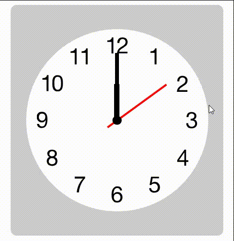
CSS时钟案例

1. 演示效果

QQ录屏20240318115401 -original-original

2. 分析思路

  • 背景是表盘,不用自己制作
  • 然后用CSS的定位做时针,分针和秒针
  • 黑点用伪元素::after生成
  • 转动用animation实现

3. 代码实现

<!DOCTYPE html>
<html lang="en">
  <head>
    <meta charset="UTF-8" />
    <title>02-时钟效果</title>
    <style>
      .box {
        display: flex;
        justify-content: center;
        align-items: center;

        width: 350px;
        height: 380px;
        background: rgb(205, 205, 205);
        margin: 0 auto;
        border-radius: 10px;
      }

      .clock {
        position: relative;
        width: 300px;
        height: 300px;
        background: #fff url("./img/ios_clock.svg") no-repeat center;
        background-size: 88%;
        border-radius: 50%;
      }

      /* 中间黑点 */
      .clock::after {
        position: absolute;
        top: 50%;
        left: 50%;

        content: "";
        width: 15px;
        height: 15px;
        background: #000;
        border-radius: 50%;

        /* 向左上移动自身的50% */
        transform: translate(-50%, -50%);
        z-index: 10;
      }

      /* 时针 */
      .hours {
        position: absolute;
        top: 30%;
        left: 48.5%;

        width: 3%;
        height: 20%;
        background: #000;
        /* 沿底部旋转 */
        transform-origin: 50% 100%;
        animation: myRotate 43200s infinite steps(60);
      }

      /* 分针 */
      .minutes {
        position: absolute;
        top: 13%;
        left: 49%;

        width: 2%;
        height: 37%;
        background: #000;
        /* 沿底部旋转 */
        transform-origin: 50% 100%;

        animation: myRotate 3600s infinite steps(60);
      }

      /* 秒针 */
      .seconds {
        position: absolute;
        top: 16.5%;
        left: 49.5%;

        width: 1%;
        height: 40%;
        background: #f00;
        /* 沿底部旋转 */
        transform-origin: 50% 84%;

        /* 添加动画 */
        /* animation: myRotate 60s infinite linear; */
        animation: myRotate 60s infinite steps(60);
      }
      /* 定义动画 */
      @keyframes myRotate {
        0% {
          transform: rotate(0deg);
        }
        100% {
          transform: rotate(360deg);
        }
      }
    </style>
  </head>

  <body>
    <div class="box">
      <div class="clock">
        <div class="hours"></div>
        <div class="minutes"></div>
        <div class="seconds"></div>
      </div>
    </div>
  </body>
</html>

相关推荐

  1. CSSCSS元素的垂直居中案例

    2024-03-25 11:26:03       35 阅读
  2. css页面搭建案例

    2024-03-25 11:26:03       34 阅读

最近更新

  1. docker php8.1+nginx base 镜像 dockerfile 配置

    2024-03-25 11:26:03       98 阅读
  2. Could not load dynamic library ‘cudart64_100.dll‘

    2024-03-25 11:26:03       106 阅读
  3. 在Django里面运行非项目文件

    2024-03-25 11:26:03       87 阅读
  4. Python语言-面向对象

    2024-03-25 11:26:03       96 阅读

热门阅读

  1. 智能小程序开发 —— P2P SDK 源码介绍(一)

    2024-03-25 11:26:03       42 阅读
  2. 怎么配置Dubbo的容错机制?

    2024-03-25 11:26:03       31 阅读
  3. 4k stars! 如何实现按拼音首字母查询证券代码?

    2024-03-25 11:26:03       39 阅读
  4. 鸿蒙开发的入门

    2024-03-25 11:26:03       35 阅读
  5. 3527. 旋转矩阵 考研上机复试真题 暴力模拟

    2024-03-25 11:26:03       39 阅读
  6. 函数封装冒泡排序

    2024-03-25 11:26:03       34 阅读
  7. sql中如何添加数据

    2024-03-25 11:26:03       40 阅读
  8. FPGA时钟资源详解——时钟Buffer的选择

    2024-03-25 11:26:03       39 阅读
  9. 数据结构——双向链表(C语言版)

    2024-03-25 11:26:03       36 阅读
  10. es6的核心语法

    2024-03-25 11:26:03       34 阅读
  11. 在DelayMS加入bsp_Idle,把单片机延时空闲利用起来

    2024-03-25 11:26:03       36 阅读