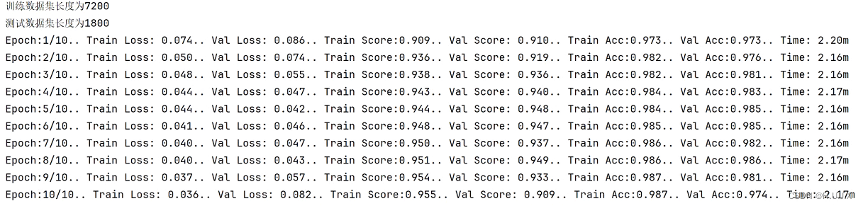
1 解释
clip-path 属性使用裁剪方式创建元素的可显示区域。区域内的部分显示,区域外的隐藏。浏览器会裁剪掉裁剪区域以外的内容,包括: 背景,内容,边框,阴影等,另外也不会捕获裁剪区域之外的hover click等事件。
2 语法
basic-shape: 基本图形,包括inset()、circle()、ellipse()、polygon()clip-source: 通过url()方法引用一段SVG的<clipPath>来作为剪裁路径geometry-box:单独使用时,将指定框的边缘作为剪裁路径,或者配合basic-shape使用,用于定义剪裁的参考框(Reference Box)none: 不创建剪切路径。
2.1 basic-shape
一种形状,其大小和位置由 <geometry-box> 的值定义。如果没有指定 <geometry-box>,则将使用 border-box 用为参考框。取值可为以下值中的任意一个:
inset()定义一个 inset 矩形。
参数类型:
inset( <shape-arg>{1,4} [round <border-radius>]? )
其中 shape-arg 分别为矩形的上右下左顶点到被剪裁元素边缘的距离(和margin、padding参数类似),border-radius 为可选参数,用于定义 border 的圆角。
Demo:
<html>
  <head>
    <style>
      .inset {

        clip-path: inset(0);
      }
      .inset:hover {

        clip-path: inset(10px 20px 10% 20% round 20px);
      }
    </style>
  </head>
  <body>
    <div>
      <img class="inset" src="./moon.png" />
    </div>
  </body>
</html>
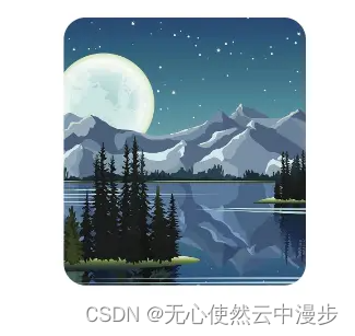
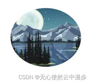
原图:

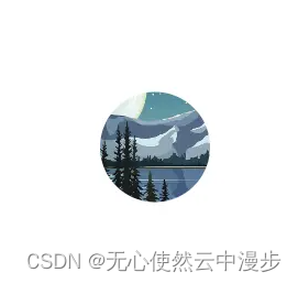
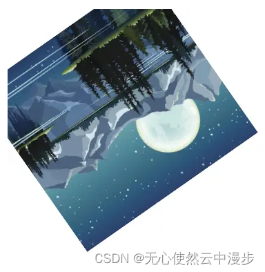
hover:
circle()定义一个圆形(使用一个半径和一个圆心位置)。
参数类型:
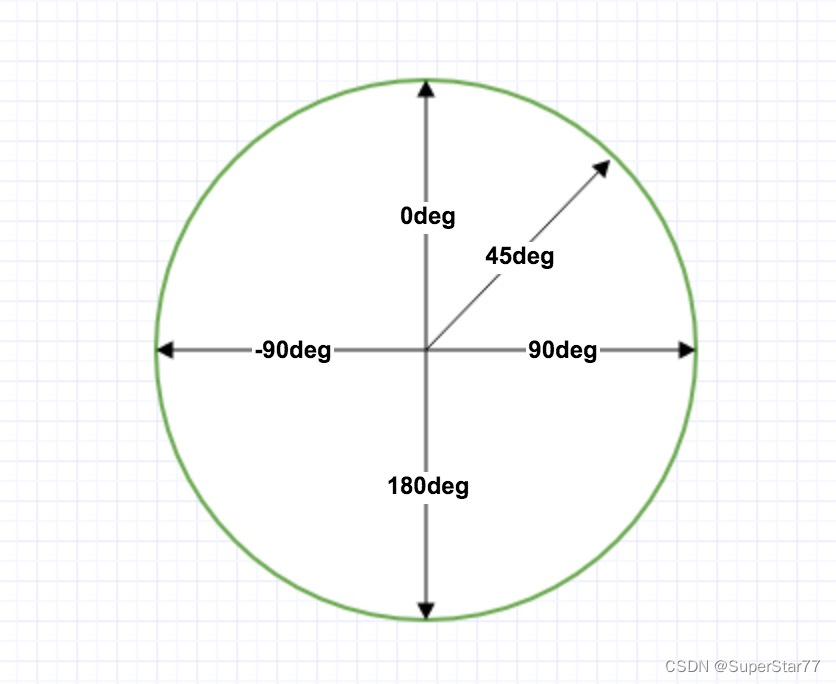
circle( [<shape-radius>]? [at <position>]? )
其中 shape-radius 为圆形的半径,position 为圆心的位置,width、height分别为被剪裁元素的宽高。
Demo:
<html>
<head>
<style>
.circle {
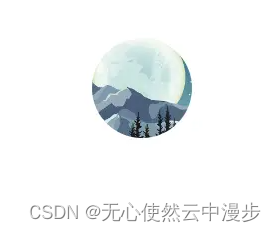
clip-path: circle(120px at center);
}
.circle:hover {
clip-path: circle(50px at center);
}
</style>
</head>
<body>
<div>
<img class="circle" src="./moon.png" />
</div>
</body>
</html>
原图:

hover:
ellipse()定义一个椭圆(使用两个半径和一个圆心位置)。
参数类型:
ellipse( [<shape-radius>{2}]? [at <position>]? )
其中 shape-radius 为椭圆x、y轴的半径,position 为椭圆中心的位置。
Demo:
<html>
  <head>
    <style>
      .ellipse {

        clip-path: ellipse(120px 100px at 50% 50%);
      }
      .ellipse:hover {

        clip-path: ellipse(100px 50px at 50% 50%);
      }
    </style>
  </head>
  <body>
    <div>
      <img class="ellipse" src="./moon.png" />
    </div>
  </body>
</html>
原图:
hover:

polygon()定义一个多边形(使用一个 SVG 填充规则和一组顶点)。
参数类型:
polygon( [<fill-rule>,]? [<shape-arg> <shape-arg>]# )
其中 fill-rule 为填充规则,即通过一系列点去定义多边形的边界。
Demo:
<html>
  <head>
    <style>
      .polygon {

        clip-path: polygon(0% 50%, 50% 0%, 100% 50%, 50% 100%);
      }
      .polygon:hover {

        transform: rotate(145deg);
        clip-path: polygon(0% 0%, 100% 0%, 100% 100%, 0% 100%);
      }
    </style>
  </head>
  <body>
    <div>
      <img class="polygon" src="./moon.png" />
    </div>
  </body>
</html>
原图:

hover:
path()定义一个任意形状(使用一个可选的 SVG 填充规则和一个 SVG 路径定义)。
Demo:
<html>
  <head>
    <style>
      .path {

        clip-path: path(
          "M  20  240 L  20  80 L 160  80 L 160  20 L 280 100 L 160 180 L 160 120 L  60 120 L  60 240 Z"
        );
      }
      .path:hover {

        transform: rotate(145deg);
      }
    </style>
  </head>
  <body>
    <div>
      <img class="path" src="./moon.png" />
    </div>
  </body>
</html>
原图:

hover:

2.2 clip-source
即通过引用一个svg的clipPath 元素来作为剪裁路径。
Demo:
<html>
  <head>
    <style>
      .path {

        clip-path: url("#svgCircle");
      }
    </style>
  </head>
  <body>
    <div>
      <svg>
        <defs>
          <clipPath id="svgCircle">
            <circle cx="100" cy="100" r="50" />
          </clipPath>
        </defs>
      </svg>
      <img class="path" src="./moon.png" />
    </div>
  </body>
</html>
2.3 geometry-box
如果同 <basic-shape> 一起声明,它将为基本形状提供相应的参考框盒。通过自定义,它将利用确定的盒子边缘包括任何形状边角(比如说,被border-radius定义的剪切路径)。几何框盒可以有以下的值中的一个:
margin-box使用margin box作为引用框。border-box使用 border box作为引用框。padding-box使用 padding box作为引用框。content-box使用 content box作为引用框。fill-box利用对象边界框(object bounding box)作为引用框。stroke-box]使用笔触边界框(stroke bounding box)作为引用框。view-box使用最近的 SVG 视口(viewport)作为引用框。如果viewBox属性被指定来为元素创建 SVG 视口,引用框将会被定位在坐标系的原点,引用框位于由viewBox属性建立的坐标系的原点,引用框的尺寸用来设置viewBox属性的宽高值。
clip-path: padding-box circle(50px at 0 100px);
3 场景
3.1 动态裁剪
利用clip-path和过渡实现动态裁减
<html>
  <head>
    <style>
      .box {

        position: relative;
        width: 400px;
        height: 300px;
        overflow: hidden;
        transition: clip-path 0.3s linear;
        clip-path: circle(20px at 44px 44px);
        background: blue;
        color: #fff;
        padding-top: 100px;
      }
      .box:hover {

        clip-path: circle(460px at 44px 44px);
      }
    </style>
  </head>
  <body>
    <div class="box">
      <ul>
        <li>button1</li>
        <li>button2</li>
        <li>button3</li>
      </ul>
    </div>
  </body>
</html>
原图:

hover:

3.2 反向裁剪
设置与背景一样颜色
<html>
  <head>
    <style>
      .box {

        position: relative;
        width: 400px;
        height: 300px;
      }
      .mask {

        width: 100%;
        height: 100%;
        border-radius: 50%;
        background-color: orange;
        position: absolute;
      }
      .mask:after {

        content: "";
        position: absolute;
        width: 100%;
        height: 100%;
        clip-path: circle(100px at center);
        background: blue;
      }
    </style>
  </head>
  <body style="background-color: blue">
    <div class="box">
      <div class="mask"></div>
    </div>
  </body>
</html>