【HarmonyOS】HarmonyOS NEXT学习日记:四、布局与容器组件
学习了基础组件之后,想要利用基础组件组装成一个页面,自然就要开始学习布局相关的知识。我理解的ArkUI的布局分为两个部分
一、组件自身的通用属性,诸如weight、height、margin、padding等
二、容器组件,ArkUI提供了很多容器组件,可以用来实现flex布局、网格布局等。
熟练掌握了以上两个方面,我们基本上就能写出一个基础页面了。

通用属性
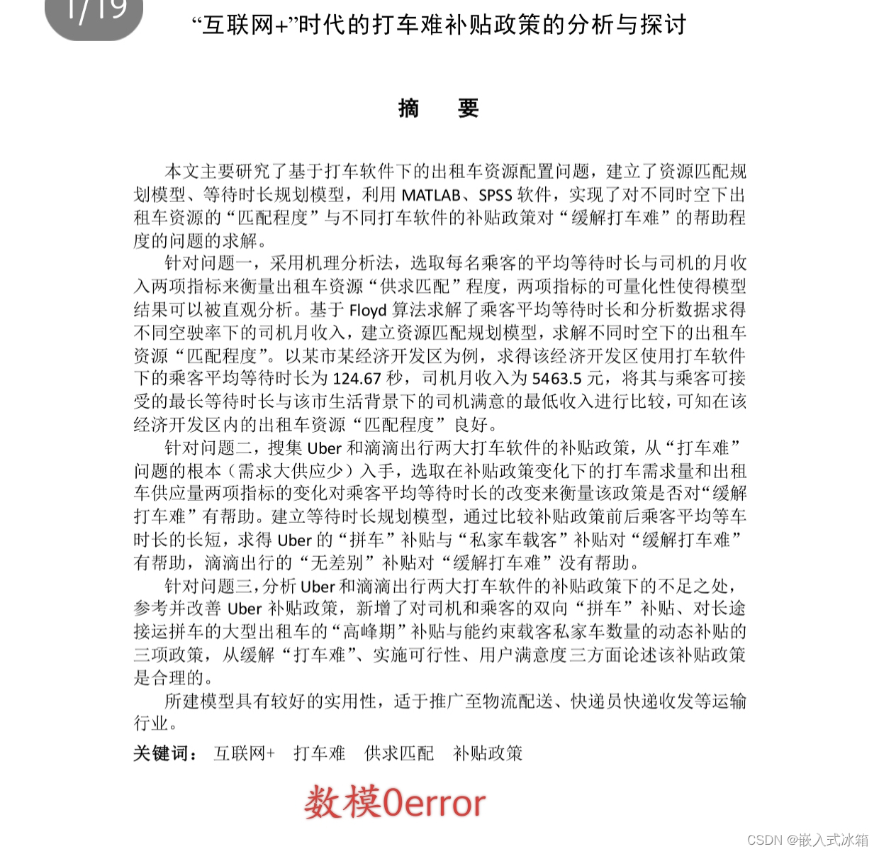
尺寸属性
width、height、padding、margin
其意义与css一致,用法如下
Text('Radio1')
      .width(200)
      .height(100)
      .padding({
        top:20,
        right: 40,
        bottom: 20,
        left: 40
      })
      .margin(20)
      .backgroundColor(Color.Red)
需要注意的是,传入的值如果不带单位,默认单位为vp。
padding和margin用法一致,可以只传入一个数字,意义为top、bottom、left、right都采用该值、也可以传入上文中结构的对象分别设置四个方向的值。
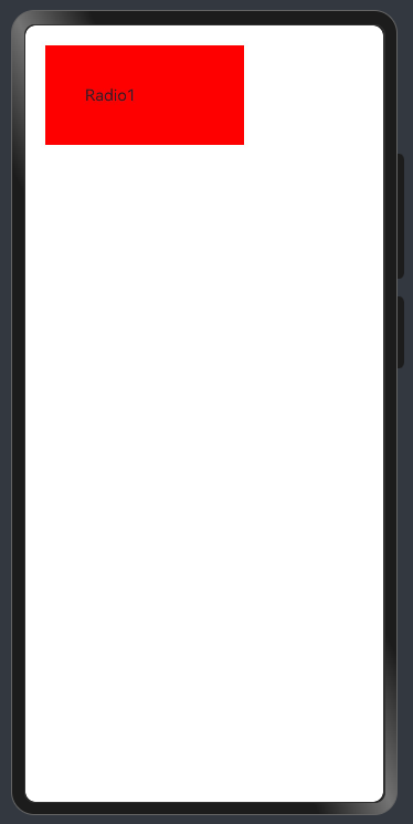
size
设置长宽也可以使用size属性,用法如下
Text('Radio1')
      .size({
        width: 200,
        height: 100,
      })
      .padding({
        top:20,
        right: 40,
        bottom: 20,
        left: 40
      })
      .margin(20)
      .backgroundColor(Color.Red)
效果与单独设置width和height一致。
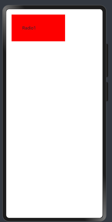
border
Text('边框').size(
        {width:100,height:100}
      ).border({
        width: {
          left: 1, right: 2
        },
        color: {
          left: Color.Red, right: Color.Blue
        },
        style: {
          left: BorderStyle.Dashed,
          right: BorderStyle.Dotted
        },
        radius: 10
      }) // top、right、bottom、left
代码中的border的参数都支持接收对象分别设置上下左右四个方向、或者接收一个数字设置四个方向的值。效果和css中的同名属性基本一致。

borderRadius
此外设置圆角也可以使用这个属性
Text('边框').size(
        {width:100,height:100}
      )
        .backgroundColor(Color.Red)
        .borderRadius(5) // 四个圆角相同
        .borderRadius({
          topLeft: 5,
          topRight: 10,
          bottomRight: 15,
          bottomLeft: 20
        }) // 四个方向圆角,单独设置
layoutWeight
自适应伸缩,和cssflex布局中使用flex: xxx的表现类似。
设置 layoutWeight 属性的子元素与兄弟元素,会按照权重进行分配主轴的空间
语法:.layoutWeight(权重数字)
Row() {
      Text('Radio1')
        .size({
          width: 200,
          height: 100,
        })
        .padding({
          top:20,
          right: 40,
          bottom: 20,
          left: 40
        })
        .margin(20)
        .backgroundColor(Color.Red)
      Text('123')
        .height(100)
        .layoutWeight(1)
        .backgroundColor(Color.Blue)
    }
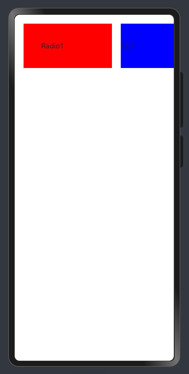
可以看到设置了layoutWeight(1)的元素占满了剩余的宽度,和flex:1的表现是不是很像。
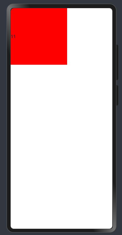
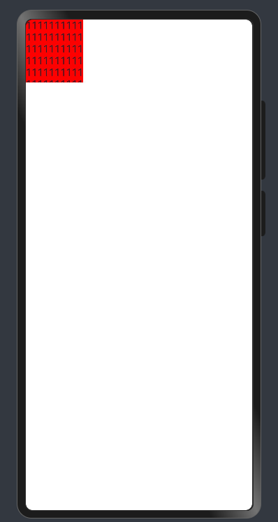
constraintSize
用来设置长宽的最大最小值,和css的maxWidth、minWidth、maxHeight、minHeight表现雷类似
Text('11')
        .constraintSize({
          minWidth: 200,
          minHeight: 200
        })
        .backgroundColor(Color.Red)
Text('11111111111111111111111111111111111111111111111111111111111111111111111111111111')
        .constraintSize({
          maxWidth: 100,
          maxHeight: 100
        })
        .backgroundColor(Color.Red)
背景
除了之前常用的backgroundColor,设置背景图片我们还会用到backgroundImage和一些相关的属性。
- backgroundColor 设置背景色
- backgroundImage 设置组件的背景图片
- backgroundImageSize 设置组件背景图片的宽高
- backgroundImagePosition 设置背景图的位置
Row()
      .width(200)
      .height(50)
      .backgroundImage($r('app.media.test2'), ImageRepeat.NoRepeat)
      .backgroundImagePosition({x: 50,y:0})
      .backgroundImageSize(ImageSize.Contain)
      .border({ width: 1 })
ImageRepeat
ImageRepeat可以设置是否平铺,它的值可以为
- NoRepeat:不平铺,默认值
- X:水平平铺
- Y:垂直平铺
- XY:水平垂直均平铺
!!!值得注意的是,背景定位默认单位是px
但是我们推荐使用vp,所以这里推荐一个方法vp2px,可以将vp值转为px值
backgroundImagePosition({x: vp2px(50),y:vp2px(0)})
backgroundImageSize
可以接收一个枚举值
枚举 ImageSize:
- Contain:等比例缩放背景图,当宽或高与组件尺寸相同停止缩放
- Cover:等比例缩放背景图至图片完全覆盖组件范围
- Auto:默认,原图尺寸
也可以接收一个对象{x:,y:}
表现与css同名元素基本一致
 Row()
      .width(200)
      .height(50)
      .backgroundImage($r('app.media.test2'), ImageRepeat.NoRepeat)
      .backgroundImageSize({ width: '100%', height: '100%' })
      // .backgroundImageSize(ImageSize.Cover)
      // .backgroundImageSize(ImageSize.Contain)
      .border({ width: 1 })
Row()
      .width(200)
      .height(50)
      .backgroundImage($r('app.media.test2'), ImageRepeat.NoRepeat)
      // .backgroundImageSize({ width: '100%', height: '100%' })
      .backgroundImageSize(ImageSize.Cover)
      // .backgroundImageSize(ImageSize.Contain)
      .border({ width: 1 })
Row()
      .width(200)
      .height(50)
      .backgroundImage($r('app.media.test2'), ImageRepeat.NoRepeat)
      // .backgroundImageSize({ width: '100%', height: '100%' })
      // .backgroundImageSize(ImageSize.Cover)
      .backgroundImageSize(ImageSize.Contain)
      .border({ width: 1 })
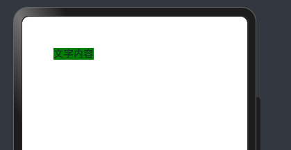
position
设置绝对定位,确定子组件相对父组件的位置。
用法: position(value: Position | Edges | LocalizedEdges)
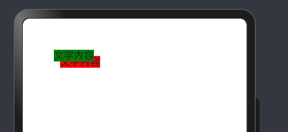
Text('文字内容')
      .position({
        x: 50,
        y: 50})
      .backgroundColor(Color.Green)
zIndex属性
Column(){
      Text('文字内容')
        .position({
          x: 50,
          y: 50})
        .backgroundColor(Color.Green)
        .zIndex(999)
      Text('文字内容')
        .position({
          x: 60,
          y: 60})
        .backgroundColor(Color.Red)
        .zIndex(1)
    }
线性布局(Column和Row)
使用过element的同学都清楚,线性布局通常使用el-column、el-row组件实现,ArkUI也提供了功能类似的容器组件Column 和 Row。
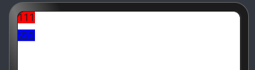
Column
沿垂直方向布局的容器
用法Column(value?: {space?: string | number}),接收一个参数设置子组件的间距
Column({space: 10}){
      Text('111').backgroundColor(Color.Red)
      Text('222').backgroundColor(Color.Blue)
    }
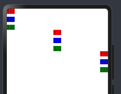
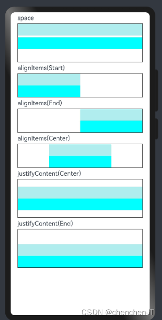
alignItems属性
设置子组件在水平方向上的对齐格式。
用法 alignItems(value: HorizontalAlign)
HorizontalAlign枚举值如下
- Start 按照语言方向起始端对齐。
- Center 居中对齐,默认对齐方式。
- End 按照语言方向末端对齐。
Column(){
      Column({space: 10}){
        Text('111').backgroundColor(Color.Red)
        Text('222').backgroundColor(Color.Blue)
        Text('333').backgroundColor(Color.Green)
      }
      .width('100%')
      .alignItems(HorizontalAlign.Start)
      Column({space: 10}){
        Text('111').backgroundColor(Color.Red)
        Text('222').backgroundColor(Color.Blue)
        Text('333').backgroundColor(Color.Green)
      }
      .width('100%')
      .alignItems(HorizontalAlign.Center)
      Column({space: 10}){
        Text('111').backgroundColor(Color.Red)
        Text('222').backgroundColor(Color.Blue)
        Text('333').backgroundColor(Color.Green)
      }
      .width('100%')
      .alignItems(HorizontalAlign.End)
    }
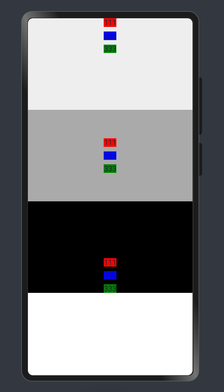
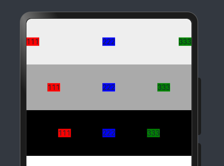
justifyContent属性
设置子组件在垂直方向上的对齐格式。
用法:justifyContent(value: FlexAlign)
FlexAlign枚举值说明:
- Start 元素在主轴方向首端对齐,第一个元素与行首对齐,同时后续的元素与前一个对齐。
- Center 元素在主轴方向中心对齐,第一个元素与行首的距离与最后一个元素与行尾距离相同。
- End 元素在主轴方向尾部对齐,最后一个元素与行尾对齐,其他元素与后一个对齐。
- SpaceBetween Flex主轴方向均匀分配弹性元素,相邻元素之间距离相同。第一个元素与行首对齐,最后一个元素与行尾对齐。
- SpaceAround Flex主轴方向均匀分配弹性元素,相邻元素之间距离相同。第一个元素到行首的距离和最后一个元素到行尾的距离是相邻元素之间距离的一半。
- SpaceEvenly Flex主轴方向均匀分配弹性元素,相邻元素之间的距离、第一个元素与行首的间距、最后一个元素到行尾的间距都完全一样。
 Column(){
      Column({space: 10}){
        Text('111').backgroundColor(Color.Red)
        Text('222').backgroundColor(Color.Blue)
        Text('333').backgroundColor(Color.Green)
      }
      .width('100%')
      .height(200)
      .backgroundColor('#eeeeee')
      .justifyContent(FlexAlign.Start)
      Column({space: 10}){
        Text('111').backgroundColor(Color.Red)
        Text('222').backgroundColor(Color.Blue)
        Text('333').backgroundColor(Color.Green)
      }
      .width('100%')
      .height(200)
      .backgroundColor('#aaaaaa')
      .justifyContent(FlexAlign.Center)
      Column({space: 10}){
        Text('111').backgroundColor(Color.Red)
        Text('222').backgroundColor(Color.Blue)
        Text('333').backgroundColor(Color.Green)
      }
      .width('100%')
      .height(200)
      .backgroundColor('#000000')
      .justifyContent(FlexAlign.End)
    }
Column(){
      Column({space: 10}){
        Text('111').backgroundColor(Color.Red)
        Text('222').backgroundColor(Color.Blue)
        Text('333').backgroundColor(Color.Green)
      }
      .width('100%')
      .height(200)
      .backgroundColor('#eeeeee')
      .justifyContent(FlexAlign.SpaceBetween)
      Column({space: 10}){
        Text('111').backgroundColor(Color.Red)
        Text('222').backgroundColor(Color.Blue)
        Text('333').backgroundColor(Color.Green)
      }
      .width('100%')
      .height(200)
      .backgroundColor('#aaaaaa')
      .justifyContent(FlexAlign.SpaceAround)
      Column({space: 10}){
        Text('111').backgroundColor(Color.Red)
        Text('222').backgroundColor(Color.Blue)
        Text('333').backgroundColor(Color.Green)
      }
      .width('100%')
      .height(200)
      .backgroundColor('#000000')
      .justifyContent(FlexAlign.SpaceEvenly)
    }
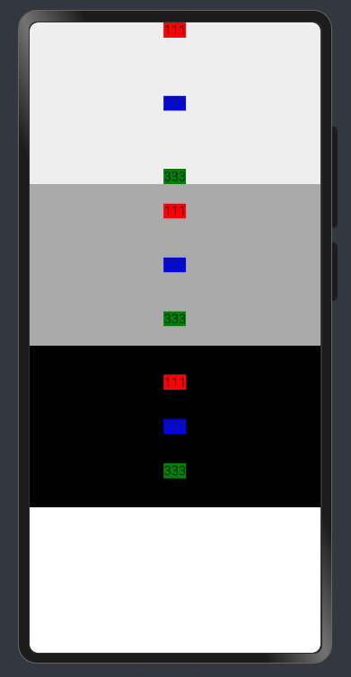
这里的值与css的flex布局同名参数值与效果基本一致。
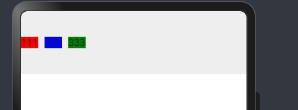
Row
沿水平方向布局容器。
用法: Row(value?:{space?: number | string }),接收一个参数设置子组件的间距
Column() {
      Row({ space: 10 }) {
        Text('111').backgroundColor(Color.Red)
        Text('222').backgroundColor(Color.Blue)
        Text('333').backgroundColor(Color.Green)
      }
      .width('100%')
      .height(100)
      .backgroundColor('#eeeeee')
    }
alignItems属性
设置子组件在垂直方向上的对齐格式。
用法:alignItems(value: VerticalAlign)
VerticalAlign枚举值如下:
- Top 顶部对齐。
- Center 居中对齐,默认对齐方式。
- Bottom 底部对齐。
Column() {
      Row({ space: 10 }) {
        Text('111').backgroundColor(Color.Red)
        Text('222').backgroundColor(Color.Blue)
        Text('333').backgroundColor(Color.Green)
      }
      .width('100%')
      .height(100)
      .backgroundColor('#eeeeee')
      .alignItems(VerticalAlign.Top)
      Row({ space: 10 }) {
        Text('111').backgroundColor(Color.Red)
        Text('222').backgroundColor(Color.Blue)
        Text('333').backgroundColor(Color.Green)
      }
      .width('100%')
      .height(100)
      .backgroundColor('#aaaaaa')
      .alignItems(VerticalAlign.Center)
      Row({ space: 10 }) {
        Text('111').backgroundColor(Color.Red)
        Text('222').backgroundColor(Color.Blue)
        Text('333').backgroundColor(Color.Green)
      }
      .width('100%')
      .height(100)
      .backgroundColor('#000000')
      .alignItems(VerticalAlign.Bottom)
    }
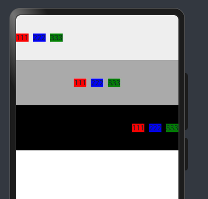
justifyContent属性
设置子组件在水平方向上的对齐格式
用法: justifyContent(value: FlexAlign)
FlexAlign枚举值说明:
- Start 元素在主轴方向首端对齐,第一个元素与行首对齐,同时后续的元素与前一个对齐。
- Center 元素在主轴方向中心对齐,第一个元素与行首的距离与最后一个元素与行尾距离相同。
- End 元素在主轴方向尾部对齐,最后一个元素与行尾对齐,其他元素与后一个对齐。
- SpaceBetween Flex主轴方向均匀分配弹性元素,相邻元素之间距离相同。第一个元素与行首对齐,最后一个元素与行尾对齐。
- SpaceAround Flex主轴方向均匀分配弹性元素,相邻元素之间距离相同。第一个元素到行首的距离和最后一个元素到行尾的距离是相邻元素之间距离的一半。
- SpaceEvenly Flex主轴方向均匀分配弹性元素,相邻元素之间的距离、第一个元素与行首的间距、最后一个元素到行尾的间距都完全一样。
Column() {
      Row({ space: 10 }) {
        Text('111').backgroundColor(Color.Red)
        Text('222').backgroundColor(Color.Blue)
        Text('333').backgroundColor(Color.Green)
      }
      .width('100%')
      .height(100)
      .backgroundColor('#eeeeee')
      .justifyContent(FlexAlign.Start)
      Row({ space: 10 }) {
        Text('111').backgroundColor(Color.Red)
        Text('222').backgroundColor(Color.Blue)
        Text('333').backgroundColor(Color.Green)
      }
      .width('100%')
      .height(100)
      .backgroundColor('#aaaaaa')
      .justifyContent(FlexAlign.Center)
      Row({ space: 10 }) {
        Text('111').backgroundColor(Color.Red)
        Text('222').backgroundColor(Color.Blue)
        Text('333').backgroundColor(Color.Green)
      }
      .width('100%')
      .height(100)
      .backgroundColor('#000000')
      .justifyContent(FlexAlign.End)
    }
Column() {
      Row({ space: 10 }) {
        Text('111').backgroundColor(Color.Red)
        Text('222').backgroundColor(Color.Blue)
        Text('333').backgroundColor(Color.Green)
      }
      .width('100%')
      .height(100)
      .backgroundColor('#eeeeee')
      .justifyContent(FlexAlign.SpaceBetween)
      Row({ space: 10 }) {
        Text('111').backgroundColor(Color.Red)
        Text('222').backgroundColor(Color.Blue)
        Text('333').backgroundColor(Color.Green)
      }
      .width('100%')
      .height(100)
      .backgroundColor('#aaaaaa')
      .justifyContent(FlexAlign.SpaceAround)
      Row({ space: 10 }) {
        Text('111').backgroundColor(Color.Red)
        Text('222').backgroundColor(Color.Blue)
        Text('333').backgroundColor(Color.Green)
      }
      .width('100%')
      .height(100)
      .backgroundColor('#000000')
      .justifyContent(FlexAlign.SpaceEvenly)
    }
弹性布局(Flex)
以弹性方式布局子组件的容器组件
用法: Flex(value?: FlexOptions)
FlexOptions说明:
| 参数名 | 参数类型 | 必填 | 默认值 | 描述 |
|---|---|---|---|---|
| direction | FlexDirection | 否 | FlexDirection.Row | 子组件在Flex容器上排列的方向,即主轴的方向。 |
| wrap | FlexWrap | 否 | FlexWrap.NoWrap | Flex容器是单行/列还是多行/列排列。在多行布局时,通过交叉轴方向,确认新行堆叠方向。 |
| justifyContent | FlexAlign | 否 | FlexAlign.Start | 所有子组件在Flex容器主轴上的对齐格式。 |
| alignItems | ItemAlign | 否 | ItemAlign.Start | 所有子组件在Flex容器交叉轴上的对齐格式。 |
| alignContent | FlexAlign | 否 | FlexAlign.Start | 交叉轴中有额外的空间时,多行内容的对齐方式。仅在wrap为Wrap或WrapReverse下生效。 |
| space12+ | FlexSpaceOptions | 否 | {main: LengthMetrics.px(0), cross: LengthMetrics.px(0)} | 所有子组件在Flex容器主轴或交叉轴的space。 空间为负数、百分比或justifyContent设置为FlexAlign.SpaceBetween、FlexAlign.SpaceAround、FlexAlign.SpaceEvenly时不生效。 |
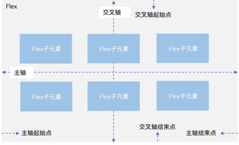
flex布局几乎和用css写flex布局参数一致。
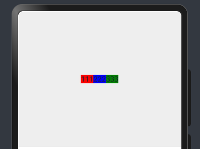
比如我们写一个常用的,水平垂直居中
Flex({
      justifyContent: FlexAlign.Center,
      alignItems: ItemAlign.Center
    }){
        Text('111').backgroundColor(Color.Red)
        Text('222').backgroundColor(Color.Blue)
        Text('333').backgroundColor(Color.Green)
    }
    .height(300)
    .backgroundColor('#eeeeee')
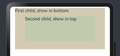
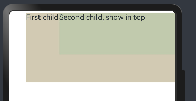
层叠布局(Stack)
Stack 堆叠容器,子组件按照顺序依次入栈,后一个子组件覆盖前一个子组件
用法:Stack(value?: { alignContent?: Alignment })
Alignment枚举如下
- TopStart 顶部起始端。
- Top 顶部横向居中。
- TopEnd 顶部尾端。
- Start 起始端纵向居中。
- Center 横向和纵向居中。
- End 尾端纵向居中。
- BottomStart 底部起始端。
- Bottom 底部横向居中。
- BottomEnd 底部尾端。
Stack({ alignContent: Alignment.Bottom }) {
      Text('First child, show in bottom').width('90%').height('100%').backgroundColor(0xd2cab3).align(Alignment.Top)
      Text('Second child, show in top').width('70%').height('60%').backgroundColor(0xc1cbac).align(Alignment.Top)
    }.width('100%').height(150).margin({ top: 5 })

Stack({ alignContent: Alignment.Center }) {
      Text('First child, show in bottom').width('90%').height('100%').backgroundColor(0xd2cab3).align(Alignment.Top)
      Text('Second child, show in top').width('70%').height('60%').backgroundColor(0xc1cbac).align(Alignment.Top)
    }.width('100%').height(150).margin({ top: 5 })
Stack({ alignContent: Alignment.TopEnd }) {
      Text('First child, show in bottom').width('90%').height('100%').backgroundColor(0xd2cab3).align(Alignment.Top)
      Text('Second child, show in top').width('70%').height('60%').backgroundColor(0xc1cbac).align(Alignment.Top)
    }.width('100%').height(150).margin({ top: 5 })


