栅格布局
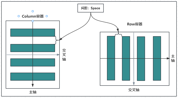
栅格布局可以为布局提供规律性的结构,解决多尺寸多设备的动态布局问题,保证不同设备上各个模块的布局一致性。
栅格容器组件,仅可以和栅格子组件(GridCol)在栅格布局场景中使用。
说明
该组件从API Version 9开始支持。后续版本如有新增内容,则采用上角标单独标记该内容的起始版本。
子组件
可以包含GridCol子组件。
接口
GridRow(option?: {columns?: number | GridRowColumnOption, gutter?: Length | GutterOption, breakpoints?: BreakPoints, direction?: GridRowDirection})
从API version 9开始,该接口支持在ArkTS卡片中使用。
参数:
参数名 |
类型 |
必填 |
说明 |
|---|---|---|---|
gutter |
Length | GutterOption |
否 |
栅格布局间距,x代表水平方向。 |
columns |
number | GridRowColumnOption |
否 |
设置布局列数。 |
breakpoints |
BreakPoints |
否 |
设置断点值的断点数列以及基于窗口或容器尺寸的相应参照。 |
direction |
GridRowDirection |
否 |
栅格布局排列方向。 |
GutterOption
从API version 9开始,该接口支持在ArkTS卡片中使用。
参数名 |
参数类型 |
必填 |
参数描述 |
|---|---|---|---|
x |
Length | GridRowSizeOption |
否 |
水平gutter option。 |
y |
Length | GridRowSizeOption |
否 |
竖直gutter option。 |
GridRowColumnOption
栅格在不同宽度设备类型下,栅格列数。
从API version 9开始,该接口支持在ArkTS卡片中使用。
参数名 |
参数类型 |
必填 |
参数描述 |
|---|---|---|---|
xs |
number |
否 |
最小宽度类型设备。 |
sm |
number |
否 |
小宽度类型设备。 |
md |
number |
否 |
中等宽度类型设备。 |
lg |
number |
否 |
大宽度类型设备。 |
xl |
number |
否 |
特大宽度类型设备。 |
xxl |
number |
否 |
超大宽度类型设备。 |
GridRowSizeOption
栅格在不同宽度设备类型下,gutter的大小。
从API version 9开始,该接口支持在ArkTS卡片中使用。
参数名 |
参数类型 |
必填 |
参数描述 |
|---|---|---|---|
xs |
Length |
否 |
最小宽度类型设备。 |
sm |
Length |
否 |
小宽度类型设备。 |
md |
Length |
否 |
中等宽度类型设备。 |
lg |
Length |
否 |
大宽度类型设备。 |
xl |
Length |
否 |
特大宽度类型设备。 |
xxl |
Length |
否 |
超大宽度类型设备。 |
BreakPoints
从API version 9开始,该接口支持在ArkTS卡片中使用。
参数名 |
参数类型 |
必填 |
参数描述 |
|---|---|---|---|
value |
Array<string> |
否 |
设置断点位置的单调递增数组。 默认值:["320vp", "520vp", "840vp"] |
reference |
BreakpointsReference |
否 |
断点切换参照物。 |
  // 启用xs、sm、md共3个断点
  breakpoints: {value: ["100vp", "200vp"]}
  // 启用xs、sm、md、lg共4个断点,断点范围值必须单调递增
  breakpoints: {value: ["320vp", "520vp", "840vp"]}
  // 启用xs、sm、md、lg、xl共5个断点,断点范围数量不可超过断点可取值数量-1
  breakpoints: {value: ["320vp", "520vp", "840vp", "1080vp"]}
BreakpointsReference枚举类型
从API version 9开始,该接口支持在ArkTS卡片中使用。
枚举名 |
描述 |
|---|---|
WindowSize |
以窗口为参照。 |
ComponentSize |
以容器为参照。 |
GridRowDirection枚举类型
从API version 9开始,该接口支持在ArkTS卡片中使用。
枚举名 |
描述 |
|---|---|
Row |
栅格元素按照行方向排列。 |
RowReverse |
栅格元素按照逆序行方向排列。 |
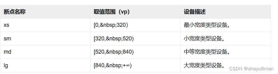
栅格最多支持xs、sm、md、lg、xl、xxl六个断点,且名称不可修改。假设传入的数组是[n0, n1, n2, n3, n4],各个断点取值如下:
断点 |
取值范围 |
|---|---|
xs |
[0, n0) |
sm |
[n0, n1) |
md |
[n1, n2) |
lg |
[n2, n3) |
xl |
[n3, n4) |
xxl |
[n4, INF) |
说明:
- 栅格元素仅支持Row/RowReverse排列,不支持column/ColumnReverse方向排列。
- 栅格子组件仅能通过span、offset计算子组件位置与大小。多个子组件span超过规定列数时自动换行。
- 单个元素span大小超过最大列数时后台默认span为最大column数。
- 新一行的Offset加上子组件的span超过总列数时,将下一个子组件在新的一行放置。
- 例:Item1: GridCol({ span: 6}), Item2: GridCol({ span: 8, offset:11})
1 |
2 |
3 |
4 |
5 |
6 |
7 |
8 |
9 |
10 |
11 |
12 |
|---|---|---|---|---|---|---|---|---|---|---|---|
∘ |
∘ |
∘ |
∘ |
∘ |
∘ |
- |
- |
- |
- |
- |
- |
- |
- |
- |
- |
- |
|||||||
∘ |
∘ |
∘ |
∘ |
∘ |
∘ |
∘ |
∘ |
属性
支持通用属性。
事件
onBreakpointChange
onBreakpointChange(callback: (breakpoints: string) => void)
从API version 9开始,该接口支持在ArkTS卡片中使用。
参数:
参数名 |
参数类型 |
必填 |
说明 |
|---|---|---|---|
breakpoints |
string |
是 |
断点发生变化时触发回调 取值为"xs"、"sm"、"md"、"lg"、"xl"、"xxl"。 |
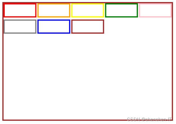
官方示例
// xxx.ets
@Entry
@Component
struct GridRowExample {
  @State bgColors: Color[] = [Color.Red, Color.Orange, Color.Yellow, Color.Green, Color.Pink, Color.Grey, Color.Blue, Color.Brown]
  @State currentBp: string = 'unknown'

  build() {
    Column() {
      GridRow({
        columns: 5,
        gutter: { x: 5, y: 10 },
        breakpoints: { value: ["400vp", "600vp", "800vp"],
          reference: BreakpointsReference.WindowSize },
        direction: GridRowDirection.Row
      }) {
        ForEach(this.bgColors, (color) => {
          GridCol({ span: { xs: 1, sm: 2, md: 3, lg: 4 } }) {
            Row().width("100%").height("20vp")
          }.borderColor(color).borderWidth(2)
        })
      }.width("100%").height("100%")
      .onBreakpointChange((breakpoint) => {
        this.currentBp = breakpoint
      })
    }.width('80%').margin({ left: 10, top: 5, bottom: 5 }).height(200)
    .border({ color: '#880606', width: 2 })
  }
}
GridContainer定义介绍
interface GridContainerInterface {
  (value?: GridContainerOptions): GridContainerAttribute;
}

declare interface GridContainerOptions {
  columns?: number | "auto";
  sizeType?: SizeType;
  gutter?: number | string;
  margin?: number | string;
}
value:设置布局的可选参数,
GridContainerOptions说明如下:- columns:设置当前布局总列数,默认为
auto。 - sizeType:设置选用设备宽度类型,
SizeType参数说明如下:- XS:最小宽度类型设备。
- SM:小宽度类型设备。
- MD:中等宽度类型设备。
- LG:大宽度类型设备。
- Auto(默认值):根据设备类型进行选择。
- gutter:设置栅格布局列间距。
- margin:设置栅格布局两侧间距。
简单样例如下所示:
- columns:设置当前布局总列数,默认为
@Entry @Component struct ComponentTest {

  @State sizeType: SizeType = SizeType.XS // 默认采用最小宽度设备类型

  build() {
    Column() {
      GridContainer({
        columns: 12,                      // 设置格栅布局为12列
        sizeType: this.sizeType,          // 设置格栅布局类型
        gutter: 10,                       // 设置格栅布局列间距,该版本还有bug
        margin: 20                        // 设计格栅布局两侧间距
      }) {
        Row() {
          Text('1')
            .useSizeType({
              xs: { span: 6, offset: 0 }, // Text1在xs设备上占用6列
              sm: { span: 2, offset: 0 }, // Text1在sm设备上占用2列
              md: { span: 2, offset: 0 }, // Text1在md设备上占用2列
              lg: { span: 3, offset: 0 }  // Text1在lg设备上占用3列
            })
            .fontSize(20)
            .height(50)
            .backgroundColor(0x4682B4)
            .textAlign(TextAlign.Center)
          Text('2')
            .useSizeType({
              xs: { span: 2, offset: 0 }, // Text2在xs设备上占用2列
              sm: { span: 6, offset: 0 }, // Text2在sm设备上占用6列
              md: { span: 2, offset: 0 }, // Text2在md设备上占用2列
              lg: { span: 3, offset: 0 }  // Text2在lg设备上占用3列
            })
            .fontSize(20)
            .height(50)
            .backgroundColor(0x00BFFF)
            .textAlign(TextAlign.Center)
          Text('3')
            .useSizeType({
              xs: { span: 2, offset: 0 }, // Text3在xs设备上占用2列
              sm: { span: 2, offset: 0 }, // Text3在sm设备上占用2列
              md: { span: 6, offset: 0 }, // Text3在md设备上占用6列
              lg: { span: 3, offset: 0 }  // Text3在lg设备上占用3列
            })
            .fontSize(20)
            .height(50)
            .backgroundColor(0x4682B4)
            .textAlign(TextAlign.Center)
          Text('4')
            .useSizeType({
              xs: { span: 2, offset: 0 }, // Text4在xs设备上占用2列
              sm: { span: 2, offset: 0 }, // Text4在sm设备上占用2列
              md: { span: 2, offset: 0 }, // Text4在md设备上占用2列
              lg: { span: 3, offset: 0 }  // Text4在lg设备上占用3列
            })
            .fontSize(20)
            .height(50)
            .backgroundColor(0x00BFFF)
            .textAlign(TextAlign.Center)
        }
      }
      .backgroundColor(Color.Pink)
      .width('90%')
      .margin({top: 10})

      Row({space: 10}) {
        Button('XS')
          .onClick(() => {
            this.sizeType = SizeType.XS
          }).backgroundColor(0x317aff)
        Button('SM')
          .onClick(() => {
            this.sizeType = SizeType.SM
          }).backgroundColor(0x317aff)
        Button('MD')
          .onClick(() => {
            this.sizeType = SizeType.MD
          }).backgroundColor(0x317aff)
        Button('LG')
          .onClick(() => {
            this.sizeType = SizeType.LG
          }).backgroundColor(0x317aff)
      }
      .margin({top: 10})
    }.width('100%')
  }
}
侧边栏容器(SideBarContainer)
SideBarContainer 表示侧边栏容器,它可以添加两个子组件,第一个子组件表示侧边栏,第二个子组件表示内容区,本节笔者简单介绍一下 SideBarContainer 的简单使用。
SideBarContainer定义介绍
interface SideBarContainerInterface {
  (type?: SideBarContainerType): SideBarContainerAttribute;
}
- type:设置侧边栏的显示类型,
SideBarContainerType定义了一下 2 中类型:- Embed:侧边栏嵌入到组件内,侧边栏和内容区并列显示。
- Overlay:侧边栏浮在内容区上面。
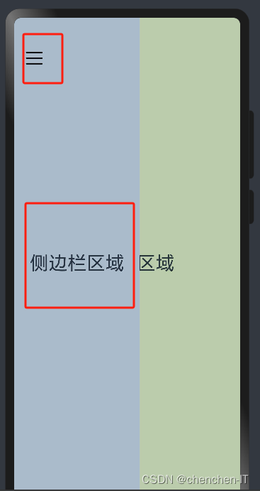
简单样例如下所示:
@Entry @Component struct SideBarContainerTest {

  build() {
    SideBarContainer(SideBarContainerType.Overlay) {
      Column() {
        Text("侧边栏区域")
          .width("100%")
          .height("100%")
          .fontSize(30)
          .textAlign(TextAlign.Center)
      }
      .width(10)
      .height("100%")
      .backgroundColor("#aabbcc")

      Column() {
        Text("侧边栏区域")
          .width("100%")
          .height("100%")
          .fontSize(30)
          .textAlign(TextAlign.Center)
      }
      .width("100%")
      .height("100%")
      .backgroundColor("#bbccaa")
    }
    .width('100%')
    .height('100%')
  }
}
样例运行结果如下图所示:
SideBarContainer属性介
- showSideBar:设置是否显示侧边栏,默认为 true 表示显示侧边栏。
- controlButton:设置侧边栏控制按钮的属性,
ButtonStyle参数说明如下:- left:设置侧边栏控制按钮距离容器左界限的间距。
- top:设置侧边栏控制按钮距离容器上界限的间距。
- width:设置侧边栏控制按钮的宽度。
- height:设置侧边栏控制按钮的高度。
- icons:设置侧边栏控制按钮的图标:
- shown:设置侧边栏显示时控制按钮的图标。
- hidden:设置侧边栏隐藏时控制按钮的图标。
- switching:设置侧边栏显示和隐藏状态切换时控制按钮的图标。
- sideBarWidth:设置侧边栏的宽度,默认为 200 。
- minSideBarWidth:设置侧边栏最小宽度,默认为 200 。
- maxSideBarWidth:设置侧边栏最大宽度,默认为 280 。
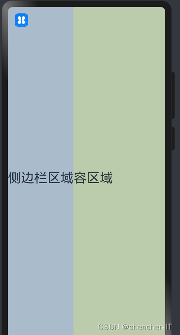
简单样例如下所示:
@Entry @Component struct SideBarContainerTest {

  build() {
    SideBarContainer(SideBarContainerType.Overlay) { // 设置侧边栏样式为悬浮态
      Column() {                                     // 第一个子组件为侧边栏视图
        Text("侧边栏区域")
          .width("100%")
          .height("100%")
          .fontSize(30)
          .textAlign(TextAlign.Center)
      }
      .width(10)
      .height("100%")
      .backgroundColor("#aabbcc")


      Column() {                                     // 第二个子组件为内容区视图
        Text("内容区域")
          .width("100%")
          .height("100%")
          .fontSize(30)
          .textAlign(TextAlign.Center)
      }
      .width("100%")
      .height("100%")
      .backgroundColor("#bbccaa")
    }
    .width('100%')
    .height('100%')
    .sideBarWidth(150)                               // 设置侧边栏宽度为150
    .minSideBarWidth(100)                            // 设置侧边栏最小宽度为100
    .maxSideBarWidth(200)                            // 设置侧边栏最大宽度为200
    .controlButton({                                 // 设置侧边栏控制按钮的样式
      width: 30,                                     // 设置侧边栏控制按钮宽度为30
      height: 30,                                    // 设置侧边栏控制按钮高度为30
      top: 15,                                       // 设置侧边栏控制按钮距离容器顶部为15
      icons: {                                       // 设置侧边栏控制按钮图片
        shown: $r("app.media.icon_back"),            // 设置侧边栏显示时控制按钮的图标。
        hidden: $r("app.media.icon_menu"),           // 设置侧边栏隐藏时控制按钮的图标。
        switching: $r("app.media.icon_back")         // 设置侧边栏显示和隐藏状态切换时控制按钮的图标。
      }
    })
  }
}
样例运行结果如下图所示:
SideBarContainer事件介绍
declare class SideBarContainerAttribute extends CommonMethod<SideBarContainerAttribute> {
  onChange(callback: (value: boolean) => void): SideBarContainerAttribute;
}
- onChange:当侧边栏的状态在显示和隐藏之间切换时触发回调,
value为 true 表示菜单栏显示显示,false表示菜单栏隐藏。
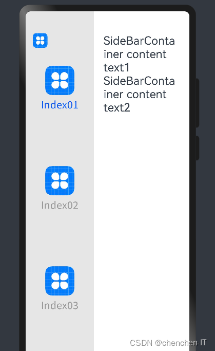
官方示例
// xxx.ets
@Entry
@Component
struct SideBarContainerExample {
  normalIcon: Resource = $r("app.media.icon")
  selectedIcon: Resource = $r("app.media.icon")
  @State arr: number[] = [1, 2, 3]
  @State current: number = 1

  build() {
    SideBarContainer(SideBarContainerType.Embed) {
      Column() {
        ForEach(this.arr, (item, index) => {
          Column({ space: 5 }) {
            Image(this.current === item ? this.selectedIcon : this.normalIcon).width(64).height(64)
            Text("Index0" + item)
              .fontSize(25)
              .fontColor(this.current === item ? '#0A59F7' : '#999')
              .fontFamily('source-sans-pro,cursive,sans-serif')
          }
          .onClick(() => {
            this.current = item
          })
        }, item => item)
      }.width('100%')
      .justifyContent(FlexAlign.SpaceEvenly)
      .backgroundColor('#19000000')


      Column() {
        Text('SideBarContainer content text1').fontSize(25)
        Text('SideBarContainer content text2').fontSize(25)
      }
      .margin({ top: 50, left: 20, right: 30 })
    }
    .controlButton({
      icons: {
        hidden: $r('app.media.drawer'),
        shown: $r('app.media.drawer'),
        switching: $r('app.media.drawer')
      }
    })
    .sideBarWidth(150)
    .minSideBarWidth(50)
    .maxSideBarWidth(300)
    .onChange((value: boolean) => {
      console.info('status:' + value)
    })
  }
}


![[图解]SysML和EA建模住宅安全系统-07 to be块定义图](https://img-blog.csdnimg.cn/direct/80e5c733e13b4710b99115e1572ef330.png)