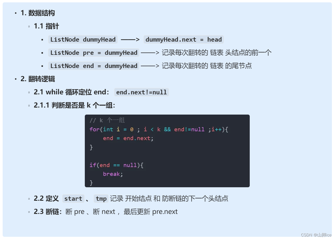
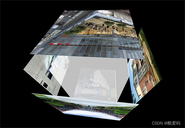
要实现对多个<a>标签(比如链接)的模拟地球仪特效和鼠标跟随特效,你可以使用CSS和一点点JavaScript来完成。下面是一个基本的示例代码:HTML代码:
<!DOCTYPE html>
<html lang="en">
<head>
  <meta charset="UTF-8">
  <meta name="viewport" content="width=device-width, initial-scale=1.0">
  <title>Earth Effect</title>
  <link rel="stylesheet" href="styles.css">
</head>
<body>
  <div class="earth-container">
    <div class="earth"></div>
    <a href="#" class="link" onmousemove="moveFollower(event)">企业融资</a>
    <a href="#" class="link" onmousemove="moveFollower(event)">产品发布</a>
    <!-- 添加更多的<a>标签 -->
    <div class="mouse-follower"></div>
  </div>
  <script>
    function moveFollower(event) {
      var follower = document.querySelector('.mouse-follower');
      follower.style.left = event.clientX + 'px';
      follower.style.top = event.clientY + 'px';
    }
  </script>
</body>
</html>
CSS代码(styles.css):
body {
  margin: 0;
  overflow: hidden;
}

.earth-container {
  position: relative;
}

.earth {
  width: 200px;
  height: 200px;
  background: url('earth.jpg') no-repeat center center;
  background-size: cover;
  border-radius: 50%;
  position: absolute;
  top: 50%;
  left: 50%;
  transform: translate(-50%, -50%);
  animation: spin 20s linear infinite;
}

.link {
  position: absolute;
  color: white;
  text-decoration: none;
  font-size: 18px;
  transition: all 0.3s ease;
}

.link:hover {
  color: yellow;
}

.mouse-follower {
  width: 20px;
  height: 20px;
  background-color: red;
  border-radius: 50%;
  position: absolute;
  top: 50%;
  left: 50%;
  transform: translate(-50%, -50%);
  pointer-events: none; /* 防止鼠标事件影响follower */
}

@keyframes spin {
  100% {
    transform: translate(-50%, -50%) rotateY(360deg);
  }
}
在这个示例中,我们创建了多个<a>标签作为链接,并且给它们添加了onmousemove事件来调用moveFollower函数,这个函数会根据鼠标位置移动.mouse-follower元素,从而实现鼠标跟随特效。同时,我们使用了CSS来实现地球特效和链接的样式。


![【YOLOv8改进[CONV]】使用DynamicConv二次创新C2f模块实现轻量化 + 含全部代码和详细修改方式 + 手撕结构图](https://img-blog.csdnimg.cn/direct/4bc21b1bd76c494c827f81157ae8cd43.png)