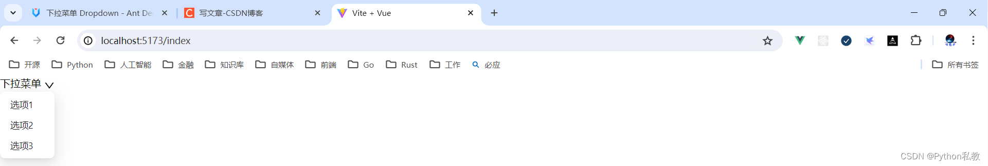
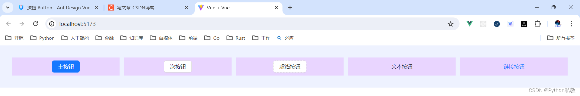
基本用法
核心代码:
<template>
  <a-dropdown>
    <a class="ant-dropdown-link" @click.prevent>
      Hover me
      <DownOutlined />
    </a>
    <template #overlay>
      <a-menu>
        <a-menu-item>
          <a href="javascript:;">1st menu item</a>
        </a-menu-item>
        <a-menu-item>
          <a href="javascript:;">2nd menu item</a>
        </a-menu-item>
        <a-menu-item>
          <a href="javascript:;">3rd menu item</a>
        </a-menu-item>
      </a-menu>
    </template>
  </a-dropdown>
</template>
<script lang="ts" setup>
import { DownOutlined } from '@ant-design/icons-vue';
</script>
vue3示例:
<script setup>
import {DownOutlined} from "@ant-design/icons-vue";
</script>
<template>
  <a-dropdown>
    <a href="" @click.prevent>
      下拉菜单
      <DownOutlined/>
    </a>
    <template #overlay>
      <a-menu>
        <a-menu-item>
          <a href="#">选项1</a>
        </a-menu-item>
        <a-menu-item>
          <a href="#">选项2</a>
        </a-menu-item>
        <a-menu-item>
          <a href="#">选项3</a>
        </a-menu-item>
      </a-menu>
    </template>
  </a-dropdown>
</template>
右键菜单
默认是移入触发菜单,可以点击鼠标右键触发。
核心代码:
<template>
  <a-dropdown :trigger="['contextmenu']">
    <div
      :style="{
        textAlign: 'center',
        background: '#f7f7f7',
        height: '200px',
        lineHeight: '200px',
        color: '#777',
      }"
    >
      Right Click on here
    </div>
    <template #overlay>
      <a-menu>
        <a-menu-item key="1">1st menu item</a-menu-item>
        <a-menu-item key="2">2nd menu item</a-menu-item>
        <a-menu-item key="3">3rd menu item</a-menu-item>
      </a-menu>
    </template>
  </a-dropdown>
</template>
vue3示例:
<script setup>
import {DownOutlined} from "@ant-design/icons-vue";
</script>
<template>
  <a-dropdown  :trigger="['contextmenu']">
    <div class="w-72 h-32 bg-indigo-500"></div>
    <template #overlay>
      <a-menu>
        <a-menu-item>
          <a href="#">选项1</a>
        </a-menu-item>
        <a-menu-item>
          <a href="#">选项2</a>
        </a-menu-item>
        <a-menu-item>
          <a href="#">选项3</a>
        </a-menu-item>
      </a-menu>
    </template>
  </a-dropdown>
</template>

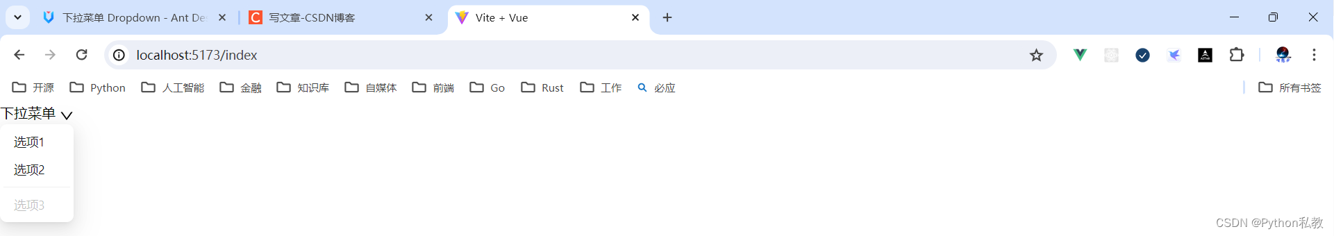
案例:分割线和不可用菜单项
核心代码:
<template>
  <a-dropdown>
    <a class="ant-dropdown-link" @click.prevent>
      Hover me
      <DownOutlined />
    </a>
    <template #overlay>
      <a-menu>
        <a-menu-item key="0">
          <a target="_blank" rel="noopener noreferrer" href="http://www.alipay.com/">
            1st menu item
          </a>
        </a-menu-item>
        <a-menu-item key="1">
          <a target="_blank" rel="noopener noreferrer" href="http://www.taobao.com/">
            2nd menu item
          </a>
        </a-menu-item>
        <a-menu-divider />
        <a-menu-item key="3" disabled>3rd menu item(disabled)</a-menu-item>
      </a-menu>
    </template>
  </a-dropdown>
</template>
<script lang="ts" setup>
import { DownOutlined } from '@ant-design/icons-vue';
</script>
如何实现分割线:
<a-menu-divider />
如何实现禁用菜单:
<a-menu-item key="3" disabled>
vue3示例:
<script setup>
import {DownOutlined} from "@ant-design/icons-vue";
</script>
<template>
  <a-dropdown>
    <a href="#" @click.prevent>
      下拉菜单
      <DownOutlined/>
    </a>
    <template #overlay>
      <a-menu>
        <a-menu-item>
          <a href="#">选项1</a>
        </a-menu-item>
        <a-menu-item>
          <a href="#">选项2</a>
        </a-menu-item>
        <a-menu-divider/>
        <a-menu-item disabled>
          <a href="#">选项3</a>
        </a-menu-item>
      </a-menu>
    </template>
  </a-dropdown>
</template>
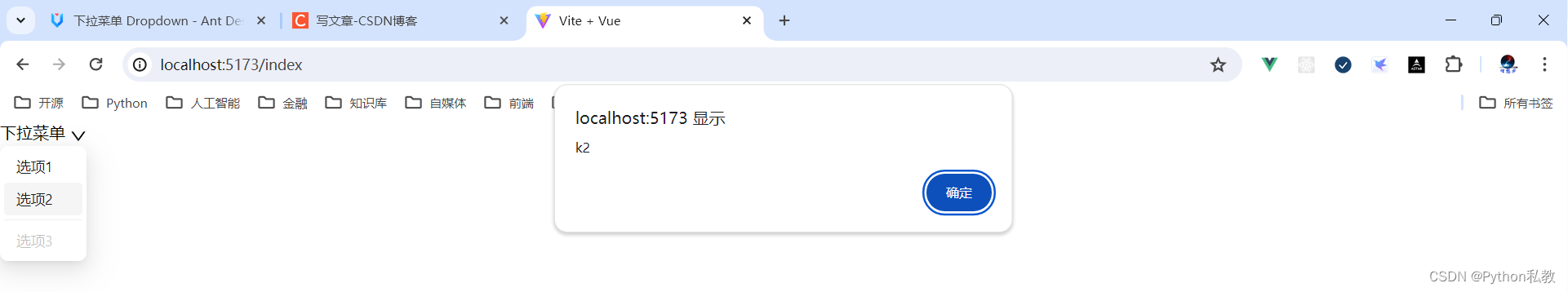
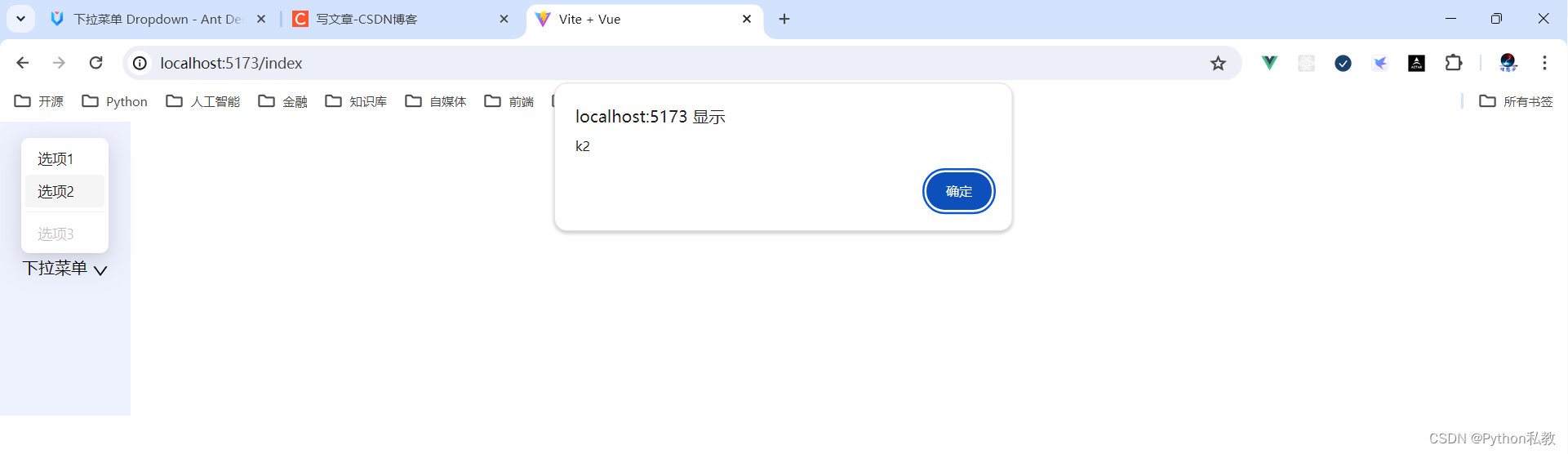
案例:触发事件
点击菜单项后会触发事件,用户可以通过相应的菜单项 key 进行不同的操作。
核心代码:
<template>
  <a-dropdown>
    <a class="ant-dropdown-link" @click.prevent>
      Hover me, Click menu item
      <DownOutlined />
    </a>
    <template #overlay>
      <a-menu @click="onClick">
        <a-menu-item key="1">1st menu item</a-menu-item>
        <a-menu-item key="2">2nd menu item</a-menu-item>
        <a-menu-item key="3">3rd menu item</a-menu-item>
      </a-menu>
    </template>
  </a-dropdown>
</template>
<script lang="ts" setup>
import { DownOutlined } from '@ant-design/icons-vue';
import type { MenuProps } from 'ant-design-vue';

const onClick: MenuProps['onClick'] = ({ key }) => {
  console.log(`Click on item ${key}`);
};
</script>
如何实现下拉菜单点击事件?
- 1、给menu-item加上key:
<a-menu-item key="1"> - 2、给menu加上点击事件:
<a-menu @click="onClick"> - 3、实现点击事件:
const onClick: MenuProps['onClick'] = ({ key }) => {
vue3示例:
<script setup>
import {DownOutlined} from "@ant-design/icons-vue";

const onClick = ({key}) => {
  alert(key)
}
</script>
<template>
  <a-dropdown>
    <a href="#" @click.prevent>
      下拉菜单
      <DownOutlined/>
    </a>
    <template #overlay>
      <a-menu @click="onClick">
        <a-menu-item key="k1">
          <a href="#">选项1</a>
        </a-menu-item>
        <a-menu-item key="k2">
          <a href="#">选项2</a>
        </a-menu-item>
        <a-menu-divider/>
        <a-menu-item disabled>
          <a href="#">选项3</a>
        </a-menu-item>
      </a-menu>
    </template>
  </a-dropdown>
</template>
案例:菜单弹出位置
核心代码:
<template>
  <div id="components-dropdown-demo-placement">
    <template v-for="(placement, index) in placements" :key="placement">
      <a-dropdown :placement="placement">
        <a-button>{{ placement }}</a-button>
        <template #overlay>
          <a-menu>
            <a-menu-item>
              <a target="_blank" rel="noopener noreferrer" href="http://www.alipay.com/">
                1st menu item
              </a>
            </a-menu-item>
            <a-menu-item>
              <a target="_blank" rel="noopener noreferrer" href="http://www.taobao.com/">
                2nd menu item
              </a>
            </a-menu-item>
            <a-menu-item>
              <a target="_blank" rel="noopener noreferrer" href="http://www.tmall.com/">
                3rd menu item
              </a>
            </a-menu-item>
          </a-menu>
        </template>
      </a-dropdown>
      <br v-if="index === 2" />
    </template>
  </div>
</template>
<script lang="ts" setup>
import type { DropdownProps } from 'ant-design-vue';
const placements = [
  'bottomLeft',
  'bottom',
  'bottomRight',
  'topLeft',
  'top',
  'topRight',
] as DropdownProps['placement'][];
</script>
<style scoped>
#components-dropdown-demo-placement .ant-btn {
  margin-right: 8px;
  margin-bottom: 8px;
}
</style>
如何控制下拉菜单弹出位置?
<a-dropdown :placement="placement">
都支持哪些位置?
const placements = [
  'bottomLeft',
  'bottom',
  'bottomRight',
  'topLeft',
  'top',
  'topRight',
] as DropdownProps['placement'][];
vue3示例:
<script setup>
import {DownOutlined} from "@ant-design/icons-vue";

const onClick = ({key}) => {
  alert(key)
}
</script>
<template>
<div class="bg-indigo-50 h-72 w-32 flex items-center justify-center">
  <a-dropdown placement="top">
    <a href="#" @click.prevent>
      下拉菜单
      <DownOutlined/>
    </a>
    <template #overlay>
      <a-menu @click="onClick">
        <a-menu-item key="k1">
          <a href="#">选项1</a>
        </a-menu-item>
        <a-menu-item key="k2">
          <a href="#">选项2</a>
        </a-menu-item>
        <a-menu-divider/>
        <a-menu-item disabled>
          <a href="#">选项3</a>
        </a-menu-item>
      </a-menu>
    </template>
  </a-dropdown>
</div>
</template>
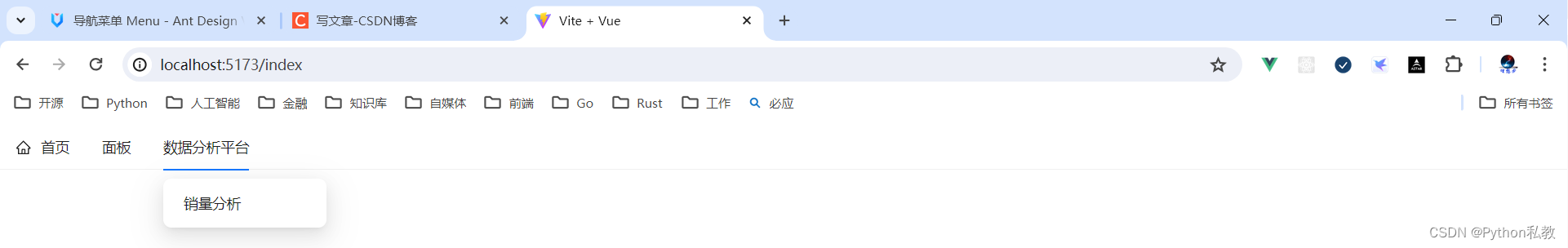
案例:多级菜单
核心代码:
<template>
  <a-dropdown>
    <a class="ant-dropdown-link" @click.prevent>
      Cascading menu
      <DownOutlined />
    </a>
    <template #overlay>
      <a-menu>
        <a-menu-item>1st menu item</a-menu-item>
        <a-menu-item>2nd menu item</a-menu-item>
        <a-sub-menu key="sub1" title="sub menu">
          <a-menu-item>3rd menu item</a-menu-item>
          <a-menu-item>4th menu item</a-menu-item>
        </a-sub-menu>
        <a-sub-menu key="sub2" title="disabled sub menu" disabled>
          <a-menu-item>5d menu item</a-menu-item>
          <a-menu-item>6th menu item</a-menu-item>
        </a-sub-menu>
      </a-menu>
    </template>
  </a-dropdown>
</template>
<script lang="ts" setup>
import { DownOutlined } from '@ant-design/icons-vue';
</script>
如何实现多级菜单:
- 一级菜单:
<a-menu-item>1st menu item</a-menu-item> - 二级菜单父类:
<a-sub-menu key="sub1" title="sub menu">- 二级菜单子类:
<a-menu-item>3rd menu item</a-menu-item>
- 二级菜单子类:
vue3示例:
<script setup>
import {DownOutlined} from "@ant-design/icons-vue";

const onClick = ({key}) => {
  alert(key)
}
</script>
<template>
  <div class="bg-indigo-50 h-72 w-32 flex items-center justify-center">
    <a-dropdown placement="top">
      <a href="#" @click.prevent>
        下拉菜单
        <DownOutlined/>
      </a>
      <template #overlay>
        <a-menu @click="onClick">
          <a-menu-item key="k1">
            <a href="#">选项1</a>
          </a-menu-item>
          <a-sub-menu key="k2" title="选项2">
            <a-menu-item key="k21">
              <a href="#">选项2-1</a>
            </a-menu-item>
            <a-menu-item key="k22">
              <a href="#">选项2-2</a>
            </a-menu-item>
          </a-sub-menu>
          <a-menu-divider/>
          <a-menu-item disabled>
            <a href="#">选项3</a>
          </a-menu-item>
        </a-menu>
      </template>
    </a-dropdown>
  </div>
</template>

案例:加载中状态
添加 loading 属性即可让按钮处于加载状态,最后两个按钮演示点击后进入加载状态。
核心代码:
<template>
  <a-space direction="vertical">
    <a-dropdown-button type="primary" loading>
      <template #overlay>
        <a-menu>
          <a-menu-item key="1">Submit and continue</a-menu-item>
        </a-menu>
      </template>
      Submit
    </a-dropdown-button>
    <a-dropdown-button type="primary" size="small" loading>
      <template #overlay>
        <a-menu>
          <a-menu-item key="1">Submit and continue</a-menu-item>
        </a-menu>
      </template>
      Submit
    </a-dropdown-button>
    <a-dropdown-button type="primary" :loading="loading1" @click="enterLoading1">
      <template #overlay>
        <a-menu>
          <a-menu-item key="1">Submit and continue</a-menu-item>
        </a-menu>
      </template>
      Submit
    </a-dropdown-button>
    <a-dropdown-button :loading="loading2" @click="enterLoading2">
      Submit
      <template #overlay>
        <a-menu>
          <a-menu-item key="1">Submit and continue</a-menu-item>
        </a-menu>
      </template>
      <template #icon><DownOutlined /></template>
    </a-dropdown-button>
  </a-space>
</template>
<script lang="ts" setup>
import { Ref, ref } from 'vue';
import { DownOutlined } from '@ant-design/icons-vue';
const loading1 = ref(false);
const loading2 = ref(false);
const enterLoading = (loading: Ref<boolean>) => {
  loading.value = true;
  setTimeout(() => {
    loading.value = false;
  }, 6000);
};
function enterLoading1() {
  enterLoading(loading1);
}
function enterLoading2() {
  enterLoading(loading2);
}
</script>
如何实现加载中状态:<a-dropdown-button type="primary" loading>
如何通过事件实现加载中状态:<a-dropdown-button :loading="loading2" @click="enterLoading2">
const enterLoading = (loading: Ref<boolean>) => {
  loading.value = true;
  setTimeout(() => {
    loading.value = false;
  }, 6000);
};

function enterLoading2() {
  enterLoading(loading2);
}
vue3示例:
<script setup>
import {DownOutlined} from "@ant-design/icons-vue";

const onClick = ({key}) => {
  alert(key)
}
</script>
<template>
  <div class="bg-indigo-50 h-72 w-72 flex items-center justify-center">
    <a-dropdown-button placement="top" loading>
      <a href="#" @click.prevent>
        下拉菜单
        <DownOutlined/>
      </a>
      <template #overlay>
        <a-menu @click="onClick">
          <a-menu-item key="k1">
            <a href="#">选项1</a>
          </a-menu-item>
          <a-sub-menu key="k2" title="选项2">
            <a-menu-item key="k21">
              <a href="#">选项2-1</a>
            </a-menu-item>
            <a-menu-item key="k22">
              <a href="#">选项2-2</a>
            </a-menu-item>
          </a-sub-menu>
          <a-menu-divider/>
          <a-menu-item disabled>
            <a href="#">选项3</a>
          </a-menu-item>
        </a-menu>
      </template>
    </a-dropdown-button>
  </div>
</template>

案例:控制加载中状态
如何通过事件实现加载中状态:<a-dropdown-button :loading="loading2" @click="enterLoading2">
const enterLoading = (loading: Ref<boolean>) => {
  loading.value = true;
  setTimeout(() => {
    loading.value = false;
  }, 6000);
};

function enterLoading2() {
  enterLoading(loading2);
}
vue3示例:
<script setup>
import {DownOutlined} from "@ant-design/icons-vue";
import {ref} from "vue";

const loading = ref(false)
const onClick = ({key}) => {
  alert(key)
}
const enterLoading = () => {
  loading.value = true
  setTimeout(() => {
    loading.value = false
  }, 3000)
}
</script>
<template>
  <div class="bg-indigo-50 h-72 w-72 flex items-center justify-center">
    <a-dropdown-button placement="top" :loading="loading" @click="enterLoading">
      <a href="#" @click.prevent>
        下拉菜单
        <DownOutlined/>
      </a>
      <template #overlay>
        <a-menu @click="onClick">
          <a-menu-item key="k1">
            <a href="#">选项1</a>
          </a-menu-item>
          <a-sub-menu key="k2" title="选项2">
            <a-menu-item key="k21">
              <a href="#">选项2-1</a>
            </a-menu-item>
            <a-menu-item key="k22">
              <a href="#">选项2-2</a>
            </a-menu-item>
          </a-sub-menu>
          <a-menu-divider/>
          <a-menu-item disabled>
            <a href="#">选项3</a>
          </a-menu-item>
        </a-menu>
      </template>
    </a-dropdown-button>
  </div>
</template>

属性
| 参数 | 说明 | 类型 | 默认值 | |
| align | 该值将合并到 placement 的配置中,设置参考 dom-align | Object | - | |
| arrow | 下拉框箭头是否显示 | boolean | { pointAtCenter: boolean } | false | 3.3.0 |
| destroyPopupOnHide | 关闭后是否销毁 Dropdown | boolean | false | 3.0 |
| disabled | 菜单是否禁用 | boolean | - | |
| getPopupContainer | 菜单渲染父节点。默认渲染到 body 上,如果你遇到菜单滚动定位问题,试试修改为滚动的区域,并相对其定位。 | Function(triggerNode) | () => document.body |
|
| overlay(v-slot) | 菜单 | Menu | - | |
| overlayClassName | 下拉根元素的类名称 | string | - | |
| overlayStyle | 下拉根元素的样式 | object | - | |
| placement | 菜单弹出位置 | bottomLeft |
bottom |
bottomRight |
| trigger | 触发下拉的行为, 移动端不支持 hover | Array<click |
hover |
contextmenu> |
| open(v-model) | 菜单是否显示 | boolean | - |
事件
| 事件名称 | 说明 | 回调参数 | 版本 |
|---|---|---|---|
| openChange | 菜单显示状态改变时调用,参数为 visible。点击菜单按钮导致的消失不会触发 | function(open) | 4.0 |
dropdown-button 属性
| 参数 | 说明 | 类型 | 默认值 | 版本 |
| disabled | 菜单是否禁用 | boolean | - | |
| icon | 右侧的 icon | VNode | slot | - | 1.5.0 |
| loading | 设置按钮载入状态 | boolean | { delay: number } | false | 3.0 |
| overlay(v-slot) | 菜单 | Menu | - | |
| placement | 菜单弹出位置 | bottomLeft |
bottom |
bottomRight |
| size | 按钮大小,和 Button 一致 | string | ‘default’ | |
| trigger | 触发下拉的行为 | Array<click |
hover |
contextmenu> |
| type | 按钮类型,和 Button 一致 | string | ‘default’ | |
| open(v-model) | 菜单是否显示 | boolean | - |
dropdown-button 事件
| 事件名称 | 说明 | 回调参数 | 版本 |
|---|---|---|---|
| click | 点击左侧按钮的回调,和 Button 一致 | Function | |
| openChange | 菜单显示状态改变时调用,参数为 visible。点击菜单按钮导致的消失不会触发 | function(open) | 4.0 |


