何时使用
标记了一个(或封装一组)操作命令,响应用户点击行为,触发相应的业务逻辑。
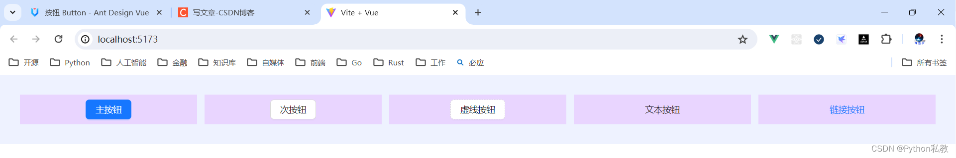
在 Ant Design Vue 中我们提供了五种按钮。
- 主按钮:用于主行动点,一个操作区域只能有一个主按钮。
- 默认按钮:用于没有主次之分的一组行动点。
- 虚线按钮:常用于添加操作。
- 文本按钮:用于最次级的行动点。
- 链接按钮:一般用于链接,即导航至某位置。
以及四种状态属性与上面配合使用。
- 危险:删除/移动/修改权限等危险操作,一般需要二次确认。
- 幽灵:用于背景色比较复杂的地方,常用在首页/产品页等展示场景。
- 禁用:行动点不可用的时候,一般需要文案解释。
- 加载中:用于异步操作等待反馈的时候,也可以避免多次提交。
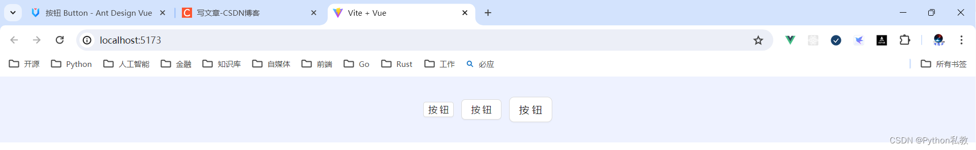
按钮类型
按钮有五种类型:主按钮、次按钮、虚线按钮、文本按钮和链接按钮。主按钮在同一个操作区域最多出现一次。
核心代码:
<template>
  <a-space wrap>
    <a-button type="primary">Primary Button</a-button>
    <a-button>Default Button</a-button>
    <a-button type="dashed">Dashed Button</a-button>
    <a-button type="text">Text Button</a-button>
    <a-button type="link">Link Button</a-button>
  </a-space>
</template>
vue3案例:
<template>
  <div class="flex bg-indigo-50 p-8 gap-3">
    <div class="flex-1 h-12 bg-purple-200 flex items-center justify-center">
      <a-button type="primary">主按钮</a-button>
    </div>
    <div class="flex-1 h-12 bg-purple-200 flex items-center justify-center">
      <a-button>次按钮</a-button>
    </div>
    <div class="flex-1 h-12 bg-purple-200 flex items-center justify-center">
      <a-button type="dashed">虚线按钮</a-button>
    </div>
    <div class="flex-1 h-12 bg-purple-200 flex items-center justify-center">
      <a-button type="text">文本按钮</a-button>
    </div>
    <div class="flex-1 h-12 bg-purple-200 flex items-center justify-center">
      <a-button type="link">链接按钮</a-button>
    </div>
  </div>
</template>
<script setup lang="ts">
</script>
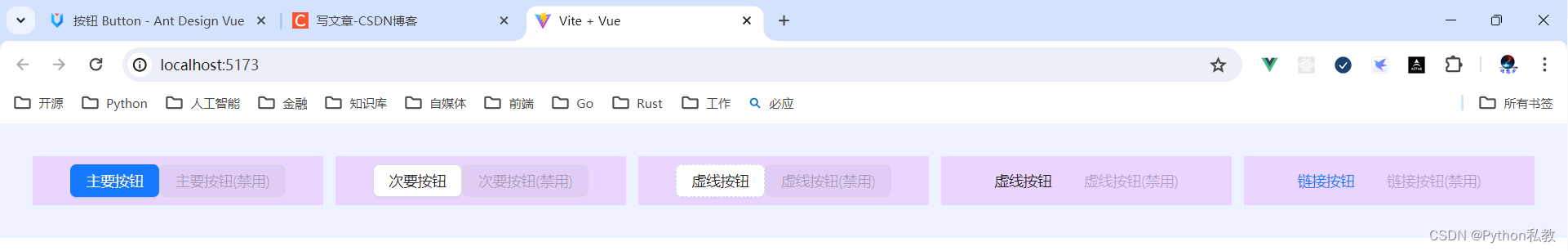
不可用状态
添加 disabled 属性即可让按钮处于不可用状态,同时按钮样式也会改变。
核心代码:
<template>
  <a-space direction="vertical">
    <a-space>
      <a-button type="primary">Primary</a-button>
      <a-button type="primary" disabled>Primary(disabled)</a-button>
    </a-space>
    <a-space>
      <a-button>Default</a-button>
      <a-button disabled>Default(disabled)</a-button>
    </a-space>
    <a-space>
      <a-button type="dashed">Dashed</a-button>
      <a-button type="dashed" disabled>Dashed(disabled)</a-button>
    </a-space>
    <a-space>
      <a-button type="text">Text</a-button>
      <a-button type="text" disabled>Text(disabled)</a-button>
    </a-space>
    <a-space>
      <a-button type="link">Link</a-button>
      <a-button type="link" disabled>Link(disabled)</a-button>
    </a-space>
    <a-space>
      <a-button danger>Danger Default</a-button>
      <a-button danger disabled>Danger Default(disabled)</a-button>
    </a-space>
    <a-space>
      <a-button danger type="text">Danger Text</a-button>
      <a-button danger type="text" disabled>Danger Text(disabled)</a-button>
    </a-space>
    <a-space>
      <a-button danger type="link">Danger Link</a-button>
      <a-button danger type="link" disabled>Danger Link(disabled)</a-button>
    </a-space>
    <div :style="{ padding: '8px', background: 'rgb(190, 200, 200)' }">
      <a-space>
        <a-button ghost>Ghost</a-button>
        <a-button ghost disabled>Ghost(disabled)</a-button>
      </a-space>
    </div>
  </a-space>
</template>
vue3示例:
<script setup>
</script>

<template>
  <div class="flex p-8 bg-indigo-50 gap-3">
    <div class="flex-1 h-12 bg-purple-200 flex items-center justify-center">
      <a-button type="primary">主要按钮</a-button>
      <a-button type="primary" disabled>主要按钮(禁用)</a-button>
    </div>
    <div class="flex-1 h-12 bg-purple-200 flex items-center justify-center">
      <a-button>次要按钮</a-button>
      <a-button disabled>次要按钮(禁用)</a-button>
    </div>
    <div class="flex-1 h-12 bg-purple-200 flex items-center justify-center">
      <a-button type="dashed">虚线按钮</a-button>
      <a-button type="dashed" disabled>虚线按钮(禁用)</a-button>
    </div>
    <div class="flex-1 h-12 bg-purple-200 flex items-center justify-center">
      <a-button type="text">虚线按钮</a-button>
      <a-button type="text" disabled>虚线按钮(禁用)</a-button>
    </div>
    <div class="flex-1 h-12 bg-purple-200 flex items-center justify-center">
      <a-button type="link">链接按钮</a-button>
      <a-button type="link" disabled>链接按钮(禁用)</a-button>
    </div>
  </div>
</template>
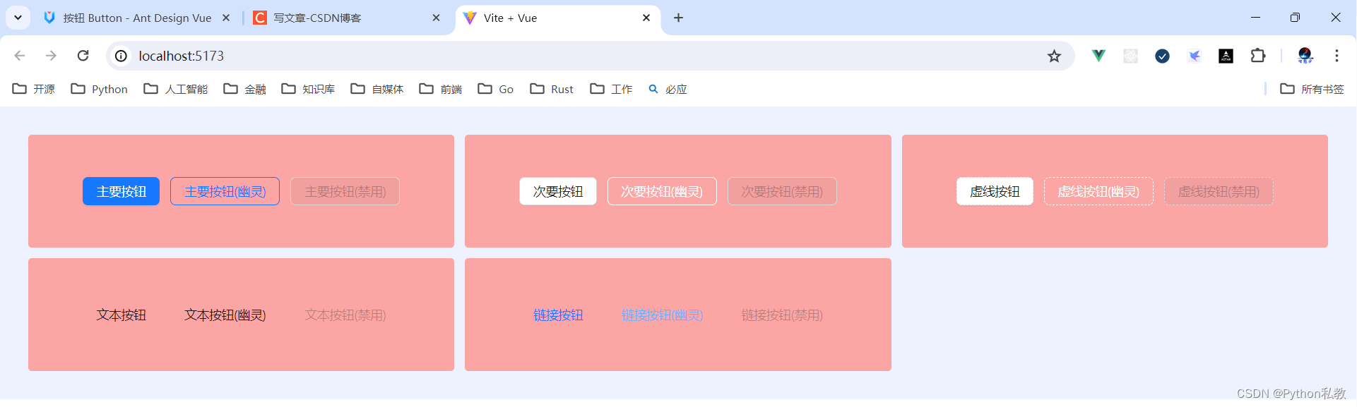
幽灵按钮
幽灵按钮将按钮的内容反色,背景变为透明,常用在有色背景上。
通过添加 ghost 关键字,能够让一个按钮变成幽灵按钮。
核心代码:
<template>
  <div :style="{ background: 'rgb(190, 200, 200)', padding: '16px 16px' }">
    <a-space>
      <a-button type="primary" ghost>Primary</a-button>
      <a-button ghost>Default</a-button>
      <a-button type="dashed" ghost>Dashed</a-button>
      <a-button type="primary" danger ghost>Danger</a-button>
    </a-space>
  </div>
</template>
vue3示例:
<script setup>
</script>

<template>
  <div class="grid grid-cols-3 gap-3 bg-indigo-50 p-8">
    <div class="h-32 bg-red-300 rounded flex space-x-3 justify-center items-center">
      <a-button type="primary">主要按钮</a-button>
      <a-button type="primary" ghost>主要按钮(幽灵)</a-button>
      <a-button type="primary" disabled>主要按钮(禁用)</a-button>
    </div>
    <div class="h-32 bg-red-300 rounded flex space-x-3 justify-center items-center">
      <a-button>次要按钮</a-button>
      <a-button ghost>次要按钮(幽灵)</a-button>
      <a-button disabled>次要按钮(禁用)</a-button>
    </div>
    <div class="h-32 bg-red-300 rounded flex space-x-3 justify-center items-center">
      <a-button type="dashed">虚线按钮</a-button>
      <a-button type="dashed" ghost>虚线按钮(幽灵)</a-button>
      <a-button type="dashed" disabled>虚线按钮(禁用)</a-button>
    </div>
    <div class="h-32 bg-red-300 rounded flex space-x-3 justify-center items-center">
      <a-button type="text">文本按钮</a-button>
      <a-button type="text" ghost>文本按钮(幽灵)</a-button>
      <a-button type="text" disabled>文本按钮(禁用)</a-button>
    </div>
    <div class="h-32 bg-red-300 rounded flex space-x-3 justify-center items-center">
      <a-button type="link">链接按钮</a-button>
      <a-button type="link" ghost>链接按钮(幽灵)</a-button>
      <a-button type="link" disabled>链接按钮(禁用)</a-button>
    </div>
  </div>
</template>
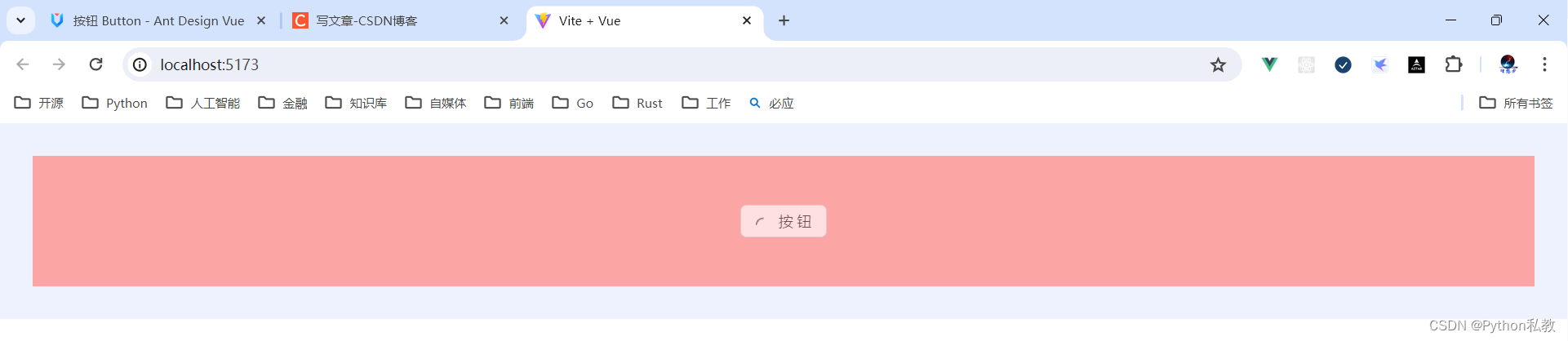
加载中状态
添加 loading 属性即可让按钮处于加载状态,最后两个按钮演示点击后进入加载状态。
核心代码:
<template>
  <a-space direction="vertical">
    <a-space>
      <a-button type="primary" loading>Loading</a-button>
      <a-button type="primary" size="small" loading>Loading</a-button>
    </a-space>
    <a-space>
      <a-button type="primary" :loading="loading" @mouseenter="loading = true">
        mouseenter me!
      </a-button>
      <a-button type="primary" :loading="iconLoading" @click="enterIconLoading">
        <template #icon><PoweroffOutlined /></template>
        延迟1s
      </a-button>
    </a-space>
    <a-space>
      <a-button type="primary" loading />
      <a-button type="primary" shape="circle" loading />
      <a-button danger shape="round" loading />
    </a-space>
  </a-space>
</template>
<script lang="ts" setup>
import { ref } from 'vue';
import { PoweroffOutlined } from '@ant-design/icons-vue';

interface DelayLoading {
  delay: number;
}
const loading = ref<boolean>(false);
const iconLoading = ref<boolean | DelayLoading>(false);
const enterIconLoading = () => {
  iconLoading.value = { delay: 1000 };

  setTimeout(() => {
    iconLoading.value = false;
  }, 6000);
};
</script>
vue3示例:
<script setup>
</script>

<template>
  <div class="flex p-8 bg-indigo-50 gap-3">
    <div class="h-32 bg-red-300 flex items-center justify-center flex-1">
      <a-button loading>按钮</a-button>
    </div>
  </div>
</template>
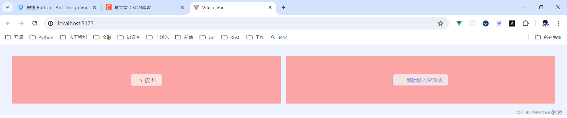
案例:鼠标移入按钮变加载状态
核心代码:
<a-button type="primary" :loading="loading" @mouseenter="loading = true">
  mouseenter me!
</a-button>
vue3示例:
<script setup>
import {ref} from "vue";

const loading = ref(false)
</script>

<template>
  <div class="flex p-8 bg-indigo-50 gap-3">
    <div class="h-32 bg-red-300 flex items-center justify-center flex-1">
      <a-button loading>按钮</a-button>
    </div>

    <div class="h-32 bg-red-300 flex items-center justify-center flex-1">
      <a-button :loading="loading" @mouseenter="loading=true" @mouseleave="loading=false">
        鼠标移入变加载
      </a-button>
    </div>
  </div>
</template>
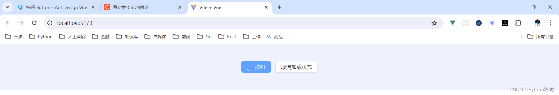
案例:点击按钮变加载状态
核心代码:
<a-button type="primary" :loading="iconLoading" @click="enterIconLoading">
  <template #icon><PoweroffOutlined /></template>
  延迟1s
</a-button>
vue3示例:
<script setup>
import {PoweroffOutlined} from "@ant-design/icons-vue";
import {ref} from "vue";

const iconLoading = ref(false)
const onClickIconButton = () => {
  iconLoading.value = true
}
</script>

<template>
  <div class="h-32 bg-indigo-50 w-screen flex items-center justify-center space-x-3">
    <a-button type="primary"
              class="flex items-center"
              :loading="iconLoading"
              @click="onClickIconButton">
      <template #icon>
        <PoweroffOutlined/>
      </template>
      按钮
    </a-button>

    <a-button @click="iconLoading=false">取消加载状态</a-button>
  </div>
</template>
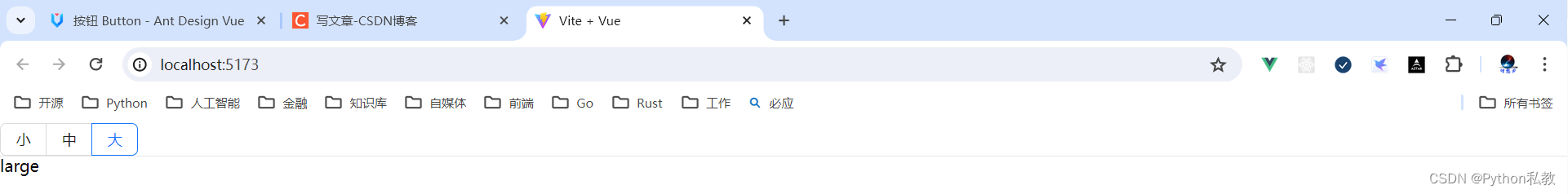
按钮尺寸
按钮有大、中、小三种尺寸。
通过设置 size 为 large small 分别把按钮设为大、小尺寸。若不设置 size,则尺寸为中。
核心代码:
<template>
  <a-space direction="vertical">
    <a-radio-group v-model:value="size">
      <a-radio-button value="large">Large</a-radio-button>
      <a-radio-button value="default">Default</a-radio-button>
      <a-radio-button value="small">Small</a-radio-button>
    </a-radio-group>
    <a-space>
      <a-button type="primary" :size="size">Primary</a-button>
      <a-button :size="size">Normal</a-button>
      <a-button type="dashed" :size="size">Dashed</a-button>
      <a-button danger :size="size">Danger</a-button>
      <a-button type="link" :size="size">Link</a-button>
    </a-space>
    <a-space>
      <a-button type="primary" :size="size">
        <template #icon>
          <DownloadOutlined />
        </template>
      </a-button>
      <a-button type="primary" shape="circle" :size="size">
        <template #icon>
          <DownloadOutlined />
        </template>
      </a-button>
      <a-button type="primary" shape="round" :size="size">
        <template #icon>
          <DownloadOutlined />
        </template>
        Download
      </a-button>
      <a-button type="primary" shape="round" :size="size">
        <template #icon>
          <DownloadOutlined />
        </template>
      </a-button>
      <a-button type="primary" :size="size">
        <template #icon>
          <DownloadOutlined />
        </template>
        Download
      </a-button>
    </a-space>
  </a-space>
</template>
<script lang="ts" setup>
import { DownloadOutlined } from '@ant-design/icons-vue';
import type { SizeType } from 'ant-design-vue/es/config-provider';
import { ref } from 'vue';
const size = ref<SizeType>('large');
</script>
vue3示例:
<script setup>
</script>

<template>
  <div class="flex justify-center items-center space-x-3 p-8 bg-indigo-50">
    <a-button size="small">按钮</a-button>
    <a-button size="middle">按钮</a-button>
    <a-button size="large">按钮</a-button>
  </div>
</template>
案例:展示一行按钮
核心代码:
<a-radio-group v-model:value="size">
  <a-radio-button value="large">Large</a-radio-button>
  <a-radio-button value="default">Default</a-radio-button>
  <a-radio-button value="small">Small</a-radio-button>
</a-radio-group>
vue3示例:
<script setup>
import {ref} from "vue";

const size = ref("middle")
</script>

<template>
  <a-radio-group v-model:value="size">
    <a-radio-button value="small">小</a-radio-button>
    <a-radio-button value="middle">中</a-radio-button>
    <a-radio-button value="large">大</a-radio-button>
  </a-radio-group>
  <hr>
  <p>{{ size}}</p>
</template>
案例:展示多行多列按钮
核心代码:
<a-space direction="vertical">
  <a-radio-group v-model:value="size">
    <a-radio-button value="large">Large</a-radio-button>
    <a-radio-button value="default">Default</a-radio-button>
    <a-radio-button value="small">Small</a-radio-button>
  </a-radio-group>
  <a-space>
    <a-button type="primary" :size="size">Primary</a-button>
    <a-button :size="size">Normal</a-button>
    <a-button type="dashed" :size="size">Dashed</a-button>
    <a-button danger :size="size">Danger</a-button>
    <a-button type="link" :size="size">Link</a-button>
  </a-space>
</a-space>
vue3示例:
<script setup>
import {ref} from "vue";

const size = ref("middle")
</script>
<template>
  <a-space direction="vertical">
    <a-radio-group v-model:value="size">
      <a-radio-button value="small">小</a-radio-button>
      <a-radio-button value="middle">中</a-radio-button>
      <a-radio-button value="large">大</a-radio-button>
    </a-radio-group>
    <a-space>
      <a-button :size="size">次要按钮</a-button>
      <a-button type="primary" :size="size">主要按钮</a-button>
      <a-button type="dashed" :size="size">虚线按钮</a-button>
      <a-button type="text" :size="size">文本按钮</a-button>
      <a-button type="link" :size="size">链接按钮</a-button>
    </a-space>
  </a-space>
</template>
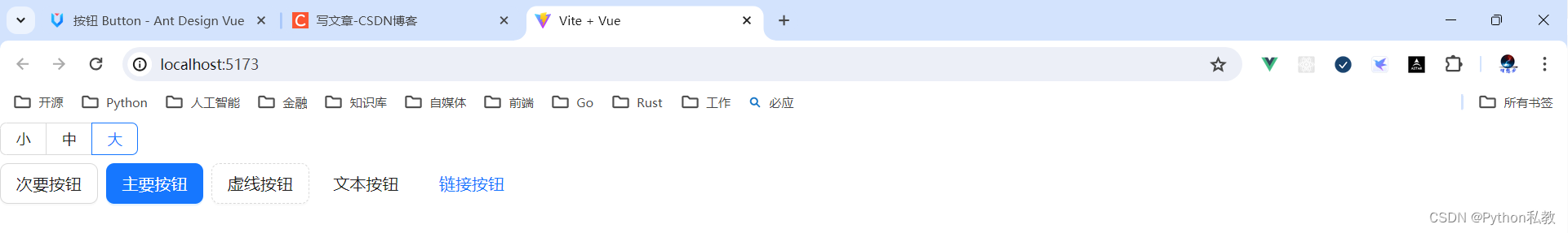
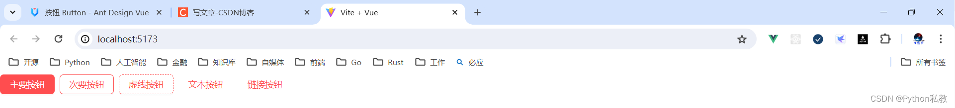
危险按钮
在 2.2.0 之后,危险成为一种按钮属性而不是按钮类型。
核心代码:
<template>
  <a-space warp>
    <a-button type="primary" danger>Primary</a-button>
    <a-button danger>Default</a-button>
    <a-button type="dashed" danger>Dashed</a-button>
    <a-button type="text" danger>Text</a-button>
    <a-button type="link" danger>Link</a-button>
  </a-space>
</template>
vue3示例:
<script setup>
</script>
<template>
  <a-space>
    <a-button danger type="primary">主要按钮</a-button>
    <a-button danger type="default">次要按钮</a-button>
    <a-button danger type="dashed">虚线按钮</a-button>
    <a-button danger type="text">文本按钮</a-button>
    <a-button danger type="link">链接按钮</a-button>
  </a-space>
</template>
图标按钮
当需要在 Button 内嵌入 Icon 时,可以设置 icon 属性,或者直接在 Button 内使用 Icon 组件。
如果想控制 Icon 具体的位置,只能直接使用 Icon 组件,而非 icon 属性。
核心代码:
<template>
  <a-space direction="vertical">
    <a-space warp>
      <a-tooltip title="search">
        <a-button type="primary" shape="circle" :icon="h(SearchOutlined)" />
      </a-tooltip>
      <a-button type="primary" shape="circle">A</a-button>
      <a-button type="primary" :icon="h(SearchOutlined)">Search</a-button>
      <a-tooltip title="search">
        <a-button shape="circle" :icon="h(SearchOutlined)" />
      </a-tooltip>
      <a-button :icon="h(SearchOutlined)">Search</a-button>
    </a-space>
    <a-space warp>
      <a-tooltip title="search">
        <a-button shape="circle" :icon="h(SearchOutlined)" />
      </a-tooltip>
      <a-button :icon="h(SearchOutlined)">Search</a-button>
      <a-tooltip title="search">
        <a-button type="dashed" shape="circle" :icon="h(SearchOutlined)" />
      </a-tooltip>
      <a-button type="dashed" :icon="h(SearchOutlined)">Search</a-button>
      <a-button :icon="h(SearchOutlined)" href="https://www.google.com" />
    </a-space>
  </a-space>
</template>
<script lang="ts" setup>
import { h } from 'vue';
import { SearchOutlined } from '@ant-design/icons-vue';
</script>
vue3示例:
<script setup>
import {h} from "vue"
import {SearchOutlined} from "@ant-design/icons-vue"
</script>
<template>
  <a-button :icon="h(SearchOutlined)" class="flex items-center">按钮</a-button>
</template>
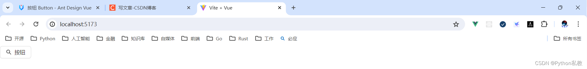
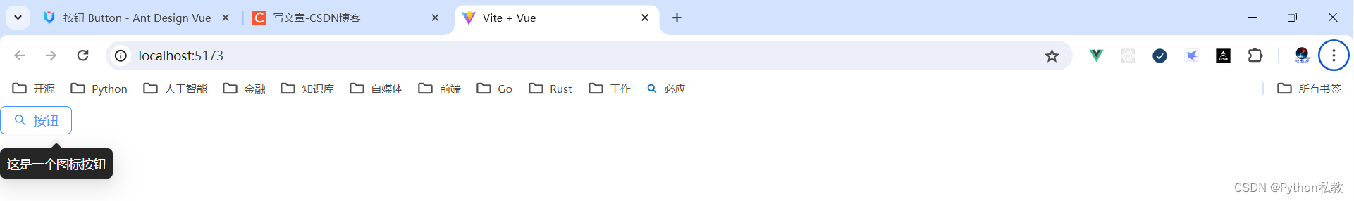
案例:按钮提示
核心代码:
<a-tooltip title="search">
  <a-button type="primary" shape="circle" :icon="h(SearchOutlined)" />
</a-tooltip>
vue3示例:
<script setup>
import {h} from "vue"
import {SearchOutlined} from "@ant-design/icons-vue"
</script>
<template>
  <a-tooltip title="这是一个图标按钮">
    <a-button :icon="h(SearchOutlined)" class="flex items-center">按钮</a-button>
  </a-tooltip>
</template>
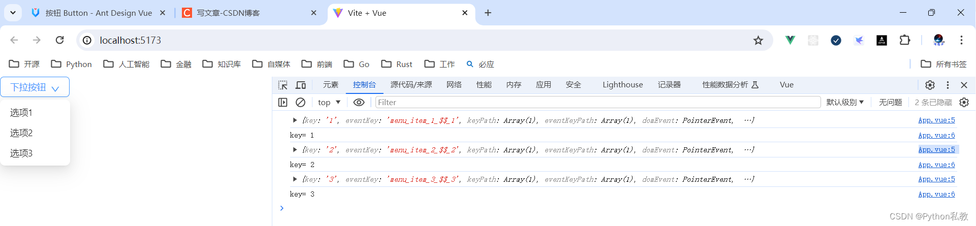
下拉按钮
按钮组合使用时,推荐使用 1 个主操作 + n 个次操作,3 个以上操作时把更多操作放到 Dropdown.Button 中组合使用。
核心代码:
<template>
  <a-space>
    <a-button type="primary">Primary</a-button>
    <a-button>secondary</a-button>
    <a-dropdown>
      <template #overlay>
        <a-menu @click="handleMenuClick">
          <a-menu-item key="1">1st item</a-menu-item>
          <a-menu-item key="2">2nd item</a-menu-item>
          <a-menu-item key="3">3rd item</a-menu-item>
        </a-menu>
      </template>
      <a-button>
        Actions
        <DownOutlined />
      </a-button>
    </a-dropdown>
  </a-space>
</template>
<script lang="ts" setup>
import { DownOutlined } from '@ant-design/icons-vue';
import type { MenuProps } from 'ant-design-vue';
const handleMenuClick: MenuProps['onClick'] = e => {
  console.log('click', e);
};
</script>
vue3示例:
<script setup>
import {DownOutlined} from "@ant-design/icons-vue"
const handleDropdownMenuClick = (e) => {
console.log(e)
console.log("key=", e.key)
}
</script>
<template>
<a-dropdown>
<template #overlay>
<a-menu @click="handleDropdownMenuClick">
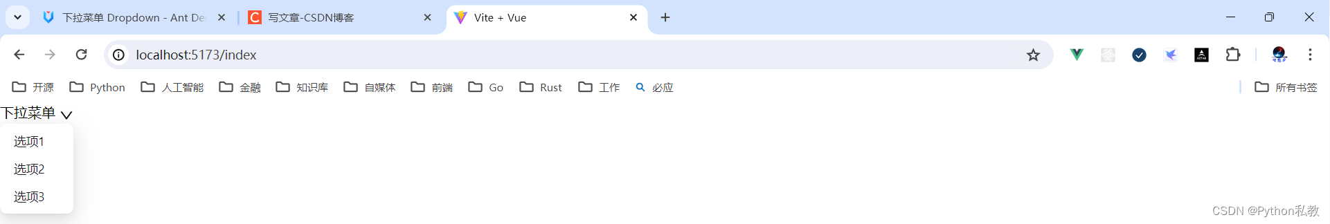
<a-menu-item key="1">选项1</a-menu-item>
<a-menu-item key="2">选项2</a-menu-item>
<a-menu-item key="3">选项3</a-menu-item>
</a-menu>
</template>
<a-button>
下拉按钮
<DownOutlined/>
</a-button>
</a-dropdown>
</template>
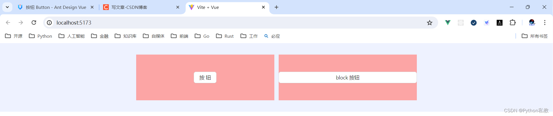
Block 按钮
block 属性将使按钮适合其父宽度。
核心代码:
<template>
  <a-space wrap>
    <a-button type="primary" block>Primary</a-button>
    <a-button block>Default</a-button>
    <a-button type="dashed" block>Dashed</a-button>
    <a-button danger block>Danger</a-button>
    <a-button type="link" block>Link</a-button>
  </a-space>
</template>
vue3示例:
<template>
  <div class="flex p-8 items-center justify-center bg-indigo-50 gap-3">
    <div class="w-96 h-32 bg-red-300 flex justify-center items-center">
      <a-button>按钮</a-button>
    </div>
    <div class="w-96 h-32 bg-red-300 flex justify-center items-center">
      <a-button block>block 按钮</a-button>
    </div>
  </div>
</template>
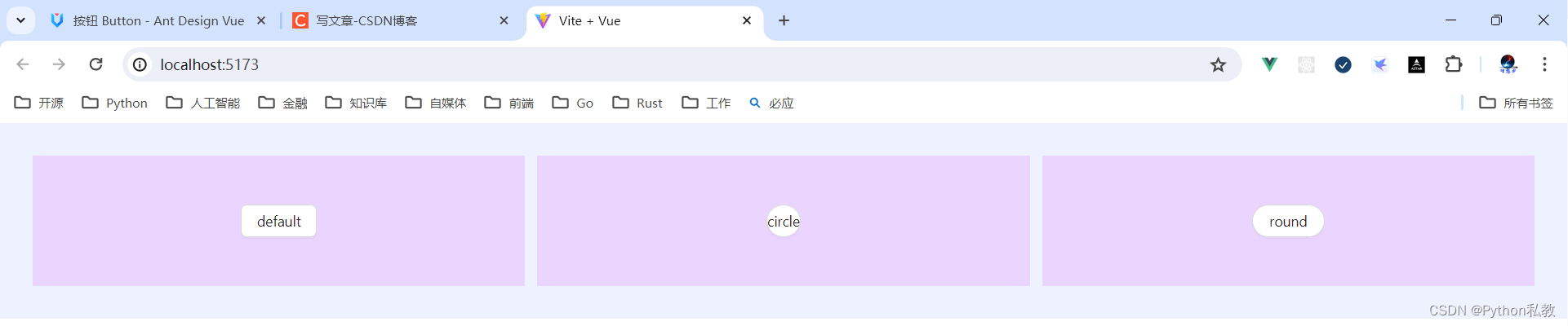
案例:按钮形状
核心代码:
<a-button type="primary" shape="circle" :icon="h(SearchOutlined)" />
按钮形状支持的值有:default | circle | round
vue3示例:
<template>
  <div class="flex p-8 bg-indigo-50 gap-3">
    <div class="h-32 flex-1 bg-purple-200 flex justify-center items-center">
      <a-button shape="default">default</a-button>
    </div>
    <div class="h-32 flex-1 bg-purple-200 flex justify-center items-center">
      <a-button shape="circle">circle</a-button>
    </div>
    <div class="h-32 flex-1 bg-purple-200 flex justify-center items-center">
      <a-button shape="round">round</a-button>
    </div>
  </div>
</template>
案例:点击按钮跳转网页
按钮有两个属性:
href:点击跳转的地址,指定此属性 button 的行为和 a 链接一致
target:相当于 a 链接的 target 属性,href 存在时生效
vue3示例:
<template>
  <a-button href="http://www.baidu.com" target="_blank">百度</a-button>
</template>
API
通过设置 Button 的属性来产生不同的按钮样式,推荐顺序为:type -> shape -> size -> loading -> disabled。
按钮的属性说明如下:
| 属性 | 说明 | 类型 | 默认值 | 版本 |
| block | 将按钮宽度调整为其父宽度的选项 | boolean | false |
|
| danger | 设置危险按钮 | boolean | false |
2.2.0 |
| disabled | 按钮失效状态 | boolean | false |
|
| ghost | 幽灵属性,使按钮背景透明 | boolean | false |
|
| href | 点击跳转的地址,指定此属性 button 的行为和 a 链接一致 | string | - | |
| htmlType | 设置 button 原生的 type 值,可选值请参考 HTML 标准 |
string | button |
|
| icon | 设置按钮的图标类型 | v-slot | - | |
| loading | 设置按钮载入状态 | boolean | { delay: number } | false |
|
| shape | 设置按钮形状 | default |
circle |
round |
| size | 设置按钮大小 | large |
middle |
small |
| target | 相当于 a 链接的 target 属性,href 存在时生效 | string | - | |
| type | 设置按钮类型 | primary |
ghost |
dashed |
事件
支持原生 button 的其他所有属性。
| 事件名称 | 说明 | 回调参数 | 版本 |
| click | 点击按钮时的回调 | (event) => void |
方法
| 名称 | 描述 | 版本 |
| blur() | 移除焦点 | |
| focus() | 获取焦点 |


![[C#]使用OpenCvSharp图像滤波中值滤波均值滤波高通滤波双边滤波锐化滤波自定义滤波](https://img-blog.csdnimg.cn/direct/a4d6680252384ddfbc8c001467e75f89.png)