1.简介WPF:
C# 一套关于windows界面应用开发框架
2.WPF和winform的差别
,(WPF比较新)
创建新项目使用模板:
WPF使用.xaml后缀,双击可查看操作界面和设置代码,其文件展开之后中有MainWindow.xaml.cs为程序交互逻辑。
winform为Form.cs,双击可进入交互逻辑界面编写,其文件展开之后下层中有Form1.Designal.cs包含 Windows 窗体设计器生成的代码,可进行查看。
界面效果实现的难易程度:WPF去实现:直接搜索需要的控件形式,然后把对应的代码加入即可。
WPF绑定:可以将界面上的某个属性跟流程中做绑定,可以进行同步更新
3.基础项目文件知识
生成文件目录:代码文件下bin目录下的对应的Debug/Realse
项目中用到的资源文件目录:代码文件下Properties/Resources.resx添加进去
App.xaml中可设置启动页
MainWindow.xaml为页面,可添加多个WPF窗口(例如:Window1.xaml)
4.布局控件Grid和StackPanel
(Grid需要自己手动移动控件位置,而StackPanel会自动进行堆积)
分为客户区和非客户区:
“Grid”为布局控件,在非客户区可用,为行列布局,布局可动态分配
而“StackPanel”会根据给的控件依次排列
WPF像素无关
//按行排列:
<Grid.RowDefinitions>
    <RowDefinition Height="20"/>	 <!--同时设置宽度-->
    <RowDefinition Height="20"/>    <!--多增加一行-->
    <RowDefinition/>
</Grid.RowDefinitions>

//按列排列
<Grid ShowGridLines="True" Grid.Row="2" Grid.Column="0">
    <Grid.ColumnDefinitions>
        <ColumnDefinition Width="70"/>
        <ColumnDefinition/>
    </Grid.ColumnDefinitions>
</Grid>
实现:

代码:
练习代码链接
5.Style 样式:用法介绍
可以统一设置一类控件的形式
举例:作用于所有button,在每次添加一个button时,会自动调用这个样式
<Window.Resources>
    <Style TargetType="Button">     <!--作用于button-->
        <Setter Property="Background" Value="Red"/>
        <Setter Property="FontSize" Value="20"/>
        <Setter Property="Height" Value="50"/>

    </Style>
</Window.Resources>
【样式多样性】,在想要使用样式时才使用
<Window.Resources>
<Style x:Key="LoginStyle" TargetType="Button">
<Setter Property="Background" Value="Green"/>
<Setter Property="FontSize" Value="20"/>
<Setter Property="Height" Value="50"/>
</Style>
<Style x:Key="QuitStyle" TargetType="Button">
<Setter Property="Background" Value="Green"/>
<Setter Property="FontSize" Value="20"/>
<Setter Property="Height" Value="50"/>
</Style>
</Window.Resources>
//使用
<Grid>
<StackPanel>
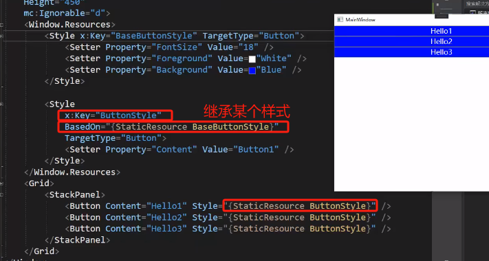
<Button Style="{StaticResource LoginStyle}" Content="登录" /> <!--定向使用-->
<Button Style="{StaticResource QuitStyle}" Content="退出" /> <!--定向使用-->
<Button Content="忘记密码" />
</StackPanel>
</Grid>

【另一种形式:先定义button使用的基础样式,在基于这个基础的样式定义个性化的样式】
<Style TargetType="Button">
    <Setter Property="Background" Value="WhiteSmoke"/>
    <Setter Property="FontSize" Value="20"/>
    <Setter Property="Margin" Value="20,10"/>
</Style>

<!--延用之前的统一style,创建新的style-->
<Style x:Key="loginStyle" TargetType="Button" BasedOn="{StaticResource {x:Type Button}}">
    <Setter Property="Background" Value="Green"/>

</Style>

<!--延用之前的统一style,创建新的style-->
<Style x:Key="QuitStyle" TargetType="Button" BasedOn="{StaticResource {x:Type Button}}">
    <Setter Property="Background" Value="Red"/>

</Style>

//样式使用时跟上面举例是相同的
【style外部引用】:方便管理,可以供所有的界面去使用
1.添加资源字典的类BaseButtonStyleDictionary1,把想要全局使用的style加在这里
<ResourceDictionary xmlns="http://schemas.microsoft.com/winfx/2006/xaml/presentation"
                    xmlns:x="http://schemas.microsoft.com/winfx/2006/xaml">


    <!--//把之前写下style的复制到这里来-->
    <Style TargetType="Button">
        <Setter Property="Background" Value="WhiteSmoke"/>
        <Setter Property="FontSize" Value="20"/>
        <Setter Property="Margin" Value="20,10"/>
    </Style>
	.........

</ResourceDictionary>
2.把创建的BaseButtonStyleDictionary1加入到App.xaml中,成为全局可识别变量
<Application.Resources>

    <!--//加入资源字典-->
    <ResourceDictionary>
        <ResourceDictionary.MergedDictionaries>
            <ResourceDictionary Source="/WpfApp1;component/BaseButtonStyleDictionary1.xaml"/>
        </ResourceDictionary.MergedDictionaries>
    </ResourceDictionary>

</Application.Resources>
3.在下面的窗口MainWindow.xaml等文件中,正常Style引用即可识别
6.自定义按钮以及设置触发器
自定义模板:例如之前的圆角按钮
<Button Width="300" Height="100" Content="自定义按钮" Background="#0078d4" FontSize="50" Foreground="White">
    <Button.Template>
        <ControlTemplate TargetType="{x:Type Button}">
            <Border Background="Red" BorderBrush="Black" BorderThickness="4" CornerRadius="10">
                <ContentPresenter HorizontalAlignment="Center" VerticalAlignment="Center"/>
            </Border>

        </ControlTemplate>
    </Button.Template>
</Button>
生成圆角按钮:

但第一行设置的会被覆盖掉。后面值设为可改,与原始按钮设置的值相同,进行同步更改不会进行覆盖:,以及触发器的部分
<Button.Template>
    <ControlTemplate TargetType="{x:Type Button}">
        <Border x:Name="boder" Background="{TemplateBinding Background}" BorderBrush="{TemplateBinding BorderBrush}"
                BorderThickness="{TemplateBinding BorderThickness}" CornerRadius="10">
            <!--<ContentPresenter HorizontalAlignment="Center" VerticalAlignment="Center"/>-->
            <TextBlock x:Name="txtContent" Text="{TemplateBinding Content}" HorizontalAlignment="Center" VerticalAlignment="Center"/>
        </Border>

        <!--//触发器设置-->
        <ControlTemplate.Triggers>
            <Trigger Property="IsMouseOver" Value="True" >
                <!--//当鼠标移入则启动触发操作-->
                <Setter TargetName="boder" Property="Background" Value="black"/>
                <Setter TargetName="txtContent" Property="FontSize" Value="100"/>
            </Trigger>

            <Trigger Property="IsPressed" Value="True" >
                <!--//当鼠标点击则启动触发操作-->
                <Setter TargetName="boder" Property="Background" Value="white"/>
            </Trigger>
        </ControlTemplate.Triggers>

    </ControlTemplate>
</Button.Template>
7.C#代码事件
界面上的的操作都跟相应的C#代码对应执行
增加界面点击事件,直接在按钮创建的时候添加Click=“Button_Click_1” ,
<Button Content="你好" Width="200" Height="30" Click="Button_Click_1" HorizontalAlignment="Center" VerticalAlignment="Center"/>
则进入对应的.xaml.cs则可看见自动创建了
private void Button_Click_1(object sender, RoutedEventArgs e)
{

}
在其中增加时间处理的流程
<StackPanel>
    <TextBlock x:Name="txtTotal" Text ="计算结果" Visibility="Hidden"/>
    <Button Content="你好" Width="200" Height="30" Click="Button_Click_1" HorizontalAlignment="Center" VerticalAlignment="Center"/>

</StackPanel>
private void Button_Click_1(object sender, RoutedEventArgs e)
{
    int num1 = 200;
    int num2 = 300;
    int total = num1 + num2;
    txtTotal.Text = total.ToString();
    //更改枚举类型(ctrl + “J”)会默认进行代码提示
    txtTotal.Visibility = Visibility.Visible;
}
查看所有的事件:点击控件之后有属性界面,点击【⚡】标识符可查看所有信号。且进入该信号边界可显示该信号内容,双击则可自动生成对应执行函数。

例如:鼠标移入和鼠标移出的事件
//鼠标移入控件范围内
private void Button_MouseEnter(object sender, MouseEventArgs e)
{
    txtTotal.Text = "你的鼠标进入button的范围了";
}

//鼠标移出控件范围内
private void Button_MouseLeave(object sender, MouseEventArgs e)
{
    txtTotal.Text = "你的鼠标移出button的范围了";
}


