原文链接:R语言绘图 | 散点小提琴图
本期教程
写在前面
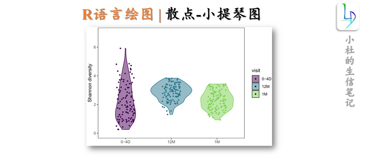
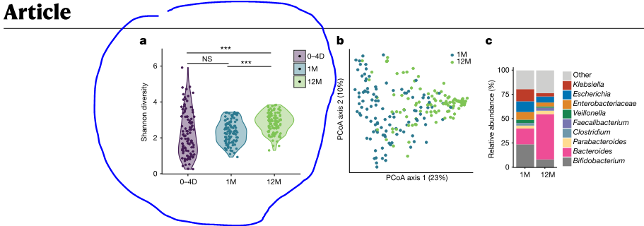
本期的图形来自发表在Nature期刊中的文章,这样的基础图形在日常分析中使用频率较高。
获得本期教程数据及代码,后台回复关键词:20240405
绘图
- 设置路径
setwd("Your Path")
- 导入所需R包
library(tidyverse)
library(readxl)
library(ggsci)
library(viridis)
library(RColorBrewer)
- 导入数据
df_data <- read_excel("data_input.xlsx",sheet = "Sheet1")
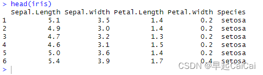
df_data[1:10,1:3]
> df_data[1:10,1:3]
# A tibble: 10 × 3
   SampleID                     visit shannon
   <chr>                        <chr>   <dbl>
 1 s.10833.35.STL.374294        1M      1.42
 2 s.10833.35.STL.433697        12M     3.10
 3 s.10833.35.STL.370901        0-4D    4.16
 4 IgramRun3.104.2.STL.V07.12mo 12M     3.82
 5 s104.STL.V02.1mo             1M      1.98
 6 s104.STL.V01.1.4d            0-4D    0.862
 7 s.10833.46.STL.372741        0-4D    0.827
 8 s.10833.46.STL.435681        12M     3.01
 9 s.10833.46.STL.375471        1M      2.57
10 IgramRun3.111.2.STL.V07.12mo 12M     2.26
- 设置主题
theme_clean <- function(){
  theme_bw() %+replace%
    theme(
      panel.grid = element_blank(),
      strip.background = element_blank()
    )
}
- 绘图
- 绘制基础图形
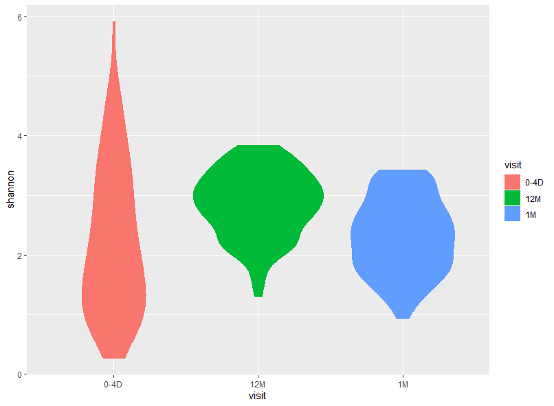
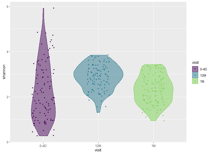
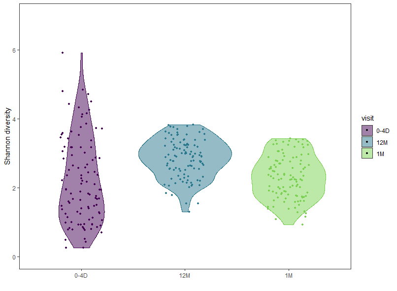
p1 <- ggplot(df_data,aes(x=visit, y=shannon, color=visit, fill=visit))+
  geom_violin()
- 添加散点
p2 <- p1 +
  geom_jitter(width = 0.2, size = 0.9)+
  scale_color_viridis(end = 0.8, discrete = T)

- 设置颜色
p3 <- p2 +
  scale_fill_viridis(end = 0.8, discrete = T, alpha = 0.5)
- 进一步参数修改
p3 +
  scale_y_continuous(limits = c(0,7))+
  guides(color="none")+
  theme_clean()+
  ##'@
  labs(
  x="",
  y="Shannon diversity"
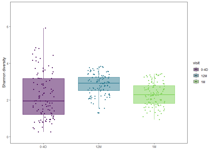
照葫芦画瓢-绘制箱线图
ggplot(df_data,aes(x=visit, y=shannon, color=visit, fill=visit))+
  geom_boxplot()
绘图全部代码
pdf("202405散点小提琴图.pdf",width = 6, height = 4)
ggplot(df_data,aes(x=visit, y=shannon, color=visit, fill=visit))+
  geom_violin()+
  ##'@添加散点
  geom_jitter(width = 0.2, size = 0.9)+
  scale_color_viridis(end = 0.8, discrete = T)+
  ##'@设置颜色
  scale_fill_viridis(end = 0.8, discrete = T, alpha = 0.5)+
  ##'@设置Y轴坐标轴
  scale_y_continuous(limits = c(0,7))+
  guides(color="none")+
  theme_clean()+
  ##'@
  labs(
  x="",
  y="Shannon diversity"
  )

dev.off()
若我们的分享对你有用,希望您可以点赞+收藏+转发,这是对小杜最大的支持。
原文链接:R语言绘图 | 散点小提琴图
往期文章:
1. 复现SCI文章系列专栏
2. 《生信知识库订阅须知》,同步更新,易于搜索与管理。
3. 最全WGCNA教程(替换数据即可出全部结果与图形)
4. 精美图形绘制教程
5. 转录组分析教程
6. 转录组下游分析
小杜的生信筆記 ,主要发表或收录生物信息学的教程,以及基于R的分析和可视化(包括数据分析,图形绘制等);分享感兴趣的文献和学习资料!!