前期内容回顾:
1.常见样式
text-shadow x轴 y轴 阴影的模糊程度 阴影的颜色
box-shadow
border-radio 实现圆角
margin 内边距
padding 外边距
background
2.特殊样式
媒体查询:@media
自定义字体:@font-face {
font-family:自定义名称;
src:url(“字体的路径”);
}
选择{
font-family:自定义名称;
}
转换:transform
移动:translate()
旋转:rotate()
缩放:scale()
翻转:skew()
综合:matrix()
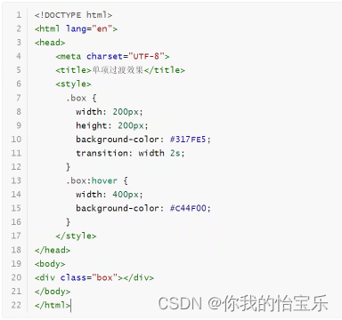
过渡:transition 属性 时间 效果(默认值:ease) 延迟(默认值:0)
动画:@keyframes animate
@keyframes 自定义动画名称{
帧名称1{
属性名:值
}
帧名称2{
属性名:值
}
…..
}
选择器{
animate:自定义动画名称;
}
属性有:动画名称(animate-name)、动画时长(animate-duration)、延迟、次数(默认值:1)、方向、状态
渐变:background-image:linear-gradient(direction,color-stop1,color-stop2,…)
background-image:radius-gradient(direction,color-stop1,color-stop2,…)
多列:column-count
字体图标:
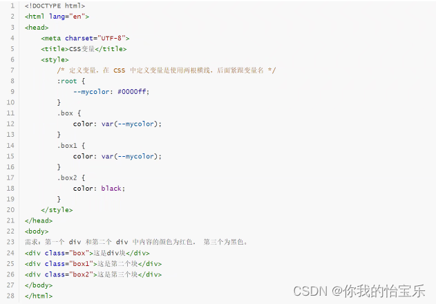
变量:定义变量使用 --名称:值; 使用变量: 属性名:var(--名称);
倒影: -webkit-box-reflect 了解
3.页面布局
table 布局 了解
div+css 盒子模型 左外边距 左边线 左内边距 内容 右内边距 右边线 右外边距
box-sizing:border-box;
坐标问题
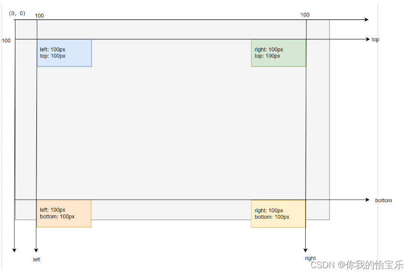
<!DOCTYPE html>
<html lang="en">
<head>
<meta charset="UTF-8">
<title>坐标问题</title>
<style>
* {
margin: 0;
padding: 0;
}
div {
width: 130px;
height: 50px;
text-align: left;
padding-left: 10px;
}
div:nth-child(1) {
background: #DAE8FC;
position: absolute;
left: 100px;
top: 100px;
}
div:nth-child(2) {
background: #D5E8D4;
position: absolute;
top: 100px;
right: 100px;
}
div:nth-child(3) {
background: #FFE6CC;
position: absolute;
left: 100px;
bottom: 100px;
}
div:nth-child(4) {
background: #FFF2CC;
position: absolute;
right: 100px;
bottom: 100px;
}
</style>
</head>
<body>
<div>left: 100px;<br>top: 100px;</div>
<div>right: 100px;<br>top: 100px;</div>
<div>left: 100px;<br>bottom: 100px;</div>
<div>right: 100px;<br>bottom: 100px;</div>
</body>
</html>
定位问题
在CSS中定位有以下几种:
1.相对定位
相对定位的参考位置:如果是第一个元素,那么它相对的就是 body(父元素) 的位置;如果是第二个元素开始,它相对的就是前一个元素的位置。
<!DOCTYPE html>
<html lang="en">
<head>
<meta charset="UTF-8">
<title>相对定位</title>
<style>
* {
margin: 0;
padding: 0;
}
.container {
width: 100%;
height: 400px;
background-color: #cccccc;
position: relative;
left: 30px;
top: 30px;
}
.box {
width: 100px;
height: 100px;
background-color: #317FE5;
position: relative; /* 相对定位 */
left: 10px;
top: 10px;
}
.haha {
width: 100px;
height: 100px;
background-color: #8B0000;
position: relative;
left: 10px;
top: 10px;
}
</style>
</head>
<body>
<div class="container">
<div class="box"></div>
<div class="haha"></div>
</div>
</body>
</html>
2.绝对定位
绝对定位就已经脱离了文档流,我们只需要给它固定 x轴坐标(left 或 right 值)以及 y 轴坐标(top 或 bottom 值)就可以了。
<!DOCTYPE html>
<html lang="en">
<head>
<meta charset="UTF-8">
<title>绝对定位</title>
<style>
* {
margin: 0;
padding: 0;
}
.container {
width: 800px;
height: 500px;
background-color: #eeeeee;
position: relative;
}
.box {
width: 150px;
height: 150px;
background-color: #317FE5;
position: absolute; /* 绝对定位 */
/*left: 500px;*/
/*top: 300px;*/
left: 500px;
bottom: 50px;
}
</style>
</head>
<body>
<div class="container">
<div class="box"></div>
</div>
</body>
</html>
3.固定定位
固定定位固名思意就是它的位置不会随滚动条的变化而发生变化。
<!DOCTYPE html>
<html lang="en">
<head>
<meta charset="UTF-8">
<title>固定定位</title>
<style>
* {
margin: 0;
padding: 0;
}
body {
height: 3000px;
}
.box {
width: 100%;
height: 60px;
background-color: #317FE5;
box-shadow: 5px 5px 10px #999999;
position: fixed;
left: 0;
top: 0;
}
.aside {
width: 60px;
height: 300px;
background: #8B0000;
position: fixed;
left: 0;
top: 100px;
}
.footer {
width: 100%;
height: 80px;
background: #eeeeee;
position: fixed;
left: 0;
bottom: 0;
}
</style>
</head>
<body>
<div class="box"></div>
<div class="aside"></div>
<div class="footer"></div>
</body>
</html>
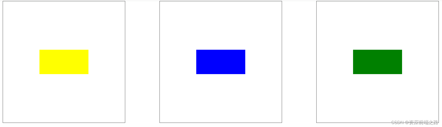
图片居中

<!DOCTYPE html>
<html lang="en">
<head>
<meta charset="UTF-8">
<title>图片居中问题</title>
<style>
.box {
width: 200px;
height: 200px;
border: 1px solid #8B0000;
position: relative;
}
img {
width: 100px;
height: 100px;
position: absolute;
/*left: 25%;*/
/*top: 25%;*/
left: 50px;
top: 50px;
}
</style>
</head>
<body>
<div class="box">
<img src="image/logo.png">
</div>
</body>
</html>


![记一次Cannot deploy POJO class [xxx$$EnhancerBySpringCGLIB$$xxx]的错误](https://img-blog.csdnimg.cn/direct/0f6a56cddfca42ad860c6c317c94015e.png)


![[StartingPoint][Tier1]Sequel](https://img-blog.csdnimg.cn/img_convert/8bc7c07778903f770c15cb1a9e938f19.jpeg)