目录
内容回顾:
特殊样式
媒体查询:@media
自定义字体:@font-face {
font-family:自定义名称;
src:url(“字体的路径”);
}
选择{
font-family:自定义名称;
}
转换:transform
移动:translate()
旋转:rotate()
缩放:scale()
翻转:skew()
综合:matrix()
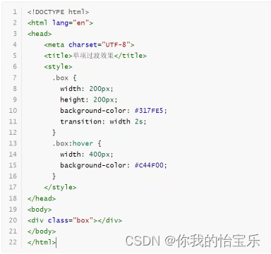
过渡:transition 属性 时间 效果(默认值:ease) 延迟(默认值:0)
动画:@keyframes animate
@keyframes 自定义动画名称{
帧名称1{
属性名:值
}
帧名称2{
属性名:值
}
…..
}
选择器{
animate:自定义动画名称;
}
属性有:动画名称(animate-name)、动画时长(animate-duration)、延迟、次数(默认值:1)、方向、状态
渐变:background-image:linear-gradient(direction,color-stop1,color-stop2,…)
background-image:radius-gradient(direction,color-stop1,color-stop2,…)
多列:column-count
字体图标
特殊样式
CSS变量
在CSS3中支持定义变量,然后可以在不同的地方来使用这个变量所对应的值。它的好处就是可以减少代码的编写,从而提交代码的复用性。
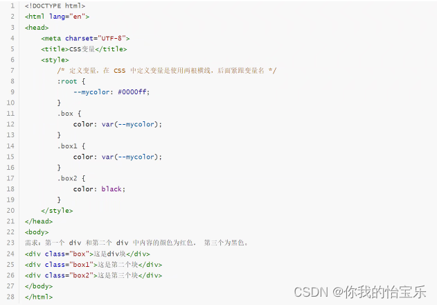
要注意:变量只能是用于值的地方,而不能用到属性的地方。
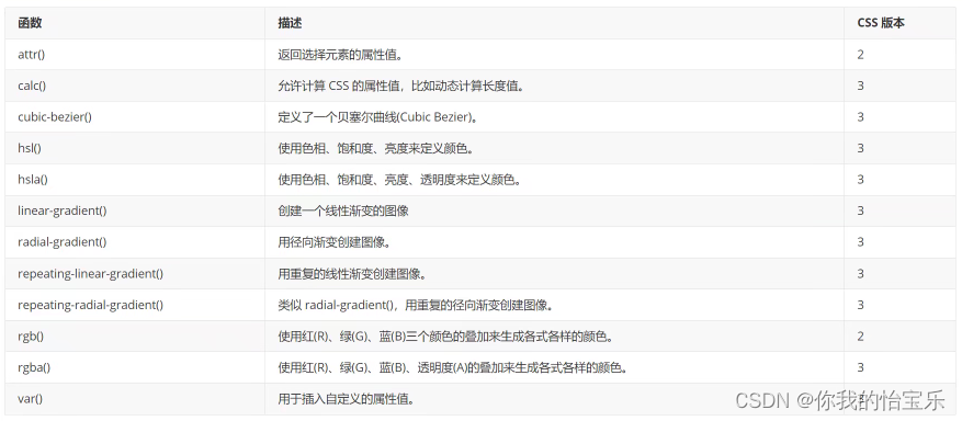
常见函数
<!DOCTYPE html>
<html lang="en">
<head>
<meta charset="UTF-8">
<title>常见函数的使用</title>
<style>
body {
background: #cccccc;
}
div {
position: absolute;
top: 30px;
left: 5px;
width: calc(100% - 50px);
height: 200px;
background: rgba(0, 200, 200, .9);
}
</style>
</head>
<body>
<div></div>
</body>
</html>
倒影效果
<!DOCTYPE html>
<html lang="en">
<head>
<meta charset="UTF-8">
<title>倒影效果</title>
<style>
.box {
width: 500px;
height: 200px;
border: 1px solid #cccccc;
-webkit-box-reflect: below 2px linear-gradient(transparent,transparent 50%,rgba(0,0,0,.8));
}
</style>
</head>
<body>
<div class="box">
<img src="image/5.jpeg" width="500">
</div>
</body>
</html>
页面布局
在实际工作中,页面布局有以下几种:
--- table 布局
--- div+css布局
--- 弹性布局
--- 网络布局
Table 布局(了解即可)
这种布局方式早起经常使用,大概在2000年开始就基本不适用这种布局方式了,因为解析性能差。
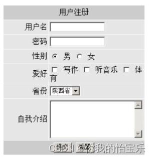
利用table布局,完成下图。
代码如下:
<!DOCTYPE html>
<html lang="en">
<head>
<meta charset="UTF-8">
<title>table 布局</title>
</head>
<body>
<table width="100%">
<tr bgcolor="#cccccc">
<td height="60" align="center">顶部内容</td>
</tr>
<tr>
<td align="center">
<form action="" method="post">
<table width="300">
<tr bgcolor="#CCCCCC">
<th colspan="2">用户注册</th>
</tr>
<tr bgcolor="#E6E6E6">
<td width="30%" align="right">用户名</td>
<td width="70%"><input type="text" name="username"></td>
</tr>
<tr bgcolor="#E6E6E6">
<td align="right">密码</td>
<td><input type="password" name="password"></td>
</tr>
<tr bgcolor="#E6E6E6">
<td align="right">性别</td>
<td><input type="radio" name="gender" checked value="男"> 男 <input type="radio" name="gender" value="女"> 女</td>
</tr>
<tr bgcolor="#E6E6E6">
<td align="right">爱好</td>
<td><input type="checkbox" name="hobby" value="写作"> 写作 <input type="checkbox" name="hobby" value="听音乐"> 听音乐 <input type="checkbox" name="hobby" value="体育"> 体育</td>
</tr>
<tr bgcolor="#E6E6E6">
<td align="right">省份</td>
<td>
<select name="province">
<option value="陕西省">陕西省</option>
</select>
</td>
</tr>
<tr bgcolor="#E6E6E6">
<td align="right">自我介绍</td>
<td><textarea name="intro" cols="25" rows="5"></textarea> </td>
</tr>
<tr bgcolor="#CCCCCC">
<td colspan="2" align="center">
<input type="submit" value="提交">
<input type="reset" value="重置">
</td>
</tr>
</table>
</form>
</td>
</tr>
<tr bgcolor="#cccccc">
<td align="center" height="30">底部</td>
</tr>
</table>
</body>
</html>
DIV+CSS布局
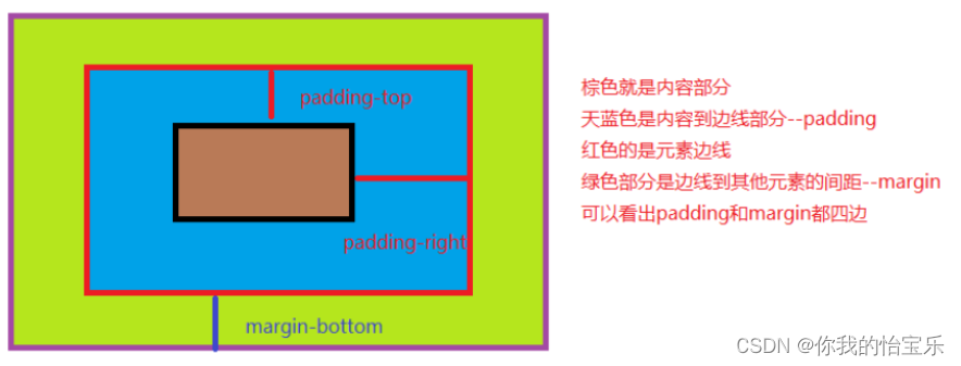
盒子模型
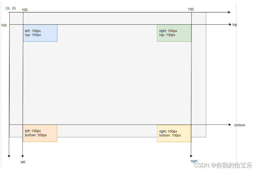
div是一个标准块标签,而HTML的块标签都存在了 margin, padding, border 等属性,我们就可以通过这些内边距、边框、外边距来控制不同的标签的布局和存放位置,这个就是我们经常说的盒子模型。
自从 1996 年 CSS1 的推出,W3C 组织就建议把所有网页上的对象都放在一个盒子(box)中,我们可以通过控制盒子属性,来操作页面。
盒模型主要定义四个区域:内容(content)、内边距(padding)、边界(border)和外边距(margin)。
利用DIV + CSS 完成 用户注册图。
代码如下:
<!DOCTYPE html>
<html lang="en">
<head>
<meta charset="UTF-8">
<title>DIV+CSS布局</title>
<style>
* {
box-sizing: border-box;
margin: 0;
padding: 0;
}
.box {
width: 300px;
margin: 0 auto;
border: 1px solid #cccccc;
}
.row {
width: 300px;
background: #E6E6E6;
margin: 1px 0;
}
.label {
display: inline-block;
width: 30%;
background: #E6E6E6;
text-align: right;
}
/*
.row:nth-child(1) {
width: 30%;
text-align: right;
background: red;
}
.row:nth-child(2) {
width: 60%;
text-align: left;
background: #317FE5;
}
.row:nth-child(2) input[type="text"] {
width: 10px;
border: 1px solid #0000ff;
}*/
</style>
</head>
<body>
<div class="box">
<h3>用户注册</h3>
<form action="" method="post">
<div class="row">
<label class="label" for="username">用户名</label>
<input type="text" id="username" name="username">
</div>
<div class="row">
<label class="label" for="password">密码</label>
<input type="password" id="password" name="password">
</div>
<div class="row">
<label class="label">性别</label>
<input type="radio" name="gender" id="man" checked value="男"> <label for="man">男</label>
<input type="radio" name="gender" id="feman" value="女"> <label for="feman">女</label>
</div>
<div class="row">
<label class="label">爱你</label>
<input type="checkbox" name="hobby" id="writer" value="写作"> <label for="writer">写作</label>
<input type="checkbox" name="hobby" id="music" value="听音乐"> <label for="music">听音乐</label>
</div>
<div class="row">
<label class="label" for="province">省份</label>
<select name="province" id="province">
<option value="陕西省">陕西省</option>
</select>
</div>
<div class="row">
<label class="label" for="intro">自我介绍</label>
<textarea name="intro" id="intro" cols="25" rows="5"></textarea>
</div>
<div class="row">
<input type="submit" value="提交">
<input type="reset" value="重置">
</div>
</form>
</div>
</body>
</html>
弹性布局
弹性布局是CSS3中出现的一种布局方式,它的作用是更加方便快捷来进行页面布局。但它只能对一维元素进行布局,如果是多维元素就不能胜任。要想使用弹性布局,我们就需要使用display:flex;来开启弹性布局。
引入案例

1)不使用弹性布局,而是使用DIV+CSS
<!DOCTYPE html>
<html lang="en">
<head>
<meta charset="UTF-8">
<title>使用DIV+CSS实现导航菜单</title>
<style>
* {
margin: 0;
padding: 0;
box-sizing: border-box;
}
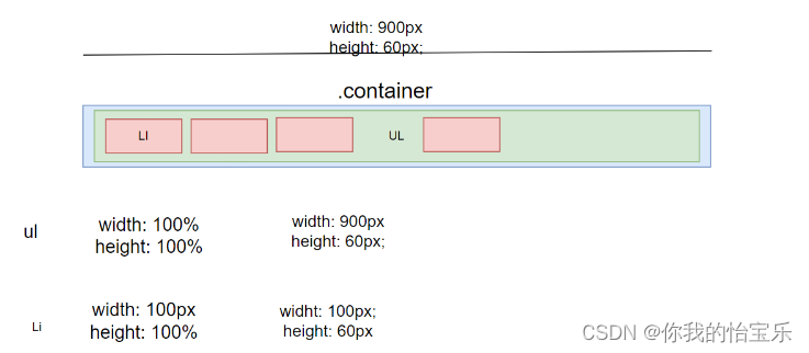
.container {
width: 900px;
height: 60px;
margin: 0 auto;
}
ul {
width: 100%;
height: 100%;
}
ul li {
list-style: none;
width: 100px;
height: 100%;
background: #2A3C5C;
float: left;
text-align: center; /* 水平居中 */
line-height: 60px; /* 垂直居中 */
color: white;
font-weight: 500;
}
ul li:hover {
background: #8B0000;
cursor: pointer; /* 将鼠标变为手 */
}
</style>
</head>
<body>
<div class="container">
<ul>
<li>游戏1</li>
<li>游戏2</li>
<li>游戏3</li>
<li>游戏4</li>
<li>游戏5</li>
<li>游戏6</li>
<li>游戏7</li>
<li>游戏8</li>
<li>游戏9</li>
</ul>
</div>
</body>
</html>
2)使用弹性布局实现导航菜单
<!DOCTYPE html>
<html lang="en">
<head>
<meta charset="UTF-8">
<title>使用弹性布局实现导航菜单</title>
<style>
* {
margin: 0;
padding: 0;
box-sizing: border-box;
}
.container {
width: 900px;
height: 60px;
margin: 0 auto;
background: #317FE5;
}
ul {
width: 100%;
height: 100%;
list-style: none;
display: flex; /* 开启弹性布局,注意它需要放到父容器中 */
}
ul li {
width: 100px;
height: 100%;
background: #2A3C5C;
color: white;
text-align: center;
line-height: 60px;
}
ul li:hover {
background: #8B0000;
cursor: pointer; /* 将鼠标变为手 */
}
</style>
</head>
<body>
<div class="container">
<ul>
<li>游戏1</li>
<li>游戏2</li>
<li>游戏3</li>
<li>游戏4</li>
<li>游戏5</li>
<li>游戏6</li>
<li>游戏7</li>
<li>游戏8</li>
<li>游戏9</li>
</ul>
</div>
</body>
</html>