一.QML中的Shape详细介绍
- 功能概述:
- Qt Quick Shapes模块提供了在QML中创建自定义形状的功能,这些形状可以通过QML的属性绑定系统动态变化。
- 从Qt 5.10版本开始,QML引入了Quick.Shapes功能,这是官方提供的在性能和易用性之间取得平衡的自绘途径。
- 技术优势:
- Shapes底层基于GPU渲染(SceneGraph),这意味着QPainter能绘制的基础图元都可以通过Shapes实现,且性能得到优化。
- 与通过QQuickPaintedItem或2D Canvas渲染形状不同,Shape通过QPainterPath生成几何图形,路径不会在软件中光栅化,适合创建分布在屏幕更大区域的形状,避免了纹理上传或帧缓冲区blit的性能损失。
- 使用方式:
- Shape可以作为可视化元素的一部分,与其他元素如Rectangle(矩形)、Text(文本)、Image(图像)等一起使用,以创建丰富的用户界面。
- 它可以通过锚点定位在窗口或父元素上,并且可以设置描边宽度和颜色来描绘形状的边缘。除了描边外,还可以选择填充形状的内部,以创建不同的填充区域。
二.QML Shape绘制tab页使用示例
RibbonTabButton.qml
import QtQuick 2.4
import QtQuick.Controls 2.4

RoundButton
{
    id: control
    font.pixelSize: checked? 16:14
    checkable: true
    autoExclusive: true
    //font.family: checked?Style.font_notosanscjksc_bold:Style.font_notosanscjksc_medium

    property color textColor: "black"
    property bool horizontal: false
    property int index: 0

    contentItem: Text {
        text: control.text
        font: control.font
        color: control.textColor
        horizontalAlignment: Text.AlignHCenter
        verticalAlignment: Text.AlignVCenter
    }

    background: Rectangle {
        radius: control.radius
        color: (control.pressed && !control.checked) ? "#41000000" : "transparent";
    }
}
RibbonTab.qml
import QtQuick 2.11
import QtQuick.Shapes 1.0
import QtGraphicalEffects 1.0
import QtQuick.Controls 2.4

Item
{
    id: root
    //property real firstBtnWidth: 90 //在第一个按钮处是一个固定的菜单按钮
    property real btnWidth: 80
    property real radius: 9
    property real tabWidth: 42
    property real tabPageWidth:width
    property int currentIndex: 0
    property alias tabBtnsCurrentIndex: tabBtns.currentIndex
    property var tabData: [{text: qsTr("Tab1"), page: null},
                           {text: qsTr("Tab2"), page: null}]
    //tab页形状
    Item
    {
        id: tabBlock
        anchors.fill: parent
        //所有路径段(路径从左上角tab页面顶点开始)
        //向左
        PathLine { id: path0; x: currentIndex*btnWidth /*+ firstBtnWidth*/ - root.radius; y: tabBtns.height}

        //向上
        PathArc  { id: path1; x: currentIndex*btnWidth /*+ firstBtnWidth*/; y: tabBtns.height - root.radius; radiusX: root.radius; radiusY: radiusX; direction: PathArc.Counterclockwise }
        PathLine { id: path2; x: currentIndex*btnWidth /*+ firstBtnWidth*/; y: root.radius}

        //向右
        PathArc  { id: path3; x: currentIndex*btnWidth /*+ firstBtnWidth*/ + root.radius; y: 0; radiusX: root.radius; radiusY: radiusX; direction: PathArc.Clockwise }
        PathLine { id: path4; x: currentIndex*btnWidth /*+ firstBtnWidth*/ + btnWidth - root.radius; y: 0}

        //向下
        PathArc  { id: path5; x: currentIndex*btnWidth /*+ firstBtnWidth*/ + btnWidth; y: root.radius; radiusX: root.radius; radiusY: radiusX; direction: PathArc.Clockwise }
        PathLine { id: path6; x: currentIndex*btnWidth /*+ firstBtnWidth*/ + btnWidth; y: tabBtns.height-root.radius}

        //向右
        PathArc  { id: path7; x: currentIndex*btnWidth /*+ firstBtnWidth*/ + btnWidth + root.radius; y: tabBtns.height;radiusX: root.radius; radiusY: radiusX; direction: PathArc.Counterclockwise}
        PathLine { id: path8; x: root.width; y: tabBtns.height }

        //向下
        PathLine { id: path9; x: root.width; y: root.height}

        //向左
        PathLine { id: path10; x: 0; y: root.height }

        //向上
        PathLine { id: path11; x: 0; y: tabBtns.height}

        //获取shape路径
        function getTabShapePath(){
            var paths = new Array;
            paths.push(path0);
            paths.push(path1);
            paths.push(path2);
            paths.push(path3);
            paths.push(path4);
            paths.push(path5);
            paths.push(path6);
            paths.push(path7);
            paths.push(path8);
            paths.push(path9);
            paths.push(path10);
            paths.push(path11);
            return paths;
        }

        //刷新形状
        function refreshShape(){
            tabShapPath.pathElements = getTabShapePath();
        }

        //tab页shape
        Shape {
            id: tabBlockShape
            anchors.fill: parent
            ShapePath{
                id: tabShapPath
                startX: 0; startY: tabBtns.height;
                fillColor: 'black';
                strokeWidth: -1;
                pathElements: tabBlock.getTabShapePath()
            }
            visible: false
        }

        //tab页背景
        Rectangle{
            id: tabBlockBackground
            anchors.fill: parent
            color: "lightgray"
            visible: false
        }

        //裁剪
        OpacityMask{
            id: tabBlockCliped
            anchors.fill: parent
            source: tabBlockBackground
            maskSource: tabBlockShape

            //反走样支持
            layer.enabled: true
            layer.smooth: true
            layer.samples: 4
        }

        //stackview区域
        StackView {
            id: tabBlockStack
            x: 0
            y: tabBtns.height
            width: root.tabPageWidth
            height: root.height - tabBtns.height
            initialItem: tabData[root.currentIndex].page
        }
    }

    property var btnObjects: new Array
    //tab按钮栏
    Item {
        id: tabBtns
        width: root.width
        height: 35
        property int tabCount: tabData.length
        property int currentIndex: root.currentIndex
        property real currentWidth: width/tabCount*currentIndex
        property real btnWidth: root.btnWidth
        property real btnHeight: 35

        //tab按钮控件
        Component{
            id: tabButton
            RibbonTabButton{
                x: index*width /*+ root.firstBtnWidth*/
                radius: root.radius
                text: tabData[index].text

                onClicked: {
                    tabBtns.currentIndex = index;
                    root.currentIndex = index;
                }
            }
        }

        property var btnYPos: new Array

        Component.onCompleted: {
            var i = 0;
            //动态创建tab按钮和tab分割线
            for(i = 0; i < tabCount; i++) {
                var btnObject = tabButton.createObject(tabBtns, {index: i,
                                           width: Qt.binding(function() {return btnWidth}),
                                           height: Qt.binding(function() {return btnHeight}),
                                           checked: i === 0 ? true : false});
                btnObjects.push(btnObject);
            }
        }

        onCurrentIndexChanged:{
            tabBlock.refreshShape();
            tabBlockStack.clear();
            if(tabData[currentIndex].page !== undefined && tabData[currentIndex].page !== null)
                tabBlockStack.push(tabData[currentIndex].page);
        }
    }
}
main.qml
import QtQuick 2.12
import QtQuick.Window 2.12

Window
{
    visible: true
    width: 640
    height: 480
    title: qsTr("Hello World")
    color: "gray"

    RibbonTab
    {
        id:_mainpanel
        tabWidth: 60
        tabPageWidth: parent.width
        width: parent.width
        height: parent.height - 35

        tabData: [{text: qsTr("基本"), page: tabBasic},
            {text: qsTr("绘图"), page: tabDraw}]


        Loader{
            id: tabBasic
            sourceComponent:Rectangle
            {
                width:200
                height:200
                color:"lightgray"
                Text {
                    anchors.centerIn: parent
                    text: qsTr("基本页面")
                }
            }
            visible: false
        }

        //绘图
        Loader{
            id: tabDraw
            sourceComponent: Rectangle
            {
                width:200
                height:200
                color:"lightgray"
                Text {
                    anchors.centerIn: parent
                    text: qsTr("绘图页面")
                }
            }
            visible: false
        }
    }
}
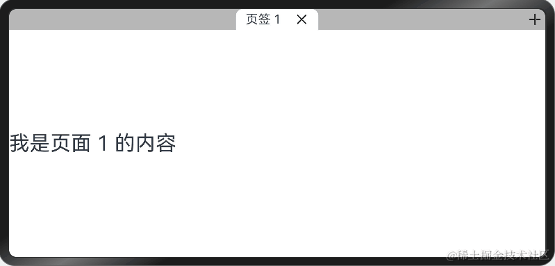
运行结果图:


![每日一题 --- 设计链表[力扣][Go]](https://img-blog.csdnimg.cn/direct/154cf7f5cca64873aefff3651e6b492e.png)
