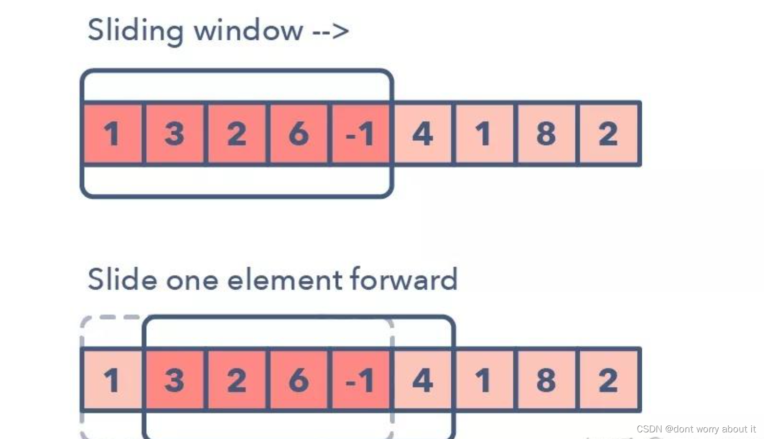
效果演示
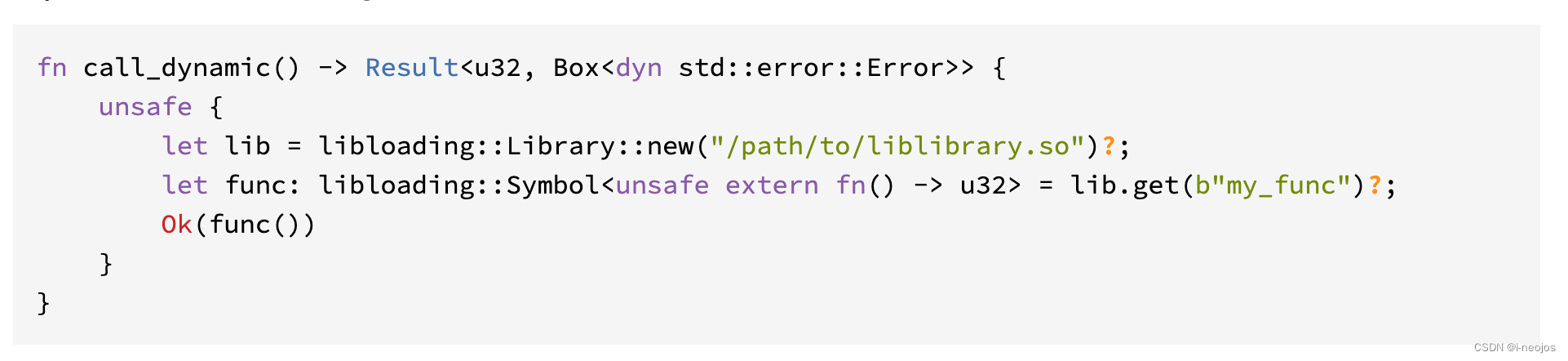
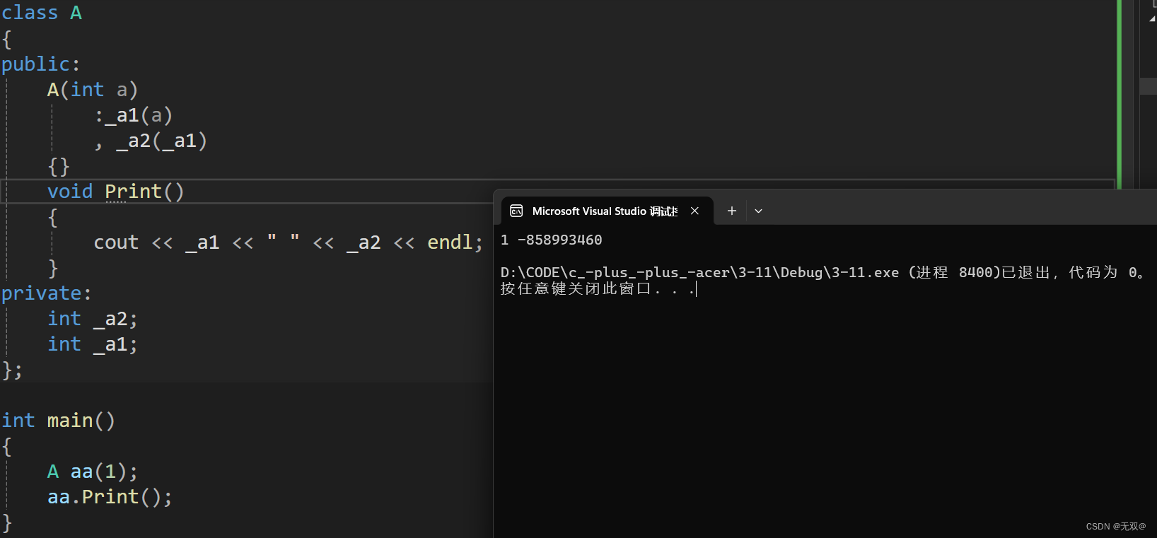
实现了一个动态加载文本效果,通过定义变量和应用动画效果来实现文本的动态展示。
Code
<div class="container">
    <h1>loading...</h1>
</div>
:root {
    --text-color: orangered; /* 定义文本颜色变量为橙红色 */
    --inner-stroke-color: white; /* 定义内部描边颜色变量为白色 */
    --outer-stroke-color: midnightblue; /* 定义外部描边颜色变量为深蓝色 */
    --shadow-color: midnightblue; /* 定义阴影颜色变量为深蓝色 */
}

body {
    height: 100vh; /* 设置body元素高度为视口高度 */
    display: flex; /* 使用flex布局 */
    justify-content: center; /* 水平居中 */
    align-items: center; /* 垂直居中 */
    font-family: 'Pacifico', cursive; /* 设置字体为'Pacifico'或cursive */
}

body,
.container>h1 {
    margin: 0; /* 去除默认的margin */
}

.container>h1 {
    position: relative; /* 设置相对定位 */
    font-size: 100px; /* 设置字体大小为100px */
    color: var(--text-color); /* 使用定义的文本颜色变量 */
    font-weight: normal; /* 设置字体为普通粗细 */
    line-height: 1; /* 行高为1 */
    text-transform: capitalize; /* 文本转换为首字母大写 */
    letter-spacing: 13px; /* 字母间距为13px */
    --text-stroke: 2px var(--inner-stroke-color); /* 定义文本描边 */
    -webkit-text-stroke: var(--text-stroke); /* 设置Webkit浏览器的文本描边样式 */
    text-stroke: var(--text-stroke); /* 设置文本描边样式 */
    animation: rise 1s ease-in-out infinite forwards; /* 应用上升动画效果 */
}

@media screen and (max-width: 550px) {
    .container>h1 {
        font-size: 70px; /* 在小于550px宽度时,设置字体大小为70px */
    }
}

.container>h1:after {
    content: 'loading...'; /* 添加文本内容为'loading...' */
    position: absolute; /* 设置绝对定位 */
    top: 0; /* 顶部对齐 */
    left: 0; /* 左侧对齐 */
    color: transparent; /* 文本颜色透明 */
    --text-stroke: 8px var(--outer-stroke-color); /* 定义外部描边 */
    -webkit-text-stroke: var(--text-stroke); /* 设置Webkit浏览器的文本描边样式 */
    text-stroke: var(--text-stroke); /* 设置文本描边样式 */
    z-index: -1; /* 设置层级为-1,位于文本下方 */
    animation: drop 1s ease-in-out infinite forwards; /* 应用下降动画效果 */
}

@keyframes drop {
    0% {
        filter: drop-shadow(-5px -5px 0 var(--shadow-color)); /* 设置阴影效果初始状态 */
    }

    50% {
        filter: drop-shadow(5px 5px 0 var(--shadow-color)); /* 设置阴影效果中间状态 */
    }

    100% {
        filter: drop-shadow(-5px -5px 0 var(--shadow-color)); /* 设置阴影效果结束状态 */
    }
}

@keyframes rise {
    0% {
        transform: translate(5px, 5px); /* 设置上升动画初始状态 */
    }

    50% {
        transform: translate(-5px, -5px); /* 设置上升动画中间状态 */
    }

    100% {
        transform: translate(5px, 5px); /* 设置上升动画结束状态 */
    }
}