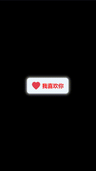
页面效果

此效果主要使用 css 伪选择器配合 css content 属性,以及 transition(过渡)属性来实现一个简约的动态按钮效果。
此效果可适用于关注按钮、详情按钮等,增强用户交互体验。
核心代码部分,简要说明了写法思路,看 css 部分的注释说明;完整代码在最后,可直接复制到本地运行。
核心代码
html代码
<button>关注我</button>
按钮主体代码就是一个 button 按钮标签,比较简单。
css代码
button{

  width: 140px;
  height: 46px;
  font-size: 16px;
  font-family: Arial, Helvetica, sans-serif;
  font-weight: 700;
  color: #333;
  background-color: transparent;  /* 使主体 button 背景透明 */
  border: none;
  position: relative;
  box-sizing: border-box;
  transition: all 0.4s ease-in-out;  /* 增加过渡效果 */
}
button:before{
      /* 伪选择器 :before */
  content: '';  /* css content 属性 */
  width: 4px;
  height: inherit;
  position: absolute;
  top: 0;
  left: 0;
  z-index: -5;  /* 设置层叠顺序低于 button 主体,不遮掩 button 中的文字内容 */
  background-color: #333;
  transition: all 0.4s ease-in-out;  /* 增加过渡效果 */
}
button:hover{

  cursor: pointer;
  color: #fff;
}
button:hover:before{

  width: 100%;
  border-radius: 6px;
}
使用伪选择器 :before 配合 css content 属性,然后设置 transition 参数来实现按钮过渡动画效果。
想了解更多 css 中伪选择器的可以看我之前的这篇文章。
想知道css content 属性的更多妙用和技巧的可以看我的这篇文章。
完整代码
html页面
<!DOCTYPE html>
<html lang="zh">
  <head>
    <meta charset="utf-8">
    <link rel="stylesheet" href="style.css">
    <title>简约的动态关注按钮</title>
  </head>
  <body>
    <div class="app">
      <button>关注我</button>
    </div>
  </body>
</html>
css样式
.app{

  width: 100%;
  height: 100vh;
  position: relative;
  display: flex;
  justify-content: center;
  align-items: center;
}
button{

  width: 140px;
  height: 46px;
  font-size: 16px;
  font-family: Arial, Helvetica, sans-serif;
  font-weight: 700;
  color: #333;
  background-color: transparent;
  border: none;
  position: relative;
  box-sizing: border-box;
  transition: all 0.4s ease-in-out;
}
button:before{

  content: '';
  width: 4px;
  height: inherit;
  position: absolute;
  top: 0;
  left: 0;
  z-index: -5;
  background-color: #333;
  transition: all 0.4s ease-in-out;
}
button:hover{

  cursor: pointer;
  color: #fff;
}
button:hover:before{

  width: 100%;
  border-radius: 6px;
}
页面效果
以上就是全部代码以及简单的写法思路,如果喜欢这个按钮,给我点个赞、点个关注吧。
[1] 原文阅读
我是Just,这里是「设计师工作日常」,求点赞求关注!!!


![[opencvsharp]C#基于Fast算法实现角点检测](https://img-blog.csdnimg.cn/direct/6c1273dc2d514826b2c0623d9a60ca97.jpeg)