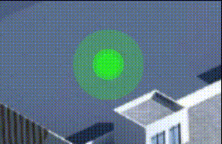
先看效果
整体效果

这个效果使用 css 中
animation属性,以及搭配伪元素::after、::before来实现两个圆交替变化。
核心代码
html部分代码
<div>
  <label class="dot"></label>
</div>
label标签画圆点主体。
css部分代码
.app{

  width: 100%;
  height: 100vh;
  position: relative;
  display: flex;
  justify-content: center;
  align-items: center;
}
.dot {

  width: 48px;
  height: 48px;
  display: block;
  position: relative;
  border-radius: 50%;
  background-color: blue;
  z-index: 1;
}
.dot::after {

  width: 100%;
  height: 100%;
  content: "";
  border-radius: 50%;
  position: absolute;
  top: 0;
  left: 0;
  z-index: -2;
  background-color: blue;
  animation: dot-play 4s linear 400ms infinite;
}
.dot::before {

  width: 100%;
  height: 100%;
  content: "";
  border-radius: 50%;
  position: absolute;
  top: 0;
  left: 0;
  z-index: -1;
  background-color: blue;
  animation: dot-play 4s linear 200ms infinite;
  animation-delay: 2s; /* 延迟 2s */
}
@keyframes dot-play{

  from{

    transform: scale(1);
    opacity: .2;
  }
  to{

    transform: scale(4);
    opacity: 0;
  }
}
伪元素基于主体圆写出两个蓝色圆形来做水波纹,并设置
animation属性进行变化。
注意:第二个伪元素的圆形,延迟 2s 启动animation动画。
完整代码
html代码
<!DOCTYPE html>
<html lang="en">
<head>
  <meta charset="UTF-8">
  <meta name="viewport" content="width=device-width, initial-scale=1.0">
  <link rel="stylesheet" href="style.css?k3f22ww">
  <title>03 圆点水波纹效果</title>
</head>
<body>
  <div class="app">
    <label class="dot"></label>
  </div>
</body>
</html>
css代码
*{

  margin: 0;
  padding: 0;
  list-style: none;
  transition: .5s;
}
html,body{

  background-color: #f5f5f5;
  color: #fff;
  font-size: 14px;
}
.app{

  width: 100%;
  height: 100vh;
  position: relative;
  display: flex;
  justify-content: center;
  align-items: center;
}
.dot {

  width: 48px;
  height: 48px;
  display: block;
  position: relative;
  border-radius: 50%;
  background-color: blue;
  z-index: 1;
}
.dot::after {

  width: 100%;
  height: 100%;
  content: "";
  border-radius: 50%;
  position: absolute;
  top: 0;
  left: 0;
  z-index: -2;
  background-color: blue;
  animation: dot-play 4s linear 400ms infinite;
}
.dot::before {

  width: 100%;
  height: 100%;
  content: "";
  border-radius: 50%;
  position: absolute;
  top: 0;
  left: 0;
  z-index: -1;
  background-color: blue;
  animation: dot-play 4s linear 200ms infinite;
  animation-delay: 2s; /* 延迟 2s */
}
@keyframes dot-play{

  from{

    transform: scale(1);
    opacity: .2;
  }
  to{

    transform: scale(4);
    opacity: 0;
  }
}
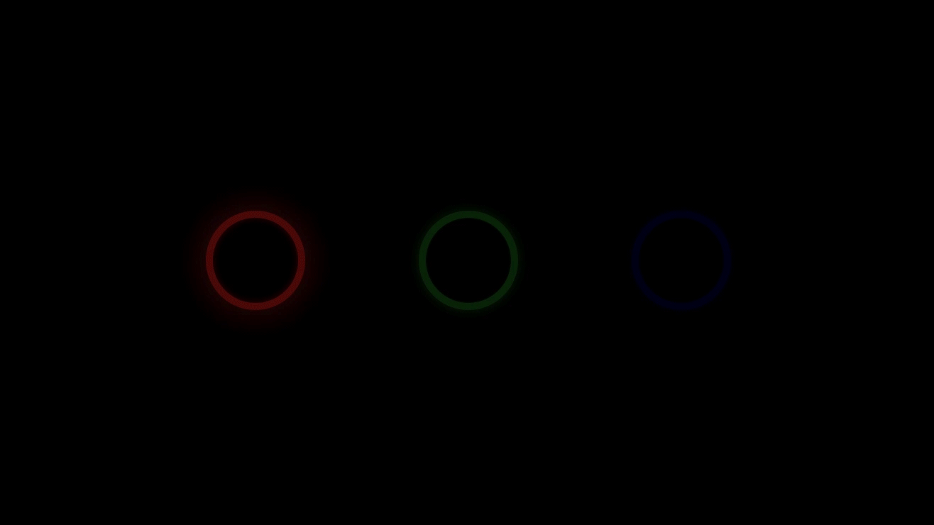
页面效果
[1] 阅读原文
我是 Just,这里是「设计师工作日常」,求点赞求关注!