从今天开始,博主将开设一门新的专栏用来讲解市面上比较热门的技术 “鸿蒙开发”,对于刚接触这项技术的小伙伴在学习鸿蒙开发之前,有必要先了解一下鸿蒙,从你的角度来讲,你认为什么是鸿蒙呢?它出现的意义又是什么?鸿蒙仅仅是一个手机操作系统吗?它的出现能够和Android和IOS三分天下吗?它未来的潜力能否制霸整个手机市场呢?
今天实现一个简单的小案例,从零开始讲解如何通过鸿蒙开发实现一个电商平台的案例。
目录
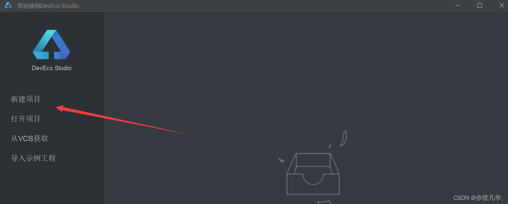
新建项目
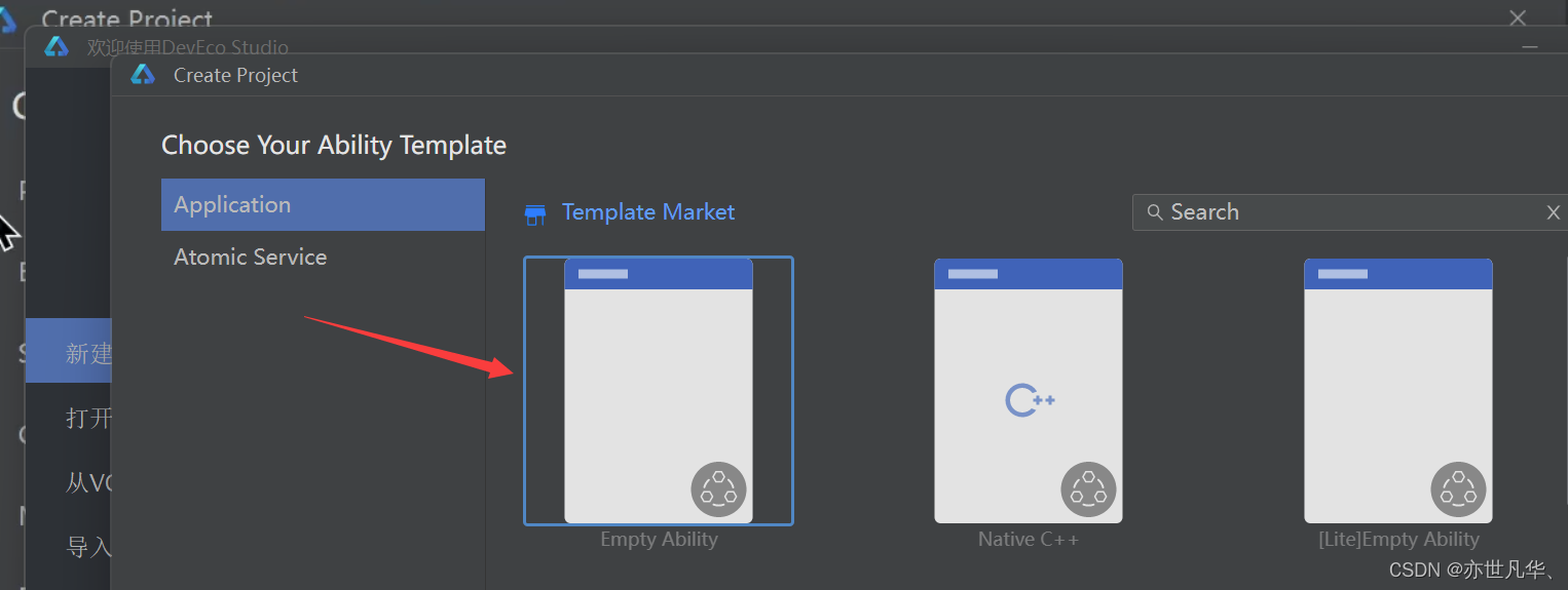
首先我们先打开DevEco Studio,点击新建项目:
然后根据自己的情况选择应用,这里我们选择空的 Empty Ability 进行创建:
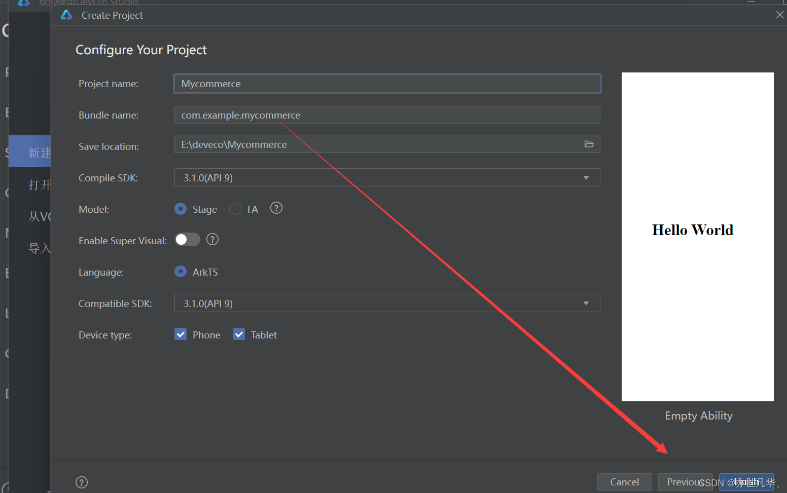
然后接下来输入自己的项目名称就行,点击finish即可:
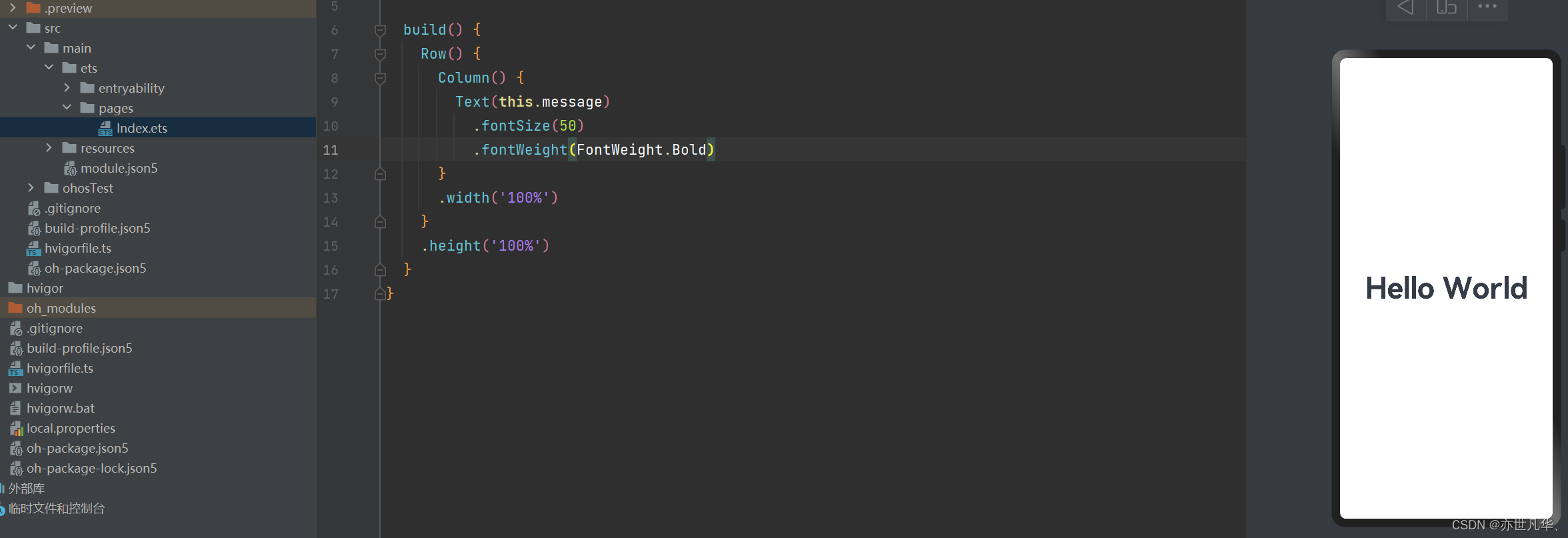
运行本地预览器,可以看到我们的初始项目已经跑通:
登录页面
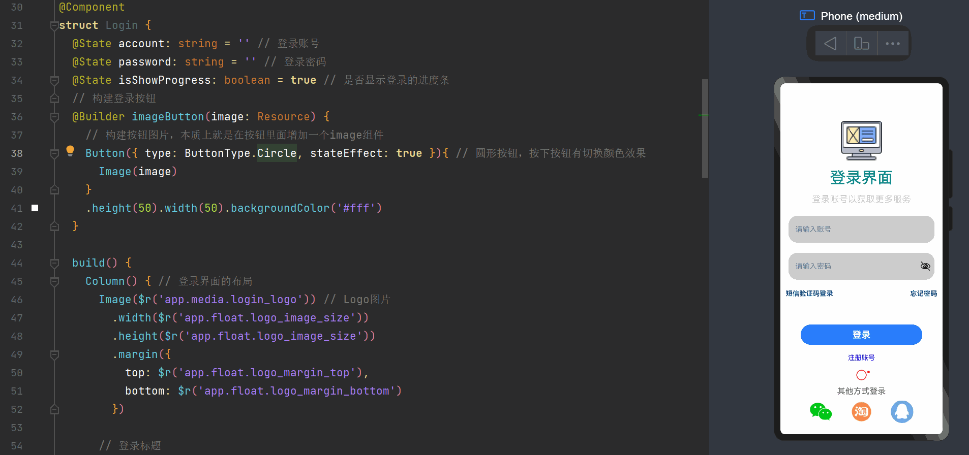
登录页面的构建很简单,我们参考网上的登录页面,简单的构建一下登录页面的画面,这里我使用的图标都是来自阿里云图标库当中,大家可以根据自己的情况在网上寻找资源来构建画面,闲话少说我们直接开始,首先我们在pages文件夹下新建arkts文件Login文件,当作是我们的登录页面,接下来我们开始正式编写相关代码:
因为构建静态页面很简单,也没有什么好讲的,这里我就将静态页面的源代码直接共享出来吧,大家可以自己看一下:
// 登录页面
// 文本框样式
@Extend(TextInput) function InputStyle() {
.placeholderColor('#ff5d7e9d')
.height(60)
.fontSize(20)
.backgroundColor('#ccc')
.width('90%')
.padding({ left: 15 })
.maxLength(10)
}
// 分割线
@Extend(Line) function liseStyle() {
.width('100%')
.height(2)
.backgroundColor('#efefef')
.margin({ top: 10, bottom: 10 })
}
// Text组件的蓝色文本样式
@Extend(Text) function blueTextStyle() {
.fontColor('#ff084d85')
.fontSize(15)
.fontWeight(FontWeight.Bold)
}
@Entry
@Component
struct Login {
@State account: string = '' // 登录账号
@State password: string = '' // 登录密码
@State isShowProgress: boolean = true // 是否显示登录的进度条
// 构建登录按钮
@Builder imageButton(image: Resource) {
// 构建按钮图片,本质上就是在按钮里面增加一个image组件
Button({ type: ButtonType.Circle, stateEffect: true }){ // 圆形按钮,按下按钮有切换颜色效果
Image(image)
}
.height(50).width(50).backgroundColor('#fff')
}
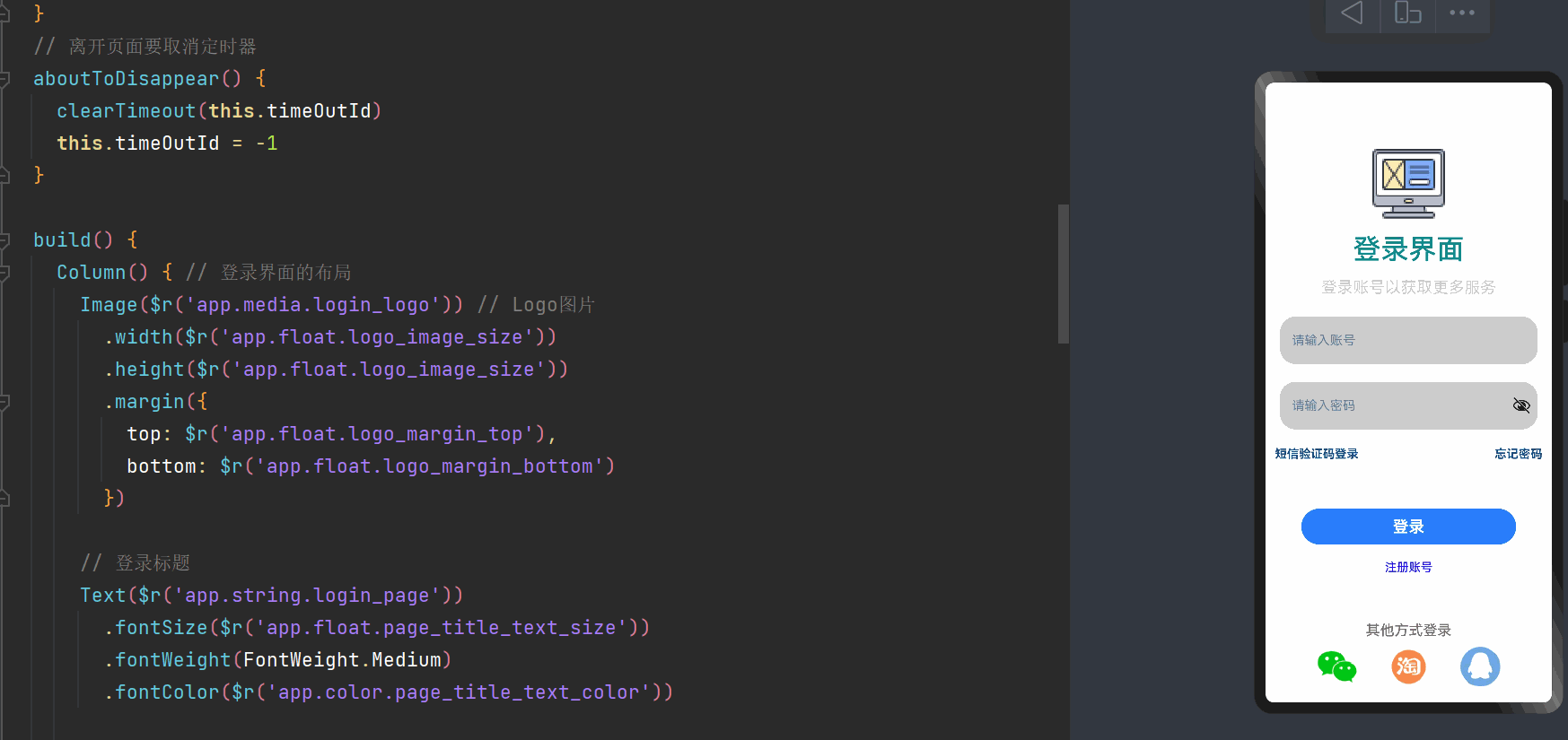
build() {
Column() { // 登录界面的布局
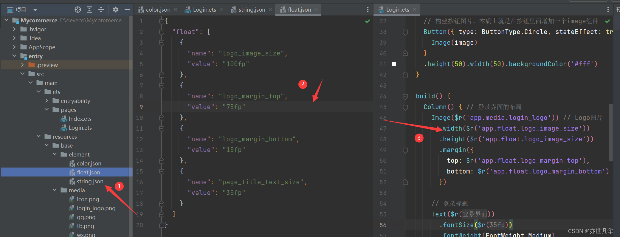
Image($r('app.media.login_logo')) // Logo图片
.width($r('app.float.logo_image_size'))
.height($r('app.float.logo_image_size'))
.margin({
top: $r('app.float.logo_margin_top'),
bottom: $r('app.float.logo_margin_bottom')
})
// 登录标题
Text($r('app.string.login_page'))
.fontSize($r('app.float.page_title_text_size'))
.fontWeight(FontWeight.Medium)
.fontColor($r('app.color.page_title_text_color'))
// 小标题
Text('登录账号以获取更多服务')
.fontSize(20)
.fontColor('#ccc')
.margin({ top: 15, bottom: 25 })
// 账号输入框
TextInput({ placeholder: '请输入账号' })
.InputStyle()
.type(InputType.Number) // 文本行中只能输入数字
.onChange((value: string) => {
this.account = value
})
Line()
.liseStyle()
// 密码输入框
TextInput({ placeholder: '请输入密码' })
.InputStyle()
.type(InputType.Password)
.onChange((value: string) => {
this.password = value
})
Line()
.liseStyle()
// 短信提示与验证码
Row(){
Text('短信验证码登录').blueTextStyle()
Text('忘记密码').blueTextStyle()
}
.width('100%')
.justifyContent(FlexAlign.SpaceBetween)
.padding({ left: 12, right: 12 })
// 登录按钮
Button('登录', { type: ButtonType.Capsule })
.width('75%')
.height(45)
.fontSize(20)
.fontWeight(FontWeight.Bold)
.margin({ top: 60, bottom: 20 })
.onClick(() => {
// 登录事件
})
// 注册账号文本
Text('注册账号')
.fontColor('blue').fontSize(15).fontWeight(FontWeight.Medium)
// 是否显示进度条
if (this.isShowProgress){
LoadingProgress()
.color('red').width(40).height(40).margin({ top: 10 })
}
// 其他方式登录
Text('其他方式登录').fontColor('#ff776f6f').fontSize(18)
.fontWeight(FontWeight.Medium).margin({ top: 5, bottom: 10 })
// 三种登录方式
Row({ space: 40 }){
this.imageButton($r("app.media.wx"))
this.imageButton($r("app.media.tb"))
this.imageButton($r('app.media.qq'))
}
}
.width('100%')
.height('100%')
}
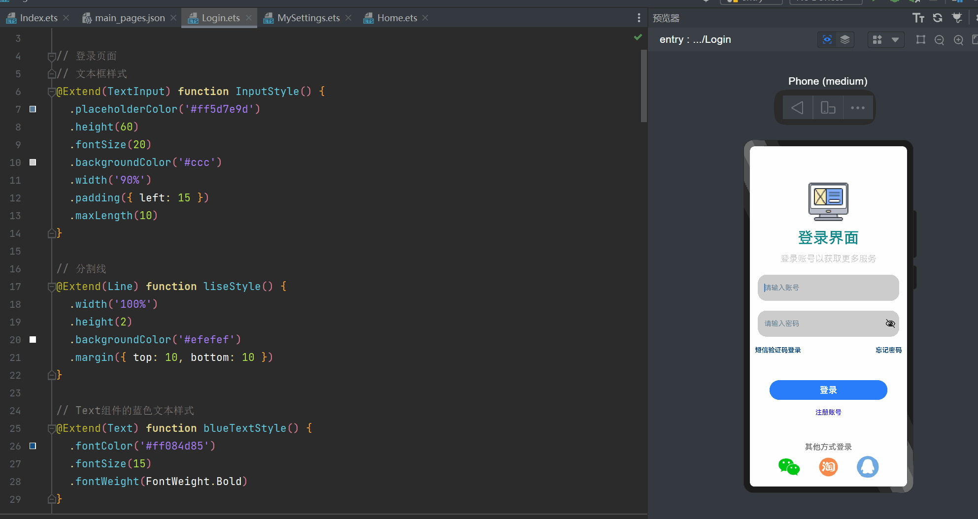
}最终呈现的效果如下:
关于这个静态页面的构建我简单提一下,对于公共常用的样式,我们可以将其书写在静态资源base当中然后进行调用即可,上文的代码我进行了简单的使用,主要的方式如下:
点击登录
接下来我们给我们静态页面的登录按钮设置点击事件进行登录操作,以及对进度条的显示进行一个设置,当点击登录和进入到正式页面之间的间隔中进行显示这个进度条出来,闲话少说正式开始:
@State isShowProgress: boolean = false // 是否显示登录的进度条
private timeOutId: number = -1 // 控制登录超时的时间变量
// 登录回调事件
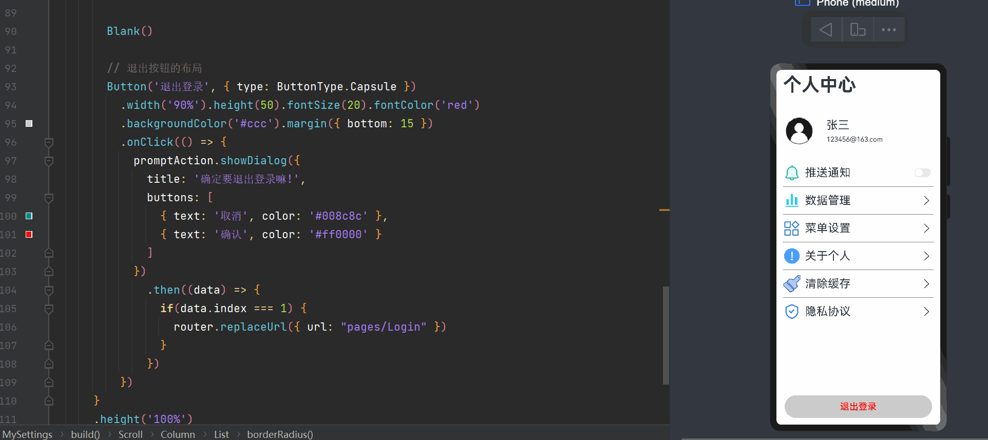
Login(): void {
if(this.account === '' || this.password === ''){
promptAction.showToast({ // 开启一个确认弹层
message: '账号密码为空,请重新输入!'
})
} else {
this.isShowProgress = true
if(this.timeOutId == -1) {
this.timeOutId = setTimeout(() => {
// 2秒之后执行的函数
this.isShowProgress = false
this.timeOutId = -1
// 页面跳转
}, 2000)
}
}
}然后我们在离开页面的时候,对定时器进行一个清除:
// 离开页面要取消定时器
aboutToDisappear() {
  clearTimeout(this.timeOutId)
  this.timeOutId = -1
}
实现的效果如下:
接下来我们开始实现点击登录按钮后,触发点击事件进行页面的路由跳转,代码如下,关于个人中心页面的搭建,可以继续看下一个标题的内容:

个人中心
接下来开始实现个人中心的页面,个人中心的页面搭建其实也非常简单,这里我们把要存放的图片和相关标题的内容单独抽离出去,形成一个新的类,来获取静态资源,后面需求页面要使用的时候直接调用就可以了,具体代码如下:
interface ItemData {
  title: string;
  imagePath: Resource;
  switch?: boolean;
}

export class DataModel {
  // 获取列表数据
  getSettingListData(): ItemData[] {
    let settingListData: ItemData[] = [
      {
        title: '推送通知',
        imagePath: $r('app.media.1'),
        switch: true,
      },
      {
        title: '数据管理',
        imagePath: $r('app.media.2'),
        switch: false,
      },
      {
        title: '菜单设置',
        imagePath: $r('app.media.3'),
        switch: false,
      },
      {
        title: '关于个人',
        imagePath: $r('app.media.4'),
        switch: false,
      },
      {
        title: '清除缓存',
        imagePath: $r('app.media.5'),
        switch: false,
      },
      {
        title: '隐私协议',
        imagePath: $r('app.media.6'),
        switch: false,
      },
    ];
    return settingListData;
  }
}

export default new DataModel();
关于这些静态资源的图片可以到阿里云图标库上寻找,这里就不再赘述了:

然后接下来我们需要开始正式的书写我们的个人中心页面的代码了,具体静态页面代码如下:
import router from '@ohos.router'
import DataModel from '../../components/DataModel'
import promptAction from '@ohos.promptAction'
// 设置界面
@Entry
@Component
struct MySettings {
@State account: number = 0
onPageShow(){
let acc = router.getParams() as Record<string, number>
if (acc) {
this.account = acc['sendMsg']
}
}
// 构建设置单元格函数
@Builder settingCell(item) {
Row(){
Row({ space: 10 }) {
Image(item.imagePath).width(38).height(38)
Text(item.title).fontSize(25)
}
// 判断switch是否为true
if(!item.switch) {
Image($r('app.media.arrow_right')).width(30).height(30)
} else {
Toggle({ type: ToggleType.Switch, isOn: false }) // 显示一个开关组件
}
}
.justifyContent(FlexAlign.SpaceBetween)
.width('100%')
.padding({ left: 15, right: 15 })
}
build() {
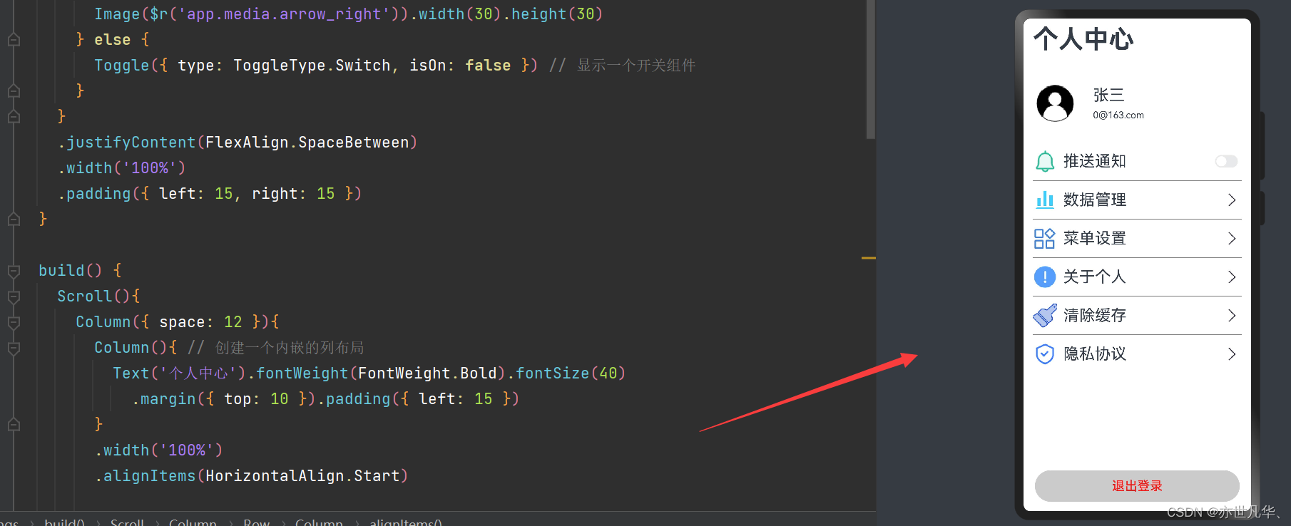
Scroll(){
Column({ space: 12 }){
Column(){ // 创建一个内嵌的列布局
Text('个人中心').fontWeight(FontWeight.Bold).fontSize(40)
.margin({ top: 10 }).padding({ left: 15 })
}
.width('100%')
.alignItems(HorizontalAlign.Start)
// 账户布局
Row(){
Image($r('app.media.account')).width(60).height(60)
Column(){
Text('张三').fontSize(25)
Text(`${this.account.toString()}@163.com`).fontSize(15).margin({ top: 8 })
}
.layoutWeight(2)
.alignItems(HorizontalAlign.Start)
.margin({ left: 30 })
}
.width('100%')
.height(70)
.backgroundColor(Color.White)
.padding({ left: 20, right: 20 })
.borderRadius(20)
.margin({ top: 30 }).alignItems(VerticalAlign.Center)
// 列表布局
List(){
ForEach(DataModel.getSettingListData(), (item, index) => {
ListItem(){
this.settingCell(item)
}
.onClick(() => {
promptAction.showDialog({
message: `第${index + 1}功能:${item.title},还未完成,尽情期待!`
})
})
.height(60)
})
}
.backgroundColor(Color.White)
.width('100%')
.divider({
strokeWidth: 1, // 设置分割线的高度
color: Color.Gray, // 设置分割线的颜色
startMargin: 15, // 设分割线的起始边距
endMargin: 15 // 设置分割线的结束边距
})
.borderRadius(30)
.padding({ top: 15, bottom: 20 })
Blank()
// 退出按钮的布局
Button('退出登录', { type: ButtonType.Capsule })
.width('90%').height(50).fontSize(20).fontColor('red')
.backgroundColor('#ccc').margin({ bottom: 15 })
}
.height('100%')
}
.width('100%')
.height('100%')
}
}呈现的效果如下所示:
然后接下来我们给退出登录的按钮设置点击事件:
首页搭建
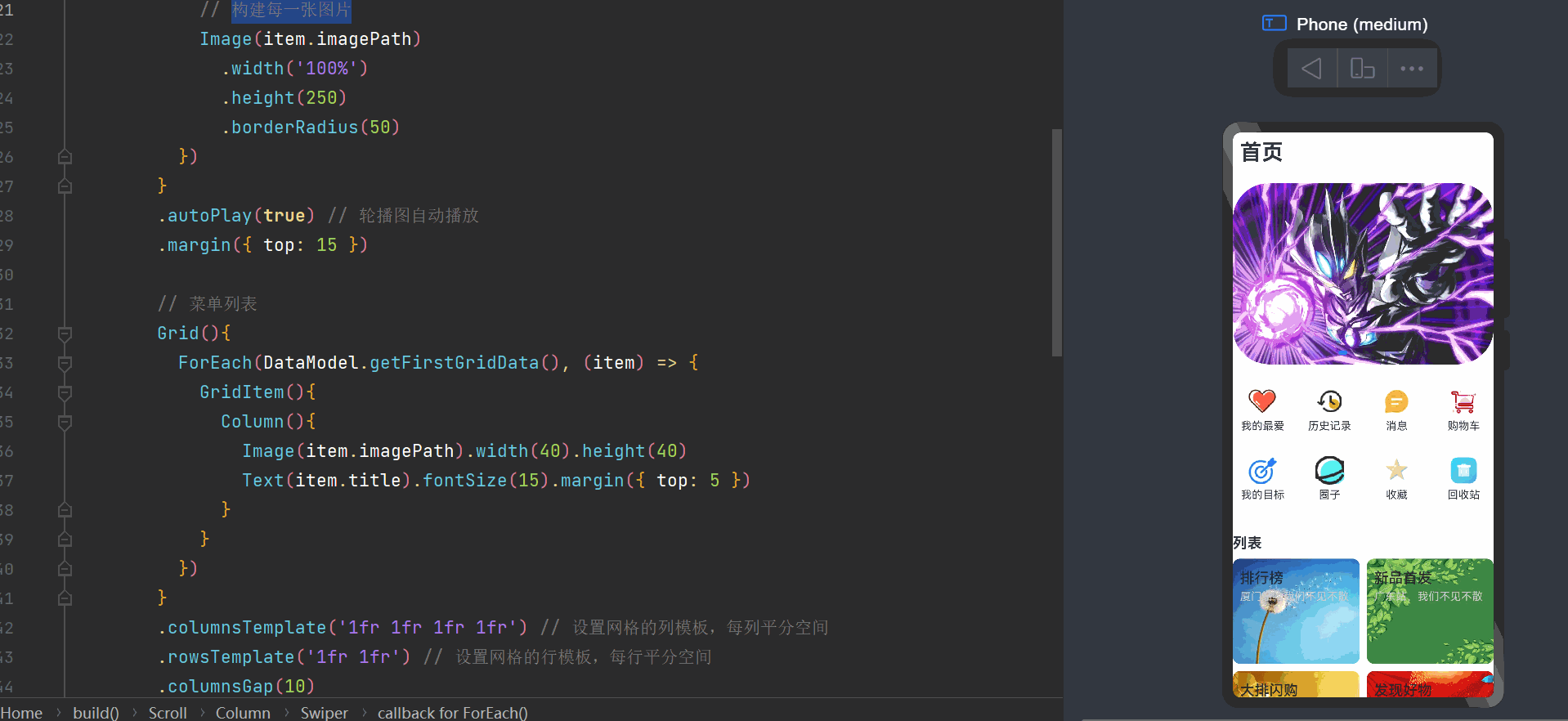
接下来开始实现首页的页面搭建,静态页面的搭建其实很简单,博主也没有什么好讲的说实话,无非就是Grid布局以及Swiper布局的排版一下注意一点就可以了,ok接下来我们开始给出具体代码吧:
import DataModel from '../../components/DataModel'

// 首页
@Entry
@Component
struct Home {
  private swiperController: SwiperController = new SwiperController() // 轮播控制器实例

  build() {
    Scroll(){
      Column({ space: 10 }){
        Column(){ // 标题
          Text('首页').fontWeight(FontWeight.Bold).fontSize(30)
            .margin({ top: 10 }).padding({ left: 10 })
        }
        .width('100%').alignItems(HorizontalAlign.Start)

        // 轮播图片
        Swiper(this.swiperController){
          ForEach(DataModel.getSwiperImage(), (item) => {
            // 构建每一张图片
            Image(item.imagePath)
              .width('100%')
              .height(250)
              .borderRadius(50)
          })
        }
        .autoPlay(true) // 轮播图自动播放
        .margin({ top: 15 })

        // 菜单列表
        Grid(){
          ForEach(DataModel.getFirstGridData(), (item) => {
            GridItem(){
              Column(){
                Image(item.imagePath).width(40).height(40)
                Text(item.title).fontSize(15).margin({ top: 5 })
              }
            }
          })
        }
        .columnsTemplate('1fr 1fr 1fr 1fr') // 设置网格的列模板,每列平分空间
        .rowsTemplate('1fr 1fr') // 设置网格的行模板,每行平分空间
        .columnsGap(10)
        .rowsGap(10)
        .padding({ top: 10, bottom: 10 })
        .height(200)
        .backgroundColor(Color.White)
        .borderRadius(50)

        // 频道列表
        Text('列表').fontSize(20).fontWeight(FontWeight.Bold).width('100%')
          .margin({ top: 15 })
        Grid(){
          ForEach(DataModel.getSecondGridData(), (item) => {
            GridItem() {
              Column() {
                Text(item.title).fontSize(20).fontWeight(FontWeight.Medium)
                Text(item.describe).fontSize(15).fontColor('#ccc').margin({ top: 5 })
              }
              .alignItems(HorizontalAlign.Start) // 两个文本框在水平方向居左对齐
            }
            .padding({ top: 15, left: 10 }).borderRadius(10)
            .align(Alignment.TopStart) // 设置网格项对齐方式为顶部对齐
            .backgroundImage(item.imagePath) // 设置网格项背景图像
            .backgroundImageSize(ImageSize.Cover) // 设置背景图像尺寸模式为覆盖
            .width('100%').height('100%')
          })
        }
        .width('100%').height(300)
        .columnsTemplate('1fr 1fr').rowsTemplate('1fr 1fr') // 设置网格的行列模板
        .columnsGap(10).rowsGap(10).margin({ bottom: 15 })
      }
    }
    .height('100%')
  }
}
最终呈现的效果如下:
Tabs组件
ArkUI开发框架提供了一种页签容器标签Tabs,开发者通过Tabs组件可以很容易的实现内容视图的切换。页签容器 Tabs 的形式多种多样,不同的页面设计页签不一样,可以把页签设置在底部、顶部或者侧边。
接下来我们创建页面组件index,然后在页面组件当中书写tab页面:
import Home from './Home'
import MySettings from './MySettings'
import router from '@ohos.router'

// app主页,页面组件
@Entry
@Component
struct Index {
  @State currentIndex: number = 0 // 当前默认的页签索引号
  private account: number
  private tabsController: TabsController = new TabsController()

  // 接收路由参数
  onPageShow(){
    let acc = router.getParams() as Record<string, number>
    if (acc) {
      this.account = acc['sendMsg']
    }
  }

  // 自定义Tabs函数
  @Builder TabBuilder(title: string, index: number, selectedImg: Resource, normalImg: Resource) {
    Column() {
      Image(this.currentIndex == index ? selectedImg : normalImg)
        .width(30).height(30)
      Text(title).margin({ top: 5 }).fontSize(15)
        .fontColor(this.currentIndex == index ? '#008c8c' : '#ccc')
    }
    .justifyContent(FlexAlign.Center)
    .width('100%').height('50')
    .onClick(() => {
      this.currentIndex = index
      this.tabsController.changeIndex(this.currentIndex) // 修改页签的索引
    })
  }
  build() {
    Tabs({
      barPosition: BarPosition.End, // 页签底部展示
      controller: this.tabsController // 页签容器的控制
    }){ // 标签容器
      // 首页
      TabContent(){
        Home()
      }
      .padding({ left: 20, right: 20 }).backgroundColor('#ccc')
      .tabBar(this.TabBuilder('首页', 0, $r('app.media.home_active'), $r('app.media.home')))
      // 个人中心
      TabContent(){
        MySettings({ account: this.account })
      }
      .padding({ left: 20, right: 20 }).backgroundColor('#ccc')
      .tabBar(this.TabBuilder('我的', 1, $r('app.media.my_active'), $r('app.media.my')))
    }
    .animationDuration(0) // 去掉切换页面的动画效果
    .scrollable(false) // 去掉滑动效果,只能点击按钮切换界面
    .width('100%')
    .backgroundColor(Color.White)
    .barHeight(50)
    .barMode(BarMode.Fixed)
  }
}
这里我们需要将之前的Home页面以及MySettings页面进行一个暴露出去:

这里简单提一下,当用户点击登录按钮之后,这里我们需要跳转到index页面的,所以携带的路由参数也是先传递给index页面,然后index页面再传递给子组件MySettings组件当中,这里注意一下:

最终呈现的效果如下: