背景
在开发小程序过程中,有个需求是,小程序底部的tabBar需要根据不同用户角色显示不同底部导航。此时就需要用到自定义底部导航 custom-tab-bar。
上次发文是组合显示4个底部tabBar导航,很多小伙伴评论说组合超过5个怎么办。他们的需求总数超过5个了。
现在我在这里更新一下。
1、实现自由组合tabBar菜单项目,支持自由组合总数超过5个tabBar菜单。
2、本示例是7个底部导航,分2种权限,权限1显示1,2,3;权限2显示4,5,6,7;
3、当然你也可以自由其他组合,比如:权限1显示1,4;权限2显示1,2,3,4;
4、本示例只是提供了思路及方法,你可以自由扩展。
实现步骤:
1、我们先在utils目录中创建tab-service.js文件,写上全局的数据及方法;
// tabBar的data
let tabData = {
  tabIndex: 0,//底部按钮高亮下标
  tabBar: {
      custom: true,
      color: "#5F5F5F",
      selectedColor: "#07c160",
      backgroundColor: "#F7F7F7",
      list: []
  }
}

// 更新菜单
const updateRole = (that, type) => {
  //这里设置权限(分2种权限,权限1显示1,2,3;权限2显示4,5,6,7;)
 if (type === '0') {
    tabData.tabBar.list=[
      {
        "pagePath": "pages/index1",
        "iconPath": "/image/icon_component.png",
        "selectedIconPath": "/image/icon_component_HL.png",
        "text": "按钮1"
      },
      {
        "pagePath": "pages/index2",
        "iconPath": "/image/icon_API.png",
        "selectedIconPath": "/image/icon_API_HL.png",
        "text": "按钮2"
      },
      {
        "pagePath": "pages/index3",
        "iconPath": "/image/icon_component.png",
        "selectedIconPath": "/image/icon_component_HL.png",
        "text": "按钮3"
      },
    ]
  }else if (type === '1'){
    tabData.tabBar.list=[{
      "pagePath": "pages/index4",
      "iconPath": "/image/icon_API.png",
      "selectedIconPath": "/image/icon_API_HL.png",
      "text": "按钮4"
    },
    {
      "pagePath": "pages/index5",
      "iconPath": "/image/icon_component.png",
      "selectedIconPath": "/image/icon_component_HL.png",
      "text": "按钮5"
    },
    {
      "pagePath": "pages/index6",
      "iconPath": "/image/icon_API.png",
      "selectedIconPath": "/image/icon_API_HL.png",
      "text": "按钮6"
    },
    {
      "pagePath": "pages/index7",
      "iconPath": "/image/icon_API.png",
      "selectedIconPath": "/image/icon_API_HL.png",
      "text": "按钮7"
    }]
  }
  updateTab(that);
}

// 更新底部高亮
const updateIndex = (that, index) => {
  tabData.tabIndex = index;
  updateTab(that);
}

// 更新Tab状态
const updateTab = (that) => {
  if (typeof that.getTabBar === 'function' && that.getTabBar()) {
      that.getTabBar().setData(tabData);
  }
}

// 将可调用的方法抛出让外面调用
module.exports = {
  updateRole, updateTab, updateIndex,tabBar:tabData.tabBar.list
}
2、在app.json文件中配置导航信息
{
  "pages": [
    "pages/index",
    "pages/index1",
    "pages/index2",
    "pages/index3",
    "pages/index4",
    "pages/index5",
    "pages/index6",
    "pages/index7"
  ],
  "tabBar": {
    "custom": true,
    "color": "#5F5F5F",
    "selectedColor": "#07c160",
    "borderStyle": "black",
    "backgroundColor": "#F7F7F7",
    "list": [
      {
        "pagePath": "pages/index1",
        "iconPath": "/image/icon_component.png",
        "selectedIconPath": "/image/icon_component_HL.png",
        "text": "按钮1"
      },
      {
        "pagePath": "pages/index2",
        "iconPath": "/image/icon_API.png",
        "selectedIconPath": "/image/icon_API_HL.png",
        "text": "按钮2"
      },
      {
        "pagePath": "pages/index3",
        "iconPath": "/image/icon_component.png",
        "selectedIconPath": "/image/icon_component_HL.png",
        "text": "按钮3"
      },
      {
        "pagePath": "pages/index4",
        "iconPath": "/image/icon_API.png",
        "selectedIconPath": "/image/icon_API_HL.png",
        "text": "按钮4"
      },
      {
        "pagePath": "pages/index5",
        "iconPath": "/image/icon_component.png",
        "selectedIconPath": "/image/icon_component_HL.png",
        "text": "按钮5"
      },
      {
        "pagePath": "pages/index6",
        "iconPath": "/image/icon_API.png",
        "selectedIconPath": "/image/icon_API_HL.png",
        "text": "按钮6"
      },
      {
        "pagePath": "pages/index7",
        "iconPath": "/image/icon_API.png",
        "selectedIconPath": "/image/icon_API_HL.png",
        "text": "按钮7"
      }
    ]
  },
  "window": {
    "backgroundTextStyle": "light",
    "navigationBarBackgroundColor": "#fff",
    "navigationBarTitleText": "WeChat",
    "navigationBarTextStyle": "black"
  }
}
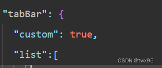
注意:“custom”: true是重点,默认是没有这个字段的,在配置项中新增即可;
这里不用管tabBar的list超过5个,因为后面是使用自定义组件,完全接管 tabBar 的渲染
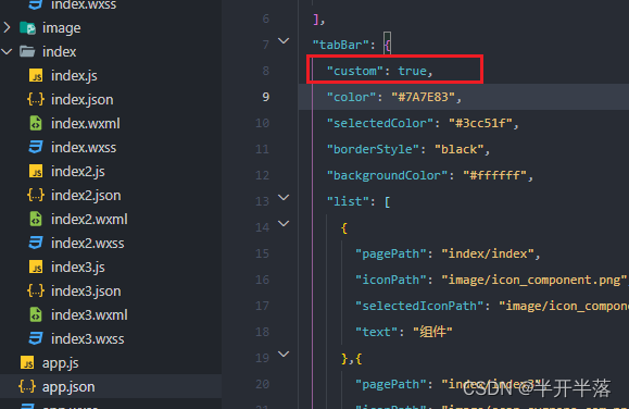
3、根目录下创建custom-tab-bar目录
custom-tab-bar/index.js
custom-tab-bar/index.json
custom-tab-bar/index.wxml
custom-tab-bar/index.wxss
4、编写custom-tab-bar组件
用自定义组件的方式编写即可,该自定义组件完全接管 tabBar 的渲染。
4.1、custom-tab-bar/index.wxml
<!--miniprogram/custom-tab-bar/index.wxml-->
<view class="tabBar">
  <view class="tabBarItem" wx:for="{
  {tabBar.list}}" wx:key="index" data-path="{
  {'/' + item.pagePath}}" data-index="{
  {index}}" bindtap="switchTab">
    <image class="itemImage" src="{
  {tabIndex === index ? item.selectedIconPath : item.iconPath}}"></image>
    <view class="itemTitle" style="color: {
  {tabIndex === index ? tabBar.selectedColor : tabBar.color}}">{
  {item.text}}</view>
  </view>
</view>
其中tabBar就是在tab-service.js文件中写的公共数据。
4.2、custom-tab-bar/index.js
Component({
  data: {},
  methods: {
      switchTab(event) {
          // data为接受到的参数
          const data = event.currentTarget.dataset;
          // 取出参数中的path作为路由跳转的目标地址
          wx.switchTab({url: data.path});
      },
  }
})
4.3、custom-tab-bar/index.wxss
.tabBar {
  position: fixed;
  bottom: 0;
  left: 0;
  right: 0;
  height: 48px;
  background: white;
  display: flex;
  padding-bottom: env(safe-area-inset-bottom);
  border-top: 1px solid #c1c1c1;
}

.tabBarItem {
  flex: 1;
  text-align: center;
  display: flex;
  justify-content: center;
  align-items: center;
  flex-direction: column;
}

.itemImage {
  width: 26px;
  height: 26px;
}

.itemTitle {
  font-size: 10px;
}
4.4、custom-tab-bar/index.json
{
  "component": true
}
5、登录页面获取角色(pages/index.js)
// 全局tab-service.js,引入一下
const tabService = require("../utils/tab-service")

/**
* 生命周期函数--监听页面加载
*/
onLoad(options) {
    //这里设置权限(0:显示1,2,3导航3个按钮,1:显示4,5,6,7导航4个按钮)
    //当然你也可以自由其他组合,比如:权限1显示1,4;权限2显示1,2,3,4;
    //注意你的index下标,及不同权限第一个页面的跳转路径
    //以下是0
    tabService.updateRole(this, '0')
    wx.switchTab({
      url:'/pages/index1'
    })
    //以下是1,从4开始
    // tabService.updateRole(this, '1')
    // wx.switchTab({
    //   url:'/pages/index4'
    // })
},
6、对应tab页面(pages/index1.js)
// 全局tab-service.js,引入一下
const tabService = require("../utils/tab-service");

/**
* 生命周期函数--监听页面显示
*/
onShow() {
    //更新底部高亮
    tabService.updateIndex(this, 0)
},
其他几个tabBar页面也是一样,每个导航对一个页面,0,1,2,3以此类推即可;
注意你的index下标,及不同权限页面里面对应的高亮下标设置。
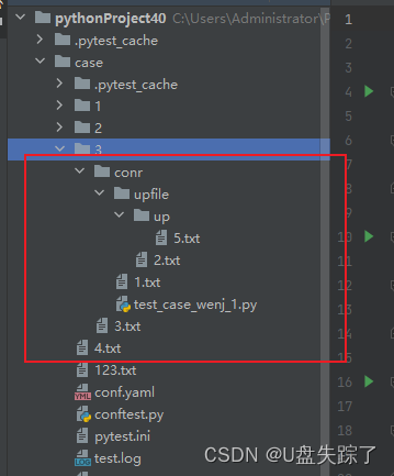
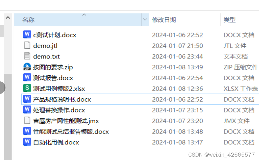
7、项目整体目录

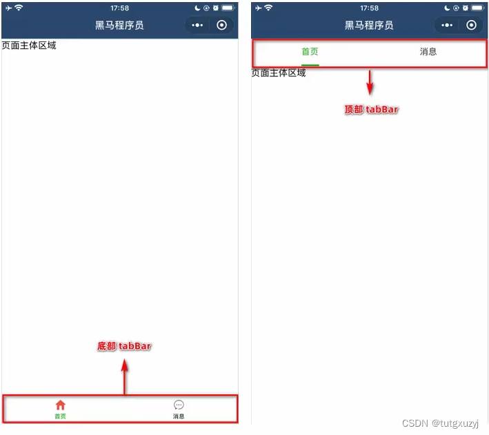
8、实现后的效果
1种权限显示3个按钮(这里做的是显示1,2,3导航)

另1种权限显示4个按钮(这里做的是显示4,5,6,7导航)

8、示例代码
相关的示例代码已经上传,可以到顶部下载下来运行查看效果。
修改好权限后,记得要重新编译哦。
其他需求或问题可以评论留言。