文章目录
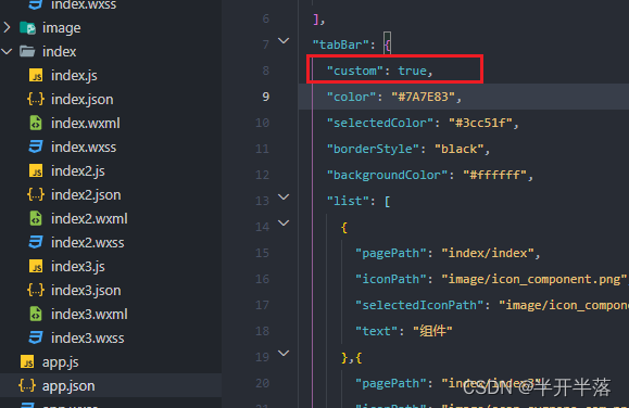
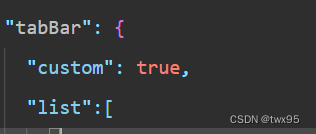
1.app.json设置custom为true开启自定义
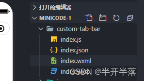
2.根目录创建自定义的tab文件
index.wxml
<view class="tab-bar">
  <view class="tab-bar-border"></view>
  <view wx:for="{
    {list}}" wx:key="index" class="tab-bar-item" data-path="{
    {item.pagePath}}" data-index="{
    {index}}" bindtap="switchTab">
  <view class="tab-bar-bulge"></view>
    <image src="{
    {selected === index ? item.selectedIconPath : item.iconPath}}"  class="{
    {item.diyClass}}"  mode="aspectFit"></image>
    <view style="color: { { selected === index ? selectedColor : color}}"  class="{
    {item.diyClass}}">{
  {item.text}}</view>
  </view>
</view>
index.json
{

  "component": true
}
index.js
Component({

  data: {

    selected: 0,
    color: "#7A7E83",
    selectedColor: "#3cc51f",
    list: [{

        pagePath: "/index/index",
        iconPath: "/image/icon_component.png",
        selectedIconPath: "/image/icon_component_HL.png",
        text: "组件"
      }, {

        pagePath: "/index/index3",
        iconPath: "/image/scan-svgrepo-com.png",
        selectedIconPath: "/image/scan-svgrepo-com.png",
        text: "扫码",
        diyClass: "diy"
      },
      {

        pagePath: "/index/index2",
        iconPath: "/image/icon_API.png",
        selectedIconPath: "/image/icon_API_HL.png",
        text: "接口"
      }
    ]
  },
  attached() {
   },
  methods: {

    switchTab(e) {

      const data = e.currentTarget.dataset
      const url = data.path
      console.log(data)
      if (data.index == 1) {

        wx.scanCode({

          success: (e) => {

            console.log(e)
          }
        })
        this.setData({

          selected: data.index
        })
      } else {

        wx.switchTab({

          url
        })
      }
    }
  }
})
index.css
/* .tab-bar {
  position: fixed;
  bottom: 0;
  left: 0;
  right: 0;
  height: 48px;
  background: white;
  display: flex;
  padding-bottom: env(safe-area-inset-bottom);
}

.tab-bar-border {
  background-color: rgba(0, 0, 0, 0.33);
  position: absolute;
  left: 0;
  top: 0;
  width: 100%;
  height: 1px;
  transform: scaleY(0.5);
}

.tab-bar-item {
  flex: 1;
  text-align: center;
  display: flex;
  justify-content: center;
  align-items: center;
  flex-direction: column;
}

.tab-bar-item image {
  width: 27px;
  height: 27px;
}
mtrj
.tab-bar-item view {
  font-size: 10px;
}
 */


/* ------------ */

/*重新样式*/
.tab-bar {

	position: fixed;
	bottom: 0;
	left: 0;
	right: 0;
	display: flex;
	box-sizing: content-box;
	background-color: transparent;
}

.tab-bar-bg {

	width: 100%;
	height: 140rpx;
}

.tab-bar-icon {

	display: flex;
	position: absolute;
	justify-content: space-between;
	width: 100%;
}

.tab-bar-border {

  background-color: rgba(0, 0, 0, 0.33);
  position: absolute;
	left: 0;
	top: 0;
	width: 100%;
	height: 1px;
	transform: scaleY(0.5);
}

.tab-bar-item {

	flex: auto;
	text-align: center;
	display: flex;
	justify-content: center;
	align-items: center;
	flex-direction: column;
	background-color: transparent;
	height: 120rpx;
}

.tab-bar-item.bm {

	margin-top: 0 !important;
	background: transparent;
	position: relative;
	flex: inherit;
	width: 134rpx;
}

.tab-bar-item image {

	width: 48rpx;
	height: 48rpx;
	overflow: initial;
}

.tab-bar-item view {

	font-size: 24rpx;
}

.tab-bar-item image.diy {

  position: absolute;
  width: 108rpx;
  height: 114rpx;
  bottom: 50%;
  z-index: 100;
}

.tab-bar-item view.diy {

	background: transparent;
	width: 100%;
	height: 100%;
	padding-top: 73rpx;
	z-index: 99;
}
3.app.js全局封装一个设置tabbar选中的方法
App({

  onLaunch: function () {
   },
  //设置tabbar的选中
  getCurrentTabbar(selected, that) {

    if (typeof that.getTabBar === 'function' &&
      that.getTabBar()) {

      that.getTabBar().setData({

        selected: selected
      })
    }
  },
})
4.在onshow中使用选中方法
// index/index3.js
const app= getApp();
Page({


  /**
   * 页面的初始数据
   */
  data: {


  },

  /**
   * 生命周期函数--监听页面显示
   */
  onShow() {

    app.getCurrentTabbar(1,this);
  },
如果是componet的页面就直接再show中自己定义它的selected代表当前的选中态
Component({

  pageLifetimes: {

    show() {

      if (typeof this.getTabBar === 'function' &&
        this.getTabBar()) {

        this.getTabBar().setData({

          selected: 0
        })
      }
    }
  }
})
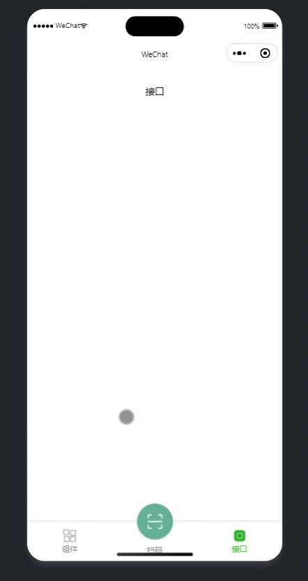
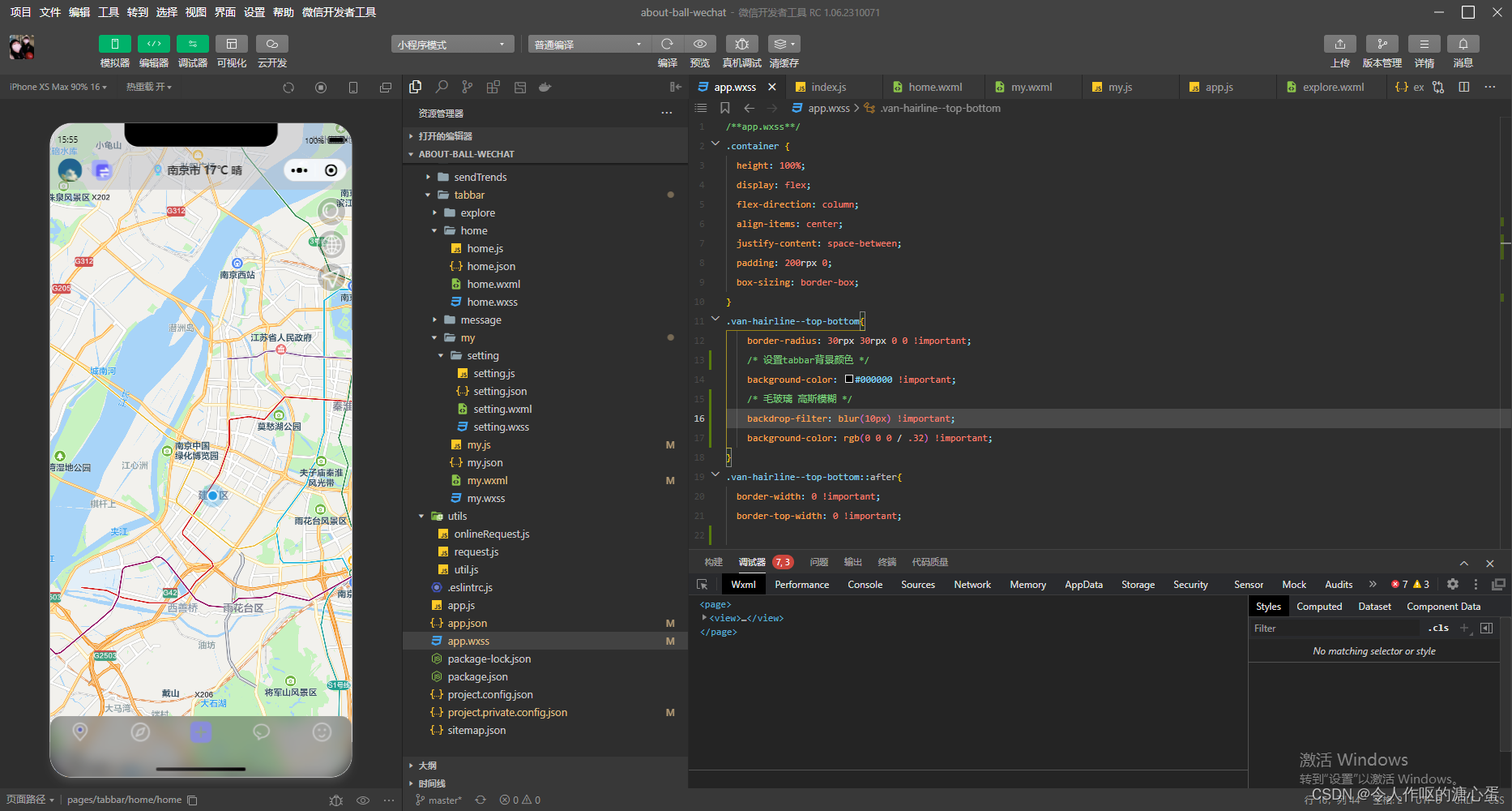
最终效果预览


