效果:
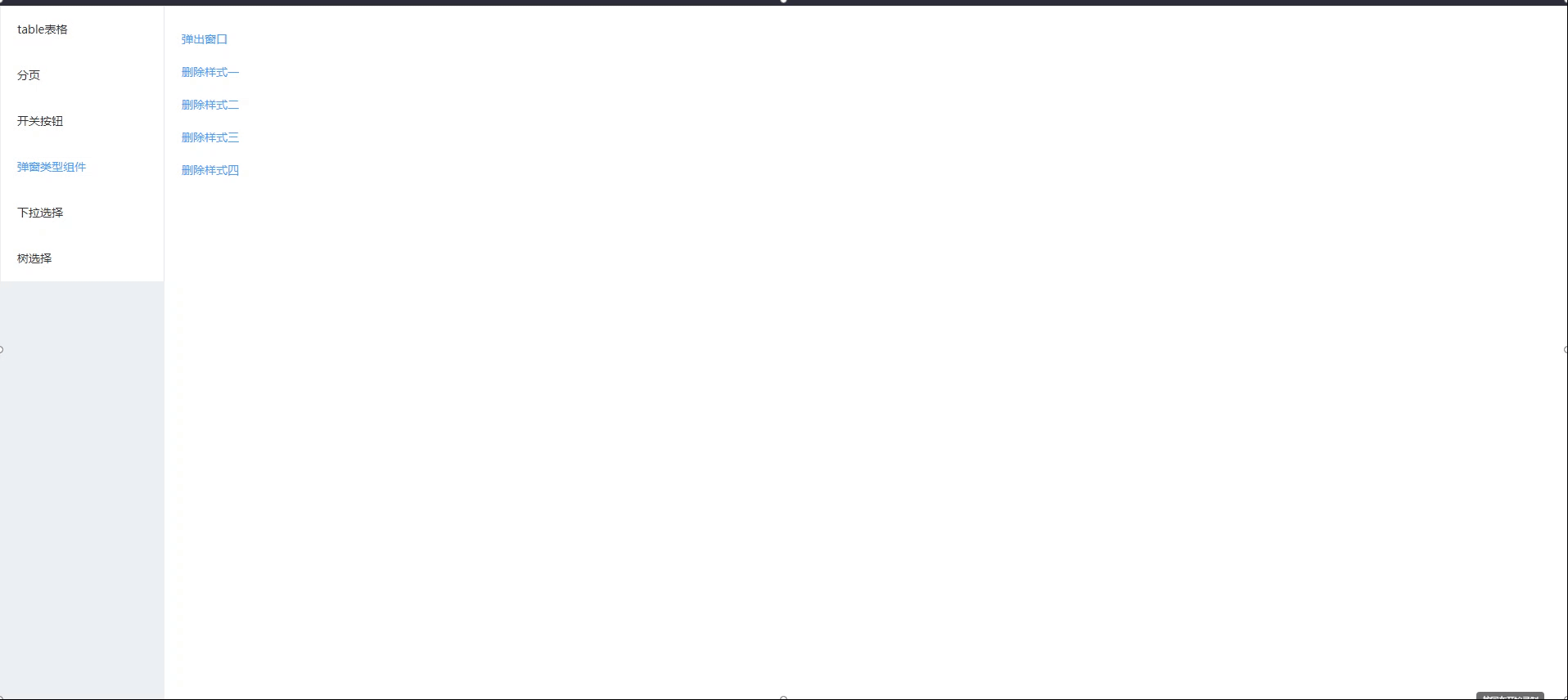
一、自定义内容类型弹窗
<!--
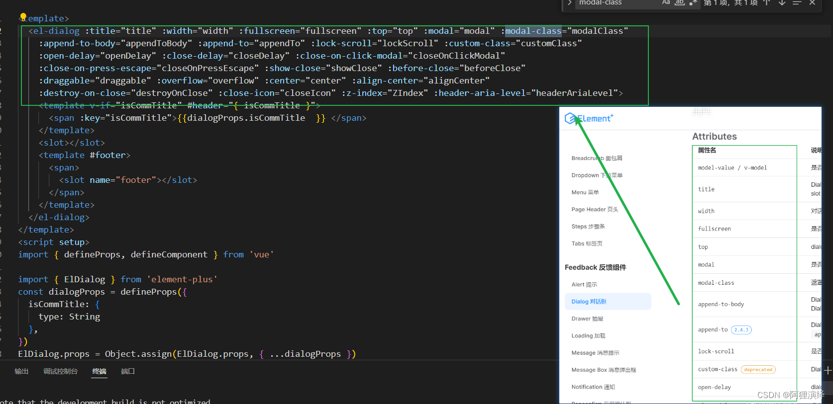
title:对话框的标题
confirmLoading:当前是否处于提交中
titleCenter:对话框标题居中方式
footerCenter:底部按钮的对其方式
visible:是否显示弹窗
width:设置对话框的宽度
beforeClose:允许您指定在对话框关闭之前将调用的函数
closeOnClickModal:确定单击对话框外部(在模态叠加层上)是否会关闭对话框
center:控制对话框是否在屏幕中央
customClass:允许您为对话框指定自定义类。此类可用于将自定义样式应用于对话框
showFooter:确定是否显示带有“取消”和“确认”按钮的默认页脚
-->
<template>
<el-dialog
:visible.sync="dialogVisible"
:width="width"
:before-close="handleBeforeClose"
:close-on-click-modal="closeOnClickModal"
:center="center"
:custom-class="customClass"
:show-close="false"
>
<div
slot="title"
:style="{'textAlign': titleCenter,'font-size':'16px','font-weight':'bold'}"
>
<span>{
{
title}}</span>
</div>
<slot></slot>
<div slot="footer" v-if="showFooter" :style="{'text-align': footerCenter}" class="dialog-footer">
<el-button class="cancel-btn" @click="handleCancel" size="small">取消</el-button>
<el-button class="primary-btn" type="primary" :loading="confirmLoading" @click="handleConfirm" size="small"
>{
{
confirmLoading ? "提交中" : "确 定" }}</el-button
>
</div>
</el-dialog>
</template>
<script>
export default {
name:"hsk-dialog",
props: {
title: {
//对话框的标题
type: String,
default: "",
},
confirmLoading:{
//当前是否处于提交中
type: Boolean,
default: false,
},
titleCenter:{
//对话框标题居中方式
type: String,
default: "center",
},
footerCenter:{
//底部按钮的对其方式
type: String,
default: "center",
},
visible: {
//是否显示弹窗
type: Boolean,
default: false,
},
width: {
//设置对话框的宽度
type: String,
default: "400px",
},
beforeClose: {
//允许您指定在对话框关闭之前将调用的函数
type: Function,
default: null,
},
closeOnClickModal: {
//确定单击对话框外部(在模态叠加层上)是否会关闭对话框
type: Boolean,
default: true,
},
center: {
//控制对话框是否在屏幕中央 ( true) 或不在屏幕中央 ( false)。
type: Boolean,
default: true,
},
customClass: {
//允许您为对话框指定自定义类。此类可用于将自定义样式应用于对话框
type: String,
default: "",
},
showFooter: {
//确定是否显示带有“取消”和“确认”按钮的默认页脚
type: Boolean,
default: true,
},
},
data() {
return {
dialogVisible: this.visible,
};
},
watch: {
visible(newValue) {
this.dialogVisible = newValue;
},
dialogVisible(newValue) {
this.$emit("update:visible", newValue);
},
},
methods: {
handleBeforeClose(done) {
if (this.beforeClose) {
this.beforeClose(done);
} else {
done();
}
},
handleCancel() {
// this.$emit('update:visible', false);
this.dialogVisible = false;
this.$emit("cancel");
},
handleConfirm() {
if (!this.confirmLoading) {
// this.dialogVisible = false;
this.$emit("confirm");
}
},
},
};
</script>
<style scoped>
/* Add your custom styles here */
/deep/.el-dialog__body{
padding: 30px 55px !important;
}
.dialog-footer {
text-align: right;
margin-top: 10px;
}
.el-openDialog__header {
margin-bottom: 10px;
}
.el-dialog__footer{
margin-bottom: 31px;
}
.cancel-btn{
width: 80px;
height: 36px;
background: #FFFFFF;
border-radius: 2px 2px 2px 2px;
opacity: 1;
box-sizing: border-box;
border: 1px solid #707070;
}
.primary-btn{
margin-left:20px;
width: 80px;
height: 36px;
background: #0759C4;
box-sizing: border-box;
border-radius: 2px 2px 2px 2px;
}
</style>
父组件使用
<template>
  <div>
    <el-button type="text" @click="openDialog">弹出窗口</el-button>
    <!-- <el-button @click="openDialog">打开对话框</el-button> -->
    <hsk-dialog
      :visible.sync="dialogVisible"
      title="自定义对话框"
      :width="width"
      :before-close="beforeCloseHandler"
      :close-on-click-modal="false"
      :center="false"
      :showFooter="true"
      custom-class="custom-dialog"
      :show-footer="false"
      @confirm="handleConfirm"
      @cancel="handleCancel"
      :confirm-loading="confirmLoading"
    >
      自定义内容及表单
    </hsk-dialog>
  </div>
</template>

<script>
export default {

  components: {

    // hskDialog
  },
  data() {

    return {

      confirmLoading: false,
      dialogVisible: false,
      width: "400px",
    };
  },
  methods: {

    openDialog() {

      this.dialogVisible = true;
    },
    beforeCloseHandler(done) {

      this.$message.info("点击了“X”操作");
      done();
    },
    handleConfirm() {

      // this.$message.success('点击了确定按钮');
      this.confirmLoading = true;
      this.$message.success("点击了确定按钮");
      setTimeout(() => {

        this.confirmLoading = false;
      }, 1000);
    },
    handleCancel() {

      this.$message.info("点击了取消按钮");
    }
  },
};
</script>
<style>
.a {

  text-align: left;
  margin-top: 0;
}
.codebox{

  line-height: 24px;
}
</style>
二、删除提示类型弹窗封装
/* eslint-disable no-unused-vars */
/* eslint-disable no-undef */
import {
   MessageBox} from "element-ui"
import "./styles/pop-up.css"
export function hskMsgbox (h, title,value,iconClass='',iconColor='') {

  const newDatas = [];
  const confirmText = Array.isArray(value) ? [...value] : [value];
  if(value.length===1){

    newDatas.push(h('i', {
    class: iconClass,style:'color:'+iconColor+';float: left;margin-right:5px;font-size:24px;'}),h('div', {
    style: 'padding-left:-6px;text-align: left;font-size: 14px;font-weight:bold;' }, confirmText[0]));
  }else{

    for (const i in confirmText) {

        if(i==='0'){

          newDatas.push(h('div', {
    class: iconClass,style:'color:'+iconColor+';float: left;margin-right:5px;font-size:24px;'}),h('div', {
    style: 'padding-left:-6px;text-align: left;font-size: 14px;font-weight:bold;' }, confirmText[i]));
        }else{

          newDatas.push(h('div', {
    style: 'padding-left:-6px;text-align: left;font-size: 12px' }, confirmText[i] ));
        }
    }
  }

   const promiseconfirm = new Promise((resolve, reject) => {

    MessageBox.confirm('Tip', {

      title: title,
      message:h('p', {
   style:"text-align: left;"}, [
        newDatas
      ]),
      showCancelButton: true,
      confirmButtonText: "确定",
      cancelButtonText: "取消",
      center: true
    }).then(() => {

      resolve(true)
    }).catch(() => {

      resolve(false)
    })
  })
  return promiseconfirm
}
删除提示类型弹窗样式文件
.el-message-box__title {

  text-align: center;
  font-size: 16px;
  font-weight: bold;
}
.el-message-box__header{

  padding-bottom: 6px !important;
  padding-top: 23px !important;
}
.el-message-box--center{

  padding-bottom:25px !important;
}
父组件使用
<template>
  <div>
    <el-button type="text" @click="deleteClick">删除样式一</el-button>
    <br />
    <el-button type="text" @click="deleteClick2">删除样式二</el-button>
    <br />
    <el-button type="text" @click="deleteClick3">删除样式三</el-button>
    <br />
    <el-button type="text" @click="deleteClick4">删除样式四</el-button>
  </div>
</template>

<script>
import {
    hskMsgbox } from "@/package/commonUtils.js";
export default {

  components: {

  },
  data() {

    return {

    };
  },
  methods: {

    //删除
    async deleteClick() {

      // confirmANewline
      const h = this.$createElement;
      // let abc = 11
      let confirmText1 = [
        `是否删除数据字典?`,
        // `删除后,数据无法找回,请谨慎操作。`,
      ];
      let a = await hskMsgbox(
        h,
        "删除数据字典",
        confirmText1
      );
      console.log("a", a);
    },
    //删除样式二
    async deleteClick2() {

      // confirmANewline
      const h = this.$createElement;
      // let abc = 11
      let confirmText1 = [
        `是否删除数据字典?`,
        `删除后,数据无法找回,请谨慎操作。`,
      ];
      let a = await hskMsgbox(
        h,
        "删除数据字典",
        confirmText1
      );
      console.log("a", a);
    },
    async deleteClick3() {

      // confirmANewline
      const h = this.$createElement;
      // let abc = 11
      let confirmText1 = [
        `是否删除数据字典?`,
      ];
      let a = await hskMsgbox(
        h,
        "删除数据字典",
        confirmText1,
        "el-icon-warning",
        "red"
      );
      console.log("a", a);
    },
    async deleteClick4() {

      // confirmANewline
      const h = this.$createElement;
      // let abc = 11
      let confirmText1 = [
        `是否删除数据字典?`,
        `删除后,数据无法找回,请谨慎操作。`,
      ];
      let a = await this.hskMsgbox(
        h,
        "删除角色",
        confirmText1,
        "el-icon-warning",
        "#E6A23C"
      );
      console.log("a", a);
    },
  },
};
</script>
<style>
</style>
提示弹窗取消和确认返回的是true和false

![<span style='color:red;'>基于</span><span style='color:red;'>ElementUI</span><span style='color:red;'>二</span><span style='color:red;'>次</span><span style='color:red;'>封装</span>el-table与el-pagination分页<span style='color:red;'>组件</span>[实际项目使用]](https://img-blog.csdnimg.cn/direct/35796df8a19544eb9e777e66efdf50c6.gif)