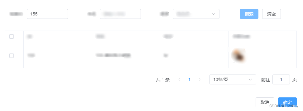
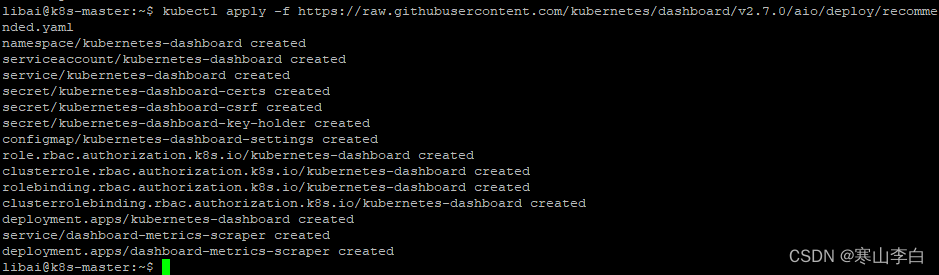
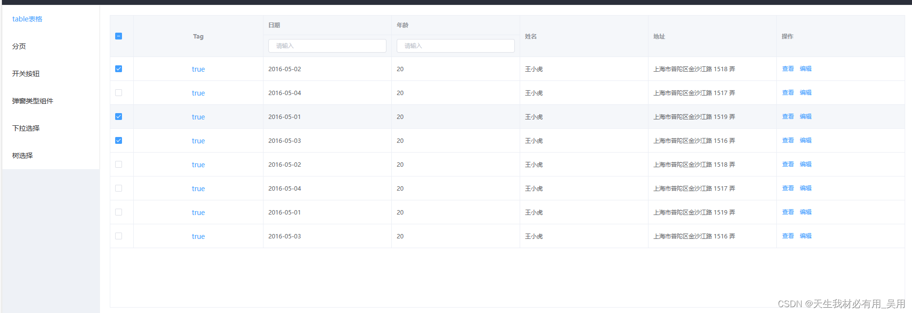
效果:
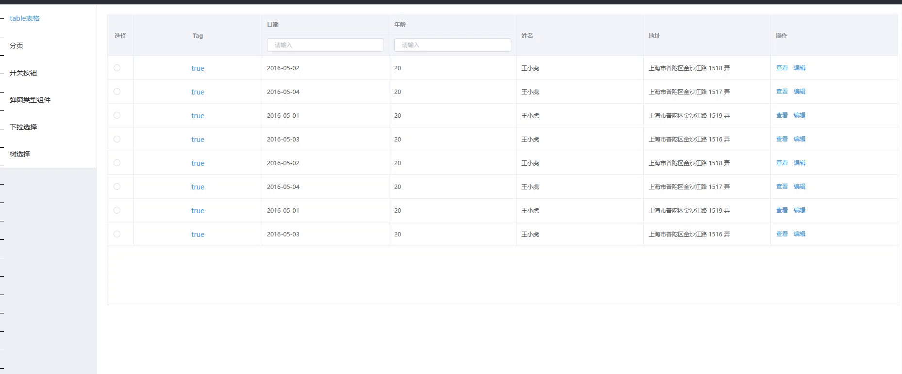
二次封装el-table组件
<template>
<div>
<!--
showHeader:是否显示头部
size:表格的大小
height:表格的高度
isStripe:表格是否为斑马纹类型
tableData:表格数据源
isBorder:是否表格边框
handleSelectionChange:行选中,多选内容发生变化回调函数
fit:列的宽度是否自己撑开
isRowBgc:如果需要设定行背景,需要指定rowClassName
rowClassName:{
bgc:"pink",
attrName:"xs",
},
isMutiSelect:是否需要多选
isRadio:是否单选
isCondition:表头是否有赛选条件框
-->
<el-table
:show-header="table.showHeader"
:size="table.size"
:height="table.height"
:stripe="table.isStripe"
:data="table.tableData"
:border="table.isBorder"
:row-key="getRowKeys"
@sort-change="handleSort"
@select="handleSelect"
@select-all="handleSelectAll"
@selection-change="handleSelectionChange"
style="width: 100%"
highlight-current-row
:row-style="table.isRowBgc?tableRowClassName:{}"
>
<el-table-column v-if="table.isRadio" align="center" width="55" label="选择">
<template slot-scope="scope">
<!-- 可以手动的修改label的值,从而控制选择哪一项 -->
<el-radio @input="singleElection(scope.row)" class="radio" v-model="templateSelection" :label="scope.row.id"> </el-radio>
</template>
</el-table-column>
<el-table-column
v-if="table.isMutiSelect"
type="selection"
style="width: 60px"
>
</el-table-column>
<template v-for="(col, key) in table.columns">
<el-table-column
v-if="col.type === 'slot'"
:key="key"
:prop="col.prop"
:label="col.label"
:width="col.width"
:align="col.align"
:header-align="col.headerAlign"
>
<template slot-scope="scope">
<slot :name="col.slot_name" :row="scope.row"></slot>
</template>
<el-table-column :align="col.align" v-if="col.isCondition" :label="col.label" :prop="col.prop">
<template
slot="header"
slot-scope="/* eslint-disable vue/no-unused-vars */ scope"
>
<slot :name="col.slot_siff_name"></slot>
</template>
</el-table-column>
</el-table-column>
<el-table-column
v-else
:key="key"
:fixed="col.isFixed"
v-show="col.hide"
:prop="col.prop"
:label="col.label"
:width="col.width"
:align="col.align"
:header-align="col.headerAlign"
>
<el-table-column v-if="col.isCondition" :align="col.align" :label="col.label" :prop="col.prop">
<template
slot="header"
slot-scope="/* eslint-disable vue/no-unused-vars */ scope"
>
<slot :name="col.slot_siff_name"></slot>
</template>
</el-table-column>
</el-table-column>
</template>
</el-table>
</div>
</template>
<script>
export default {
name: "hsk-table",
props: {
data: Object,
},
data() {
return {
templateSelection: "",
checkList: [],
table: {
showHeader:true,
fit:"true",
size:"small",
height:"500",
isRowBgc:true,
rowClassName: null,
columns: [],
tableData: [],
isMutiSelect: false,
isRadio:false,
isBorder: true,
isStripe: false,
},
};
},
watch: {
data: {
handler(newVal) {
this.init(newVal);
},
immediate: true,
deep: true,
},
},
methods: {
tableRowClassName(e) {
if(e.row[this.table.rowClassName.attrName]){
return {
background:this.table.rowClassName.bgc
}
}else{
return {
}
}
},
async init(val) {
for (let key in val) {
if (Object.keys(this.table).includes(key)) {
this.table[key] = val[key];
}
}
},
getRowKeys(row) {
return row.id;
},
handleSort(column, prop, order) {
this.$emit("tableSort", column, prop, order);
},
handleSelectionChange(val) {
this.$emit("selectChange", val);
},
handleSelectAll(val) {
this.$emit("selectAll", val);
},
handleSelect(val, row) {
this.$emit("select", val, row);
},
singleElection(row){
this.$emit("radioSelectChange", row);
}
},
};
</script>
<style scoped>
.b {
color: pink;
}
</style>
属性参数
| 属性 |
说明 |
| showHeader |
是否显示头部 |
| height |
表格的高度 |
| size |
表格大小 |
| isStripe |
表格是否为斑马纹类型 |
| tableData |
表格数据源 |
| isBorder |
是否表格边框 |
| handleSelectionChange |
行选中,多选内容发生变化回调函数 |
| fit |
列的宽度是否自己撑开 |
| isRowBgc |
如果需要设定行背景,需要指定rowClassName |
| rowClassName |
例子: { bgc:“pink”, //背景颜色 attrName:“xs”, //需要根据是否背景的属性 }, |
| isMutiSelect |
是否需要多选 |
| isRadio |
是否单选 |
| isCondition |
表头是否有赛选条件框 |
父组件使用实例
<template>
<div>
<HskTable :data="table" @select="tableSlect" @selectChange="selectChange">
<template v-slot:tag_slot="scope">
<el-link type="primary">{
{
scope.row.status }}</el-link>
</template>
<template v-slot:controls_slot="scope">
<el-button type="text" @click="viewClick(scope.row)" size="small"
>查看</el-button
>
<el-button type="text" size="small">编辑</el-button>
</template>
<template v-slot:data_siff_slot>
<el-input
v-model="table.roleName"
size="mini"
placeholder="请输入"
clearable
@clear="getList()"
@keyup.enter.native="getList()"
/>
</template>
<template v-slot:age_siff_slot>
<el-input
v-model="table.roleName"
size="mini"
placeholder="请输入"
clearable
@clear="getList()"
@keyup.enter.native="getList()"
/>
</template>
</HskTable>
<br />
</div>
</template>
<script>
import HskTable from "../package/hsk-table/index.vue";
export default {
name: "hskTable",
components: {
HskTable,
},
data() {
return {
isHidden:false,
table: {
showHeader: true,
size: "small",
fit: true,
height: "600",
isRowBgc: false,
rowClassName: {
bgc: "pink",
attrName: "xs",
},
isStripe: false,
isBorder: true,
isMutiSelect: false,
isRadio: true,
columns: [
{
type: "slot",
label: "Tag",
align: "center",
headerAlign: "center",
slot_name: "tag_slot",
prop: "tag",
width: "",
},
{
label: "日期",
prop: "date",
isCondition: true,
slot_siff_name: "data_siff_slot",
width: "",
},
{
label: "年龄",
prop: "age",
isCondition: true,
slot_siff_name: "age_siff_slot",
width: "",
},
{
label: "姓名",
prop: "name",
width: "",
},
{
label: "地址",
prop: "address",
width: "",
},
{
type: "slot",
label: "操作",
slot_name: "controls_slot",
width: "",
},
],
tableData: [
{
id: "1",
date: "2016-05-02",
name: "王小虎",
address: "上海市普陀区金沙江路 1518 弄",
status: true,
age: 20,
xs: true,
},
{
id: "2",
date: "2016-05-04",
name: "王小虎",
address: "上海市普陀区金沙江路 1517 弄",
status: true,
age: 20,
xs: false,
},
{
id: "3",
date: "2016-05-01",
name: "王小虎",
address: "上海市普陀区金沙江路 1519 弄",
status: true,
age: 20,
xs: true,
},
{
id: "4",
date: "2016-05-03",
name: "王小虎",
address: "上海市普陀区金沙江路 1516 弄",
status: true,
age: 20,
xs: false,
},
{
id: "5",
date: "2016-05-02",
name: "王小虎",
address: "上海市普陀区金沙江路 1518 弄",
status: true,
age: 20,
xs: true,
},
{
id: "6",
date: "2016-05-04",
name: "王小虎",
address: "上海市普陀区金沙江路 1517 弄",
status: true,
age: 20,
xs: false,
},
{
id: "7",
date: "2016-05-01",
name: "王小虎",
address: "上海市普陀区金沙江路 1519 弄",
status: true,
age: 20,
xs: true,
},
{
id: "8",
date: "2016-05-03",
name: "王小虎",
address: "上海市普陀区金沙江路 1516 弄",
status: true,
age: 20,
xs: false,
},
],
},
};
},
methods: {
showHidden(){
this.isHidden = !this.isHidden
},
tableSlect(val, row) {
console.log("val, row", val, row);
},
selectChange(val) {
console.log("val", val);
},
},
};
</script>
<style>
.code {
line-height: 20px;
}
.rotate-180 {
transform: rotate(180deg);
transition: transform 0.5s;
}
.rotate-0 {
transform: rotate(0deg);
transition: transform 0.5s;
}
</style>
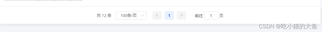
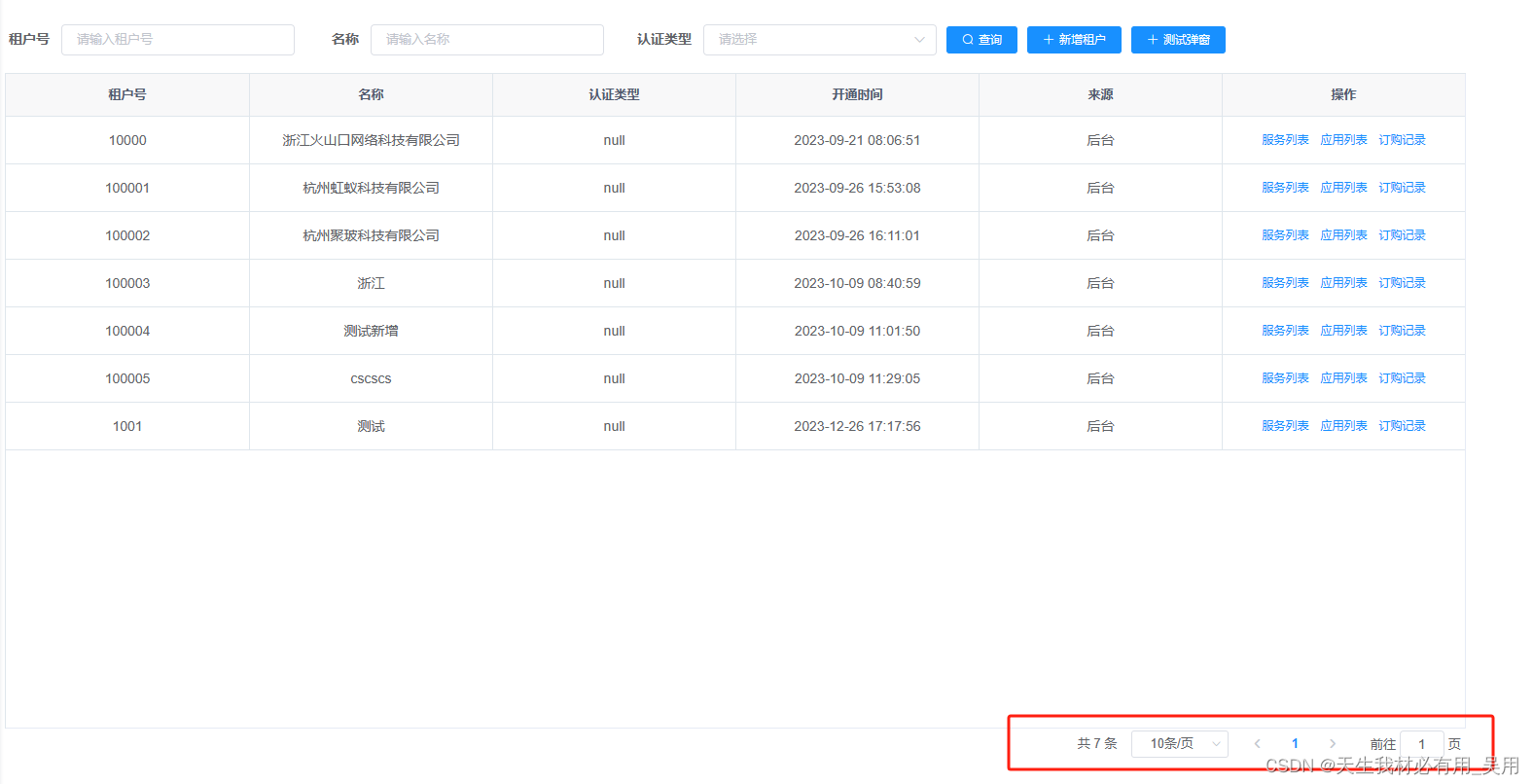
效果:
二次封装el-pagination组件
<template>
  <!-- 分页组件 -->
  <!-- size-change(每页条数)    pageSize 改变时会触发 -->
  <!-- current-change(当前页)  currentPage 改变时会触发 -->
  <!-- page-size    每页显示条目个数,支持 .sync 修饰符 -->
  <!-- page-sizes   每页显示个数选择器的选项设置 -->
  <el-pagination
    @size-change="handleSizeChange"
    @current-change="handleCurrentChange"
    :current-page="currentPage"
    :page-sizes="pageSizes"
    :page-size="pageSize"
    :layout="layout"
    :total="total"
  >
  </el-pagination>
</template>

<script>
export default {

  name:"hsk-pagination",
  props: {

    currentPage: {

      type: [String, Number],
      default: 1,
    },
    total: {

      type: [String, Number],
      default: 0,
    },
    pageSizes: {

      type: Array,
      default: () => [10, 15, 30, 50],
    },
    pageSize: {

      type: [String, Number],
      default: 10,
    },
    layout: {

      type: String,
      default: "total, sizes, prev, pager, next, jumper",
    },
  },
  data() {

    return {
   };
  },
  methods: {

    handleSizeChange(val) {

      this.$emit("sizeChange", val);
    },
    handleCurrentChange(val) {

      this.$emit("currentChange", val);
    },
  },
};
</script>
<style lang="less" scoped>
.page {

  text-align: center;
  color: #409eff;
}
</style>
属性参数
| 属性 |
说明 |
| size-change(每页条数) |
pageSize 改变时会触发 |
| current-change(当前页) |
currentPage 改变时会触发 |
| page-size |
每页显示条目个数,支持 .sync 修饰符 |
| page-sizes |
每页显示个数选择器的选项设置 |
父组件使用实例
<template>
<div class="tenant" style="margin: 15px">
<el-row :gutter="24">
<el-col :span="24" :xs="24">
<hsk-pagination
:total="queryParams.total"
:currentPage.sync="queryParams.current"
:pageSize="queryParams.pageSize"
@sizeChange="sizeChange"
@currentChange="currentChange"
></hsk-pagination>
</el-col>
</el-row>
</div>
</template>
<script>
import {
getListAppByPage } from "@/api/application/application";
export default {
data() {
return {
queryParams: {
current: 1,
pageSize: 10,
total: 0,
}
}
},
created() {
this.getList();
},
mounted(){
},
methods: {
sizeChange(val) {
this.queryParams.pageSize = val
this.getList()
},
currentChange(val) {
this.queryParams.current = val
this.getList()
},
resetQuery() {
this.$refs.add.add();
},
getList() {
getListAppByPage(this.queryParams)
.then((res) => {
this.appList = res.data.data;
this.table.tableData = res.data.data
this.queryParams.total = parseInt(res.data.total);
})
.catch((err) => {
});
},
},
};
</script>
<style lang="scss" scoped>
</style>
效果