上回介绍了基础组件中最常用的组件常用的基础组件,接下来还有其他基础组件
一、Blank
描述:空白填充组件
功能:在容器主轴方向上,具有自动填充容器空余部分的能力。只有当父组件为Row/Column时生效
子组件:无
Blank(min?: number | string)
参数:
- min:主轴上的最小大小(可选)
属性:
- color:设置填充颜色
使用案例:
1.基础功能,用来占位,填充剩余部分
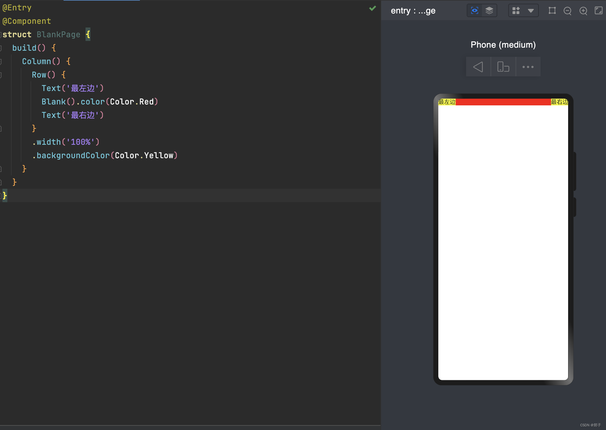
2.父组件不设置宽度时,Blank失效。可使用min来限制最小填充宽度
@Entry
@Component
struct BlankPage {
  build() {
    Column({ space: 20 }) {
      // blank父组件不设置宽度时,Blank失效
      Row() {
        Text('最左边')
        Blank().color(Color.Red)
        Text('最右边')
      }.backgroundColor(Color.Yellow)

      // blank父组件不设置宽度时,可以通过设置min最小宽度填充固定宽度
      Row() {
        Text('最左边')
        Blank('180').color(Color.Red)
        Text('最右边')
      }.backgroundColor(Color.Yellow)

    }.width('100%')
  }
}
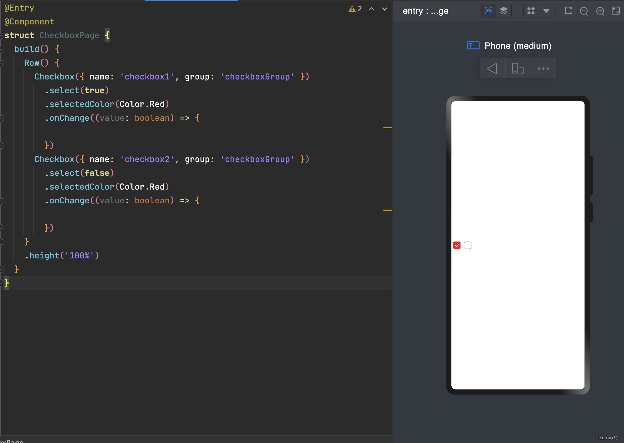
二、Checkbox
多选框组件
功能:用于选项的打开或关闭
是否支持设置子组件:不支持
Checkbox( options?: {name?: string, group?: string} )
参数:
- name:名称
- group:群组名称
属性:
- select:设置是否选中
- selectedColor:设置选中状态颜色
事件:
- onChange(callback: (value: boolean) => void):当选中状态发生变化时,触发该回调;value表示是否选中
使用案例:
@Entry
@Component
struct CheckboxPage {
  build() {
    Row() {
      Checkbox({ name: 'checkbox1', group: 'checkboxGroup' })
        .select(true)
        .selectedColor(Color.Red)
        .onChange((value: boolean) => {

        })
      Checkbox({ name: 'checkbox2', group: 'checkboxGroup' })
        .select(false)
        .selectedColor(Color.Red)
        .onChange((value: boolean) => {

        })
    }
    .height('100%')
  }
}
三、CheckboxGroup
描述:多选框群组
功能:用于控制多选框全选或者不全选状态
子组件:无
CheckboxGroup( options?: { group?: string } )
参数:
- group:群组名称
属性:
- selectAll:设置是否全选
- selectedColor:设置被选中或部分选中状态的颜色
事件:
- onChange(callback: (event: CheckboxGroupResult) => void):选中状态或群组内的Checkbox的选中状态发生变化时,触发回调
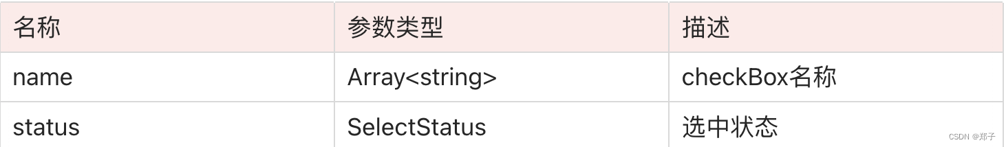
CheckboxGroupResult详解
参数:
SelectStatus:
- All:多选择框全部选择
- Part:多选择框部分选择
- None:多选择框全部没有选择
使用案例:
@Entry
@Component
struct CheckboxExample {
  build() {
    Scroll() {
      Column() {
        // 全选按钮
        CheckboxGroup({ group: 'checkboxGroup' })
          .selectedColor(0xed6f21)
          .onChange((itemName: CheckboxGroupResult) => {

          })
        Text('全选').fontSize(20)

        // 选项1
        Checkbox({ name: 'checkbox1', group: 'checkboxGroup' })
          .selectedColor(0x39a2db)
          .onChange((value: boolean) => {

          })
        Text('java').fontSize(20)

        // 选项2
        Checkbox({ name: 'checkbox2', group: 'checkboxGroup' })
          .selectedColor(0x39a2db)
          .onChange((value: boolean) => {

          })
        Text('ios').fontSize(20)

        // 选项3
        Checkbox({ name: 'checkbox3', group: 'checkboxGroup' })
          .selectedColor(0x39a2db)
          .onChange((value: boolean) => {

          })
        Text('H5').fontSize(20)
      }
    }
  }
}
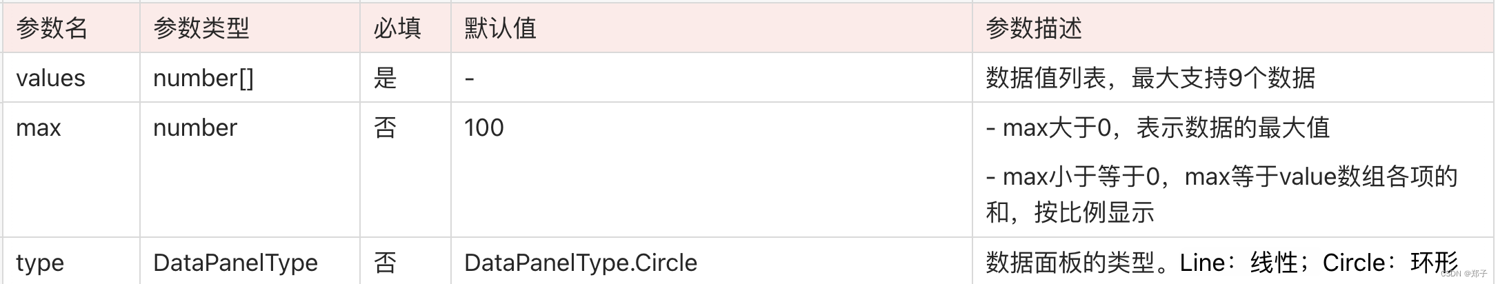
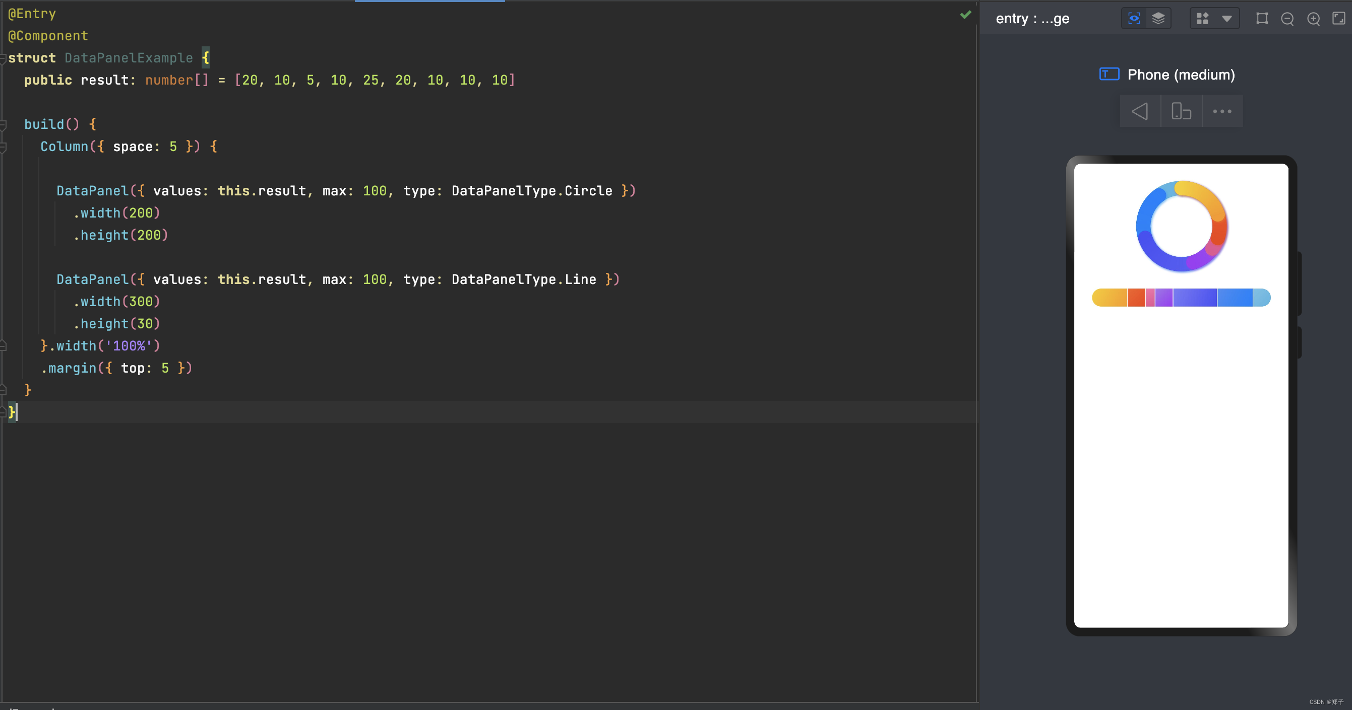
四、DataPanel
描述:数据统计组件
功能:用于将多个数据占比情况使用占比图进行展示
子组件:无
DataPanel(options:{values: number[], max?: number, type?: DataPanelType})
参数:
属性:

使用案例:
@Entry
@Component
struct DataPanelExample {
  public result: number[] = [20, 10, 5, 10, 25, 20, 10, 10, 10]

  build() {
    Column({ space: 5 }) {

      DataPanel({ values: this.result, max: 100, type: DataPanelType.Circle })
        .width(200)
        .height(200)

      DataPanel({ values: this.result, max: 100, type: DataPanelType.Line })
        .width(300)
        .height(30)
    }.width('100%')
    .margin({ top: 5 })
  }
}
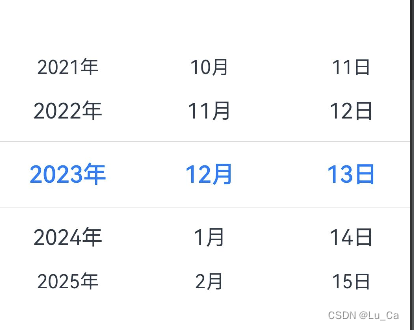
五、DatePicker
描述:日期选择器组件
功能:根据指定范围的Date创建可以选择日期的滑动选择器
子组件:无
DatePicker(options?: {start?: Date, end?: Date, selected?: Date})
参数:
属性:
事件:
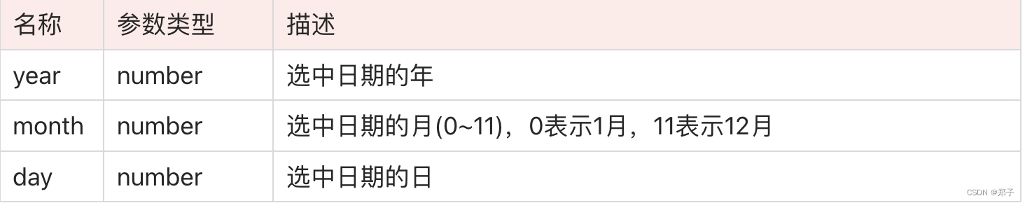
onChange(callback: (value: DatePickerResult) => void):选择日期时触发该事件


DatePickerResult详解
使用案例:
@Entry
@Component
struct DatePickerExample {
  @State isLunar: boolean = false
  private selectedDate: Date = new Date('2023-08-08')

  build() {
    Column() {
      Button('切换公历农历')
        .margin({ top: 30 })
        .onClick(() => {
          this.isLunar = !this.isLunar
        })
      DatePicker({
        start: new Date('2023-1-1'),
        end: new Date('2024-1-1'),
        selected: this.selectedDate,
      })
        .lunar(this.isLunar)
        .onChange((value: DatePickerResult) => {
          this.selectedDate.setFullYear(value.year, value.month, value.day)
          console.info('select current date is: ' + JSON.stringify(value))
        })
    }.width('100%')
  }
}
六、Divider
描述:分隔器组件
功能:分隔不同内容块/内容元素。
子组件:无
Divider()
属性:

使用案例:
@Entry
@Component
struct DividerPage {
  build() {
    Flex({ direction: FlexDirection.Column, alignItems: ItemAlign.Start, justifyContent: FlexAlign.SpaceBetween }) {
      //基础使用
      Row().width('100%').height(5).backgroundColor(Color.Red)
      Divider()
      Row().width('100%').height(5).backgroundColor(Color.Yellow)

      //横向分割线
      Flex({ alignItems: ItemAlign.Center, wrap: FlexWrap.Wrap }) {
        Text('横向1')
        Divider().vertical(true).margin(20).height(30)
        Text('横向2')
        Divider().vertical(true).margin(20).height(30)
        Text('横向3')
      }.width('100%')

      //给分割线设置参数
      Row().width('100%').height(5).backgroundColor(Color.Red)
      Divider().vertical(false).strokeWidth(5)
        .color(Color.Green).lineCap(LineCapStyle.Round)
      Row().width('100%').height(5).backgroundColor(Color.Yellow)
    }
    .width('100%')
    .height(350)
    .padding({ left: 35, right: 35, top: 35 })
  }
}
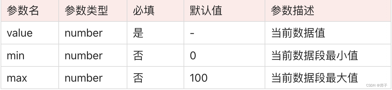
七、Gauge
描述:环形统计图组件
功能:用于将数据展示为环形图表。
子组件:无
Gauge(options:{value: number, min?: number, max?: number})
参数:
属性:
注意:
- 当属性和参数都可以设置value,当两者同时设置时以参数为准

ColorStop详解
颜色断点类型,用于描述渐进色颜色断点

使用案例:
@Entry
@Component
struct GaugeExample {
  build() {
    Column({ space: 20 }) {
      // 默认的min和max为0-100,角度范围默认0-360,value参数中设置当前值为50
      Gauge({ value: 50 })
        .width(100).height(100)
        .colors([[Color.Red, 3], [Color.Green, 1], [Color.Blue, 1], [Color.Yellow, 1]])

      // 参数设置当前值为75,属性设置值为25,属性设置优先级高
      Gauge({ value: 75 })
        .value(25) // 以这个为准
        .width(100).height(100)
        .colors([[Color.Red, 3], [Color.Green, 1], [Color.Blue, 1], [Color.Yellow, 1]])

      // 其他参数和属性的应用
      Gauge({ value: 40, min: 0, max: 100 })
        .startAngle(230) //开始位置
        .endAngle(130)  //结束位置
        .colors([[Color.Red, 0.3], [Color.Green, 0.1], [Color.Blue, 0.2], [Color.Yellow, 0.4]])
        .strokeWidth(30)
        .width(300)
        .height(300)
    }.width('100%').margin({ top: 100 })
  }
}
八、ImageAnimator
描述:图片播放组价
功能:提供帧动画组件来实现逐帧播放图片的能力,可以配置需要播放的图片列表,每张图片可以配置时长
子组件:无
ImageAnimator()
属性:
事件:
onStart(event: () => void) :状态回调,动画开始播放时触发
onPause(event: () => void):状态回调,动画暂停播放时触发
onRepeat(event: () => void):状态回调,动画重新播放时触发
onCancel(event: () => void):状态回调,动画取消播放时触发
onFinish(event: () => void):状态回调,动画播放完成时触发
注意:
属性duration值的改变只会在下一次循环开始时生效
当images中设置了单独的duration后,属性duration设置无效
当设置fixedSize为true时,表示图片大小与组件大小一致,此时设置图片的width 、height 、top 和left属性是无效的;设置false表示每一张图片的 width 、height 、top和left属性都要单独设置

images设置详解:
参数类型:
Array<{
src: string,
width?: number | string,
height?: number | string,
top?: number | string,
left?: number | string,
duration?: number
}>
参数描述:
src:图片路径,图片格式为svg,png和jpg
width:图片宽度
height:图片高度
top:图片相对于组件左上角的纵向坐标
left:图片相对于组件左上角的横向坐标
duration:每一帧图片的播放时长,单位毫秒。
使用案例:
@Entry
@Component
struct ImageAnimatorExample {
  @State state: AnimationStatus = AnimationStatus.Initial
  @State reverse: boolean = false
  @State iterations: number = 1

  build() {
    Column({ space:5 }) {
      ImageAnimator()
        .images([
          {
            //comment文件夹与pages同级
            src: $r('app.media.bg1'),
            duration: 500,
            width: 325,
            height: 200,
            top: 0,
            left: 0
          },
          {
            src: $r('app.media.bg2'),
            duration: 500,
            width: 325,
            height: 200,
            top: 0,
            left: 0
          },
          {
            src: $r('app.media.bg3'),
            duration: 500,
            width: 325,
            height: 200,
            top: 0,
            left: 0
          },
          {
            src: $r('app.media.bg3'),
            duration: 500,
            width: 325,
            height: 200,
            top: 0,
            left: 0
          }
        ])
        .state(this.state).reverse(this.reverse).fixedSize(false).preDecode(2)
        .fillMode(FillMode.None).iterations(this.iterations).width(325).height(210)
        .margin({top:100})
        .onStart(() => { // 当帧动画开始播放后触发
          console.info('Start')
        })
        .onPause(() => {
          console.info('Pause')
        })
        .onRepeat(() => {
          console.info('Repeat')
        })
        .onCancel(() => {
          console.info('Cancel')
        })
        .onFinish(() => { // 当帧动画播放完成后触发
          console.info('Finish')
        })
      Row() {
        Button('start').width(100).padding(5).onClick(() => {
          this.state = AnimationStatus.Running
        })
        Button('pause').width(100).padding(5).onClick(() => {
          this.state = AnimationStatus.Paused
        })
        Button('stop').width(100).padding(5).onClick(() => {
          this.state = AnimationStatus.Stopped
        })
      }
      Row() {
        Button('reverse').width(100).padding(5).onClick(() => {
          this.reverse = !this.reverse
        })
        Button('once').width(100).padding(5).onClick(() => {
          this.iterations = 1
        })
        Button('iteration').width(100).padding(5).onClick(() => {
          this.iterations = -1
        })
      }
    }.width('100%').height('100%').backgroundColor(0xF1F3F5)
  }
}
九、 Marquee
描述: 跑马灯组件
功能: 用于滚动展示一段单行文本,仅当文本内容宽度超过跑马灯组件宽度时滚动
子组件:无
Marquee(value: { start: boolean, step?: number, loop?: number, fromStart?: boolean, src: string })
参数:
属性:
事件:
名称
参数类型
默认值
描述
allowScale
boolean
false
是否允许文本缩放
暂不支持该接口
名称
功能描述
onStart(event: () => void)
开始滚动时触发回调
onBounce(event: () => void)
滚动到底时触发回调
onFinish(event: () => void)
滚动完成时触发回调

使用案例:
@Entry
@Component
struct MarqueeExample {
  @State start: boolean = false
  @State fromStart: boolean = true
  @State step: number = 50
  @State loop: number = 3
  @State src: string = "Running Marquee starts rolling"

  build() {
    Flex({ direction: FlexDirection.Column, alignItems: ItemAlign.Center, justifyContent: FlexAlign.Center }) {
      Marquee({
        start: this.start,
        step: this.step,
        loop: this.loop,
        fromStart: this.fromStart,
        src: this.src
      })
        .width(400)
        .fontColor(Color.White)
        .fontSize(50)
        .allowScale(false)
        .fontWeight(FontWeight.Bold)
        .backgroundColor(Color.Black)
        .margin({bottom:40})
        .onStart(() => {
          console.log('Marquee animation complete onStart')
        })
        .onBounce(() => {
          console.log('Marquee animation complete onBounce')
        })
        .onFinish(() => {
          console.log('Marquee animation complete onFinish')
        })
      Button('start')
        .onClick(() => {
          this.start = true
        })
        .width(200)
        .height(60)
        .margin({bottom:20})
    }
    .width('100%')
    .height('100%')
  }
}
十、 Navigation
描述: 页面头部根容器
功能: 通过属性设置来展示页面的标题、工具栏、菜单
子组件:可以包含子组件
Navigation()
属性:
事件:
名称
参数类型
默认值 描述
title
string | CustomBuilder
- 页面标题
subtitle
string
- 页面副标题。
menus
Array<NavigationMenuItem> | CustomBuilder
- 页面右上角菜单
titleMode
NavigationTitleMode
NavigationTitleMode.Free 页面标题栏显示模式。
toolBar
object | CustomBuilder
- 设置工具栏内容。
items: 工具栏所有项
hideToolBar
boolean
false 设置隐藏/显示工具栏
hideTitleBar
boolean
false 隐藏标题栏
hideBackButton
boolean
false 隐藏返回键
名称
功能描述
onTitleModeChange(callback: (titleMode: NavigationTitleMode) => void)
当titleMode为NavigationTitleMode.Free时,随着可滚动组件的滑动标题栏模式发生变化时触发此回调
使用案例:
@Entry
@Component
struct NavigationExample {
  @State hideBar: boolean = false
  @State hideTitleBar: boolean = false

  @Builder NavigationTitle() {
    Column() {
      Text(this.index == 0 ? "首页" : this.index == 1 ? "列表" : "更多")
        .width(80)
        .height(60)
        .fontColor(Color.Red)
        .fontSize(30)
    }
    .onClick(() => {
      console.log("title")
    })
  }

  @Builder NavigationMenus() {
    Row() {
      Image($r('app.media.bg1'))
        .width(25)
        .height(25)
      Image($r('app.media.bg2'))
        .width(25)
        .height(25)
        .margin({ left: 30 })
    }
  }

  @State index: number = 0

  // CustomBuilder类型的toolbar
  @Builder NavigationToolbar() {
    Row() {
      Column() {
        Image(this.index == 0 ? $r('app.media.bg1') : $r('app.media.bg2'))
          .size({ width: 25, height: 25 })
        Text('首页')
          .fontSize(16)
          .fontColor(this.index == 0 ? Color.Red : Color.Gray)
          .margin({ top: 5 })
      }
      .alignItems(HorizontalAlign.Center)
      .height('100%')
      .layoutWeight(1)
      .onClick(() => {
        this.index = 0;
      })

      Column() {
        Image(this.index == 1 ? $r('app.media.bg1') : $r('app.media.bg2'))
          .size({ width: 25, height: 25 })
        Text('列表')
          .fontSize(16)
          .fontColor(this.index == 1 ? Color.Red : Color.Gray)
          .margin({ top: 5 })
      }
      .alignItems(HorizontalAlign.Center)
      .height('100%')
      .layoutWeight(1)
      .onClick(() => {
        this.index = 1;
      })

      Column() {
        Image(this.index == 2 ? $r('app.media.bg1') : $r('app.media.bg2'))
          .size({ width: 25, height: 25 })
        Text('更多')
          .fontSize(16)
          .fontColor(this.index == 2 ? Color.Red : Color.Gray)
          .margin({ top: 5 })
      }
      .alignItems(HorizontalAlign.Center)
      .height('100%')
      .layoutWeight(1)
      .onClick(() => {
        this.index = 2;
      })
    }
    .width('100%')
    .height(50)
    .alignItems(VerticalAlign.Center)
  }

  build() {
    Column() {
      Navigation() {
        Column(){
          //具体内容区
          //可以根据具体的index 来显示不同的界面布局
          Text(this.index == 0 ? "首页" : this.index == 1 ? "列表" : "更多")
            .textAlign(TextAlign.Center)
            .fontSize(30)
            .fontColor(Color.Red)

          //测试按钮
          Row() {
            Button(this.hideBar ? "tool bar" : "hide tool bar")
              .onClick(() => {
                this.hideBar = !this.hideBar
              })
            Button(this.hideTitleBar ? "title bar" : "hide title bar")
              .onClick(() => {
                this.hideTitleBar = !this.hideTitleBar
              }).margin({ left: 50 })
          }.margin({ left: 35, top: 60 })
        }
      }
      .title(this.NavigationTitle)
      .menus(this.NavigationMenus)
      .titleMode(NavigationTitleMode.Free)
      .hideTitleBar(this.hideTitleBar)
      .hideBackButton(false)
      .onTitleModeChange((titleModel: NavigationTitleMode) => {
        console.log('titleMode')
      })
      .toolBar(this.NavigationToolbar)
      // .toolBar({ items: [
      //   { value: 'app', icon: $r('app.media.bg2'), action: () => {
      //     console.log("app")
      //   } },
      //   { value: 'add', icon: $r('app.media.bg2'), action: () => {
      //     console.log("add")
      //   } },
      //   { value: 'collect', icon: $r('app.media.bg2'), action: () => {
      //     console.log("collect")
      //   } }] })
      .hideToolBar(this.hideBar)
    }
  }
}
十一、 Progress
描述: 进度条组件
功能: 用于显示内容加载进度
子组件:无
Progress(options: {value: number, total?: number, style?: ProgressStyle, type?: ProgressType})
参数:
属性:
参数名
参数类型
必填
默认值 参数描述
value
number
是
- 指定当前进度值
total
number
否
100 指定进度总长
type
ProgressType
否
ProgressType.Linear 指定进度条类型
名称
参数类型
描述
value
number
设置当前进度值。
color
ResourceColor
设置进度条前景色。
style
{
strokeWidth?: Length
scaleCount?: number,
scaleWidth?: length
}
定义组件的样式。
刻度粗细大于进度条宽度时,刻度粗细为系统默认粗细。
ProgressType 样式可选类型:
名称 |
描述 |
|---|---|
Linear |
线性 |
Ring |
环形无刻度样式,环形圆环逐渐显示至完全填充效果 |
Eclipse |
圆形样式,显示类似月圆月缺的进度展示效果,从月牙逐渐变化至满月 |
ScaleRing |
环形有刻度样式,显示类似时钟刻度形式的进度展示效果 |
Capsule |
胶囊样式,头尾两端圆弧处的进度展示效果与Eclipse相同;中段处的进度展示效果与Linear相同 |
style详解:
- strokeWidth: 设置进度条宽度
- scaleCount: 设置环形进度条总刻度数
- scaleWidth: 设置环形进度条刻度粗细
使用案例:
@Entry
@Component
struct ProgressExample {
  build() {
    Column({ space: 15 }) {
      //线性进度条
      Progress({ value: 50, type: ProgressType.Linear })
        .width(200)
      Progress({ value: 100, total: 150, type: ProgressType.Linear })
        .color(Color.Red)
        .value(100)
        .width(200)


      //圆形进度条
      Row({ space: 50 }) {
        Progress({ value: 50, type: ProgressType.Eclipse })
          .width(100)
        Progress({ value: 100, total: 150, type: ProgressType.Eclipse })
          .color(Color.Red)
          .value(100)
          .width(100)
      }

      //环形有刻度进度条
      Row({ space: 50 }) {
        Progress({ value: 50, type: ProgressType.ScaleRing })
          .width(100)
        Progress({ value: 50, total: 150, type: ProgressType.ScaleRing })
          .color(Color.Red)
          .value(100)
          .width(100)
          .style({ strokeWidth: 15, scaleCount: 15, scaleWidth: 5 })
      }

      //环形有刻度进度条 定义样式
      Row({ space: 40 }) {
        Progress({ value: 20,  type: ProgressType.ScaleRing })
          .value(50)
          .width(100)
          .style({ strokeWidth: 20, scaleCount: 20, scaleWidth: 5 })
        Progress({ value: 100, total: 150, type: ProgressType.ScaleRing })
          .color(Color.Red)
          .value(100)
          .width(100)
          .style({ strokeWidth: 20, scaleCount: 30, scaleWidth: 3 })
      }

      //环形进度条
      Row({ space: 50 }) {
        Progress({ value: 50, type: ProgressType.Ring })
          .width(100)
        Progress({ value: 100, total: 150, type: ProgressType.Ring })
          .color(Color.Red)
          .value(100)
          .width(100)
          .style({ strokeWidth: 20, scaleCount: 30, scaleWidth: 20 })
      }

      //胶囊进度条
      Row({ space: 50 }) {
        Progress({ value: 50, type: ProgressType.Capsule })
          .width(200)
          .height(50)
        Progress({ value: 100, total: 150, type: ProgressType.Capsule })
          .color(Color.Red)
          .value(100)
          .width(100)
          .height(50)
      }
    }.width('100%').margin({ top: 30 })
  }
}
十二、 Progress
描述: 二维码组件
功能: 用来显示二维码
子组件:无
QRCode(value: string)
参数:
- value:二维码内容
属性:
- color:二维码颜色
- backgroundColor:二维码背景色
使用案例:
@Entry
@Component
struct QRCodeExample {
  private value: string = 'hello world'
  build() {
    Column({ space: 5 }) {

      QRCode(this.value)
        .width(200)
        .height(200)

      // 设置二维码颜色
      QRCode(this.value)
        .color(Color.Red)
        .width(200)
        .height(200)

      // 设置二维码背景色
      QRCode(this.value)
        .width(200)
        .height(200)
        .backgroundColor(Color.Red)
    }.width('100%').margin({ top: 5 })
  }
}
十二、 Radio
描述: 单选框组件
功能: 提供相应的用户交互选择项
子组件:无
Radio(options: {value: string, group: string})
参数:
- value:值
- group:组名,一个组只能有一个单选框被选中
属性:
- checked:设置是否选中
事件:
- onChange(callback: (isChecked: boolean) => void):单选框状态改变时触发
使用案例:
@Entry
@Component
struct RadioPage {
@State message: string = 'Hello World'
build() {
Row() {
Column() {
Radio({ value: 'Radio1', group: 'radioGroup' })
.checked(true)
.height(50)
.width(50)
.onChange((isChecked: boolean) => {
})
Radio({ value: 'Radio2', group: 'radioGroup' })
.checked(true)
.height(50)
.width(50)
.onChange((isChecked: boolean) => {
})
}
.width('100%')
}
.height('100%')
}
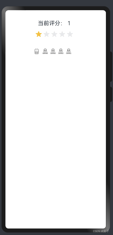
}十三、 Rating
描述: 评分组件
功能: 用来评分
子组件:无
Rating(options?: { rating: number, indicator?: boolean })
参数:
- rating:设置并接收评分值
- indicator:指示器
属性:
- stars:设置评星总数,默认值:5
- stepSize:步长,一次可增加减少多少,默认值:0.5
- starStyle:选中与未选中样式
事件:
- onChange(callback:(value: number) => void):操作发生改变时触发
可由用户自定义或使用系统默认图片,仅支持本地。
- backgroundSrc:未选中的星级的图片链接
- foregroundSrc:选中的星级的图片路径
- secondarySrc:部分选中的星级的图片路径
使用案例:
@Entry
@Component
struct RatingPage {
  @State rating: number = 1
  @State indicator: boolean = false

  build() {
    Flex({ direction: FlexDirection.Column, alignItems: ItemAlign.Center, justifyContent: FlexAlign.SpaceBetween }) {
      Text('当前评分: ' + this.rating).fontSize(20)
      //基础用法
      Rating({ rating: this.rating, indicator: this.indicator })
        .stars(5)
        .stepSize(1)
        .onChange((value: number) => {
          this.rating = value
        })

      //可设置本地图片
      Rating({ rating: this.rating, indicator: false })
        .stars(5)
        .stepSize(1)
        .starStyle({
          backgroundUri: '/common/bg1.png',
          foregroundUri: '/common/bg2.png',
          secondaryUri: '/common/bg3.png'
        })
        .margin({ top: 24 })
        .onChange((value: number) => {
          this.rating = value
        })
    }.width(350).height(200).padding(35)
  }
}
十四、 RichText
描述: 富文本组件
功能: 解析并显示HTML格式文本。
子组件:无
RichText(content: string)
参数:
- content :HTML格式的字符串
事件:
- onStart(callback: () => void):加载网页开始时触发
- onComplete(callback: () => void) :加载网页完成时触发
支持标签:
<h1>--<h6>:定义标题,1~6
<p></p>:定义段落
<br/>:插入一个简单的换行符
<hr/>:定义HTML页面中的主题变化(比如话题的转移),并显示为一条水平线
<div></div>:常用于组合块级元素,以便通过CSS来对这些元素进行格式化
<i></i>:斜体
<u></u>:下划线
<style></style>:HTML文档的样式信息
<script></script>:用于定义客户端文本,比如JavaScript


![[SWPUCTF 2021 新生赛]jicao](https://img-blog.csdnimg.cn/direct/9d5d19b9434a485c9465365010d9352d.png)