一、通用属性和文本样式
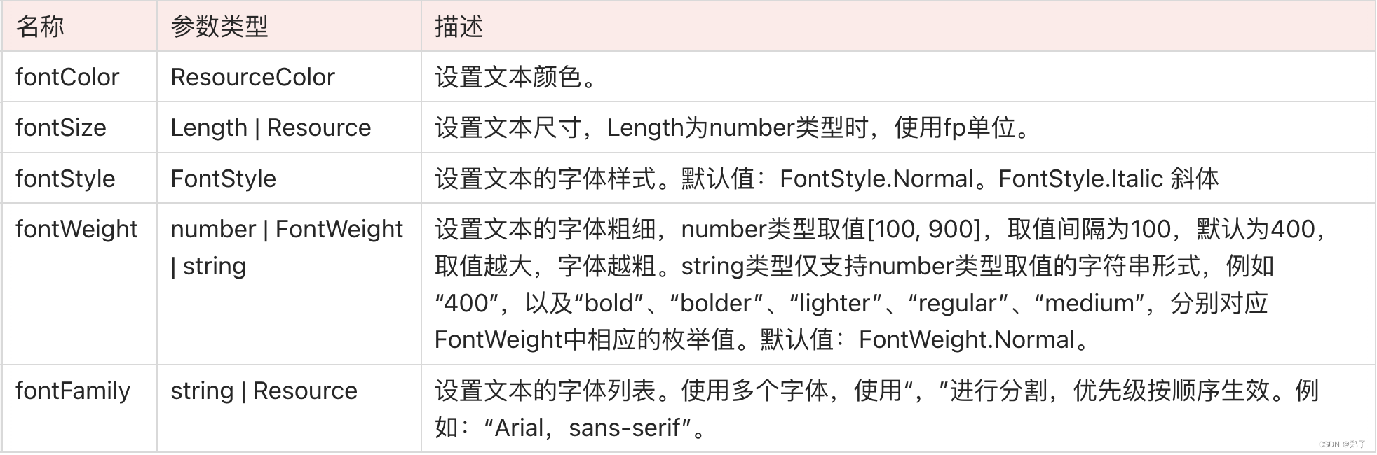
针对包含文本元素的组件(比如:Text、Span、Button、TextInput等),可以设置一些通用的文本样式,比如颜色:fontColor、大小:fontSize、样式:fontStyle、 粗细:fontWeight、字体:fontFamily
二、Text
文本组件,可以包含子组件Span
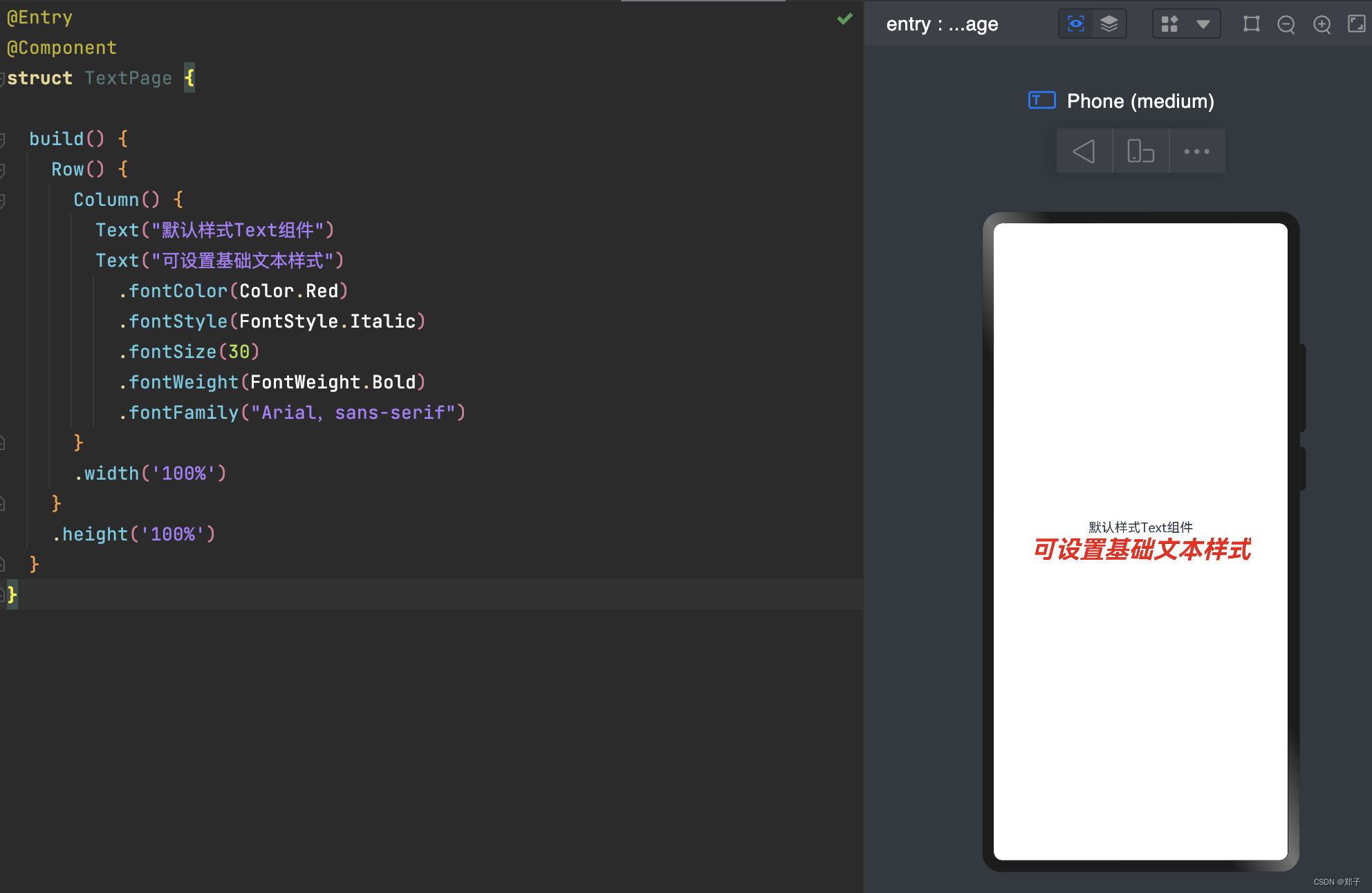
1.基础用法
@Entry
@Component
struct TextPage {
  build() {
    Row() {
      Column() {
        Text("默认样式Text组件")
        Text("可设置基础文本样式")
          .fontColor(Color.Red)
          .fontStyle(FontStyle.Italic)
          .fontSize(30)
          .fontWeight(FontWeight.Bold)
          .fontFamily("Arial,sans-serif")
      }
      .width('100%')
    }
    .height('100%')
  }
}
2.常用属性
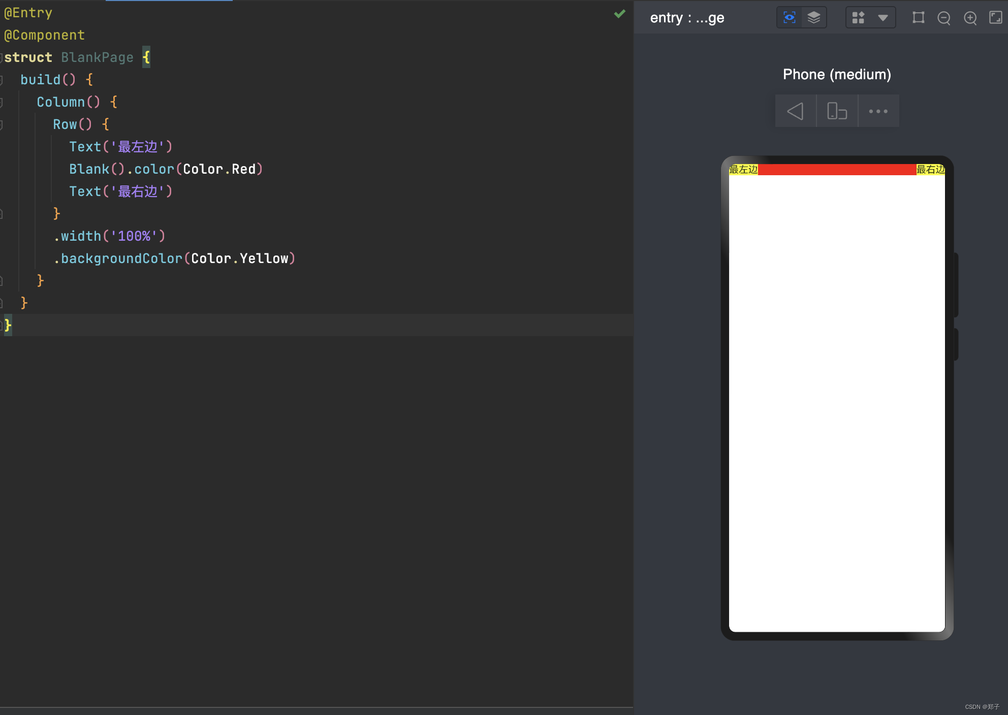
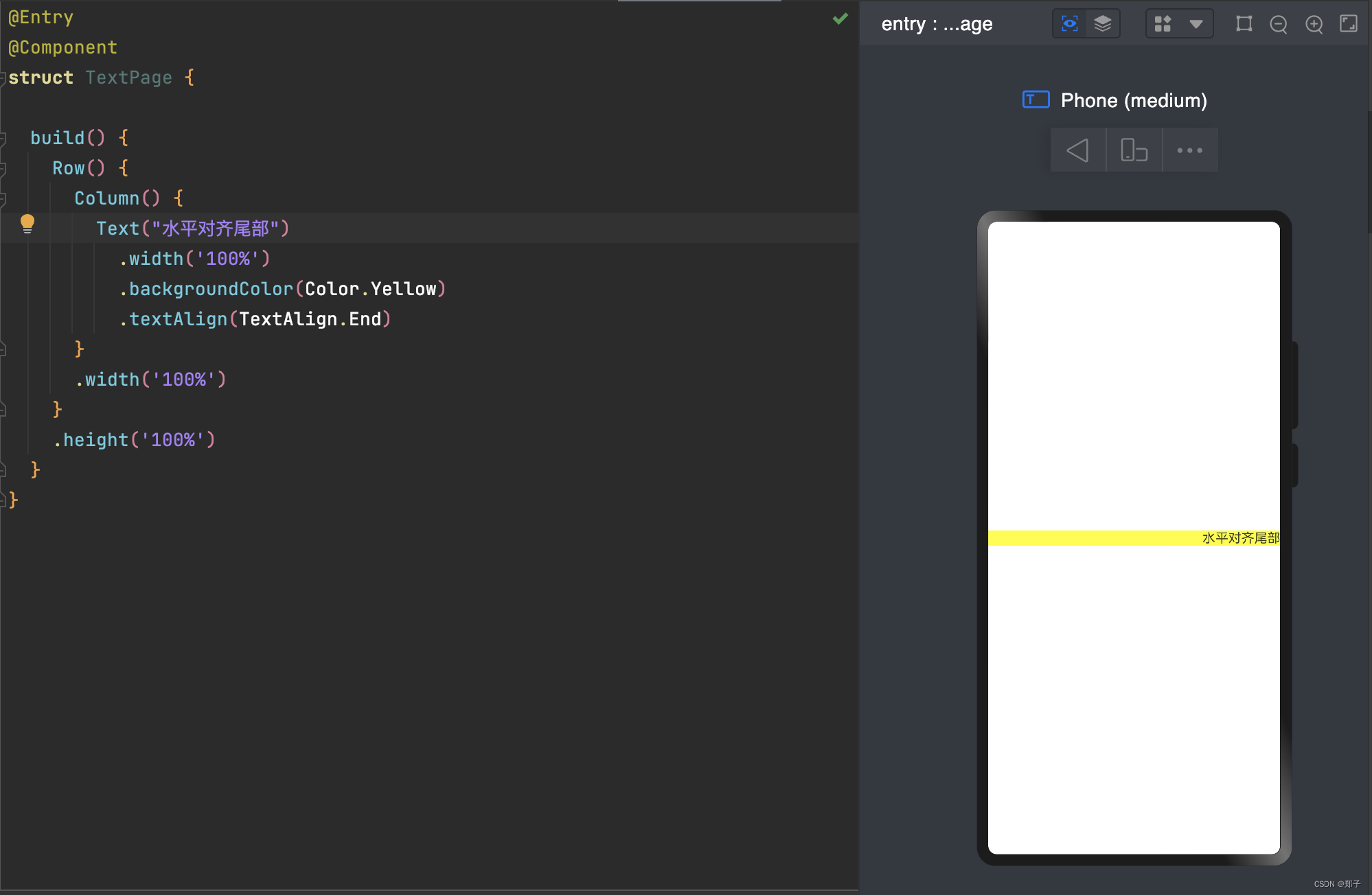
textAlign:
@Entry
@Component
struct TextPage {

  build() {
    Row() {
      Column() {
        Text("水平对齐尾部")
          .width('100%')
          .backgroundColor(Color.Yellow)
          .textAlign(TextAlign.End)
      }
      .width('100%')
    }
    .height('100%')
  }
}
设置文本的对齐方式
参数类型为TextAlign,可选类型:
- Start:水平对齐首部(默认)
- Center:水平居中对齐
- End:水平对齐尾部
maxLines:
用于设置文本显示最大行数。
textOverflow:
设置文本截取方式
    .textOverflow({overflow:TextOverflow.Ellipsis})
    .maxLines(1)
当文本内容较多超出了组件范围时,用来设置文本截取方式,需配合maxLines使用,单独设置不生效
参数类型为TextOverflow,可设置类型:
- None:无
- Clip:直接剪裁
- Ellipsis:将显示不下的文本用 “...” 表示

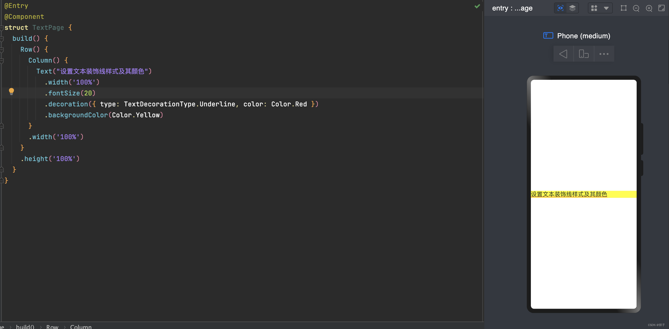
decoration:
设置文本装饰线样式及其颜色
.decoration({ type: TextDecorationType.Underline, color: Color.Red })设置文本装饰线样式,使用TextDecorationType设置,可设置的类型:
- None:不使用文本装饰线
- Overline:文字上划线修饰
- LineThrough:穿过文本的修饰线,中划线
- Underline:文字下划线修饰。
使用Color设置本文装饰线颜色
三、Image
图片组件,可以给Image设置图片地址、宽和高
1.基础用法
@Entry
@Component
struct ImagePage {

  build() {
    Row() {
      Column() {
        Image($r("app.media.icon"))
          .width(100)
          .height(100)
      }
      .width('100%')
    }
    .height('100%')
  }
}
2.常用属性
objectFit
设置图片的缩放类型
.objectFit(ImageFit.Contain)
使用ImageFit设置,可设置类型:
- Cover:保持宽高比进行缩小或者放大,使得图片两边都大于或等于显示边界。默认
- Contain:保持宽高比进行缩小或者放大,使得图片完全显示在显示边界内
- Auto:自适应显示
- Fill:不保持宽高比进行放大缩小,使得图片充满显示边界
- ScaleDown:保持宽高比显示,图片缩小或者保持不变
- None:保持原有尺寸显示
3.加载网络图片
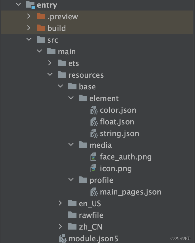
Image('https://网络图片.jpg')需要在module.json5文件中申明网络访问权限
{
    "module" : {
        "requestPermissions":[
           {
             "name": "ohos.permission.INTERNET"
           }
        ]
    }
}四、TextInput
输入单行文本
1.基础用法
@Entry
@Component
struct TextInputPage {

  build() {
    Row() {
      Column() {
        TextInput()
          .fontColor(Color.Blue)
          .fontSize(20)
          .fontStyle(FontStyle.Italic)
          .fontWeight(FontWeight.Bold)
          .fontFamily('Arial')
      }
      .width('100%')
    }
    .height('100%')
  }
}
2.设置提示文本:placeholder
@Entry
@Component
struct TextInputPage {
  build() {
    Row() {
      Column() {
        TextInput({ placeholder: '请输入账号' })
          .placeholderColor(0x999999)
          .placeholderFont({ size: 20, weight: FontWeight.Medium, family: 'cursive', style: FontStyle.Italic })
      }
      .width('100%')
    }
    .height('100%')
  }
}- placeholderColor:设置提示文本的颜色
- placeholderFont:设置提示文本的样式,可以设置文本大小size,粗细weight,样式style,字体family
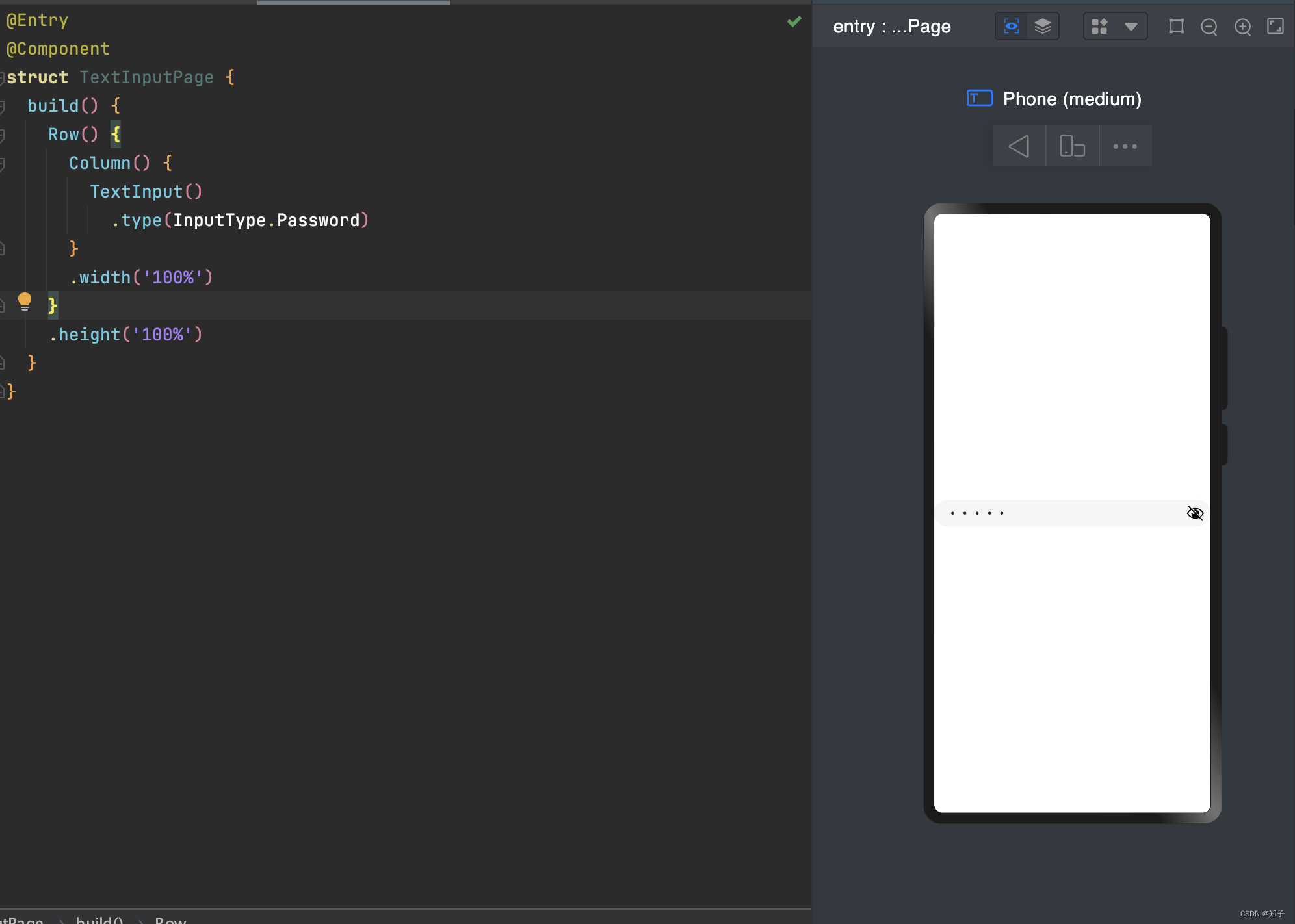
3.设置输入类型:type
type的参数类型为InputType,包含的输入类型:
- Normal:基本输入模式。支持输入数字、字母、下划线、空格、特殊字符
- Password:密码输入模式
- Email:e-mail地址输入模式
- Number:纯数字输入模式
4.设置光标位置
使用TextInputController的caretPosition方法
创建一个TextInputController对象,将这个对象设置到TextInput组件中,当点击按钮时,如果输入的字符数满足条件,光标会移动到caretPosition设置的position中
@Entry
@Component
struct TextInputPage {
  controller: TextInputController = new TextInputController()

  build() {
    Row() {
      Column() {
        TextInput({ controller: this.controller })
          .type(InputType.Email)

        Button('设置光标位置')
          .onClick(() => {
            this.controller.caretPosition(2)
          })
      }
      .width('100%')
    }
    .height('100%')
  }
}
5.获取输入文本
可以给TextInput设置onChange事件,输入文本发生变化时触发回调
@Entry
@Component
struct TextInputPage {
  @State text: string = ''

  build() {
    Row() {
      Column() {
        TextInput({ placeholder: '请输入账号' })
          .onChange((value:string) => {
            this.text = value
          })

        Text(this.text)
      }
      .width('100%')
    }
    .height('100%')
  }
}
6.其他属性
caretColor:
修改光标颜色
.caretColor(Color.Red)
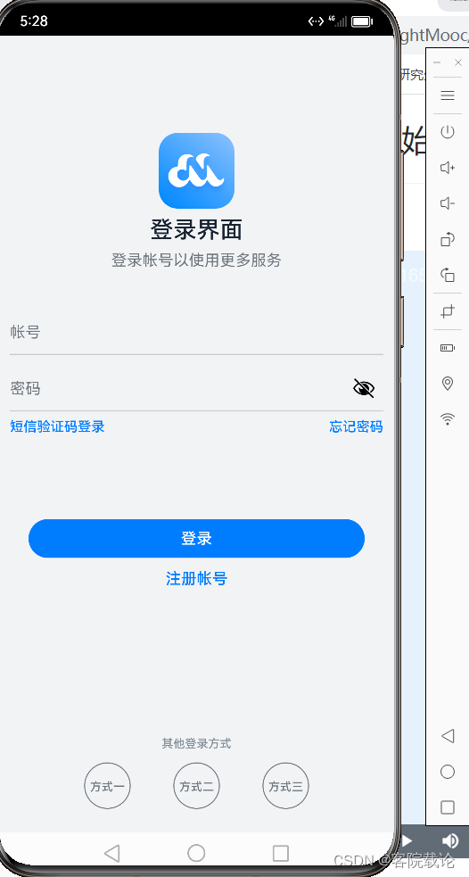
五、Button
用来响应点击事件操作,可以包含子组件
1.基础用法
实现一个登录按钮
@Entry
@Component
struct ButtonPage {

  build() {
    Row() {
      Column() {
        Button('登录', { type: ButtonType.Capsule, stateEffect: true })
          .width('90%')
          .height(40)
          .fontSize(16)
          .fontWeight(FontWeight.Medium)
          .backgroundColor('#007DFF')
      }
      .width('100%')
    }
    .height('100%')
  }
}
2.设置按钮样式:type
用ButtonType来设置按钮样式,可设置的类型有:
- Capsule:胶囊型按钮(圆角默认为高度的一半)
- Circle:圆形按钮
- Normal:普通按钮(默认不带圆角)
用stateEffect来设置按钮是否开启切换效果(闪动),false时,点击效果关闭,默认值为true。
Button('登录', { type: ButtonType.Capsule, stateEffect: true })
3.设置按钮点击事件
用onClick来给按钮绑定点击事件
      .onClick(()=>{
            // 处理点击事件逻辑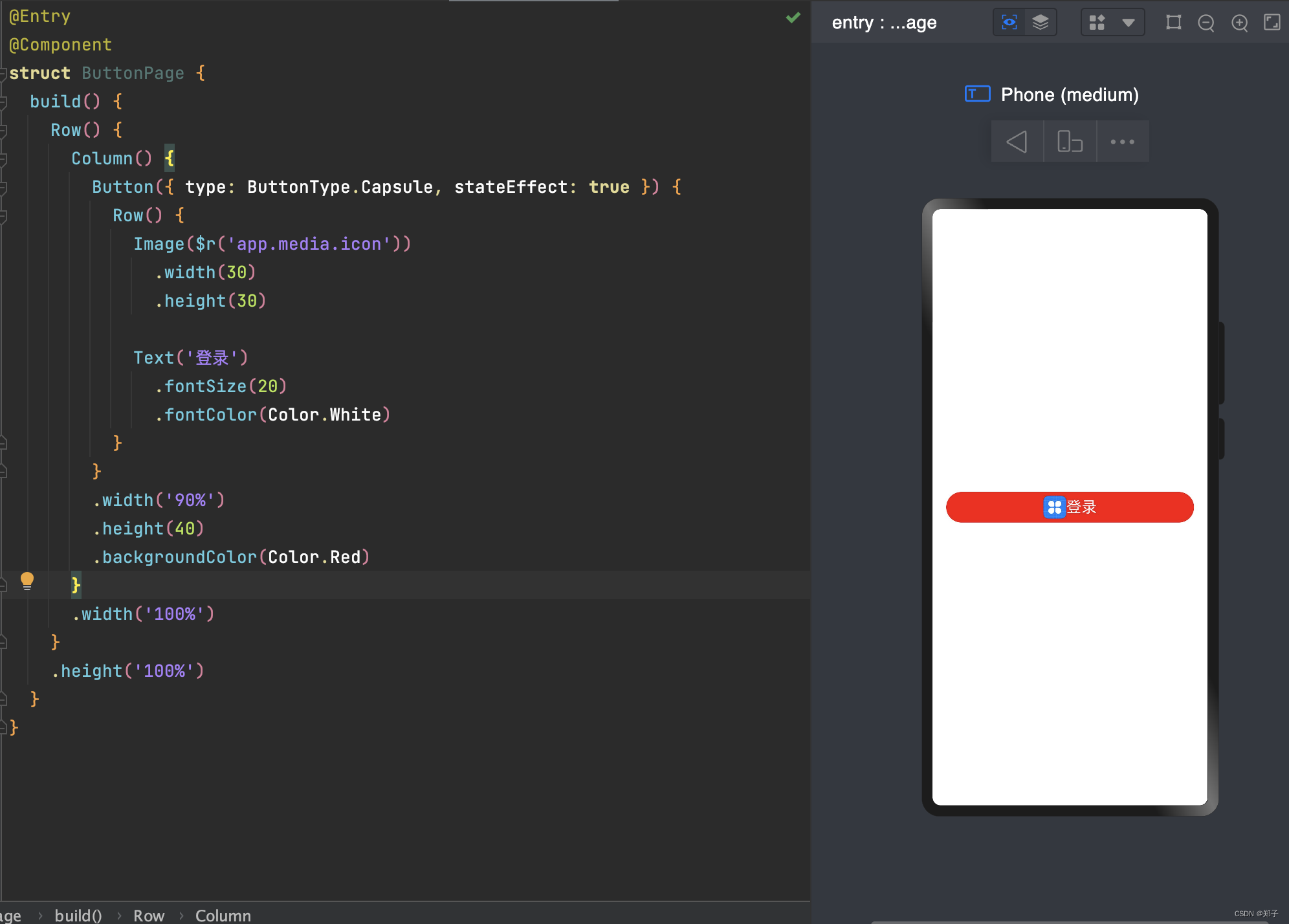
})4.设置子组件
@Entry
@Component
struct ButtonPage {
  build() {
    Row() {
      Column() {
        Button({ type: ButtonType.Capsule, stateEffect: true }) {
          Row() {
            Image($r('app.media.icon'))
              .width(30)
              .height(30)

            Text('登录')
              .fontSize(20)
              .fontColor(Color.White)
          }
        }
        .width('90%')
        .height(40)
        .backgroundColor(Color.Red)
      }
      .width('100%')
    }
    .height('100%')
  }
}
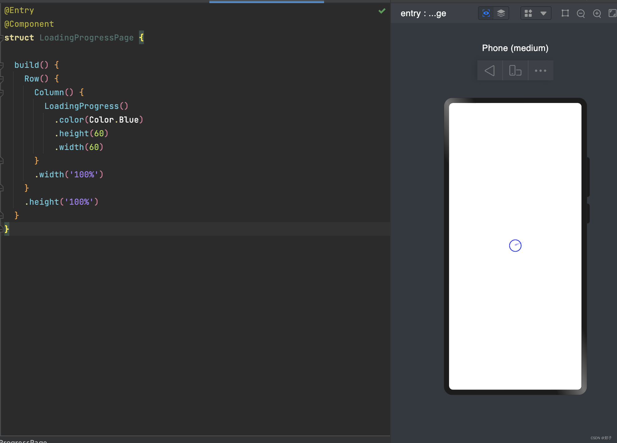
六、LoadingProgress
进度条组件
可以设置颜色color,和宽width、高height
@Entry
@Component
struct LoadingProgressPage {

  build() {
    Row() {
      Column() {
        LoadingProgress()
          .color(Color.Blue)
          .height(60)
          .width(60)
      }
      .width('100%')
    }
    .height('100%')
  }
}