一、前言
HTML,全称HyperText Markup Language,即超文本标记语言,是用于创建网页的标准标记语言。HTML是一种标记语言,由一系列的元素标签组成,用于描述网页的结构和内容。
CSS,全称是“层叠样式表”(Cascading Style Sheets),是一种用于描述HTML或XML(包括如SVG、MathML等派生语言)文档样式的计算机语言。CSS是网页设计的重要组成部分,它能够定义网页的布局、颜色、字体和动画等。
结合html标签,使用css的animation方法实现一个跳动的,来表达心情的。。。
二、创意名
跳动的心
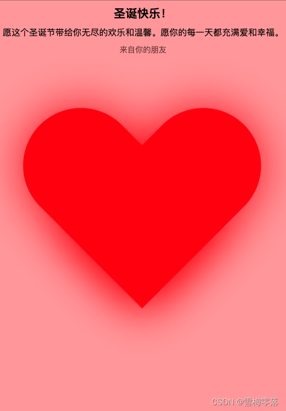
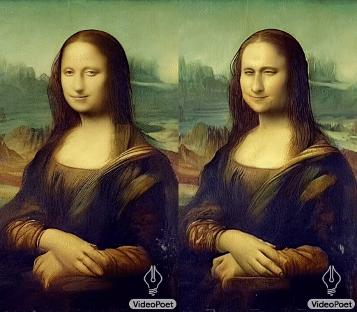
三、效果展示
四、实现步骤
- html创建标签
- css实现动态效果
五、编码实现
<!DOCTYPE html>
<html>
<head>
  <title>圣诞贺卡</title>
  <style>
    body {

      background-color: #f0f0f0;
      font-family: Arial, sans-serif;
      text-align: center;
    }

    .card {

      display: inline-block;
      background-color: #ff9999;
      border: 2px solid #996666;
      padding: 10px;
      margin: 10px;
      font-size: 20px;
      height: calc(100vh - 60px);
    }

    .card-header {

      font-weight: bold;
      font-size: 24px;
      margin-bottom: 10px;
    }

    .card-content {

      font-size: 18px;
      line-height: 1.5;
    }

    .card-footer {

      font-size: 16px;
      color: #663333;
      margin-top: 10px;
    }
    .main-content {

      position: absolute;
      width: 420px;
      height: 400px;
      top: 50%;
      left: 50%;
      margin-top: -200px;
      margin-left: -210px;
      animation: love 1s infinite alternate;
    }

    .main-content p {

      z-index: 1;
      position: absolute;
      top: 0;
      left: 0;
      right: 0;
      bottom: 0;
      margin: auto;
      width: 100px;
      height: 30px;
      color: yellow;
    }

    .love-left {

      width: 200px;
      height: 350px;
      background-color: red;
      transform: translate(55px) rotate(-45deg);
      border-radius: 120px 120px 0 0;
      box-shadow: 0 0 80px 0 red;
    }

    .love-right {

      position: relative;
      top: -350px;
      width: 200px;
      height: 350px;
      background-color: red;
      transform: translate(161px) rotate(45deg);
      border-radius: 120px 120px 0 0;
      box-shadow: 0 0 80px 0 red;
    }

    @keyframes love {


      0% {

        transform: scale(1);
      }

      50% {

        transform: scale(0.6);
      }

      100% {

        transform: scale(1.2);
      }
    }

    .main-content:hover {

      animation-play-state: paused;
    }
  </style>
</head>
<body>
  <div class="card">
    <div class="card-header">圣诞快乐!</div>
    <div class="card-content">
      愿这个圣诞节带给你无尽的欢乐和温馨。愿你的每一天都充满爱和幸福。
    </div>
    <div class="main-content">
      <div class="love-left"></div>
      <div class="love-right"></div>
    </div>
    <div class="card-footer">来自你的朋友</div>
  </div>
</body>
</html>


