CSS Float(浮动)
什么是 CSS Float(浮动)?

CSS 的 Float(浮动),会使元素向左或向右移动,其周围的元素也会重新排列。
Float(浮动),往往是用于图像,但它在布局时一样非常有用。
元素怎样浮动
元素的水平方向浮动,意味着元素只能左右移动而不能上下移动。
一个浮动元素会尽量向左或向右移动,直到它的外边缘碰到包含框或另一个浮动框的边框为止。
浮动元素之后的元素将围绕它。
浮动元素之前的元素将不会受到影响。
如果图像是右浮动,下面的文本流将环绕在它左边:
实例
img { float:right; }彼此相邻的浮动元素
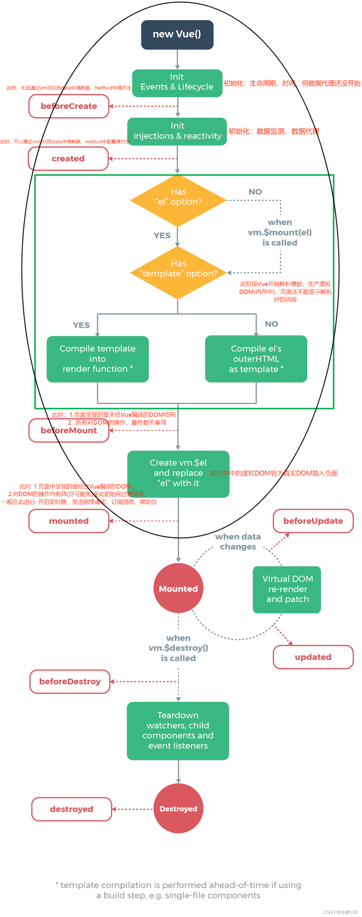
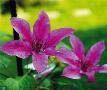
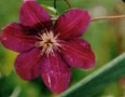
如果你把几个浮动的元素放到一起,如果有空间的话,它们将彼此相邻。
在这里,我们对图片廊使用 float 属性:
实例
.thumbnail { float:left; width:110px; height:90px; margin:5px; }清除浮动 - 使用 clear
元素浮动之后,周围的元素会重新排列,为了避免这种情况,使用 clear 属性。
clear 属性指定元素两侧不能出现浮动元素。
使用 clear 属性往文本中添加图片廊:
实例
.text_line { clear:both; }
更多实例
<!DOCTYPE html>
<html>
<head>
<meta charset="utf-8">
<title>菜鸟教程(runoob.com)</title>
<style>
img
{
	float:right;
	border:1px dotted black;
	margin:0px 0px 15px 20px;
}
</style>
</head>

<body>
<p>
	在下面的段落中,图像将向右浮动。黑色虚线边界添加到图像。
我们还添加了边缘的0 px的顶部和右侧 margin,15 px底部margin,和20 px左侧的margin的图像。使得文本远离图片:</p>
<p>
<img src="logocss.gif" width="95" height="84" />
This is some text. This is some text. This is some text.
This is some text. This is some text. This is some text.
This is some text. This is some text. This is some text.
This is some text. This is some text. This is some text.
This is some text. This is some text. This is some text.
This is some text. This is some text. This is some text.
This is some text. This is some text. This is some text.
This is some text. This is some text. This is some text.
This is some text. This is some text. This is some text.
This is some text. This is some text. This is some text.
</p>
</body>

</html>
让我们为图像添加边框和边距并浮动到段落的右侧
<!DOCTYPE html>
<html>
<head>
<meta charset="utf-8">
<title>菜鸟教程(runoob.com)</title>
<style>
div
{
	float:right;
	width:120px;
	margin:0 0 15px 20px;
	padding:15px;
	border:1px solid black;
	text-align:center;
}
</style>
</head>

<body>
<div>
<img src="logocss.gif" width="95" height="84" /><br>
CSS is fun!
</div>
<p>
This is some text. This is some text. This is some text.
This is some text. This is some text. This is some text.
This is some text. This is some text. This is some text.
This is some text. This is some text. This is some text.
This is some text. This is some text. This is some text.
This is some text. This is some text. This is some text.
This is some text. This is some text. This is some text.
This is some text. This is some text. This is some text.
This is some text. This is some text. This is some text.
This is some text. This is some text. This is some text.
This is some text. This is some text. This is some text.
This is some text. This is some text. This is some text.
This is some text. This is some text. This is some text.
</p>

<p>
	在上面的段落中,div元素是120像素宽,它包含了图像。
	div元素会向右浮动。
	Margins 被添加到div使得文本远离div。
	Borders和padding被添加到div框架的图片和标题中
</p>
</body>

</html>
让标题和图片向右侧浮动。
<!DOCTYPE html>
<html>
<head>
<meta charset="utf-8">
<title>菜鸟教程(runoob.com)</title>
<style>
span
{
	float:left;
	width:1.2em;
	font-size:400%;
	font-family:algerian,courier;
	line-height:80%;
}
</style>
</head>

<body>
<p>
<span>这</span>是一些文本。
这是一些文本。这是一些文本。
这是一些文本。这是一些文本。这是一些文本。
这是一些文本。这是一些文本。这是一些文本。
这是一些文本。这是一些文本。这是一些文本。
这是一些文本。这是一些文本。这是一些文本。
这是一些文本。这是一些文本。这是一些文本。
这是一些文本。这是一些文本。这是一些文本。
</p>

<p>
在上面的段落中, 第一个字嵌入在span 元素中。
这个 span 元素的宽度是当前字体大小的1.2倍。
这个 span 元素是当前字体的400%(相当大), line-height 为80%。
文字的字体为"Algerian"。
</p>

</body>
</html>
改变样式,让段落的第一个字母浮动到左侧。
<!DOCTYPE html>
<html>
<head>
<meta charset="utf-8">
<title>菜鸟教程(runoob.com)</title>
<style>
* {
    box-sizing: border-box;
}
body {
    margin: 0;
}
.header {
    background-color: #2196F3;
    color: white;
    text-align: center;
    padding: 15px;
}
.footer {
    background-color: #444;
    color: white;
    padding: 15px;
}
.topmenu {
    list-style-type: none;
    margin: 0;
    padding: 0;
    overflow: hidden;
    background-color: #777;
}
.topmenu li {
    float: left;
}
.topmenu li a {
    display: inline-block;
    color: white;
    text-align: center;
    padding: 16px;
    text-decoration: none;
}
.topmenu li a:hover {
    background-color: #222;
}
.topmenu li a.active {
    color: white;
    background-color: #4CAF50;
}
.column {
    float: left;
    padding: 15px;
}
.clearfix::after {
    content: "";
    clear: both;
    display: table;
}
.sidemenu {
    width: 25%;
}
.content {
    width: 75%;
}
.sidemenu ul {
    list-style-type: none;
    margin: 0;
    padding: 0;
}
.sidemenu li a {
    margin-bottom: 4px;
    display: block;
    padding: 8px;
    background-color: #eee;
    text-decoration: none;
    color: #666;
}
.sidemenu li a:hover {
    background-color: #555;
    color: white;
}
.sidemenu li a.active {
    background-color: #008CBA;
    color: white;
}
</style>
</head>
<body>

<ul class="topmenu">
  <li><a href="#home" class="active">主页</a></li>
  <li><a href="#news">新闻</a></li>
  <li><a href="#contact">联系我们</a></li>
  <li><a href="#about">关于我们</a></li>
</ul>

<div class="clearfix">
  <div class="column sidemenu">
    <ul>
      <li><a href="#flight">The Flight</a></li>
      <li><a href="#city" class="active">The City</a></li>
      <li><a href="#island">The Island</a></li>
      <li><a href="#food">The Food</a></li>
      <li><a href="#people">The People</a></li>
      <li><a href="#history">The History</a></li>
      <li><a href="#oceans">The Oceans</a></li>
    </ul>
  </div>

  <div class="column content">
    <div class="header">
      <h1>The City</h1>
    </div>
    <h1>Chania</h1>
    <p>Chania is the capital of the Chania region on the island of Crete. The city can be divided in two parts, the old town and the modern city.</p>
    <p>You will learn more about responsive web pages in a later chapter.</p>
  </div>
</div>

<div class="footer">
  <p>底部文本</p>
</div>

</body>
</html>
使用 float 创建一个网页页眉、页脚、左边的内容和主要内容。
CSS 中所有的浮动属性
"CSS" 列中的数字表示不同的 CSS 版本(CSS1 或 CSS2)定义了该属性。
| 属性 | 描述 | 值 | CSS |
|---|---|---|---|
| clear | 指定不允许元素周围有浮动元素。 | left right both none inherit |
1 |
| float | 指定一个盒子(元素)是否可以浮动。 | left right none inherit |
1 |
CSS 布局 - 水平 & 垂直对齐
水平 & 垂直居中对齐
元素居中对齐
要水平居中对齐一个元素(如 <div>), 可以使用 margin: auto;。
设置到元素的宽度将防止它溢出到容器的边缘。
元素通过指定宽度,并将两边的空外边距平均分配:
div 元素是居中的
实例
.center { margin: auto; width: 50%; border: 3px solid green; padding: 10px; }注意: 如果没有设置 width 属性(或者设置 100%),居中对齐将不起作用。
文本居中对齐
如果仅仅是为了文本在元素内居中对齐,可以使用 text-align: center;
文本居中对齐
实例
.center { text-align: center; border: 3px solid green; }提示: 更多文本对齐实例,请参阅之前发布的文本章节。
图片居中对齐
要让图片居中对齐, 可以使用 margin: auto; 并将它放到 块 元素中:

实例
img { display: block; margin: auto; width: 40%; }左右对齐 - 使用定位方式
我们可以使用 position: absolute; 属性来对齐元素:
菜鸟教程 -- 学的不仅是技术,更是梦想!!!
实例
.right { position: absolute; right: 0px; width: 300px; border: 3px solid #73AD21; padding: 10px; }注释:绝对定位元素会被从正常流中删除,并且能够交叠元素。
提示: 当使用 position 来对齐元素时, 通常 <body> 元素会设置 margin 和 padding 。 这样可以避免在不同的浏览器中出现可见的差异。
当使用 position 属性时,IE8 以及更早的版本存在一个问题。如果容器元素(在我们的案例中是 <div class="container">)设置了指定的宽度,并且省略了 !DOCTYPE 声明,那么 IE8 以及更早的版本会在右侧增加 17px 的外边距。这似乎是为滚动条预留的空间。当使用 position 属性时,请始终设置 !DOCTYPE 声明:
实例
body { margin: 0; padding: 0; } .container { position: relative; width: 100%; } .right { position: absolute; right: 0px; width: 300px; background-color: #b0e0e6; }左右对齐 - 使用 float 方式
我们也可以使用 float 属性来对齐元素:
实例
.right { float: right; width: 300px; border: 3px solid #73AD21; padding: 10px; }当像这样对齐元素时,对 <body> 元素的外边距和内边距进行预定义是一个好主意。这样可以避免在不同的浏览器中出现可见的差异。
注意:如果子元素的高度大于父元素,且子元素设置了浮动,那么子元素将溢出,这时候你可以使用 "clearfix(清除浮动)" 来解决该问题。
我们可以在父元素上添加 overflow: auto; 来解决子元素溢出的问题:
实例
.clearfix { overflow: auto; }当使用 float 属性时,IE8 以及更早的版本存在一个问题。如果省略 !DOCTYPE 声明,那么 IE8 以及更早的版本会在右侧增加 17px 的外边距。这似乎是为滚动条预留的空间。当使用 float 属性时,请始终设置 !DOCTYPE 声明:
实例
body { margin: 0; padding: 0; } .right { float: right; width: 300px; background-color: #b0e0e6; }垂直居中对齐 - 使用 padding
CSS 中有很多方式可以实现垂直居中对齐。 一个简单的方式就是头部顶部使用 padding:
我是垂直居中。
实例
.center { padding: 70px 0; border: 3px solid green; }如果要水平和垂直都居中,可以使用 padding 和 text-align: center:
我是水平和垂直都居中的。
实例
.center { padding: 70px 0; border: 3px solid green; text-align: center; }垂直居中 - 使用 line-height
我是垂直居中的。
实例
.center { line-height: 200px; height: 200px; border: 3px solid green; text-align: center; } /* 如果文本有多行,添加以下代码: */ .center p { line-height: 1.5; display: inline-block; vertical-align: middle; }垂直居中 - 使用 position 和 transform
除了使用 padding 和 line-height 属性外,我们还可以使用 transform 属性来设置垂直居中:
实例
.center { height: 200px; position: relative; border: 3px solid green; } .center p { margin: 0; position: absolute; top: 50%; left: 50%; transform: translate(-50%, -50%); }提示: 更多 transform 属性内容可以参阅之后会出的2D反转章节。
更多实例
div {
    margin-left: auto;
    margin-right: auto;
    width: 300px;
    background-color: #b0e0e6;
}
div {
position: absolute;
right: 0px;
width: 300px;
background-color: #b0e0e6;
}CSS 组合选择符
CSS 组合选择符
|
组合选择符说明了两个选择器之间的关系。 |
|---|
CSS组合选择符包括各种简单选择符的组合方式。
在 CSS3 中包含了四种组合方式:
- 后代选择器(以空格 分隔)
- 子元素选择器(以大于 > 号分隔)
- 相邻兄弟选择器(以加号 + 分隔)
- 普通兄弟选择器(以波浪号 ~ 分隔)
后代选择器
后代选择器用于选取某元素的后代元素。
以下实例选取所有 <p> 元素插入到 <div> 元素中:
实例
div p { background-color:yellow; }子元素选择器
与后代选择器相比,子元素选择器(Child selectors)只能选择作为某元素直接/一级子元素的元素。
以下实例选择了<div>元素中所有直接子元素 <p> :
实例
div>p { background-color:yellow; }相邻兄弟选择器
相邻兄弟选择器(Adjacent sibling selector)可选择紧接在另一元素后的元素,且二者有相同父元素。
如果需要选择紧接在另一个元素后的元素,而且二者有相同的父元素,可以使用相邻兄弟选择器(Adjacent sibling selector)。
以下实例选取了所有位于 <div> 元素后的第一个 <p> 元素:
实例
div+p { background-color:yellow; }后续兄弟选择器
后续兄弟选择器选取所有指定元素之后的相邻兄弟元素。
以下实例选取了所有 <div> 元素之后的所有相邻兄弟元素 <p> :
实例
div~p { background-color:yellow; }CSS 伪类(Pseudo-classes)
CSS伪类是用来添加一些选择器的特殊效果。
语法
伪类的语法:
selector:pseudo-class {property:value;}CSS类也可以使用伪类:
selector.class:pseudo-class {property:value;}anchor伪类
在支持 CSS 的浏览器中,链接的不同状态都可以以不同的方式显示
实例
a:link {color:#FF0000;} /* 未访问的链接 */ a:visited {color:#00FF00;} /* 已访问的链接 */ a:hover {color:#FF00FF;} /* 鼠标划过链接 */ a:active {color:#0000FF;} /* 已选中的链接 */注意: 在CSS定义中,a:hover 必须被置于 a:link 和 a:visited 之后,才是有效的。
注意: 在 CSS 定义中,a:active 必须被置于 a:hover 之后,才是有效的。
注意:伪类的名称不区分大小写。
伪类和CSS类
伪类可以与 CSS 类配合使用:
a.red:visited {color:#FF0000;} <a class="red" href="css-syntax.html">CSS 语法</a>如果在上面的例子的链接已被访问,它会显示为红色。
CSS :first-child 伪类
您可以使用 :first-child 伪类来选择父元素的第一个子元素。
注意:在IE8的之前版本必须声明<!DOCTYPE> ,这样 :first-child 才能生效。
匹配第一个 <p> 元素
在下面的例子中,选择器匹配作为任何元素的第一个子元素的 <p> 元素:
实例
p:first-child { color:blue; }匹配所有<p> 元素中的第一个 <i> 元素
在下面的例子中,选择相匹配的所有<p>元素的第一个 <i> 元素:
实例
p > i:first-child { color:blue; }匹配所有作为第一个子元素的 <p> 元素中的所有 <i> 元素
在下面的例子中,选择器匹配所有作为元素的第一个子元素的 <p> 元素中的所有 <i> 元素:
实例
p:first-child i { color:blue; }CSS - :lang 伪类
:lang 伪类使你有能力为不同的语言定义特殊的规则
注意:IE8必须声明<!DOCTYPE>才能支持;lang伪类。
在下面的例子中,:lang 类为属性值为 no 的q元素定义引号的类型:
实例
q:lang(no) {quotes: "~" "~";}
更多实例
<!DOCTYPE html>
<html>
<head>
<meta charset="utf-8">
<title>菜鸟教程(runoob.com)</title>
<style>
a.one:link {color:#ff0000;}
a.one:visited {color:#0000ff;}
a.one:hover {color:#ffcc00;}

a.two:link {color:#ff0000;}
a.two:visited {color:#0000ff;}
a.two:hover {font-size:150%;}

a.three:link {color:#ff0000;}
a.three:visited {color:#0000ff;}
a.three:hover {background:#66ff66;}

a.four:link {color:#ff0000;}
a.four:visited {color:#0000ff;}
a.four:hover {font-family:Georgia, serif;}

a.five:link {color:#ff0000;text-decoration:none;}
a.five:visited {color:#0000ff;text-decoration:none;}
a.five:hover {text-decoration:underline;}
</style>
</head>

<body>
<p>将鼠标移至链接上改变样式.</p>

<p><b><a class="one" href="/css/" target="_blank">这个链接改变颜色</a></b></p>
<p><b><a class="two" href="/css/" target="_blank">这个链接改变字体大小</a></b></p>
<p><b><a class="three" href="/css/" target="_blank">这个链接改变背景颜色</a></b></p>
<p><b><a class="four" href="/css/" target="_blank">这个链接改变字体类型</a></b></p>
<p><b><a class="five" href="/css/" target="_blank">这个链接改变文字修饰</a></b></p>
</body>

</html>
这个例子演示了如何为超链接添加其他样式。
<!DOCTYPE html>
<html>
<head>
<meta charset="utf-8">
<title>菜鸟教程(runoob.com)</title>
<style>
input:focus
{
	background-color:yellow;
}
</style>
</head>

<body>
<form action="demo-form.php" method="get">
First name: <input type="text" name="fname" /><br>
Last name: <input type="text" name="lname" /><br>
<input type="submit" value="提交" />
</form>

<p><b>注意:</b>仅当 !DOCTYPE 已经声明时 IE8 支持 :focus.</p>

</body>
</html>
这个例子演示了如何使用 :focus伪类。
所有CSS伪类/元素
| 选择器 | 示例 | 示例说明 |
|---|---|---|
| :checked | input:checked | 选择所有选中的表单元素 |
| :disabled | input:disabled | 选择所有禁用的表单元素 |
| :empty | p:empty | 选择所有没有子元素的p元素 |
| :enabled | input:enabled | 选择所有启用的表单元素 |
| :first-of-type | p:first-of-type | 选择的每个 p 元素是其父元素的第一个 p 元素 |
| :in-range | input:in-range | 选择元素指定范围内的值 |
| :invalid | input:invalid | 选择所有无效的元素 |
| :last-child | p:last-child | 选择所有p元素的最后一个子元素 |
| :last-of-type | p:last-of-type | 选择每个p元素是其母元素的最后一个p元素 |
| :not | :not(p) | 选择所有p以外的元素 |
| :nth-child() | p:nth-child(2) | 选择所有 p 元素的父元素的第二个子元素 |
| :nth-last-child(n) | p:nth-last-child(2) | 选择所有p元素倒数的第二个子元素 |
| :nth-last-of-type(n) | p:nth-last-of-type(2) | 选择所有p元素倒数的第二个为p的子元素 |
| :nth-of-type(n) | p:nth-of-type(2) | 选择所有p元素第二个为p的子元素 |
| :only-of-type | p:only-of-type | 选择所有仅有一个子元素为p的元素 |
| :only-child | p:only-child | 选择所有仅有一个子元素的p元素 |
| :optional | input:optional | 选择没有"required"的元素属性 |
| :out-of-range | input:out-of-range | 选择指定范围以外的值的元素属性 |
| :read-only | input:read-only | 选择只读属性的元素属性 |
| :read-write | input:read-write | 选择没有只读属性的元素属性 |
| :required | input:required | 选择有"required"属性指定的元素属性 |
| :root | root | 选择文档的根元素 |
| :target | #news:target | 选择当前活动#news元素(点击URL包含锚的名字) |
| :valid | input:valid | 选择所有有效值的属性 |
| :link | a:link | 选择所有未访问链接 |
| :visited | a:visited | 选择所有访问过的链接 |
| :active | a:active | 选择正在活动链接 |
| :hover | a:hover | 把鼠标放在链接上的状态 |
| :focus | input:focus | 选择元素输入后具有焦点 |
| :first-letter | p:first-letter | 选择每个<p> 元素的第一个字母 |
| :first-line | p:first-line | 选择每个<p> 元素的第一行 |
| :first-child | p:first-child | 选择器匹配属于任意元素的第一个子元素的 <p> 元素 |
| :before | p:before | 在每个<p>元素之前插入内容 |
| :after | p:after | 在每个<p>元素之后插入内容 |
| :lang() | p:lang(it) | 为<p>元素的lang属性选择一个开始值 |