基本UI描述
ArkTS通过装饰器@Component和@Entry装饰struct关键字声明的数据结构,构成一个自定义组件。自定义组件中提供了一个build函数,开发者需在该函数内以链式调用的方式进行基本的UI描述,UI描述的方法请参考UI描述规范。
基本概念
- struct:自定义组件可以基于struct实现,不能有继承关系,对于struct的实例化,可以省略new。
- 装饰器:装饰器给被装饰的对象赋予某一种能力,其不仅可以装饰类或结构体,还可以装饰类的属性。多个装饰器可以叠加到目标元素上,定义在同一行中或者分开多行,推荐分开多行定义。
less复制代码@Entry
@Component
struct MyComponent {
}
- build函数:自定义组件必须定义build函数,并且禁止自定义构造函数。build函数满足Builder构造器接口定义,用于定义组件的声明式UI描述。
typescript复制代码interface Builder {
    build: () => void
}
- @Component:装饰struct,结构体在装饰后具有基于组件的能力,需要实现build方法来创建UI。
- @Entry: 装饰struct,组件被装饰后作为页面的入口,页面加载时将被渲染显示。
- @Preview:装饰struct, 用@Preview装饰的自定义组件可以在DevEco Studio的预览器上进行实时预览,加载页面时,将创建并显示@Preview装饰的自定义组件。
说明: 在单个源文件中,最多可以使用10个@Preview装饰自定义组件,更多说明请参考查看ArkTS组件预览效果。
- 链式调用:以 “.” 链式调用的方式配置UI组件的属性方法、事件方法等。
UI描述规范
无参数构造配置
如果组件的接口定义中不包含必选构造参数,组件后面的“()”中不需要配置任何内容。例如,Divider组件不包含构造参数:
scss复制代码Column() {
    Text('item 1')
    Divider()
    Text('item 2')
}
有参数构造配置
如果组件的接口定义中包含构造参数,则在组件后面的“()”中可配置相应参数,参数可以使用常量进行赋值。
例如:
- Image组件的必选参数src:
rust
复制代码Image('https://xyz/test.jpg')
- Text组件的参数content,该参数非必选,即配置或不配置均可:
scss
复制代码Text('test')
变量或表达式也可以用于参数赋值,其中表达式返回的结果类型必须满足参数类型要求,变量的定义详见页面级变量的状态管理与应用级变量的状态管理。例如,设置变量或表达式来构造Image和Text组件的参数:
kotlin复制代码Image(this.imagePath)
Image('https://' + this.imageUrl)
Text(`count: ${this.count}`)
属性配置
使用属性方法配置组件的属性,属性方法紧随组件,并用"."运算符连接。
- 配置Text组件的字体大小属性:
scss复制代码Text('test')
  .fontSize(12)
- 使用"."运算符进行链式调用并同时配置组件的多个属性,如下所示:
scss复制代码Image('test.jpg')
  .alt('error.jpg')
  .width(100)
  .height(100)
- 除了直接传递常量参数外,还可以传递变量或表达式,如下所示:
kotlin复制代码Text('hello')
  .fontSize(this.size)
Image('test.jpg')
  .width(this.count % 2 === 0 ? 100 : 200)
  .height(this.offset + 100)
- 对于系统内置组件,框架还为其属性预定义了一些枚举类型供开发人员调用,枚举类型可以作为参数传递,且必须满足参数类型要求。例如,可以按以下方式配置Text组件的颜色和字体属性:
scss复制代码Text('hello')
  .fontSize(20)
  .fontColor(Color.Red)
  .fontWeight(FontWeight.Bold)
事件配置
通过事件方法可以配置组件支持的事件,事件方法紧随组件,并用"."运算符连接。
- 使用lambda表达式配置组件的事件方法:
javascript复制代码Button('add counter')
    .onClick(() => {
        this.counter += 2
    })
- 使用匿名函数表达式配置组件的事件方法,要求使用bind,以确保函数体中的this引用包含的组件:
javascript复制代码Button('add counter')
    .onClick(function () {
        this.counter += 2
    }.bind(this))
- 使用组件的成员函数配置组件的事件方法:
kotlin复制代码myClickHandler(): void {
this.counter += 2
}
...
Button('add counter')
.onClick(this.myClickHandler.bind(this))
子组件配置
对于支持子组件配置的组件,例如容器组件,在"{ … }"里为组件添加子组件的UI描述。Column、Row、Stack、Grid、List等组件都是容器组件。
- 以下是简单的Column示例:
scss复制代码Column() {
    Text('Hello')
      .fontSize(100)
    Divider()
    Text(this.myText)
      .fontSize(100)
      .fontColor(Color.Red)
}
- 容器组件之间也可以互相嵌套,实现相对复杂的多级嵌套效果:
scss复制代码Column() {
Row() {
Image('test1.jpg')
.width(100)
.height(100)
Button('click +1')
.onClick(() => {
console.info('+1 clicked!')
})
}
Divider()
Row() {
Image('test2.jpg')
.width(100)
.height(100)
Button('click +2')
.onClick(() => {
console.info('+2 clicked!')
})
}
Divider()
Row() {
Image('test3.jpg')
.width(100)
.height(100)
Button('click +3')
.onClick(() => {
console.info('+3 clicked!')
})
}
}
动态构建UI元素
基本UI描述介绍的是如何创建一个内部UI结构固定的自定义组件,为了满足开发者自定义组件内部UI结构的需求,ArkTS同时提供了动态构建UI元素的能力。
@Builder
可通过@Builder装饰器进行描述,该装饰器可以修饰一个函数,此函数可以在build函数之外声明,并在build函数中或其他@Builder修饰的函数中使用,从而实现在一个自定义组件内快速生成多个布局内容。使用方式如下面示例所示。
kotlin复制代码// xxx.ets
@Component
struct CompB {
@State CompValue: string = ''
aboutToAppear() {
console.info('CompB aboutToAppear.')
}
aboutToDisappear() {
console.info('CompB aboutToDisappear.')
}
build() {
Column() {
Button(this.CompValue)
.margin(5)
}
}
}
@Entry
@Component
struct CompA {
size1: number = 100
@State CompValue1: string = "Hello,CompValue1"
@State CompValue2: string = "Hello,CompValue2"
@State CompValue3: string = "Hello,CompValue3"
// @Builder装饰的函数CompC内使用自定义组件CompB
@Builder CompC(value: string) {
CompB({ CompValue: value })
}
@Builder SquareText(label: string) {
Text(label)
.fontSize(18)
.width(1 * this.size1)
.height(1 * this.size1)
}
// @Builder装饰的函数RowOfSquareTexts内使用@Builder装饰的函数SquareText
@Builder RowOfSquareTexts(label1: string, label2: string) {
Row() {
this.SquareText(label1)
this.SquareText(label2)
}
.width(2 * this.size1)
.height(1 * this.size1)
}
build() {
Column() {
Row() {
this.SquareText("A")
this.SquareText("B")
}
.width(2 * this.size1)
.height(1 * this.size1)
this.RowOfSquareTexts("C", "D")
Column() {
// 使用三次@Builder装饰的自定义组件
this.CompC(this.CompValue1)
this.CompC(this.CompValue2)
this.CompC(this.CompValue3)
}
.width(2 * this.size1)
.height(2 * this.size1)
}
.width(2 * this.size1)
.height(2 * this.size1)
}
}

@BuilderParam8+
@BuilderParam装饰器用于修饰自定义组件内函数类型的属性(例如:@BuilderParam noParam: () => void),并且在初始化自定义组件时被@BuilderParam修饰的属性必须赋值。
引入动机 当开发者创建自定义组件,并想对该组件添加特定功能时(例如在自定义组件中添加一个点击跳转操作)。若直接在组件内嵌入事件方法,将会导致所有引入该自定义组件的地方均增加了该功能。为解决此问题,引入了@BuilderParam装饰器,此装饰器修饰的属性值可为@Builder装饰的函数,开发者可在初始化自定义组件时对此属性进行赋值,为自定义组件增加特定的功能。
参数初始化组件
通过参数初始化组件时,将@Builder装饰的函数赋值给@BuilderParam修饰的属性,并在自定义组件内调用该属性值。若@BuilderParam修饰的属性在进行赋值时不带参数(如:noParam: this.specificNoParam),则此属性的类型需定义为无返回值的函数(如:@BuilderParam noParam: () => void);若带参数(如:withParam: this.SpecificWithParam(‘WithParamA’)),则此属性的类型需定义成any(如:@BuilderParam withParam: any)。
scss复制代码// xxx.ets
@Component
struct CustomContainer {
header: string = ''
@BuilderParam noParam: () => void
@BuilderParam withParam: any
footer: string = ''
build() {
Column() {
Text(this.header)
.fontSize(30)
this.noParam()
this.withParam()
Text(this.footer)
.fontSize(30)
}
}
}
@Entry
@Component
struct CustomContainerUser {
@Builder specificNoParam() {
Column() {
Text('noParam').fontSize(30)
}
}
@Builder SpecificWithParam(label: string) {
Column() {
Text(label).fontSize(30)
}
}
build() {
Column() {
CustomContainer({
header: 'HeaderA',
noParam: this.specificNoParam,
withParam: this.SpecificWithParam('WithParamA'),
footer: 'FooterA'
})
Divider()
.strokeWidth(3)
.margin(10)
CustomContainer({
header: 'HeaderB',
noParam: this.specificNoParam,
withParam: this.SpecificWithParam('WithParamB'),
footer: 'FooterB'
})
}
}
}

尾随闭包初始化组件
在自定义组件中使用@BuilderParam修饰的属性时也可通过尾随闭包进行初始化(在初始化自定义组件时,组件后紧跟一个大括号“{}”形成尾随闭包场景(CustomContainer(){})。开发者可把尾随闭包看做一个容器,向其中填充内容,如在闭包内增加组件({Column(){…}),闭包内语法规范与build函数一致。此场景下自定义组件内有且仅有一个使用@BuilderParam修饰的属性。
示例:在闭包内添加Column组件并设置点击事件,在Column组件内调用@Builder修饰的specificParam函数,点击Column组件后将自定义组件CustomContainer中header的属性值由“header”改变为“changeHeader”。在初始化自定义组件CustomContainer时,尾随闭包的内容会被赋值给@BuilderParam修饰的closer属性。
scss复制代码// xxx.ets
@Component
struct CustomContainer {
header: string = ''
@BuilderParam closer: () => void
build() {
Column() {
Text(this.header)
.fontSize(30)
this.closer()
}
}
}
@Builder function specificParam(label1: string, label2: string) {
Column() {
Text(label1)
.fontSize(30)
Text(label2)
.fontSize(30)
}
}
@Entry
@Component
struct CustomContainerUser {
@State text: string = 'header'
build() {
Column() {
CustomContainer({
header: this.text,
}) {
Column() {
specificParam('testA', 'testB')
}.backgroundColor(Color.Yellow)
.onClick(() => {
this.text = 'changeHeader'
})
}
}
}
}

@Styles
ArkTS为了避免开发者对重复样式的设置,通过@Styles装饰器可以将多个样式设置提炼成一个方法,直接在组件声明时调用,通过@Styles装饰器可以快速定义并复用自定义样式。当前@Styles仅支持通用属性。
@Styles可以定义在组件内或组件外,在组件外定义时需在方法名前面添加function关键字,组件内定义时则不需要添加function关键字。
scss复制代码// xxx.ets
@Styles function globalFancy () {
.width(150)
.height(100)
.backgroundColor(Color.Pink)
}
@Entry
@Component
struct FancyUse {
@Styles componentFancy() {
.width(100)
.height(200)
.backgroundColor(Color.Yellow)
}
build() {
Column({ space: 10 }) {
Text('FancyA')
.globalFancy()
.fontSize(30)
Text('FancyB')
.globalFancy()
.fontSize(20)
Text('FancyC')
.componentFancy()
.fontSize(30)
Text('FancyD')
.componentFancy()
.fontSize(20)
}
}
}

@Styles还可以在StateStyles属性内部使用,在组件处于不同的状态时赋予相应的属性。
在StateStyles内可以直接调用组件外定义的@Styles方法,但需要通过this关键字调用组件内定义的@Styles方法。
less复制代码// xxx.ets
@Styles function globalFancy () {
.width(120)
.height(120)
.backgroundColor(Color.Green)
}
@Entry
@Component
struct FancyUse {
@Styles componentFancy() {
.width(80)
.height(80)
.backgroundColor(Color.Red)
}
build() {
Row({ space: 10 }) {
Button('Fancy')
.stateStyles({
normal: {
.width(100)
.height(100)
.backgroundColor(Color.Blue)
},
disabled: this.componentFancy,
pressed: globalFancy
})
}
}
}

@Extend
@Extend装饰器将新的属性方法添加到Text、Column、Button等内置组件上,通过@Extend装饰器可以快速地扩展原生组件。@Extend不能定义在自定义组件struct内。
less复制代码// xxx.ets
@Extend(Text) function fancy (fontSize: number) {
.fontColor(Color.Red)
.fontSize(fontSize)
.fontStyle(FontStyle.Italic)
.fontWeight(600)
}
@Entry
@Component
struct FancyUse {
build() {
Row({ space: 10 }) {
Text("Fancy")
.fancy(16)
Text("Fancy")
.fancy(24)
Text("Fancy")
.fancy(32)
}
}
}
说明:
- @Extend装饰器不能定义在自定义组件struct内。
- @Extend装饰器内仅支持属性方法设置。

@CustomDialog
@CustomDialog装饰器用于装饰自定义弹窗组件,使得弹窗可以动态设置内容及样式。
scss复制代码// xxx.ets
@CustomDialog
struct DialogExample {
controller: CustomDialogController
action: () => void
build() {
Row() {
Button('Close CustomDialog')
.onClick(() => {
this.controller.close()
this.action()
})
}.padding(20)
}
}
@Entry
@Component
struct CustomDialogUser {
dialogController: CustomDialogController = new CustomDialogController({
builder: DialogExample({ action: this.onAccept }),
cancel: this.existApp,
autoCancel: true
});
onAccept() {
console.info('onAccept');
}
existApp() {
console.info('Cancel dialog!');
}
build() {
Column() {
Button('Click to open Dialog')
.onClick(() => {
this.dialogController.open()
})
}
}
}

插件分享
1.Chinese
汉化插件,让国人开发者更加如鱼得水
2.Atom Material File Icons
提供文件和文件夹图标支持,让你的项目看的更加赏心悦目

3.One Dark theme
一款暗色系主题插件,非常适合在晚上偷偷卷代码

4.Material Theme UI
一款多色系主题插件,自2021年后需要收费使用,本节文末提供下载链接

5.Rainbow Brackets
括号匹配彩虹色

6.Indent Rainbow
代码缩进提供色彩支持,非常适合控制代码格式

本文主要简单解析了在鸿蒙开发当中,声明式UI讲解。有更多的鸿蒙开发学习,可以查看《鸿蒙开发者进阶》点击可以查看详细的内容板块。
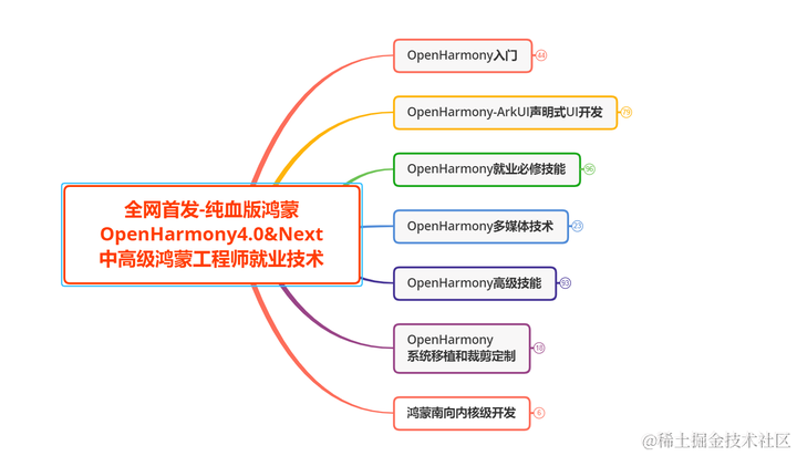
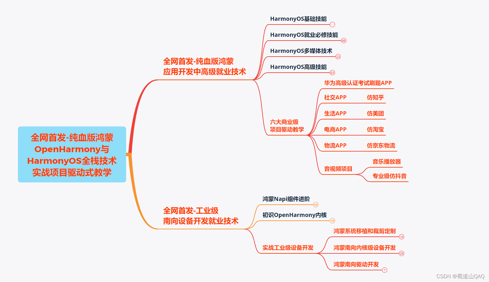
以上为一张学习路线略缩图,高清完整版请移至主业查看获取。


