CSS
选择器
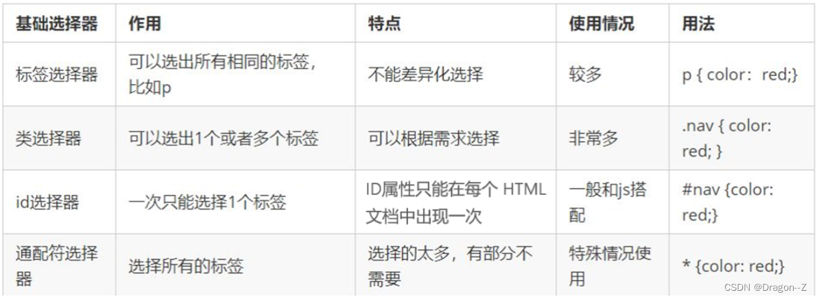
- 基础选择器
- 标签 div{}
- 类名 .one{}
- id #two{}
- 通用 *{}
- 组合 div,p{}
- 后代 ul li{}
*交叉 div .one{}
- 伪类选择器
- :hover
- :focus,
- 伪元素选择器
- ::before
- ::after
- ::first-letter
- ::first-line
- 属性选择器
- [attrname]—拥有属性 例:[data-name]{}
- [attrname=value]—属性等于值 例:[data-name=uek]{ color: red;}
- [attrname^=value]—开始等于值 例:[data-name^=uek]{color: blue;}–开头为uek字符的都变成蓝色
- [attrname = v a l u e ] − − − 结束等于值例: [ d a t a − n a m e =value]---结束等于值 例:[data-name =value]−−−结束等于值例:[data−name=uek]{color: green;}–结尾为uek字符的都变成绿色
- [attrname*=value]—包含值 例:[data-name*=uek]{ color:purple}–所有包含uek字符的都变成紫色
- [attr1][attr2][attr3]… —交叉 例: p[data-name]{ color:pink;}
<p data-name="list-uek">gkfj</p>
- 相邻选择器
-
- ~
"+"选择器----紧挨在h3之后的可以被选中
<style>h3+div{
     color:red;}</style>
<h3>标题</h3>
<div>111</div>
- "~"选择器----在之前的同级元素中有h3的p标签(在h3之后的同级p标签)
<style>h3~p{
     color:green;}</style>
<p>22222</p>
<h3>标题</h3>
<div>111</div>
<p>3333</p>
<p>4444</p>
- 后代选择器
<style>
   ul li{

    width: 100px;
    height: 100px;
    border: 1px solid #5e7387;
}
</style>
<ul>
 <li></li>
 <li></li>
</ul>
- 子代选择器
<style>
   ul>li{

     width: 100px;
     height: 100px;
     background: #ff6700;
 }
</style>
<ul>
 <li></li>
 <li></li>
</ul>
- 根据元素在父元素中的位置进行选择
- :first-child: 是父元素的第一个子元素
- :last-child: 是父元素的最后一个子元素
- :nth-child(n): 是父元素的第n个子元素
在nth-child中nth-child(even)表示偶数,nth-child(odd)表示奇数,nth-child(3n),nth-child(5n),nth-child(10n+1)
- :nth-last-child: 是父元素中的倒数第n个元素
- :only-child: 是父元素唯一的子元素
- :first-of-type: 父元素中的子元素的第一个
- :last-of-type: 父元素中的子元素的最后一个
- :nth-of-type(): 父元素中的子元素的第n个
- :only-of-type: 同类型(标签名相同)
- :nth-last-of-type(): 父元素中的子元素的倒数第n个
- :nth-last-child(n)~div:父元素中的子元素的倒数n个
- :root: 根选择器
- :before{ content:“”; display:block;}: 在某个元素的内容之前插入一个元素
- :after{ content:“”; display:block;}:在某个元素的内容之后插入一个元素
- :foucus: 获得焦点的状态
圆角
- border-radius:30px;
- 一个值表示四个角,
- 两个值表示两条对角线,
- 三个值表示左上、右上和左下、右下,
- 四个值表示左上、右上、右下、左下,
- 最多可以有八个值:border-radius:10px 20px 30px 40px/20px 30px 40px 50px;
阴影
- box-shadow: 5px 5px 5px 10px #000 inset;
- 第一、二个值分别表示横向的偏移和纵向的偏移
- 第三个值表示阴影的模糊程度
- 第四个值表示阴影的大小变化(正值增大,负值减小),
颜色,
内发光
- 可以设置多组
- 例: box-shadow: 0 0 0 1px #000,0 0 0 2px red,0 0 0 3px blue;
背景
- background-attachment: fixed;—图片固定在浏览器
- background-clip --背景的裁剪区域------那一部分会显示背景
- background-clip: content-box; --内容部分显示
- background-clip: border-box; --边框部分显示
- background-clip: padding-box;–内边距部分显示 默认显示
- background-origin: border-box;–设置背景图片的原点
- background-size: 100px 100px ;–背景的大小
- 100px 100px auto
- 50% 50%
- cover(优先铺满)
- contain(优先展示图片)
其他
- outline: 1px solid blue;—轮廓线
- outline-offset: 10px;—轮廓线的边距
问题:不会随着圆角的改变而改变
- outline: none;–清除表单控件获得焦点后的轮廓线
- box-sizing:border-box;
- box-sizing:content-box; 默认显示
- calc()计算函数
transition 过渡
- transition-timing-function: linear;— 匀速过渡
- transition-property: a11;— 可以进行过渡的属性
- transition-duration: 1s; ---- 完成一次过渡效果所需要的时间
- transition-timing-function:cubic-bezier(1,0,0,1);— 速度变化趋势
- ease-in 加速,
- ease-out 减速,
- ease-in-out 先加速后减速,
- linear 匀速,
- ease 与 ease-in-out 类似。
- transition-delay: 1s;— 过渡延迟
transform 转换
2D转换
1.位移
transform: translate(100px,100px);--- 沿着x轴y轴位移
transform: translateX(100px);--- 沿着x轴位移
transform: translateY(100px);--- 沿着y轴位移
2.旋转
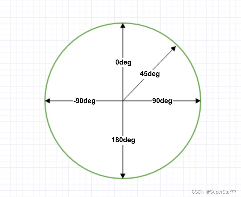
transform: rotate(45deg);--- 旋转45度
3.缩放
transform: scale(1.5,1);--- 缩放(大于1放大,小于1缩小)
4.斜切
transform: skew(30deg,30deg);--- 斜切(横向纵向一起发生)
5.基准点
transform-origin: 0 0;
[transform:translate(100px,100px) scale(0.5,0.5) skew(30deg,30deg) rotate(360deg);]
3D效果
 perspective:1000px;--- 景深  默认观察点在屏幕正中心
 transform:translateZ(800px);
 transform: translate3d(100px, 100px, 300px);--- x、y、z轴移动
 transform: rotateY(360deg);--- 沿着y轴旋转
 transform: rotateX(360deg);--- 沿着x轴旋转
 transform: rotate3d(1,1,0,360deg);--- 沿着对角线旋转
 transform-style: preserve-3d;--- 当前元素的子元素 呈现的方式
 backface-visibility: hidden;--- 设置元素背面是否可见
 perspective-origin:center top;--- 观察者的位置【正上方】
元素居中的问题
1.元素水平居中:margin:0 auto
2.定位元素水平居中:
     position:absolute;
     left:0;
     right:0;
     margin: 0 auto;
3.定位元素垂直居中:
     position: absolute;
     top:0;
     bottom: 0;
     margin: auto 0;
4.定位元素居中:
     position: absolute;
     left:0;
     top:0;
     right:0;
     bottom: 0;
     margin: auto;
animation动画
 定义动画的名称
     animation-name: demo;
 定义动画的时间
     animation-duration: 3s;
 定义速度变化的时间函数
     animation-timing-function: linear;
 动画的延迟
     animation-delay: 1s;
 动画的播放次数
     animation-iteration-count: 3;
     animation-iteration-count: infinite;无数次
 动画最终停留的状态
     animation-fill-mode: forwards;---停留在结束状态
     animation-fill-mode: backwards;---停留在开始状态
 方向:正向、反向、交替
      animation-direction: alternate;---方向交替
 停止
      animation-play-state: paused;/*鼠标放上去就停止*/
渐变 生成的是图片
线性渐变
background-image: linear-gradient(to right,red,blue);--从左往右
     background-image: linear-gradient(to right top,red,blue);--从左下往右上
     background-image: linear-gradient(30dep,red,blue);--角度
     background-image: linear-gradient(30dep,red 0,red 50%,blue 50%);--一半一半
     background-image: linear-gradient(to right bottom,#fff 0,#fff 30px,transparent 0),
     linear-gradient(to right top,#fff 0,#fff 30px,transparent 0),
     linear-gradient(to left bottom,#fff 0,#fff 30px,transparent 0),
     linear-gradient(to left top,#fff 0,#fff 30px,transparent 0); --做切角
     background-image: linear-gradient(45deg,red 0,red 20%,blue 0,blue 40%,green 0,green 60%,  yellow 0,yellow 80%,pink 0);
 background-size: 30px 30px;
 background-repeat: repeat;  ---图案重复
径向渐变
background-image: radial-gradient(circle closest-side at 100px 150px,red 0,red 50%,blue 0,blue 100%,transparent 0);--形状 距离 中心点,颜色

/* closest-side:最近的边  closest-corner:最近的角  farthest-side:最远的边 farthest-corner:最远的角 */

background-image: radial-gradient(red 0,red 50%,blue 0,blue 100%,transparent 0);--一半一半

background-image: repeating-radial-gradient(circle,red 0,red 10px,blue 0,blue 20px);--重复渐变

background-image: radial-gradient(circle at 15px 15px,red 0,red 10px,transparent 0);

background-size: 30px 30px;----做波点图

background-image: radial-gradient(circle at 0 0,#fff 0,#fff 50px,transparent 0),radial-gradient(circle at 300px 0,#fff 0,#fff 50px,transparent 0),radial-gradient(circle at 0 300px,#fff 0,#fff 50px,transparent 0),radial-gradient(circle at 300px 300px,#fff 0,#fff 50px,transparent 0);---实现切角效果