目录
5.背景图像起始位置:background-position
6.背景图像是否固定:background-attachment
7.背景图像相对于什么定位:background-origin
CSS (Cascading Style Sheets,层叠样式表),是一种用来为结构化文档(如 HTML 文档或 XML 应用)添加样式(字体、间距和颜色等)的计算机语言,CSS 文件扩展名为 .css。
一、CSS语法
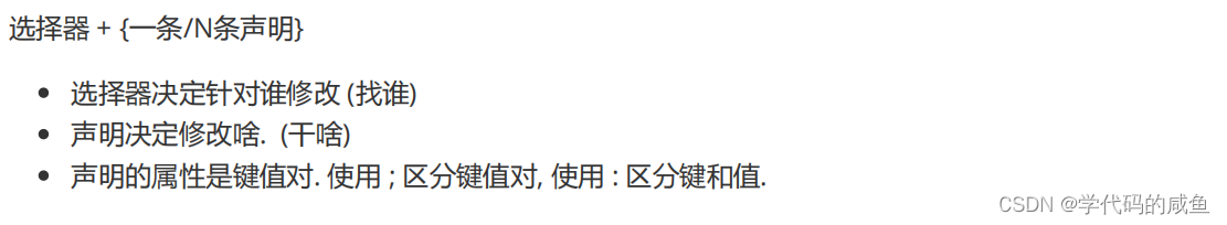
CSS语法构成:选择器+1条或多条声明。每条声明由一个属性和一个值构成。
p {
    color:red;
    text-align:center;
}
二、CSS选择器
CSS选择器包含:id选择器和class选择器。
id选择器以 # 显示。
# demo {
    color:#0fff;
    display:flex;
 }
/*调用时*/
<div id="demo"></div>
class选择器以 . 点号显示。
.img {
    background-color:#0fff;
 }
/*调用时*/
<div class="img"></div>
三、CSS样式表
1.外部样式表
通过<link>标签链接到样式表。
<head>
    <link rel="stylesheet" type="text/css" href="style.css">
</head>
2.内部样式表
通过<style>标签在文档头部定义。
<head>
    <style>
        p {
            margin-left:20px;
            padding:10px 20px;
            text-align:center;
        }
    </style>
</head>
3.内联样式
<p style="color:AliceBlue;margin:10px 20px">这是一个段落。</p>四、CSS背景
1.背景颜色:background-color
.image {
    background-color:transparent  /*透明*/
}
2.背景图片:background-image
通过url设置相对或绝对位置。
.image {
    background-image:url("相对或绝对位置");
}
3.背景大小:background-size
| 属性值 | 描述 |
| cover | 使背景图片始终铺满整个背景区域,但如果图片比背景区域小,会自动拉伸或放大图片,使其铺满整个背景区域。 |
| contain | 使背景图片在不拉伸的情况下,尽可能地在背景区域中居中显示,同时保留其原始大小。 |
| px | 直接指定背景图片的大小,可以是固定值、百分比或关键字auto,其中auto表示原始大小。 |
4.背景图片是否重复:background-repeat
| 属性值 | 描述 |
| repeat | 默认值,表示背景图像在水平和垂直方向都重复出现。 |
| repeat-x | 表示背景图像只在水平方向重复出现,而不在垂直方向上出现 。 |
| repeat-y | 表示背景图像只在垂直方向上重复出现,而不在水平方向上出现。 |
| no-repeat | 表示背景图像不重复出现。 |
5.背景图像起始位置:background-position
(1)属性值为“长度单位”
当background-position取值为长度单位时,要设置水平方向数值(x轴)和垂直方向数值(y轴)。通过px,百分比%来设置。
属性值 |
描述 |
x(数值) |
设置网页的横向位置 |
y(数值) |
设置网页的纵向位置 |
(2)属性值为“关键字”
当background-position取值为关键字时,也需要设置水平方向和垂直方向的值,使用关键字。
属性值 |
描述 |
|---|---|
top left |
左上 |
top center |
靠上居中 |
top right |
右上 |
left center |
靠左居中 |
center center |
正中 |
right center |
靠右居中 |
bottom left |
左下 |
bottom center |
靠下居中 |
bottom right |
右下 |
6.背景图像是否固定:background-attachment
属性值 |
描述 |
|---|---|
scroll |
默认值。背景图像会随着页面其余部分的滚动而移动。 |
fixed |
当页面的其余部分滚动时,背景图像不会移动。 |
inherit |
规定应该从父元素继承 background-attachment 属性的设置 |
7.背景图像相对于什么定位:background-origin
| 属性值 | 描述 |
| padding-box | 背景图像相对于内边距框来定位。 |
| border-box | 背景图像相对于边框盒来定位。 |
| content-box | 背景图像相对于内容框来定位。 |
8.背景绘制区域:background-clip
| 属性值 | 描述 |
| border-box | 默认值。背景绘制在边框方框内(剪切成边框方框)。 |
| padding-box | 背景绘制在衬距方框内(剪切成衬距方框)。 |
| content-box | 背景绘制在内容方框内(剪切成内容方框)。 |
五、CSS文本格式
| 属性值 | 描述 |
|---|---|
| color | 设置文本颜色 |
| direction | 设置文本方向 |
| letter-spacing | 设置字符间距 |
| line-height | 设置行高 |
| text-align | 对齐元素中的文本 |
| text-decoration | 向文本添加修饰 |
| text-indent | 缩进元素中文本的首行 |
| text-shadow | 设置文本阴影 |
| text-transform | 控制元素中的字母 |
| unicode-bidi | 设置或返回文本是否被重写 |
| vertical-align | 设置元素的垂直对齐 |
| white-space | 设置元素中空白的处理方式 |
| word-spacing | 设置字间距 |
六、CSS链接
- a:link - 正常,未访问过的链接
- a:visited - 用户已访问过的链接
- a:hover - 当用户鼠标放在链接上时
- a:active - 链接被点击的那一刻
注意:
- a:hover 必须跟在 a:link 和 a:visited后面
- a:active 必须跟在 a:hover后面
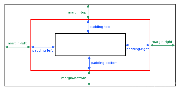
七、CSS盒子模型
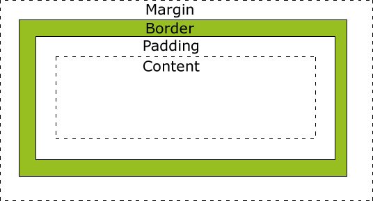
- Margin(外边距) - 清除边框外的区域,外边距是透明的。
- Border(边框) - 围绕在内边距和内容外的边框。
- Padding(内边距) - 清除内容周围的区域,内边距是透明的。
- Content(内容) - 盒子的内容,显示文本和图像。
1.margin-外边距
margin属性可以有1-4个值:
- margin:25px 50px 75px 100px;
- 上边距为25px
- 右边距为50px
- 下边距为75px
- 左边距为100px
- margin:25px 50px 75px;
- 上边距为25px
- 左右边距为50px
- 下边距为75px
- margin:25px 50px;
- 上下边距为25px
- 左右边距为50px
- margin:25px;
- 所有的4个边距都是25px
2.border-边框
border-style属性可以有1-4个值:
- border-style:dotted solid double dashed;
- 上边框是 dotted
- 右边框是 solid
- 底边框是 double
- 左边框是 dashed
- border-style:dotted solid double;
- 上边框是 dotted
- 左、右边框是 solid
- 底边框是 double
- border-style:dotted solid;
- 上、底边框是 dotted
- 右、左边框是 solid
- border-style:dotted;
- 四面边框是 dotted
3.padding-内边距
padding属性可以有1-4个值:
padding:25px 50px 75px 100px;
- 上填充为25px
- 右填充为50px
- 下填充为75px
- 左填充为100px
padding:25px 50px 75px;
- 上填充为25px
- 左右填充为50px
- 下填充为75px
padding:25px 50px;
- 上下填充为25px
- 左右填充为50px
padding:25px;
- 所有的填充都是25px
八、CSS定位-Position
| 属性值 | 描述 |
| static | 默认值,静态定位。 |
| relative | 相对定位元素的定位是相对其正常位置。 |
| fixed | 元素的位置相对于浏览器窗口是固定位置。 |
| absolute | 绝对定位的元素的位置相对于最近的已定位父元素,如果元素没有已定位的父元素,那么它的位置相对于<html>。 |
| sticky | 粘性定位,基于用户的滚动位置来定位。 |
九、CSS布局-Overflow
| 属性值 | 描述 |
|---|---|
| visible | 默认值。内容不会被修剪,会呈现在元素框之外。 |
| hidden | 内容会被修剪,并且其余内容是不可见的。 |
| scroll | 内容会被修剪,但是浏览器会显示滚动条以便查看其余的内容。 |
| auto | 如果内容被修剪,则浏览器会显示滚动条以便查看其余的内容。 |
| inherit | 规定应该从父元素继承 overflow 属性的值。 |
十、代码示例
下面结合上面学到的知识代码,将会简单编写代码实现:发送新年祝福~
<html>
	<head>
		<meta charset="utf-8">
		<title>2024新年祝福</title>
		<style type="text/css">
			.deng-box {
				position: fixed;
				top: -40px;
				right: 150px;
				z-index: 9999;
				pointer-events: none;
			}

			.deng-box1 {
				position: fixed;
				top: -30px;
				right: 10px;
				z-index: 9999;
				pointer-events: none;
			}

			.deng-box2{
				position: fixed;
				top: -40px;
				left: 150px;
				z-index: 9999;
				pointer-events: none;
			}

			.deng-box3 {
				position: fixed;
				top: -30px;
				left: 10px;
				z-index: 9999;
				pointer-events: none;
			}

			.deng-box1 .deng,
			.deng-box3 .deng {
				position: relative;
				width: 120px;
				height: 90px;
				margin: 50px;
				background: #d8000f;
				background: rgba(216,0,15,0.8);
				border-radius: 50% 50%;
				-webkit-transform-origin: 50% -100px;
				-webkit-animation: swing 5s infinite ease-in-out;
				box-shadow: -5px 5px 30px 4px #fc903d
			}

			.deng {
				position: relative;
				width: 120px;
				height: 90px;
				margin: 50px;
				background: #d8000f;
				background: rgba(216,0,15,0.8);
				border-radius: 50% 50%;
				-webkit-transform-origin: 50% -100px;
				-webkit-animation: swing 3s infinite ease-in-out;
				box-shadow: -5px 5px 50px 4px #fa6c00;
			}

			.deng-a {
				width: 100px;
				height: 90px;
				background: #d8000f;
				background: rgba(216,0,15,0.1);
				margin: 12px 8px 8px 8px;
				border-radius: 50% 50%;
				border: 2px solid #dc8f03;
			}

			.deng-b {
				width: 45px;
				height: 90px;
				background: #d8000f;
				background: rgba(216,0,15,0.1);
				margin: -4px 8px 8px 26px;
				border-radius: 50% 50%;
				border: 2px solid #dc8f03;
			}

			.xian {
				position: absolute;
				top: -20px;
				left: 60px;
				width: 2px;
				height: 20px;
				background: #dc8f03;
			}

			.shui-a {
				position: relative;
				width: 5px;
				height: 20px;
				margin: -5px 0 0 59px;
				-webkit-animation: swing 4s infinite ease-in-out;
				-webkit-transform-origin: 50% -45px;
				background: orange;
				border-radius: 0 0 5px 5px;
			}

			.shui-b {
				position: absolute;
				top: 14px;
				left: -2px;
				width: 10px;
				height: 10px;
				background: #dc8f03:
				border-radius: 50%;
			}

			.shui-c {
				position: absolute;
				top: 18px;
				left: -2px;
				width: 10px;
				height: 35px;
				background: orange;
				border-radius: 0 0 0 5px;
			}

			.deng:before {
				position: absolute;
				top: -7px;
				left: 29px;
				height: 12px;
				width: 60px;
				content: " ";
				display: block;
				z-index: 999;
				border-radius: 5px 5px 0 0;
				border: solid 1px #dc8f03;
				background: orange;
				background: linear-gradient(to right, #dc8f03, orange, #dc8f03, orange, #dc8f03);
			}

			.deng:after {
				position: absolute;
				bottom: -7px;
				left: 10px;
				height: 12px;
				width: 60px;
				content: " ";
				display: block;
				margin-left: 20px;
				border-radius: 0 0 5px 5px;
				border: solid 1px #dc8f03;
				background: orange;
				background: linear-gradient(to right, #dc8f03, orange, #dc8f03, orange, #dc8f03);
			}

			.deng-t {
				font-family: 黑体, Arial, Lucida Grande, Tahoma, sans-serif;
				font-size: 3.2rem;
				color: #dc8f03;
				font-weight: 700;
				line-height: 85px;
				text-align: center;
			}
			.night .deng-box,
			.night .deng-box1,
			.night .deng-t {
				background:transparent !important;
			}

			@-moz-keyframes swing {
				0% {
					-moz-transform: rotate(-10deg);
				}
				50% {
					-moz-transform: rotate(10deg);
				}
				100% {
					-moz-transform: rotate(-10deg);
				}
			}

			@-webkit-keyframes swing {
				0% {
					-webkit-transform: rotate(-10deg);
				}
				50% {
					-webkit-transform: rotate(10deg);
				}
				100% {
					-webkit-transform: rotate(-10deg);
				}
			}
		</style>

		<style>
			h1 {
				text-align:center;
				color:#B8860B;
				font-size:40px;
				margin:10px;
				padding:10px;
			}


			body {
				background-image:url('https://img.tukuppt.com/bg_grid/00/13/34/ieRv1gTX6x.jpg!/fh/350');
				background-repeat:no-repeat;
				background-size:cover;
			}

			.image-container {
				display:flex;
			}

			img {
				width:33%;
				height:25%;
				margin-right:10px;
			}

		</style>

		<style>
			.fade-in-out {
				opacity: 0;
				animation: fade-in-out-animation 3s ease-in-out infinite;
			}

			@keyframes fade-in-out-animation {
				0% {
					opacity:0;
				}
				50% {
					opacity:1;
				}
				100% {
					opacity:0;
				}
			}
		</style>

		<style>

			/* 应用动画到目标元素 */
			.shake {
				text-align:center;
				color:#4B0082;
				font-size:30px;
				padding:10px;
				position:relative;
				-webkit-box-reflect: below -12px linear-gradient(transparent,rgba(0,0,0,0.2));
			}

			.shake span{
				position: relative;
				display: inline-block;
				font-size: 30px;
				text-transform: uppercase;
				letter-spacing: 2px;
				/* 执行动画:动画名 时长 加速后减速 无限次播放 */
				animation: shake 1s ease-in-out infinite;
				/* 通过var函数调用自定义属性--i,再计算出动画延迟时间 */
				animation-delay: calc(0.1s * var(--i));
			}

			/* 定义动画 */
			@keyframes shake {
				0%{
					transform: translateY(0);
				}
				20%{
					transform: translateY(-20px);
				}
				40%,100%{
					transform: translateY(0);
				}
			}

		</style>
	</head>

	<body>
		<div class="deng-box2">
			<div class="deng">
				<div class="xian">
			</div>
			<div class="deng-a">
				<div class="deng-b">
					<div class="deng-t">年</div>
				</div>
			</div>
			<div class="shui shui-a">
				<div class="shui-c"></div>
				<div class="shui-b"></div>
				</div>
			</div>
		</div>

		<div class="deng-box3">
			<div class="deng">
				<div class="xian">
			</div>
			<div class="deng-a">
				<div class="deng-b">
					<div class="deng-t">新</div>
				</div>
			</div>
			<div class="shui shui-a">
				<div class="shui-c"></div>
				<div class="shui-b"></div>
				</div>
			</div>
		</div>

		<div class="deng-box1">
			<div class="deng">
				<div class="xian">
			</div>
			<div class="deng-a">
				<div class="deng-b">
					<div class="deng-t">乐</div>
				</div>
			</div>
			<div class="shui shui-a">
				<div class="shui-c"></div>
				<div class="shui-b"></div>
				</div>
			</div>
		</div>

		<div class="deng-box">
			<div class="deng">
				<div class="xian">
			</div>
			<div class="deng-a">
				<div class="deng-b">
					<div class="deng-t">快</div>
				</div>
			</div>
			<div class="shui shui-a">
				<div class="shui-c"></div>
				<div class="shui-b"></div>
				</div>
			</div>
		</div>

		<br>
		<h1>新年快乐</h1>
		<h1>龙年大吉</h1>
		<br>
		<div class="image-container">
			<img src="images/yanhua1.gif">
			<img src="images/2024.jpg" alt="HappyNewYear">
			<img src="images/yanhua.gif">
		</div>
		<strong><div class="shake">
			<span style="--i:1;">小</span>
			<span style="--i:2;">哪</span>
			<span style="--i:3;">吒</span>
			<span style="--i:4;">祝</span>
			<span style="--i:5;">各</span>
			<span style="--i:6;">位</span>
			<span style="--i:7;">在</span>
			<span style="--i:8;">新</span>
			<span style="--i:9;">的</span>
			<span style="--i:10;">一</span>
			<span style="--i:11;">年</span>
			<span style="--i:12;">里</span>
			<span style="--i:13;">,</span>
			<span style="--i:14;">心</span>
			<span style="--i:15;">想</span>
			<span style="--i:16;">事</span>
			<span style="--i:17;">成</span>
			<span style="--i:18;">,</span>
			<span style="--i:19;">财</span>
			<span style="--i:20;">运</span>
			<span style="--i:21;">亨</span>
			<span style="--i:22;">通</span>
			<span style="--i:23;">!</span>
		</div></strong>
	</body>

</html>
具体实现如下:
新年祝福
本文主要分享了CSS的基础知识,通过学习这篇文章,相信大家会对CSS有一个初步认识,下篇将会介绍:CSS3的基础知识,大家尽请期待~


![[pytorch入门] 6. 神经网络](https://img-blog.csdnimg.cn/direct/607655a8e94f47a98260bacdf9a63740.png)