课程学习来源:b站up:【蚂蚁学python】
【课程链接:【【数据可视化】Python数据图表可视化入门到实战】】
【课程资料链接:【链接】】
本节代码
1.读取数据
import pandas as pd
import numpy as np

df = pd.read_excel("../DATA_POOL/PY_DATA/ant-learn-visualization-master/datas/boston-house-prices/housing.xlsx")
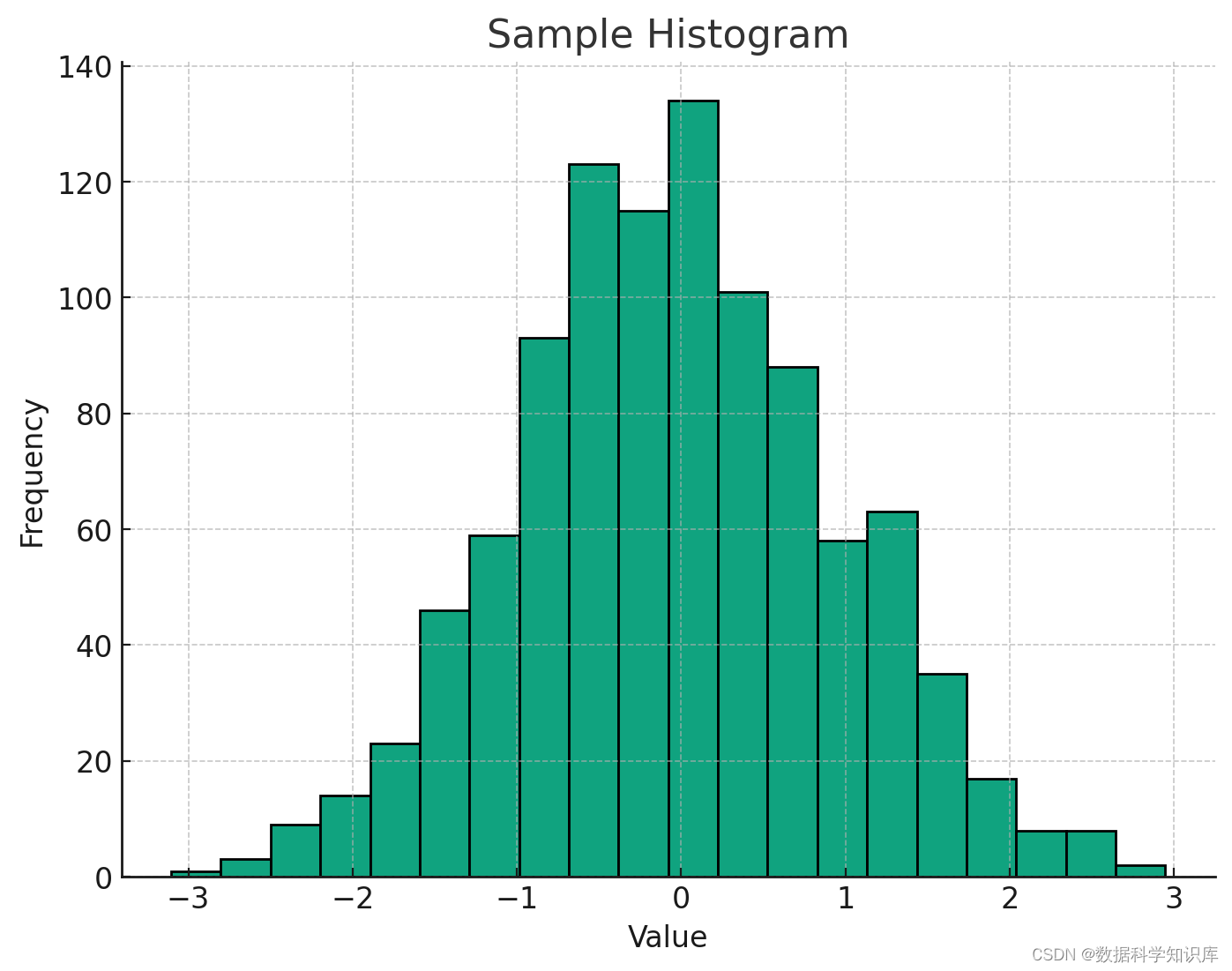
2.使用matplotlib画直方图
import matplotlib.pyplot as plt
%matplotlib inline

plt.figure(figsize=(12,5))#图片的长宽
plt.hist(df["MEDV"],bins=100)#bins分成100份
plt.show()
效果:

3.使用pyecharts绘制直方图
from pyecharts import options as opts
from pyecharts.charts import Bar

# 自己计算多少个间隔,计算每个间隔有多少值
hist,bin_edges = np.histogram(df["MEDV"],bins=100)

# pyecharts的直方图使用bar实现
# 取bins[:-1],意思是用每个区间的左边元素作为x轴的值
bar = (
    Bar()
    .add_xaxis([str(x) for x in bin_edges[:-1]])
    .add_yaxis("价格分布",[float(x) for x in hist], category_gap=0)
    .set_global_opts(
        title_opts = opts.TitleOpts(title="波士顿房价-价格分布-直方图",pos_left="center"),
        legend_opts = opts.LegendOpts(is_show=False)
    )
)

from IPython.display import HTML

# 同上,读取 HTML 文件内容
# bar.render()的值是一个路径,以字符串形式表示
with open(bar.render(), 'r', encoding='utf-8') as file:
    html_content = file.read()

# 直接在 JupyterLab 中渲染 HTML
HTML(html_content)
效果:

本节作业
小作业:
- 获取你们产品的销量数据、价格数据,提取得到一个数组,画一个直方图看一下数据分布
- 获取北京天气数据,取年度365个温度数字,绘制直方图查看温度分布
作业1:大型商超数据集
数据集来源:【https://www.heywhale.com/mw/dataset/656069b19a74cc18269207c4】

from pyecharts import options as opts
from pyecharts.charts import Bar

hist1,bin_edges_sales = np.histogram(df["Sales"],bins=100000)

bar = (
    Bar()
    .add_xaxis(str(x) for x in bin_edges_sales[:-1])
    .add_yaxis("销量分布",[float(x) for x in hist1], category_gap=1)
    .set_global_opts(
        title_opts = opts.TitleOpts(title="大型商场-销量分布-直方图",pos_left="center"),
        legend_opts = opts.LegendOpts(is_show=False)
    )
)
from IPython.display import HTML

# 同上,读取 HTML 文件内容
# bar.render()的值是一个路径,以字符串形式表示
with open(bar.render(), 'r', encoding='utf-8') as file:
    html_content = file.read()

# 直接在 JupyterLab 中渲染 HTML
HTML(html_content)


作业二:北京天气数据集


yWendu列有℃符号,导致整列都是object类型,需要先把℃符号去掉,然后转换成int类型
numeric_df = df["yWendu"].str.replace('℃', '').astype(int)
numeric_df

然后开始绘图
# 自己计算多少个间隔,计算每个间隔有多少值
hist,bin_edges = np.histogram(numeric_df,bins=365)

# pyecharts的直方图使用bar实现
# 取bins[:-1],意思是用每个区间的左边元素作为x轴的值
bar = (
    Bar()
    .add_xaxis([str(x) for x in bin_edges[:-1]])
    .add_yaxis("温度分布",[float(x) for x in hist], category_gap=0)
    .set_global_opts(
        title_opts = opts.TitleOpts(title="北京天气-温度分布-直方图",pos_left="center"),
        legend_opts = opts.LegendOpts(is_show=False)
    )
)

from IPython.display import HTML

# 同上,读取 HTML 文件内容
# bar.render()的值是一个路径,以字符串形式表示
with open(bar.render(), 'r', encoding='utf-8') as file:
    html_content = file.read()

# 直接在 JupyterLab 中渲染 HTML
HTML(html_content)


![[Spring] SpringBoot基本配置与快速上手](https://i-blog.csdnimg.cn/direct/f0c5b1e3dbe044769fc9fc5c38accbae.jpeg#pic_center)