要提前准备一个xinyang.json文件
可以在这个网站下载
DataV.GeoAtlas地理小工具系列 (aliyun.com)

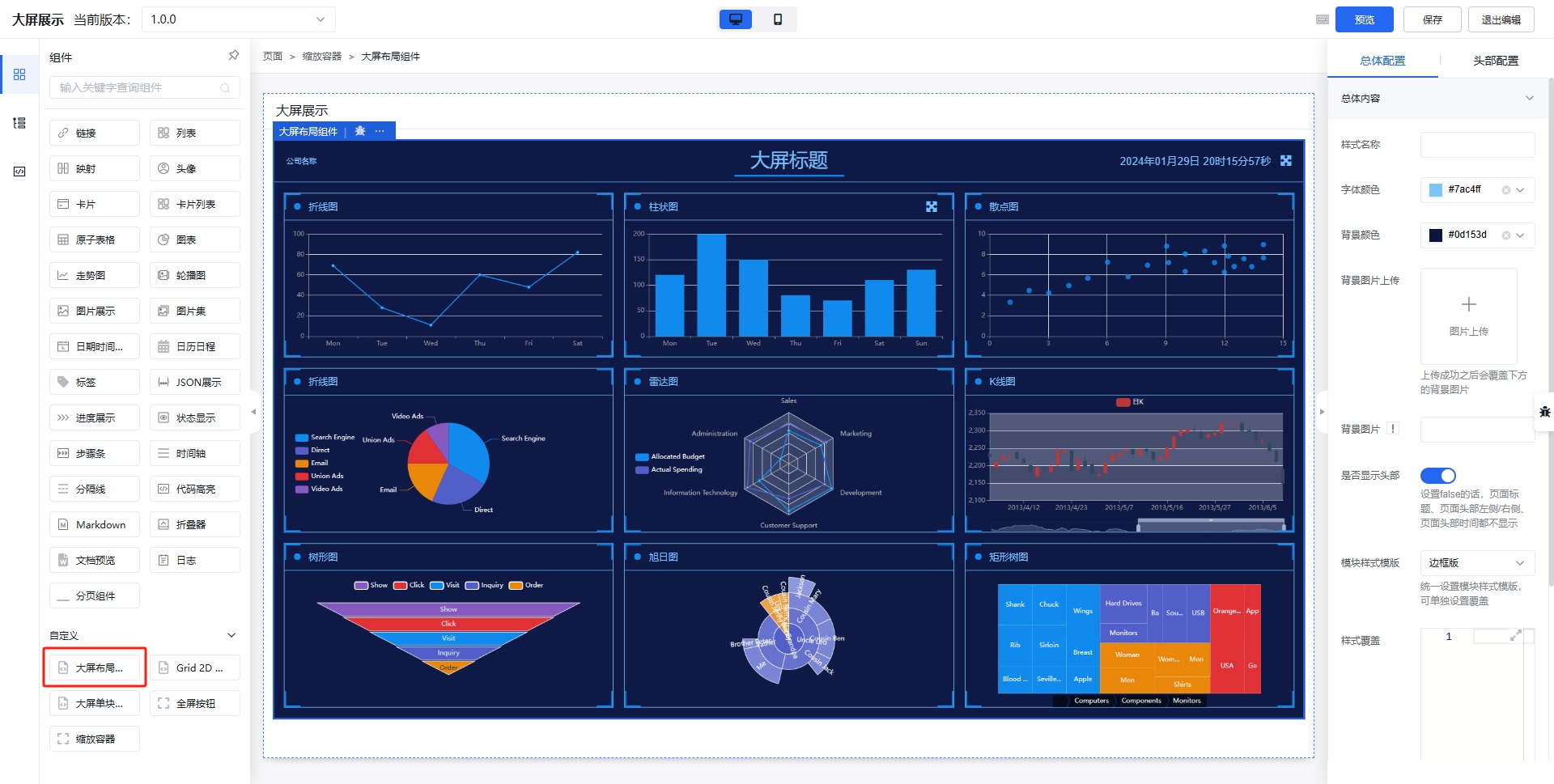
代码结构
总框架代码:
<template>
  <div>
    <div class="center">
      <center-left />
      <center-map />
      <center-right />
    </div>
    <div class="bottom"></div>
  </div>
</template>

<script>
import centerLeft from "./components/centerLeft.vue";
import centerRight from "./components/centerRight.vue";
import centerMap from "./components/centerMap.vue";
export default {
  components: { centerMap, centerLeft, centerRight },
};
</script>

<style lang="scss" scoped>
.center {
  display: flex;

  justify-content: space-between;
}
.bottom {
  display: flex;
  justify-content: space-between;
  align-items: center;
  margin-top: 30px;
}
</style>
中心map,2D地图
模板部分(<template>):
- 整体布局使用了一个
div元素class="content"作为容器。 - 容器内包含一个
heat-map-echarts组件,设置了高度为580px,宽度为680px。 - 接着是一个包含子元素的
div,其中有一个自定义的dv-border-box-7组件,内部包含一个标题h2和一个Echart组件。
脚本部分(<script>):
- 导入了两个组件:
Echart和heatMapEcharts。 data函数中定义了一个名为options1的对象,用于配置Echart组件的选项。xAxis配置了轴的类型和最大值。yAxis配置了轴的类型、数据、反转、动画时长和显示的最大条数。series配置了图表的类型为柱状图,数据、实时排序、标签等相关属性。- 还配置了图例、动画时长、缓动效果等。
- 在
components中注册了导入的两个组件。
样式部分(<style scoped>):
- 为
.content类设置了 Flex 布局,使其内容在垂直和水平方向上居中。 - 为
.title类设置了上下边距。
总体来说,这段代码是一个 Vue 组件的模板、脚本和样式的组合,主要用于展示一个热图组件和一个柱状图组件,并对其进行了相应的配置和布局设置。
中心map
<template>
  <div class="content">  <!-- 定义一个名为 content 的 div 容器 -->
    <heat-map-echarts height="580px" width="680px" />  <!-- 引入 heat-map-echarts 组件,并设置高度和宽度 -->
    <div>  <!-- 内部的另一个 div -->
      <dv-border-box-7>  <!-- 引入自定义的 dv-border-box-7 组件 -->
        <h2 class="title">人口排名前五的地区</h2>  <!-- 标题元素,显示文本 -->
        <Echart :options="options1" height="350px" width="680px" />  <!-- 引入 Echart 组件,并传递 options1 配置,设置高度和宽度 -->
      </dv-border-box-7>
    </div>
  </div>
</template>

<script>
import Echart from "@/common/echart/index.vue";  // 导入 Echart 组件
import heatMapEcharts from "./echarts/heatMapEcharts.vue";  // 导入 heatMapEcharts 组件

export default {
  data() {  // 定义组件的数据
    return {
      options1: {  // 定义 Echart 的配置选项对象 options1
        xAxis: {  // x 轴的配置
          type: "value",  // x 轴类型为数值型
          max: "dataMax",  // x 轴的最大值设置为 "dataMax"
        },
        yAxis: {  // y 轴的配置
          type: "category",  // y 轴类型为分类
          data: ["平桥区", "浉河区区", "光山县", "罗山县", "新县", "固始县"],  // y 轴的数据
          inverse: true,  // 是否反转
          animationDuration: 300,  // 动画持续时间
          animationDurationUpdate: 300,  // 更新动画的持续时间
          max: 4,  // 只显示最大的 4 个条
        },
        series: [  // 系列配置
          {
            realtimeSort: true,  // 实时排序
            // name: '人口数',  // 注释掉的系列名称
            type: "bar",  // 图表类型为柱状图
            // data: [156, 48, 111, 58, 92, 219],  // 注释掉的数据
            data: ["156", "48", "111", "58", "92", "219"],  // 系列的数据
            label: {  // 标签配置
              show: true,  // 显示标签
              position: "right",  // 标签位置在右侧
              valueAnimation: true,  // 标签值的动画效果
            },
          },
        ],
        legend: {  // 图例配置
          show: true,  // 显示图例
        },
        animationDuration: 1000,  // 动画持续时间
        animationDurationUpdate: 1000,  // 更新动画的持续时间
        animationEasing: "linear",  // 动画缓动效果为线性
        animationEasingUpdate: "linear",  // 更新动画的缓动效果为线性
      },
    };
  },
  components: {  // 注册组件
    Echart,  // 注册 Echart 组件
    heatMapEcharts,  // 注册 heatMapEcharts 组件
  },
};
</script>

<style scoped>
.content {  // 为 content 类设置样式
  display: flex;  // 启用 Flex 布局
  flex-direction: column;  // 主轴方向为列
  align-items: center;  // 水平居中
  justify-content: center;  // 垂直居中
}
.title {  // 为 title 类设置样式
  margin-top: 20px;  // 顶部外边距 20 像素
  margin-bottom: -30px;  // 底部外边距 -30 像素
}
</style>
引入代码heatMapEcharts.vue
<template>
  <div :id="id" :class="className" :style="{ height: height, width: width }" />
</template>

<script>
import geoJson from "@/common/map/xinyang.json";
import tdTheme from "@/common/echart/theme.json"; // 引入默认主题
export default {
  name: "echart",
  props: {
    className: {
      type: String,
      default: "chart",
    },
    id: {
      type: String,
      default: "chart",
    },
    width: {
      type: String,
      default: "100%",
    },
    height: {
      type: String,
      default: "2.5rem",
    },
  },
  data() {
    return {
      chart: null,
      options: {
        title: {
          text: "信阳市人口密度图 (2024)",
        },
        tooltip: {
          trigger: "item",
          formatter: "{b}<br/>{c} (p / km2)",
        },
        toolbox: {
          show: true,
          orient: "vertical",
          left: "right",
          top: "center",
          feature: {
            dataView: { readOnly: false },
            restore: {},
            saveAsImage: {},
          },
        },
        visualMap: {
          min: 800,
          max: 50000,
          text: ["High", "Low"],
          realtime: false,
          calculable: true,
          inRange: {
            color: ["lightskyblue", "yellow", "orangered"],
          },
        },
        series: [
          {
            name: "信阳市人口密度",
            type: "map",
            map: "CQ",
            label: {
              show: true,
            },
            data: [
              { name: "平桥区", value: 20057.34 },
              { name: "浉河区", value: 15477.48 },
              { name: "罗山县", value: 31686.1 },
              { name: "息县", value: 6992.6 },
              { name: "光山县", value: 44045.49 },
              { name: "新县", value: 40689.64 },
              { name: "潢川县", value: 37659.78 },
              { name: "淮滨县", value: 45180.97 },
              { name: "商城县", value: 55204.26 },
              { name: "固始县", value: 21900.9 }
            ],
            // 自定义名称映射
            nameMap: {},
          },
        ],
      },
    };
  },
  watch: {
    options: {
      handler(options) {
        // 设置true清空echart缓存
        this.chart.setOption(options, true);
      },
      deep: true,
    },
  },
  mounted() {
    this.$echarts.registerTheme("tdTheme", tdTheme); // 覆盖默认主题
    this.initChart();
  },
  beforeDestroy() {
    this.chart.dispose();
    this.chart = null;
  },
  methods: {
    initChart() {
      // 初始化echart
      this.chart = this.$echarts.init(this.$el, "tdTheme");

      this.$echarts.registerMap("CQ", geoJson);

      this.chart.setOption(this.options, true);
    },
  },
};
</script>

<style></style>

左边left
<template>
  <div>  <!-- 最外层的 div 容器 -->
    <dv-border-box-6 style="padding-top: 20px">  <!-- 自定义的 dv-border-box-6 组件,并设置顶部内边距为 20 像素 -->
      <h2 class="title">2010-2024 年信阳市常住人口及增量</h2>  <!-- 标题 1 -->
      <Echart :options="options1" height="500px" width="600px" />  <!-- 引入 Echart 组件 1,并传递 options1 配置,设置高度和宽度 -->
      <h2 class="title">2015-2024 年信阳市人口出生率、死亡率和自然增长率</h2>  <!-- 标题 2 -->
      <Echart :options="options2" height="350px" width="600px" />  <!-- 引入 Echart 组件 2,并传递 options2 配置,设置高度和宽度 -->
    </dv-border-box-6>
  </div>
</template>

<script>
import Echart from "@/common/echart/index.vue";  // 导入 Echart 组件

export default {
  data() {  // 定义组件的数据
    return {
      options1: {  // 第一个 Echart 的配置选项对象 options1
        tooltip: {  // 提示框配置
          trigger: "axis",  // 触发类型为坐标轴
          axisPointer: {  // 坐标轴指示器配置
            type: "cross",  // 类型为十字准线
            crossStyle: {  // 十字准线样式
              color: "#999",  // 颜色为 #999
            },
          },
        },
        toolbox: {  // 工具栏配置
          feature: {  // 工具栏功能配置
            dataView: { show: true, readOnly: false },  // 数据视图,可显示和编辑
            magicType: { show: true, type: ["line", "bar"] },  // 图表类型切换
            restore: { show: true },  // 还原配置
            saveAsImage: { show: true },  // 保存为图片
          },
        },
        legend: {  // 图例配置
          data: ["人口", "人口增长率"],  // 图例数据
        },
        xAxis: [  // x 轴配置
          {
            type: "category",  // 类型为分类
            data: [  // x 轴数据
              "2012",
              "2013",
              "2014",
              "2015",
              "2016",
              "2017",
              "2018",
              "2019",
              "2020",
              "2021",
              "2022",
              "2023",
              "2024",
            ],
            axisPointer: {  // 坐标轴指示器配置
              type: "shadow",  // 类型为阴影
            },
          },
        ],
        yAxis: [  // y 轴配置
          {
            type: "value",  // 数值类型
            name: "万人",  // y 轴名称
            min: 2700,  // 最小值
            max: 3300,  // 最大值
            interval: 100,  // 间隔
            axisLabel: {  // y 轴标签配置
              formatter: "{value}",  // 格式化函数
            },
          },
          {
            type: "value",  // 数值类型
            name: "万人",  // y 轴名称
            min: 0,  // 最小值
            max: 70,  // 最大值
            interval: 10,  // 间隔
            axisLabel: {  // y 轴标签配置
              formatter: "{value}",  // 格式化函数
            },
          },
        ],
        series: [  // 系列配置
          {
            name: "人口",  // 系列名称
            type: "bar",  // 图表类型为柱状图
            tooltip: {  // 提示框配置
              valueFormatter: function (value) {  // 值格式化函数
                return value + " 万";  // 返回值加上单位 "万"
              },
            },
            data: [  // 数据
              2920, 2950, 2970, 3010, 3040, 3070, 3110, 3150, 3160, 3190, 3210,
              3220, 3250,
            ],
          },
          {
            name: "人口增长率",  // 系列名称
            type: "line",  // 图表类型为折线图
            yAxisIndex: 1,  // 使用第二个 y 轴
            tooltip: {  // 提示框配置
              valueFormatter: function (value) {  // 值格式化函数
                return value + " 万人";  // 返回值加上单位 "万人"
              },
            },
            data: [  // 数据
              40.21, 59.81, 30.45, 36.15, 32.45, 26.54, 39.94, 33.55, 19.63,
              24.7, 21.09, 3.5, 4.21,
            ],
          },
        ],
      },
      options2: {  // 第二个 Echart 的配置选项对象 options2
        tooltip: {  // 提示框配置
          trigger: "axis",  // 触发类型为坐标轴
        },
        legend: {  // 图例配置
          data: ["出生率", "死亡率", "自然增长率"],  // 图例数据
        },
        grid: {  // 网格配置
          left: "3%",  // 左边距
          right: "4%",  // 右边距
          bottom: "3%",  // 下边距
          containLabel: true,  // 包含标签
        },
        toolbox: {  // 工具栏配置
          feature: {  // 工具栏功能配置
            saveAsImage: {},  // 保存为图片
          },
        },
        xAxis: {  // x 轴配置
          type: "category",  // 类型为分类
          boundaryGap: false,  // 两端不留空白
          data: [  // x 轴数据
            "2017",
            "2018",
            "2019",
            "2020",
            "2021",
            "2022",
            "2023",
            "2024",
          ],
        },
        yAxis: {  // y 轴配置
          type: "value",  // 数值类型
          min: -4,  // 最小值
          max: 14,  // 最大值
          interval: 2,  // 间隔
        },
        series: [  // 系列配置
          {
            name: "出生率",  // 系列名称
            type: "line",  // 图表类型为折线图
            data: [10.8, 11.9, 11.6, 11.5, 10.5, 7.8, 6.5, 6.0],  // 数据
          },
          {
            name: "死亡率",  // 系列名称
            type: "line",  // 图表类型为折线图
            data: [7.3, 7.3, 7.4, 7.8, 7.9, 7.9, 8.1, 8.2],  // 数据
          },
          {
            name: "自然增长率",  // 系列名称
            type: "line",  // 图表类型为折线图
            data: [4, 4.4, 4, 3.8, 3.1, -1, -1.6, -2],  // 数据
          },
        ],
      },
    };
  },
  components: {  // 注册组件
    Echart,  // 注册 Echart 组件
  },
};
</script>

<style>
.title {  // 标题的样式
  display: flex;  // 启用 Flex 布局
  justify-content: center;  // 水平居中
  margin-bottom: 10px;  // 底部外边距 10 像素
}
</style>

右边right
<template>
  <div>  <!-- 最外层的 div 容器 -->
    <dv-border-box-6 style="padding-top: 20px">  <!-- 自定义组件 dv-border-box-6,并设置顶部内边距为 20 像素 -->
      <h2 class="title">2010 - 2024 年信阳市常住人口及增量</h2>  <!-- 第一个标题 -->
      <Echart :options="options1" height="500px" width="600px" />  <!-- 引入 Echart 组件 1,并绑定 options1 配置,设置高度和宽度 -->
      <h2 class="title">2015 - 2024 年信阳市人口出生率、死亡率和自然增长率</h2>  <!-- 第二个标题 -->
      <Echart :options="options2" height="350px" width="600px" />  <!-- 引入 Echart 组件 2,并绑定 options2 配置,设置高度和宽度 -->
    </dv-border-box-6>
  </div>
</template>

<script>
import Echart from "@/common/echart/index.vue";  // 导入 Echart 组件

export default {
  data() {  // 定义组件的数据
    return {
      options1: {  // 第一个 Echart 的配置对象
        tooltip: {  // 提示框配置
          trigger: "axis",  // 触发方式为坐标轴
          axisPointer: {  // 坐标轴指针配置
            type: "cross",  // 指针类型为十字线
            crossStyle: {  // 十字线样式
              color: "#999",  // 颜色为 #999
            },
          },
        },
        toolbox: {  // 工具栏配置
          feature: {  // 工具栏功能配置
            dataView: { show: true, readOnly: false },  // 数据视图功能,可显示且可编辑
            magicType: { show: true, type: ["line", "bar"] },  // 图表类型切换功能,可切换为折线图和柱状图
            restore: { show: true },  // 恢复功能
            saveAsImage: { show: true },  // 保存为图片功能
          },
        },
        legend: {  // 图例配置
          data: ["人口", "人口增长率"],  // 图例数据
        },
        xAxis: [  // x 轴配置
          {
            type: "category",  // 类型为分类
            data: [  // x 轴数据
              "2012",
              "2013",
              "2014",
              "2015",
              "2016",
              "2017",
              "2018",
              "2019",
              "2020",
              "2021",
              "2022",
              "2023",
              "2024",
            ],
            axisPointer: {  // 坐标轴指针配置
              type: "shadow",  // 类型为阴影
            },
          },
        ],
        yAxis: [  // y 轴配置
          {
            type: "value",  // 数值类型
            name: "万人",  // y 轴名称
            min: 2700,  // 最小值
            max: 3300,  // 最大值
            interval: 100,  // 间隔
            axisLabel: {  // y 轴标签配置
              formatter: "{value}",  // 格式化函数
            },
          },
          {
            type: "value",  // 数值类型
            name: "万人",  // y 轴名称
            min: 0,  // 最小值
            max: 70,  // 最大值
            interval: 10,  // 间隔
            axisLabel: {  // y 轴标签配置
              formatter: "{value}",  // 格式化函数
            },
          },
        ],
        series: [  // 系列配置
          {
            name: "人口",  // 系列名称
            type: "bar",  // 图表类型为柱状图
            tooltip: {  // 提示框配置
              valueFormatter: function (value) {  // 值格式化函数
                return value + " 万";  // 返回值加上 " 万" 单位
              },
            },
            data: [  // 数据
              2920, 2950, 2970, 3010, 3040, 3070, 3110, 3150, 3160, 3190, 3210,
              3220, 3250,
            ],
          },
          {
            name: "人口增长率",  // 系列名称
            type: "line",  // 图表类型为折线图
            yAxisIndex: 1,  // 使用第二个 y 轴
            tooltip: {  // 提示框配置
              valueFormatter: function (value) {  // 值格式化函数
                return value + " 万人";  // 返回值加上 " 万人" 单位
              },
            },
            data: [  // 数据
              40.21, 59.81, 30.45, 36.15, 32.45, 26.54, 39.94, 33.55, 19.63,
              24.7, 21.09, 3.5, 4.21,
            ],
          },
        ],
      },
      options2: {  // 第二个 Echart 的配置对象
        tooltip: {  // 提示框配置
          trigger: "axis",  // 触发方式为坐标轴
        },
        legend: {  // 图例配置
          data: ["出生率", "死亡率", "自然增长率"],  // 图例数据
        },
        grid: {  // 网格配置
          left: "3%",  // 左边距为 3%
          right: "4%",  // 右边距为 4%
          bottom: "3%",  // 下边距为 3%
          containLabel: true,  // 包含标签
        },
        toolbox: {  // 工具栏配置
          feature: {  // 工具栏功能配置
            saveAsImage: {},  // 保存为图片功能
          },
        },
        xAxis: {  // x 轴配置
          type: "category",  // 类型为分类
          boundaryGap: false,  // 两端不留空白
          data: [  // x 轴数据
            "2017",
            "2018",
            "2019",
            "2020",
            "2021",
            "2022",
            "2023",
            "2024",
          ],
        },
        yAxis: {  // y 轴配置
          type: "value",  // 数值类型
          min: -4,  // 最小值
          max: 14,  // 最大值
          interval: 2,  // 间隔
        },
        series: [  // 系列配置
          {
            name: "出生率",  // 系列名称
            type: "line",  // 图表类型为折线图
            data: [10.8, 11.9, 11.6, 11.5, 10.5, 7.8, 6.5, 6.0],  // 数据
          },
          {
            name: "死亡率",  // 系列名称
            type: "line",  // 图表类型为折线图
            data: [7.3, 7.3, 7.4, 7.8, 7.9, 7.9, 8.1, 8.2],  // 数据
          },
          {
            name: "自然增长率",  // 系列名称
            type: "line",  // 图表类型为折线图
            data: [4, 4.4, 4, 3.8, 3.1, -1, -1.6, -2],  // 数据
          },
        ],
      },
    };
  },
  components: {  // 注册组件
    Echart,  // 注册 Echart 组件
  },
};
</script>

<style>
.title {  // 标题的样式
  display: flex;  // 使用 Flex 布局
  justify-content: center;  // 水平居中
  margin-bottom: 10px;  // 底部外边距 10 像素
}
</style>
最后运行主代码就可以了: