地理网络图与传统的网络图不同,当引用地理位置进行节点网络可视化时,需要将这些节点放置在地图上,然后绘制他们之间的连结。Markus konrad的帖子(https://datascience.blog.wzb.eu/2018/05/31/three-ways-of-visualizing-a-graph-on-a-map/),非常赞。其中他的部分思路对于我们学习可视化很有帮助。
首先准备需要的R包,当需要一次性加载多个R包时,我们可以利用pacman,它整合了library包中的一些相关函数,利用pacman包中的p_load函数可以自动加载需要的R包,如果没有找到则会自动安装缺失的R包。这样我们就不用写很多行library命令了,从而使代码变得简单些。
library(pacman)
p_load(assertthat,tidyverse,ggraph,igraph,ggmap)
为了方便大家练习,仅挑出部分国家地理位置,如下:
country_coords_txt <- "
 1     3.00000  28.00000       Algeria
 2    54.00000  24.00000           UAE
 3   139.75309  35.68536         Japan
 4    45.00000  25.00000 'Saudi Arabia'
 5     9.00000  34.00000       Tunisia
 6     5.75000  52.50000   Netherlands
 7   103.80000   1.36667     Singapore
 8   124.10000  -8.36667         Korea
 9    -2.69531  54.75844            UK
10    34.91155  39.05901        Turkey
11  -113.64258  60.10867        Canada
12    77.00000  20.00000         India
13    25.00000  46.00000       Romania
14   135.00000 -25.00000     Australia
15    10.00000  62.00000        Norway"

nodes <- read.table(text = country_coords_txt, header = FALSE, quote = "'",sep = "\t",col.names = c("id","lon","lat","name"))
现在我们有了15个国家的地理坐标(LON和LAT)和国家名字,这些就是之后要在地图中展现的节点,下面我们需要在这些节点之间随机创建一些连结,方便之后将不同国家连起来。
# 生成随机数种子,保证结果的重复性
set.seed(42)
min <- 1
max <- 4
n_categories <- 4

# edges:建立国家之间的随机连结
edges <- map_dfr(nodes$id, function(id){
  n <- floor(runif(1,min,max+1))
  to <- sample(1:max(nodes$id),n ,replace = FALSE)
  to <- to[to!=id]
  categories <- sample(1:n_categories,length(to), replace = TRUE)
  weight <- runif(length(to))
  data_frame(from=id, to=to, weight=weight, category=categories)
})
edges <- edges%>%mutate(category=as.factor(category))上面我们已经创建好了节点(node)以及连接(edge),并且还生成了连结之间的类别(categories)和权重(weight),下面就进行可视化。
生成图形结构
下面创建一个绘制边缘的数据框架。
(g <- graph_from_data_frame(edges, directed = FALSE, vertices = nodes))此外,还需要再额外定义四列用来绘制节点的起始位置。
edges_for_plot <- edges%>%
  inner_join(nodes%>%select(id, lon, lat),by=c("from"="id"))%>%
  rename(x=lon, y=lat)%>%
  inner_join(nodes%>%select(id,lon,lat),by=c("to"="id"))%>%
  rename(xend=lon,yend=lat)
assert_that(nrow(edges_for_plot)==nrow(edges))

# 给每个节点一个权重(weight)值,在之后的绘图中将反应在节点的大小上
nodes$weight <- degree(g)下面再定义以下ggplot2主题用来绘制地图。
# 定义主题
maptheme <- theme(
  panel.grid = element_blank(),
  axis.text = element_blank(),
  axis.ticks = element_blank(),
  axis.title = element_blank(),
  legend.position = "bottom",
  panel.background = element_rect(fill="#596673"),
  plot.margin = unit(c(0,0,0.5,0),"cm")
)

# 指定`data=map_data("world")`保证每个节点共享同一世界地图中的坐标系
country_shape <- geom_polygon(aes(x=long, y=lat, group=group),
                              data=map_data("world"),
                              fill="#CECECE", color="#515151",size=0.1)

# coord_fixed函数可以改变xy轴的范围
mapcoords <- coord_fixed(xlim=c(-150,180), ylim=c(-55,80))
方法一:ggplot2
除了需要世界地图(country_shape)中国家边界外,我们还需要三个几何对象:
geom_point:绘制节点;
geom_text:添加节点的标签名字;
geom_curve:绘制节点间的连线(edge)。
此外我们需要定义aesthetic来规定数据如何可视化地映射在地图上
对于节点(nodes):将各个地理坐标映射到画板的x、y位置,并且节点的大小取决于权重大小;
对于连线(edges):使用
edges_for_plot数据集,xend和yend指定连线的起始和重点,按照category着色,根据weight来指定连线的粗细。
注意:geoms的顺序很重要,因为它定义了先绘制哪个对象,先绘制的将被后面的图层覆盖。因此我们先绘制了连线(edges),然后绘制节点(nodes),最后绘制节点的标签(labels)。
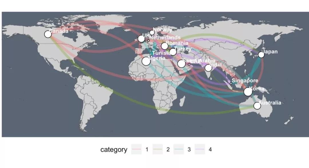
ggplot(nodes)+country_shape+
  geom_curve(aes(x=x,y=y,xend=xend,yend=yend,color=category,size=weight),
             data=edges_for_plot,curvature = 0.33,alpha=0.5)+
  scale_size_continuous(guide = FALSE,range = c(0.25,2))+  # scale for edge widths
  geom_point(aes(x=lon,y=lat,size=weight),  # draw nodes
             shape=21,fill="white",color="black",stroke=0.5)+
  scale_size_continuous(guide = FALSE, range = c(1,6))+ # scale for node size
  geom_text(aes(x=lon,y=lat,label=name), # draw text labels
            hjust=0,nudge_x = 1,nudge_y = 4,
            size=3,color="white",fontface="bold")+
  mapcoords+maptheme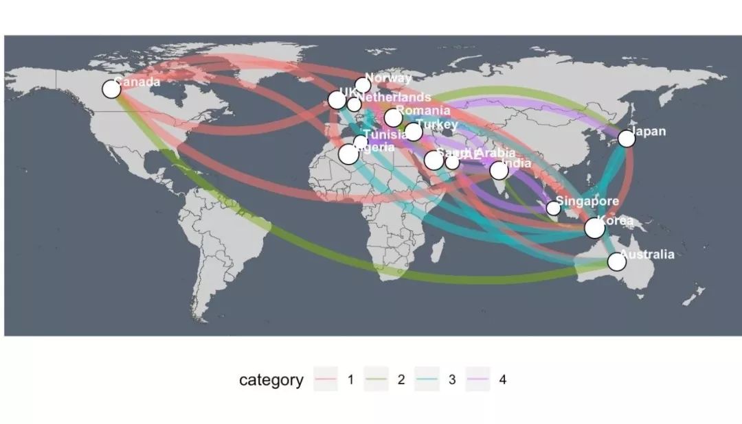
方法二:ggplot2+ggraph
ggplot2有一个名叫gggraph的扩展包(点我了解更多的ggplot2扩展包)专门为网络图的绘制添加了geoms美学,它可以帮助我们对节点和连线使用单独的标度(scales)。
nodes_pos <- nodes%>%
  select(lon,lat)%>%
  rename(x=lon,y=lat)
lay <- create_layout(g,"manual",node.position=nodes_pos)
assert_that(nrow(lay)==nrow(nodes))

# add node degree for scaling the node sizes
lay$weight <- degree(g)

# 使用gggraph包中的geom_edge_arc和geom_node_point函数进行绘图
ggraph(lay)+
  country_shape+
  geom_edge_arc(aes(color=category,edge_width=weight,circular=FALSE),
                data = edges_for_plot,curvature = 0.33,alpha=0.5)+
  scale_edge_width_continuous(range = c(0.5,2),guide=FALSE)+
  geom_node_point(aes(size=weight),shape=21,fill="white",color="black",stroke=0.5)+
  scale_size_continuous(range = c(1,6),guide = FALSE)+
  # 指定repel = TRUE来分发各个节点的标签
  geom_node_text(aes(label=name),repel = TRUE, size=3,color="white",fontface="bold")+
  mapcoords+maptheme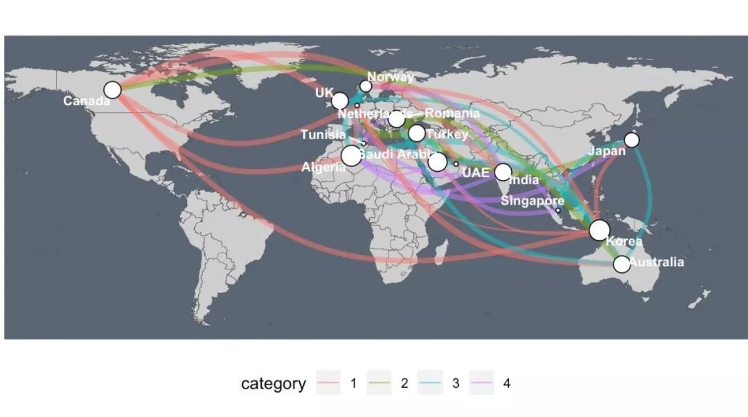
方法三:图形叠加
图形叠加需要一个透明背景,可通过下面的命令创建。
theme_transp_overlay <- theme(
  panel.background = element_rect(fill="transparent",color=NA),
  plot.background = element_rect(fill="transparent",color=NA)
)
在透明的背景上添加地图。
这里介绍一个技巧,我们可以将绘图代码放置在()中,运行一句命令即可将图形显示在你的RStudio中,而不需要再次运行p_base。
(p_base <- ggplot() + country_shape + mapcoords + maptheme)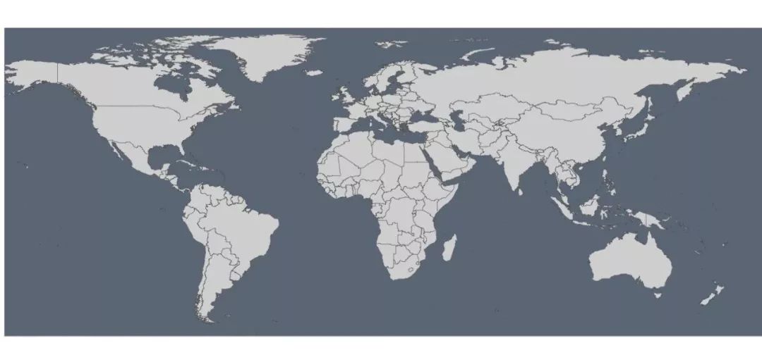
下面创建第一个需要覆盖在地图上的图层——各节点之间的连线(edges)。
(p_edges <- ggplot(edges_for_plot)+
  geom_curve(aes(x=x,y=y,xend=xend,yend=yend,color=category,size=weight), # draw edges as arcs
             curvature = 0.33,alpha=0.33)+
  scale_size_continuous(guide = FALSE, range = c(0.5, 2)) + # scale for edge widths
  mapcoords + maptheme + theme_transp_overlay +
  theme(legend.position = c(0.5, -0.1),
        legend.direction = "horizontal"))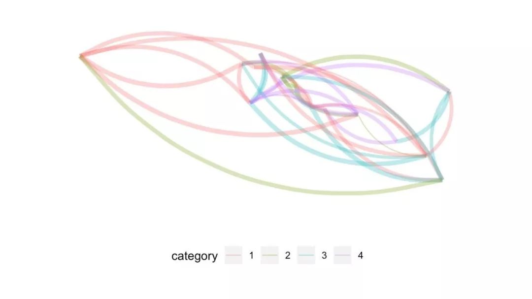
然后是绘制第二个需要叠加的图层——节点(nodes)
(p_nodes <- ggplot(nodes) +
  geom_point(aes(x = lon, y = lat, size = weight),
             shape = 21, fill = "white", color = "black",   # draw nodes
             stroke = 0.5) +
  scale_size_continuous(guide = FALSE, range = c(1, 6)) +   # scale for node size
  geom_text(aes(x = lon, y = lat, label = name),            # draw text labels
            hjust = 0, nudge_x = 1, nudge_y = 4,
            size = 3, color = "white", fontface = "bold") +
  mapcoords + maptheme + theme_transp_overlay)
最后需要用annotation_custom(ggplotGrob)把p_edges和p_nodes添加到p_base上,三个图形就叠加在一起了。之后还需要手动多次调整p_edges和p_nodes在垂直方向上的位置。
p <- p_base+
  annotation_custom(ggplotGrob(p_edges), ymin = -74)+
  annotation_custom(ggplotGrob(p_nodes), ymin = -74)
print(p)