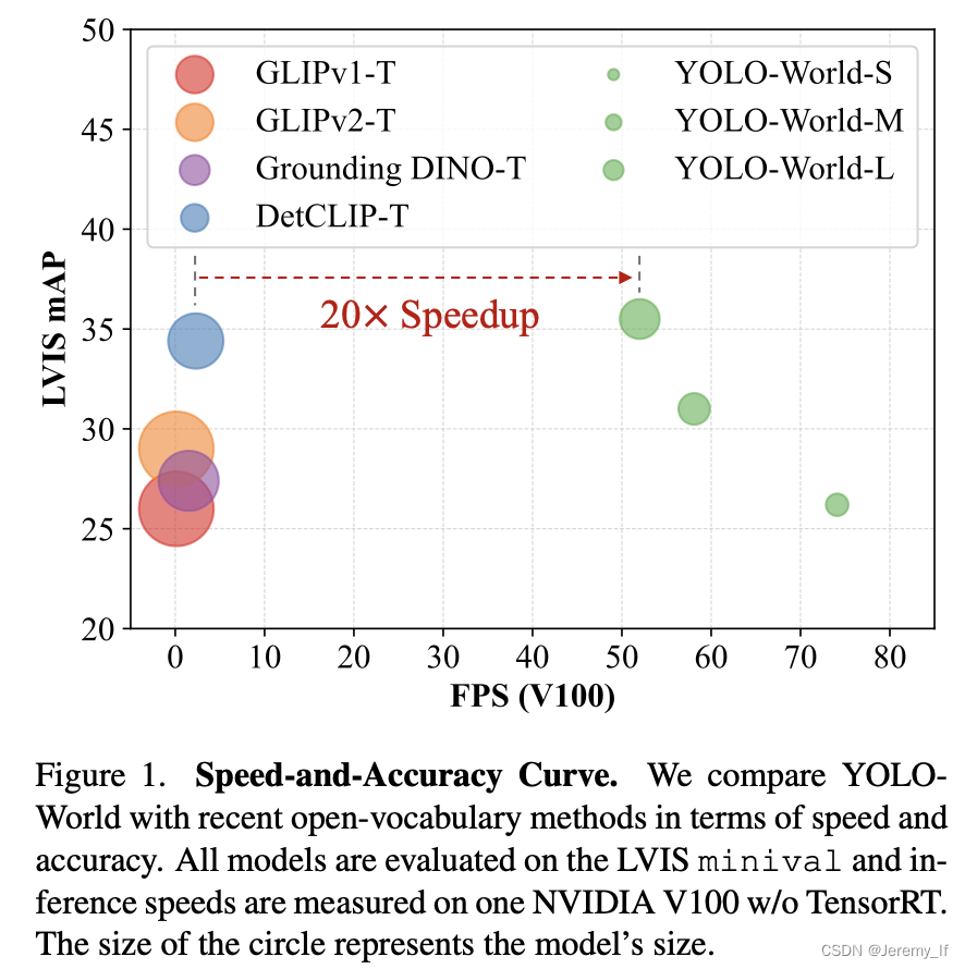
介绍
ggcharts提供了一个高级{ggplot2}接口,用于创建通用图表。它的目标既简单又雄心勃勃:让您更快地从数据可视化的想法到实际的绘图。所以如何?通过处理大量的数据预处理,为您模糊{ggplot2}细节和绘图样式。生成的图是ggplot对象,可以使用任何{ggplot2}函数进一步定制。
remotes::install_github("thomas-neitmann/ggcharts")
library(ggcharts)
library(tidyverse)
data("biomedicalrevenue")

pl1 <- biomedicalrevenue %>%
  filter(year %in% c(2012, 2015, 2018)) %>%
  group_by(year) %>%
  top_n(10, revenue) %>%
  ungroup() %>%
  mutate(company = tidytext::reorder_within(company, revenue, year)) %>%
  ggplot(aes(company, revenue)) +
  geom_col() +
  coord_flip() +
  tidytext::scale_x_reordered() +
  facet_wrap(vars(year), scales = "free_y")

pl2 <- biomedicalrevenue %>%
  filter(year %in% c(2012, 2015, 2018)) %>%
  bar_chart(x = company, y = revenue, facet = year, top_n = 10)

wrap_plots(pl1, pl2, ncol = 1)

Charts
各种线图
data("revenue_wide")

line_chart(data = revenue_wide, x = year, y = Roche:Bayer) +
  labs(x = "Year", y = "Revenue (Billion USD)")

biomedicalrevenue %>%
  filter(year == 2018) %>%
  lollipop_chart(x = company, y = revenue, threshold = 30) +
  labs(
    x = NULL,
    y = "Revenue",
    title = "Biomedical Companies with Revenue > $30Bn."
  ) +
  scale_y_continuous(
    labels = function(x) paste0("$", x, "Bn."),
    expand = expansion(mult = c(0, .05))
  )

data("popeurope")
dumbbell_chart(
  data = popeurope,
  x = country,
  y1 = pop1952,
  y2 = pop2007,
  top_n = 10,
  point_colors = c("lightgray", "#494F5C")
) +
  labs(
    x = NULL,
    y = "Population",
    title = "Europe's Largest Countries by Population in 2007"
  ) +
  scale_y_continuous(
    limits = c(0, NA),
    labels = function(x) paste(x, "Mn.")
  )

data(mtcars)
mtcars_z <- dplyr::transmute(
  .data = mtcars,
  model = row.names(mtcars),
  hpz = scale(hp)
)

diverging_bar_chart(data = mtcars_z, x = model, y = hpz)

diverging_lollipop_chart(
  data = mtcars_z,
  x = model,
  y = hpz,
  lollipop_colors = c("#006400", "#b32134"),
  text_color = c("#006400", "#b32134")
)

data("popch")
pyramid_chart(data = popch, x = age, y = pop, group = sex)


![[ACM独立出版]2024年虚拟现实、图像和信号处理国际学术会议(ICVISP 2024)](https://img-blog.csdnimg.cn/img_convert/67b64be0ec3791a39b833c5bd583a1a4.png)