Vue 3 中集成 ECharts 的完全指南
引言
在现代Web开发中,Vue 3以其卓越的性能和灵活的Composition API赢得了广泛的关注。而ECharts,作为开源的一个使用JavaScript实现的强大可视化库,以其丰富的图表类型和高度可定制性成为了数据可视化的首选工具之一。今天,我们将结合Vue 3的<script setup>语法糖和ECharts,来详细探讨如何在Vue 3项目中集成ECharts,并不仅仅局限于折线图,而是展示一个通用的集成方法。
一、安装和配置
1.安装ECharts
首先,你需要通过npm或yarn来安装ECharts。在你的Vue 3项目根目录下打开终端,执行以下命令之一:
npm install echarts --save
# 或者
yarn add echarts
2. Vue 3项目设置
确保你已经有一个Vue 3项目,并熟悉其基本结构。<script setup>是Vue 3引入的一种新的组件编写方式,它使得组件的编写更加简洁和直观。
二、编写Vue组件
1. 组件结构
在你的Vue 3项目中,创建一个新的组件,比如命名为EChartsComponent.vue。以下是该组件的基本结构,用于展示如何在Vue 3中集成ECharts:
<template>
  <div ref="chartDom" style="width: 600px; height: 400px;"></div>
</template>

<script setup>
import { ref, onMounted, onUnmounted, nextTick } from 'vue';
import * as echarts from 'echarts';

// 创建一个响应式引用来保存DOM元素
const chartDom = ref(null);
let chartInstance = null;

// 初始化ECharts实例并设置配置项(这里以折线图为例,但可灵活替换)
onMounted(async () => {
  await nextTick(); // 确保DOM已经渲染完成
  chartInstance = echarts.init(chartDom.value);
  const option = {
    // 这里是ECharts的配置项,可以根据需要绘制不同类型的图表
    title: {
      text: 'ECharts 示例图表'
    },
    tooltip: {},
    xAxis: {
      data: ["类别1", "类别2", "类别3", "类别4", "类别5"]
    },
    yAxis: {},
    series: [{
      name: '数据系列',
      type: 'line', // 这里可以是'line'、'bar'、'pie'等,根据图表类型选择
      data: [120, 200, 150, 80, 70]
    }]
  };
  chartInstance.setOption(option);
});

// 销毁ECharts实例
onUnmounted(() => {
  if (chartInstance != null && chartInstance.dispose) {
    chartInstance.dispose();
  }
});
</script>

<style scoped>
/* 添加一些CSS样式来美化图表容器(可选) */
</style>
2. 关键点解释
nextTick: 使用
await nextTick();来确保Vue的DOM更新已经完成,这是初始化ECharts实例前的关键步骤。ECharts配置: 配置项
option可以根据需要绘制不同类型的图表,如折线图、柱状图、饼图等。通过修改series中的type字段,可以轻松切换图表类型。图表初始化与销毁: 在
onMounted钩子中初始化ECharts实例,在onUnmounted钩子中销毁实例,以避免内存泄漏。
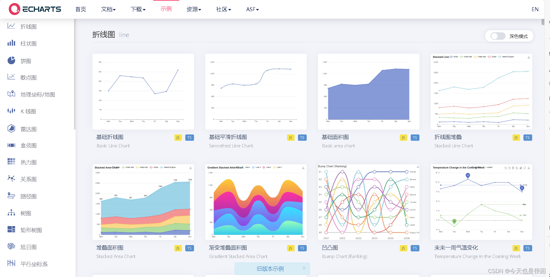
三、案例
好了,以上咱知道了基础用法,接下来展示几个案例
1. 堆叠柱状图案例

代码如下
const monthlyIndicators = ref(null);

// 绘制柱状图
const drawMonthlyIndicators = () => {
  const monthlyIndicatorsElement = echarts.init(monthlyIndicators.value);
  const option = {
    legend: {
      data: ['计划', '实际'],
      icon: 'circle', // 设置图例图标为圆形
      left: 'left', // 将图例定位到左侧
      top: 'top', // 将图例定位到顶部
    },
    grid: {
      top: '45', // 距离容器上边界的距离
      right: '10', // 距离容器右边界的距离
      bottom: '3', // 距离容器下边界的距离
      left: '10', // 距离容器左边界的距离
      containLabel: true, // 包含标签的绘图区域
    },
    xAxis: {
      type: 'category',
      data: ['1月', '2月', '3月', '4月', '5月', '6月', '7月', '8月', '9月', '10月', '11月', '12月'],
      axisTick: {
        alignWithLabel: true,
      },
      axisLine: {
        show: false, // 不显示横坐标轴线
      },
      axisTick: {
        show: false, // 不显示刻度线
      },
    },
    yAxis: {
      type: 'value',
      boundaryGap: [0, 0.01],
    },
    series: [
      {
        name: '实际',
        data: [220, 182, 191, 234, 290, 330, 310, 123, 442, 321, 234, 123],
        type: 'bar',
        stack: 'total', // 添加堆积效果
        barWidth: '30%', // 调整柱子宽度
        itemStyle: {
          borderRadius: [5, 5, 0, 0], // 只有顶部圆角
          color: new echarts.graphic.LinearGradient(0, 0, 0, 1, [
            // 设置渐变色
            { offset: 0, color: '#bdd1f6' },
            { offset: 1, color: '#4282ff' },
          ]),
        },
      },
      {
        name: '计划',
        data: [320, 132, 101, 134, 90, 230, 210, 320, 132, 101, 134, 90],
        type: 'bar',
        stack: 'total', // 添加堆积效果
        barWidth: '30%', // 调整柱子宽度
        itemStyle: {
          borderRadius: [5, 5, 0, 0], // 只有顶部圆角
          color: '#ebf2ff', // 设置柱子颜色
        },
      },
    ],
  };

  monthlyIndicatorsElement.setOption(option);
};
2. 渐变折线图

代码如下
const businessTrends = ref(null);

// 绘制折线图
const drawBusinessTrends = () => {
  const businessTrendsElement = echarts.init(businessTrends.value);
  const option = {
    tooltip: {
      trigger: 'axis',
    },
    grid: {
      left: '3%', // 调整左边距
      right: '3%', // 调整右边距
      bottom: '3%', // 调整底部边距
      top: '5%', // 调整顶部边距
      containLabel: true, // 确保标签和轴标题被包含在容器内
    },
    xAxis: {
      type: 'category',
      boundaryGap: false,
      data: ['1月', '2月', '3月', '4月', '5月', '6月', '7月'], // 示例数据
      axisLine: {
        show: false, // 不显示横坐标轴线
      },
      axisTick: {
        show: false, // 不显示刻度线
      },
    },
    yAxis: {
      type: 'value',
      axisLabel: {
        formatter: '{value}',
      },
    },
    series: [
      {
        name: '销售额',
        type: 'line',
        data: [620, 1032, 701, 1234, 890, 1430, 1120], // 示例数据,模拟起伏更大
        smooth: true, // 折线平滑
        lineStyle: {
          width: 2,
          color: new echarts.graphic.LinearGradient(0, 0, 1, 0, [
            { offset: 0, color: '#62c1fe' },
            { offset: 0.5, color: '#ad90f7' },
            { offset: 1, color: '#e875f2' },
          ]),
        },
        symbolSize: (value, params) => {
          // 获取数据系列的长度
          const seriesLength = option.series[0].data.length;
          // 中间节点放大
          if (params.dataIndex === Math.floor(seriesLength / 2)) {
            return 8; // 中间节点的大小
          }
          return 8; // 其他节点的大小
        },
      },
    ],
  };
  businessTrendsElement.setOption(option);
};
3. 环形饼图

代码如下
const projectSigningOverview = ref(null);

// 绘制饼图环形
const drawProjectSigningOverview = () => {
  const projectSigningOverviewElement = echarts.init(projectSigningOverview.value);
  const option = {
    legend: {
      orient: 'vertical',
      right: 10,
      align: 'left',
      top: 'center',
      textStyle: {
        rich: {
          name: {
            color: '#929292',
          },
          value: {
            color: '#000',
            fontWeight: 'bold',
            fontSize: 16, // 根据需要调整字体大小
          },
        },
      },
      data: [
        {
          name: '已签约 {value|80}{name| 个/5800万}',
          textStyle: { rich: { value: {}, name: {} } },
        },
        {
          name: '未签约 {value|18}{name| 个/5800万}',
          textStyle: { rich: { value: {}, name: {} } },
        },
        {
          name: '跟进中 {value|24}{name| 个/5800万}',
          textStyle: { rich: { value: {}, name: {} } },
        },
      ],
      icon: 'circle', // 设置图例图标为圆形
    },
    series: [
      {
        name: 'Access From',
        type: 'pie',
        radius: ['50%', '70%'],
        center: ['22%', '50%'],
        avoidLabelOverlap: false,
        label: {
          show: false,
          position: 'center',
        },
        emphasis: {
          label: {
            show: false,
          },
        },
        labelLine: {
          show: false,
        },
        data: [
          { value: 80, name: '已签约 {value|80}{name| 个/5800万}' }, // 已签约
          { value: 18, name: '未签约 {value|18}{name| 个/5800万}' }, // 未签约
          { value: 24, name: '跟进中 {value|24}{name| 个/5800万}' }, // 跟进中
        ],
        itemStyle: {
          borderRadius: 0,
          borderColor: '#fff',
          borderWidth: 0,
        },
      },
    ],
    graphic: [
      {
        type: 'text',
        left: '65%', // 将文本水平居中
        top: '19%', // 根据实际情况调整,确保文本显示在legend上方
        style: {
          // 使用富文本格式
          rich: {
            a: {
              // 为“80”设置的样式
              fontSize: 16, // 放大字体大小
              fontWeight: 'bold', // 加粗
              color: '#000', // 字体颜色
            },
            b: {
              // 为“个/5800万”设置的样式
              fontSize: 14, // 字体大小
              color: '#929292',
            },
          },
          text: '项目总数 {a|80} {b|个/5800万}', // 显示的文本内容,使用上面定义的样式标签
          textAlign: 'center',
          fill: '#000', // 默认文本颜色,这里可能不会生效因为已经在rich中指定了颜色
        },
      },
      {
        type: 'text',
        left: '18%',
        top: '40%',
        style: {
          text: '72%',
          textAlign: 'center',
          fill: '#000',
          fontSize: 20,
        },
      },
      {
        type: 'text',
        left: '18%',
        top: '55%',
        z: 100,
        style: {
          text: '转化率',
          textAlign: 'center',
          fill: '#000',
          fontSize: 14,
        },
      },
    ],
  };
  projectSigningOverviewElement.setOption(option);
};
4. 横向柱状排行榜

代码如下
const salesRanking = ref(null);

// 绘制横向柱状图排行榜
const drawSalesRanking = () => {
  const salesRankingElement = echarts.init(salesRanking.value);
  const option = {
    tooltip: {
      trigger: 'axis',
      axisPointer: {
        type: 'shadow',
      },
    },
    grid: {
      left: '0%', // 调整左边距
      right: '5%', // 调整右边距
      bottom: '3%', // 调整底部边距
      top: '5%', // 调整顶部边距
      containLabel: true, // 确保标签和轴标题被包含在容器内
    },
    xAxis: {
      type: 'value',
      boundaryGap: [0, 0.01],
      axisLine: {
        show: false, // 不显示横坐标轴线
      },
      axisTick: {
        show: false, // 不显示刻度线
      },
      splitLine: {
        show: false, // 不显示x轴网格线
      },
    },
    yAxis: {
      type: 'category',
      data: ['刘晓彬', '萧秀凝', '曲严琰'], // 示例数据
      axisLine: {
        show: false, // 不显示横坐标轴线
      },
      axisTick: {
        show: false, // 不显示刻度线
      },
      splitLine: {
        show: false, // 不显示y轴网格线
      },
      axisLabel: {
        rich: {
          iconStyle: {
            fontSize: 20, // 设置图标的字体大小为20
          },
          nameStyle: {
            // 定义名字的样式
            fontSize: 12, // 设置名字的字体大小为12,或者您希望的任何大小
          },
        },
        formatter: function (value, index) {
          // 根据index或value来决定显示哪个排名的图标
          const rankIcons = {
            2: '{iconStyle|🥇}',
            1: '{iconStyle|🥈}',
            0: '{iconStyle|🥉}',
          };
          return `${rankIcons[index]} {nameStyle|${value}}`;
        },
      },
    },
    series: [
      {
        name: '销售额',
        type: 'bar',
        data: [920, 1032, 1201], // 示例数据
        barWidth: '30%', // 调整柱子宽度
        itemStyle: {
          borderRadius: [0, 5, 5, 0], // 只有右侧圆角
          color: new echarts.graphic.LinearGradient(0, 0, 1, 0, [
            // 设置渐变色,方向也要调整为横向
            { offset: 0, color: '#bdd1f6' },
            { offset: 1, color: '#4282ff' },
          ]),
        },
        label: {
          show: true, // 显示标签
          position: 'right', // 标签位置在顶部
          formatter: '{c}万', // 自定义显示的内容,{c}是指当前数据点的值
        },
      },
    ],
  };
  salesRankingElement.setOption(option);
};