边 Edge
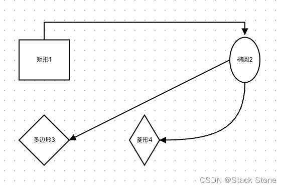
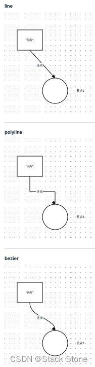
和节点一样,LogicFlow 也内置一些基础的边。LogicFlow 的内置边包括:
- 直线 - line
- 直角折现 - polyline
- 贝塞尔曲线 - bezier
新建 src/views/Example/LogicFlow/Example08.vue 并编写如下代码:
<script setup lang="ts">
// 导入 LogicFlow 库及其样式
import LogicFlow from '@logicflow/core'
import '@logicflow/core/dist/style/index.css'
// 导入 Vue 的 onMounted 钩子,用于组件挂载后的操作
import { onMounted } from 'vue'

// 配置项,用于设定 LogicFlow 的交互模式,禁止图表的滚动、移动和缩放功能
const SilentConfig = {
  stopScrollGraph: true,
  stopMoveGraph: true,
  stopZoomGraph: true
}

// 定义图表数据,包括各种形状的节点和连接它们的边
const data = {
  nodes: [
    {
      id: '1', // 节点的唯一标识符
      type: 'rect', // 节点的类型为矩形
      x: 100, // 矩形的 x 坐标
      y: 100, // 矩形的 y 坐标
      text: '矩形1' // 节点上显示的文本
    },
    {
      id: '2',
      type: 'ellipse', // 节点类型为椭圆
      x: 500,
      y: 100,
      text: '椭圆2'
    },
    {
      id: '3',
      type: 'polygon', // 节点类型为多边形
      x: 100,
      y: 250,
      text: '多边形3'
    },
    {
      id: '4',
      type: 'diamond', // 节点类型为菱形
      x: 300,
      y: 250,
      text: '菱形4'
    }
  ],
  edges: [
    {
      sourceNodeId: '1', // 边的起始节点 ID
      targetNodeId: '2', // 边的目标节点 ID
      startPoint: {
        x: 100, // 起始点的 x 坐标
        y: 60 // 起始点的 y 坐标
      },
      endPoint: {
        x: 500, // 结束点的 x 坐标
        y: 50 // 结束点的 y 坐标
      },
      type: 'polyline' // 连接线类型为折线
    },
    {
      sourceNodeId: '2',
      targetNodeId: '3',
      type: 'line' // 连接线类型为直线
    },
    {
      sourceNodeId: '2',
      targetNodeId: '4',
      type: 'bezier' // 连接线类型为贝塞尔曲线
    }
  ]
}

// 当 Vue 组件挂载完成后执行的操作
onMounted(() => {
  // 创建 LogicFlow 实例,并指定容器和其他配置
  const lf = new LogicFlow({
    container: document.getElementById('container')!, // 获取 DOM 元素作为图表的容器
    grid: true, // 启用网格
    ...SilentConfig // 应用静默模式配置
  })
  // 使用预定义的数据渲染图表
  lf.render(data)
  lf.translateCenter() // 将图表内容居中显示
})
</script>

<template>
  <h3>Example08</h3>
  <div id="container"></div>
  <!-- 容器用于展示 LogicFlow 图表 -->
</template>

<style>
#container {
  /* 定义容器的宽度和高度 */
  width: 100%;
  height: 500px;
}
</style>
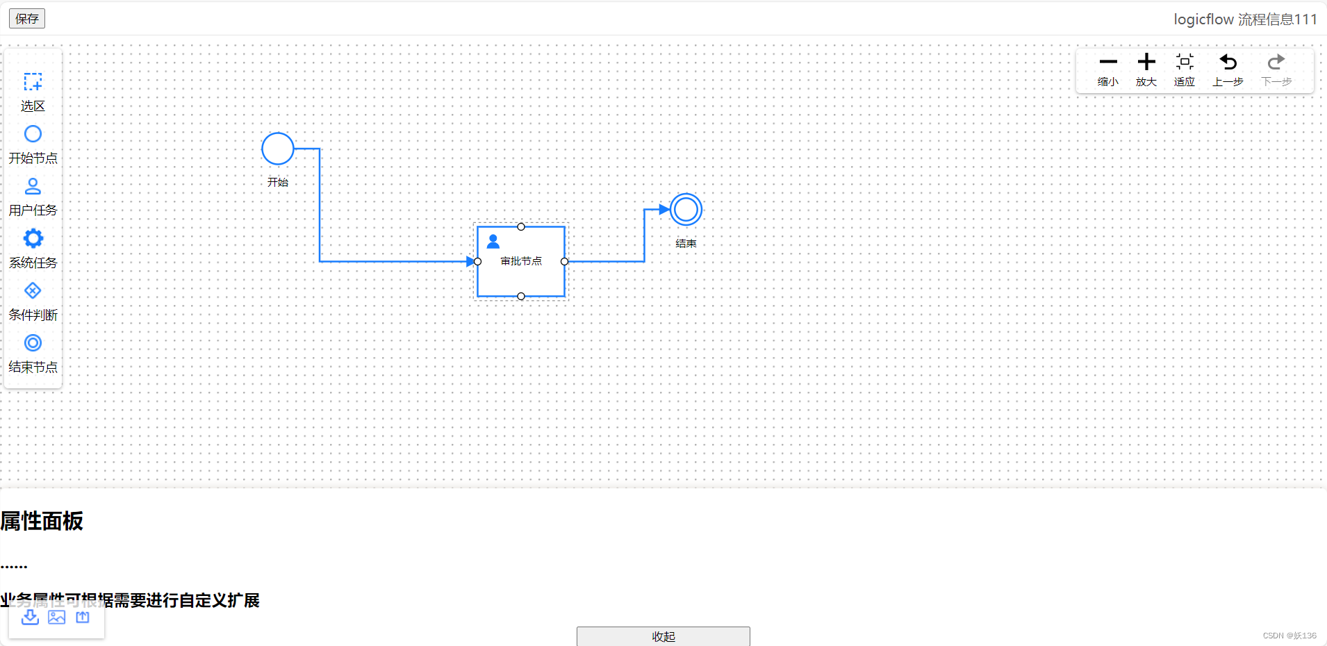
运行后效果如下:
选择自定义边继承的内置边
// 直线
import { LineEdge, PolylineEdgeModel } from "@logicflow/core";
// 折线
import { PolylineEdge, PolylineEdgeModel } from "@logicflow/core";
// 贝塞尔曲线
import { BezierEdge, BezierEdgeModel } from "@logicflow/core";
基于继承的自定义边
和节点一样,LogicFlow 的边也支持基于继承的自定义机制。同样也只需同时继承view和model。但是和节点不一样的是,由于边的编辑复杂度问题,绝大多数情况下,自定义边时不推荐自定义 view。只需要在自定义 edgeModel 中样式类即可。
新建 src/views/Example/LogicFlow/component/Sequence/index.ts 代码内容如下:
// 从 @logicflow/core 导入 PolylineEdge 和 PolylineEdgeModel 类
import { PolylineEdge, PolylineEdgeModel } from '@logicflow/core'

// 创建一个名为 SequenceModel 的类,继承自 PolylineEdgeModel
class SequenceModel extends PolylineEdgeModel {
  // 设置属性方法
  setAttributes() {
    this.offset = 20 // 设置折线的偏移量为 20,这可能影响折线的布局或外观
  }

  // 获取动画样式方法
  getAnimation() {
    const animation = super.getAnimation() // 调用父类的方法获取默认动画设置
    animation.stroke = 'blue' // 设置动画的颜色为蓝色
    return animation // 返回配置后的动画对象
  }

  // 获取边的样式方法
  getEdgeStyle() {
    const style = super.getEdgeStyle() // 调用父类的方法获取默认边的样式
    const { properties } = this // 从当前模型中获取属性
    if (properties.isActived) {
      style.strokeDasharray = '4 4' // 如果边处于激活状态,设置虚线样式
    }
    style.stroke = 'orange' // 设置边的颜色为橙色
    return style // 返回配置后的样式对象
  }

  // 获取文本样式方法
  getTextStyle() {
    const style = super.getTextStyle() // 调用父类的方法获取默认文本样式
    style.color = '#3451F1' // 设置文本颜色为深蓝色
    style.fontSize = 30 // 设置文本字体大小为 30
    if (style.background) {
      style.background.fill = '#F2F131' // 如果有背景,设置背景颜色为浅黄色
    }
    return style // 返回配置后的文本样式
  }

  // 获取轮廓样式方法
  getOutlineStyle() {
    const style = super.getOutlineStyle() // 调用父类的方法获取默认轮廓样式
    style.stroke = 'red' // 设置轮廓的颜色为红色
    if (style.hover) {
      style.hover.stroke = 'red' // 如果有悬停样式,设置悬停时轮廓的颜色也为红色
    }
    return style // 返回配置后的轮廓样式
  }
}

// 导出一个对象,包含类型、视图和模型的配置
export default {
  type: 'Sequence', // 自定义边的类型标识
  view: PolylineEdge, // 使用 PolylineEdge 作为视图
  model: SequenceModel // 使用 SequenceModel 作为模型
}
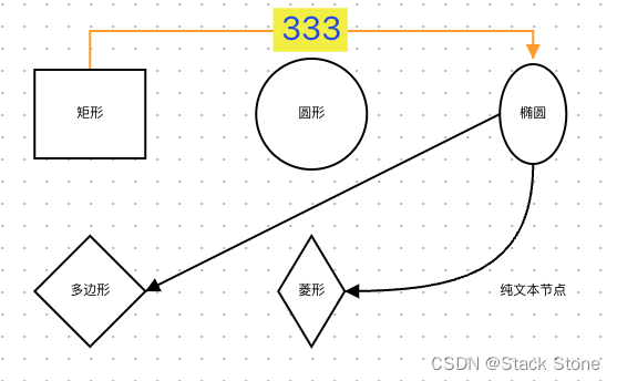
之后新增 src/views/Example/LogicFlow/Example09.vue,内容如下:
<script setup lang="ts">
// 导入 LogicFlow 库及其样式
import LogicFlow from '@logicflow/core'
import '@logicflow/core/dist/style/index.css'
// 导入 Vue 的 onMounted 钩子,用于组件挂载后的操作
import { onMounted } from 'vue'
import Sequence from './component/Sequence'

// 配置项,用于设定 LogicFlow 的交互模式,禁止图表的滚动、移动和缩放功能
const SilentConfig = {
  stopScrollGraph: true,
  stopMoveGraph: true,
  stopZoomGraph: true
}

// 定义图表数据,包括各种形状的节点和连接它们的边
const data = {
  nodes: [
    {
      id: '1',
      type: 'rect',
      x: 100,
      y: 100,
      text: '矩形'
    },
    {
      id: '2',
      type: 'circle',
      x: 300,
      y: 100,
      text: '圆形'
    },
    {
      id: '3',
      type: 'ellipse',
      x: 500,
      y: 100,
      text: '椭圆'
    },
    {
      id: '4',
      type: 'polygon',
      x: 100,
      y: 250,
      text: '多边形'
    },
    {
      id: '5',
      type: 'diamond',
      x: 300,
      y: 250,
      text: '菱形'
    },
    {
      id: '6',
      type: 'text',
      x: 500,
      y: 250,
      text: '纯文本节点'
    }
  ],
  edges: [
    {
      sourceNodeId: '1',
      targetNodeId: '3',
      startPoint: {
        x: 100,
        y: 60
      },
      endPoint: {
        x: 500,
        y: 50
      },
      text: '333',
      type: 'Sequence'
    },
    {
      sourceNodeId: '3',
      targetNodeId: '4',
      type: 'line'
    },
    // TODO
    {
      sourceNodeId: '3',
      targetNodeId: '5',
      type: 'bezier'
    }
  ]
}

// 当 Vue 组件挂载完成后执行的操作
onMounted(() => {
  // 创建 LogicFlow 实例,并指定容器和其他配置
  const lf = new LogicFlow({
    container: document.getElementById('container')!, // 获取 DOM 元素作为图表的容器
    grid: true, // 启用网格
    ...SilentConfig // 应用静默模式配置
  })
  lf.register(Sequence)
  // 使用预定义的数据渲染图表
  lf.render(data)
  lf.translateCenter() // 将图表内容居中显示
})
</script>

<template>
  <h3>Example08</h3>
  <div id="container"></div>
  <!-- 容器用于展示 LogicFlow 图表 -->
</template>

<style>
#container {
  /* 定义容器的宽度和高度 */
  width: 100%;
  height: 500px;
}
</style>
页面效果如下:
自定义边文本位置
默认情况下,边上文本的位置是用户双击点击边时的位置。如果是通过 API 的方式给边添加的文本,文本位置按照如下规则。
- line:起点和终点中间
- poyline:最长线段中间
- bezier:起点、终点、调整点中间
LogicFlow支持开发者自定义文本位置,例如文本位置永远在边起点旁边。定义方式为将属性customTextPosition设置为 true,然后重写getTextPosition方法,此方法发回的坐标就是文本的坐标。
新建 src/views/Example/LogicFlow/component/CustomEdge2/index.ts 代码如下:
// 导入 @logicflow/core 中的 PolylineEdge 和 PolylineEdgeModel
import { PolylineEdge, PolylineEdgeModel } from '@logicflow/core'

// 定义一个自定义的边模型
class CustomEdgeModel extends PolylineEdgeModel {
  customTextPosition = true // 设置一个属性来标识是否自定义文本位置
  getTextStyle() {
    const style = super.getTextStyle() // 获取默认的文本样式
    // const { x: x1 } = this.pointsList[0];
    // const { x: x2 } = this.pointsList[1];
    // // if (x1 === x2) {
    // //   // 垂直
    // //   style.textWidth = 20;
    // // } else {
    // //   style.textWidth = 200;
    // // }
    style.className = 'custom-text' // 为文本样式添加一个自定义的类名,用于CSS样式定制
    return style
  }
  // 重写获取文本位置的方法
  getTextPosition() {
    const position = super.getTextPosition() // 获取默认的文本位置
    const currentPositionList = this.points.split(' ') // 将点列表字符串分割为单个点
    const pointsList = [] // 初始化一个数组来存储点对象
    // 遍历当前点列表,将字符串转换为点对象
    currentPositionList &&
      currentPositionList.forEach((item) => {
        const [x, y] = item.split(',')
        pointsList.push({ x: Number(x), y: Number(y) })
      })
    if (currentPositionList.length > 1) {
      let [x1, y1]: string[] | number[] = currentPositionList[0].split(',')
      let [x2, y2]: string[] | number[] = currentPositionList[1].split(',')
      let distence = 50 // 设置默认文本偏移距离
      x1 = Number(x1)
      y1 = Number(y1)
      x2 = Number(x2)
      y2 = Number(y2)

      // 计算文本的新位置,根据点的相对位置来调整
      if (x1 === x2) {
        // 如果 x 坐标相同,表示线是垂直的
        // 垂直
        if (y2 < y1) {
          distence = -50 // 如果第二个点在第一个点之上,调整偏移方向
        }
        position.y = y1 + distence
        position.x = x1
      } else {
        // 如果线是水平的或斜的
        if (x2 < x1) {
          distence = -50 // 如果第二个点在第一个点之左,调整偏移方向
        }
        position.x = x1 + distence
        position.y = y1 - 10 // 小幅下移文本,使其不直接覆盖在线上
      }
    }
    return position
  }
}

class CustomEdge extends PolylineEdge {}

export default {
  type: 'CustomEdge2',
  model: CustomEdgeModel,
  view: CustomEdge
}
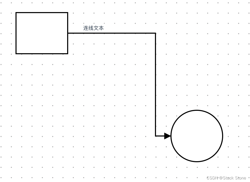
之后新增 src/views/Example/LogicFlow/Example10.vue 代码如下:
<script setup lang="ts">
// 导入 LogicFlow 库及其样式
import LogicFlow from '@logicflow/core'
import '@logicflow/core/dist/style/index.css'
// 导入 Vue 的 onMounted 钩子,用于组件挂载后的操作
import { onMounted } from 'vue'
import CustomEdge2 from './component/CustomEdge2'

// 配置项,用于设定 LogicFlow 的交互模式,禁止图表的滚动、移动和缩放功能
const SilentConfig = {
  stopScrollGraph: true,
  stopMoveGraph: true,
  stopZoomGraph: true
}

// 定义图表数据,包括各种形状的节点和连接它们的边
const data = {
  nodes: [
    {
      id: 'rect_2',
      type: 'circle',
      x: 450,
      y: 300
    },
    {
      id: 'rect_3',
      type: 'rect',
      x: 150,
      y: 100
    }
  ],
  edges: [
    {
      sourceNodeId: 'rect_3',
      targetNodeId: 'rect_2',
      type: 'CustomEdge2',
      text: '连线文本'
    }
  ]
}

// 当 Vue 组件挂载完成后执行的操作
onMounted(() => {
  // 创建 LogicFlow 实例,并指定容器和其他配置
  const lf = new LogicFlow({
    container: document.getElementById('container')!, // 获取 DOM 元素作为图表的容器
    grid: true, // 启用网格
    ...SilentConfig // 应用静默模式配置
  })
  lf.register(CustomEdge2)
  lf.setDefaultEdgeType('CustomEdge2')
  lf.setTheme({
    edgeText: {
      textWidth: 100,
      overflowMode: 'autoWrap',
      fontSize: 10,
      background: {
        fill: '#FFFFFF'
      }
    }
  })
  // 使用预定义的数据渲染图表
  lf.render(data)
  lf.translateCenter() // 将图表内容居中显示
})
</script>

<template>
  <h3>Example10</h3>
  <div id="container"></div>
  <!-- 容器用于展示 LogicFlow 图表 -->
</template>

<style>
#container {
  /* 定义容器的宽度和高度 */
  width: 100%;
  height: 500px;
}
</style>
页面结果如下:
自定义节点之间边的类型
默认情况下,通过从锚点手动连接节点生成的边为初始化edgeType指定的类型,也可以通过lf.setDefaultEdgeType(edgeType)来指定。但是当需要不同的节点之间连接的边类型不一样时,就只有自定义节点之间边的类型了。
const lf = new LogicFlow({
  ...,
  // 默认边
  edgeType: 'bezier',
  // 移动已有边时会有 currentEdge 信息, 否则为空
  edgeGenerator: (sourceNode, targetNode, currentEdge) => {
    // 起始节点类型 rect 时使用 自定义的边 custom-edge
    if (sourceNode.type === 'rect') return 'custom-edge'
  }
})
自定义箭头
在1.1.27版本后,LogicFlow支持单独自定义连线两端的箭头。和之前的自定义方式一样,支持通过主题自定义大小等基本数据和通过重写对应的方法实现完全的自定义。
主题设置
lf.setTheme({
  arrow: {
    offset: 4, // 箭头垂线长度
    verticalLength: 2, // 箭头底线长度
  },
});
自定义箭头形状
在自定义连线 view 的时候,可以重写 getEndArrow 和 getStartArrow 方法来实现自定义连线两端的图形,这两个方法可以返回的任意 svg 图形。
这里以通过连线属性中的 arrowType 来控制连线不同的外观为例。
class Connection extends PolylineEdge {
  getEndArrow() {
    const { model, graphModel } = this.props;
    const {
      id,
      properties: { arrowType },
    } = model;
    const { stroke, strokeWidth } = this.getArrowStyle();
    const pathAttr = {
      stroke,
      strokeWidth,
    };
    if (arrowType === "empty") {
      // 空心箭头
      return h("path", {
        ...pathAttr,
        fill: "#FFF",
        d: "M -10 0  -20 -5 -30 0 -20 5 z",
      });
    } else if (arrowType === "half") {
      // 半箭头
      return h("path", {
        ...pathAttr,
        d: "M 0 0 -10 5",
      });
    }
    return h("path", {
      ...pathAttr,
      d: "M 0 0 -10 -5 -10 5 z",
    });
  }
}
自定义调整点样式
在初始化 LogicFlow 实例的时候,可以通过参数 adjustEdgeStartAndEnd 来开启调整边的起始点和结束点的功能。
在自定义连线 view 的时候,可以重写 getAdjustPointShape 方法来实现自定义调整点的样式。
// lf.js
const lf = new LogicFlow({
  adjustEdgeStartAndEnd: true,
});
// edge.js
class CustomEdge extends LineEdge {
  getAdjustPointShape(x, y, edgeModel) {
    return h("g", {}, [
      h("image", {
        x: x - 9,
        y: y - 9,
        width: 18,
        height: 18,
        cursor: "move",
        href: "data:image/svg+xml;base64,PCFET0NUWVBFIHN2ZyBQVUJMSUMgIi0vL1czQy8vRFREIFNWRyAxLjEvL0VOIiAiaHR0cDovL3d3dy53My5vcmcvR3JhcGhpY3MvU1ZHLzEuMS9EVEQvc3ZnMTEuZHRkIj48c3ZnIHhtbG5zPSJodHRwOi8vd3d3LnczLm9yZy8yMDAwL3N2ZyIgeG1sbnM6eGxpbms9Imh0dHA6Ly93d3cudzMub3JnLzE5OTkveGxpbmsiIHdpZHRoPSIyMnB4IiBoZWlnaHQ9IjIycHgiIHZlcnNpb249IjEuMSI+PGNpcmNsZSBjeD0iMTEiIGN5PSIxMSIgcj0iNyIgc3Ryb2tlPSIjZmZmIiBmaWxsPSIjMjliNmYyIi8+PGNpcmNsZSBjeD0iMTEiIGN5PSIxMSIgcj0iMyIgc3Ryb2tlPSIjZmZmIiBmaWxsPSJ0cmFuc3BhcmVudCIvPjwvc3ZnPg==",
      }),
    ]);
  }
}
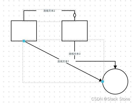
以下为完整的样例代码,新建 src/views/Example/LogicFlow/Example11.vue 代码如下:
<script setup lang="ts">
// 导入 LogicFlow 核心库及其样式
import LogicFlow, {
  h, // 用于创建虚拟DOM节点
  LineEdge, // 基础线边类
  LineEdgeModel, // 基础线边模型
  PolylineEdge, // 基础折线边类
  PolylineEdgeModel // 基础折线边模型
} from '@logicflow/core'
import '@logicflow/core/dist/style/index.css' // 导入默认样式

// 导入 Vue 的 onMounted 生命周期钩子
import { onMounted } from 'vue'
// 导入自定义边模块
import CustomEdge2 from './component/CustomEdge2'

// 配置项,用于限制用户交互,禁用图形的滚动、移动和缩放功能
const SilentConfig = {
  stopScrollGraph: true,
  stopMoveGraph: true,
  stopZoomGraph: true
}

// 自定义的连接类继承自 PolylineEdge,用于定义箭头的类型和样式
class Connection extends PolylineEdge {
  getEndArrow() {
    const { model } = this.props // 获取边的模型属性
    const {
      properties: { arrowType }
    } = model // 从模型中提取箭头类型
    const { stroke, strokeWidth } = model.getArrowStyle() // 获取箭头的样式
    const pathAttr = {
      stroke,
      strokeWidth
    }
    // 根据箭头类型返回不同的 SVG path 元素
    if (arrowType === 'empty') {
      // 空心箭头
      return h('path', {
        ...pathAttr,
        fill: '#FFF',
        d: 'M -10 0  -20 -5 -30 0 -20 5 z'
      })
    } else if (arrowType === 'half') {
      // 半箭头
      return h('path', {
        ...pathAttr,
        d: 'M 0 0 -10 5'
      })
    }
    // 默认实心箭头
    return h('path', {
      ...pathAttr,
      d: 'M 0 0 -10 -5 -10 5 z'
    })
  }
}

// 自定义的边视图,用于自定义边上的控制点形状
class CustomEdge extends LineEdge {
  getAdjustPointShape(x: any, y: any, edgeModel: any) {
    console.log(edgeModel) // 打印边模型信息
    // 返回一个含有 SVG 图像的组,用于表示控制点
    return h('g', {}, [
      h('image', {
        x: x - 9,
        y: y - 9,
        width: 18,
        height: 18,
        cursor: 'move',
        href: 'data:image/svg+xml;base64,PCFET0NUWVBFIHN2ZyBQVUJMSUMgIi0vL1czQy8vRFREIFNWRyAxLjEvL0VOIiAiaHR0cDovL3d3dy53My5vcmcvR3JhcGhpY3MvU1ZHLzEuMS9EVEQvc3ZnMTEuZHRkIj48c3ZnIHhtbG5zPSJodHRwOi8vd3d3LnczLm9yZy8yMDAwL3N2ZyIgeG1sbnM6eGxpbms9Imh0dHA6Ly93d3cudzMub3JnLzE5OTkveGxpbmsiIHdpZHRoPSIyMnB4IiBoZWlnaHQ9IjIycHgiIHZlcnNpb249IjEuMSI+PGNpcmNsZSBjeD0iMTEiIGN5PSIxMSIgcj0iNyIgc3Ryb2tlPSIjZmZmIiBmaWxsPSIjMjliNmYyIi8+PGNpcmNsZSBjeD0iMTEiIGN5PSIxMSIgcj0iMyIgc3Ryb2tlPSIjZmZmIiBmaWxsPSJ0cmFuc3BhcmVudCIvPjwvc3ZnPg=='
      })
    ])
  }
}

// 定义图表数据,包括节点和边
const data = {
  nodes: [
    // 定义节点信息
    {
      id: 'rect_2',
      type: 'circle',
      x: 450,
      y: 300
    },
    {
      id: 'rect_3',
      type: 'rect',
      x: 300,
      y: 100
    },
    {
      id: 'rect_4',
      type: 'rect',
      x: 100,
      y: 100
    }
  ],
  edges: [
    // 定义边信息
    {
      sourceNodeId: 'rect_4',
      targetNodeId: 'rect_2',
      type: 'CustomEdge',
      text: '连线文本1',
      startPoint: {
        x: 100,
        y: 100 + 40
      }
    },
    {
      sourceNodeId: 'rect_4',
      targetNodeId: 'rect_3',
      type: 'Connection',
      text: '连线文本2',
      startPoint: {
        x: 100,
        y: 100 - 40
      },
      endPoint: {
        x: 300,
        y: 100 - 40
      },
      pointsList: [
        {
          x: 100,
          y: 100 - 40
        },
        {
          x: 100,
          y: 100 - 80
        },
        {
          x: 300,
          y: 100 - 80
        },
        {
          x: 300,
          y: 100 - 40
        }
      ],
      properties: {
        arrowType: 'empty' // 指定箭头类型
      }
    },
    {
      sourceNodeId: 'rect_3',
      targetNodeId: 'rect_2',
      type: 'CustomEdge2',
      text: '连线文本3'
    }
  ]
}

// 在 Vue 组件挂载后,初始化 LogicFlow 实例并渲染图表
onMounted(() => {
  const lf = new LogicFlow({
    container: document.getElementById('container')!, // 指定图表的 DOM 容器
    grid: true, // 启用网格显示
    adjustEdgeStartAndEnd: true, // 自动调整边的起始和结束位置
    ...SilentConfig // 应用静默模式配置
  })
  lf.register(CustomEdge2) // 注册自定义边类型
  lf.register({
    type: 'Connection',
    model: PolylineEdgeModel,
    view: Connection
  })
  lf.register({
    type: 'CustomEdge',
    model: LineEdgeModel,
    view: CustomEdge
  })
  lf.setDefaultEdgeType('CustomEdge2') // 设置默认边类型
  lf.setTheme({
    edgeText: {
      textWidth: 100, // 设置文本框宽度
      overflowMode: 'autoWrap', // 自动换行模式
      fontSize: 10, // 字体大小
      background: {
        fill: '#FFFFFF' // 文本背景色
      }
    }
  })
  lf.render(data) // 渲染图表数据
  lf.translateCenter() // 居中显示图表
})
</script>

<template>
  <h3>Example10</h3>
  <div id="container"></div>
  <!-- 图表容器 -->
</template>

<style>
#container {
  width: 100%;
  height: 500px;
}
</style>
效果如下:


![[大模型]ChatTTS Windows安装(CPU)](https://img-blog.csdnimg.cn/direct/d46ac069d92d4c62a2bad7d6f3692727.png)
![【Spine学习09】之导入皮肤两种方式[skin]](https://img-blog.csdnimg.cn/direct/bde27ba452824b0a941a049884a52736.png)