欢迎大家关注全网生信学习者系列:
WX公zhong号:生信学习者
Xiao hong书:生信学习者
知hu:生信学习者
CDSN:生信学习者2
介绍
ggpubr是我经常会用到的R包,它傻瓜式的画图方式对很多初次接触R绘图的人来讲是很友好的。该包有个stat_compare_means函数可以做组间假设检验分析。
安装R包
install.packages("ggpubr")
devtools::devtools::install_github("kassambara/ggpubr")
library(ggpubr)
plotdata <- data.frame(sex = factor(rep(c("F", "M"), each=200)),
weight = c(rnorm(200, 55), rnorm(200, 58)))
密度图density
ggdensity(plotdata,
          x = "weight",
          add = "mean",
          rug = TRUE,    # x轴显示分布密度
          color = "sex",
          fill = "sex",
          palette = c("#00AFBB", "#E7B800"))

柱状图histogram
gghistogram(plotdata,
            x = "weight",
            bins = 30,
            add = "mean",
            rug = TRUE,
            color = "sex",
            fill = "sex",
            palette = c("#00AFBB", "#E7B800"))

箱线图boxplot
df <- ToothGrowth
head(df)
my_comparisons <- list( c("0.5", "1"), c("1", "2"), c("0.5", "2") )
ggboxplot(df,
          x = "dose",
          y = "len",
          color = "dose",
          palette =c("#00AFBB", "#E7B800", "#FC4E07"),
          add = "jitter",
          shape = "dose")+
  stat_compare_means(comparisons = my_comparisons)+ # Add pairwise comparisons p-value
  stat_compare_means(label.y = 50)

小提琴图violin
ggviolin(df,
         x = "dose",
         y = "len",
         fill = "dose",
         palette = c("#00AFBB", "#E7B800", "#FC4E07"),
         add = "boxplot",
         add.params = list(fill = "white"))+
  stat_compare_means(comparisons = my_comparisons, label = "p.signif")+ # Add significance levels
  stat_compare_means(label.y = 50)

点图dotplot
ggdotplot(ToothGrowth,
          x = "dose",
          y = "len",
          color = "dose",
          palette = "jco",
          binwidth = 1)

有序条形图 ordered bar plots
data("mtcars")
dfm <- mtcars
dfm$cyl <- as.factor(dfm$cyl)
dfm$name <- rownames(dfm)
head(dfm[, c("name", "wt", "mpg", "cyl")])
ggbarplot(dfm,
x = "name", y = "mpg",
fill = "cyl", # change fill color by cyl
color = "white", # Set bar border colors to white
palette = "jco", # jco journal color palett. see ?ggpar
sort.val = "asc", # Sort the value in dscending order
sort.by.groups = TRUE, # Sort inside each group
x.text.angle = 90) # Rotate vertically x axis texts

偏差图Deviation graphs
dfm$mpg_z <- (dfm$mpg -mean(dfm$mpg))/sd(dfm$mpg)
dfm$mpg_grp <- factor(ifelse(dfm$mpg_z < 0, "low", "high"),
levels = c("low", "high"))
# Inspect the data
head(dfm[, c("name", "wt", "mpg", "mpg_z", "mpg_grp", "cyl")])
ggbarplot(dfm, x = "name", y = "mpg_z",
fill = "mpg_grp", # change fill color by mpg_level
color = "white", # Set bar border colors to white
palette = "jco", # jco journal color palett. see ?ggpar
sort.val = "asc", # Sort the value in ascending order
sort.by.groups = FALSE, # Don't sort inside each group
x.text.angle = 90, # Rotate vertically x axis texts
ylab = "MPG z-score",
rotate = FALSE,
xlab = FALSE,
legend.title = "MPG Group")

棒棒糖图 lollipop chart
ggdotchart(dfm, x = "name", y = "mpg",
           color = "cyl",                                # Color by groups
           palette = c("#00AFBB", "#E7B800", "#FC4E07"), # Custom color palette
           sorting = "descending",                       # Sort value in descending order
           add = "segments",                             # Add segments from y = 0 to dots
           rotate = TRUE,                                # Rotate vertically
           group = "cyl",                                # Order by groups
           dot.size = 6,                                 # Large dot size
           label = round(dfm$mpg),                       # Add mpg values as dot labels
           font.label = list(color = "white", size = 9,
                             vjust = 0.5),               # Adjust label parameters
           ggtheme = theme_pubr())                       # ggplot2 theme

偏差图Deviation graph
ggdotchart(dfm, x = "name", y = "mpg_z",
           color = "cyl",                                # Color by groups
           palette = c("#00AFBB", "#E7B800", "#FC4E07"), # Custom color palette
           sorting = "descending",                       # Sort value in descending order
           add = "segments",                             # Add segments from y = 0 to dots
           add.params = list(color = "lightgray", size = 2), # Change segment color and size
           group = "cyl",                                # Order by groups
           dot.size = 6,                                 # Large dot size
           label = round(dfm$mpg_z,1),                   # Add mpg values as dot labels
           font.label = list(color = "white", size = 9,
                             vjust = 0.5),               # Adjust label parameters
           ggtheme = theme_pubr())+                      # ggplot2 theme
  geom_hline(yintercept = 0, linetype = 2, color = "lightgray")

散点图scatterplot
df <- datasets::iris
head(df)
ggscatter(df,
          x = 'Sepal.Width',
          y = 'Sepal.Length',
          palette = 'jco',
          shape = 'Species',
          add = 'reg.line',
          color = 'Species',
          conf.int = TRUE)

添加回归线的系数
ggscatter(df,
          x = 'Sepal.Width',
          y = 'Sepal.Length',
          palette = 'jco',
          shape = 'Species',
          add = 'reg.line',
          color = 'Species',
          conf.int = TRUE)+
  stat_cor(aes(color=Species),method = "pearson", label.x = 3)

添加聚类椭圆 concentration ellipses
data("mtcars")
dfm <- mtcars
dfm$cyl <- as.factor(dfm$cyl)
dfm$name <- rownames(dfm)
p1 <- ggscatter(dfm,
x = "wt",
y = "mpg",
color = "cyl",
palette = "jco",
shape = "cyl",
ellipse = TRUE)
p2 <- ggscatter(dfm,
x = "wt",
y = "mpg",
color = "cyl",
palette = "jco",
shape = "cyl",
ellipse = TRUE,
ellipse.type = "convex")
cowplot::plot_grid(p1, p2, align = "hv", nrow = 1)

添加mean和stars
ggscatter(dfm, x = "wt", y = "mpg",
          color = "cyl", palette = "jco",
          shape = "cyl",
          ellipse = TRUE,
          mean.point = TRUE,
          star.plot = TRUE)

显示点标签
dfm$name <- rownames(dfm)
p3 <- ggscatter(dfm,
          x = "wt",
          y = "mpg",
          color = "cyl",
          palette = "jco",
          label = "name",
          repel = TRUE)
p4 <- ggscatter(dfm,
                x = "wt",
                y = "mpg",
                color = "cyl",
                palette = "jco",
                label = "name",
                repel = TRUE,
                label.select = c("Toyota Corolla", "Merc 280", "Duster 360"))
cowplot::plot_grid(p3, p4, align = "hv", nrow = 1)

气泡图bubble plot
ggscatter(dfm,
          x = "wt",
          y = "mpg",
          color = "cyl",
          palette = "jco",
          size = "qsec",
          alpha = 0.5)+
  scale_size(range = c(0.5, 15))    # Adjust the range of points size

连线图 lineplot
p1 <- ggbarplot(ToothGrowth,
          x = "dose",
          y = "len",
          add = "mean_se",
          color = "supp",
          palette = "jco",
          position = position_dodge(0.8))+
  stat_compare_means(aes(group = supp), label = "p.signif", label.y = 29)
p2 <- ggline(ToothGrowth,
       x = "dose",
       y = "len",
       add = "mean_se",
       color = "supp",
       palette = "jco")+
  stat_compare_means(aes(group = supp), label = "p.signif",
                     label.y = c(16, 25, 29))
cowplot::plot_grid(p1, p2, ncol = 2, align = "hv")

添加边沿图 marginal plots
library(ggExtra)
p <- ggscatter(iris,
               x = "Sepal.Length",
               y = "Sepal.Width",
               color = "Species",
               palette = "jco",
               size = 3,
               alpha = 0.6)
ggMarginal(p, type = "boxplot")

第二种添加方式: 分别画出三个图,然后进行组合
sp <- ggscatter(iris,
x = "Sepal.Length",
y = "Sepal.Width",
color = "Species",
palette = "jco",
size = 3,
alpha = 0.6,
ggtheme = theme_bw())
xplot <- ggboxplot(iris,
x = "Species",
y = "Sepal.Length",
color = "Species",
fill = "Species",
palette = "jco",
alpha = 0.5,
ggtheme = theme_bw())+ rotate()
yplot <- ggboxplot(iris,
x = "Species",
y = "Sepal.Width",
color = "Species",
fill = "Species",
palette = "jco",
alpha = 0.5,
ggtheme = theme_bw())
sp <- sp + rremove("legend")
yplot <- yplot + clean_theme() + rremove("legend")
xplot <- xplot + clean_theme() + rremove("legend")
cowplot::plot_grid(xplot, NULL, sp, yplot, ncol = 2, align = "hv",
rel_widths = c(2, 1), rel_heights = c(1, 2))

上图主图和边沿图之间的space太大,第三种方法能克服这个缺点
library(cowplot)
# Main plot
pmain <- ggplot(iris, aes(x = Sepal.Length, y = Sepal.Width, color = Species))+
geom_point()+
ggpubr::color_palette("jco")
# Marginal densities along x axis
xdens <- axis_canvas(pmain, axis = "x")+
geom_density(data = iris, aes(x = Sepal.Length, fill = Species),
alpha = 0.7, size = 0.2)+
ggpubr::fill_palette("jco")
# Marginal densities along y axis
# Need to set coord_flip = TRUE, if you plan to use coord_flip()
ydens <- axis_canvas(pmain, axis = "y", coord_flip = TRUE)+
geom_boxplot(data = iris, aes(x = Sepal.Width, fill = Species),
alpha = 0.7, size = 0.2)+
coord_flip()+
ggpubr::fill_palette("jco")
p1 <- insert_xaxis_grob(pmain, xdens, grid::unit(.2, "null"), position = "top")
p2 <- insert_yaxis_grob(p1, ydens, grid::unit(.2, "null"), position = "right")
ggdraw(p2)

第四种方法,通过grob设置
# Scatter plot colored by groups ("Species")
#::::::::::::::::::::::::::::::::::::::::::::::::::::::::::
sp <- ggscatter(iris, x = "Sepal.Length", y = "Sepal.Width",
                color = "Species", palette = "jco",
                size = 3, alpha = 0.6)
# Create box plots of x/y variables
#::::::::::::::::::::::::::::::::::::::::::::::::::::::::::
# Box plot of the x variable
xbp <- ggboxplot(iris$Sepal.Length, width = 0.3, fill = "lightgray") +
  rotate() +
  theme_transparent()
# Box plot of the y variable
ybp <- ggboxplot(iris$Sepal.Width, width = 0.3, fill = "lightgray") +
  theme_transparent()
# Create the external graphical objects
# called a "grop" in Grid terminology
xbp_grob <- ggplotGrob(xbp)
ybp_grob <- ggplotGrob(ybp)
# Place box plots inside the scatter plot
#::::::::::::::::::::::::::::::::::::::::::::::::::::::::::
xmin <- min(iris$Sepal.Length); xmax <- max(iris$Sepal.Length)
ymin <- min(iris$Sepal.Width); ymax <- max(iris$Sepal.Width)
yoffset <- (1/15)*ymax; xoffset <- (1/15)*xmax
# Insert xbp_grob inside the scatter plot
sp + annotation_custom(grob = xbp_grob, xmin = xmin, xmax = xmax,
                       ymin = ymin-yoffset, ymax = ymin+yoffset) +
  # Insert ybp_grob inside the scatter plot
  annotation_custom(grob = ybp_grob,
                       xmin = xmin-xoffset, xmax = xmin+xoffset,
                       ymin = ymin, ymax = ymax)

二维密度图 2d density
sp <- ggscatter(iris, x = "Sepal.Length", y = "Sepal.Width",
color = "lightgray")
p1 <- sp + geom_density_2d()
# Gradient color
p2 <- sp + stat_density_2d(aes(fill = ..level..), geom = "polygon")
# Change gradient color: custom
p3 <- sp + stat_density_2d(aes(fill = ..level..), geom = "polygon")+
gradient_fill(c("white", "steelblue"))
# Change the gradient color: RColorBrewer palette
p4 <- sp + stat_density_2d(aes(fill = ..level..), geom = "polygon") +
gradient_fill("YlOrRd")
cowplot::plot_grid(p1, p2, p3, p4, ncol = 2, align = "hv")

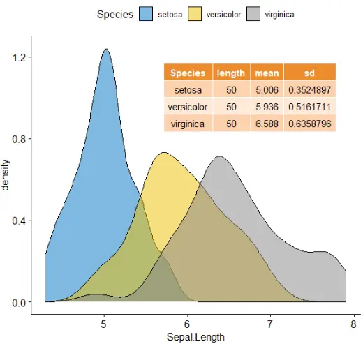
混合图
混合表、字体和图
# Density plot of "Sepal.Length"
#::::::::::::::::::::::::::::::::::::::
density.p <- ggdensity(iris, x = "Sepal.Length",
                       fill = "Species", palette = "jco")
# Draw the summary table of Sepal.Length
#::::::::::::::::::::::::::::::::::::::
# Compute descriptive statistics by groups
stable <- desc_statby(iris, measure.var = "Sepal.Length",
                      grps = "Species")
stable <- stable[, c("Species", "length", "mean", "sd")]
# Summary table plot, medium orange theme
stable.p <- ggtexttable(stable, rows = NULL,
                        theme = ttheme("mOrange"))
# Draw text
#::::::::::::::::::::::::::::::::::::::
text <- paste("iris data set gives the measurements in cm",
              "of the variables sepal length and width",
              "and petal length and width, respectively,",
              "for 50 flowers from each of 3 species of iris.",
             "The species are Iris setosa, versicolor, and virginica.", sep = " ")
text.p <- ggparagraph(text = text, face = "italic", size = 11, color = "black")
# Arrange the plots on the same page
ggarrange(density.p, stable.p, text.p,
          ncol = 1, nrow = 3,
          heights = c(1, 0.5, 0.3))

注释table在图上
density.p <- ggdensity(iris, x = "Sepal.Length",
fill = "Species", palette = "jco")
stable <- desc_statby(iris, measure.var = "Sepal.Length",
grps = "Species")
stable <- stable[, c("Species", "length", "mean", "sd")]
stable.p <- ggtexttable(stable, rows = NULL,
theme = ttheme("mOrange"))
density.p + annotation_custom(ggplotGrob(stable.p),
xmin = 5.5, ymin = 0.7,
xmax = 8)
systemic information
sessionInfo()
R version 3.6.1 (2019-07-05) Platform: x86_64-w64-mingw32/x64 (64-bit) Running under: Windows 10 x64 (build 19042) Matrix products: default locale: [1] LC_COLLATE=Chinese (Simplified)_China.936 LC_CTYPE=Chinese (Simplified)_China.936 [3] LC_MONETARY=Chinese (Simplified)_China.936 LC_NUMERIC=C [5] LC_TIME=Chinese (Simplified)_China.936 attached base packages: [1] stats graphics grDevices utils datasets methods base other attached packages: [1] ggpubr_0.4.0 ggplot2_3.3.2 loaded via a namespace (and not attached): [1] zip_2.0.4 Rcpp_1.0.3 cellranger_1.1.0 pillar_1.4.6 compiler_3.6.1 forcats_0.5.0 [7] tools_3.6.1 digest_0.6.27 lifecycle_0.2.0 tibble_3.0.4 gtable_0.3.0 pkgconfig_2.0.3 [13] rlang_0.4.8 openxlsx_4.2.3 ggsci_2.9 rstudioapi_0.10 curl_4.3 haven_2.3.1 [19] rio_0.5.16 withr_2.1.2 dplyr_1.0.2 generics_0.0.2 vctrs_0.3.4 hms_0.5.3 [25] grid_3.6.1 tidyselect_1.1.0 glue_1.4.2 data.table_1.13.2 R6_2.4.1 rstatix_0.6.0 [31] readxl_1.3.1 foreign_0.8-73 carData_3.0-4 farver_2.0.3 tidyr_1.0.0 purrr_0.3.3 [37] car_3.0-10 magrittr_1.5 scales_1.1.0 backports_1.1.10 ellipsis_0.3.1 abind_1.4-5 [43] colorspace_1.4-1 ggsignif_0.6.0 labeling_0.4.2 stringi_1.4.3 munsell_0.5.0 broom_0.7.2 [49] crayon_1.3.4