Element UI快速入门
前提:
电脑中有node.js 和npm
1.1 官方定义
网站快速成型工具和桌面端组件库
1.2 定义
Element UI 就是基于vue的一个ui框架,该框架基于vue开发了很多相关组件,方便我们快速开发页面。
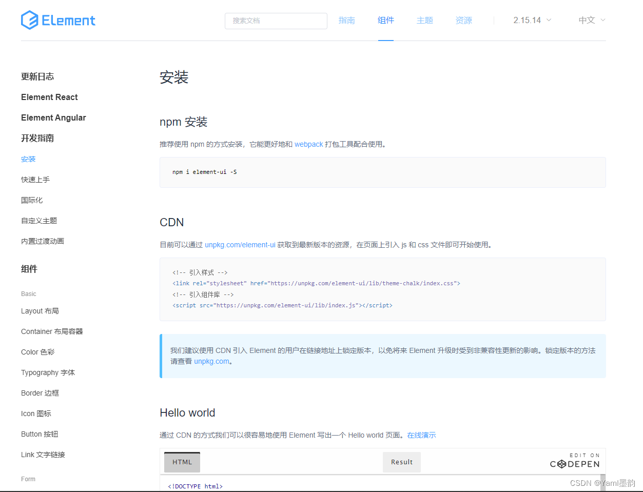
2.安装Element UI
2.1 通过vue脚手架创建项目
vue init webpack element(项目名)- 1.
2.2 在vue脚手架项目中安装 Element UI
# 1.下载elementUI
npm i element-ui -S
#2.指定当前项目中使用elementui
/*引入 */
import ElementUI from 'element-ui';
import 'element-ui/lib/theme-chalk/index.css';
//在vue脚手架中使用ElementUI
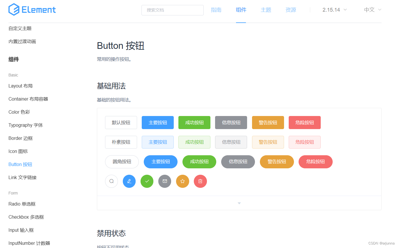
Vue.use(ElementUI);3、按钮组件
# 1.默认样式按钮
<!-- 使用默认按钮组件-->
      <el-row>
        <el-button>默认按钮</el-button>
        <el-button type="primary">主要按钮</el-button>
        <el-button type="success">成功按钮</el-button>
        <el-button type="info">信息按钮</el-button>
        <el-button type="warning">警告按钮</el-button>
        <el-button type="danger">危险按钮</el-button>
    </el-row>

# 2.简洁按钮 鼠标移动上去才会显示背景颜色
 <el-row>
        <el-button plain>朴素按钮</el-button>
        <el-button type="primary" plain>主要按钮</el-button>
        <el-button type="success" plain>成功按钮</el-button>
        <el-button type="info" plain>信息按钮</el-button>
        <el-button type="warning" plain>警告按钮</el-button>
        <el-button type="danger" plain>危险按钮</el-button>
  </el-row>
# 3. 圆角按钮
 <!-- 使用圆角按钮 -->
    <el-row>
        <el-button round>圆角按钮</el-button>
        <el-button type="primary" round>主要按钮</el-button>
        <el-button type="success" round>成功按钮</el-button>
        <el-button type="info" round>信息按钮</el-button>
        <el-button type="warning" round>警告按钮</el-button>
        <el-button type="danger" round>危险按钮</el-button>
    </el-row>
 # 4. 图标按钮
 <el-row>
            <el-button icon="el-icon-search" circle></el-button>
            <el-button type="primary" icon="el-icon-edit" circle></el-button>
            <el-button type="success" icon="el-icon-check" circle></el-button>
            <el-button type="info" icon="el-icon-message" circle></el-button>
            <el-button type="warning" icon="el-icon-star-off" circle></el-button>
            <el-button type="danger" icon="el-icon-delete" circle></el-button>
 </el-row>
Button.vue 用div包围按钮组件
<template>
   <div>
      <!-- 使用默认按钮组件-->
      <el-row>
        <el-button>默认按钮</el-button>
        <el-button type="primary">主要按钮</el-button>
        <el-button type="success">成功按钮</el-button>
        <el-button type="info">信息按钮</el-button>
        <el-button type="warning">警告按钮</el-button>
        <el-button type="danger">危险按钮</el-button>
    </el-row>
    <!-- 使用简洁按钮  plain -->
    <el-row>
        <el-button plain>朴素按钮</el-button>
        <el-button type="primary" plain>主要按钮</el-button>
        <el-button type="success" plain>成功按钮</el-button>
        <el-button type="info" plain>信息按钮</el-button>
        <el-button type="warning" plain>警告按钮</el-button>
        <el-button type="danger" plain>危险按钮</el-button>
    </el-row>
   <!-- 使用圆角按钮 round -->
    <el-row>
        <el-button round>圆角按钮</el-button>
        <el-button type="primary" round>主要按钮</el-button>
        <el-button type="success" round>成功按钮</el-button>
        <el-button type="info" round>信息按钮</el-button>
        <el-button type="warning" round>警告按钮</el-button>
        <el-button type="danger" round>危险按钮</el-button>
    </el-row>
 <!-- 图标按钮  icon -->
        <el-row>
            <el-button icon="el-icon-search" circle></el-button>
            <el-button type="primary" icon="el-icon-edit" circle></el-button>
            <el-button type="success" icon="el-icon-check" circle></el-button>
            <el-button type="info" icon="el-icon-message" circle></el-button>
            <el-button type="warning" icon="el-icon-star-off" circle></el-button>
            <el-button type="danger" icon="el-icon-delete" circle></el-button>
        </el-row>

   </div>
</template>

<script>
export default {
    name: "button.vue"
}
</script>
<style scoped>

</style>
vue的项目如何关闭服务
打开Terminal窗口按键盘【Ctrl】+【C】,提示是否关闭,键盘输入 【y】退出https://www.bilibili.com/video/BV1NK4y187XH?p=3&spm_id_from=pageDriver
4、按钮组件的详细使用
4.1 创建按钮
总结:日后使用element ui的相关组件的时候需要注意的是,所有的组件都是el-组件名称开头
<el-button disabled>默认按钮</el-button>4.2 按钮的属性的使用
在element ui中所有的属性都写在组件的标签上
<h1>使用按钮的属性</h1>
<el-button type="primary" size="medium " plain>primary</el-button>
<el-button type="primary" size="small  " round icon="el-icon-picture"></el-button>
<el-button type="primary" size="mini ">primary</el-button>
4.3 按钮组的使用
<h1>按钮组的使用</h1>
<el-button-group>
    <el-button type="primary" icon="el-icon-back">上一页</el-button>
    <el-button type="primary" icon="el-icon-right">下一页</el-button>
</el-button-group>
注意:
1、element ui的相关组件的时候需要注意的是,所有的组件都是el-组件名称开头
2、element ui中的组件的属性使用直接将属性名=属性值方式写在对应的组件标签上
5、Link文字链接组件
<el-link >默认链接</el-link><h1>使用文字链接</h1> <el-link type="danger" disabled>默认链接</el-link> <el-link type="success" icon="el-icon-user" href="https://www.baidu.com">默认链接</el-link> <el-link :underline="aa" >默认链接</el-link> <el-link :underline="false" type="info" >默认链接</el-link>注意:
使用是否有下划线,采用1或2均可
1、需要在前面加个:绑定
2、在data中写
<el-link :underline="aa" >默认链接</el-link>export default { name: "Link.vue", data(){ return{ aa:false, } }}例子:
<template> <div> <h1>使用文字链接</h1> <el-link type="danger" disabled>默认链接</el-link> <el-link type="success" icon="el-icon-user" href="https://www.baidu.com">默认链接</el-link> <el-link :underline="aa" >默认链接</el-link> <el-link :underline="false" type="info" >默认链接</el-link> </div></template><script>export default { name: "Link.vue", data(){ return{ aa:false, } }}</script><style scoped></style>6、Layout(栅格)布局组件的使用
通过基础的24分栏,迅速简便的创建布局
在element ui中布局组件将页面划分为多个行row,每行最多分为24列(列)
6.1 使用Layout
<el-row> <el-col :span="8">占用8份</el-col> <el-col :span="8">占用8份</el-col> <el-col :span="8">占用8份</el-col></el-row>注意:
1、在一个布局组件中是由row和col组合而成的
2、在使用的时候要区分row属性和col属性
6.2 属性的使用
- 行属性
<el-row :gutter="10" tag="span"> <el-col :span="8"><div style="border:1px red solid;">占用8份</div></el-col> <el-col :span="8"><div style="border:1px red solid;">占用8份</div></el-col> <el-col :span="8"><div style="border:1px red solid;">占用8份</div></el-col></el-row>- 列属性
<h2>layout组件的偏移</h2><el-row> <el-col :span="12" :offset="6"><div style="border:1px red solid;">占用12份</div></el-col></el-row>


![[经验] 手机老是关机怎么回事-手机为何总是自动关机 #经验分享#知识分享](https://img-home.csdnimg.cn/images/20230724024159.png?origin_url=https%3A%2F%2Fwww.hao123rr.com%2Fzb_users%2Fcache%2Fly_autoimg%2F%25E6%2589%258B%25E6%259C%25BA%25E8%2580%2581%25E6%2598%25AF%25E5%2585%25B3%25E6%259C%25BA%25E6%2580%258E%25E4%25B9%2588%25E5%259B%259E%25E4%25BA%258B-%25E6%2589%258B%25E6%259C%25BA%25E4%25B8%25BA%25E4%25BD%2595%25E6%2580%25BB%25E6%2598%25AF%25E8%2587%25AA%25E5%258A%25A8%25E5%2585%25B3%25E6%259C%25BA.jpg&pos_id=cgOqZiGE)


![[经验] 造梦西游5哪个人物最厉害 哪个职业最厉害 #知识分享#其他](https://img-home.csdnimg.cn/images/20230724024159.png?origin_url=https%3A%2F%2Fwww.hao123rr.com%2Fzb_users%2Fcache%2Fly_autoimg%2F%25E9%2580%25A0%25E6%25A2%25A6%25E8%25A5%25BF%25E6%25B8%25B85%25E5%2593%25AA%25E4%25B8%25AA%25E4%25BA%25BA%25E7%2589%25A9%25E6%259C%2580%25E5%258E%2589%25E5%25AE%25B3%2B%25E5%2593%25AA%25E4%25B8%25AA%25E8%2581%258C%25E4%25B8%259A%25E6%259C%2580%25E5%258E%2589%25E5%25AE%25B3.jpg&pos_id=3Jvx4FYh)