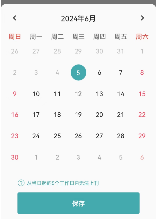
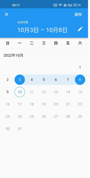
1.传入日期跨度,选择上架日期时,自动显示下架日期

2.手动选择上架日期和下架日期(图中下架日期自动填了只需CalendarDateRangePicker在initState方法中使用_startDate = widget.initialStartDate; _endDate = widget.initialEndDate;,而不直接引用widget.initialStartDate、widget.initialEndDate;利用initState方法只在初始化时调用一次的特性)

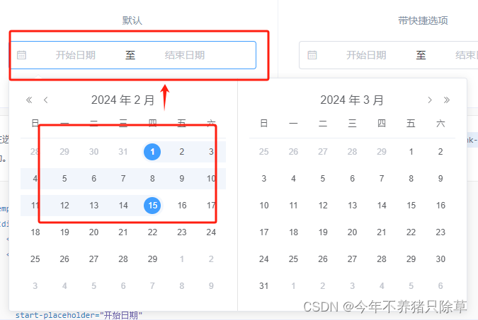
从flutter源码中找到一个组件:showDateRangePicker,它的效果是这样的,主体功能一样,只是有些不同。要通过它来实现上图中的功能只能进行微改。
先把需要的的日历部分功能从源码中抽出来(是flutter2.10.5的环境,所以抽出来以后改了一点点late、?、!的语法差异)
import 'package:jade/customWidget/JadeDateRange/FocusedDate.dart';
import 'package:flutter/material.dart';
import 'package:flutter/services.dart';
class CalendarKeyboardNavigator extends StatefulWidget {
const CalendarKeyboardNavigator({
Key key,
this.child,
this.firstDate,
this.lastDate,
this.initialFocusedDay,
}) : super(key: key);
final Widget child;
final DateTime firstDate;
final DateTime lastDate;
final DateTime initialFocusedDay;
_CalendarKeyboardNavigatorState createState() => _CalendarKeyboardNavigatorState();
}
class _CalendarKeyboardNavigatorState extends State<CalendarKeyboardNavigator> {
final Map<ShortcutActivator, Intent> _shortcutMap = const <ShortcutActivator, Intent>{
SingleActivator(LogicalKeyboardKey.arrowLeft): DirectionalFocusIntent(TraversalDirection.left),
SingleActivator(LogicalKeyboardKey.arrowRight): DirectionalFocusIntent(TraversalDirection.right),
SingleActivator(LogicalKeyboardKey.arrowDown): DirectionalFocusIntent(TraversalDirection.down),
SingleActivator(LogicalKeyboardKey.arrowUp): DirectionalFocusIntent(TraversalDirection.up),
};
Map<Type, Action<Intent>> _actionMap;
FocusNode _dayGridFocus;
TraversalDirection _dayTraversalDirection;
DateTime _focusedDay;
void initState() {
super.initState();
_actionMap = <Type, Action<Intent>>{
NextFocusIntent: CallbackAction<NextFocusIntent>(onInvoke: _handleGridNextFocus),
PreviousFocusIntent: CallbackAction<PreviousFocusIntent>(onInvoke: _handleGridPreviousFocus),
DirectionalFocusIntent: CallbackAction<DirectionalFocusIntent>(onInvoke: _handleDirectionFocus),
};
_dayGridFocus = FocusNode(debugLabel: 'Day Grid');
}
void dispose() {
_dayGridFocus.dispose();
super.dispose();
}
void _handleGridFocusChange(bool focused) {
setState(() {
if (focused) {
_focusedDay ??= widget.initialFocusedDay;
}
});
}
/// Move focus to the next element after the day grid.
void _handleGridNextFocus(NextFocusIntent intent) {
_dayGridFocus.requestFocus();
_dayGridFocus.nextFocus();
}
/// Move focus to the previous element before the day grid.
void _handleGridPreviousFocus(PreviousFocusIntent intent) {
_dayGridFocus.requestFocus();
_dayGridFocus.previousFocus();
}
/// Move the internal focus date in the direction of the given intent.
///
/// This will attempt to move the focused day to the next selectable day in
/// the given direction. If the new date is not in the current month, then
/// the page view will be scrolled to show the new date's month.
///
/// For horizontal directions, it will move forward or backward a day (depending
/// on the current [TextDirection]). For vertical directions it will move up and
/// down a week at a time.
void _handleDirectionFocus(DirectionalFocusIntent intent) {
assert(_focusedDay != null);
setState(() {
final DateTime nextDate = _nextDateInDirection(_focusedDay, intent.direction);
if (nextDate != null) {
_focusedDay = nextDate;
_dayTraversalDirection = intent.direction;
}
});
}
static const Map<TraversalDirection, int> _directionOffset = <TraversalDirection, int>{
TraversalDirection.up: -DateTime.daysPerWeek,
TraversalDirection.right: 1,
TraversalDirection.down: DateTime.daysPerWeek,
TraversalDirection.left: -1,
};
int _dayDirectionOffset(TraversalDirection traversalDirection, TextDirection textDirection) {
// Swap left and right if the text direction if RTL
if (textDirection == TextDirection.rtl) {
if (traversalDirection == TraversalDirection.left)
traversalDirection = TraversalDirection.right;
else if (traversalDirection == TraversalDirection.right)
traversalDirection = TraversalDirection.left;
}
return _directionOffset[traversalDirection];
}
DateTime _nextDateInDirection(DateTime date, TraversalDirection direction) {
final TextDirection textDirection = Directionality.of(context);
final DateTime nextDate = DateUtils.addDaysToDate(date, _dayDirectionOffset(direction, textDirection));
if (!nextDate.isBefore(widget.firstDate) && !nextDate.isAfter(widget.lastDate)) {
return nextDate;
}
return null;
}
Widget build(BuildContext context) {
return FocusableActionDetector(
shortcuts: _shortcutMap,
actions: _actionMap,
focusNode: _dayGridFocus,
onFocusChange: _handleGridFocusChange,
child: FocusedDate(
date: _dayGridFocus.hasFocus ? _focusedDay : null,
scrollDirection: _dayGridFocus.hasFocus ? _dayTraversalDirection : null,
child: widget.child,
),
);
}
}
import 'package:jade/customWidget/JadeDateRange/MonthItemGridDelegate.dart';
import 'package:flutter/material.dart';
class DayHeaders extends StatelessWidget {
/// Builds widgets showing abbreviated days of week. The first widget in the
/// returned list corresponds to the first day of week for the current locale.
///
/// Examples:
///
/// ```
/// ┌ Sunday is the first day of week in the US (en_US)
/// |
/// S M T W T F S <-- the returned list contains these widgets
/// _ _ _ _ _ 1 2
/// 3 4 5 6 7 8 9
///
/// ┌ But it's Monday in the UK (en_GB)
/// |
/// M T W T F S S <-- the returned list contains these widgets
/// _ _ _ _ 1 2 3
/// 4 5 6 7 8 9 10
/// ```
List<Widget> _getDayHeaders(TextStyle headerStyle, MaterialLocalizations localizations) {
final List<Widget> result = <Widget>[];
for (int i = localizations.firstDayOfWeekIndex; true; i = (i + 1) % 7) {
final String weekday = localizations.narrowWeekdays[i];
result.add(ExcludeSemantics(
child: Center(child: Text(weekday, style: headerStyle)),
));
if (i == (localizations.firstDayOfWeekIndex - 1) % 7)
break;
}
return result;
}
Widget build(BuildContext context) {
final ThemeData themeData = Theme.of(context);
final ColorScheme colorScheme = themeData.colorScheme;
final TextStyle textStyle = themeData.textTheme.subtitle2.apply(color: colorScheme.onSurface);
final MaterialLocalizations localizations = MaterialLocalizations.of(context);
final List<Widget> labels = _getDayHeaders(textStyle, localizations);
// Add leading and trailing containers for edges of the custom grid layout.
labels.insert(0, Container());
labels.add(Container());
return Container(
constraints: BoxConstraints(
maxWidth: MediaQuery.of(context).orientation == Orientation.landscape
? 384.0
: 480.0,
maxHeight: 42.0,
),
child: GridView.custom(
shrinkWrap: true,
gridDelegate: const MonthItemGridDelegate(),
childrenDelegate: SliverChildListDelegate(
labels,
addRepaintBoundaries: false,
),
),
);
}
}
import 'package:flutter/material.dart';
class FocusedDate extends InheritedWidget {
const FocusedDate({
Key key,
Widget child,
this.date,
this.scrollDirection,
}) : super(key: key, child: child);
final DateTime date;
final TraversalDirection scrollDirection;
bool updateShouldNotify(FocusedDate oldWidget) {
return !DateUtils.isSameDay(date, oldWidget.date) || scrollDirection != oldWidget.scrollDirection;
}
static FocusedDate of(BuildContext context) {
return context.dependOnInheritedWidgetOfExactType<FocusedDate>();
}
}
import 'package:flutter/material.dart';
enum HighlightPainterStyle {
/// Paints nothing.
none,
/// Paints a rectangle that occupies the leading half of the space.
highlightLeading,
/// Paints a rectangle that occupies the trailing half of the space.
highlightTrailing,
/// Paints a rectangle that occupies all available space.
highlightAll,
}
class HighlightPainter extends CustomPainter {
HighlightPainter({
this.color,
this.style = HighlightPainterStyle.none,
this.textDirection,
});
final Color color;
final HighlightPainterStyle style;
final TextDirection textDirection;
void paint(Canvas canvas, Size size) {
if (style == HighlightPainterStyle.none) {
return;
}
final Paint paint = Paint()
..color = color
..style = PaintingStyle.fill;
final Rect rectLeft = Rect.fromLTWH(0, 0, size.width / 2, size.height);
final Rect rectRight = Rect.fromLTWH(size.width / 2, 0, size.width / 2, size.height);
switch (style) {
case HighlightPainterStyle.highlightTrailing:
canvas.drawRect(
textDirection == TextDirection.ltr ? rectRight : rectLeft,
paint,
);
break;
case HighlightPainterStyle.highlightLeading:
canvas.drawRect(
textDirection == TextDirection.ltr ? rectLeft : rectRight,
paint,
);
break;
case HighlightPainterStyle.highlightAll:
canvas.drawRect(
Rect.fromLTWH(0, 0, size.width, size.height),
paint,
);
break;
case HighlightPainterStyle.none:
break;
}
}
bool shouldRepaint(CustomPainter oldDelegate) => false;
}
import 'package:jade/customWidget/JadeDateRange/FocusedDate.dart';
import 'package:jade/customWidget/JadeDateRange/HighlightPainter.dart';
import 'package:jade/customWidget/JadeDateRange/MonthItemGridDelegate.dart';
import 'package:jade/utils/JadeColors.dart';
import 'package:flutter/gestures.dart';
import 'package:flutter/material.dart';
import 'dart:math' as math;
const Duration _monthScrollDuration = Duration(milliseconds: 200);
const double _monthItemHeaderHeight = 58.0;
const double _monthItemFooterHeight = 12.0;
const double _monthItemRowHeight = 42.0;
const double _monthItemSpaceBetweenRows = 8.0;
const double _maxCalendarWidthLandscape = 384.0;
const double _maxCalendarWidthPortrait = 480.0;
class MonthItem extends StatefulWidget {
/// Creates a month item.
MonthItem({
Key key,
this.selectedDateStart,
this.selectedDateEnd,
this.currentDate,
this.onChanged,
this.firstDate,
this.lastDate,
this.displayedMonth,
this.blackoutDateTimes,
this.isAllDisabled,
this.dragStartBehavior = DragStartBehavior.start,
}) : assert(firstDate != null),
assert(lastDate != null),
assert(!firstDate.isAfter(lastDate)),
assert(selectedDateStart == null || !selectedDateStart.isBefore(firstDate)),
assert(selectedDateEnd == null || !selectedDateEnd.isBefore(firstDate)),
assert(selectedDateStart == null || !selectedDateStart.isAfter(lastDate)),
assert(selectedDateEnd == null || !selectedDateEnd.isAfter(lastDate)),
assert(selectedDateStart == null || selectedDateEnd == null || !selectedDateStart.isAfter(selectedDateEnd)),
assert(currentDate != null),
assert(onChanged != null),
assert(displayedMonth != null),
assert(dragStartBehavior != null),
super(key: key);
/// The currently selected start date.
///
/// This date is highlighted in the picker.
final DateTime selectedDateStart;
/// The currently selected end date.
///
/// This date is highlighted in the picker.
final DateTime selectedDateEnd;
/// The current date at the time the picker is displayed.
final DateTime currentDate;
/// Called when the user picks a day.
final ValueChanged<DateTime> onChanged;
/// The earliest date the user is permitted to pick.
final DateTime firstDate;
/// The latest date the user is permitted to pick.
final DateTime lastDate;
/// The month whose days are displayed by this picker.
final DateTime displayedMonth;
//传入的设置失效的日期(置灰、禁用不可点击)
final List<DateTime> blackoutDateTimes;
///日期是否可以点击
final bool isAllDisabled;
/// Determines the way that drag start behavior is handled.
///
/// If set to [DragStartBehavior.start], the drag gesture used to scroll a
/// date picker wheel will begin at the position where the drag gesture won
/// the arena. If set to [DragStartBehavior.down] it will begin at the position
/// where a down event is first detected.
///
/// In general, setting this to [DragStartBehavior.start] will make drag
/// animation smoother and setting it to [DragStartBehavior.down] will make
/// drag behavior feel slightly more reactive.
///
/// By default, the drag start behavior is [DragStartBehavior.start].
///
/// See also:
///
/// * [DragGestureRecognizer.dragStartBehavior], which gives an example for
/// the different behaviors.
final DragStartBehavior dragStartBehavior;
_MonthItemState createState() => _MonthItemState();
}
class _MonthItemState extends State<MonthItem> {
/// List of [FocusNode]s, one for each day of the month.
List<FocusNode> _dayFocusNodes;
void initState() {
super.initState();
final int daysInMonth = DateUtils.getDaysInMonth(widget.displayedMonth.year, widget.displayedMonth.month);
_dayFocusNodes = List<FocusNode>.generate(
daysInMonth,
(int index) => FocusNode(skipTraversal: true, debugLabel: 'Day ${index + 1}'),
);
}
void didChangeDependencies() {
super.didChangeDependencies();
// Check to see if the focused date is in this month, if so focus it.
final DateTime focusedDate = FocusedDate.of(context)?.date;
if (focusedDate != null && DateUtils.isSameMonth(widget.displayedMonth, focusedDate)) {
_dayFocusNodes[focusedDate.day - 1].requestFocus();
}
}
void dispose() {
for (final FocusNode node in _dayFocusNodes) {
node.dispose();
}
super.dispose();
}
Color _highlightColor(BuildContext context) {
return Theme.of(context).colorScheme.primary.withOpacity(0.12);
}
void _dayFocusChanged(bool focused) {
if (focused) {
final TraversalDirection focusDirection = FocusedDate.of(context)?.scrollDirection;
if (focusDirection != null) {
ScrollPositionAlignmentPolicy policy = ScrollPositionAlignmentPolicy.explicit;
switch (focusDirection) {
case TraversalDirection.up:
case TraversalDirection.left:
policy = ScrollPositionAlignmentPolicy.keepVisibleAtStart;
break;
case TraversalDirection.right:
case TraversalDirection.down:
policy = ScrollPositionAlignmentPolicy.keepVisibleAtEnd;
break;
}
Scrollable.ensureVisible(primaryFocus.context,
duration: _monthScrollDuration,
alignmentPolicy: policy,
);
}
}
}
Widget _buildDayItem(BuildContext context, DateTime dayToBuild, int firstDayOffset, int daysInMonth) {
final ThemeData theme = Theme.of(context);
final ColorScheme colorScheme = theme.colorScheme;
final TextTheme textTheme = theme.textTheme;
final MaterialLocalizations localizations = MaterialLocalizations.of(context);
final TextDirection textDirection = Directionality.of(context);
final Color highlightColor = _highlightColor(context);
final int day = dayToBuild.day;
final bool isDisabled = dayToBuild.isAfter(widget.lastDate) || dayToBuild.isBefore(widget.firstDate) || widget.blackoutDateTimes.contains(dayToBuild) || widget.isAllDisabled;
BoxDecoration decoration;
TextStyle itemStyle = textTheme.bodyText2;
final bool isRangeSelected = widget.selectedDateStart != null && widget.selectedDateEnd != null;
final bool isSelectedDayStart = widget.selectedDateStart != null && dayToBuild.isAtSameMomentAs(widget.selectedDateStart);
final bool isSelectedDayEnd = widget.selectedDateEnd != null && dayToBuild.isAtSameMomentAs(widget.selectedDateEnd);
final bool isInRange = isRangeSelected &&
dayToBuild.isAfter(widget.selectedDateStart) &&
dayToBuild.isBefore(widget.selectedDateEnd);
HighlightPainter highlightPainter;
if (isSelectedDayStart || isSelectedDayEnd) {
// The selected start and end dates gets a circle background
// highlight, and a contrasting text color.
itemStyle = textTheme.bodyText2?.apply(color: colorScheme.onPrimary);
decoration = BoxDecoration(
// color: colorScheme.primary,
color: JadeColors.blue_2,
// shape: BoxShape.circle,
borderRadius: BorderRadius.only(
topLeft: Radius.circular(isSelectedDayStart ? 5 : 0),
bottomLeft: Radius.circular(isSelectedDayStart ? 5 : 0),
topRight: Radius.circular(isSelectedDayEnd ? 5 : 0),
bottomRight: Radius.circular(isSelectedDayEnd ? 5 : 0)));
if (isRangeSelected && widget.selectedDateStart != widget.selectedDateEnd) {
final HighlightPainterStyle style = isSelectedDayStart
? HighlightPainterStyle.highlightTrailing
: HighlightPainterStyle.highlightLeading;
highlightPainter = HighlightPainter(
color: highlightColor,
style: style,
textDirection: textDirection,
);
}
} else if (isInRange) {
// The days within the range get a light background highlight.
highlightPainter = HighlightPainter(
color: highlightColor,
style: HighlightPainterStyle.highlightAll,
textDirection: textDirection,
);
} else if (isDisabled) {
itemStyle = textTheme.bodyText2?.apply(color: colorScheme.onSurface.withOpacity(0.38));
} else if (DateUtils.isSameDay(widget.currentDate, dayToBuild)) {
// The current day gets a different text color and a circle stroke
// border.
itemStyle = textTheme.bodyText2?.apply(color: colorScheme.primary);
decoration = BoxDecoration(
border: Border.all(color: colorScheme.primary),
shape: BoxShape.circle,
);
}
// We want the day of month to be spoken first irrespective of the
// locale-specific preferences or TextDirection. This is because
// an accessibility user is more likely to be interested in the
// day of month before the rest of the date, as they are looking
// for the day of month. To do that we prepend day of month to the
// formatted full date.
String semanticLabel = '${localizations.formatDecimal(day)}, ${localizations.formatFullDate(dayToBuild)}';
if (isSelectedDayStart) {
semanticLabel = localizations.dateRangeStartDateSemanticLabel(semanticLabel);
} else if (isSelectedDayEnd) {
semanticLabel = localizations.dateRangeEndDateSemanticLabel(semanticLabel);
}
Widget dayWidget = Container(
decoration: decoration,
child: Center(
child: Semantics(
label: semanticLabel,
selected: isSelectedDayStart || isSelectedDayEnd,
child: ExcludeSemantics(
child: isSelectedDayStart ?
Column(
mainAxisAlignment: MainAxisAlignment.center,
children: [
Text(localizations.formatDecimal(day), style: itemStyle),
Text('上架日期', style: TextStyle(color: Colors.white,fontSize: 9.0))
],
) : isSelectedDayEnd ?
Column(
mainAxisAlignment: MainAxisAlignment.center,
children: [
Text(localizations.formatDecimal(day), style: itemStyle),
Text('下架日期', style: TextStyle(color: Colors.white,fontSize: 9.0))
],
) : Text(localizations.formatDecimal(day), style: itemStyle),
),
),
),
);
if (highlightPainter != null) {
dayWidget = CustomPaint(
painter: highlightPainter,
child: dayWidget,
);
}
if (!isDisabled) {
dayWidget = InkResponse(
focusNode: _dayFocusNodes[day - 1],
// onTap: () => widget.onChanged(dayToBuild),
onTap: () {
widget.onChanged(dayToBuild);
print('点击天=======》');
},
radius: _monthItemRowHeight / 2 + 4,
splashColor: colorScheme.primary.withOpacity(0.38),
onFocusChange: _dayFocusChanged,
child: dayWidget,
);
}
return dayWidget;
}
Widget _buildEdgeContainer(BuildContext context, bool isHighlighted) {
return Container(color: isHighlighted ? _highlightColor(context) : null);
}
Widget build(BuildContext context) {
final ThemeData themeData = Theme.of(context);
final TextTheme textTheme = themeData.textTheme;
final MaterialLocalizations localizations = MaterialLocalizations.of(context);
final int year = widget.displayedMonth.year;
final int month = widget.displayedMonth.month;
final int daysInMonth = DateUtils.getDaysInMonth(year, month);
final int dayOffset = DateUtils.firstDayOffset(year, month, localizations);
final int weeks = ((daysInMonth + dayOffset) / DateTime.daysPerWeek).ceil();
final double gridHeight =
weeks * _monthItemRowHeight + (weeks - 1) * _monthItemSpaceBetweenRows;
final List<Widget> dayItems = <Widget>[];
for (int i = 0; true; i += 1) {
// 1-based day of month, e.g. 1-31 for January, and 1-29 for February on
// a leap year.
final int day = i - dayOffset + 1;
if (day > daysInMonth)
break;
if (day < 1) {
dayItems.add(Container());
} else {
final DateTime dayToBuild = DateTime(year, month, day);
final Widget dayItem = _buildDayItem(
context,
dayToBuild,
dayOffset,
daysInMonth,
);
dayItems.add(dayItem);
}
}
// Add the leading/trailing edge containers to each week in order to
// correctly extend the range highlight.
final List<Widget> paddedDayItems = <Widget>[];
for (int i = 0; i < weeks; i++) {
final int start = i * DateTime.daysPerWeek;
final int end = math.min(
start + DateTime.daysPerWeek,
dayItems.length,
);
final List<Widget> weekList = dayItems.sublist(start, end);
final DateTime dateAfterLeadingPadding = DateTime(year, month, start - dayOffset + 1);
// Only color the edge container if it is after the start date and
// on/before the end date.
final bool isLeadingInRange =
!(dayOffset > 0 && i == 0) &&
widget.selectedDateStart != null &&
widget.selectedDateEnd != null &&
dateAfterLeadingPadding.isAfter(widget.selectedDateStart) &&
!dateAfterLeadingPadding.isAfter(widget.selectedDateEnd);
weekList.insert(0, _buildEdgeContainer(context, isLeadingInRange));
// Only add a trailing edge container if it is for a full week and not a
// partial week.
if (end < dayItems.length || (end == dayItems.length && dayItems.length % DateTime.daysPerWeek == 0)) {
final DateTime dateBeforeTrailingPadding =
DateTime(year, month, end - dayOffset);
// Only color the edge container if it is on/after the start date and
// before the end date.
final bool isTrailingInRange =
widget.selectedDateStart != null &&
widget.selectedDateEnd != null &&
!dateBeforeTrailingPadding.isBefore(widget.selectedDateStart) &&
dateBeforeTrailingPadding.isBefore(widget.selectedDateEnd);
weekList.add(_buildEdgeContainer(context, isTrailingInRange));
}
paddedDayItems.addAll(weekList);
}
final double maxWidth = MediaQuery.of(context).orientation == Orientation.landscape
? _maxCalendarWidthLandscape
: _maxCalendarWidthPortrait;
return Column(
children: <Widget>[
Container(
constraints: BoxConstraints(maxWidth: maxWidth),
height: _monthItemHeaderHeight,
padding: const EdgeInsets.symmetric(horizontal: 16),
alignment: AlignmentDirectional.center,
child: ExcludeSemantics(
child: Text(
localizations.formatMonthYear(widget.displayedMonth),
style: textTheme.bodyText2.apply(color: themeData.colorScheme.onSurface),
),
),
),
Container(height: 0.5,color: Colors.grey[200]),
Container(
constraints: BoxConstraints(
maxWidth: maxWidth,
maxHeight: gridHeight,
),
child: GridView.custom(
physics: const NeverScrollableScrollPhysics(),
gridDelegate: const MonthItemGridDelegate(),
childrenDelegate: SliverChildListDelegate(
paddedDayItems,
addRepaintBoundaries: false,
),
),
),
const SizedBox(height: _monthItemFooterHeight),
],
);
}
}
import 'package:flutter/rendering.dart';
import 'dart:math' as math;
const double _monthItemRowHeight = 42.0;
const double _monthItemSpaceBetweenRows = 8.0;
const double _horizontalPadding = 8.0;
class MonthItemGridDelegate extends SliverGridDelegate {
const MonthItemGridDelegate();
SliverGridLayout getLayout(SliverConstraints constraints) {
final double tileWidth = (constraints.crossAxisExtent - 2 * _horizontalPadding) / DateTime.daysPerWeek;
return _MonthSliverGridLayout(
crossAxisCount: DateTime.daysPerWeek + 2,
dayChildWidth: tileWidth,
edgeChildWidth: _horizontalPadding,
reverseCrossAxis: axisDirectionIsReversed(constraints.crossAxisDirection),
);
}
bool shouldRelayout(MonthItemGridDelegate oldDelegate) => false;
}
class _MonthSliverGridLayout extends SliverGridLayout {
/// Creates a layout that uses equally sized and spaced tiles for each day of
/// the week and an additional edge tile for padding at the start and end of
/// each row.
///
/// This is necessary to facilitate the painting of the range highlight
/// correctly.
const _MonthSliverGridLayout({
this.crossAxisCount,
this.dayChildWidth,
this.edgeChildWidth,
this.reverseCrossAxis,
}) : assert(crossAxisCount != null && crossAxisCount > 0),
assert(dayChildWidth != null && dayChildWidth >= 0),
assert(edgeChildWidth != null && edgeChildWidth >= 0),
assert(reverseCrossAxis != null);
/// The number of children in the cross axis.
final int crossAxisCount;
/// The width in logical pixels of the day child widgets.
final double dayChildWidth;
/// The width in logical pixels of the edge child widgets.
final double edgeChildWidth;
/// Whether the children should be placed in the opposite order of increasing
/// coordinates in the cross axis.
///
/// For example, if the cross axis is horizontal, the children are placed from
/// left to right when [reverseCrossAxis] is false and from right to left when
/// [reverseCrossAxis] is true.
///
/// Typically set to the return value of [axisDirectionIsReversed] applied to
/// the [SliverConstraints.crossAxisDirection].
final bool reverseCrossAxis;
/// The number of logical pixels from the leading edge of one row to the
/// leading edge of the next row.
double get _rowHeight {
return _monthItemRowHeight + _monthItemSpaceBetweenRows;
}
/// The height in logical pixels of the children widgets.
double get _childHeight {
return _monthItemRowHeight;
}
int getMinChildIndexForScrollOffset(double scrollOffset) {
return crossAxisCount * (scrollOffset ~/ _rowHeight);
}
int getMaxChildIndexForScrollOffset(double scrollOffset) {
final int mainAxisCount = (scrollOffset / _rowHeight).ceil();
return math.max(0, crossAxisCount * mainAxisCount - 1);
}
double _getCrossAxisOffset(double crossAxisStart, bool isPadding) {
if (reverseCrossAxis) {
return
((crossAxisCount - 2) * dayChildWidth + 2 * edgeChildWidth) -
crossAxisStart -
(isPadding ? edgeChildWidth : dayChildWidth);
}
return crossAxisStart;
}
SliverGridGeometry getGeometryForChildIndex(int index) {
final int adjustedIndex = index % crossAxisCount;
final bool isEdge = adjustedIndex == 0 || adjustedIndex == crossAxisCount - 1;
final double crossAxisStart = math.max(0, (adjustedIndex - 1) * dayChildWidth + edgeChildWidth);
return SliverGridGeometry(
scrollOffset: (index ~/ crossAxisCount) * _rowHeight,
crossAxisOffset: _getCrossAxisOffset(crossAxisStart, isEdge),
mainAxisExtent: _childHeight,
crossAxisExtent: isEdge ? edgeChildWidth : dayChildWidth,
);
}
double computeMaxScrollOffset(int childCount) {
assert(childCount >= 0);
final int mainAxisCount = ((childCount - 1) ~/ crossAxisCount) + 1;
final double mainAxisSpacing = _rowHeight - _childHeight;
return _rowHeight * mainAxisCount - mainAxisSpacing;
}
}
gif图1效果选择器
import 'package:jade/customWidget/JadeDateRange/CalendarKeyboardNavigator.dart';
import 'package:jade/customWidget/JadeDateRange/DayHeaders.dart';
import 'package:jade/customWidget/JadeDateRange/MonthItem.dart';
import 'package:flutter/material.dart';
import 'package:flutter/services.dart';
class CalendarDateRangePicker2 extends StatefulWidget {
/// Creates a scrollable calendar grid for picking date ranges.
CalendarDateRangePicker2({
Key key,
DateTime initialStartDate,
DateTime initialEndDate,
DateTime firstDate,
DateTime lastDate,
DateTime currentDate,
bool isAllDisabled,
this.blackoutDateTimes,
this.onStartDateChanged,
this.onEndDateChanged,
}) : initialStartDate = initialStartDate != null ? DateUtils.dateOnly(initialStartDate) : null,
initialEndDate = initialEndDate != null ? DateUtils.dateOnly(initialEndDate) : null,
assert(firstDate != null),
assert(lastDate != null),
firstDate = DateUtils.dateOnly(firstDate),
lastDate = DateUtils.dateOnly(lastDate),
currentDate = DateUtils.dateOnly(currentDate ?? DateTime.now()),
isAllDisabled = isAllDisabled != null ? isAllDisabled : false,
super(key: key) {
assert(
this.initialStartDate == null || this.initialEndDate == null || !this.initialStartDate.isAfter(initialEndDate),
'initialStartDate must be on or before initialEndDate.',
);
assert(
!this.lastDate.isBefore(this.firstDate),
'firstDate must be on or before lastDate.',
);
}
/// The [DateTime] that represents the start of the initial date range selection.
DateTime initialStartDate;
/// The [DateTime] that represents the end of the initial date range selection.
DateTime initialEndDate;
/// The earliest allowable [DateTime] that the user can select.
final DateTime firstDate;
/// The latest allowable [DateTime] that the user can select.
final DateTime lastDate;
/// The [DateTime] representing today. It will be highlighted in the day grid.
final DateTime currentDate;
///传入的设置失效的日期(置灰、禁用不可点击)
final List<DateTime> blackoutDateTimes;
//传入设置日期是否全部禁用
bool isAllDisabled;
/// Called when the user changes the start date of the selected range.
final ValueChanged<DateTime> onStartDateChanged;
/// Called when the user changes the end date of the selected range.
final ValueChanged<DateTime> onEndDateChanged;
_CalendarDateRangePickerState createState() => _CalendarDateRangePickerState();
}
class _CalendarDateRangePickerState extends State<CalendarDateRangePicker2> {
final GlobalKey _scrollViewKey = GlobalKey();
// DateTime _startDate;
// DateTime _endDate;
int _initialMonthIndex = 0;
ScrollController _controller;
bool _showWeekBottomDivider;
List<DateTime> _blackoutDateTimes;
void initState() {
super.initState();
_controller = ScrollController();
_controller.addListener(_scrollListener);
//利用initState只在初始化时调用一次的特性(_startDate、_endDate赋值后不会再次赋值),
//直接引用widget.initialStartDate、widget.initialEndDate(外部传入的参数刷新后对应的相关引用也刷新)
// _startDate = widget.initialStartDate;
// _endDate = widget.initialEndDate;
// Calculate the index for the initially displayed month. This is needed to
// divide the list of months into two `SliverList`s.
final DateTime initialDate = widget.initialStartDate ?? widget.currentDate;
if (!initialDate.isBefore(widget.firstDate) &&
!initialDate.isAfter(widget.lastDate)) {
_initialMonthIndex = DateUtils.monthDelta(widget.firstDate, initialDate);
}
_showWeekBottomDivider = _initialMonthIndex != 0;
_blackoutDateTimes = widget.blackoutDateTimes??[];
}
void dispose() {
_controller.dispose();
super.dispose();
}
void _scrollListener() {
if (_controller.offset <= _controller.position.minScrollExtent) {
setState(() {
_showWeekBottomDivider = false;
});
} else if (!_showWeekBottomDivider) {
setState(() {
_showWeekBottomDivider = true;
});
}
}
int get _numberOfMonths => DateUtils.monthDelta(widget.firstDate, widget.lastDate) + 1;
void _vibrate() {
switch (Theme.of(context).platform) {
case TargetPlatform.android:
case TargetPlatform.fuchsia:
HapticFeedback.vibrate();
break;
case TargetPlatform.iOS:
case TargetPlatform.linux:
case TargetPlatform.macOS:
case TargetPlatform.windows:
break;
}
}
// This updates the selected date range using this logic:
//
// * From the unselected state, selecting one date creates the start date.
// * If the next selection is before the start date, reset date range and
// set the start date to that selection.
// * If the next selection is on or after the start date, set the end date
// to that selection.
// * After both start and end dates are selected, any subsequent selection
// resets the date range and sets start date to that selection.
void _updateSelection(DateTime date) {
_vibrate();
setState(() {
if (widget.initialStartDate != null && widget.initialStartDate == null && !date.isBefore(widget.initialStartDate)) {
widget.initialEndDate = date;
widget.onEndDateChanged?.call(widget.initialEndDate);
} else {
widget.initialStartDate = date;
widget.onStartDateChanged?.call(widget.initialStartDate);
if (widget.initialStartDate != null) {
widget.initialEndDate = null;
widget.onEndDateChanged?.call(widget.initialEndDate);
}
}
});
}
Widget _buildMonthItem(BuildContext context, int index, bool beforeInitialMonth) {
final int monthIndex = beforeInitialMonth
? _initialMonthIndex - index - 1
: _initialMonthIndex + index;
final DateTime month = DateUtils.addMonthsToMonthDate(widget.firstDate, monthIndex);
return Stack(
alignment: Alignment.center,
children: [
Text('${month.month}',style: TextStyle(fontSize: 200,color: Colors.grey.withOpacity(0.1)),),
MonthItem(
selectedDateStart: widget.initialStartDate,
selectedDateEnd: widget.initialEndDate,
currentDate: widget.currentDate,
firstDate: widget.firstDate,
lastDate: widget.lastDate,
displayedMonth: month,
blackoutDateTimes: _blackoutDateTimes,
isAllDisabled: widget.isAllDisabled,
onChanged: _updateSelection,
)
],
);
}
Widget build(BuildContext context) {
const Key sliverAfterKey = Key('sliverAfterKey');
return Column(
children: <Widget>[
DayHeaders(),
if (_showWeekBottomDivider) const Divider(height: 0),
Expanded(
child: CalendarKeyboardNavigator(
firstDate: widget.firstDate,
lastDate: widget.lastDate,
initialFocusedDay: widget.initialStartDate ?? widget.initialStartDate ?? widget.currentDate,
// In order to prevent performance issues when displaying the
// correct initial month, 2 `SliverList`s are used to split the
// months. The first item in the second SliverList is the initial
// month to be displayed.
child: CustomScrollView(
key: _scrollViewKey,
controller: _controller,
center: sliverAfterKey,
slivers: <Widget>[
SliverList(
delegate: SliverChildBuilderDelegate(
(BuildContext context, int index) => _buildMonthItem(context, index, true),
childCount: _initialMonthIndex,
),
),
SliverList(
key: sliverAfterKey,
delegate: SliverChildBuilderDelegate(
(BuildContext context, int index) => _buildMonthItem(context, index, false),
childCount: _numberOfMonths - _initialMonthIndex,
),
),
],
),
),
),
],
);
}
}
gif图2效果选择器
import 'package:jade/customWidget/JadeDateRange/CalendarKeyboardNavigator.dart';
import 'package:jade/customWidget/JadeDateRange/DayHeaders.dart';
import 'package:jade/customWidget/JadeDateRange/MonthItem.dart';
import 'package:flutter/material.dart';
import 'package:flutter/rendering.dart';
import 'package:flutter/services.dart';
class CalendarDateRangePicker3 extends StatefulWidget {
/// Creates a scrollable calendar grid for picking date ranges.
CalendarDateRangePicker3({
Key key,
DateTime initialStartDate,
DateTime initialEndDate,
DateTime firstDate,
DateTime lastDate,
DateTime currentDate,
this.onStartDateChanged,
this.onEndDateChanged,
}) : initialStartDate = initialStartDate != null ? DateUtils.dateOnly(initialStartDate) : null,
initialEndDate = initialEndDate != null ? DateUtils.dateOnly(initialEndDate) : null,
assert(firstDate != null),
assert(lastDate != null),
firstDate = DateUtils.dateOnly(firstDate),
lastDate = DateUtils.dateOnly(lastDate),
currentDate = DateUtils.dateOnly(currentDate ?? DateTime.now()),
super(key: key) {
assert(
this.initialStartDate == null || this.initialEndDate == null || !this.initialStartDate.isAfter(initialEndDate),
'initialStartDate must be on or before initialEndDate.',
);
assert(
!this.lastDate.isBefore(this.firstDate),
'firstDate must be on or before lastDate.',
);
}
/// The [DateTime] that represents the start of the initial date range selection.
final DateTime initialStartDate;
/// The [DateTime] that represents the end of the initial date range selection.
final DateTime initialEndDate;
/// The earliest allowable [DateTime] that the user can select.
final DateTime firstDate;
/// The latest allowable [DateTime] that the user can select.
final DateTime lastDate;
/// The [DateTime] representing today. It will be highlighted in the day grid.
final DateTime currentDate;
/// Called when the user changes the start date of the selected range.
final ValueChanged<DateTime> onStartDateChanged;
/// Called when the user changes the end date of the selected range.
final ValueChanged<DateTime> onEndDateChanged;
_CalendarDateRangePickerState createState() => _CalendarDateRangePickerState();
}
class _CalendarDateRangePickerState extends State<CalendarDateRangePicker3> {
final GlobalKey _scrollViewKey = GlobalKey();
DateTime _startDate;
DateTime _endDate;
int _initialMonthIndex = 0;
ScrollController _controller;
bool _showWeekBottomDivider;
void initState() {
super.initState();
_controller = ScrollController();
_controller.addListener(_scrollListener);
_startDate = widget.initialStartDate;
_endDate = widget.initialEndDate;
// Calculate the index for the initially displayed month. This is needed to
// divide the list of months into two `SliverList`s.
final DateTime initialDate = widget.initialStartDate ?? widget.currentDate;
if (!initialDate.isBefore(widget.firstDate) &&
!initialDate.isAfter(widget.lastDate)) {
_initialMonthIndex = DateUtils.monthDelta(widget.firstDate, initialDate);
}
_showWeekBottomDivider = _initialMonthIndex != 0;
}
void dispose() {
_controller.dispose();
super.dispose();
}
void _scrollListener() {
if (_controller.offset <= _controller.position.minScrollExtent) {
setState(() {
_showWeekBottomDivider = false;
});
} else if (!_showWeekBottomDivider) {
setState(() {
_showWeekBottomDivider = true;
});
}
}
int get _numberOfMonths => DateUtils.monthDelta(widget.firstDate, widget.lastDate) + 1;
void _vibrate() {
switch (Theme.of(context).platform) {
case TargetPlatform.android:
case TargetPlatform.fuchsia:
HapticFeedback.vibrate();
break;
case TargetPlatform.iOS:
case TargetPlatform.linux:
case TargetPlatform.macOS:
case TargetPlatform.windows:
break;
}
}
// This updates the selected date range using this logic:
//
// * From the unselected state, selecting one date creates the start date.
// * If the next selection is before the start date, reset date range and
// set the start date to that selection.
// * If the next selection is on or after the start date, set the end date
// to that selection.
// * After both start and end dates are selected, any subsequent selection
// resets the date range and sets start date to that selection.
void _updateSelection(DateTime date) {
_vibrate();
setState(() {
if (_startDate != null && _endDate == null && !date.isBefore(_startDate)) {
_endDate = date;
widget.onEndDateChanged?.call(_endDate);
} else {
_startDate = date;
widget.onStartDateChanged?.call(_startDate);
if (_endDate != null) {
_endDate = null;
widget.onEndDateChanged?.call(_endDate);
}
}
});
}
Widget _buildMonthItem(BuildContext context, int index, bool beforeInitialMonth) {
final int monthIndex = beforeInitialMonth
? _initialMonthIndex - index - 1
: _initialMonthIndex + index;
final DateTime month = DateUtils.addMonthsToMonthDate(widget.firstDate, monthIndex);
return Stack(
alignment: Alignment.center,
children: [
Text('${month.month}',style: TextStyle(fontSize: 200,color: Colors.grey.withOpacity(0.1)),),
MonthItem(
selectedDateStart: _startDate,
selectedDateEnd: _endDate,
currentDate: widget.currentDate,
firstDate: widget.firstDate,
lastDate: widget.lastDate,
displayedMonth: month,
onChanged: _updateSelection,
)
],
);
}
Widget build(BuildContext context) {
const Key sliverAfterKey = Key('sliverAfterKey');
print('====initialEndDate=======${_endDate.toString()}');
return Column(
children: <Widget>[
DayHeaders(),
if (_showWeekBottomDivider) const Divider(height: 0),
Expanded(
child: CalendarKeyboardNavigator(
firstDate: widget.firstDate,
lastDate: widget.lastDate,
initialFocusedDay: _startDate ?? widget.initialStartDate ?? widget.currentDate,
// In order to prevent performance issues when displaying the
// correct initial month, 2 `SliverList`s are used to split the
// months. The first item in the second SliverList is the initial
// month to be displayed.
child: CustomScrollView(
key: _scrollViewKey,
controller: _controller,
center: sliverAfterKey,
slivers: <Widget>[
SliverList(
delegate: SliverChildBuilderDelegate(
(BuildContext context, int index) => _buildMonthItem(context, index, true),
childCount: _initialMonthIndex,
),
),
SliverList(
key: sliverAfterKey,
delegate: SliverChildBuilderDelegate(
(BuildContext context, int index) => _buildMonthItem(context, index, false),
childCount: _numberOfMonths - _initialMonthIndex,
),
),
],
),
),
),
],
);
}
}
引用
import 'package:jade/customWidget/JadeDateRange/JadeDateRangePicker2.dart';
import 'package:jade/customWidget/JadeDateRange/JadeDateRangePicker3.dart';
import 'package:jade/utils/JadeColors.dart';
import 'package:jade/utils/Utils.dart';
import 'package:widget/custom_appbar.dart';
import 'package:flutter/material.dart';
import 'package:flutter_screenutil/flutter_screenutil.dart';
class TestSS extends StatefulWidget{
State<StatefulWidget> createState() {
// TODO: implement createState
return _SelectTypeDateRange();
}
}
class _SelectTypeDateRange extends State<TestSS>{
DateTime _time = DateTime.now();
DateTime _startDate;
DateTime _endDate;
DateTimeRange _initDateTimeRange;
void initState() {
// TODO: implement initState
super.initState();
_initDateTimeRange = DateTimeRange(
start: DateTime(_time.year, 6, 7),
end: DateTime(_time.year, 6, 18)
);
}
Widget build(BuildContext context) {
// TODO: implement build
return Scaffold(
backgroundColor: Colors.white,
appBar: CustomAppBar(
backgroundColor: Colors.white,
elevation: 0,
leading: GestureDetector(
onTap: () {
Navigator.of(context).pop();
},
child: Icon(
Icons.arrow_back_ios,
color: Color(0xff3c3c3c),
),
),
title: Text(
'选择类型、时间',
style: TextStyle(color: Color(0xff333333)),
),
centerTitle: true,
),
body: _body()
);
}
_body(){
return Column(
children: [
_selectTypeView(),
Container(height: 20.w,color: JadeColors.lightGrey),
_showDateRangeView(),
Expanded(child: _dateRangePickerView()),
_btnView()
],
);
}
_selectTypeView(){
return GestureDetector(
child: Container(
width: double.infinity,
height: 100.w,
padding: EdgeInsets.symmetric(horizontal: 30.w),
child: Row(
children: [
Text('选择服务类型',style: TextStyle(fontSize: 28.sp,color: JadeColors.grey_3)),
Expanded(child: Text('按月付费类型:1个月',style: TextStyle(color: JadeColors.blue_2,fontSize: 28.sp,fontWeight: FontWeight.w600),textAlign: TextAlign.right)),
Container(margin: EdgeInsets.only(left: 20.w),child: Image.asset("images/want/yulan_jiantou.png",height: 18.w)),
])
),
onTap: (){}
);
}
_showDateRangeView(){
return Container(
width: double.infinity,
height: 100.w,
padding: EdgeInsets.only(left: 30.w,right: 40.w),
child: Row(
children: [
Expanded(child: Text('上下架日期',style: TextStyle(fontSize: 28.sp,color: JadeColors.grey_3))),
Container(
width: 120.w,
alignment: Alignment.center,
child: Text(_startDate == null?'上架日期' : '${_startDate.month<10?'0${_startDate.month}': _startDate.month}.${_startDate.day<10?'0${_startDate.day}':_startDate.day}',style: TextStyle(color: _startDate == null ? JadeColors.grey : JadeColors.blue_2,fontSize: 28.sp,fontWeight: FontWeight.w600)),
),
Container(width: 24.w,height: 4.w,color: JadeColors.grey_7,margin: EdgeInsets.symmetric(horizontal: 30.w)),
Container(
width: 120.w,
alignment: Alignment.center,
child: Text(_endDate == null?'下架日期' : '${_endDate.month<10?'0${_endDate.month}':_endDate.month}.${_endDate.day<10?'0${_endDate.day}':_endDate.day}',style: TextStyle(color: _endDate == null ? JadeColors.grey : JadeColors.blue_2,fontSize: 28.sp,fontWeight: FontWeight.w600)),
),
])
);
}
_btnView(){
return Column(
children: [
Container(height: 1,color: JadeColors.lightGrey,margin: EdgeInsets.only(bottom: 15.w)),
Text('选择上架日期时请确保有充分的时间将样品寄送至体验秀',style: TextStyle(color: JadeColors.grey_3,fontSize: 20.sp),),
GestureDetector(
child: Container(
height: 80.w,
width: Utils().screenWidth(context) / 2,
alignment: Alignment.center,
margin: EdgeInsets.only(top: 15.w,bottom: 60.w),
decoration: BoxDecoration(
color: JadeColors.blue_2,
borderRadius: BorderRadius.circular(50)
),
child: Text('确认',style: TextStyle(color: Colors.white,fontSize: 32.sp,fontWeight: FontWeight.w600)),
),
)
],
);
}
_dateRangePickerView(){
return CalendarDateRangePicker2(
// 开始日期
firstDate: DateTime(_time.year, _time.month, _time.day),
// 结束日期
lastDate: DateTime(_time.year + 1, 12, 30),
// 当前日期
currentDate: DateTime.now(),
initialStartDate: _initDateTimeRange.start,
initialEndDate: _initDateTimeRange.end,
blackoutDateTimes: [DateTime(2024, 6, 25),DateTime(2024, 6, 26),DateTime(2024, 6, 28)],
isAllDisabled: true,
onStartDateChanged: (dateValue) {
print('startDate=${dateValue.toString()}');
_startDate = dateValue;
_endDate = _startDate.add(Duration(days: 30));
_initDateTimeRange = DateTimeRange(
start: _startDate,
end: _startDate.add(Duration(days: 30))
);
setState(() {});
},
onEndDateChanged: (dateValue) {
print('endDate=${dateValue.toString()}');
// setState(() {
// _endDate = dateValue;
// });
});
}
}
抽出后未改动的可运行代码 (flutter2.10.5环境)
// Copyright 2014 The Flutter Authors. All rights reserved.
// Use of this source code is governed by a BSD-style license that can be
// found in the LICENSE file.
import 'dart:math' as math;
import 'package:flutter/gestures.dart' show DragStartBehavior;
import 'package:flutter/material.dart';
import 'package:flutter/rendering.dart';
import 'package:flutter/services.dart';
import 'package:flutter/widgets.dart';
const Size _calendarPortraitDialogSize = Size(330.0, 518.0);
const Size _calendarLandscapeDialogSize = Size(496.0, 346.0);
const Size _inputPortraitDialogSize = Size(330.0, 270.0);
const Size _inputLandscapeDialogSize = Size(496, 160.0);
const Size _inputRangeLandscapeDialogSize = Size(496, 164.0);
const Duration _dialogSizeAnimationDuration = Duration(milliseconds: 200);
const double _inputFormPortraitHeight = 98.0;
const double _inputFormLandscapeHeight = 108.0;
/// Shows a dialog containing a Material Design date picker.
///
/// The returned [Future] resolves to the date selected by the user when the
/// user confirms the dialog. If the user cancels the dialog, null is returned.
///
/// When the date picker is first displayed, it will show the month of
/// [initialDate], with [initialDate] selected.
///
/// The [firstDate] is the earliest allowable date. The [lastDate] is the latest
/// allowable date. [initialDate] must either fall between these dates,
/// or be equal to one of them. For each of these [DateTime] parameters, only
/// their dates are considered. Their time fields are ignored. They must all
/// be non-null.
///
/// The [currentDate] represents the current day (i.e. today). This
/// date will be highlighted in the day grid. If null, the date of
/// `DateTime.now()` will be used.
///
/// An optional [initialEntryMode] argument can be used to display the date
/// picker in the [DatePickerEntryMode.calendar] (a calendar month grid)
/// or [DatePickerEntryMode.input] (a text input field) mode.
/// It defaults to [DatePickerEntryMode.calendar] and must be non-null.
///
/// An optional [selectableDayPredicate] function can be passed in to only allow
/// certain days for selection. If provided, only the days that
/// [selectableDayPredicate] returns true for will be selectable. For example,
/// this can be used to only allow weekdays for selection. If provided, it must
/// return true for [initialDate].
///
/// The following optional string parameters allow you to override the default
/// text used for various parts of the dialog:
///
/// * [helpText], label displayed at the top of the dialog.
/// * [cancelText], label on the cancel button.
/// * [confirmText], label on the ok button.
/// * [errorFormatText], message used when the input text isn't in a proper date format.
/// * [errorInvalidText], message used when the input text isn't a selectable date.
/// * [fieldHintText], text used to prompt the user when no text has been entered in the field.
/// * [fieldLabelText], label for the date text input field.
///
/// An optional [locale] argument can be used to set the locale for the date
/// picker. It defaults to the ambient locale provided by [Localizations].
///
/// An optional [textDirection] argument can be used to set the text direction
/// ([TextDirection.ltr] or [TextDirection.rtl]) for the date picker. It
/// defaults to the ambient text direction provided by [Directionality]. If both
/// [locale] and [textDirection] are non-null, [textDirection] overrides the
/// direction chosen for the [locale].
///
/// The [context], [useRootNavigator] and [routeSettings] arguments are passed to
/// [showDialog], the documentation for which discusses how it is used. [context]
/// and [useRootNavigator] must be non-null.
///
/// The [builder] parameter can be used to wrap the dialog widget
/// to add inherited widgets like [Theme].
///
/// An optional [initialDatePickerMode] argument can be used to have the
/// calendar date picker initially appear in the [DatePickerMode.year] or
/// [DatePickerMode.day] mode. It defaults to [DatePickerMode.day], and
/// must be non-null.
///
/// ### State Restoration
///
/// Using this method will not enable state restoration for the date picker.
/// In order to enable state restoration for a date picker, use
/// [Navigator.restorablePush] or [Navigator.restorablePushNamed] with
/// [DatePickerDialog].
///
/// For more information about state restoration, see [RestorationManager].
///
/// {@macro flutter.widgets.RestorationManager}
///
/// {@tool sample}
/// This sample demonstrates how to create a restorable Material date picker.
/// This is accomplished by enabling state restoration by specifying
/// [MaterialApp.restorationScopeId] and using [Navigator.restorablePush] to
/// push [DatePickerDialog] when the button is tapped.
///
/// ** See code in examples/api/lib/material/date_picker/show_date_picker.0.dart **
/// {@end-tool}
///
/// See also:
///
/// * [showDateRangePicker], which shows a material design date range picker
/// used to select a range of dates.
/// * [CalendarDatePicker], which provides the calendar grid used by the date picker dialog.
/// * [InputDatePickerFormField], which provides a text input field for entering dates.
/// * [showTimePicker], which shows a dialog that contains a material design time picker.
///
Future<DateTime> showDatePicker({
BuildContext context,
DateTime initialDate,
DateTime firstDate,
DateTime lastDate,
DateTime currentDate,
DatePickerEntryMode initialEntryMode = DatePickerEntryMode.calendar,
SelectableDayPredicate selectableDayPredicate,
String helpText,
String cancelText,
String confirmText,
Locale locale,
bool useRootNavigator = true,
RouteSettings routeSettings,
TextDirection textDirection,
TransitionBuilder builder,
DatePickerMode initialDatePickerMode = DatePickerMode.day,
String errorFormatText,
String errorInvalidText,
String fieldHintText,
String fieldLabelText,
}) async {
assert(context != null);
assert(initialDate != null);
assert(firstDate != null);
assert(lastDate != null);
initialDate = DateUtils.dateOnly(initialDate);
firstDate = DateUtils.dateOnly(firstDate);
lastDate = DateUtils.dateOnly(lastDate);
assert(
!lastDate.isBefore(firstDate),
'lastDate $lastDate must be on or after firstDate $firstDate.',
);
assert(
!initialDate.isBefore(firstDate),
'initialDate $initialDate must be on or after firstDate $firstDate.',
);
assert(
!initialDate.isAfter(lastDate),
'initialDate $initialDate must be on or before lastDate $lastDate.',
);
assert(
selectableDayPredicate == null || selectableDayPredicate(initialDate),
'Provided initialDate $initialDate must satisfy provided selectableDayPredicate.',
);
assert(initialEntryMode != null);
assert(useRootNavigator != null);
assert(initialDatePickerMode != null);
assert(debugCheckHasMaterialLocalizations(context));
Widget dialog = DatePickerDialog(
initialDate: initialDate,
firstDate: firstDate,
lastDate: lastDate,
currentDate: currentDate,
initialEntryMode: initialEntryMode,
selectableDayPredicate: selectableDayPredicate,
helpText: helpText,
cancelText: cancelText,
confirmText: confirmText,
initialCalendarMode: initialDatePickerMode,
errorFormatText: errorFormatText,
errorInvalidText: errorInvalidText,
fieldHintText: fieldHintText,
fieldLabelText: fieldLabelText,
);
if (textDirection != null) {
dialog = Directionality(
textDirection: textDirection,
child: dialog,
);
}
if (locale != null) {
dialog = Localizations.override(
context: context,
locale: locale,
child: dialog,
);
}
return showDialog<DateTime>(
context: context,
useRootNavigator: useRootNavigator,
routeSettings: routeSettings,
builder: (BuildContext context) {
return builder == null ? dialog : builder(context, dialog);
},
);
}
/// A Material-style date picker dialog.
///
/// It is used internally by [showDatePicker] or can be directly pushed
/// onto the [Navigator] stack to enable state restoration. See
/// [showDatePicker] for a state restoration app example.
///
/// See also:
///
/// * [showDatePicker], which is a way to display the date picker.
class DatePickerDialog extends StatefulWidget {
/// A Material-style date picker dialog.
DatePickerDialog({
Key key,
DateTime initialDate,
DateTime firstDate,
DateTime lastDate,
DateTime currentDate,
this.initialEntryMode = DatePickerEntryMode.calendar,
this.selectableDayPredicate,
this.cancelText,
this.confirmText,
this.helpText,
this.initialCalendarMode = DatePickerMode.day,
this.errorFormatText,
this.errorInvalidText,
this.fieldHintText,
this.fieldLabelText,
this.restorationId,
}) : assert(initialDate != null),
assert(firstDate != null),
assert(lastDate != null),
initialDate = DateUtils.dateOnly(initialDate),
firstDate = DateUtils.dateOnly(firstDate),
lastDate = DateUtils.dateOnly(lastDate),
currentDate = DateUtils.dateOnly(currentDate ?? DateTime.now()),
assert(initialEntryMode != null),
assert(initialCalendarMode != null),
super(key: key) {
assert(
!this.lastDate.isBefore(this.firstDate),
'lastDate ${this.lastDate} must be on or after firstDate ${this.firstDate}.',
);
assert(
!this.initialDate.isBefore(this.firstDate),
'initialDate ${this.initialDate} must be on or after firstDate ${this.firstDate}.',
);
assert(
!this.initialDate.isAfter(this.lastDate),
'initialDate ${this.initialDate} must be on or before lastDate ${this.lastDate}.',
);
assert(
selectableDayPredicate == null || selectableDayPredicate(this.initialDate),
'Provided initialDate ${this.initialDate} must satisfy provided selectableDayPredicate',
);
}
/// The initially selected [DateTime] that the picker should display.
final DateTime initialDate;
/// The earliest allowable [DateTime] that the user can select.
final DateTime firstDate;
/// The latest allowable [DateTime] that the user can select.
final DateTime lastDate;
/// The [DateTime] representing today. It will be highlighted in the day grid.
final DateTime currentDate;
/// The initial mode of date entry method for the date picker dialog.
///
/// See [DatePickerEntryMode] for more details on the different data entry
/// modes available.
final DatePickerEntryMode initialEntryMode;
/// Function to provide full control over which [DateTime] can be selected.
final SelectableDayPredicate selectableDayPredicate;
/// The text that is displayed on the cancel button.
final String cancelText;
/// The text that is displayed on the confirm button.
final String confirmText;
/// The text that is displayed at the top of the header.
///
/// This is used to indicate to the user what they are selecting a date for.
final String helpText;
/// The initial display of the calendar picker.
final DatePickerMode initialCalendarMode;
/// The error text displayed if the entered date is not in the correct format.
final String errorFormatText;
/// The error text displayed if the date is not valid.
///
/// A date is not valid if it is earlier than [firstDate], later than
/// [lastDate], or doesn't pass the [selectableDayPredicate].
final String errorInvalidText;
/// The hint text displayed in the [TextField].
///
/// If this is null, it will default to the date format string. For example,
/// 'mm/dd/yyyy' for en_US.
final String fieldHintText;
/// The label text displayed in the [TextField].
///
/// If this is null, it will default to the words representing the date format
/// string. For example, 'Month, Day, Year' for en_US.
final String fieldLabelText;
/// Restoration ID to save and restore the state of the [DatePickerDialog].
///
/// If it is non-null, the date picker will persist and restore the
/// date selected on the dialog.
///
/// The state of this widget is persisted in a [RestorationBucket] claimed
/// from the surrounding [RestorationScope] using the provided restoration ID.
///
/// See also:
///
/// * [RestorationManager], which explains how state restoration works in
/// Flutter.
final String restorationId;
State<DatePickerDialog> createState() => _DatePickerDialogState();
}
class _DatePickerDialogState extends State<DatePickerDialog> with RestorationMixin {
RestorableDateTime _selectedDate;
_RestorableDatePickerEntryMode _entryMode;
final _RestorableAutovalidateMode _autovalidateMode = _RestorableAutovalidateMode(AutovalidateMode.disabled);
String get restorationId => widget.restorationId;
void initState() {
// TODO: implement initState
super.initState();
_selectedDate = RestorableDateTime(widget.initialDate);
_entryMode = _RestorableDatePickerEntryMode(widget.initialEntryMode);
}
void restoreState(RestorationBucket oldBucket, bool initialRestore) {
registerForRestoration(_selectedDate, 'selected_date');
registerForRestoration(_autovalidateMode, 'autovalidateMode');
registerForRestoration(_entryMode, 'calendar_entry_mode');
}
final GlobalKey _calendarPickerKey = GlobalKey();
final GlobalKey<FormState> _formKey = GlobalKey<FormState>();
void _handleOk() {
if (_entryMode.value == DatePickerEntryMode.input || _entryMode.value == DatePickerEntryMode.inputOnly) {
final FormState form = _formKey.currentState;
if (!form.validate()) {
setState(() => _autovalidateMode.value = AutovalidateMode.always);
return;
}
form.save();
}
Navigator.pop(context, _selectedDate.value);
}
void _handleCancel() {
Navigator.pop(context);
}
void _handleEntryModeToggle() {
setState(() {
switch (_entryMode.value) {
case DatePickerEntryMode.calendar:
_autovalidateMode.value = AutovalidateMode.disabled;
_entryMode.value = DatePickerEntryMode.input;
break;
case DatePickerEntryMode.input:
_formKey.currentState.save();
_entryMode.value = DatePickerEntryMode.calendar;
break;
case DatePickerEntryMode.calendarOnly:
case DatePickerEntryMode.inputOnly:
assert(false, 'Can not change entry mode from _entryMode');
break;
}
});
}
void _handleDateChanged(DateTime date) {
setState(() {
_selectedDate.value = date;
});
}
Size _dialogSize(BuildContext context) {
final Orientation orientation = MediaQuery.of(context).orientation;
switch (_entryMode.value) {
case DatePickerEntryMode.calendar:
case DatePickerEntryMode.calendarOnly:
switch (orientation) {
case Orientation.portrait:
return _calendarPortraitDialogSize;
case Orientation.landscape:
return _calendarLandscapeDialogSize;
}
break;
case DatePickerEntryMode.input:
case DatePickerEntryMode.inputOnly:
switch (orientation) {
case Orientation.portrait:
return _inputPortraitDialogSize;
case Orientation.landscape:
return _inputLandscapeDialogSize;
}
}
}
static const Map<ShortcutActivator, Intent> _formShortcutMap = <ShortcutActivator, Intent>{
// Pressing enter on the field will move focus to the next field or control.
SingleActivator(LogicalKeyboardKey.enter): NextFocusIntent(),
};
Widget build(BuildContext context) {
final ThemeData theme = Theme.of(context);
final ColorScheme colorScheme = theme.colorScheme;
final MaterialLocalizations localizations = MaterialLocalizations.of(context);
final Orientation orientation = MediaQuery.of(context).orientation;
final TextTheme textTheme = theme.textTheme;
// Constrain the textScaleFactor to the largest supported value to prevent
// layout issues.
final double textScaleFactor = math.min(MediaQuery.of(context).textScaleFactor, 1.3);
final String dateText = localizations.formatMediumDate(_selectedDate.value);
final Color onPrimarySurface = colorScheme.brightness == Brightness.light
? colorScheme.onPrimary
: colorScheme.onSurface;
final TextStyle dateStyle = orientation == Orientation.landscape
? textTheme.headline5?.copyWith(color: onPrimarySurface)
: textTheme.headline4?.copyWith(color: onPrimarySurface);
final Widget actions = Container(
alignment: AlignmentDirectional.centerEnd,
constraints: const BoxConstraints(minHeight: 52.0),
padding: const EdgeInsets.symmetric(horizontal: 8),
child: OverflowBar(
spacing: 8,
children: <Widget>[
TextButton(
onPressed: _handleCancel,
child: Text(widget.cancelText ?? localizations.cancelButtonLabel),
),
TextButton(
onPressed: _handleOk,
child: Text(widget.confirmText ?? localizations.okButtonLabel),
),
],
),
);
CalendarDatePicker calendarDatePicker() {
return CalendarDatePicker(
key: _calendarPickerKey,
initialDate: _selectedDate.value,
firstDate: widget.firstDate,
lastDate: widget.lastDate,
currentDate: widget.currentDate,
onDateChanged: _handleDateChanged,
selectableDayPredicate: widget.selectableDayPredicate,
initialCalendarMode: widget.initialCalendarMode,
);
}
Form inputDatePicker() {
return Form(
key: _formKey,
autovalidateMode: _autovalidateMode.value,
child: Container(
padding: const EdgeInsets.symmetric(horizontal: 24),
height: orientation == Orientation.portrait ? _inputFormPortraitHeight : _inputFormLandscapeHeight,
child: Shortcuts(
shortcuts: _formShortcutMap,
child: Column(
children: <Widget>[
const Spacer(),
InputDatePickerFormField(
initialDate: _selectedDate.value,
firstDate: widget.firstDate,
lastDate: widget.lastDate,
onDateSubmitted: _handleDateChanged,
onDateSaved: _handleDateChanged,
selectableDayPredicate: widget.selectableDayPredicate,
errorFormatText: widget.errorFormatText,
errorInvalidText: widget.errorInvalidText,
fieldHintText: widget.fieldHintText,
fieldLabelText: widget.fieldLabelText,
autofocus: true,
),
const Spacer(),
],
),
),
),
);
}
Widget picker;
Widget entryModeButton;
switch (_entryMode.value) {
case DatePickerEntryMode.calendar:
picker = calendarDatePicker();
entryModeButton = IconButton(
icon: const Icon(Icons.edit),
color: onPrimarySurface,
tooltip: localizations.inputDateModeButtonLabel,
onPressed: _handleEntryModeToggle,
);
break;
case DatePickerEntryMode.calendarOnly:
picker = calendarDatePicker();
entryModeButton = null;
break;
case DatePickerEntryMode.input:
picker = inputDatePicker();
entryModeButton = IconButton(
icon: const Icon(Icons.calendar_today),
color: onPrimarySurface,
tooltip: localizations.calendarModeButtonLabel,
onPressed: _handleEntryModeToggle,
);
break;
case DatePickerEntryMode.inputOnly:
picker = inputDatePicker();
entryModeButton = null;
break;
}
final Widget header = _DatePickerHeader(
helpText: widget.helpText ?? localizations.datePickerHelpText,
titleText: dateText,
titleStyle: dateStyle,
orientation: orientation,
isShort: orientation == Orientation.landscape,
entryModeButton: entryModeButton,
);
final Size dialogSize = _dialogSize(context) * textScaleFactor;
return Dialog(
insetPadding: const EdgeInsets.symmetric(horizontal: 16.0, vertical: 24.0),
clipBehavior: Clip.antiAlias,
child: AnimatedContainer(
width: dialogSize.width,
height: dialogSize.height,
duration: _dialogSizeAnimationDuration,
curve: Curves.easeIn,
child: MediaQuery(
data: MediaQuery.of(context).copyWith(
textScaleFactor: textScaleFactor,
),
child: Builder(builder: (BuildContext context) {
switch (orientation) {
case Orientation.portrait:
return Column(
mainAxisSize: MainAxisSize.min,
crossAxisAlignment: CrossAxisAlignment.stretch,
children: <Widget>[
header,
Expanded(child: picker),
actions,
],
);
case Orientation.landscape:
return Row(
mainAxisSize: MainAxisSize.min,
crossAxisAlignment: CrossAxisAlignment.stretch,
children: <Widget>[
header,
Flexible(
child: Column(
mainAxisSize: MainAxisSize.min,
crossAxisAlignment: CrossAxisAlignment.stretch,
children: <Widget>[
Expanded(child: picker),
actions,
],
),
),
],
);
}
}),
),
),
);
}
}
// A restorable [DatePickerEntryMode] value.
//
// This serializes each entry as a unique `int` value.
class _RestorableDatePickerEntryMode extends RestorableValue<DatePickerEntryMode> {
_RestorableDatePickerEntryMode(
DatePickerEntryMode defaultValue,
) : _defaultValue = defaultValue;
final DatePickerEntryMode _defaultValue;
DatePickerEntryMode createDefaultValue() => _defaultValue;
void didUpdateValue(DatePickerEntryMode oldValue) {
assert(debugIsSerializableForRestoration(value.index));
notifyListeners();
}
DatePickerEntryMode fromPrimitives(Object data) => DatePickerEntryMode.values[data as int];
Object toPrimitives() => value.index;
}
// A restorable [AutovalidateMode] value.
//
// This serializes each entry as a unique `int` value.
class _RestorableAutovalidateMode extends RestorableValue<AutovalidateMode> {
_RestorableAutovalidateMode(
AutovalidateMode defaultValue,
) : _defaultValue = defaultValue;
final AutovalidateMode _defaultValue;
AutovalidateMode createDefaultValue() => _defaultValue;
void didUpdateValue(AutovalidateMode oldValue) {
assert(debugIsSerializableForRestoration(value.index));
notifyListeners();
}
AutovalidateMode fromPrimitives(Object data) => AutovalidateMode.values[data as int];
Object toPrimitives() => value.index;
}
/// Re-usable widget that displays the selected date (in large font) and the
/// help text above it.
///
/// These types include:
///
/// * Single Date picker with calendar mode.
/// * Single Date picker with text input mode.
/// * Date Range picker with text input mode.
///
/// [helpText], [orientation], [icon], [onIconPressed] are required and must be
/// non-null.
class _DatePickerHeader extends StatelessWidget {
/// Creates a header for use in a date picker dialog.
const _DatePickerHeader({
Key key,
this.helpText,
this.titleText,
this.titleSemanticsLabel,
this.titleStyle,
this.orientation,
this.isShort = false,
this.entryModeButton,
}) : assert(helpText != null),
assert(orientation != null),
assert(isShort != null),
super(key: key);
static const double _datePickerHeaderLandscapeWidth = 152.0;
static const double _datePickerHeaderPortraitHeight = 120.0;
static const double _headerPaddingLandscape = 16.0;
/// The text that is displayed at the top of the header.
///
/// This is used to indicate to the user what they are selecting a date for.
final String helpText;
/// The text that is displayed at the center of the header.
final String titleText;
/// The semantic label associated with the [titleText].
final String titleSemanticsLabel;
/// The [TextStyle] that the title text is displayed with.
final TextStyle titleStyle;
/// The orientation is used to decide how to layout its children.
final Orientation orientation;
/// Indicates the header is being displayed in a shorter/narrower context.
///
/// This will be used to tighten up the space between the help text and date
/// text if `true`. Additionally, it will use a smaller typography style if
/// `true`.
///
/// This is necessary for displaying the manual input mode in
/// landscape orientation, in order to account for the keyboard height.
final bool isShort;
final Widget entryModeButton;
Widget build(BuildContext context) {
final ThemeData theme = Theme.of(context);
final ColorScheme colorScheme = theme.colorScheme;
final TextTheme textTheme = theme.textTheme;
// The header should use the primary color in light themes and surface color in dark
final bool isDark = colorScheme.brightness == Brightness.dark;
final Color primarySurfaceColor = isDark ? colorScheme.surface : colorScheme.primary;
final Color onPrimarySurfaceColor = isDark ? colorScheme.onSurface : colorScheme.onPrimary;
final TextStyle helpStyle = textTheme.overline?.copyWith(
color: onPrimarySurfaceColor,
);
final Text help = Text(
helpText,
style: helpStyle,
maxLines: 1,
overflow: TextOverflow.ellipsis,
);
final Text title = Text(
titleText,
semanticsLabel: titleSemanticsLabel ?? titleText,
style: titleStyle,
maxLines: orientation == Orientation.portrait ? 1 : 2,
overflow: TextOverflow.ellipsis,
);
switch (orientation) {
case Orientation.portrait:
return SizedBox(
height: _datePickerHeaderPortraitHeight,
child: Material(
color: primarySurfaceColor,
child: Padding(
padding: const EdgeInsetsDirectional.only(
start: 24,
end: 12,
),
child: Column(
crossAxisAlignment: CrossAxisAlignment.start,
children: <Widget>[
const SizedBox(height: 16),
help,
const Flexible(child: SizedBox(height: 38)),
Row(
children: <Widget>[
Expanded(child: title),
if (entryModeButton != null)
entryModeButton,
],
),
],
),
),
),
);
case Orientation.landscape:
return SizedBox(
width: _datePickerHeaderLandscapeWidth,
child: Material(
color: primarySurfaceColor,
child: Column(
crossAxisAlignment: CrossAxisAlignment.start,
children: <Widget>[
const SizedBox(height: 16),
Padding(
padding: const EdgeInsets.symmetric(
horizontal: _headerPaddingLandscape,
),
child: help,
),
SizedBox(height: isShort ? 16 : 56),
Expanded(
child: Padding(
padding: const EdgeInsets.symmetric(
horizontal: _headerPaddingLandscape,
),
child: title,
),
),
if (entryModeButton != null)
Padding(
padding: const EdgeInsets.symmetric(horizontal: 4),
child: entryModeButton,
),
],
),
),
);
}
}
}
/// Shows a full screen modal dialog containing a Material Design date range
/// picker.
///
/// The returned [Future] resolves to the [DateTimeRange] selected by the user
/// when the user saves their selection. If the user cancels the dialog, null is
/// returned.
///
/// If [initialDateRange] is non-null, then it will be used as the initially
/// selected date range. If it is provided, `initialDateRange.start` must be
/// before or on `initialDateRange.end`.
///
/// The [firstDate] is the earliest allowable date. The [lastDate] is the latest
/// allowable date. Both must be non-null.
///
/// If an initial date range is provided, `initialDateRange.start`
/// and `initialDateRange.end` must both fall between or on [firstDate] and
/// [lastDate]. For all of these [DateTime] values, only their dates are
/// considered. Their time fields are ignored.
///
/// The [currentDate] represents the current day (i.e. today). This
/// date will be highlighted in the day grid. If null, the date of
/// `DateTime.now()` will be used.
///
/// An optional [initialEntryMode] argument can be used to display the date
/// picker in the [DatePickerEntryMode.calendar] (a scrollable calendar month
/// grid) or [DatePickerEntryMode.input] (two text input fields) mode.
/// It defaults to [DatePickerEntryMode.calendar] and must be non-null.
///
/// The following optional string parameters allow you to override the default
/// text used for various parts of the dialog:
///
/// * [helpText], the label displayed at the top of the dialog.
/// * [cancelText], the label on the cancel button for the text input mode.
/// * [confirmText],the label on the ok button for the text input mode.
/// * [saveText], the label on the save button for the fullscreen calendar
/// mode.
/// * [errorFormatText], the message used when an input text isn't in a proper
/// date format.
/// * [errorInvalidText], the message used when an input text isn't a
/// selectable date.
/// * [errorInvalidRangeText], the message used when the date range is
/// invalid (e.g. start date is after end date).
/// * [fieldStartHintText], the text used to prompt the user when no text has
/// been entered in the start field.
/// * [fieldEndHintText], the text used to prompt the user when no text has
/// been entered in the end field.
/// * [fieldStartLabelText], the label for the start date text input field.
/// * [fieldEndLabelText], the label for the end date text input field.
///
/// An optional [locale] argument can be used to set the locale for the date
/// picker. It defaults to the ambient locale provided by [Localizations].
///
/// An optional [textDirection] argument can be used to set the text direction
/// ([TextDirection.ltr] or [TextDirection.rtl]) for the date picker. It
/// defaults to the ambient text direction provided by [Directionality]. If both
/// [locale] and [textDirection] are non-null, [textDirection] overrides the
/// direction chosen for the [locale].
///
/// The [context], [useRootNavigator] and [routeSettings] arguments are passed
/// to [showDialog], the documentation for which discusses how it is used.
/// [context] and [useRootNavigator] must be non-null.
///
/// The [builder] parameter can be used to wrap the dialog widget
/// to add inherited widgets like [Theme].
///
/// ### State Restoration
///
/// Using this method will not enable state restoration for the date range picker.
/// In order to enable state restoration for a date range picker, use
/// [Navigator.restorablePush] or [Navigator.restorablePushNamed] with
/// [DateRangePickerDialog].
///
/// For more information about state restoration, see [RestorationManager].
///
/// {@macro flutter.widgets.RestorationManager}
///
/// {@tool sample}
/// This sample demonstrates how to create a restorable Material date range picker.
/// This is accomplished by enabling state restoration by specifying
/// [MaterialApp.restorationScopeId] and using [Navigator.restorablePush] to
/// push [DateRangePickerDialog] when the button is tapped.
///
/// ** See code in examples/api/lib/material/date_picker/show_date_range_picker.0.dart **
/// {@end-tool}
///
/// See also:
///
/// * [showDatePicker], which shows a material design date picker used to
/// select a single date.
/// * [DateTimeRange], which is used to describe a date range.
///
Future<DateTimeRange> showDateRangePickerA({
BuildContext context,
DateTimeRange initialDateRange,
DateTime firstDate,
DateTime lastDate,
DateTime currentDate,
DatePickerEntryMode initialEntryMode = DatePickerEntryMode.calendar,
String helpText,
String cancelText,
String confirmText,
String saveText,
String errorFormatText,
String errorInvalidText,
String errorInvalidRangeText,
String fieldStartHintText,
String fieldEndHintText,
String fieldStartLabelText,
String fieldEndLabelText,
Locale locale,
bool useRootNavigator = true,
RouteSettings routeSettings,
TextDirection textDirection,
TransitionBuilder builder,
}) async {
assert(context != null);
assert(
initialDateRange == null || (initialDateRange.start != null && initialDateRange.end != null),
'initialDateRange must be null or have non-null start and end dates.',
);
assert(
initialDateRange == null || !initialDateRange.start.isAfter(initialDateRange.end),
"initialDateRange's start date must not be after it's end date.",
);
initialDateRange = initialDateRange == null ? null : DateUtils.datesOnly(initialDateRange);
assert(firstDate != null);
firstDate = DateUtils.dateOnly(firstDate);
assert(lastDate != null);
lastDate = DateUtils.dateOnly(lastDate);
assert(
!lastDate.isBefore(firstDate),
'lastDate $lastDate must be on or after firstDate $firstDate.',
);
assert(
initialDateRange == null || !initialDateRange.start.isBefore(firstDate),
"initialDateRange's start date must be on or after firstDate $firstDate.",
);
assert(
initialDateRange == null || !initialDateRange.end.isBefore(firstDate),
"initialDateRange's end date must be on or after firstDate $firstDate.",
);
assert(
initialDateRange == null || !initialDateRange.start.isAfter(lastDate),
"initialDateRange's start date must be on or before lastDate $lastDate.",
);
assert(
initialDateRange == null || !initialDateRange.end.isAfter(lastDate),
"initialDateRange's end date must be on or before lastDate $lastDate.",
);
currentDate = DateUtils.dateOnly(currentDate ?? DateTime.now());
assert(initialEntryMode != null);
assert(useRootNavigator != null);
assert(debugCheckHasMaterialLocalizations(context));
Widget dialog = DateRangePickerDialog(
initialDateRange: initialDateRange,
firstDate: firstDate,
lastDate: lastDate,
currentDate: currentDate,
initialEntryMode: initialEntryMode,
helpText: helpText,
cancelText: cancelText,
confirmText: confirmText,
saveText: saveText,
errorFormatText: errorFormatText,
errorInvalidText: errorInvalidText,
errorInvalidRangeText: errorInvalidRangeText,
fieldStartHintText: fieldStartHintText,
fieldEndHintText: fieldEndHintText,
fieldStartLabelText: fieldStartLabelText,
fieldEndLabelText: fieldEndLabelText,
);
if (textDirection != null) {
dialog = Directionality(
textDirection: textDirection,
child: dialog,
);
}
if (locale != null) {
dialog = Localizations.override(
context: context,
locale: locale,
child: dialog,
);
}
return showDialog<DateTimeRange>(
context: context,
useRootNavigator: useRootNavigator,
routeSettings: routeSettings,
useSafeArea: false,
builder: (BuildContext context) {
return builder == null ? dialog : builder(context, dialog);
},
);
}
/// Returns a locale-appropriate string to describe the start of a date range.
///
/// If `startDate` is null, then it defaults to 'Start Date', otherwise if it
/// is in the same year as the `endDate` then it will use the short month
/// day format (i.e. 'Jan 21'). Otherwise it will return the short date format
/// (i.e. 'Jan 21, 2020').
String _formatRangeStartDate(MaterialLocalizations localizations, DateTime startDate, DateTime endDate) {
return startDate == null
? localizations.dateRangeStartLabel
: (endDate == null || startDate.year == endDate.year)
? localizations.formatShortMonthDay(startDate)
: localizations.formatShortDate(startDate);
}
/// Returns an locale-appropriate string to describe the end of a date range.
///
/// If `endDate` is null, then it defaults to 'End Date', otherwise if it
/// is in the same year as the `startDate` and the `currentDate` then it will
/// just use the short month day format (i.e. 'Jan 21'), otherwise it will
/// include the year (i.e. 'Jan 21, 2020').
String _formatRangeEndDate(MaterialLocalizations localizations, DateTime startDate, DateTime endDate, DateTime currentDate) {
return endDate == null
? localizations.dateRangeEndLabel
: (startDate != null && startDate.year == endDate.year && startDate.year == currentDate.year)
? localizations.formatShortMonthDay(endDate)
: localizations.formatShortDate(endDate);
}
/// A Material-style date range picker dialog.
///
/// It is used internally by [showDateRangePicker] or can be directly pushed
/// onto the [Navigator] stack to enable state restoration. See
/// [showDateRangePicker] for a state restoration app example.
///
/// See also:
///
/// * [showDateRangePicker], which is a way to display the date picker.
class DateRangePickerDialog extends StatefulWidget {
/// A Material-style date range picker dialog.
const DateRangePickerDialog({
Key key,
this.initialDateRange,
this.firstDate,
this.lastDate,
this.currentDate,
this.initialEntryMode = DatePickerEntryMode.calendar,
this.helpText,
this.cancelText,
this.confirmText,
this.saveText,
this.errorInvalidRangeText,
this.errorFormatText,
this.errorInvalidText,
this.fieldStartHintText,
this.fieldEndHintText,
this.fieldStartLabelText,
this.fieldEndLabelText,
this.restorationId,
}) : super(key: key);
/// The date range that the date range picker starts with when it opens.
///
/// If an initial date range is provided, `initialDateRange.start`
/// and `initialDateRange.end` must both fall between or on [firstDate] and
/// [lastDate]. For all of these [DateTime] values, only their dates are
/// considered. Their time fields are ignored.
///
/// If [initialDateRange] is non-null, then it will be used as the initially
/// selected date range. If it is provided, `initialDateRange.start` must be
/// before or on `initialDateRange.end`.
final DateTimeRange initialDateRange;
/// The earliest allowable date on the date range.
final DateTime firstDate;
/// The latest allowable date on the date range.
final DateTime lastDate;
/// The [currentDate] represents the current day (i.e. today).
///
/// This date will be highlighted in the day grid.
///
/// If `null`, the date of `DateTime.now()` will be used.
final DateTime currentDate;
/// The initial date range picker entry mode.
///
/// The date range has two main modes: [DatePickerEntryMode.calendar] (a
/// scrollable calendar month grid) or [DatePickerEntryMode.input] (two text
/// input fields) mode.
///
/// It defaults to [DatePickerEntryMode.calendar] and must be non-null.
final DatePickerEntryMode initialEntryMode;
/// The label on the cancel button for the text input mode.
///
/// If null, the localized value of
/// [MaterialLocalizations.cancelButtonLabel] is used.
final String cancelText;
/// The label on the "OK" button for the text input mode.
///
/// If null, the localized value of
/// [MaterialLocalizations.okButtonLabel] is used.
final String confirmText;
/// The label on the save button for the fullscreen calendar mode.
///
/// If null, the localized value of
/// [MaterialLocalizations.saveButtonLabel] is used.
final String saveText;
/// The label displayed at the top of the dialog.
///
/// If null, the localized value of
/// [MaterialLocalizations.dateRangePickerHelpText] is used.
final String helpText;
/// The message used when the date range is invalid (e.g. start date is after
/// end date).
///
/// If null, the localized value of
/// [MaterialLocalizations.invalidDateRangeLabel] is used.
final String errorInvalidRangeText;
/// The message used when an input text isn't in a proper date format.
///
/// If null, the localized value of
/// [MaterialLocalizations.invalidDateFormatLabel] is used.
final String errorFormatText;
/// The message used when an input text isn't a selectable date.
///
/// If null, the localized value of
/// [MaterialLocalizations.dateOutOfRangeLabel] is used.
final String errorInvalidText;
/// The text used to prompt the user when no text has been entered in the
/// start field.
///
/// If null, the localized value of
/// [MaterialLocalizations.dateHelpText] is used.
final String fieldStartHintText;
/// The text used to prompt the user when no text has been entered in the
/// end field.
///
/// If null, the localized value of [MaterialLocalizations.dateHelpText] is
/// used.
final String fieldEndHintText;
/// The label for the start date text input field.
///
/// If null, the localized value of [MaterialLocalizations.dateRangeStartLabel]
/// is used.
final String fieldStartLabelText;
/// The label for the end date text input field.
///
/// If null, the localized value of [MaterialLocalizations.dateRangeEndLabel]
/// is used.
final String fieldEndLabelText;
/// Restoration ID to save and restore the state of the [DateRangePickerDialog].
///
/// If it is non-null, the date range picker will persist and restore the
/// date range selected on the dialog.
///
/// The state of this widget is persisted in a [RestorationBucket] claimed
/// from the surrounding [RestorationScope] using the provided restoration ID.
///
/// See also:
///
/// * [RestorationManager], which explains how state restoration works in
/// Flutter.
final String restorationId;
State<DateRangePickerDialog> createState() => _DateRangePickerDialogState();
}
class _DateRangePickerDialogState extends State<DateRangePickerDialog> with RestorationMixin {
_RestorableDatePickerEntryMode _entryMode;
RestorableDateTimeN _selectedStart;
RestorableDateTimeN _selectedEnd;
final RestorableBool _autoValidate = RestorableBool(false);
final GlobalKey _calendarPickerKey = GlobalKey();
final GlobalKey<_InputDateRangePickerState> _inputPickerKey = GlobalKey<_InputDateRangePickerState>();
void initState() {
// TODO: implement initState
super.initState();
_entryMode = _RestorableDatePickerEntryMode(widget.initialEntryMode);
_selectedStart = RestorableDateTimeN(widget.initialDateRange?.start);
_selectedEnd = RestorableDateTimeN(widget.initialDateRange?.end);
}
String get restorationId => widget.restorationId;
void restoreState(RestorationBucket oldBucket, bool initialRestore) {
registerForRestoration(_entryMode, 'entry_mode');
registerForRestoration(_selectedStart, 'selected_start');
registerForRestoration(_selectedEnd, 'selected_end');
registerForRestoration(_autoValidate, 'autovalidate');
}
void _handleOk() {
if (_entryMode.value == DatePickerEntryMode.input || _entryMode.value == DatePickerEntryMode.inputOnly) {
final _InputDateRangePickerState picker = _inputPickerKey.currentState;
if (!picker.validate()) {
setState(() {
_autoValidate.value = true;
});
return;
}
}
final DateTimeRange selectedRange = _hasSelectedDateRange
? DateTimeRange(start: _selectedStart.value, end: _selectedEnd.value)
: null;
Navigator.pop(context, selectedRange);
}
void _handleCancel() {
Navigator.pop(context);
}
void _handleEntryModeToggle() {
setState(() {
switch (_entryMode.value) {
case DatePickerEntryMode.calendar:
_autoValidate.value = false;
_entryMode.value = DatePickerEntryMode.input;
break;
case DatePickerEntryMode.input:
// Validate the range dates
if (_selectedStart.value != null &&
(_selectedStart.value.isBefore(widget.firstDate) || _selectedStart.value.isAfter(widget.lastDate))) {
_selectedStart.value = null;
// With no valid start date, having an end date makes no sense for the UI.
_selectedEnd.value = null;
}
if (_selectedEnd.value != null &&
(_selectedEnd.value.isBefore(widget.firstDate) || _selectedEnd.value.isAfter(widget.lastDate))) {
_selectedEnd.value = null;
}
// If invalid range (start after end), then just use the start date
if (_selectedStart.value != null && _selectedEnd.value != null && _selectedStart.value.isAfter(_selectedEnd.value)) {
_selectedEnd.value = null;
}
_entryMode.value = DatePickerEntryMode.calendar;
break;
case DatePickerEntryMode.calendarOnly:
case DatePickerEntryMode.inputOnly:
assert(false, 'Can not change entry mode from $_entryMode');
break;
}
});
}
void _handleStartDateChanged(DateTime date) {
setState(() => _selectedStart.value = date);
}
void _handleEndDateChanged(DateTime date) {
setState(() => _selectedEnd.value = date);
}
bool get _hasSelectedDateRange => _selectedStart.value != null && _selectedEnd.value != null;
Widget build(BuildContext context) {
final MediaQueryData mediaQuery = MediaQuery.of(context);
final Orientation orientation = mediaQuery.orientation;
final double textScaleFactor = math.min(mediaQuery.textScaleFactor, 1.3);
final MaterialLocalizations localizations = MaterialLocalizations.of(context);
final ColorScheme colors = Theme.of(context).colorScheme;
final Color onPrimarySurface = colors.brightness == Brightness.light
? colors.onPrimary
: colors.onSurface;
Widget contents;
Size size;
ShapeBorder shape;
double elevation;
EdgeInsets insetPadding;
final bool showEntryModeButton =
_entryMode.value == DatePickerEntryMode.calendar ||
_entryMode.value == DatePickerEntryMode.input;
switch (_entryMode.value) {
case DatePickerEntryMode.calendar:
case DatePickerEntryMode.calendarOnly:
contents = _CalendarRangePickerDialog(
key: _calendarPickerKey,
selectedStartDate: _selectedStart.value,
selectedEndDate: _selectedEnd.value,
firstDate: widget.firstDate,
lastDate: widget.lastDate,
currentDate: widget.currentDate,
onStartDateChanged: _handleStartDateChanged,
onEndDateChanged: _handleEndDateChanged,
onConfirm: _hasSelectedDateRange ? _handleOk : null,
onCancel: _handleCancel,
entryModeButton: showEntryModeButton
? IconButton(
icon: const Icon(Icons.edit),
padding: EdgeInsets.zero,
color: onPrimarySurface,
tooltip: localizations.inputDateModeButtonLabel,
onPressed: _handleEntryModeToggle,
)
: null,
confirmText: widget.saveText ?? localizations.saveButtonLabel,
helpText: widget.helpText ?? localizations.dateRangePickerHelpText,
);
size = mediaQuery.size;
insetPadding = EdgeInsets.zero;
shape = const RoundedRectangleBorder();
elevation = 0;
break;
case DatePickerEntryMode.input:
case DatePickerEntryMode.inputOnly:
contents = _InputDateRangePickerDialog(
selectedStartDate: _selectedStart.value,
selectedEndDate: _selectedEnd.value,
currentDate: widget.currentDate,
picker: Container(
padding: const EdgeInsets.symmetric(horizontal: 24),
height: orientation == Orientation.portrait
? _inputFormPortraitHeight
: _inputFormLandscapeHeight,
child: Column(
children: <Widget>[
const Spacer(),
_InputDateRangePicker(
key: _inputPickerKey,
initialStartDate: _selectedStart.value,
initialEndDate: _selectedEnd.value,
firstDate: widget.firstDate,
lastDate: widget.lastDate,
onStartDateChanged: _handleStartDateChanged,
onEndDateChanged: _handleEndDateChanged,
autofocus: true,
autovalidate: _autoValidate.value,
helpText: widget.helpText,
errorInvalidRangeText: widget.errorInvalidRangeText,
errorFormatText: widget.errorFormatText,
errorInvalidText: widget.errorInvalidText,
fieldStartHintText: widget.fieldStartHintText,
fieldEndHintText: widget.fieldEndHintText,
fieldStartLabelText: widget.fieldStartLabelText,
fieldEndLabelText: widget.fieldEndLabelText,
),
const Spacer(),
],
),
),
onConfirm: _handleOk,
onCancel: _handleCancel,
entryModeButton: showEntryModeButton
? IconButton(
icon: const Icon(Icons.calendar_today),
padding: EdgeInsets.zero,
color: onPrimarySurface,
tooltip: localizations.calendarModeButtonLabel,
onPressed: _handleEntryModeToggle,
)
: null,
confirmText: widget.confirmText ?? localizations.okButtonLabel,
cancelText: widget.cancelText ?? localizations.cancelButtonLabel,
helpText: widget.helpText ?? localizations.dateRangePickerHelpText,
);
final DialogTheme dialogTheme = Theme.of(context).dialogTheme;
size = orientation == Orientation.portrait ? _inputPortraitDialogSize : _inputRangeLandscapeDialogSize;
insetPadding = const EdgeInsets.symmetric(horizontal: 16.0, vertical: 24.0);
shape = dialogTheme.shape;
elevation = dialogTheme.elevation ?? 24;
break;
}
return Dialog(
insetPadding: insetPadding,
shape: shape,
elevation: elevation,
clipBehavior: Clip.antiAlias,
child: AnimatedContainer(
width: size.width,
height: size.height,
duration: _dialogSizeAnimationDuration,
curve: Curves.easeIn,
child: MediaQuery(
data: MediaQuery.of(context).copyWith(
textScaleFactor: textScaleFactor,
),
child: Builder(builder: (BuildContext context) {
return contents;
}),
),
),
);
}
}
class _CalendarRangePickerDialog extends StatelessWidget {
const _CalendarRangePickerDialog({
Key key,
this.selectedStartDate,
this.selectedEndDate,
this.firstDate,
this.lastDate,
this.currentDate,
this.onStartDateChanged,
this.onEndDateChanged,
this.onConfirm,
this.onCancel,
this.confirmText,
this.helpText,
this.entryModeButton,
}) : super(key: key);
final DateTime selectedStartDate;
final DateTime selectedEndDate;
final DateTime firstDate;
final DateTime lastDate;
final DateTime currentDate;
final ValueChanged<DateTime> onStartDateChanged;
final ValueChanged<DateTime> onEndDateChanged;
final VoidCallback onConfirm;
final VoidCallback onCancel;
final String confirmText;
final String helpText;
final Widget entryModeButton;
Widget build(BuildContext context) {
final ThemeData theme = Theme.of(context);
final ColorScheme colorScheme = theme.colorScheme;
final MaterialLocalizations localizations = MaterialLocalizations.of(context);
final Orientation orientation = MediaQuery.of(context).orientation;
final TextTheme textTheme = theme.textTheme;
final Color headerForeground = colorScheme.brightness == Brightness.light
? colorScheme.onPrimary
: colorScheme.onSurface;
final Color headerDisabledForeground = headerForeground.withOpacity(0.38);
final String startDateText = _formatRangeStartDate(localizations, selectedStartDate, selectedEndDate);
final String endDateText = _formatRangeEndDate(localizations, selectedStartDate, selectedEndDate, DateTime.now());
final TextStyle headlineStyle = textTheme.headline5;
final TextStyle startDateStyle = headlineStyle?.apply(
color: selectedStartDate != null ? headerForeground : headerDisabledForeground,
);
final TextStyle endDateStyle = headlineStyle?.apply(
color: selectedEndDate != null ? headerForeground : headerDisabledForeground,
);
final TextStyle saveButtonStyle = textTheme.button.apply(
color: onConfirm != null ? headerForeground : headerDisabledForeground,
);
return SafeArea(
top: false,
left: false,
right: false,
child: Scaffold(
appBar: AppBar(
leading: CloseButton(
onPressed: onCancel,
),
actions: <Widget>[
if (orientation == Orientation.landscape && entryModeButton != null)
entryModeButton,
TextButton(
onPressed: onConfirm,
child: Text(confirmText, style: saveButtonStyle),
),
const SizedBox(width: 8),
],
bottom: PreferredSize(
preferredSize: const Size(double.infinity, 64),
child: Row(children: <Widget>[
SizedBox(width: MediaQuery.of(context).size.width < 360 ? 42 : 72),
Expanded(
child: Semantics(
label: '$helpText $startDateText to $endDateText',
excludeSemantics: true,
child: Column(
crossAxisAlignment: CrossAxisAlignment.start,
children: <Widget>[
Text(
helpText,
style: textTheme.overline.apply(
color: headerForeground,
),
),
const SizedBox(height: 8),
Row(
children: <Widget>[
Text(
startDateText,
style: startDateStyle,
maxLines: 1,
overflow: TextOverflow.ellipsis,
),
Text(' – ', style: startDateStyle,
),
Flexible(
child: Text(
endDateText,
style: endDateStyle,
maxLines: 1,
overflow: TextOverflow.ellipsis,
),
),
],
),
const SizedBox(height: 16),
],
),
),
),
if (orientation == Orientation.portrait && entryModeButton != null)
Padding(
padding: const EdgeInsets.symmetric(horizontal: 8.0),
child: entryModeButton,
),
]),
),
),
body: _CalendarDateRangePicker(
initialStartDate: selectedStartDate,
initialEndDate: selectedEndDate,
firstDate: firstDate,
lastDate: lastDate,
currentDate: currentDate,
onStartDateChanged: onStartDateChanged,
onEndDateChanged: onEndDateChanged,
),
),
);
}
}
const Duration _monthScrollDuration = Duration(milliseconds: 200);
const double _monthItemHeaderHeight = 58.0;
const double _monthItemFooterHeight = 12.0;
const double _monthItemRowHeight = 42.0;
const double _monthItemSpaceBetweenRows = 8.0;
const double _horizontalPadding = 8.0;
const double _maxCalendarWidthLandscape = 384.0;
const double _maxCalendarWidthPortrait = 480.0;
/// Displays a scrollable calendar grid that allows a user to select a range
/// of dates.
class _CalendarDateRangePicker extends StatefulWidget {
/// Creates a scrollable calendar grid for picking date ranges.
_CalendarDateRangePicker({
Key key,
DateTime initialStartDate,
DateTime initialEndDate,
DateTime firstDate,
DateTime lastDate,
DateTime currentDate,
this.onStartDateChanged,
this.onEndDateChanged,
}) : initialStartDate = initialStartDate != null ? DateUtils.dateOnly(initialStartDate) : null,
initialEndDate = initialEndDate != null ? DateUtils.dateOnly(initialEndDate) : null,
assert(firstDate != null),
assert(lastDate != null),
firstDate = DateUtils.dateOnly(firstDate),
lastDate = DateUtils.dateOnly(lastDate),
currentDate = DateUtils.dateOnly(currentDate ?? DateTime.now()),
super(key: key) {
assert(
this.initialStartDate == null || this.initialEndDate == null || !this.initialStartDate.isAfter(initialEndDate),
'initialStartDate must be on or before initialEndDate.',
);
assert(
!this.lastDate.isBefore(this.firstDate),
'firstDate must be on or before lastDate.',
);
}
/// The [DateTime] that represents the start of the initial date range selection.
final DateTime initialStartDate;
/// The [DateTime] that represents the end of the initial date range selection.
final DateTime initialEndDate;
/// The earliest allowable [DateTime] that the user can select.
final DateTime firstDate;
/// The latest allowable [DateTime] that the user can select.
final DateTime lastDate;
/// The [DateTime] representing today. It will be highlighted in the day grid.
final DateTime currentDate;
/// Called when the user changes the start date of the selected range.
final ValueChanged<DateTime> onStartDateChanged;
/// Called when the user changes the end date of the selected range.
final ValueChanged<DateTime> onEndDateChanged;
_CalendarDateRangePickerState createState() => _CalendarDateRangePickerState();
}
class _CalendarDateRangePickerState extends State<_CalendarDateRangePicker> {
final GlobalKey _scrollViewKey = GlobalKey();
DateTime _startDate;
DateTime _endDate;
int _initialMonthIndex = 0;
ScrollController _controller;
bool _showWeekBottomDivider;
void initState() {
super.initState();
_controller = ScrollController();
_controller.addListener(_scrollListener);
_startDate = widget.initialStartDate;
_endDate = widget.initialEndDate;
// Calculate the index for the initially displayed month. This is needed to
// divide the list of months into two `SliverList`s.
final DateTime initialDate = widget.initialStartDate ?? widget.currentDate;
if (!initialDate.isBefore(widget.firstDate) &&
!initialDate.isAfter(widget.lastDate)) {
_initialMonthIndex = DateUtils.monthDelta(widget.firstDate, initialDate);
}
_showWeekBottomDivider = _initialMonthIndex != 0;
}
void dispose() {
_controller.dispose();
super.dispose();
}
void _scrollListener() {
if (_controller.offset <= _controller.position.minScrollExtent) {
setState(() {
_showWeekBottomDivider = false;
});
} else if (!_showWeekBottomDivider) {
setState(() {
_showWeekBottomDivider = true;
});
}
}
int get _numberOfMonths => DateUtils.monthDelta(widget.firstDate, widget.lastDate) + 1;
void _vibrate() {
switch (Theme.of(context).platform) {
case TargetPlatform.android:
case TargetPlatform.fuchsia:
HapticFeedback.vibrate();
break;
case TargetPlatform.iOS:
case TargetPlatform.linux:
case TargetPlatform.macOS:
case TargetPlatform.windows:
break;
}
}
// This updates the selected date range using this logic:
//
// * From the unselected state, selecting one date creates the start date.
// * If the next selection is before the start date, reset date range and
// set the start date to that selection.
// * If the next selection is on or after the start date, set the end date
// to that selection.
// * After both start and end dates are selected, any subsequent selection
// resets the date range and sets start date to that selection.
void _updateSelection(DateTime date) {
_vibrate();
setState(() {
if (_startDate != null && _endDate == null && !date.isBefore(_startDate)) {
_endDate = date;
widget.onEndDateChanged?.call(_endDate);
} else {
_startDate = date;
widget.onStartDateChanged?.call(_startDate);
if (_endDate != null) {
_endDate = null;
widget.onEndDateChanged?.call(_endDate);
}
}
});
}
Widget _buildMonthItem(BuildContext context, int index, bool beforeInitialMonth) {
final int monthIndex = beforeInitialMonth
? _initialMonthIndex - index - 1
: _initialMonthIndex + index;
final DateTime month = DateUtils.addMonthsToMonthDate(widget.firstDate, monthIndex);
return Stack(
alignment: Alignment.center,
children: [
Text('${month.month}',style: TextStyle(fontSize: 200,color: Colors.grey.withOpacity(0.1)),),
_MonthItem(
selectedDateStart: _startDate,
selectedDateEnd: _endDate,
currentDate: widget.currentDate,
firstDate: widget.firstDate,
lastDate: widget.lastDate,
displayedMonth: month,
onChanged: _updateSelection,
)
],
);
;
}
Widget build(BuildContext context) {
const Key sliverAfterKey = Key('sliverAfterKey');
return Column(
children: <Widget>[
_DayHeaders(),
if (_showWeekBottomDivider) const Divider(height: 0),
Expanded(
child: _CalendarKeyboardNavigator(
firstDate: widget.firstDate,
lastDate: widget.lastDate,
initialFocusedDay: _startDate ?? widget.initialStartDate ?? widget.currentDate,
// In order to prevent performance issues when displaying the
// correct initial month, 2 `SliverList`s are used to split the
// months. The first item in the second SliverList is the initial
// month to be displayed.
child: CustomScrollView(
key: _scrollViewKey,
controller: _controller,
center: sliverAfterKey,
slivers: <Widget>[
SliverList(
delegate: SliverChildBuilderDelegate(
(BuildContext context, int index) => _buildMonthItem(context, index, true),
childCount: _initialMonthIndex,
),
),
SliverList(
key: sliverAfterKey,
delegate: SliverChildBuilderDelegate(
(BuildContext context, int index) => _buildMonthItem(context, index, false),
childCount: _numberOfMonths - _initialMonthIndex,
),
),
],
),
),
),
],
);
}
}
class _CalendarKeyboardNavigator extends StatefulWidget {
const _CalendarKeyboardNavigator({
Key key,
this.child,
this.firstDate,
this.lastDate,
this.initialFocusedDay,
}) : super(key: key);
final Widget child;
final DateTime firstDate;
final DateTime lastDate;
final DateTime initialFocusedDay;
_CalendarKeyboardNavigatorState createState() => _CalendarKeyboardNavigatorState();
}
class _CalendarKeyboardNavigatorState extends State<_CalendarKeyboardNavigator> {
final Map<ShortcutActivator, Intent> _shortcutMap = const <ShortcutActivator, Intent>{
SingleActivator(LogicalKeyboardKey.arrowLeft): DirectionalFocusIntent(TraversalDirection.left),
SingleActivator(LogicalKeyboardKey.arrowRight): DirectionalFocusIntent(TraversalDirection.right),
SingleActivator(LogicalKeyboardKey.arrowDown): DirectionalFocusIntent(TraversalDirection.down),
SingleActivator(LogicalKeyboardKey.arrowUp): DirectionalFocusIntent(TraversalDirection.up),
};
Map<Type, Action<Intent>> _actionMap;
FocusNode _dayGridFocus;
TraversalDirection _dayTraversalDirection;
DateTime _focusedDay;
void initState() {
super.initState();
_actionMap = <Type, Action<Intent>>{
NextFocusIntent: CallbackAction<NextFocusIntent>(onInvoke: _handleGridNextFocus),
PreviousFocusIntent: CallbackAction<PreviousFocusIntent>(onInvoke: _handleGridPreviousFocus),
DirectionalFocusIntent: CallbackAction<DirectionalFocusIntent>(onInvoke: _handleDirectionFocus),
};
_dayGridFocus = FocusNode(debugLabel: 'Day Grid');
}
void dispose() {
_dayGridFocus.dispose();
super.dispose();
}
void _handleGridFocusChange(bool focused) {
setState(() {
if (focused) {
_focusedDay ??= widget.initialFocusedDay;
}
});
}
/// Move focus to the next element after the day grid.
void _handleGridNextFocus(NextFocusIntent intent) {
_dayGridFocus.requestFocus();
_dayGridFocus.nextFocus();
}
/// Move focus to the previous element before the day grid.
void _handleGridPreviousFocus(PreviousFocusIntent intent) {
_dayGridFocus.requestFocus();
_dayGridFocus.previousFocus();
}
/// Move the internal focus date in the direction of the given intent.
///
/// This will attempt to move the focused day to the next selectable day in
/// the given direction. If the new date is not in the current month, then
/// the page view will be scrolled to show the new date's month.
///
/// For horizontal directions, it will move forward or backward a day (depending
/// on the current [TextDirection]). For vertical directions it will move up and
/// down a week at a time.
void _handleDirectionFocus(DirectionalFocusIntent intent) {
assert(_focusedDay != null);
setState(() {
final DateTime nextDate = _nextDateInDirection(_focusedDay, intent.direction);
if (nextDate != null) {
_focusedDay = nextDate;
_dayTraversalDirection = intent.direction;
}
});
}
static const Map<TraversalDirection, int> _directionOffset = <TraversalDirection, int>{
TraversalDirection.up: -DateTime.daysPerWeek,
TraversalDirection.right: 1,
TraversalDirection.down: DateTime.daysPerWeek,
TraversalDirection.left: -1,
};
int _dayDirectionOffset(TraversalDirection traversalDirection, TextDirection textDirection) {
// Swap left and right if the text direction if RTL
if (textDirection == TextDirection.rtl) {
if (traversalDirection == TraversalDirection.left)
traversalDirection = TraversalDirection.right;
else if (traversalDirection == TraversalDirection.right)
traversalDirection = TraversalDirection.left;
}
return _directionOffset[traversalDirection];
}
DateTime _nextDateInDirection(DateTime date, TraversalDirection direction) {
final TextDirection textDirection = Directionality.of(context);
final DateTime nextDate = DateUtils.addDaysToDate(date, _dayDirectionOffset(direction, textDirection));
if (!nextDate.isBefore(widget.firstDate) && !nextDate.isAfter(widget.lastDate)) {
return nextDate;
}
return null;
}
Widget build(BuildContext context) {
return FocusableActionDetector(
shortcuts: _shortcutMap,
actions: _actionMap,
focusNode: _dayGridFocus,
onFocusChange: _handleGridFocusChange,
child: _FocusedDate(
date: _dayGridFocus.hasFocus ? _focusedDay : null,
scrollDirection: _dayGridFocus.hasFocus ? _dayTraversalDirection : null,
child: widget.child,
),
);
}
}
/// InheritedWidget indicating what the current focused date is for its children.
///
/// This is used by the [_MonthPicker] to let its children [_DayPicker]s know
/// what the currently focused date (if any) should be.
class _FocusedDate extends InheritedWidget {
const _FocusedDate({
Key key,
Widget child,
this.date,
this.scrollDirection,
}) : super(key: key, child: child);
final DateTime date;
final TraversalDirection scrollDirection;
bool updateShouldNotify(_FocusedDate oldWidget) {
return !DateUtils.isSameDay(date, oldWidget.date) || scrollDirection != oldWidget.scrollDirection;
}
static _FocusedDate of(BuildContext context) {
return context.dependOnInheritedWidgetOfExactType<_FocusedDate>();
}
}
class _DayHeaders extends StatelessWidget {
/// Builds widgets showing abbreviated days of week. The first widget in the
/// returned list corresponds to the first day of week for the current locale.
///
/// Examples:
///
/// ```
/// ┌ Sunday is the first day of week in the US (en_US)
/// |
/// S M T W T F S <-- the returned list contains these widgets
/// _ _ _ _ _ 1 2
/// 3 4 5 6 7 8 9
///
/// ┌ But it's Monday in the UK (en_GB)
/// |
/// M T W T F S S <-- the returned list contains these widgets
/// _ _ _ _ 1 2 3
/// 4 5 6 7 8 9 10
/// ```
List<Widget> _getDayHeaders(TextStyle headerStyle, MaterialLocalizations localizations) {
final List<Widget> result = <Widget>[];
for (int i = localizations.firstDayOfWeekIndex; true; i = (i + 1) % 7) {
final String weekday = localizations.narrowWeekdays[i];
result.add(ExcludeSemantics(
child: Center(child: Text(weekday, style: headerStyle)),
));
if (i == (localizations.firstDayOfWeekIndex - 1) % 7)
break;
}
return result;
}
Widget build(BuildContext context) {
final ThemeData themeData = Theme.of(context);
final ColorScheme colorScheme = themeData.colorScheme;
final TextStyle textStyle = themeData.textTheme.subtitle2.apply(color: colorScheme.onSurface);
final MaterialLocalizations localizations = MaterialLocalizations.of(context);
final List<Widget> labels = _getDayHeaders(textStyle, localizations);
// Add leading and trailing containers for edges of the custom grid layout.
labels.insert(0, Container());
labels.add(Container());
return Container(
constraints: BoxConstraints(
maxWidth: MediaQuery.of(context).orientation == Orientation.landscape
? _maxCalendarWidthLandscape
: _maxCalendarWidthPortrait,
maxHeight: _monthItemRowHeight,
),
child: GridView.custom(
shrinkWrap: true,
gridDelegate: _monthItemGridDelegate,
childrenDelegate: SliverChildListDelegate(
labels,
addRepaintBoundaries: false,
),
),
);
}
}
class _MonthItemGridDelegate extends SliverGridDelegate {
const _MonthItemGridDelegate();
SliverGridLayout getLayout(SliverConstraints constraints) {
final double tileWidth = (constraints.crossAxisExtent - 2 * _horizontalPadding) / DateTime.daysPerWeek;
return _MonthSliverGridLayout(
crossAxisCount: DateTime.daysPerWeek + 2,
dayChildWidth: tileWidth,
edgeChildWidth: _horizontalPadding,
reverseCrossAxis: axisDirectionIsReversed(constraints.crossAxisDirection),
);
}
bool shouldRelayout(_MonthItemGridDelegate oldDelegate) => false;
}
const _MonthItemGridDelegate _monthItemGridDelegate = _MonthItemGridDelegate();
class _MonthSliverGridLayout extends SliverGridLayout {
/// Creates a layout that uses equally sized and spaced tiles for each day of
/// the week and an additional edge tile for padding at the start and end of
/// each row.
///
/// This is necessary to facilitate the painting of the range highlight
/// correctly.
const _MonthSliverGridLayout({
this.crossAxisCount,
this.dayChildWidth,
this.edgeChildWidth,
this.reverseCrossAxis,
}) : assert(crossAxisCount != null && crossAxisCount > 0),
assert(dayChildWidth != null && dayChildWidth >= 0),
assert(edgeChildWidth != null && edgeChildWidth >= 0),
assert(reverseCrossAxis != null);
/// The number of children in the cross axis.
final int crossAxisCount;
/// The width in logical pixels of the day child widgets.
final double dayChildWidth;
/// The width in logical pixels of the edge child widgets.
final double edgeChildWidth;
/// Whether the children should be placed in the opposite order of increasing
/// coordinates in the cross axis.
///
/// For example, if the cross axis is horizontal, the children are placed from
/// left to right when [reverseCrossAxis] is false and from right to left when
/// [reverseCrossAxis] is true.
///
/// Typically set to the return value of [axisDirectionIsReversed] applied to
/// the [SliverConstraints.crossAxisDirection].
final bool reverseCrossAxis;
/// The number of logical pixels from the leading edge of one row to the
/// leading edge of the next row.
double get _rowHeight {
return _monthItemRowHeight + _monthItemSpaceBetweenRows;
}
/// The height in logical pixels of the children widgets.
double get _childHeight {
return _monthItemRowHeight;
}
int getMinChildIndexForScrollOffset(double scrollOffset) {
return crossAxisCount * (scrollOffset ~/ _rowHeight);
}
int getMaxChildIndexForScrollOffset(double scrollOffset) {
final int mainAxisCount = (scrollOffset / _rowHeight).ceil();
return math.max(0, crossAxisCount * mainAxisCount - 1);
}
double _getCrossAxisOffset(double crossAxisStart, bool isPadding) {
if (reverseCrossAxis) {
return
((crossAxisCount - 2) * dayChildWidth + 2 * edgeChildWidth) -
crossAxisStart -
(isPadding ? edgeChildWidth : dayChildWidth);
}
return crossAxisStart;
}
SliverGridGeometry getGeometryForChildIndex(int index) {
final int adjustedIndex = index % crossAxisCount;
final bool isEdge = adjustedIndex == 0 || adjustedIndex == crossAxisCount - 1;
final double crossAxisStart = math.max(0, (adjustedIndex - 1) * dayChildWidth + edgeChildWidth);
return SliverGridGeometry(
scrollOffset: (index ~/ crossAxisCount) * _rowHeight,
crossAxisOffset: _getCrossAxisOffset(crossAxisStart, isEdge),
mainAxisExtent: _childHeight,
crossAxisExtent: isEdge ? edgeChildWidth : dayChildWidth,
);
}
double computeMaxScrollOffset(int childCount) {
assert(childCount >= 0);
final int mainAxisCount = ((childCount - 1) ~/ crossAxisCount) + 1;
final double mainAxisSpacing = _rowHeight - _childHeight;
return _rowHeight * mainAxisCount - mainAxisSpacing;
}
}
/// Displays the days of a given month and allows choosing a date range.
///
/// The days are arranged in a rectangular grid with one column for each day of
/// the week.
class _MonthItem extends StatefulWidget {
/// Creates a month item.
_MonthItem({
Key key,
this.selectedDateStart,
this.selectedDateEnd,
this.currentDate,
this.onChanged,
this.firstDate,
this.lastDate,
this.displayedMonth,
this.dragStartBehavior = DragStartBehavior.start,
}) : assert(firstDate != null),
assert(lastDate != null),
assert(!firstDate.isAfter(lastDate)),
assert(selectedDateStart == null || !selectedDateStart.isBefore(firstDate)),
assert(selectedDateEnd == null || !selectedDateEnd.isBefore(firstDate)),
assert(selectedDateStart == null || !selectedDateStart.isAfter(lastDate)),
assert(selectedDateEnd == null || !selectedDateEnd.isAfter(lastDate)),
assert(selectedDateStart == null || selectedDateEnd == null || !selectedDateStart.isAfter(selectedDateEnd)),
assert(currentDate != null),
assert(onChanged != null),
assert(displayedMonth != null),
assert(dragStartBehavior != null),
super(key: key);
/// The currently selected start date.
///
/// This date is highlighted in the picker.
final DateTime selectedDateStart;
/// The currently selected end date.
///
/// This date is highlighted in the picker.
final DateTime selectedDateEnd;
/// The current date at the time the picker is displayed.
final DateTime currentDate;
/// Called when the user picks a day.
final ValueChanged<DateTime> onChanged;
/// The earliest date the user is permitted to pick.
final DateTime firstDate;
/// The latest date the user is permitted to pick.
final DateTime lastDate;
/// The month whose days are displayed by this picker.
final DateTime displayedMonth;
/// Determines the way that drag start behavior is handled.
///
/// If set to [DragStartBehavior.start], the drag gesture used to scroll a
/// date picker wheel will begin at the position where the drag gesture won
/// the arena. If set to [DragStartBehavior.down] it will begin at the position
/// where a down event is first detected.
///
/// In general, setting this to [DragStartBehavior.start] will make drag
/// animation smoother and setting it to [DragStartBehavior.down] will make
/// drag behavior feel slightly more reactive.
///
/// By default, the drag start behavior is [DragStartBehavior.start].
///
/// See also:
///
/// * [DragGestureRecognizer.dragStartBehavior], which gives an example for
/// the different behaviors.
final DragStartBehavior dragStartBehavior;
_MonthItemState createState() => _MonthItemState();
}
class _MonthItemState extends State<_MonthItem> {
/// List of [FocusNode]s, one for each day of the month.
List<FocusNode> _dayFocusNodes;
void initState() {
super.initState();
final int daysInMonth = DateUtils.getDaysInMonth(widget.displayedMonth.year, widget.displayedMonth.month);
_dayFocusNodes = List<FocusNode>.generate(
daysInMonth,
(int index) => FocusNode(skipTraversal: true, debugLabel: 'Day ${index + 1}'),
);
}
void didChangeDependencies() {
super.didChangeDependencies();
// Check to see if the focused date is in this month, if so focus it.
final DateTime focusedDate = _FocusedDate.of(context)?.date;
if (focusedDate != null && DateUtils.isSameMonth(widget.displayedMonth, focusedDate)) {
_dayFocusNodes[focusedDate.day - 1].requestFocus();
}
}
void dispose() {
for (final FocusNode node in _dayFocusNodes) {
node.dispose();
}
super.dispose();
}
Color _highlightColor(BuildContext context) {
return Theme.of(context).colorScheme.primary.withOpacity(0.12);
}
void _dayFocusChanged(bool focused) {
if (focused) {
final TraversalDirection focusDirection = _FocusedDate.of(context)?.scrollDirection;
if (focusDirection != null) {
ScrollPositionAlignmentPolicy policy = ScrollPositionAlignmentPolicy.explicit;
switch (focusDirection) {
case TraversalDirection.up:
case TraversalDirection.left:
policy = ScrollPositionAlignmentPolicy.keepVisibleAtStart;
break;
case TraversalDirection.right:
case TraversalDirection.down:
policy = ScrollPositionAlignmentPolicy.keepVisibleAtEnd;
break;
}
Scrollable.ensureVisible(primaryFocus.context,
duration: _monthScrollDuration,
alignmentPolicy: policy,
);
}
}
}
Widget _buildDayItem(BuildContext context, DateTime dayToBuild, int firstDayOffset, int daysInMonth) {
final ThemeData theme = Theme.of(context);
final ColorScheme colorScheme = theme.colorScheme;
final TextTheme textTheme = theme.textTheme;
final MaterialLocalizations localizations = MaterialLocalizations.of(context);
final TextDirection textDirection = Directionality.of(context);
final Color highlightColor = _highlightColor(context);
final int day = dayToBuild.day;
final bool isDisabled = dayToBuild.isAfter(widget.lastDate) || dayToBuild.isBefore(widget.firstDate);
BoxDecoration decoration;
TextStyle itemStyle = textTheme.bodyText2;
final bool isRangeSelected = widget.selectedDateStart != null && widget.selectedDateEnd != null;
final bool isSelectedDayStart = widget.selectedDateStart != null && dayToBuild.isAtSameMomentAs(widget.selectedDateStart);
final bool isSelectedDayEnd = widget.selectedDateEnd != null && dayToBuild.isAtSameMomentAs(widget.selectedDateEnd);
final bool isInRange = isRangeSelected &&
dayToBuild.isAfter(widget.selectedDateStart) &&
dayToBuild.isBefore(widget.selectedDateEnd);
_HighlightPainter highlightPainter;
if (isSelectedDayStart || isSelectedDayEnd) {
// The selected start and end dates gets a circle background
// highlight, and a contrasting text color.
itemStyle = textTheme.bodyText2?.apply(color: colorScheme.onPrimary);
decoration = BoxDecoration(
color: colorScheme.primary,
shape: BoxShape.circle,
);
if (isRangeSelected && widget.selectedDateStart != widget.selectedDateEnd) {
final _HighlightPainterStyle style = isSelectedDayStart
? _HighlightPainterStyle.highlightTrailing
: _HighlightPainterStyle.highlightLeading;
highlightPainter = _HighlightPainter(
color: highlightColor,
style: style,
textDirection: textDirection,
);
}
} else if (isInRange) {
// The days within the range get a light background highlight.
highlightPainter = _HighlightPainter(
color: highlightColor,
style: _HighlightPainterStyle.highlightAll,
textDirection: textDirection,
);
} else if (isDisabled) {
itemStyle = textTheme.bodyText2?.apply(color: colorScheme.onSurface.withOpacity(0.38));
} else if (DateUtils.isSameDay(widget.currentDate, dayToBuild)) {
// The current day gets a different text color and a circle stroke
// border.
itemStyle = textTheme.bodyText2?.apply(color: colorScheme.primary);
decoration = BoxDecoration(
border: Border.all(color: colorScheme.primary),
shape: BoxShape.circle,
);
}
// We want the day of month to be spoken first irrespective of the
// locale-specific preferences or TextDirection. This is because
// an accessibility user is more likely to be interested in the
// day of month before the rest of the date, as they are looking
// for the day of month. To do that we prepend day of month to the
// formatted full date.
String semanticLabel = '${localizations.formatDecimal(day)}, ${localizations.formatFullDate(dayToBuild)}';
if (isSelectedDayStart) {
semanticLabel = localizations.dateRangeStartDateSemanticLabel(semanticLabel);
} else if (isSelectedDayEnd) {
semanticLabel = localizations.dateRangeEndDateSemanticLabel(semanticLabel);
}
Widget dayWidget = Container(
decoration: decoration,
child: Center(
child: Semantics(
label: semanticLabel,
selected: isSelectedDayStart || isSelectedDayEnd,
child: ExcludeSemantics(
child: Text(localizations.formatDecimal(day), style: itemStyle),
),
),
),
);
if (highlightPainter != null) {
dayWidget = CustomPaint(
painter: highlightPainter,
child: dayWidget,
);
}
if (!isDisabled) {
dayWidget = InkResponse(
focusNode: _dayFocusNodes[day - 1],
onTap: () => widget.onChanged(dayToBuild),
radius: _monthItemRowHeight / 2 + 4,
splashColor: colorScheme.primary.withOpacity(0.38),
onFocusChange: _dayFocusChanged,
child: dayWidget,
);
}
return dayWidget;
}
Widget _buildEdgeContainer(BuildContext context, bool isHighlighted) {
return Container(color: isHighlighted ? _highlightColor(context) : null);
}
Widget build(BuildContext context) {
final ThemeData themeData = Theme.of(context);
final TextTheme textTheme = themeData.textTheme;
final MaterialLocalizations localizations = MaterialLocalizations.of(context);
final int year = widget.displayedMonth.year;
final int month = widget.displayedMonth.month;
final int daysInMonth = DateUtils.getDaysInMonth(year, month);
final int dayOffset = DateUtils.firstDayOffset(year, month, localizations);
final int weeks = ((daysInMonth + dayOffset) / DateTime.daysPerWeek).ceil();
final double gridHeight =
weeks * _monthItemRowHeight + (weeks - 1) * _monthItemSpaceBetweenRows;
final List<Widget> dayItems = <Widget>[];
for (int i = 0; true; i += 1) {
// 1-based day of month, e.g. 1-31 for January, and 1-29 for February on
// a leap year.
final int day = i - dayOffset + 1;
if (day > daysInMonth)
break;
if (day < 1) {
dayItems.add(Container());
} else {
final DateTime dayToBuild = DateTime(year, month, day);
final Widget dayItem = _buildDayItem(
context,
dayToBuild,
dayOffset,
daysInMonth,
);
dayItems.add(dayItem);
}
}
// Add the leading/trailing edge containers to each week in order to
// correctly extend the range highlight.
final List<Widget> paddedDayItems = <Widget>[];
for (int i = 0; i < weeks; i++) {
final int start = i * DateTime.daysPerWeek;
final int end = math.min(
start + DateTime.daysPerWeek,
dayItems.length,
);
final List<Widget> weekList = dayItems.sublist(start, end);
final DateTime dateAfterLeadingPadding = DateTime(year, month, start - dayOffset + 1);
// Only color the edge container if it is after the start date and
// on/before the end date.
final bool isLeadingInRange =
!(dayOffset > 0 && i == 0) &&
widget.selectedDateStart != null &&
widget.selectedDateEnd != null &&
dateAfterLeadingPadding.isAfter(widget.selectedDateStart) &&
!dateAfterLeadingPadding.isAfter(widget.selectedDateEnd);
weekList.insert(0, _buildEdgeContainer(context, isLeadingInRange));
// Only add a trailing edge container if it is for a full week and not a
// partial week.
if (end < dayItems.length || (end == dayItems.length && dayItems.length % DateTime.daysPerWeek == 0)) {
final DateTime dateBeforeTrailingPadding =
DateTime(year, month, end - dayOffset);
// Only color the edge container if it is on/after the start date and
// before the end date.
final bool isTrailingInRange =
widget.selectedDateStart != null &&
widget.selectedDateEnd != null &&
!dateBeforeTrailingPadding.isBefore(widget.selectedDateStart) &&
dateBeforeTrailingPadding.isBefore(widget.selectedDateEnd);
weekList.add(_buildEdgeContainer(context, isTrailingInRange));
}
paddedDayItems.addAll(weekList);
}
final double maxWidth = MediaQuery.of(context).orientation == Orientation.landscape
? _maxCalendarWidthLandscape
: _maxCalendarWidthPortrait;
return Column(
children: <Widget>[
Container(
constraints: BoxConstraints(maxWidth: maxWidth),
height: _monthItemHeaderHeight,
padding: const EdgeInsets.symmetric(horizontal: 16),
alignment: AlignmentDirectional.centerStart,
child: ExcludeSemantics(
child: Text(
localizations.formatMonthYear(widget.displayedMonth),
style: textTheme.bodyText2.apply(color: themeData.colorScheme.onSurface),
),
),
),
Container(
constraints: BoxConstraints(
maxWidth: maxWidth,
maxHeight: gridHeight,
),
child: GridView.custom(
physics: const NeverScrollableScrollPhysics(),
gridDelegate: _monthItemGridDelegate,
childrenDelegate: SliverChildListDelegate(
paddedDayItems,
addRepaintBoundaries: false,
),
),
),
const SizedBox(height: _monthItemFooterHeight),
],
);
}
}
/// Determines which style to use to paint the highlight.
enum _HighlightPainterStyle {
/// Paints nothing.
none,
/// Paints a rectangle that occupies the leading half of the space.
highlightLeading,
/// Paints a rectangle that occupies the trailing half of the space.
highlightTrailing,
/// Paints a rectangle that occupies all available space.
highlightAll,
}
/// This custom painter will add a background highlight to its child.
///
/// This highlight will be drawn depending on the [style], [color], and
/// [textDirection] supplied. It will either paint a rectangle on the
/// left/right, a full rectangle, or nothing at all. This logic is determined by
/// a combination of the [style] and [textDirection].
class _HighlightPainter extends CustomPainter {
_HighlightPainter({
this.color,
this.style = _HighlightPainterStyle.none,
this.textDirection,
});
final Color color;
final _HighlightPainterStyle style;
final TextDirection textDirection;
void paint(Canvas canvas, Size size) {
if (style == _HighlightPainterStyle.none) {
return;
}
final Paint paint = Paint()
..color = color
..style = PaintingStyle.fill;
final Rect rectLeft = Rect.fromLTWH(0, 0, size.width / 2, size.height);
final Rect rectRight = Rect.fromLTWH(size.width / 2, 0, size.width / 2, size.height);
switch (style) {
case _HighlightPainterStyle.highlightTrailing:
canvas.drawRect(
textDirection == TextDirection.ltr ? rectRight : rectLeft,
paint,
);
break;
case _HighlightPainterStyle.highlightLeading:
canvas.drawRect(
textDirection == TextDirection.ltr ? rectLeft : rectRight,
paint,
);
break;
case _HighlightPainterStyle.highlightAll:
canvas.drawRect(
Rect.fromLTWH(0, 0, size.width, size.height),
paint,
);
break;
case _HighlightPainterStyle.none:
break;
}
}
bool shouldRepaint(CustomPainter oldDelegate) => false;
}
class _InputDateRangePickerDialog extends StatelessWidget {
const _InputDateRangePickerDialog({
Key key,
this.selectedStartDate,
this.selectedEndDate,
this.currentDate,
this.picker,
this.onConfirm,
this.onCancel,
this.confirmText,
this.cancelText,
this.helpText,
this.entryModeButton,
}) : super(key: key);
final DateTime selectedStartDate;
final DateTime selectedEndDate;
final DateTime currentDate;
final Widget picker;
final VoidCallback onConfirm;
final VoidCallback onCancel;
final String confirmText;
final String cancelText;
final String helpText;
final Widget entryModeButton;
String _formatDateRange(BuildContext context, DateTime start, DateTime end, DateTime now) {
final MaterialLocalizations localizations = MaterialLocalizations.of(context);
final String startText = _formatRangeStartDate(localizations, start, end);
final String endText = _formatRangeEndDate(localizations, start, end, now);
if (start == null || end == null) {
return localizations.unspecifiedDateRange;
}
if (Directionality.of(context) == TextDirection.ltr) {
return '$startText – $endText';
} else {
return '$endText – $startText';
}
}
Widget build(BuildContext context) {
final ThemeData theme = Theme.of(context);
final ColorScheme colorScheme = theme.colorScheme;
final MaterialLocalizations localizations = MaterialLocalizations.of(context);
final Orientation orientation = MediaQuery.of(context).orientation;
final TextTheme textTheme = theme.textTheme;
final Color onPrimarySurfaceColor = colorScheme.brightness == Brightness.light
? colorScheme.onPrimary
: colorScheme.onSurface;
final TextStyle dateStyle = orientation == Orientation.landscape
? textTheme.headline5?.apply(color: onPrimarySurfaceColor)
: textTheme.headline4?.apply(color: onPrimarySurfaceColor);
final String dateText = _formatDateRange(context, selectedStartDate, selectedEndDate, currentDate);
final String semanticDateText = selectedStartDate != null && selectedEndDate != null
? '${localizations.formatMediumDate(selectedStartDate)} – ${localizations.formatMediumDate(selectedEndDate)}'
: '';
final Widget header = _DatePickerHeader(
helpText: helpText ?? localizations.dateRangePickerHelpText,
titleText: dateText,
titleSemanticsLabel: semanticDateText,
titleStyle: dateStyle,
orientation: orientation,
isShort: orientation == Orientation.landscape,
entryModeButton: entryModeButton,
);
final Widget actions = Container(
alignment: AlignmentDirectional.centerEnd,
constraints: const BoxConstraints(minHeight: 52.0),
padding: const EdgeInsets.symmetric(horizontal: 8),
child: OverflowBar(
spacing: 8,
children: <Widget>[
TextButton(
onPressed: onCancel,
child: Text(cancelText ?? localizations.cancelButtonLabel),
),
TextButton(
onPressed: onConfirm,
child: Text(confirmText ?? localizations.okButtonLabel),
),
],
),
);
switch (orientation) {
case Orientation.portrait:
return Column(
mainAxisSize: MainAxisSize.min,
crossAxisAlignment: CrossAxisAlignment.stretch,
children: <Widget>[
header,
Expanded(child: picker),
actions,
],
);
case Orientation.landscape:
return Row(
mainAxisSize: MainAxisSize.min,
crossAxisAlignment: CrossAxisAlignment.stretch,
children: <Widget>[
header,
Flexible(
child: Column(
mainAxisSize: MainAxisSize.min,
crossAxisAlignment: CrossAxisAlignment.stretch,
children: <Widget>[
Expanded(child: picker),
actions,
],
),
),
],
);
}
}
}
/// Provides a pair of text fields that allow the user to enter the start and
/// end dates that represent a range of dates.
class _InputDateRangePicker extends StatefulWidget {
/// Creates a row with two text fields configured to accept the start and end dates
/// of a date range.
_InputDateRangePicker({
Key key,
DateTime initialStartDate,
DateTime initialEndDate,
DateTime firstDate,
DateTime lastDate,
this.onStartDateChanged,
this.onEndDateChanged,
this.helpText,
this.errorFormatText,
this.errorInvalidText,
this.errorInvalidRangeText,
this.fieldStartHintText,
this.fieldEndHintText,
this.fieldStartLabelText,
this.fieldEndLabelText,
this.autofocus = false,
this.autovalidate = false,
}) : initialStartDate = initialStartDate == null ? null : DateUtils.dateOnly(initialStartDate),
initialEndDate = initialEndDate == null ? null : DateUtils.dateOnly(initialEndDate),
assert(firstDate != null),
firstDate = DateUtils.dateOnly(firstDate),
assert(lastDate != null),
lastDate = DateUtils.dateOnly(lastDate),
assert(firstDate != null),
assert(lastDate != null),
assert(autofocus != null),
assert(autovalidate != null),
super(key: key);
/// The [DateTime] that represents the start of the initial date range selection.
final DateTime initialStartDate;
/// The [DateTime] that represents the end of the initial date range selection.
final DateTime initialEndDate;
/// The earliest allowable [DateTime] that the user can select.
final DateTime firstDate;
/// The latest allowable [DateTime] that the user can select.
final DateTime lastDate;
/// Called when the user changes the start date of the selected range.
final ValueChanged<DateTime> onStartDateChanged;
/// Called when the user changes the end date of the selected range.
final ValueChanged<DateTime> onEndDateChanged;
/// The text that is displayed at the top of the header.
///
/// This is used to indicate to the user what they are selecting a date for.
final String helpText;
/// Error text used to indicate the text in a field is not a valid date.
final String errorFormatText;
/// Error text used to indicate the date in a field is not in the valid range
/// of [firstDate] - [lastDate].
final String errorInvalidText;
/// Error text used to indicate the dates given don't form a valid date
/// range (i.e. the start date is after the end date).
final String errorInvalidRangeText;
/// Hint text shown when the start date field is empty.
final String fieldStartHintText;
/// Hint text shown when the end date field is empty.
final String fieldEndHintText;
/// Label used for the start date field.
final String fieldStartLabelText;
/// Label used for the end date field.
final String fieldEndLabelText;
/// {@macro flutter.widgets.editableText.autofocus}
final bool autofocus;
/// If true, this the date fields will validate and update their error text
/// immediately after every change. Otherwise, you must call
/// [_InputDateRangePickerState.validate] to validate.
final bool autovalidate;
_InputDateRangePickerState createState() => _InputDateRangePickerState();
}
/// The current state of an [_InputDateRangePicker]. Can be used to
/// [validate] the date field entries.
class _InputDateRangePickerState extends State<_InputDateRangePicker> {
String _startInputText;
String _endInputText;
DateTime _startDate;
DateTime _endDate;
TextEditingController _startController;
TextEditingController _endController;
String _startErrorText;
String _endErrorText;
bool _autoSelected = false;
void initState() {
super.initState();
_startDate = widget.initialStartDate;
_startController = TextEditingController();
_endDate = widget.initialEndDate;
_endController = TextEditingController();
}
void dispose() {
_startController.dispose();
_endController.dispose();
super.dispose();
}
void didChangeDependencies() {
super.didChangeDependencies();
final MaterialLocalizations localizations = MaterialLocalizations.of(context);
if (_startDate != null) {
_startInputText = localizations.formatCompactDate(_startDate);
final bool selectText = widget.autofocus && !_autoSelected;
_updateController(_startController, _startInputText, selectText);
_autoSelected = selectText;
}
if (_endDate != null) {
_endInputText = localizations.formatCompactDate(_endDate);
_updateController(_endController, _endInputText, false);
}
}
/// Validates that the text in the start and end fields represent a valid
/// date range.
///
/// Will return true if the range is valid. If not, it will
/// return false and display an appropriate error message under one of the
/// text fields.
bool validate() {
String startError = _validateDate(_startDate);
final String endError = _validateDate(_endDate);
if (startError == null && endError == null) {
if (_startDate.isAfter(_endDate)) {
startError = widget.errorInvalidRangeText ?? MaterialLocalizations.of(context).invalidDateRangeLabel;
}
}
setState(() {
_startErrorText = startError;
_endErrorText = endError;
});
return startError == null && endError == null;
}
DateTime _parseDate(String text) {
final MaterialLocalizations localizations = MaterialLocalizations.of(context);
return localizations.parseCompactDate(text);
}
String _validateDate(DateTime date) {
if (date == null) {
return widget.errorFormatText ?? MaterialLocalizations.of(context).invalidDateFormatLabel;
} else if (date.isBefore(widget.firstDate) || date.isAfter(widget.lastDate)) {
return widget.errorInvalidText ?? MaterialLocalizations.of(context).dateOutOfRangeLabel;
}
return null;
}
void _updateController(TextEditingController controller, String text, bool selectText) {
TextEditingValue textEditingValue = controller.value.copyWith(text: text);
if (selectText) {
textEditingValue = textEditingValue.copyWith(selection: TextSelection(
baseOffset: 0,
extentOffset: text.length,
));
}
controller.value = textEditingValue;
}
void _handleStartChanged(String text) {
setState(() {
_startInputText = text;
_startDate = _parseDate(text);
widget.onStartDateChanged?.call(_startDate);
});
if (widget.autovalidate) {
validate();
}
}
void _handleEndChanged(String text) {
setState(() {
_endInputText = text;
_endDate = _parseDate(text);
widget.onEndDateChanged?.call(_endDate);
});
if (widget.autovalidate) {
validate();
}
}
Widget build(BuildContext context) {
final MaterialLocalizations localizations = MaterialLocalizations.of(context);
final InputDecorationTheme inputTheme = Theme.of(context).inputDecorationTheme;
return Row(
crossAxisAlignment: CrossAxisAlignment.start,
children: <Widget>[
Expanded(
child: TextField(
controller: _startController,
decoration: InputDecoration(
border: inputTheme.border ?? const UnderlineInputBorder(),
filled: inputTheme.filled,
hintText: widget.fieldStartHintText ?? localizations.dateHelpText,
labelText: widget.fieldStartLabelText ?? localizations.dateRangeStartLabel,
errorText: _startErrorText,
),
keyboardType: TextInputType.datetime,
onChanged: _handleStartChanged,
autofocus: widget.autofocus,
),
),
const SizedBox(width: 8),
Expanded(
child: TextField(
controller: _endController,
decoration: InputDecoration(
border: inputTheme.border ?? const UnderlineInputBorder(),
filled: inputTheme.filled,
hintText: widget.fieldEndHintText ?? localizations.dateHelpText,
labelText: widget.fieldEndLabelText ?? localizations.dateRangeEndLabel,
errorText: _endErrorText,
),
keyboardType: TextInputType.datetime,
onChanged: _handleEndChanged,
),
),
],
);
}
}
引用
_showRangeDatePickerForDay() async {
     final DateTimeRange _picker =  await showDateRangePickerA(
      context: context, // 上下文
  //    firstDate: DateTime(time.year, time.month - 1, 1), // 开始日期
      firstDate: DateTime(2024, 5, 31), // 开始日期
      lastDate: DateTime(time.year + 1, 12, 30), // 结束日期
      currentDate: DateTime.now(), // 当前日期
      initialDateRange: DateTimeRange(
          start: DateTime.now().subtract(Duration(days: 5)),
          end: DateTime.now().add(Duration(days: 5))), // 初始时间范围
      initialEntryMode: DatePickerEntryMode
          .calendarOnly, // DatePickerEntryMode 日历弹框样式 calendar: 默认显示日历,可切换成输入模式,input:默认显示输入模式,可切换到日历,calendarOnly:只显示日历,inputOnly:只显示输入模式
      helpText: "请选择日期区间", // 左上角提示语
      cancelText: "取消", // 取消按钮 文案
      confirmText: "确定", // 确认按钮 文案
      saveText: "完成", // 保存按钮 文案
      errorFormatText: "输入格式有误", // 格式错误时下方提示
      errorInvalidRangeText: "开始日期不可以在结束日期之后", // 输入日期范围不合法 开始日期在结束日期之后
      errorInvalidText: "输入不合法", // 输入了不在 first 与 last 之间的日期提示语
      fieldStartHintText: "请输入开始日期", // 开始日期 输入框默认提示语
      fieldEndHintText: "请输入结束日期", // 结束日期 输入框默认提示语
      fieldStartLabelText: "开始日期", // 开始日期 输入框上方提示语
      fieldEndLabelText: "结束日期", // 结束日期 输入框上方提示语
      useRootNavigator: true, // 是否使用根导航,默认为 true,官方文档也没做详解,暂时没用到
      textDirection: TextDirection.ltr, // 水平方向 显示方向 默认 ltr
    );
     print('start:${_picker.start}  end:${_picker.end}');
  }