<template>
  <div class="screen-wrapper" ref="screenWrapper" :style="wrapperStyle">
    <slot></slot>
  </div>
</template>
<script>
function debounce(fn, delay) {
  let timer = null
  return function (...args) {
    timer = setTimeout(
      () => {
        typeof fn === 'function' && fn.apply(null, args)
        clearTimeout(timer)
      },
      delay > 0 ? delay : 100
    )
  }
}

export default {
  name: 'VScaleScreen',
  props: {
    width: {
      type: [String, Number],
      default: 1920
    },
    height: {
      type: [String, Number],
      default: 1080
    },
    fullScreen: {
      type: Boolean,
      default: false
    },
    autoScale: {
      type: [Object, Boolean],
      default: true
    },
    selfAdaption: {
      type: Boolean,
      default: true
    },
    delay: {
      type: Number,
      default: 500
    },
    boxStyle: {
      type: Object,
      default: () => ({})
    },
    wrapperStyle: {
      type: Object,
      default: () => ({})
    }
  },
  data() {
    return {
      currentWidth: 0,
      currentHeight: 0,
      originalWidth: 0,
      originalHeight: 0,
      onResize: null,
      observer: null
    }
  },
  watch: {
    selfAdaption(val) {
      if (val) {
        this.resize()
        this.addListener()
      } else {
        this.clearListener()
        this.clearStyle()
      }
    }
  },
  computed: {
    screenWrapper() {
      return this.$refs['screenWrapper']
    }
  },
  methods: {
    initSize() {
      return new Promise((resolve, reject) => {
        this.screenWrapper.parentNode.style.overflow = 'hidden'
        this.screenWrapper.parentNode.scrollLeft = 0
        this.screenWrapper.parentNode.scrollTop = 0

        this.$nextTick(() => {
          if (this.width && this.height) {
            this.currentWidth = this.width
            this.currentHeight = this.height
          } else {
            this.currentWidth = this.screenWrapper.clientWidth
            this.currentHeight = this.screenWrapper.clientHeight
          }
          if (!this.originalHeight || !this.originalWidth) {
            this.originalWidth = window.screen.width
            this.originalHeight = window.screen.height
          }
          resolve()
        })
      })
    },
    updateSize() {
      if (this.currentWidth && this.currentHeight) {
        this.screenWrapper.style.width = `${this.currentWidth}px`
        this.screenWrapper.style.height = `${this.currentHeight}px`
      } else {
        this.screenWrapper.style.width = `${this.originalWidth}px`
        this.screenWrapper.style.height = `${this.originalHeight}px`
      }
    },
    handleAutoScale(scale) {
      if (!this.autoScale) return
      const screenWrapper = this.screenWrapper
      const domWidth = screenWrapper.clientWidth
      const domHeight = screenWrapper.clientHeight
      const currentWidth = document.body.clientWidth
      const currentHeight = document.body.clientHeight
      screenWrapper.style.transform = `scale(${scale},${scale}) `
      let mx = Math.max((currentWidth - domWidth * scale) / 2, 0)
      let my = Math.max((currentHeight - domHeight * scale) / 2, 0)
      if (typeof this.autoScale === 'object') {
        !this.autoScale.x && (mx = 0)
        !this.autoScale.y && (my = 0)
      }
      this.screenWrapper.style.margin = `${my}px ${mx}px`
    },
    updateScale() {
      const screenWrapper = this.screenWrapper
      const currentWidth = document.body.clientWidth
      const currentHeight = document.body.clientHeight
      const realWidth = this.currentWidth || this.originalWidth
      const realHeight = this.currentHeight || this.originalHeight
      const widthScale = currentWidth / realWidth
      const heightScale = currentHeight / realHeight
      if (this.fullScreen) {
        screenWrapper.style.transform = `scale(${widthScale},${heightScale})`
        return false
      }
      const scale = Math.min(widthScale, heightScale)
      this.handleAutoScale(scale)
    },
    initMutationObserver() {
      const screenWrapper = this.screenWrapper
      const observer = (this.observer = new MutationObserver(() => {
        this.onResize()
      }))

      observer.observe(screenWrapper, {
        attributes: true,
        attributeFilter: ['style'],
        attributeOldValue: true
      })
    },
    clearListener() {
      window.removeEventListener('resize', this.onResize)
    },
    addListener() {
      window.addEventListener('resize', this.onResize)
    },
    clearStyle() {
      const screenWrapper = this.screenWrapper
      screenWrapper.parentNode.style.overflow = 'auto'

      screenWrapper.style = ''
    },
    async resize() {
      if (!this.selfAdaption) {
        return
      }
      await this.initSize()
      this.updateSize()
      this.updateScale()
    }
  },
  mounted() {
    this.onResize = debounce(() => {
      this.resize()
    }, this.delay)
    this.$nextTick(() => {
      if (this.selfAdaption) {
        this.resize()
        this.addListener()
      }
    })
  },
  beforeDestroy() {
    this.clearListener()
  }
}
</script>

<style scoped>
.screen-box {
  overflow: hidden;
  background-size: 100% 100%;
  background: #000;
  width: 100vw;
  height: 100vh;
}

.screen-wrapper {
  transition-property: all;
  transition-timing-function: cubic-bezier(0.4, 0, 0.2, 1);
  transition-duration: 500ms;
  position: relative;
  overflow: hidden;
  z-index: 100;
  transform-origin: left top;
}
</style>
<template>
  <VScaleScreen :width="1920" :height="969">
    <div class="container">
      <Header />
      <Content />
      <Footer />
    </div>
  </VScaleScreen>
</template>

<script>
import Header from './layout/Header.vue'
import Footer from './layout/Footer.vue'
import Content from './layout/Content.vue'
import VScaleScreen from './layout/VScaleScreen.vue'

export default {
  components: {
    Header,
    Content,
    Footer,
    VScaleScreen
  },
  data() {
    return {}
  },
  mounted() {
    document.body.style.backgroundColor = '#141414'
  }
}
</script>

<style scoped>
.container {
  background-color: #141414;
  color: #fff;
  min-height: 100%;
  display: flex;
  flex-direction: column;
  justify-content: space-between;
}
</style>
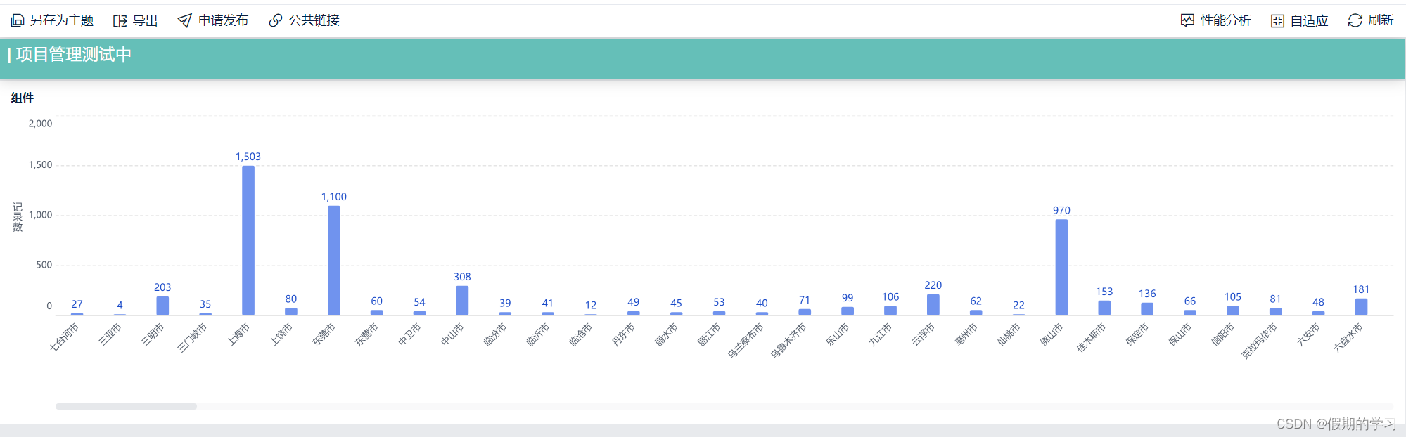
摘录自 大屏组件
找了很久,发现这个可以完美解决我的我问题
在此做记录