Button是按钮组件,通常用于响应用户的点击操作,其类型包括胶囊按钮、圆形按钮、普通按钮。Button做为容器使用时可以通过添加子组件实现包含文字、图片等元素的按钮。具体用法请参考Button。
创建按钮
Button通过调用接口来创建,接口调用有以下两种形式:
- 创建不包含子组件的按钮。
Button(label?: ResourceStr, options?: { type?: ButtonType, stateEffect?: boolean })
ts
Button(label?: ResourceStr, options?: { type?: ButtonType, stateEffect?: boolean })
其中,label用来设置按钮文字,type用于设置Button类型,stateEffect属性设置Button是否开启点击效果。
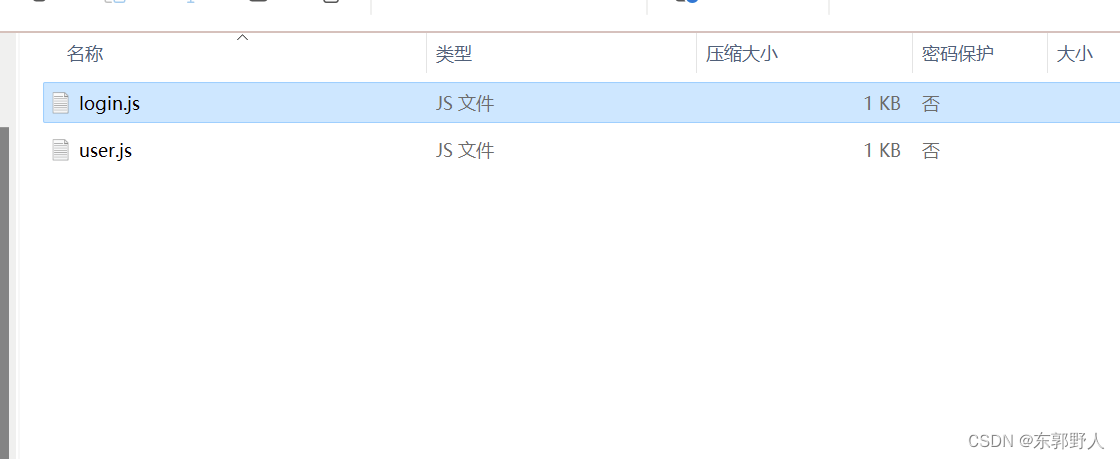
Button('Ok', { type: ButtonType.Normal, stateEffect: true })
  .borderRadius(8)
  .backgroundColor(0x317aff)
  .width(90)
  .height(40)
ts
Button('Ok', { type: ButtonType.Normal, stateEffect: true })
  .borderRadius(8)
  .backgroundColor(0x317aff)
  .width(90)
  .height(40)

zh-cn_image_0000001562820757
- 创建包含子组件的按钮。
Button(options?: {type?: ButtonType, stateEffect?: boolean})
ts
Button(options?: {type?: ButtonType, stateEffect?: boolean})
只支持包含一个子组件,子组件可以是基础组件或者容器组件。
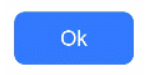
Button({ type: ButtonType.Normal, stateEffect: true }) {
  Row() {
    Image($r('app.media.loading')).width(20).height(40).margin({ left: 12 })
    Text('loading').fontSize(12).fontColor(0xffffff).margin({ left: 5, right: 12 })
  }.alignItems(VerticalAlign.Center)
}.borderRadius(8).backgroundColor(0x317aff).width(90).height(40)
ts
Button({ type: ButtonType.Normal, stateEffect: true }) {
  Row() {
    Image($r('app.media.loading')).width(20).height(40).margin({ left: 12 })
    Text('loading').fontSize(12).fontColor(0xffffff).margin({ left: 5, right: 12 })
  }.alignItems(VerticalAlign.Center)
}.borderRadius(8).backgroundColor(0x317aff).width(90).height(40)

zh-cn_image_0000001511421216
设置按钮类型
Button有三种可选类型,分别为胶囊类型(Capsule)、圆形按钮(Circle)和普通按钮(Normal),通过type进行设置。
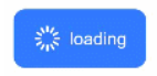
- 胶囊按钮(默认类型)
此类型按钮的圆角自动设置为高度的一半,不支持通过borderRadius属性重新设置圆角。
Button('Disable', { type: ButtonType.Capsule, stateEffect: false })
  .backgroundColor(0x317aff)
  .width(90)
  .height(40)
ts
Button('Disable', { type: ButtonType.Capsule, stateEffect: false })
  .backgroundColor(0x317aff)
  .width(90)
  .height(40)

zh-cn_image_0000001511421208
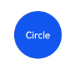
- 圆形按钮
此类型按钮为圆形,不支持通过borderRadius属性重新设置圆角。
Button('Circle', { type: ButtonType.Circle, stateEffect: false })
  .backgroundColor(0x317aff)
  .width(90)
  .height(90)
ts
Button('Circle', { type: ButtonType.Circle, stateEffect: false })
  .backgroundColor(0x317aff)
  .width(90)
  .height(90)

zh-cn_image_0000001511740428
- 普通按钮
此类型的按钮默认圆角为0,支持通过borderRadius属性重新设置圆角。
Button('Ok', { type: ButtonType.Normal, stateEffect: true })
  .borderRadius(8)
  .backgroundColor(0x317aff)
  .width(90)
  .height(40)
ts
Button('Ok', { type: ButtonType.Normal, stateEffect: true })
  .borderRadius(8)
  .backgroundColor(0x317aff)
  .width(90)
  .height(40)

zh-cn_image_0000001563060641

自定义样式
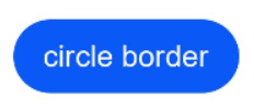
- 设置边框弧度。
使用通用属性来自定义按钮样式。例如通过borderRadius属性设置按钮的边框弧度。
Button('circle border', { type: ButtonType.Normal })
  .borderRadius(20)
  .height(40)
ts
Button('circle border', { type: ButtonType.Normal })
  .borderRadius(20)
  .height(40)

zh-cn_image_0000001511900392
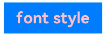
- 设置文本样式。
通过添加文本样式设置按钮文本的展示样式。
Button('font style', { type: ButtonType.Normal })
  .fontSize(20)
  .fontColor(Color.Pink)
  .fontWeight(800)
ts
Button('font style', { type: ButtonType.Normal })
  .fontSize(20)
  .fontColor(Color.Pink)
  .fontWeight(800)

zh-cn_image_0000001511580828
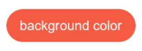
- 设置背景颜色。
添加backgroundColor属性设置按钮的背景颜色。
Button('background color').backgroundColor(0xF55A42)
ts
Button('background color').backgroundColor(0xF55A42)

zh-cn_image_0000001562940477
- 创建功能型按钮。
为删除操作创建一个按钮。
let MarLeft: Record<string, number> = { 'left': 20 }
Button({ type: ButtonType.Circle, stateEffect: true }) {
  Image($r('app.media.ic_public_delete_filled')).width(30).height(30)
}.width(55).height(55).margin(MarLeft).backgroundColor(0xF55A42)
ts
let MarLeft: Record<string, number> = { 'left': 20 }
Button({ type: ButtonType.Circle, stateEffect: true }) {
  Image($r('app.media.ic_public_delete_filled')).width(30).height(30)
}.width(55).height(55).margin(MarLeft).backgroundColor(0xF55A42)

zh-cn_image_0000001511740436

添加事件
Button组件通常用于触发某些操作,可以绑定onClick事件来响应点击操作后的自定义行为。
Button('Ok', { type: ButtonType.Normal, stateEffect: true })
  .onClick(()=>{
    console.info('Button onClick')
  })
ts
Button('Ok', { type: ButtonType.Normal, stateEffect: true })
  .onClick(()=>{
    console.info('Button onClick')
  })
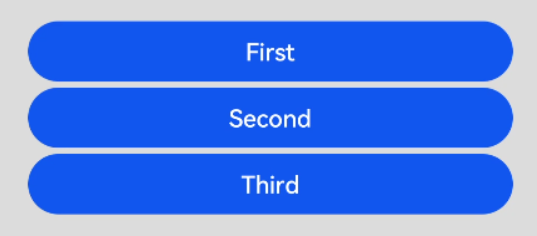
场景示例
- 用于启动操作。
可以用按钮启动任何用户界面元素,按钮会根据用户的操作触发相应的事件。例如,在List容器里通过点击按钮进行页面跳转。
// xxx.ets
import router from '@ohos.router';
@Entry
@Component
struct ButtonCase1 {
  @State FurL:router.RouterOptions = {'url':'pages/first_page'}
  @State SurL:router.RouterOptions = {'url':'pages/second_page'}
  @State TurL:router.RouterOptions = {'url':'pages/third_page'}
  build() {
    List({ space: 4 }) {
      ListItem() {
        Button("First").onClick(() => {
          router.pushUrl(this.FurL)
        })
          .width('100%')
      }
      ListItem() {
        Button("Second").onClick(() => {
          router.pushUrl(this.SurL)
        })
          .width('100%')
      }
      ListItem() {
        Button("Third").onClick(() => {
          router.pushUrl(this.TurL)
        })
          .width('100%')
      }
    }
    .listDirection(Axis.Vertical)
    .backgroundColor(0xDCDCDC).padding(20)
  }
}
ts
// xxx.ets
import router from '@ohos.router';
@Entry
@Component
struct ButtonCase1 {
  @State FurL:router.RouterOptions = {'url':'pages/first_page'}
  @State SurL:router.RouterOptions = {'url':'pages/second_page'}
  @State TurL:router.RouterOptions = {'url':'pages/third_page'}
  build() {
    List({ space: 4 }) {
      ListItem() {
        Button("First").onClick(() => {
          router.pushUrl(this.FurL)
        })
          .width('100%')
      }
      ListItem() {
        Button("Second").onClick(() => {
          router.pushUrl(this.SurL)
        })
          .width('100%')
      }
      ListItem() {
        Button("Third").onClick(() => {
          router.pushUrl(this.TurL)
        })
          .width('100%')
      }
    }
    .listDirection(Axis.Vertical)
    .backgroundColor(0xDCDCDC).padding(20)
  }
}

zh-cn_image_0000001562700393
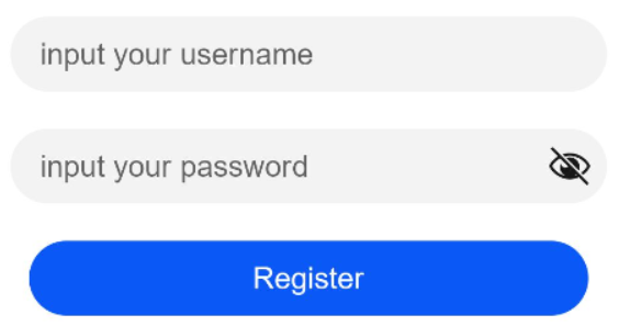
- 用于提交表单。
在用户登录/注册页面,使用按钮进行登录或注册操作。
// xxx.ets
@Entry
@Component
struct ButtonCase2 {
  build() {
    Column() {
      TextInput({ placeholder: 'input your username' }).margin({ top: 20 })
      TextInput({ placeholder: 'input your password' }).type(InputType.Password).margin({ top: 20 })
      Button('Register').width(300).margin({ top: 20 })
        .onClick(() => {
          // 需要执行的操作
        })
    }.padding(20)
  }
}
ts
// xxx.ets
@Entry
@Component
struct ButtonCase2 {
  build() {
    Column() {
      TextInput({ placeholder: 'input your username' }).margin({ top: 20 })
      TextInput({ placeholder: 'input your password' }).type(InputType.Password).margin({ top: 20 })
      Button('Register').width(300).margin({ top: 20 })
        .onClick(() => {
          // 需要执行的操作
        })
    }.padding(20)
  }
}

zh-cn_image_0000001562940473
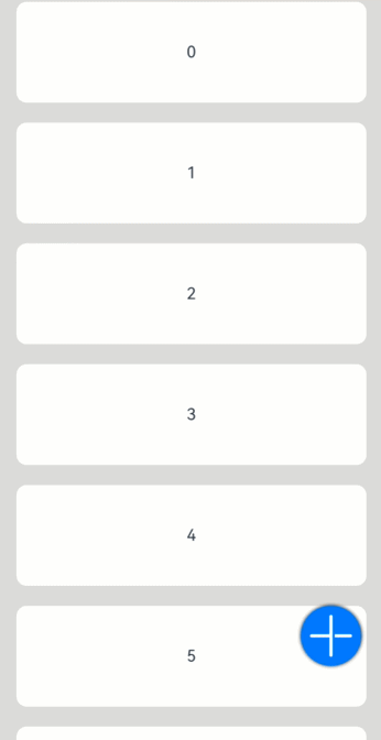
- 悬浮按钮
在可以滑动的界面,滑动时按钮始终保持悬浮状态。
// xxx.ets
@Entry
@Component
struct HoverButtonExample {
  private arr: number[] = [0, 1, 2, 3, 4, 5, 6, 7, 8, 9]
  build() {
    Stack() {
      List({ space: 20, initialIndex: 0 }) {
        ForEach(this.arr, (item:number) => {
          ListItem() {
            Text('' + item)
              .width('100%').height(100).fontSize(16)
              .textAlign(TextAlign.Center).borderRadius(10).backgroundColor(0xFFFFFF)
          }
        }, (item:number) => item.toString())
      }.width('90%')
      Button() {
        Image($r('app.media.ic_public_add'))
          .width(50)
          .height(50)
      }
      .width(60)
      .height(60)
      .position({x: '80%', y: 600})
      .shadow({radius: 10})
      .onClick(() => {
        // 需要执行的操作
      })
    }
    .width('100%')
    .height('100%')
    .backgroundColor(0xDCDCDC)
    .padding({ top: 5 })
  }
}
ts
// xxx.ets
@Entry
@Component
struct HoverButtonExample {
  private arr: number[] = [0, 1, 2, 3, 4, 5, 6, 7, 8, 9]
  build() {
    Stack() {
      List({ space: 20, initialIndex: 0 }) {
        ForEach(this.arr, (item:number) => {
          ListItem() {
            Text('' + item)
              .width('100%').height(100).fontSize(16)
              .textAlign(TextAlign.Center).borderRadius(10).backgroundColor(0xFFFFFF)
          }
        }, (item:number) => item.toString())
      }.width('90%')
      Button() {
        Image($r('app.media.ic_public_add'))
          .width(50)
          .height(50)
      }
      .width(60)
      .height(60)
      .position({x: '80%', y: 600})
      .shadow({radius: 10})
      .onClick(() => {
        // 需要执行的操作
      })
    }
    .width('100%')
    .height('100%')
    .backgroundColor(0xDCDCDC)
    .padding({ top: 5 })
  }
}

floating_button
如果大家还没有掌握鸿蒙,现在想要在最短的时间里吃透它,我这边特意整理了《鸿蒙语法ArkTS、TypeScript、ArkUI等…视频教程》以及《鸿蒙开发学习手册》(共计890页),希望对大家有所帮助:https://docs.qq.com/doc/DZVVBYlhuRkZQZlB3
鸿蒙语法ArkTS、TypeScript、ArkUI等…视频教程:https://docs.qq.com/doc/DZVVBYlhuRkZQZlB3
OpenHarmony APP开发教程步骤:https://docs.qq.com/doc/DZVVBYlhuRkZQZlB3
《鸿蒙开发学习手册》:
如何快速入门:https://docs.qq.com/doc/DZVVBYlhuRkZQZlB3
1.基本概念
2.构建第一个ArkTS应用
3.……

开发基础知识:https://docs.qq.com/doc/DZVVBYlhuRkZQZlB3
1.应用基础知识
2.配置文件
3.应用数据管理
4.应用安全管理
5.应用隐私保护
6.三方应用调用管控机制
7.资源分类与访问
8.学习ArkTS语言
9.……

基于ArkTS 开发:https://docs.qq.com/doc/DZVVBYlhuRkZQZlB3
1.Ability开发
2.UI开发
3.公共事件与通知
4.窗口管理
5.媒体
6.安全
7.网络与链接
8.电话服务
9.数据管理
10.后台任务(Background Task)管理
11.设备管理
12.设备使用信息统计
13.DFX
14.国际化开发
15.折叠屏系列
16.……

鸿蒙生态应用开发白皮书V2.0PDF:https://docs.qq.com/doc/DZVVBYlhuRkZQZlB3


