学习ArkTS
使用Deveco studio写ArkTS
鸿蒙开发指南
新建一个ArkTs的项目一些默认代码的意思。
@Entry   // 装饰器: 用来装饰类结构,方法,变量  // 标记当前组件是入口组件
@Component // 标记自定义组件
struct Index { // 自定义组件: 可复用的UI单元
  @State message: string = 'Hello World' // 标记一个变量是一个状态变量,一旦变量变了,就会更改

  build() { // UI描述: 其内部以声明方式描述UI构建
    Row() {   // 内置组件:ArkUI提供的组件
      Column() {    // 容器组件:用来完成页面布局,例如Row,Column
        Text(this.message)  // 基础组件,自带样式和功能的页面元素,例如Text
          .fontSize(50)
          .fontWeight(FontWeight.Bold)
          .onClick(()=>{    // 事件方法:设置组件的事件回调
            // 处理事件
            this.message = 'hello ArkTS!'
          })
          .fontColor('#36D')
      }
      .width('100%')  // 属性方法: 设置组件的UI样式
    }
    .height('100%')
  }
}
Image: 图片显示组件
1.声明Image组件并设置图片源
Image(src: string|PixelMap|Resource)
- string 格式,通常用来加载网络图片,需要申请网络访问权限:ohos.permission.INTERNET
Image('https://xxx/org')
- PixelMap格式,可以加载像素图,常用在图片编辑中
Image(pixelMapObject)
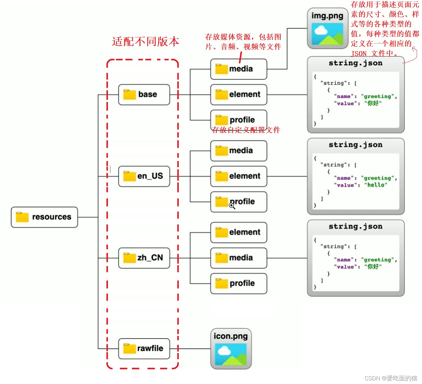
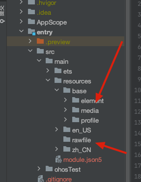
- Resource格式,加载本地图片,
Image($r('app.media.xxx')) //加载目录media目录下的,项目工程目录下的文件夹
Image($rawfile('xxx.png')) //加载目录在rawfile目录下的
2. 添加图片属性
Image($r('app.media.icon'))
	.width(100)	// 宽度
	.height(120)		// 高度
	.borderRadius(10)		//边框圆角
	.interpolation(IamgeInterpolation.High)	// 图片差值
Text: 文本显示组件
1. 声明Text组件并设置文本内容
Text(content?: string| Resource)
1. string格式,直接填写文本内容
Text('图片宽度')
2. Resource格式,读取本地资源文件
3. Text($r('app.string.width_label')) //写在string.json 用来实现国际化的
2. 添加文本属性
Text('注册账号')
	.lineHeight(20)		//行高
	.fontSize(20)		// 字体大小
	.fontColor('#ff1876f8')		// 自己颜色
	.fontWeight(FontWeight.Medium) // 字体粗细
TextInput:文本输入框
1. 声明TextInput
TextInput({placeholder?: ResourceStr, Text?;ResourceStr})
placeholder:  输入框无输入时的提示文本
TextInput({placeholder:'请输入账号或者手机号'})
Text:输入框当前的文本内容
TextInput({text:'itcast'})
2. 添加属性和事件
TextInput({text:'当前输入的文本'})
	.width(150)		// 宽
	.height(30)		// 高
	.backgroundColor('#FFF')		// 背景色
	.type(InputType.Password)		// 输入框类型
	.onChange(value=>{
		// value是用户输入的文本内容
})
	除了Password还有以下常用的类型
	名称						描述
	Normal 				基本输入模式,支持输入数字,字母,下划线,空格,特殊字符。
	Password			密码输入模式,支持输入数字,字母,下划线,空格,特殊字符。
	Email				邮箱地址输入模式,支持数字,字母,下划线,以及@字符。
	Number				纯数字输入模式。
	PhoneNumber			电话号码输入模式,支持输入数字,+ - # * 长度不限
Button 组件
1. 声明Button组件,label是按钮文字:
Button(label?: ResourceStr)
label:文字
1. 文字按钮
	Button('点我')
2. 自定义按钮,在button内嵌套其他组件
	Button(){
		Image($r('app.media.search'))
			.width(20)
			.margin(10)
}
2. 添加属性和事件
Button(‘点我’)
	.width(100)
	.height(30)
	.type(ButtonType.Normal) // 按钮类型
	.onClick(() => {
		// 处理点击事件
})

按钮类型:
名称					描述
Capsule			胶囊型按钮(圆角默认认为高度的一半)
Circle			圆形按钮
Normal			普通按钮(默认不带圆角)
Slider 滑动条组件
	silder(options?:SliderOptions)
	Slider({
	min: 0,		// 最小值
	max: 100,	// 最大值
	value: 30,	// 当前值
	step: 10,		// 滑动步长
	style: SliderStyle.OutSet,
	direction: Axis.Horizontal,	// 水平方向
	reverse: false	// 是否反向滑动
})
.width('90%')
.showTips(true)	// 是否显示value百分比提示
.blockColor('#36D')
.onChange( value => {
	// value 就是当前滑块值
})
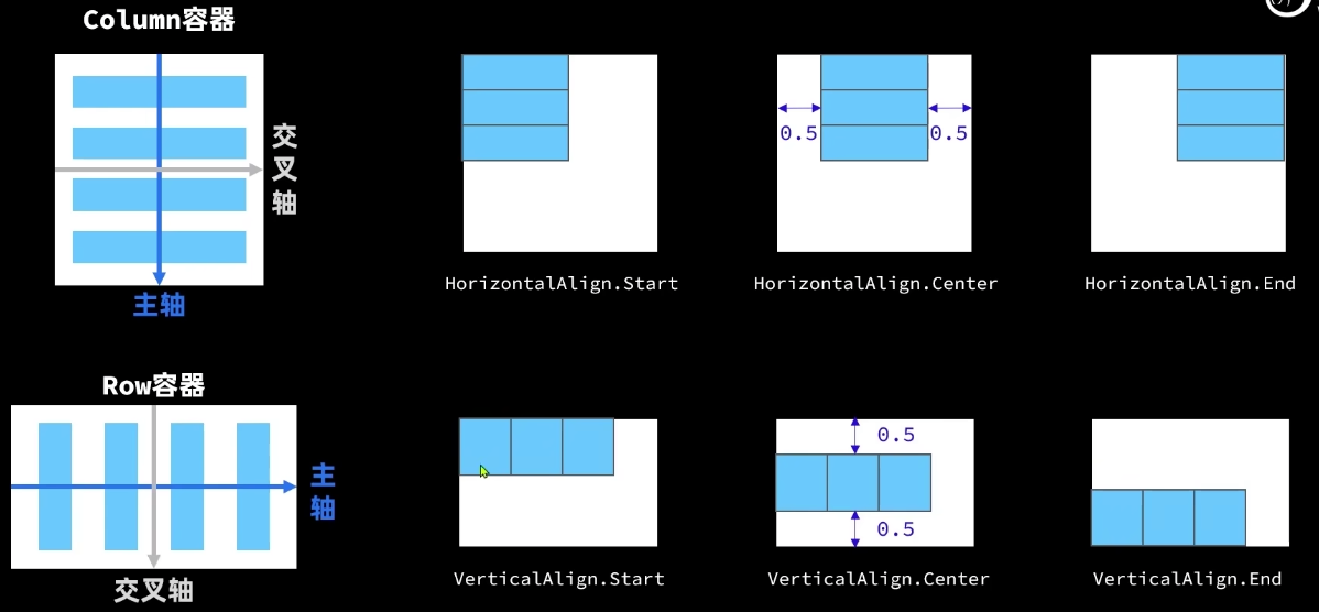
页面布局
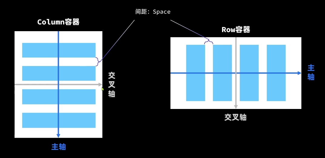
属性方法 说明 参数
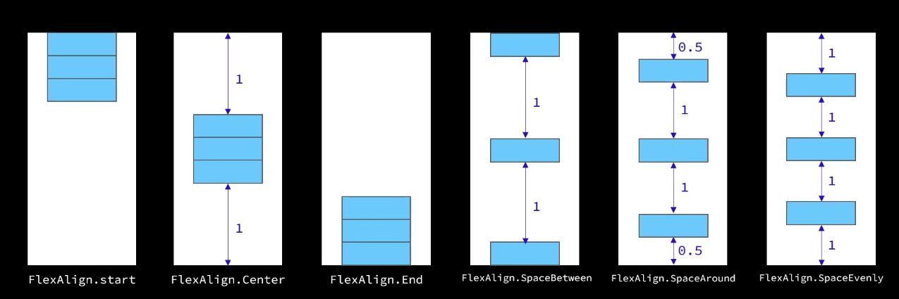
justifyContent 设置子元素在主轴方向的对齐格式 FlexAlign枚举
alignItems 设置子元素在交叉轴方向的对齐格式 Column容器使用HorizontalAlign枚举
线性布局组件
Column 容器 按列排序
Row 容器 按行排序
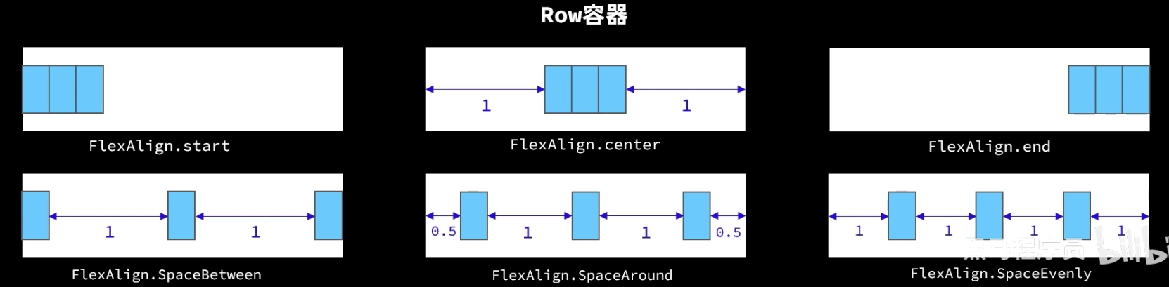
常见布局属性
@Entry   // 装饰器: 用来装饰类结构,方法,变量  // 标记当前组件是入口组件
@Component // 标记自定义组件
struct Index { // 自定义组件: 可复用的UI单元
  @State message: string = 'Hello World' // 标记一个变量是一个状态变量,一旦变量变了,就会更改
  @State ImageWidth: number = 130
  build() { // UI描述: 其内部以声明方式描述UI构建
    Row() {   // 内置组件:ArkUI提供的组件
      Column() {    // 容器组件:用来完成页面布局,例如Row,Column
        Row() // 里面可以设置 Row({space:20}) 设置space
        {
          Image($r('app.media.mate60'))
            .width(this.ImageWidth)
            .interpolation(ImageInterpolation.High)
        }
        .width('100%')
        .height(400)
        .justifyContent(FlexAlign.Center)
        Row()
        {
          Text($r('app.string.width_label'))
            .fontSize(20)
            .fontWeight(FontWeight.Bold)
          TextInput({text: this.ImageWidth.toFixed(0)})
            .width(150)
            .backgroundColor('#FF')
            .type(InputType.Number)
            .onChange(value => {
              this.ImageWidth = parseInt(value)
            })
        }
        .width('100%')
        .padding({left:14,right:14}) // Row的内边距
        .justifyContent(FlexAlign.SpaceBetween)

        Divider() // 加下划线
          .width('91%')
        Row()
        {
          Button('缩小')
            .width(80)
            .fontSize(20)
            .onClick(() =>{
              if (this.ImageWidth >= 10) {
                this.ImageWidth = this.ImageWidth - 10
              }})
          Button('放大')
            .width(80)
            .fontSize(20)
            .onClick(() => {
              if (this.ImageWidth < 300)
              {
                this.ImageWidth += 10
              }})
        }
        .width('100%')
        .justifyContent(FlexAlign.SpaceEvenly)
        .margin({top:30,bottom:35}) // 外边距

        Row() {
          Slider({
            min: 100,
            max: 300,
            value: this.ImageWidth,
            step: 10
          })
            .width('90%')
            .blockColor('#36D')
            .trackThickness(10)
            .showTips(true)
            .onChange(value => {
              this.ImageWidth = value
            })
        }
      }
      .width('100%')  // 属性方法: 设置组件的UI样式
    }
    .height('100%')
  }
}
渲染控制
ForEach 循环渲染
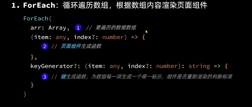
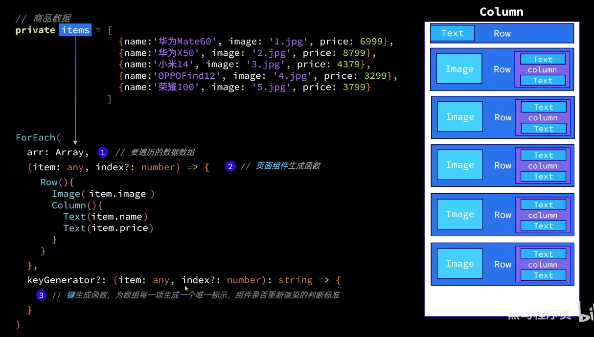
例子:
class Item{
name: string
image: ResourceStr
price: Number
constructor(name: string, image: ResourceStr, price: Number) {
this.name = name
this.image = image
this.price = price
}
}
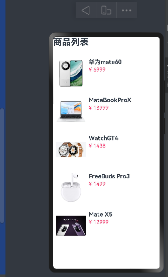
@Entry
@Component
struct ItemPage {
private items: Array<Item> =[
new Item('华为mate60',$r('app.media.mate60'),6999),
new Item('MateBookProX',$r('app.media.MateBookProX'),13999),
new Item('WatchGT4',$r('app.media.WatchGT4'),1438),
new Item('FreeBuds Pro3',$r('app.media.FreeBuds'),1499),
new Item('Mate X5',$r('app.media.mateX5'),12999)
]
build(){
Column({space: 8}) {
Row() {
Text('商品列表')
.fontSize(30)
.fontWeight(FontWeight.Bold)
}
.width('100%')
.margin({ bottom: 20 })
ForEach(this.items,
(item: Item) => {
Row({ space: 10 }) {
Image(item.image)
.width(100)
Column({ space: 4 }) {
Text(item.name)
.fontSize(20)
.fontWeight(FontWeight.Bold)
Text('¥ ' + item.price)
.fontColor('#F36')
.fontSize(18)
}
.height('100%')
.alignItems(HorizontalAlign.Start)
}
.width('100%')
.height('100%')
.backgroundColor('#FFF')
.borderRadius(20)
.height(120)
.padding(10)
})
}
.width('100%')
}
}
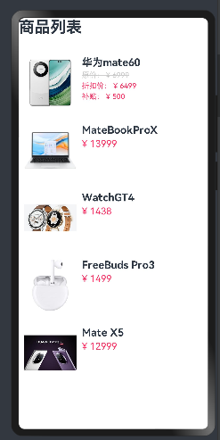
使用if添加折扣信息
class Item{
  name: string
  image: ResourceStr
  price: Number
  discount: Number

  constructor(name: string, image: ResourceStr, price: Number, discount: Number = 0) {
    this.name = name
    this.image = image
    this.price = price
    this.discount = discount
  }
}

@Entry
@Component
struct ItemPage {
  private items: Array<Item> =[
    new Item('华为mate60',$r('app.media.mate60'),6999, 500),
    new Item('MateBookProX',$r('app.media.MateBookProX'),13999),
    new Item('WatchGT4',$r('app.media.WatchGT4'),1438),
    new Item('FreeBuds Pro3',$r('app.media.FreeBuds'),1499),
    new Item('Mate X5',$r('app.media.mateX5'),12999)
  ]

  build(){
    Column({space: 8}) {
      Row() {
        Text('商品列表')
          .fontSize(30)
          .fontWeight(FontWeight.Bold)
      }
      .width('100%')
      .margin({ bottom: 20 })


      ForEach(this.items,
        (item: Item) => {
          Row({ space: 10 }) {
            Image(item.image)
              .width(100)

            if (item.discount)
            {
              Column({ space: 4 }) {
                Text(item.name)
                  .fontSize(20)
                  .fontWeight(FontWeight.Bold)
                Text('原价: ¥ ' + item.price)
                  .fontColor('#CCC')
                  .fontSize(14)
                  .decoration({type:TextDecorationType.LineThrough})
                // @ts-ignore
                Text('折扣价: ¥ ' + (item.price - item.discount))
                  .fontColor('#F36')
                  .fontSize(14)
                Text('补贴: ¥ ' +  item.discount)
                  .fontColor('#F36')
                  .fontSize(14)
              }
              .height('100%')
              .alignItems(HorizontalAlign.Start)
            } else {
              Column({ space: 4 }) {
                Text(item.name)
                  .fontSize(20)
                  .fontWeight(FontWeight.Bold)
                Text('¥ ' + item.price)
                  .fontColor('#F36')
                  .fontSize(18)
              }
              .height('100%')
              .alignItems(HorizontalAlign.Start)
            }

          }
          .width('100%')
          .height('100%')
          .backgroundColor('#FFF')
          .borderRadius(20)
          .height(120)
          .padding(10)
        })
    }
    .width('100%')

  }
}
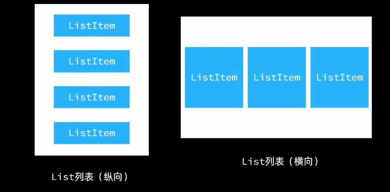
List
列表(List)是一种复杂容器,具有以下特点:
1. 列表项(ListItem)数量过多超过屏幕后,会自动提供滚动功能
2. 列表项(ListItem)既可以纵向排列,也可以横向排列
List({space: 10}){
	ForEach([1,2,3,4],item =>{
		ListItem(){
			// 列表项内容,只能包含一个根组件
			Text('ListItem')
		}
	})
}
.width('100%')
.listDirection(Axis.Vertical)		// 列表方向,默认纵向(垂直)
自定义组件
@Component
struct Header{
 private title: ResourceStr
 build()
 {
   Row() {
     Text(this.title)
       .fontSize(30)
       .fontWeight(FontWeight.Bold)
   }
   .width('100%')
   .height(30)
   .margin({ bottom: 20 })

 }
}
这就是自定义组件
全局自定义构建函数
//全局的自定义构建函数
@Builder function ItemCard()
{
	// 函数内容
}

局部的自定义构建函数需要把函数写到@Compont内,不需要写function
自定义公共样式全局/局部都可以
用法直接.fillScreen()
@Styles function fillScreen() // 只能用于公共样式
{
            .width('100%')
            .height('100%')
            .backgroundColor('#FFF')
            .borderRadius(20)
            .height(120)
            .padding(10)

}

有些样式是某些组件特有的需要以下操作
@Extend(Text) function priceText()	 // 需要继承组件
{
	.fontColor('#F36)
	.fontSize(18)
}