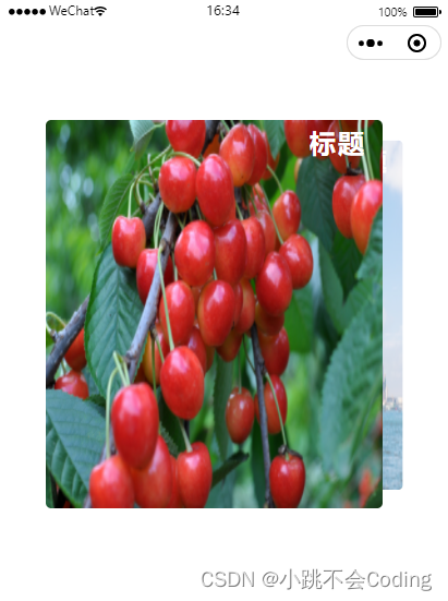
组件代码直接引入项目就可以看效果
<template>
<view class="certificate">
<view class="title">{{title}}</view>
<view class="con-part2-con">
<swiper class="swiper-tall" :autoplay="false" :interval="3000" :duration="1000"
circular='true' previous-margin='161rpx' next-margin='161rpx' current='0' @change="partSwiperChange">
<swiper-item class="con-part2-con-container"
:class="partcurrentIndex === index?'active-item':''"
v-for="(item,index) in partSwiperChangeList" :key="index">
<view :class="['info-warp', partcurrentIndex === index?'active':'']">
<image class="img" :src="item.pic" mode=""></image>
</view>
</swiper-item>
</swiper>
</view>
</view>
</template>
<script>
export default {
props:{
title:{
typeof: String,
default:''
},
data:{
typeof: Array,
default:()=>[]
}
},
data(){
return{
partSwiperChangeList: [
{
pic: 'https://picsum.photos/161/119?1',
},
{
pic: 'https://picsum.photos/161/119?2',
},
{
pic: 'https://picsum.photos/161/119?3',
},
],
partcurrentIndex: 0,
}
},
methods:{
partSwiperChange(event) {
this.partcurrentIndex = event.detail.current
}
}
}
</script>
<style scoped lang="scss">
.certificate{
margin-bottom: 60rpx;
padding: 0 15rpx;
.title{
margin-bottom: 15rpx;
width: 108rpx;
height: 38rpx;
font-family: PingFangSC, PingFang SC;
font-weight: 600;
font-size: 27rpx;
color: #44B00B;
line-height: 38rpx;
text-align: left;
font-style: normal;
}
.con-part2-con {
width: 646rpx;
.swiper-tall {
.con-part2-con-container {
display: flex;
align-items: center;
width: 323rpx !important;
height: 238rpx;
overflow: visible;
.info-warp {
display: block;
width: 323rpx;
height: 238rpx;
// background-color: #000;
.img{
width: 100%;
height: 100%;
display: block;
}
}
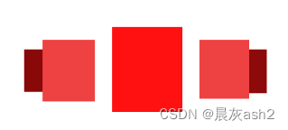
.active {
position: relative;
bottom: 36rpx;
transform: scale(1.3);
transition: all 0.2s ease-in 0s;
// background-color: red;
}
}
.active-item{
z-index: 999;//使中间的元素放在上面
}
}
}
}
</style>


![[python] Numpy库用法(持续更新)](https://img-blog.csdnimg.cn/direct/0c3055a024084dbea9baa106695fd386.png)