import numpy as np
import matplotlib.pyplot as plt
from matplotlib.gridspec import GridSpec
plt.style.use('./deeplearning.mplstyle')
import tensorflow as tf
from tensorflow.keras.models import Sequential
from tensorflow.keras.layers import Dense, LeakyReLU
from tensorflow.keras.activations import linear, relu, sigmoid
%matplotlib widget
from matplotlib.widgets import Slider
from lab_utils_common import dlc
from autils import plt_act_trio
from lab_utils_relu import *
import warnings
warnings.simplefilter(action='ignore', category=UserWarning)
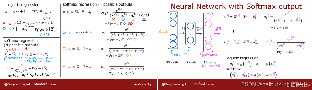
2-Relu激活
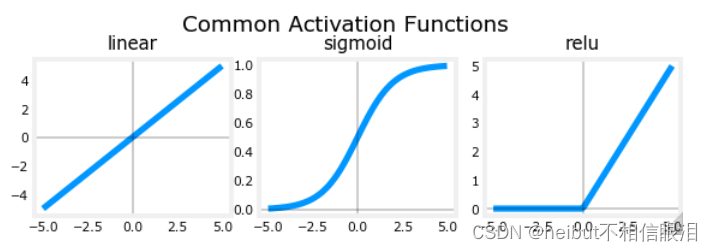
本周,引入了一种新的激活方式,即整流线性单元(ReLU)。
𝑎=𝑚𝑎𝑥(0,𝑧) # ReLU函数
plt_act_trio()
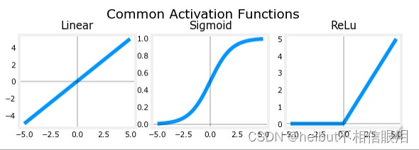
👆讲座中的例子展示了ReLU的应用。在本例中,派生的“感知”特征不是二进制的,而是具有连续的值范围。sigmoid最适合开/关或二进制情况。ReLU提供了连续的线性关系。此外,它还有一个输出为零的“关闭”范围。“关闭”功能使ReLU成为非线性激活。为什么需要这样做?让我们在下面检查一下。
为什么是非线性激活?

所示的函数由线性片段(分段线性)组成。斜率在线性部分期间是一致的,然后在过渡点处突然变化。在过渡点,添加一个新的线性函数,当添加到现有函数时,将产生新的斜率。新函数是在过渡点添加的,但对该点之前的输出没有贡献。非线性激活函数负责在转换点之前和之后禁用输入。下面的练习提供了一个更具体的例子。
该练习将在回归问题中使用以下网络,其中您必须对分段线性目标进行建模: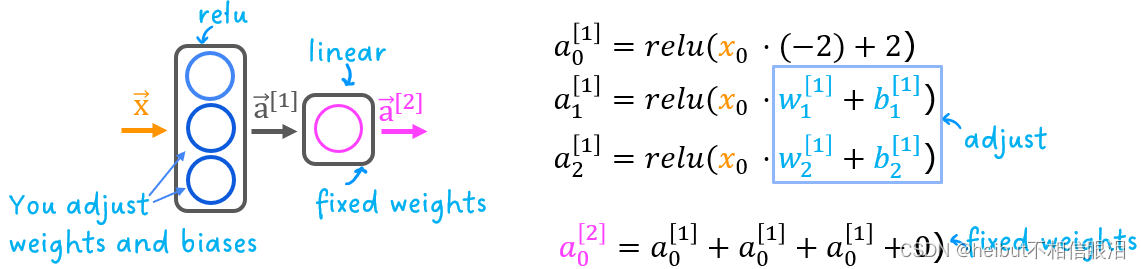
网络在第一层有3个单元。每个人将对目标的一部分负责。单元0被预先编程并固定为映射第一个段。您将修改第一单元和第2单元中的权重和偏差,以对第2段和第3段进行建模。输出单元也是固定的,并且简单地对第一层的输出求和。
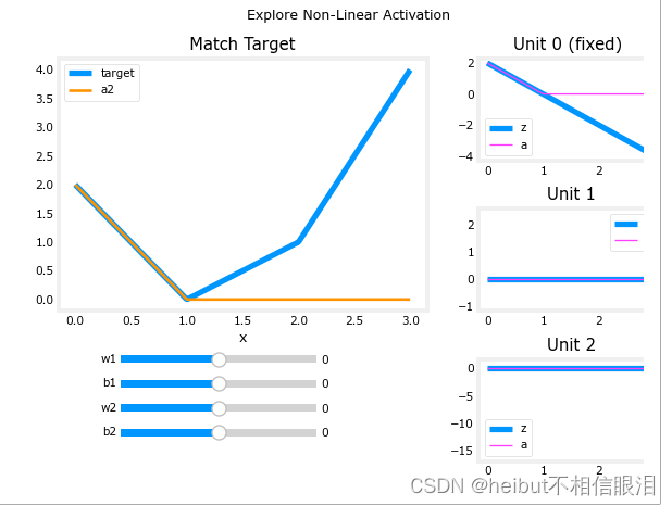
使用下面的滑块,修改权重和偏移以匹配目标。提示:从w1和b1开始,让w2和b2为零,直到匹配第二个线段。点击比滑动更快。如果你有麻烦,别担心,下面的文字会更详细地描述这一点。
_ = plt_relu_ex()
未匹配前:
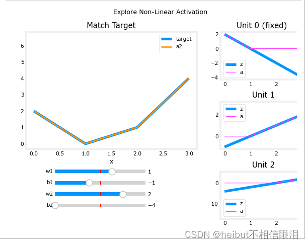
匹配第二个线段

匹配第三条直线:
本练习的目的是了解ReLU的非线性行为如何提供所需的能力,以关闭功能,直到需要为止。让我们看看这在这个例子中是如何工作的。
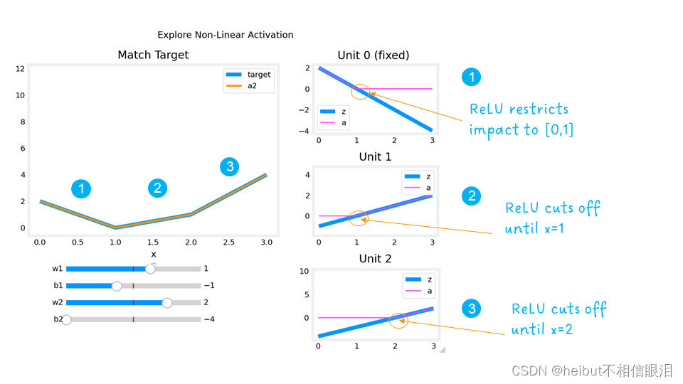
右边的图包含第一层中单位的输出。
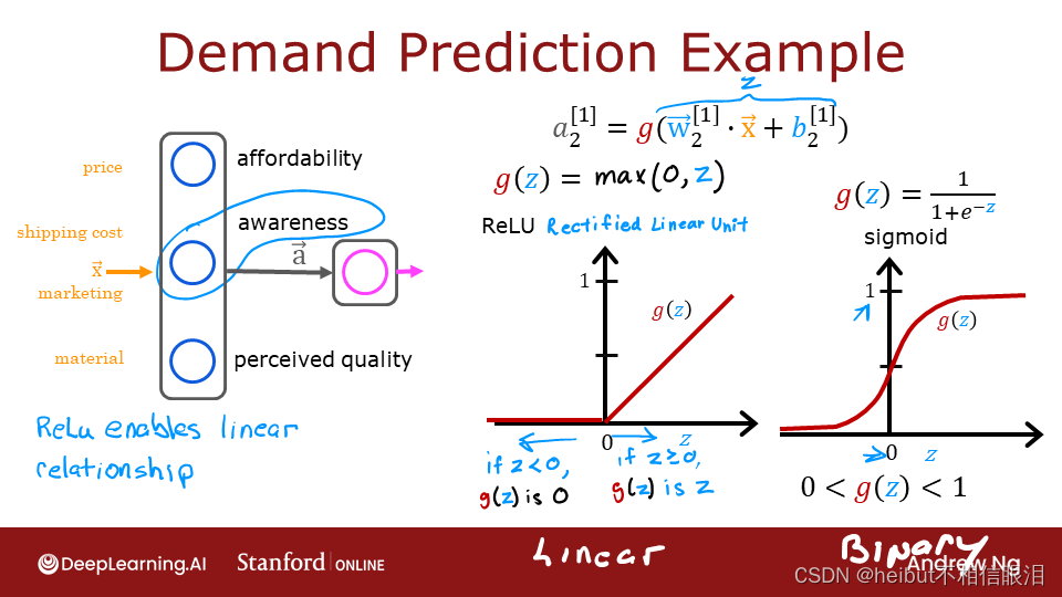
从顶部开始,Unit 0负责标记为1的第一个段。两个线性函数𝑧以及ReLU之后的函数𝑎
如图所示。您可以看到ReLU在区间[0,1]之后截断了函数。这是关键,因为它可以防止干扰以下片段。
Unit 1负责第二段。在这里,ReLU使该单元保持安静,直到x为1之后。由于Unit 1 𝑤[1]1没有贡献,只是目标线的斜率。必须调整偏置以保持输出为负,直到x达到1。
Unit 2负责第三段。ReLU再次将输出归零,直到x达到正确的值。单元的坡度,𝑤[1]2
,必须设置为使得Unit 1和2的总和具有期望的斜率。再次调整偏置以保持输出为负,直到x达到2。
ReLU激活的“关闭”或禁用功能使模型能够将线性段缝合在一起,以对复杂的非线性函数进行建模。
====新材料结束=
新激活
本周推出了一种新的激活方式,即整流线性单元(ReLU)。
def plt_act_trio():
    X = np.linspace(-5,5,100)
    fig,ax = plt.subplots(1,3, figsize=(6,2))
    widgvis(fig)
    ax[0].plot(X,tf.keras.activations.linear(X))
    ax[0].axvline(0, lw=0.3, c="black")
    ax[0].axhline(0, lw=0.3, c="black")
    ax[0].set_title("linear")
    ax[1].plot(X,tf.keras.activations.sigmoid(X))
    ax[1].axvline(0, lw=0.3, c="black")
    ax[1].axhline(0, lw=0.3, c="black")
    ax[1].set_title("sigmoid")
    ax[2].plot(X,tf.keras.activations.relu(X))
    ax[2].axhline(0, lw=0.3, c="black")
    ax[2].axvline(0, lw=0.3, c="black")
    ax[2].set_title("relu")
    fig.suptitle("Common Activation Functions", fontsize=14)
    fig.tight_layout(pad=0.2)
    plt.show()
plt_act_trio()
右边的例子展示了ReLu的一个应用程序。在本例中,“感知”功能不是二进制的,但其范围从0到更大的值不等。sigmoid最适合开/关或二进制情况。ReLu提供了一个线性关系和一个输出为零的“关”范围。“关闭”功能使ReLu成为非线性激活。为什么需要这样做?让我们用下面的例子来检查一下。
X = np.linspace(0,2*np.pi, 100)
y = np.cos(X)+1
y[50:100]=0
fig,ax = plt.subplots(1,1, figsize=(2,2))
widgvis(fig)
ax.plot(X,y)
plt.show()

w10 = np.array([[-1]])
b10 = np.array([2.6])
d10 = Dense(1, activation = "linear", input_shape = (1,), weights=[w10,b10])
z10 = d10(X.reshape(-1,1))
a10 = relu(z10)
def plt_act1(y,z,a):
fig,ax = plt.subplots(1,3, figsize=(6,2.5)) #创建一个包含一行三列子图的图形对象 fig,并返回包含这些子图坐标轴的数组 ax。
widgvis(fig)
ax[0].plot(X,y,label="target")#在第一个子图中绘制了目标输出 y 的折线图,并设置了标签为 "target"。
ax[0].axvline(0, lw=0.3, c="black")#在第一个子图中添加了一条垂直于 x 轴的黑色虚线,位置在 x=0 处。
ax[0].axhline(0, lw=0.3, c="black")#在第一个子图中添加了一条水平于 y 轴的黑色虚线,位置在 y=0 处。
ax[0].set_title("y - target")#设置第一个子图的标题为 "y - target"。
ax[1].plot(X,y, label="target")
ax[1].plot(X,z, c=dlc["dldarkred"],label="z")#颜色为预定义的深红色
ax[1].axvline(0, lw=0.3, c="black")
ax[1].axhline(0, lw=0.3, c="black")
ax[1].set_title("z = wX+b")
ax[1].legend(loc="upper center")
ax[2].plot(X,y, label="target")
ax[2].plot(X,a, c=dlc["dldarkred"],label="ReLu(z)")
ax[2].axhline(0, lw=0.3, c="black")
ax[2].axvline(0, lw=0.3, c="black")
ax[2].set_title("with relu")
ax[2].legend()
fig.suptitle("Role of Activation", fontsize=14)
fig.tight_layout(pad=0.2)
return(ax)
def plt_add_notation(ax):
ax[1].annotate(text = "matches\n here", xy =(1.5,1.0),
xytext = (0.1,-1.5), fontsize=10,
arrowprops=dict(facecolor=dlc["dlpurple"],width=2, headwidth=8))
ax[1].annotate(text = "but not\n here", xy =(5,-2.5),
xytext = (1,-3), fontsize=10,
arrowprops=dict(facecolor=dlc["dlpurple"],width=2, headwidth=8))
ax[2].annotate(text = "ReLu\n 'off'", xy =(2.6,0),
xytext = (0.1,0.1), fontsize=10,
arrowprops=dict(facecolor=dlc["dlpurple"],width=2, headwidth=8))
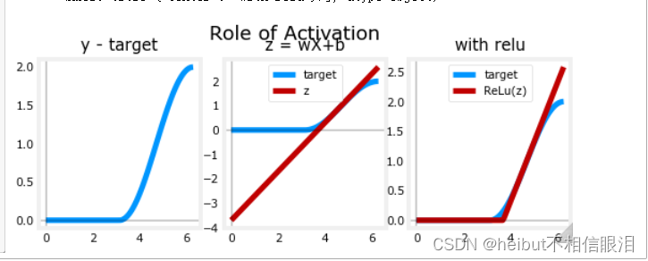
ax = plt_act1(y,z10,a10)
plt_add_notation(ax)
plt_act1(y, z, a): 这个函数用来绘制三个子图,展示了神经网络中激活函数的作用和神经元之间的影响。具体包括:
第一个子图:绘制了目标输出 y; 第二个子图:绘制了目标输出 y 和模型输出 z,展示了模型对输入 X 的线性变换;
第三个子图:绘制了目标输出 y 和经过 ReLU 激活函数处理后的输出 a,展示了激活函数的非线性变换效果。

👆上面是d10 -> (-1,2.6)
👇下面是d11 ->(1,-3.7)
X = np.linspace(0,2*np.pi, 100)
y = np.cos(X)+1
y[0:49]=0
fig,ax = plt.subplots(1,1, figsize=(2,2))
widgvis(fig)
ax.plot(X,y)
plt.show()

w11 = np.array([[1]])
b11 = np.array([-3.7])
d11 = Dense(1, activation = "linear", input_shape = (1,), weights=[w11,b11])
z11 = d11(X.reshape(-1,1))
a11 = relu(z11)
plt_act1(y,z11,a11)
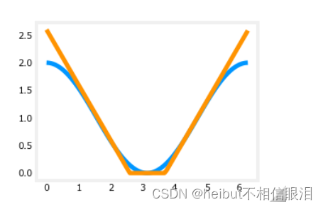
X = np.linspace(0,2*np.pi, 100)
y = np.cos(X)+1
X=X.reshape(-1,1)
yhat = relu(d10(X)) + relu(d11(X))

fig,ax = plt.subplots(1,2, figsize=(4,2))
widgvis(fig)
ax[0].plot(X,y)
ax[1].plot(X,y)
ax[1].plot(X,yhat)
plt.show()

X=X.reshape(-1,1)
yhat = relu(d10(X)) + relu(d11(X))
fig,ax = plt.subplots(1,1, figsize=(2,2))
widgvis(fig)
ax.plot(X,y)
ax.plot(X,yhat)
plt.show()
说实话从这往下就没看懂这是要干啥,下面也没解析
model = Sequential([
    Dense(10),
    tf.keras.layers.Activation(tf.nn.relu),
    Dense(11),
    tf.keras.layers.Activation(tf.nn.relu),
    Dense(1, activation='linear')
])
model.compile(
    loss=tf.keras.losses.MeanSquaredError(),
    optimizer=tf.keras.optimizers.Adam(0.1),
)

model.fit(
    X,y,
    epochs=1000
)

yhat = model.predict(X.reshape(-1,1))
fig,ax = plt.subplots(1,1, figsize=(2,2))
widgvis(fig)
ax.plot(X,y)
ax.plot(X,yhat)
plt.show()

model = Sequential(
    [
        Dense(1,activation="relu", name = 'l1'),
        Dense(1,activation="linear", name = 'l2')
    ]
)
model.compile(
    loss=tf.keras.losses.MeanSquaredError(),
    optimizer=tf.keras.optimizers.Adam(0.01),
)

model.fit(
    X,y,
    epochs=10
)

yhat = model.predict(X)
yhat[0:5]

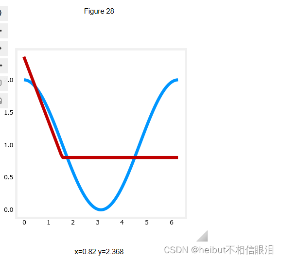
fig,ax = plt.subplots(1,1, figsize=(4,4))
ax.plot(X,y)
ax.plot(X,yhat, c=dlc["dldarkred"])
plt.show()

l1 = model.get_layer('l1')
l2 = model.get_layer('l2')
l1.get_weights()
l2.get_weights()
[array([[-0.93]], dtype=float32), array([0.], dtype=float32)]
[array([[-1.02]], dtype=float32), array([0.38], dtype=float32)]
l1 = model.get_layer('l1')
l2 = model.get_layer('l2')
l1.get_weights()
l2.get_weights()

w1 = np.array([[-1]])
b1 = np.array([1])
l1.set_weights([w1,b1])

w2 = np.array([[1]])
b2 = np.array([0])
l2.set_weights([w2,b2])
model.fit(
    X,y,
    epochs=100
)

👇没看懂为什么拟合好之后又设置一遍
l2.set_weights([w2,b2])
yhat = model.predict(X)
fig,ax = plt.subplots(1,1, figsize=(4,4))
ax.plot(X,y)
ax.plot(X,yhat, c=dlc["dldarkred"])
plt.show()
2-D
import matplotlib.pyplot as plt
import numpy as np
import matplotlib as mpl
import warnings
from matplotlib import cm
from matplotlib.patches import FancyArrowPatch
from matplotlib.colors import ListedColormap, LinearSegmentedColormap
import matplotlib.colors as colors
from lab_utils_common import dlc
dkcolors = plt.cm.Paired((1,3,7,9,5,11))
ltcolors = plt.cm.Paired((0,2,6,8,4,10))
dkcolors_map = mpl.colors.ListedColormap(dkcolors)
ltcolors_map = mpl.colors.ListedColormap(ltcolors)
def plt_mc_data(ax, X, y, classes,  class_labels=None, map=plt.cm.Paired,
                legend=False, size=50, m='o', equal_xy = False):
    """ Plot multiclass data. Note, if equal_xy is True, setting ylim on the plot may not work """#plt_mc_data 函数用于绘制多类别数据的散点图。
    for i in range(classes):
        idx = np.where(y == i)
        col = len(idx[0])*[i]
        label = class_labels[i] if class_labels else "c{}".format(i)
        ax.scatter(X[idx, 0], X[idx, 1],  marker=m,
                    c=col, vmin=0, vmax=map.N, cmap=map,
                    s=size, label=label)
    if legend: ax.legend()
    if equal_xy: ax.axis("equal")

def plt_mc(X_train,y_train,classes):#函数用于创建一个包含多类别数据散点图的图像。
    css = np.unique(y_train)
    fig,ax = plt.subplots(1,1,figsize=(3,3))
    fig.canvas.toolbar_visible = False
    fig.canvas.header_visible = False
    fig.canvas.footer_visible = False
    plt_mc_data(ax, X_train,y_train,classes, map=dkcolors_map, legend=True, size=10, equal_xy = False)
    ax.set_title("Multiclass Data")
    ax.set_xlabel("x0")
    ax.set_ylabel("x1")
    return(ax)

def plot_cat_decision_boundary_mc(ax, X, predict , class_labels=None, legend=False, vector=True):#函数用于绘制分类决策边界

    # create a mesh to points to plot
    x_min, x_max = X[:, 0].min(), X[:, 0].max()
    y_min, y_max = X[:, 1].min(), X[:, 1].max()
    h = max(x_max-x_min, y_max-y_min)/200
    xx, yy = np.meshgrid(np.arange(x_min, x_max, h),
                         np.arange(y_min, y_max, h))
    points = np.c_[xx.ravel(), yy.ravel()]
    #print("points", points.shape)
    #print("xx.shape", xx.shape)

    #make predictions for each point in mesh
    if vector:
        Z = predict(points)
    else:
        Z = np.zeros((len(points),))
        for i in range(len(points)):
            Z[i] = predict(points[i].reshape(1,2))
    Z = Z.reshape(xx.shape)

    #contour plot highlights boundaries between values - classes in this case
    ax.contour(xx, yy, Z, linewidths=1)
    #ax.axis('tight')
X = np.random.rand(300, 2)
y = np.sqrt( X[:,0]**2 + X[:,1]**2 ) < 0.6
#y = np.logical_and( X[:,0] < 0.5, X[:,1] < 0.5 ).astype(int)
y.shape
plt_mc(X,y,2,)

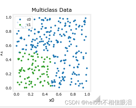
X = np.random.rand(300, 2)
#y = np.sqrt( X[:,0]**2 + X[:,1]**2 ) < 0.6
y = np.logical_and( X[:,0] < 0.5, X[:,1] < 0.5 ).astype(int)
y.shape
plt_mc(X,y,2,)
model = Sequential(
[
Dense(2,activation="relu", name = 'l1'),
Dense(1,activation="sigmoid", name = 'l2')
]
)
model.compile(
loss=tf.keras.losses.MeanSquaredError(),
optimizer=tf.keras.optimizers.Adam(0.01),
)
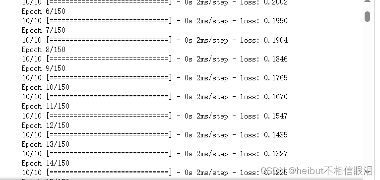
model.fit(
X,y,
epochs=150
)
ax = plt_mc(X,y,2,)
predict = lambda  x: (model.predict(x) > 0.5).astype(int)
plot_cat_decision_boundary_mc(ax, X, predict, legend = True, vector=True)

l1 = model.get_layer("l1")
W1,b1 = l1.get_weights()
l2 = model.get_layer("l2")
W2,b2 = l2.get_weights()
print(W1,b1)
print(W2,b2)
[[1.98 1.7 ]
 [1.98 2.13]] [-1.14 -1.07]
[[-5.89]
 [-2.59]] [2.88]
x0 = np.array([0.4,0.60])
np.dot( np.dot(x0,W1) + b1, W2) + b2
array([-4.36])
import time
import warnings

import numpy as np
import matplotlib.pyplot as plt

from sklearn import cluster, datasets, mixture
from sklearn.neighbors import kneighbors_graph
from sklearn.preprocessing import StandardScaler
from itertools import cycle, islice

np.random.seed(0)

# ============
# Generate datasets. We choose the size big enough to see the scalability
# of the algorithms, but not too big to avoid too long running times
# ============
n_samples = 500
noisy_circles = datasets.make_circles(n_samples=n_samples, factor=0.5, noise=0.05)
noisy_moons = datasets.make_moons(n_samples=n_samples, noise=0.05)
blobs = datasets.make_blobs(n_samples=n_samples, random_state=8)
no_structure = np.random.rand(n_samples, 2), None

# Anisotropicly distributed data
random_state = 170
X, y = datasets.make_blobs(n_samples=n_samples, random_state=random_state)
transformation = [[0.6, -0.6], [-0.4, 0.8]]
X_aniso = np.dot(X, transformation)
aniso = (X_aniso, y)

# blobs with varied variances
varied = datasets.make_blobs(
    n_samples=n_samples, cluster_std=[1.0, 2.5, 0.5], random_state=random_state
)

# ============
# Set up cluster parameters
# ============
plt.figure(figsize=(9 * 2 + 3, 13))
plt.subplots_adjust(
    left=0.02, right=0.98, bottom=0.001, top=0.95, wspace=0.05, hspace=0.01
)

plot_num = 1

default_base = {
    "quantile": 0.3,
    "eps": 0.3,
    "damping": 0.9,
    "preference": -200,
    "n_neighbors": 3,
    "n_clusters": 3,
    "min_samples": 7,
    "xi": 0.05,
    "min_cluster_size": 0.1,
}

datasets = [
    (
        noisy_circles,
        {
            "damping": 0.77,
            "preference": -240,
            "quantile": 0.2,
            "n_clusters": 2,
            "min_samples": 7,
            "xi": 0.08,
        },
    ),
    (
        noisy_moons,
        {
            "damping": 0.75,
            "preference": -220,
            "n_clusters": 2,
            "min_samples": 7,
            "xi": 0.1,
        },
    ),
    (
        varied,
        {
            "eps": 0.18,
            "n_neighbors": 2,
            "min_samples": 7,
            "xi": 0.01,
            "min_cluster_size": 0.2,
        },
    ),
    (
        aniso,
        {
            "eps": 0.15,
            "n_neighbors": 2,
            "min_samples": 7,
            "xi": 0.1,
            "min_cluster_size": 0.2,
        },
    ),
    (blobs, {"min_samples": 7, "xi": 0.1, "min_cluster_size": 0.2}),
    (no_structure, {}),
]

datasets = [
    (no_structure, {}),
]

for i_dataset, (dataset, algo_params) in enumerate(datasets):
    # update parameters with dataset-specific values
    params = default_base.copy()
    params.update(algo_params)

    X, y = dataset

    # normalize dataset for easier parameter selection
    X = StandardScaler().fit_transform(X)

    # estimate bandwidth for mean shift
    bandwidth = cluster.estimate_bandwidth(X, quantile=params["quantile"])

    # connectivity matrix for structured Ward
    connectivity = kneighbors_graph(
        X, n_neighbors=params["n_neighbors"], include_self=False
    )
    # make connectivity symmetric
    connectivity = 0.5 * (connectivity + connectivity.T)

    # ============
    # Create cluster objects
    # ============
    ms = cluster.MeanShift(bandwidth=bandwidth, bin_seeding=True)
    two_means = cluster.MiniBatchKMeans(n_clusters=params["n_clusters"])
    ward = cluster.AgglomerativeClustering(
        n_clusters=params["n_clusters"], linkage="ward", connectivity=connectivity
    )
    spectral = cluster.SpectralClustering(
        n_clusters=params["n_clusters"],
        eigen_solver="arpack",
        affinity="nearest_neighbors",
    )
    dbscan = cluster.DBSCAN(eps=params["eps"])
    optics = cluster.OPTICS(
        min_samples=params["min_samples"],
        xi=params["xi"],
        min_cluster_size=params["min_cluster_size"],
    )
    affinity_propagation = cluster.AffinityPropagation(
        damping=params["damping"], preference=params["preference"], random_state=0
    )
    average_linkage = cluster.AgglomerativeClustering(
        linkage="average",
       # affinity="cityblock",
        n_clusters=params["n_clusters"],
        connectivity=connectivity,
    )
    birch = cluster.Birch(n_clusters=params["n_clusters"])
    gmm = mixture.GaussianMixture(
        n_components=params["n_clusters"], covariance_type="full"
    )

    clustering_algorithms = (
        ("MiniBatch\nKMeans", two_means),
        ("Affinity\nPropagation", affinity_propagation),
        ("MeanShift", ms),
        ("Spectral\nClustering", spectral),
        ("Ward", ward),
        ("Agglomerative\nClustering", average_linkage),
        ("DBSCAN", dbscan),
        ("OPTICS", optics),
        ("BIRCH", birch),
        ("Gaussian\nMixture", gmm),
    )

    for name, algorithm in clustering_algorithms:
        t0 = time.time()

        # catch warnings related to kneighbors_graph
        with warnings.catch_warnings():
            warnings.filterwarnings(
                "ignore",
                message="the number of connected components of the "
                + "connectivity matrix is [0-9]{1,2}"
                + " > 1. Completing it to avoid stopping the tree early.",
                category=UserWarning,
            )
            warnings.filterwarnings(
                "ignore",
                message="Graph is not fully connected, spectral embedding"
                + " may not work as expected.",
                category=UserWarning,
            )
            print(X.shape,algorithm)
            algorithm.fit(X)

        t1 = time.time()
        if hasattr(algorithm, "labels_"):
            y_pred = algorithm.labels_.astype(int)
        else:
            y_pred = algorithm.predict(X)

        plt.subplot(len(datasets), len(clustering_algorithms), plot_num)
        if i_dataset == 0:
            plt.title(name, size=18)

        colors = np.array(
            list(
                islice(
                    cycle(
                        [
                            "#377eb8",
                            "#ff7f00",
                            "#4daf4a",
                            "#f781bf",
                            "#a65628",
                            "#984ea3",
                            "#999999",
                            "#e41a1c",
                            "#dede00",
                        ]
                    ),
                    int(max(y_pred) + 1),
                )
            )
        )
        # add black color for outliers (if any)
        colors = np.append(colors, ["#000000"])
        plt.scatter(X[:, 0], X[:, 1], s=10, color=colors[y_pred])

        plt.xlim(-2.5, 2.5)
        plt.ylim(-2.5, 2.5)
        plt.xticks(())
        plt.yticks(())
        plt.text(
            0.99,
            0.01,
            ("%.2fs" % (t1 - t0)).lstrip("0"),
            transform=plt.gca().transAxes,
            size=15,
            horizontalalignment="right",
        )
        plot_num += 1

plt.show()