目录
八、弹窗/自定义弹窗(AlertDialog/CustomDialog)
在@CustomDialog装饰器内添加按钮操作,创建函数。
10.3 Video控制器使用(VideoController)
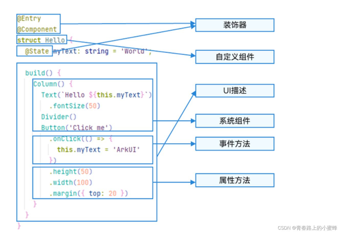
一、常用组件
文本显示(Text/Span)
按钮(Button)
文本输入(TextInput/TextArea)
单选框(Radio)
切换按钮(Toggle)
进度条(Progress)
弹窗/自定义弹窗(AlertDialog/CustomDialog)
视频播放(Video)
二、文本显示(Text/Span)
2.1 创建文本
Text可通过以下两种方式来创建:
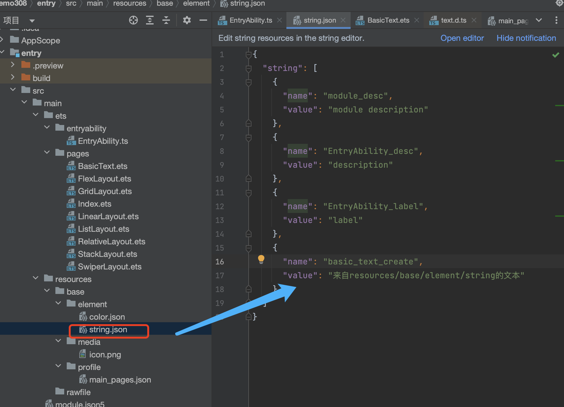
string字符串
- 引用Resource资源
资源引用类型可以通过$r创建Resource类型对象,文件位置为/resources/base/element/string.json。
interface TextInterface {
    (content?: string | Resource): TextAttribute;
}
添加 string 资源
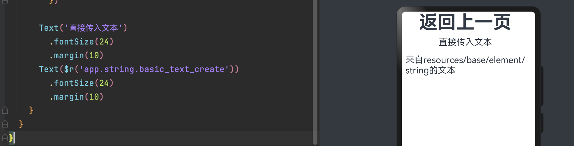
      Text('直接传入文本')
        .fontSize(24)
        .margin(10)
      Text($r('app.string.basic_text_create'))
        .fontSize(24)
        .margin(10)
2.2 属性
| 名称 | 参数类型 | 描述 |
|---|---|---|
| fontColor | ResourceColor | 设置文本颜色 |
| fontSize | Length|Resource | 设置文本尺寸 |
| fontStyle | FontStyle | 设置文本的字体样式 |
| fontWeight | number|FontWeight|string | 设置文本的字体粗细 |
| fontFamily | string|Resource | 设置文本的字体列表 |
| textAlign | TextAlign | 设置文本在水平方向的对齐方式 |
| textOverflow | {overflow: TextOverflow} | 设置文本超长时的显示方式(需配合maxLines一起使用) |
| maxLines | number | 设置文本的最大行数 |
| decoration | {type: TextDecorationType;color?: ResourceColor;} | 设置文本装饰线样式及其颜色 |
| textCase | TextCase | 设置文本大小写 |
| lineHeight | string|number|Resource | 设置文本的文本行高,设置值不大于0时,不限制文本行高,自适应字体大小,Length为number类型时单位为fp |
| letterSpacing | number|string | 设置文本字符间距 |
| copyOption | CopyOptions | 组件支持设置文本是否可复制粘贴(默认值:CopyOptions.None)。设置copyOptions为CopyOptions.InApp或者CopyOptions.LocalDevice,长按文本,会弹出文本选择菜单,可选中文本并进行复制、全选操作。 |
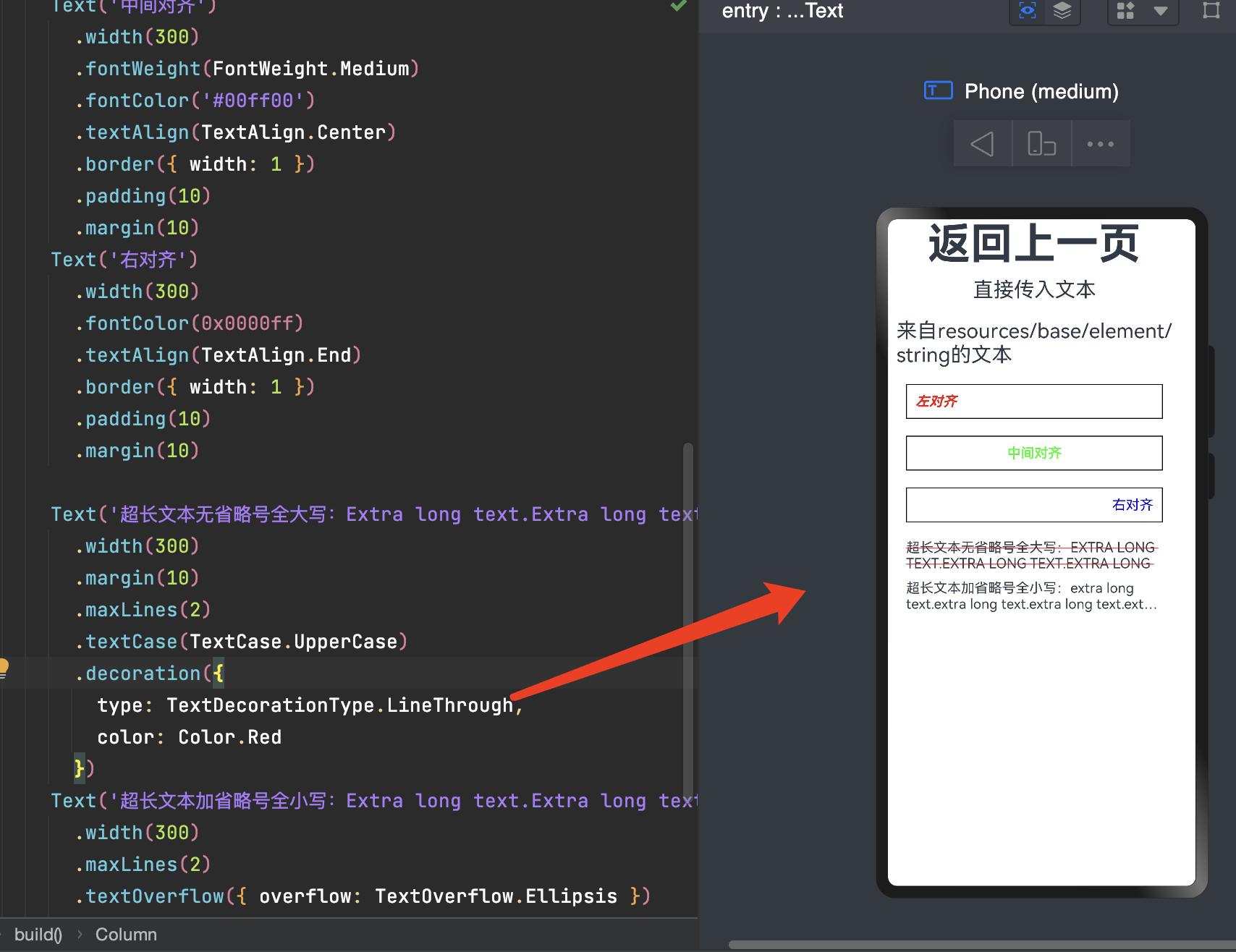
      Text('左对齐')
        .width(300)
        .fontColor(Color.Red)
        .fontStyle(FontStyle.Italic)//斜体
        .fontWeight(FontWeight.Bold)//粗体
        .textAlign(TextAlign.Start)
        .border({ width: 1 })
        .padding(10)
        .margin(10)
      Text('中间对齐')
        .width(300)
        .fontWeight(FontWeight.Medium)
        .fontColor('#00ff00')
        .textAlign(TextAlign.Center)
        .border({ width: 1 })
        .padding(10)
        .margin(10)
      Text('右对齐')
        .width(300)
        .fontColor(0x0000ff)
        .textAlign(TextAlign.End)
        .border({ width: 1 })
        .padding(10)
        .margin(10)

      Text('超长文本无省略号全大写:Extra long text.Extra long text.Extra long text.Extra long text.Extra long text.Extra long text.Extra long text.Extra long text.Extra long text.Extra long text.Extra long text.Extra long text.')
        .width(300)
        .margin(10)
        .maxLines(2)
        .textCase(TextCase.UpperCase)
        .decoration({
          type: TextDecorationType.LineThrough,
          color: Color.Red
        })
      Text('超长文本加省略号全小写:Extra long text.Extra long text.Extra long text.Extra long text.Extra long text.Extra long text.Extra long text.Extra long text.Extra long text.Extra long text.Extra long text.Extra long text.')
        .width(300)
        .maxLines(2)
        .textOverflow({ overflow: TextOverflow.Ellipsis })
        .textCase(TextCase.LowerCase)
2.3 添加子组件(Span)
Span组件需要写到Text组件内(支持多个),单独写Span组件不会显示信息,Text与Span同时配置文本内容时,Span内容覆盖Text内容。
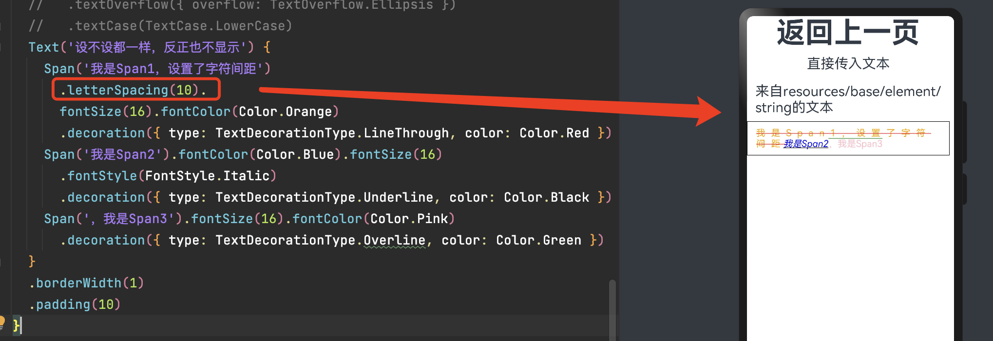
      Text('设不设都一样,反正也不显示') {
        Span('我是Span1,设置了字符间距')
          .letterSpacing(10).
          fontSize(16).fontColor(Color.Orange)
          .decoration({ type: TextDecorationType.LineThrough, color: Color.Red })
        Span('我是Span2').fontColor(Color.Blue).fontSize(16)
          .fontStyle(FontStyle.Italic)
          .decoration({ type: TextDecorationType.Underline, color: Color.Black })
        Span(',我是Span3').fontSize(16).fontColor(Color.Pink)
          .decoration({ type: TextDecorationType.Overline, color: Color.Green })
      }
      .borderWidth(1)
      .padding(10)
2.4 添加事件
Text组件可以添加通用事件,如onClick、onTouch等事件。
由于Span组件无尺寸信息,事件仅支持onClick事件。
      Text('设不设都一样,反正也不显示') {
        Span('我是Span1,设置了字符间距')
          .letterSpacing(10).
          fontSize(16).fontColor(Color.Orange)
          .decoration({ type: TextDecorationType.LineThrough, color: Color.Red })
          .onClick(()=>{
            console.info('我是Span1,设置了字符间距被点击了')
          })
        ......
      }
      .onClick(()=>{
        console.info('我是Text,被点击了')
      })
      .borderWidth(1)
      .padding(10)
三、按钮(Button)
Button是按钮组件,通常用于响应用户的点击操作,其类型包括胶囊按钮、圆形按钮、普通按钮。Button当做为容器使用时可以通过添加子组件实现包含文字、图片等元素的按钮。
3.1 创建按钮
创建不包含子组件的按钮。
- 创建包含子组件的按钮。
具有标签参数的Button组件不能有任何子级。
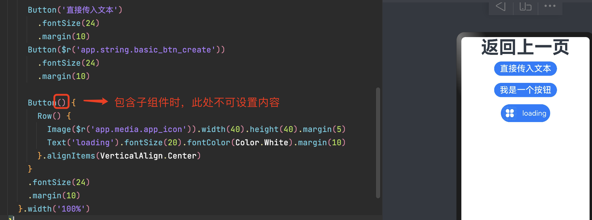
      Button('直接传入文本')
        .fontSize(24)
        .margin(10)
      Button($r('app.string.basic_btn_create'))
        .fontSize(24)
        .margin(10)

      Button() {
        Row() {
          Image($r('app.media.app_icon')).width(40).height(40).margin(5)
          Text('loading').fontSize(20).fontColor(Color.White).margin(10)
        }.alignItems(VerticalAlign.Center)
      }
      .fontSize(24)
      .margin(10)
3.2 设置按钮类型
Button有三种可选类型,通过type进行设置。
Capsul(默认类型):胶囊类型,圆角默认为高度的一半,不支持通过borderRadius属性重新设置圆角。
Circle(圆形按钮):按钮为圆形,不支持通过borderRadius属性重新设置圆角。
Normal(普通按钮:默认不带圆角):按钮默认圆角为0,支持通过borderRadius属性重新设置圆角。
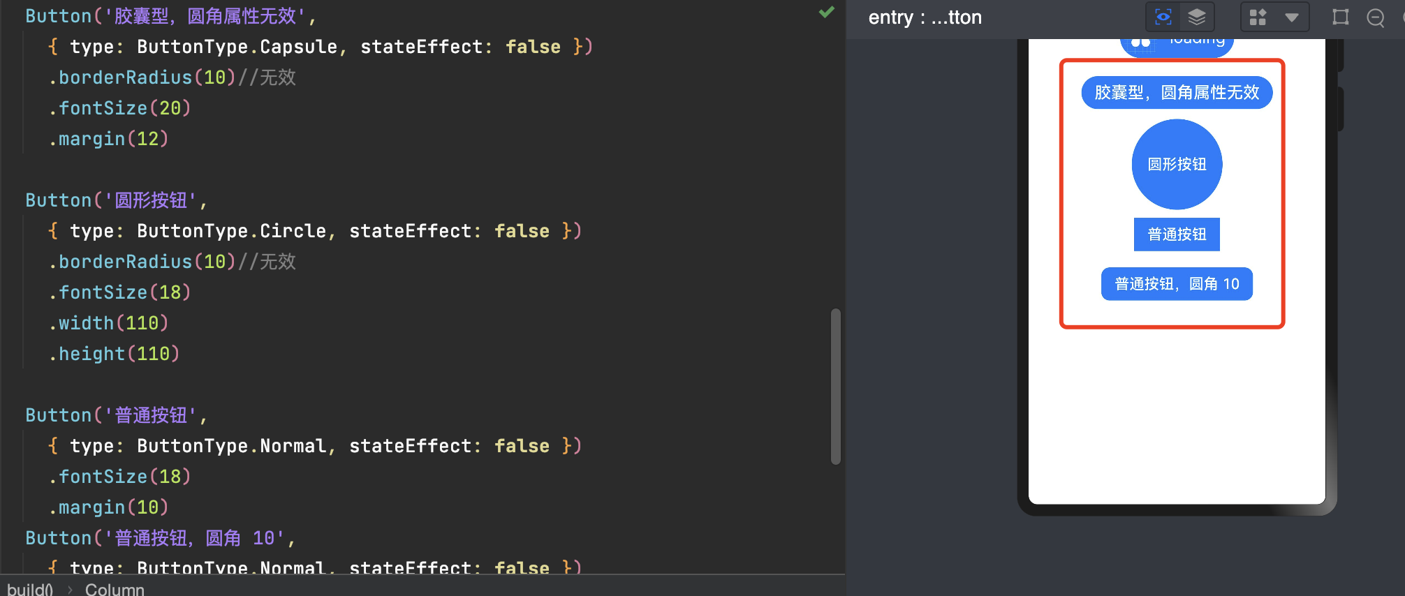
      Button('胶囊型,圆角属性无效',
        { type: ButtonType.Capsule, stateEffect: false })
        .borderRadius(10)//无效
        .fontSize(20)
        .margin(12)

      Button('圆形按钮',
        { type: ButtonType.Circle, stateEffect: false })
        .borderRadius(10)//无效
        .fontSize(18)
        .width(110)
        .height(110)

      Button('普通按钮',
        { type: ButtonType.Normal, stateEffect: false })
        .fontSize(18)
        .margin(10)
      Button('普通按钮,圆角 10',
        { type: ButtonType.Normal, stateEffect: false })
        .borderRadius(10)//有效
        .fontSize(18)
        .margin(10)
3.3 悬浮按钮
在可以滑动的界面,滑动时按钮始终保持悬浮状态。

      Button('+',
        { type: ButtonType.Circle, stateEffect: false })
        .borderRadius(10)//无效
        .fontSize(50)
        .width(80)
        .height(80)
        .position({x: '60%', y: '20%'})//悬浮位置
        .shadow({radius: 10})//添加阴影效果
四、文本输入(TextInput/TextArea)
TextInput、TextArea是输入框组件,通常用于响应用户的输入操作,例如登录注册页面、聊天框的输入等。
TextInput为单行输入框。
TextArea为多行输入框。
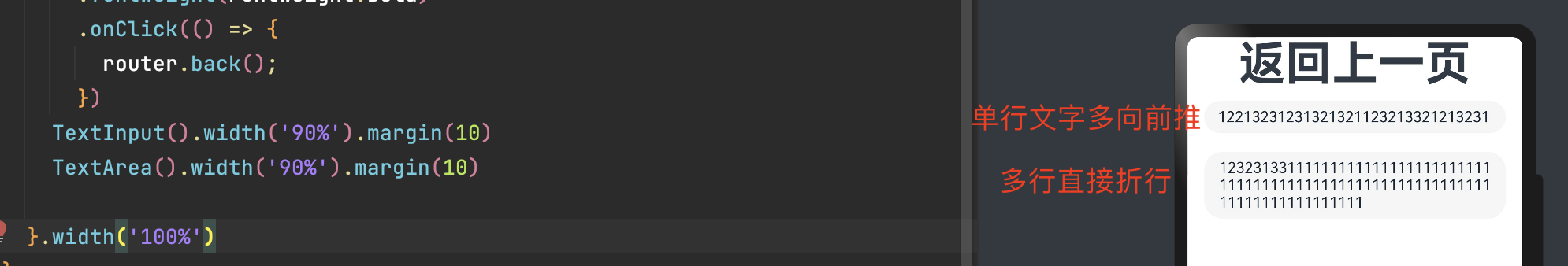
      TextInput().width('90%').margin(10)
      TextArea().width('90%').margin(10)
4.1 InputType输入框类型
Normal(默认):基本输入模式。支持输入数字、字母、下划线、空格、特殊字符。
Password:密码输入模式。支持输入数字、字母、下划线、空格、特殊字符。密码显示小眼睛图标并且默认会将文字变成圆点。
Email:邮箱地址输入模式。支持数字,字母,下划线,以及@字符(只能存在一个@字符)。
Number:纯数字输入模式。
PhoneNumber:电话号码输入模式。支持输入数字
、+ 、-、*、#,长度不限。
      TextInput({placeholder:"请输入手机号"}).width('90%').margin(10)
        .type(InputType.PhoneNumber)
        .placeholderColor(Color.Green)//修改提示语颜色
        .backgroundColor(Color.Pink)
      TextInput({placeholder:"请输入密码"}).width('90%').margin(10)
        .type(InputType.Password)
        .backgroundColor(Color.Pink)

4.2 键盘回车键类型
如上图,第一行已完成,下面还有输入框,需要将完成样式改为下一个样式。
Go:显示为开始样式。
Search:显示为搜索样式。
Send:显示为发送样式。
Next:显示为下一个样式。
**Done(默认)**:显示为换行(多行)样式/完成(单行)样式。
      TextInput({placeholder:"请输入手机号"}).width('90%').margin(10)
        .type(InputType.PhoneNumber)
        .placeholderColor(Color.Green)//修改提示语颜色
        .backgroundColor(Color.Pink)
        .enterKeyType(EnterKeyType.Next)
        .onSubmit((EnterKeyType)=>{
          console.info(EnterKeyType+'输入法回车键的类型值')
        })
      TextInput({placeholder:"请输入密码"}).width('90%').margin(10)
        .type(InputType.Password)
        .backgroundColor(Color.Pink)
        .enterKeyType(EnterKeyType.Send)
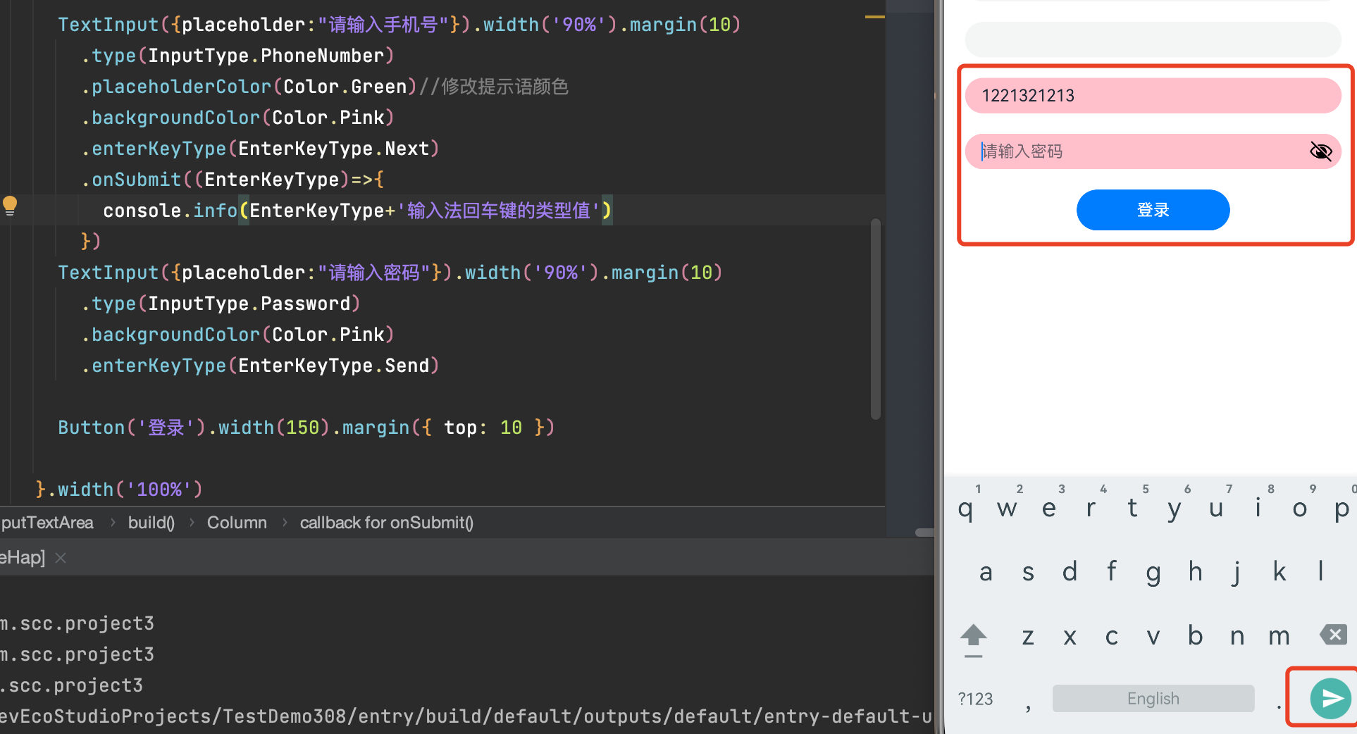
一个简单的登录页就有了。
五、单选框(Radio)
Radio是单选框组件,通常用于提供相应的用户交互选择项,同一组的Radio中只有一个可以被选中。
Radio(options: {value: string, group: string})
value:当前单选框的值。
group:当前单选框的所属群组名称,相同group的Radio只能有一个被选中。
        Radio({ value: 'Radio1', group: 'radioGroup' })
          .checked(false)//是否选中
          .width(50)

        Radio({ value: 'Radio2', group: 'radioGroup' })
          .checked(true)//是否选中
          .width(50)

5.1 添加事件
除支持通用事件外,Radio通常用于选中后触发某些操作,可以绑定onChange事件来响应选中操作后的自定义行为。
        Radio({ value: 'Radio1', group: 'radioGroup' })
          .checked(false)//是否选中
          .width(50)
          .onChange((isChecked: boolean) => {
            if(isChecked) {
              //需要执行的操作
            }
          })
        Radio({ value: 'Radio2', group: 'radioGroup' })
          .checked(true)//是否选中
          .width(50)
          .onChange((isChecked: boolean) => {
            if(isChecked) {
              //需要执行的操作
            }
          })
5.2 添加文字
没有可以设置文字的地方只能自己做文字排版了。
      Row(){
        Radio({ value: 'Radio1', group: 'radioGroup' })
          .checked(false)//是否选中
          .width(50)
          .onChange((isChecked: boolean) => {
            if(isChecked) {
              //需要执行的操作
            }
          })
        Text('男').fontSize(30)
        Radio({ value: 'Radio2', group: 'radioGroup' })
          .checked(true)//是否选中
          .width(50)
          .onChange((isChecked: boolean) => {
            if(isChecked) {
              //需要执行的操作
            }
          })
        Text('女').fontSize(30)
      }.margin(20)

六、切换按钮(Toggle)
Toggle组件提供状态按钮样式,勾选框样式及开关样式,一般用于两种状态之间的切换。
Toggle(options: { type: ToggleType, isOn?: boolean })
- type:开关的样式。
Checkbox:勾选框样式。
Switch:开关样式。
Button:按钮样式,可包含组件。只能包含一个子组件,如果子组件有文本设置,则相应的文本内容会显示在按钮内部。
isOn:开关是否打开,true:打开,false:关闭。默认值:false
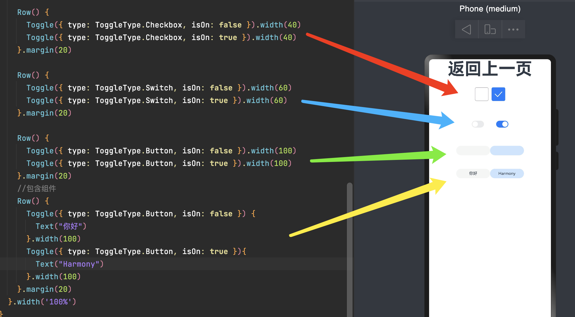
      Row() {
        Toggle({ type: ToggleType.Checkbox, isOn: false }).width(40)
        Toggle({ type: ToggleType.Checkbox, isOn: true }).width(40)
      }.margin(20)

      Row() {
        Toggle({ type: ToggleType.Switch, isOn: false }).width(60)
        Toggle({ type: ToggleType.Switch, isOn: true }).width(60)
      }.margin(20)

      Row() {
        Toggle({ type: ToggleType.Button, isOn: false }).width(100)
        Toggle({ type: ToggleType.Button, isOn: true }).width(100)
      }.margin(20)
      //包含组件
      Row() {
        Toggle({ type: ToggleType.Button, isOn: false }) {
          Text("你好")
        }.width(100)
        Toggle({ type: ToggleType.Button, isOn: true }){
          Text("Harmony")
        }.width(100)
      }.margin(20)
自定义样式/添加事件
selectedColor:设置Toggle打开选中后的背景颜色。
switchPointColor:设置Switch类型的圆形滑块颜色,仅对type为ToggleType.Switch生效。
onChange:开关状态切换时触发该事件。

七、进度条(Progress)
进度条组件,用于显示内容加载或操作处理等进度。
value:用于设置初始进度值。
total:用于设置进度总长度。
- type:决定Progress样式。
ProgressType.Linear(线性样式):从API version9开始,组件高度大于宽度的时候自适应垂直显示,相等时仍然保持水平显示。
ProgressType.Ring(环形无刻度样式)
- ProgressType.ScaleRing(环形有刻度样式):需要设置环形有刻度进度条的样式。
strokeWidth: 设置进度条宽度(不支持百分比设置)。
scaleCount: 设置环形进度条总刻度数。
scaleWidth: 设置环形进度条刻度粗细(不支持百分比设置),刻度粗细大于进度条宽度时,为系统默认粗细。
ProgressType.Eclipse(圆形样式)
ProgressType.Capsule(胶囊样式)
Progress(options: {value: number, total?: number, type?: ProgressType})
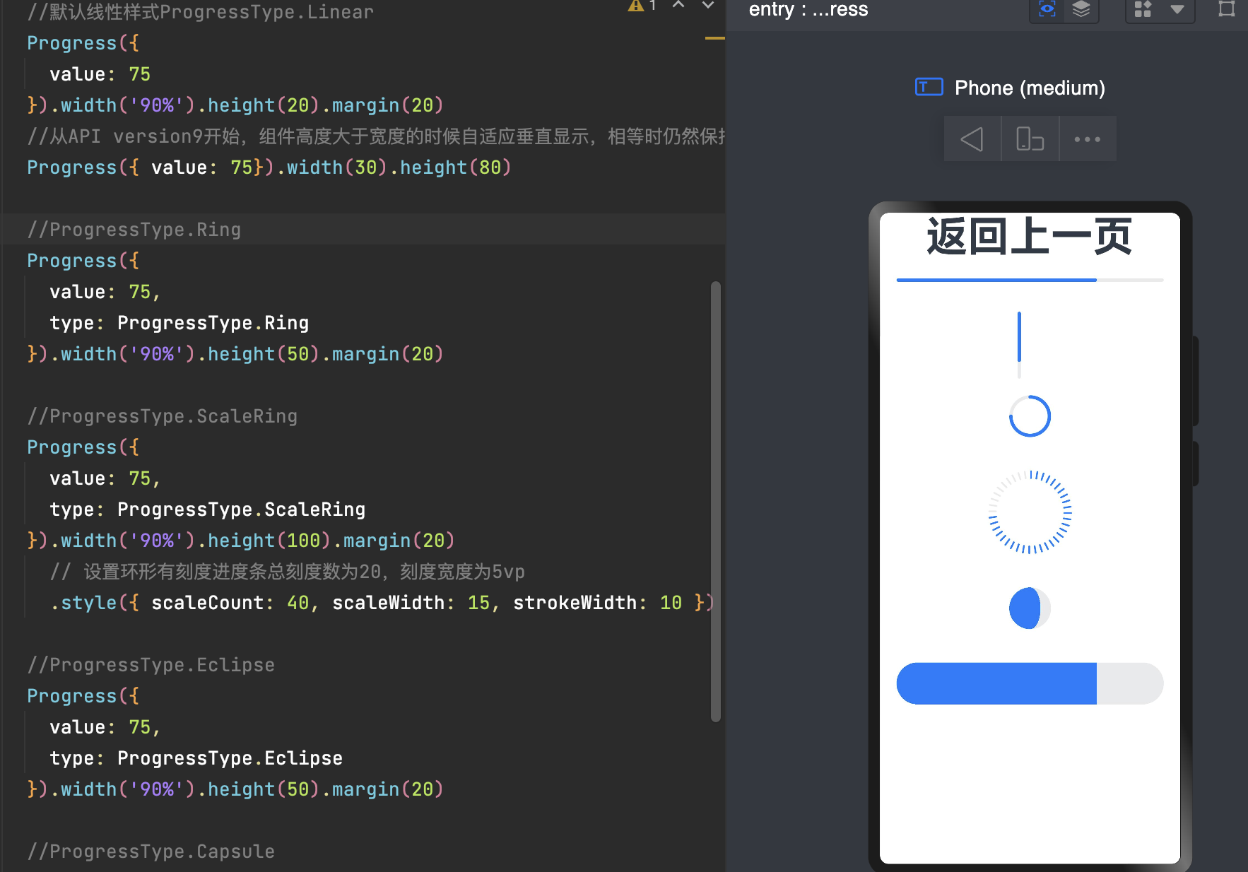
      //默认线性样式ProgressType.Linear
      Progress({
        value: 75
      }).width('90%').height(20).margin(20)
      //从API version9开始,组件高度大于宽度的时候自适应垂直显示,相等时仍然保持水平显示。
      Progress({ value: 75}).width(30).height(80)

      //ProgressType.Ring
      Progress({
        value: 75,
        type: ProgressType.Ring
      }).width('90%').height(50).margin(20)

      //ProgressType.ScaleRing
      Progress({
        value: 75,
        type: ProgressType.ScaleRing
      }).width('90%').height(100).margin(20)
        // 设置环形有刻度进度条总刻度数为20,刻度宽度为5vp
        .style({ scaleCount: 40, scaleWidth: 15, strokeWidth: 10 })

      //ProgressType.Eclipse
      Progress({
        value: 75,
        type: ProgressType.Eclipse
      }).width('90%').height(50).margin(20)

      //ProgressType.Capsule
      Progress({
        value: 75,
        type: ProgressType.Capsule
      }).width('90%').height(50).margin(20)
自定义样式
color:设置进度条前景色。默认值:'#ff007dff'
backgroundColor:设置进度条底色。默认值:'#19182431'
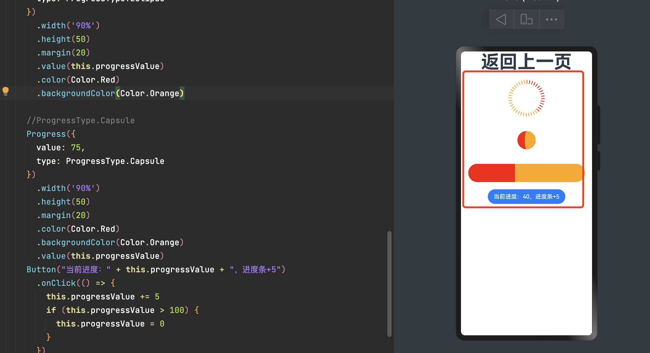
      //ProgressType.ScaleRing
      Progress({
        value: 75,
        type: ProgressType.ScaleRing
      })
        .width('90%')
        .height(100)
        .margin(20)
        .value(this.progressValue)
          // 设置环形有刻度进度条总刻度数为40,刻度宽度为15,条刻度粗细10
        .style({ scaleCount: 40, scaleWidth: 15, strokeWidth: 10 })
        .color(Color.Red)
        .backgroundColor(Color.Orange)

      //ProgressType.Eclipse
      Progress({
        value: 75,
        type: ProgressType.Eclipse
      })
        .width('90%')
        .height(50)
        .margin(20)
        .value(this.progressValue)
        .color(Color.Red)
        .backgroundColor(Color.Orange)

      //ProgressType.Capsule
      Progress({
        value: 75,
        type: ProgressType.Capsule
      })
        .width('90%')
        .height(50)
        .margin(20)
        .color(Color.Red)
        .backgroundColor(Color.Orange)
        .value(this.progressValue)
      Button("当前进度:" + this.progressValue + ",进度条+5")
        .onClick(() => {
          this.progressValue += 5
          if (this.progressValue > 100) {
            this.progressValue = 0
          }
        })
八、弹窗/自定义弹窗(AlertDialog/CustomDialog)
警告弹窗
列表选择弹窗
自定义弹窗
日期滑动选择器弹窗
时间滑动选择器弹窗
文本滑动选择器弹窗
8.1 弹窗
8.1.1 警告弹窗(AlertDialog)
显示警告弹窗组件,可设置文本内容与响应回调。
AlertDialogParamWithConfirm
AlertDialogParamWithButtons
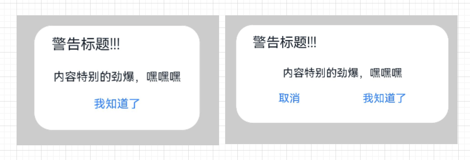
      Button('警告弹窗-1个按钮')
        .onClick(() => {
          //AlertDialogParamWithConfirm
          AlertDialog.show(
            {
              title: '警告标题!!!',
              message: '内容特别的劲爆,嘿嘿嘿',
              autoCancel: true,//点击遮障层时,是否关闭弹窗
              alignment: DialogAlignment.Center,
              gridCount: 3,
              confirm: {
                value: '我知道了',
                action: () => {
                  promptAction.showToast({message:'羡慕你被点了一下'})
                }
              },
              cancel: () => {
                promptAction.showToast({message:'你取消了'})
              }
            }
          )
        })
        .backgroundColor(Color.Pink)
      Button('警告弹窗-2个按钮')
        .onClick(() => {
          AlertDialog.show(
            {
              title: '警告标题!!!',
              message: '内容特别的劲爆,嘿嘿嘿',
              autoCancel: true,//点击其他区域是否自动关闭
              alignment: DialogAlignment.Center,
              gridCount: 4,
              primaryButton: {
                value: '取消',
                action: () => {
                  promptAction.showToast({message:'讨厌,你咋取消了'})
                }
              },
              secondaryButton: {
                value: '我知道了',
                action: () => {
                  promptAction.showToast({message:'羡慕你被点了一下'})
                }
              },
              cancel: () => {
                promptAction.showToast({message:'你取消了'})
              }
            }
          )
        })
        .backgroundColor(Color.Pink)
        .margin({top:20})
AlertDialogParamWithConfirm
title:弹窗标题。
message:弹窗内容。
autoCancel:点击遮障层时,是否关闭弹窗。默认值:true
- confirm:确认按钮的文本内容、文本色、按钮背景色和点击回调。
value: ResourceStr
fontColor?: ResourceColor
backgroundColor?: ResourceColor
action: () => void
cancel:点击遮障层关闭dialog时的回调。
- alignment :弹窗在竖直方向上的对齐方式。对齐方式(DialogAlignment)说明如下:
Default(默认值):默认对齐。
Top:垂直顶部对齐。
Center:垂直居中对齐。
Bottom:垂直底部对齐。
TopStart:左上对齐。
TopEnd:右上对齐。
CenterStart:左中对齐。
CenterEnd:右中对齐。
BottomStart:左下对齐。
BottomEnd8:右下对齐。
offset:弹窗相对alignment所在位置的偏移量。
gridCount:弹窗容器宽度所占用栅格数。
AlertDialogParamWithButtons
其他属性相通,以下两个属性 是个特色。
- primaryButton:按钮的文本内容、文本色、按钮背景色和点击回调。
value: ResourceStr
fontColor?: ResourceColor
backgroundColor?: ResourceColor
action: () => void
- secondaryButton:按钮的文本内容、文本色、按钮背景色和点击回调。
value: ResourceStr
fontColor?: ResourceColor
backgroundColor?: ResourceColor
action: () => void
8.1.2 列表选择弹窗(ActionSheet)
其他属性相通,有个特色属性:
- sheets:设置选项内容,每个选择项支持设置图片、文本和选中的回调。
Array<SheetInfo>。SheetInfo说明:title:选项的文本内容。
icon:选项的图标,默认无图标显示。
action:选项选中的回调。
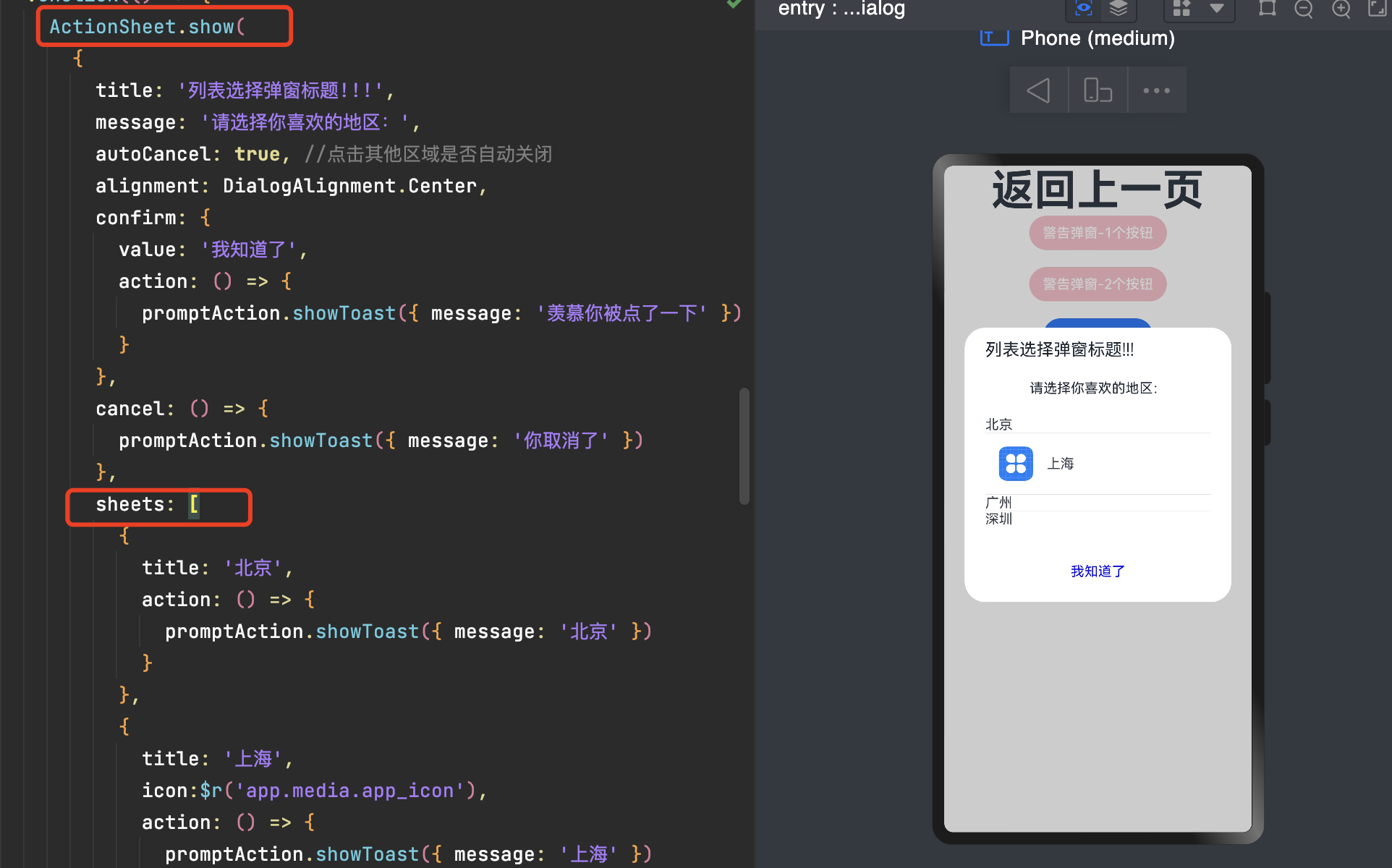
          ActionSheet.show(
            {
              title: '列表选择弹窗标题!!!',
              message: '请选择你喜欢的地区:',
              autoCancel: true, //点击其他区域是否自动关闭
              alignment: DialogAlignment.Center,
              confirm: {
                value: '我知道了',
                action: () => {
                  promptAction.showToast({ message: '羡慕你被点了一下' })
                }
              },
              cancel: () => {
                promptAction.showToast({ message: '你取消了' })
              },
              sheets: [
                {
                  title: '北京',
                  action: () => {
                    promptAction.showToast({ message: '北京' })
                  }
                },
                {
                  title: '上海',
                  icon:$r('app.media.app_icon'),
                  action: () => {
                    promptAction.showToast({ message: '上海' })
                  }
                },
                {
                  title: '广州',
                  action: () => {
                    promptAction.showToast({ message: '广州' })
                  }
                },
                {
                title: '深圳',
                action: () => {
                  promptAction.showToast({ message: '深圳' })
                }
              }
              ]
            }
          )
8.2自定义弹窗(CustomDialog)
自定义弹窗(CustomDialog)可用于广告、中奖、警告、软件更新等与用户交互响应操作。开发者可以通过CustomDialogController类显示自定义弹窗。
8.2.1 简单实用
使用@CustomDialog装饰器装饰自定义弹窗。
@Entry
@Component
struct BasicDialog {
  ......
}

//自定义弹窗
@CustomDialog
struct CustomDialogSc {
  customDialogSc?: CustomDialogController

  build() {
    Column() {
      Text('我是个弹窗,嘿嘿嘿')
        .fontSize(24)
        .height(100)
      Button('点击关闭弹窗')
        .onClick(() => {
          if (this.customDialogSc != undefined) {
            this.customDialogSc.close()
          }
        })
        .margin(20)
    }
  }
}
创建构造器
@Entry
@Component
struct BasicDialog {
  @State message: string = '返回上一页'
  customDialogSc: CustomDialogController = new CustomDialogController({
    builder: CustomDialogSc(),
    alignment: DialogAlignment.Center})//弹窗位置
  build() {
   ......
  }
}
添加时间,弹窗弹出
this.customDialogSc.open()

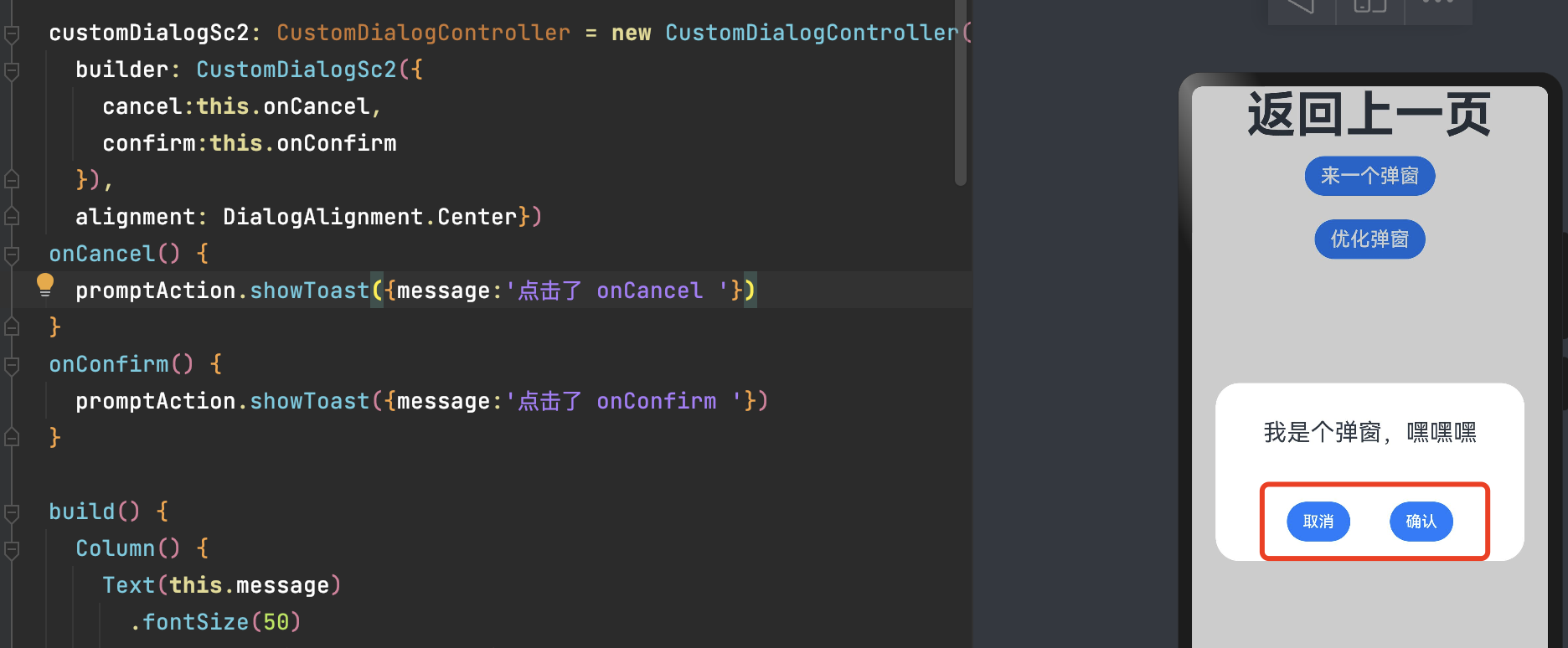
8.2.2 弹窗添加交互
在@CustomDialog装饰器内添加按钮操作,创建函数。
//自定义弹窗
@CustomDialog
struct CustomDialogSc2 {
  customDialogSc?: CustomDialogController
  cancel: () => void//创建函数
  confirm: () => void//创建函数
  build() {
    Column() {
      Text('我是个弹窗,嘿嘿嘿')
        .fontSize(24)
        .height(100)
      Row(){
        Button('取消')
          .onClick(() => {
            this.customDialogSc.close()
            this.cancel()
          })
          .margin(20)
        Button('确认')
          .onClick(() => {
            this.customDialogSc.close()
            this.confirm()
          })
          .margin(20)
      }.width('90%').justifyContent(FlexAlign.Center)
    }
  }
}
页面内需要在构造器内进行接收,同时创建相应的函数操作。
  customDialogSc2: CustomDialogController = new CustomDialogController({
    builder: CustomDialogSc2({
      cancel:this.onCancel,
      confirm:this.onConfirm
    }),
    alignment: DialogAlignment.Center})
  onCancel() {
    promptAction.showToast({message:'点击了 onCancel '})
  }
  onConfirm() {
    promptAction.showToast({message:'点击了 onConfirm '})
  }
8.3 日期滑动选择器弹窗
根据指定的日期范围创建日期滑动选择器,展示在弹窗上。
start:设置选择器的起始日期。默认:Date('1970-1-1')
end:设置选择器的结束日期。默认:Date('2100-12-31')
selected:设置当前选中的日期。默认:当前系统日期
lunar:日期是否显示为农历。默认:false
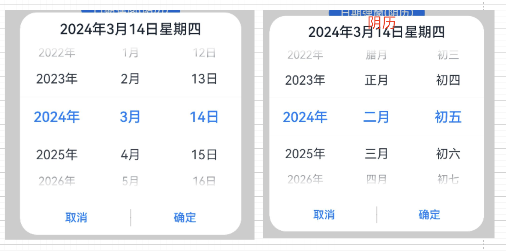
      Button("日期弹窗")
        .margin({ top: 20 })
        .onClick(() => {
          DatePickerDialog.show({
            start: new Date("2000-1-1"),
            end: new Date("2100-12-31"),
            selected: this.selectedDate,
            onAccept: (value: DatePickerResult) => {
              // 通过Date的setFullYear方法设置按下确定按钮时的日期,这样当弹窗再次弹出时显示选中的是上一次确定的日期
              this.selectedDate.setFullYear(value.year, value.month, value.day)
              //开整
            },
            onCancel: () => {
              //开整
            },
            onChange: (value: DatePickerResult) => {
              //开整
            }
          })
        })

      Button("日期弹窗(阴历)")
        .margin({ top: 20 })
        .onClick(() => {
          DatePickerDialog.show({
            start: new Date("2000-1-1"),
            end: new Date("2100-12-31"),
            selected: this.selectedDate,
            lunar: true,
            onAccept: (value: DatePickerResult) => {
              this.selectedDate.setFullYear(value.year, value.month, value.day)
              //开整
            },
            onCancel: () => {
              //开整
            },
            onChange: (value: DatePickerResult) => {
              //开整
            }
          })
        })
8.4 时间滑动选择器弹窗
以24小时的时间区间创建时间滑动选择器,展示在弹窗上。
selected:设置当前选中的时间。默认值:当前系统时间
useMilitaryTime:展示时间是否为24小时制。默认值:false,12小时制
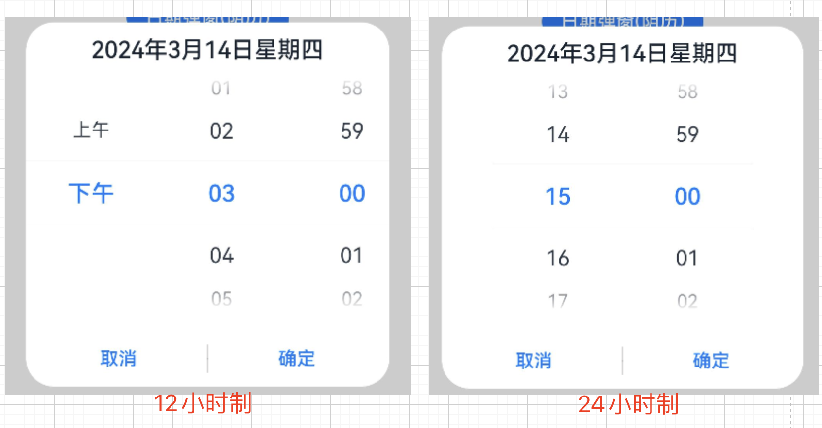
      Button("时间选择器 12小时制")
        .margin({ top: 20 })
        .onClick(() => {
          TimePickerDialog.show({
            selected: this.selectTime,
            onAccept: (value: TimePickerResult) => {
              // 设置selectTime为按下确定按钮时的时间,这样当弹窗再次弹出时显示选中的为上一次确定的时间
              this.selectTime.setHours(value.hour, value.minute)
              //开整
            },
            onCancel: () => {
              //开整
            },
            onChange: (value: TimePickerResult) => {
              //开整
            }
          })
        })
      Button("时间选择器 24小时制")
        .margin({ top: 20 })
        .onClick(() => {
          TimePickerDialog.show({
            selected: this.selectTime,
            useMilitaryTime: true,
            onAccept: (value: TimePickerResult) => {
              this.selectTime.setHours(value.hour, value.minute)
              //开整
            },
            onCancel: () => {
              //开整
            },
            onChange: (value: TimePickerResult) => {
              //开整
            }
          })
        })
8.5 文本滑动选择器弹窗
指定的选择范围创建文本选择器,展示在弹窗上。
range:设置文本选择器的选择范围。
selected:设置选中项的索引值。
value:设置选中项的文本内容。当设置了selected参数时,该参数不生效。如果设置的value值不在range范围内,则默认取range第一个元素。
defaultPickerItemHeight:设置选择器中选项的高度。
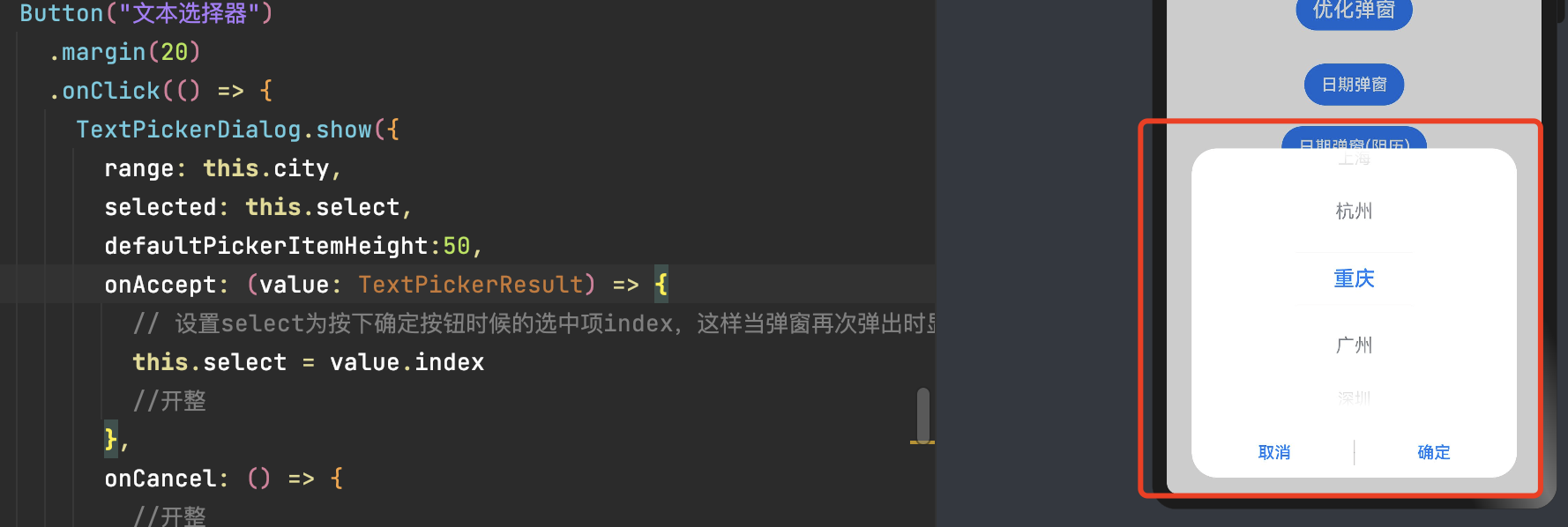
      Button("文本选择器")
        .margin(20)
        .onClick(() => {
          TextPickerDialog.show({
            range: this.city,
            selected: this.select,
            defaultPickerItemHeight:50,
            onAccept: (value: TextPickerResult) => {
              // 设置select为按下确定按钮时候的选中项index,这样当弹窗再次弹出时显示选中的是上一次确定的选项
              this.select = value.index
              //开整
            },
            onCancel: () => {
              //开整
            },
            onChange: (value: TextPickerResult) => {
              //开整
            }
          })
        })
总体来说 ArkTS Dialog 封装的很全,涵盖了大部分的情况,样式也很好看,不需要我们再自定义了。
九、图片
实际开发中经常需要在应用中显示一些图片,例如:按钮中的icon、网络图片、本地图片等。在应用中显示图片需要使用Image组件实现,Image支持多种图片格式,包括png、jpg、bmp、svg和gif。
Image(src: string | Resource | media.PixelMap)
9.1 本地资源
创建images文件夹,将本地图片放入ets文件夹下的任意位置。
Image组件引入本地图片路径,即可显示图片(根目录为ets文件夹)。
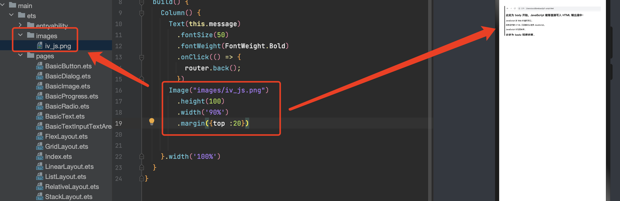
      Image("images/iv_js.png")
        .height(100)
        .width('90%')
        .margin({top :20})
9.2 网络资源
引入网络图片需申请权限ohos.permission.INTERNET,具体申请方式请参考权限申请声明。此时,Image组件的src参数为网络图片的链接。
      Image('https://img-blog.csdnimg.cn/img_convert/0e3fbae79c61d17bb2737b803f92a6c6.png')
        .height(100)
        .width('90%')
        .margin({ top:20 })
9.3 Resource资源
使用资源格式可以跨包/跨模块引入图片,resources文件夹下的图片都可以通过$r资源接口读取到并转换到Resource格式。
      Image($r('app.media.app_icon'))
        .height(100)
        .width(100)
        .margin({ top:20 })
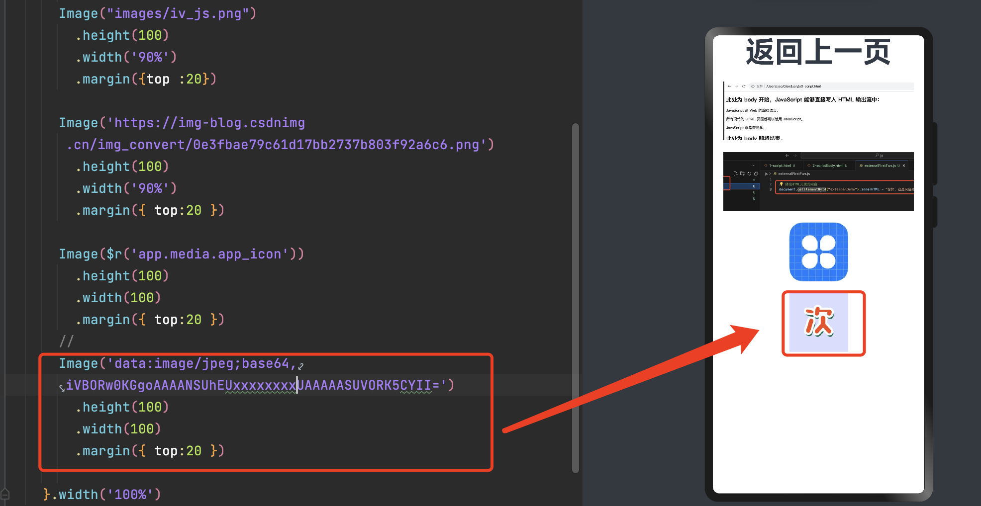
9.4 base64
路径格式为data:image/[png|jpeg|bmp|webp];base64,[base64 data],其中[base64 data]为Base64字符串数据。
      Image('data:image/jpeg;base64,iVBORw0KGgoAAAANSUhEUgAAAJYAAACWCAYAAAA8AXHiAA....特别长直接省略了...VORK5CYII=')
        .height(100)
        .width(100)
        .margin({ top:20 })
Base64格式字符串可用于存储图片的像素数据,在网页上使用较为广泛。
十、视频播放(Video)
视频播放组件。Video组件支持加载本地视频和网络视频。
- src:播放视频内容的路径。
支持在resources下面的video或rawfile文件夹里放置媒体资源。
支持dataability://的路径前缀,用于访问通过Data Ability提供的视频路径。
支持file:///data/storage路径前缀的字符串,用于读取应用沙箱路径内的资源。需要保证目录包路径下的文件有可读权限。
视频支持的格式是:mp4、mkv、webm、TS。
- currentProgressRate:视频播放倍速。number取值仅支持:0.75,1.0,1.25,1.75,2.0。
Speed_Forward_0_75_X:0.75倍速播放。
Speed_Forward_1_00_X(默认):1倍速播放。
Speed_Forward_1_25_X:1.25倍速播放。
Speed_Forward_1_75_X:1.75倍速播放。
Speed_Forward_2_00_X:2倍速播放。
previewUri:视频未播放时的预览图片路径,默认不显示图片。
controller:设置视频控制器,可以控制视频的播放状态。
muted:是否静音。默认值:false
autoPlay:是否自动播放。默认值:false
controls:控制视频播放的控制栏是否显示。默认值:true
loop:是否单个视频循环播放。默认值:false
- objectFit:设置视频显示模式。ImageFit模式说明:
Cover(默认值):保持宽高比进行缩小或者放大,使得图片两边都大于或等于显示边界。
Contain:保持宽高比进行缩小或者放大,使得图片完全显示在显示边界内。
Auto:自适应显示
Fill:不保持宽高比进行放大缩小,使得图片充满显示边界。
ScaleDown:保持宽高比显示,图片缩小或者保持不变。
None:保持原有尺寸显示。
注:This component is not supported on PC preview.(该组件不支持预览)
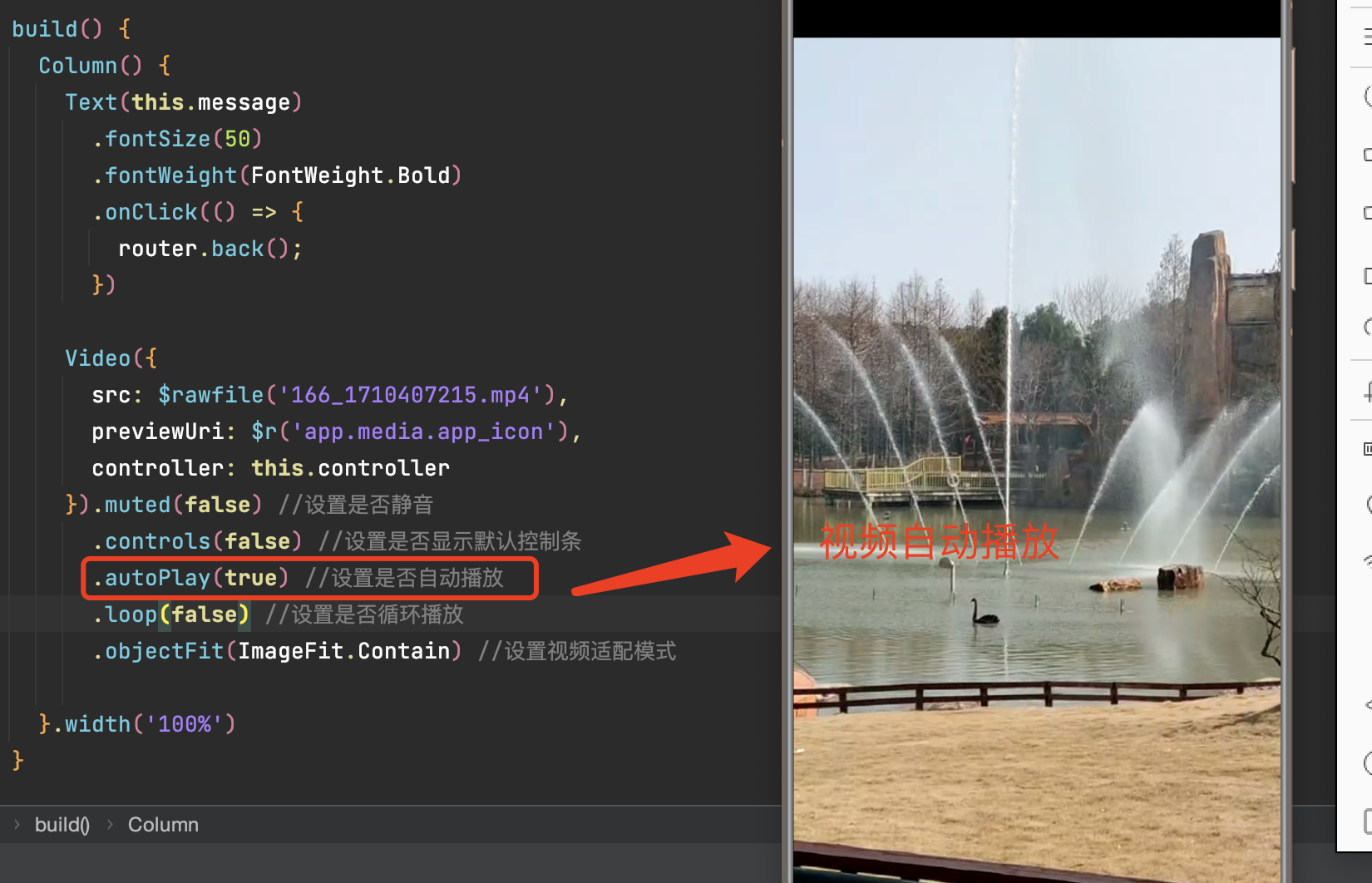
10.1 普通本地视频。
加载本地视频时,首先在本地rawfile目录指定对应的文件。已设置视频未播放时的预览图片路径。

添加一些事件,让视频自动播放。
 Video({
        src: $r('app.media.app_icon'),
        previewUri: $r('app.media.app_icon'),
        controller: this.controller
      })
        .muted(false) //设置是否静音
        .controls(false) //设置是否显示默认控制条
        .autoPlay(true) //设置是否自动播放
        .loop(false) //设置是否循环播放
        .objectFit(ImageFit.Contain) //设置视频适配模式
10.2 加载网络视频
加载网络视频时,需要申请权限ohos.permission.INTERNET,具体申请方式请参考权限申请声明。此时,Video的src属性为网络视频的链接。
      Video({
        src: 'https://xxxxx/hao.map',//替换有效地址在 src引用即可。
        previewUri: $r('app.media.app_icon'),
        controller: this.controller
      }).muted(false) //设置是否静音
        .controls(false) //设置是否显示默认控制条
        .autoPlay(true) //设置是否自动播放
        .loop(false) //设置是否循环播放
        .objectFit(ImageFit.Contain) //设置视频适配模式
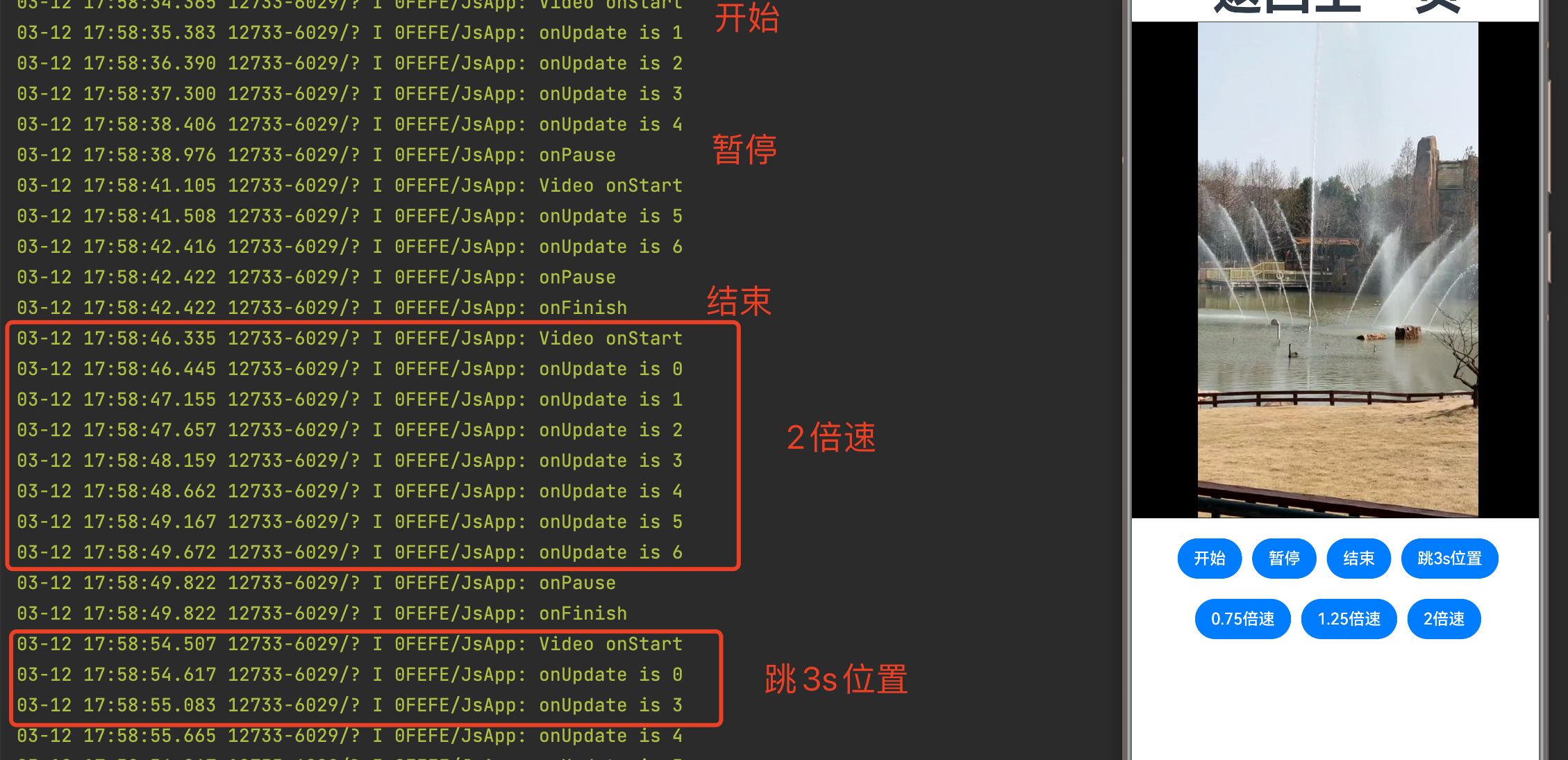
10.3 Video控制器使用(VideoController)
start:开始播放。
pause:暂停播放,显示当前帧,再次播放时从当前位置继续播放。
stop:停止播放,显示当前帧,再次播放时从头开始播放。
setCurrentTime:setCurrentTime(value: number),指定视频播放的进度位置。
- setCurrentTime:setCurrentTime(value: number, seekMode: SeekMode),指定视频播放的进度位置。SeekMode类型:
PreviousKeyframe:跳转到前一个最近的关键帧。
NextKeyframe:跳转到后一个最近的关键帧。
ClosestKeyframe:跳转到最近的关键帧。
Accurate:精准跳转,不论是否为关键帧。
requestFullscreen:请求全屏播放。
exitFullscreen:退出全屏播放。

@Entry
@Component
struct BasicVideo {
  private controller: VideoController = new VideoController();
  @State curRate: PlaybackSpeed = PlaybackSpeed.Speed_Forward_1_00_X

  build() {
    Column() {
      ......
      Row() {
        Button("开始")
          .onClick(() => {
            this.controller.start() //开始播放
          })
        Button("暂停")
          .onClick(() => {
            this.controller.pause() // 暂停播放
          }).margin({ left: 10 })
        Button("结束")
          .onClick(() => {
            this.controller.stop() // 结束播放
          }).margin({ left: 10 })
        Button('跳3s位置').onClick(() => {
          this.controller.setCurrentTime(3, SeekMode.Accurate) // 精准跳转到视频的3s位置
        }).margin({ left: 10 })
      }.margin(20)

      Row() {
        Button("0.75倍速")
          .onClick(() => {
            this.curRate = PlaybackSpeed.Speed_Forward_0_75_X //0.75倍速播放
          })
        Button("1.25倍速")
          .onClick(() => {
            this.curRate = PlaybackSpeed.Speed_Forward_1_25_X //1.25倍速播放
          }).margin({ left: 10 })
        Button("2倍速")
          .onClick(() => {
            this.curRate = PlaybackSpeed.Speed_Forward_2_00_X //2倍速播放
          }).margin({ left: 10 })
      }

    }.width('100%')
  }
}
10.4 事件回调
Video组件回调事件主要为播放开始、暂停结束、播放失败、视频准备和操作进度条等事件,除此之外,Video组件也支持通用事件的调用,如点击、触摸等事件的调用。
      Video({
        src: $rawfile('166_1710407215.mp4'),
        previewUri: $r('app.media.app_icon'),
        currentProgressRate: this.curRate,
        controller: this.controller
      })
        .onStart(() => {
          console.info("Video",'onStart')
        })
        .onPause(() => {
          console.info('onPause')
        })
        .onFinish(() => {
          console.info('onFinish')
        })
        .onError(() => {
          console.info('onError')
        })
        .onPrepared((e) => {
          console.info('onPrepared is ' + e.duration)
        })
        .onSeeking((e) => {
          console.info('onSeeking is ' + e.time)
        })
        .onSeeked((e) => {
          console.info('onSeeked is ' + e.time)
        })
        .onUpdate((e) => {
          console.info('onUpdate is ' + e.time)
        })
相关推荐
Dev Studio 安装与使用
ArkTS 开发基础/语言
ArkTS 构建布局