博主其它CSS3 3D的文章:
CSS3干货4:CSS中3D运用_css 3d-CSDN博客
CSS3干货5:CSS中3D运用-2_中3d-2-CSDN博客
CSS3干货6:CSS中3D运用-3_css3d 使用-CSDN博客
=======================
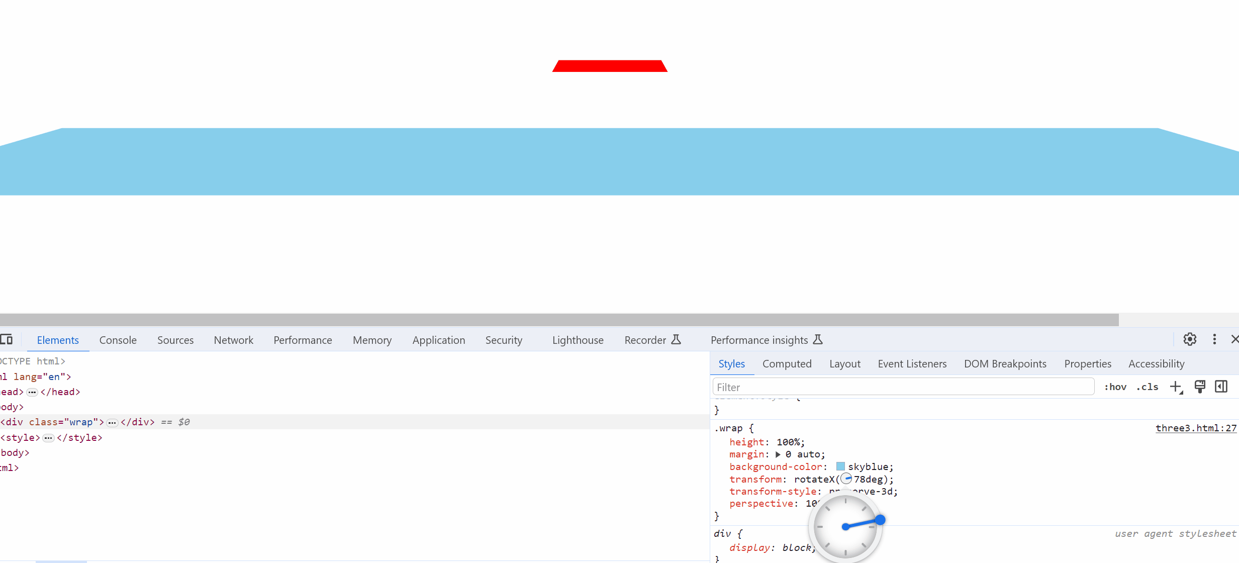
最近工作上烦心的事情太多,只有周末才能让我冷静一下 coding 一会玩~
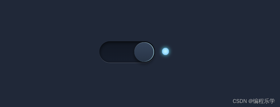
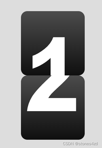
今天做一个 3D 翻转数字效果。示例图如下:
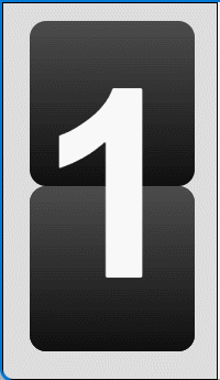
这个东西看着比较难,其实很简单。
一、结构分析
它由两部分组成:
1. 底层的半截数字
2. 翻动的半截数字
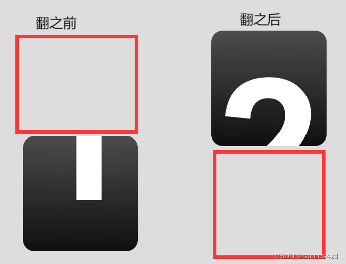
每部分都是一个div。半截数字由 ::before 、::after 伪标签制作。
数字由伪标签的 content 设置。
HTML 结构如下:
<!-- 一个数字 -->
<section>
   <div data-before="1" data-after="2"></div>
   <div data-before="1" data-after="2"></div>
</section>
<!-- 一个数字 end -->
二、CSS 制作半截数字
半截数字,在这里要分为上半截和下半截。
1. 上半截要设置 line-height 为整个 section 的高。
2. 下半截则要设置 line-height 为 0。
 &::before{
        line-height: $height;
        content: attr(data-before);
}
&::after{
        line-height: 0;
        content: attr(data-after);
}
三、翻转部分制作
翻转的部分,其实就是2个半截数字绝对定位,进行重叠。其中,数字2 的上半截,还要翻转 180deg,因为它要翻转下才会摆正。
 &::after{
    line-height: $height;
    top:0;
    transform-origin: bottom center;
    transform: rotateX(-180deg);
   }
为了保证效果,还要设置翻转部分的 3D 效果。
section  div:nth-child(2){
    transform-style: preserve-3d;
    transition: all 0.5s ease-in-out;
}
四、完成 SCSS 代码
这里用 SCSS 完整整个 CSS。
SCSS 分为了 5 个文件
- _public.scss 放公用样式。略。
- _vars.scss 放变量设置。
$page-width: 100vw;
$page-height: 100vh;

$width :200px;
$height: 400px;- _mixins.scss 放SCSS函数。
@mixin setSize($w, $h) {
    width: $w;
    height: $h;
}
@mixin flex($justify:center, $align:center){
    display: flex;
    justify-content: $justify;
    align-items: $align;
}- _pages.scss 存放页面样式
@charset "UTF-8";
// 页面设置
body {
  @include setSize($page-width, $page-height);
  @include flex();  // 启用flex布局,让内容居中
  background: #ddd;
}
// 每个数字
section {
  @include setSize($width, $height);
  margin-left: auto;
  margin-right: auto;
  position: relative;
  perspective: 1000px;

  div{
    position: absolute;
    font-family: Arial;
    @include setSize($width, $height);
    // 数字的样式
    &::before,
    &::after {
        border-radius: 20px;
        display: block;
        width: $width;
        height: $height/2;
        color: #fff;
        background: linear-gradient(to bottom, #4c4c4c 0%,#0f0f0f 100%);
        font-size: $height*0.8;
        font-weight: bold;
        overflow: hidden;
        line-height: $height;
        text-align: center;
    }
    &::before{
        line-height: $height;
        content: attr(data-before);
    }
    &::after{
        line-height: 0;
        content: attr(data-after);
    }
  }
}
// 数字翻转
section  div:nth-child(2){
    transform-style: preserve-3d;
    transition: all 0.5s ease-in-out;
   &::before,
   &::after{
    position: absolute;
    backface-visibility: hidden;
    transition: all 0.5s ease-in-out;
   }
   &::before{
    line-height: 0;
    top:$height/2;
    transform-origin: top center;
   }
   &::after{
    line-height: $height;
    top:0;
    transform-origin: bottom center;
    transform: rotateX(-180deg);
   }
}
// 鼠标悬停
section:hover  div:nth-child(2){
    transform: rotateX(180deg);
}
- app.scss 依次载入对应的 SCSS 文件。
@import "_vars.scss";
@import "_mixins.scss";
@import "_public.scss";
@import "_page.scss";
生成的 CSS 文件,引入 HTML 即可。